
Two of my biggest passions outside of painting are photography and movies. Naturally then, the photography of movies is something I find particularly interesting. As another visual medium, it also informs my painting and can provide a lot of ideas and education. Today I want to look at the work of one of the most celebrated living directors of photography: Robert Richardson.
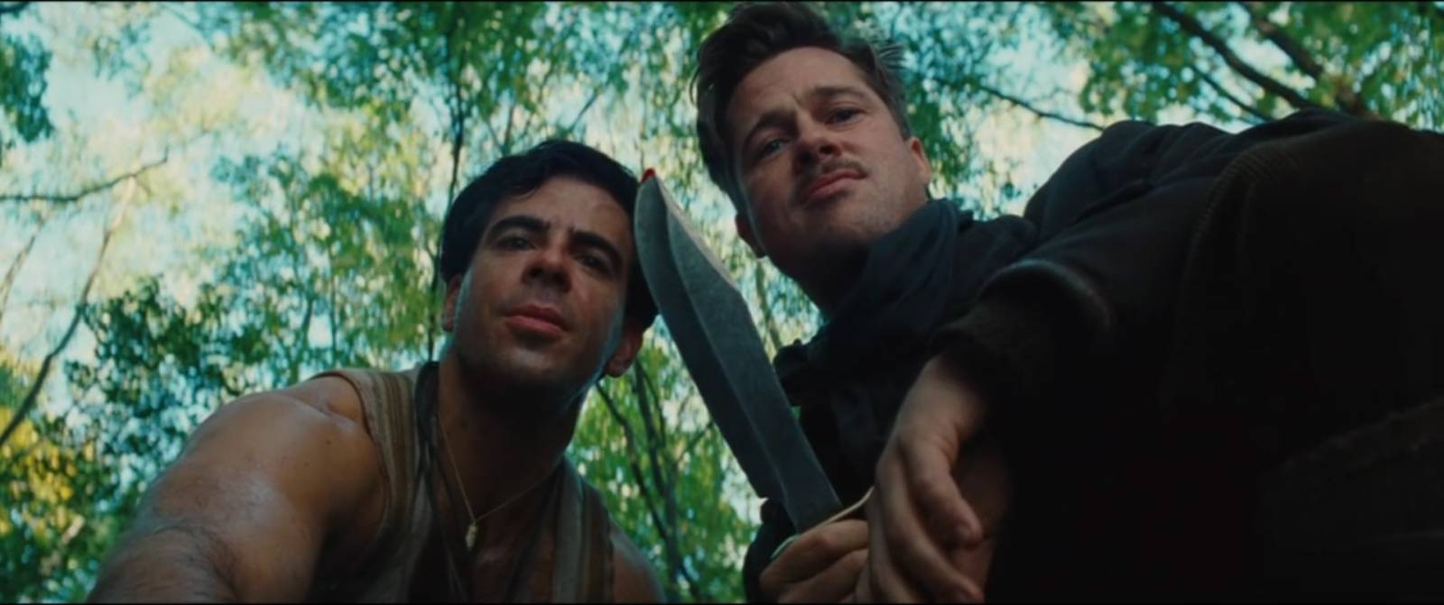
If you’re not familiar with the term “Director of Photography”, this is the person who is responsible for all of the technical decisions in the photography of a film. Chief among these decisions is how to light every scene, lens choices, camera placement and movement, and composition within the frame. They are working along side the production artists, wardrobe, and hair and makeup. Leading everyone is the film’s director, who may be very hands on or may be more collaborative with the photography. For that reason, I wanted to look at Richardson’s work with three different directors so that we could see commonalities in his choices. The three pieces I’ve reviewed are JFK (directed by Oliver Stone, 1990), Casino (directed by Martin Scorcese 1996), and Inglorious Basterds (directed by Quentin Tarantino 2009). Of these three, Richardson has noted in interviews that Scorcese was the most pre-planned and so his contribution was more technical, while Tarantino and Stone gave him broader creative freedom in designing shots.
I’m looking at Richardson’s work in the hopes of learning about light, composition, and how those two aspects create mood. Obviously these movies are meant to be viewed in motion and so stripping them down to single frames is missing out on a lot of his craft. As a person who works in single static images, however, pulling key stills and studying them helps me better relate this work to designing a painting.
Here are some pulled frames with notes on what I find interesting or striking:
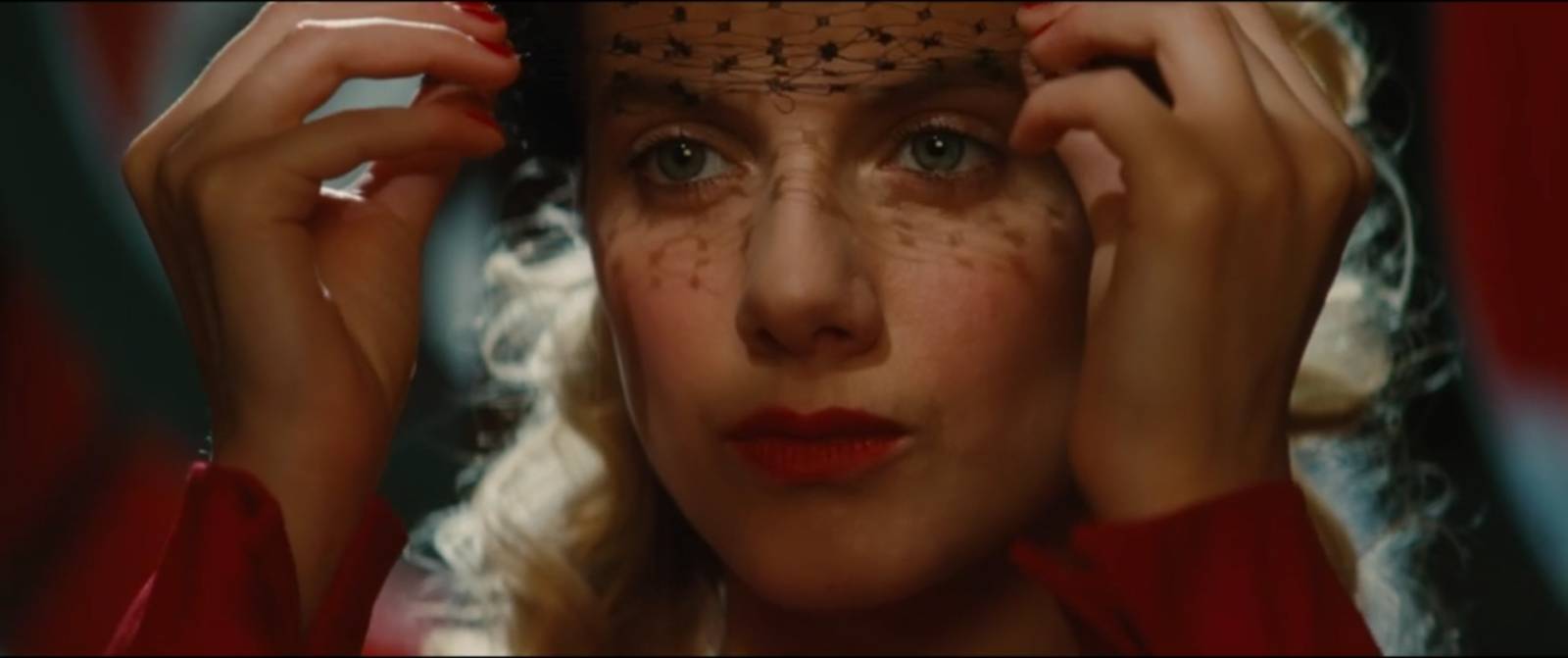
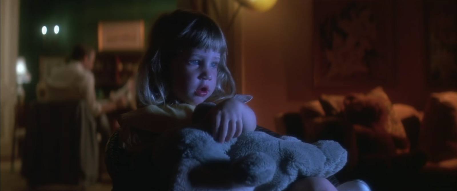
This closeup shows a deceptively simple lighting set-up. The face and hands are filled by warm soft light, while a subtle harder spot brightens the eyes and casts the veil shadow. We also see a very bright cool backlight hitting the hair and parts of the right hand. The result is glamorous and dramatic while still understated.
Richardson often uses lenses or filters that give over-exposed areas a halation effect (a bloom of light around highlights). The emotional effect often feels nostalgic or historical. This scene is also characteristic of his tendency to spot-light focal areas from above or behind and expose for the bounced light on the face.
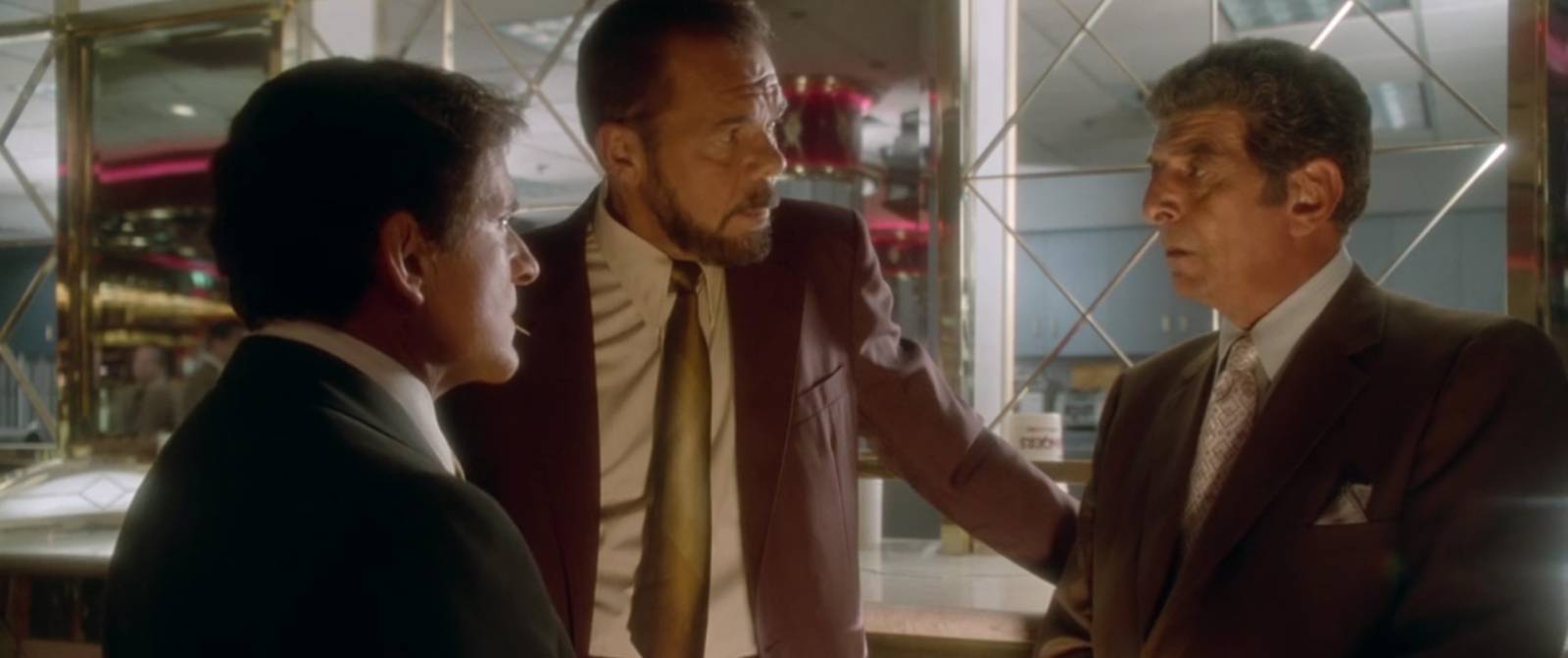
A classic Richardson bounce-light fill gives this scene extra atmosphere. The golden color complements the cooler backlight. The placement of actors against the background creates strong compositional shapes as well.
JFK’s black and white segments are some of my favorite shots in the movie. They tend to be lit with very high contrast that creates stark shapes of light and dark and this is used very very effectively in building compositions.
A wonderful “frame within a frame” as we see one figure in the foreground unaware of the watching figure in the background. Excellent variety and placement of shapes build this solid composition.

The circular window makes for a striking compositional element, but this shot is all about the lighting. Having the actor and windowsill lit by a very powerful spot creates a high contrast image while also bouncing a reflection of the actor into the glass. Everything else is nearly black.

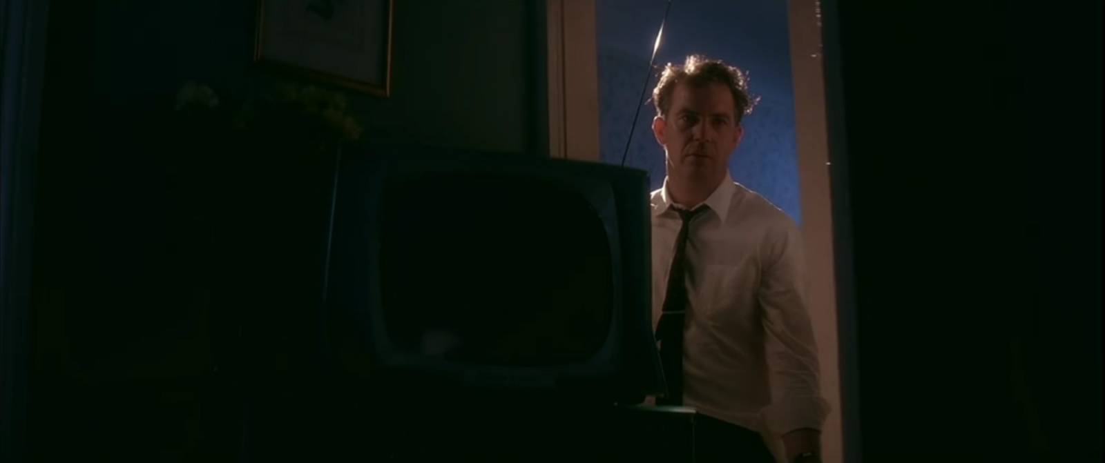
This whole scene appears to be lit by the single overhead in-frame light, creating a very dramatic effect
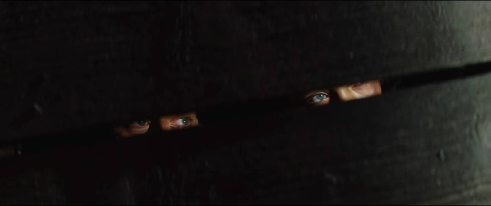
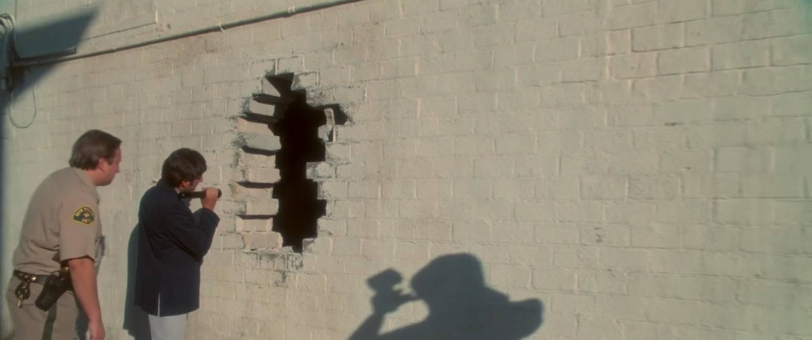
The stark minimalism of this frame is very striking. The slight diagonal adds a bit of movement. Contrast in value, color, and detail draws our eyes to the small but information packed focal points.
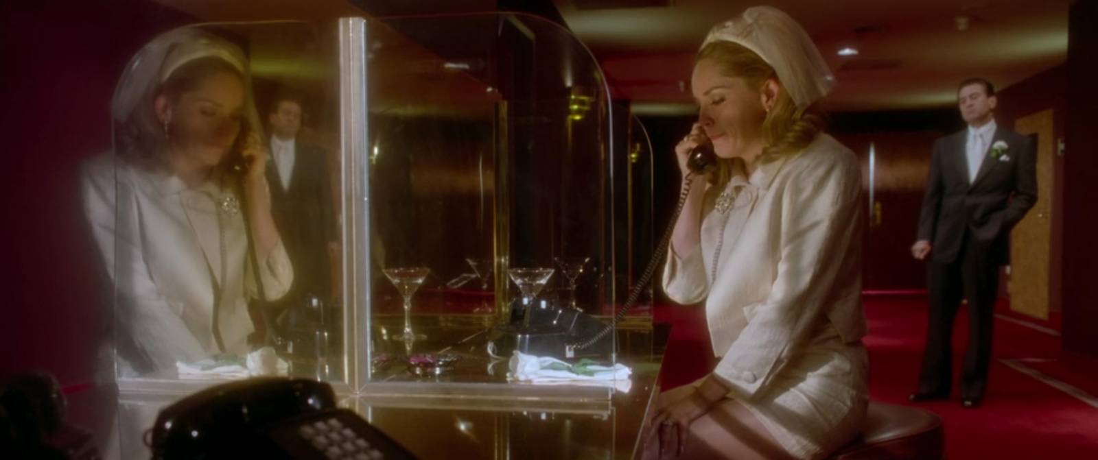
The lighting and reflections make this shot particularly interesting to me. The figure in the background, also seen in the reflection, adds additional tension.

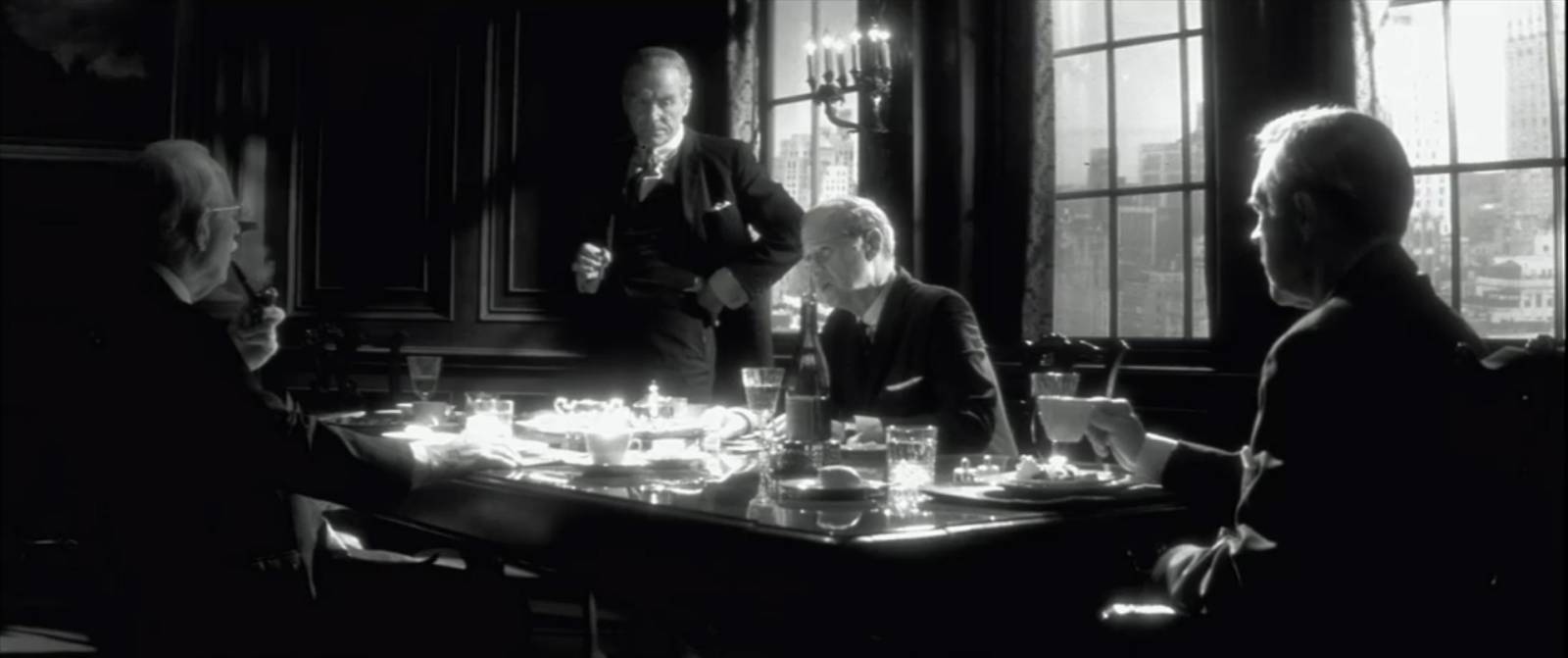
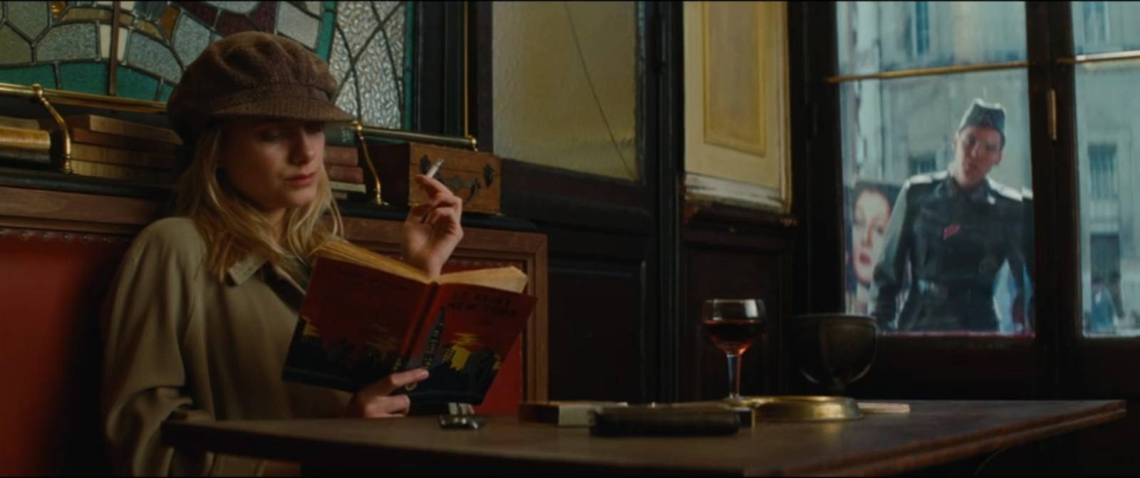
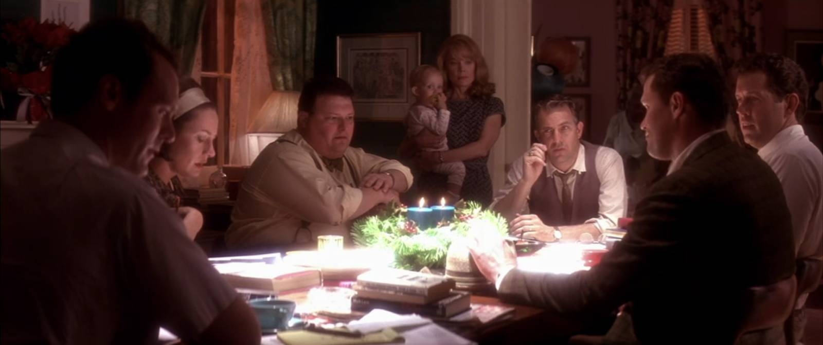
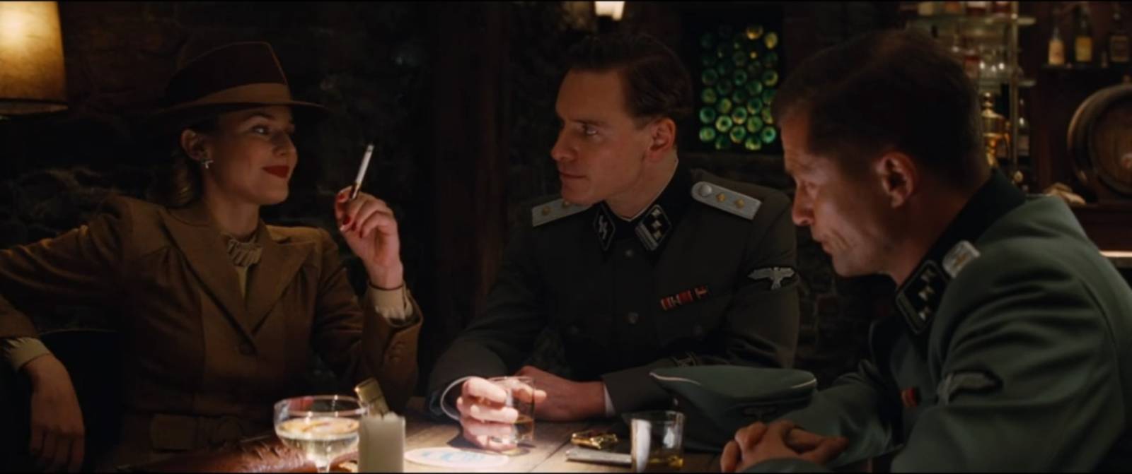
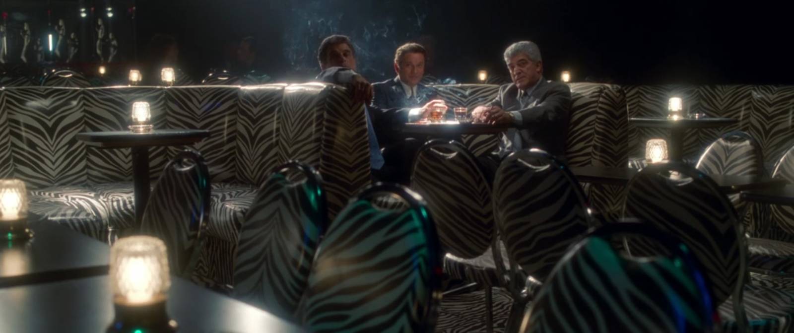
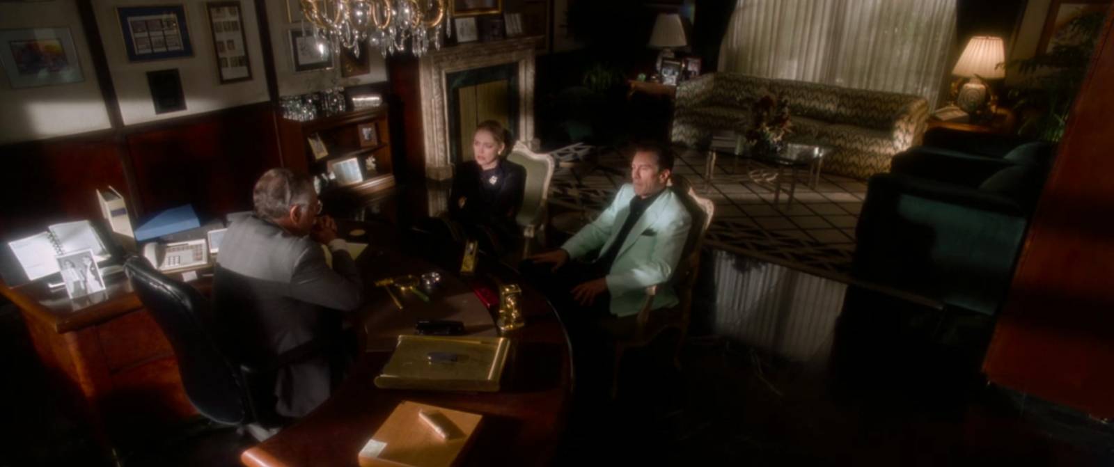
While this lighting is almost nonsensical in a real-world scenario, it creates fantastic mood and gives a very strong sense of isolation and privacy, while also making a very clear focal point of what would otherwise be a somewhat busy environment. The two key figures are lit from the right side, while an overhead spot illuminates the table. Every other table is completely unlit, except for what light comes from a small distant window. The light from the window seems to be sunlight, but the fact that there are three beams pointing in different direction indicates that it is artificially achieved by multiple lights. These window lit areas help fill out the frame, including a few other figures sitting off in the distance.
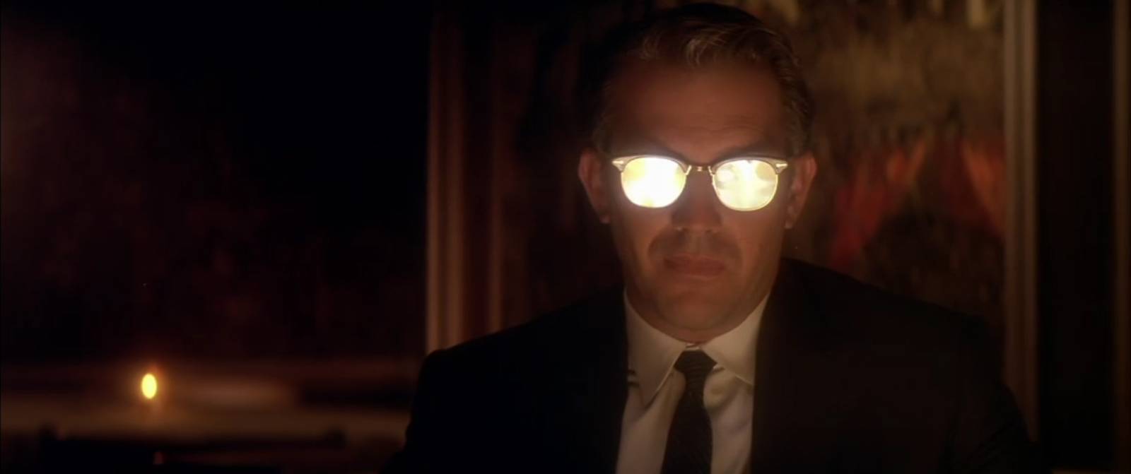
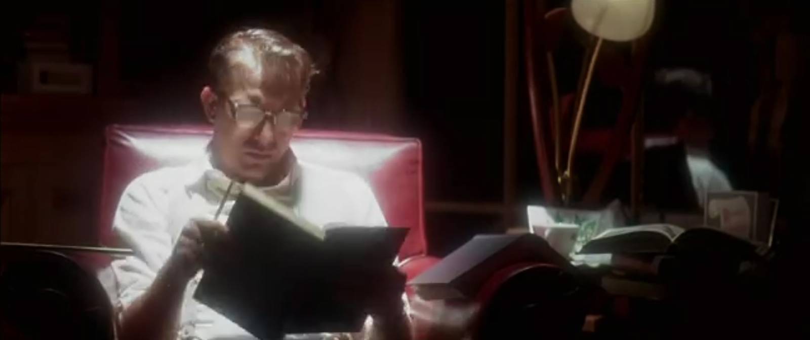
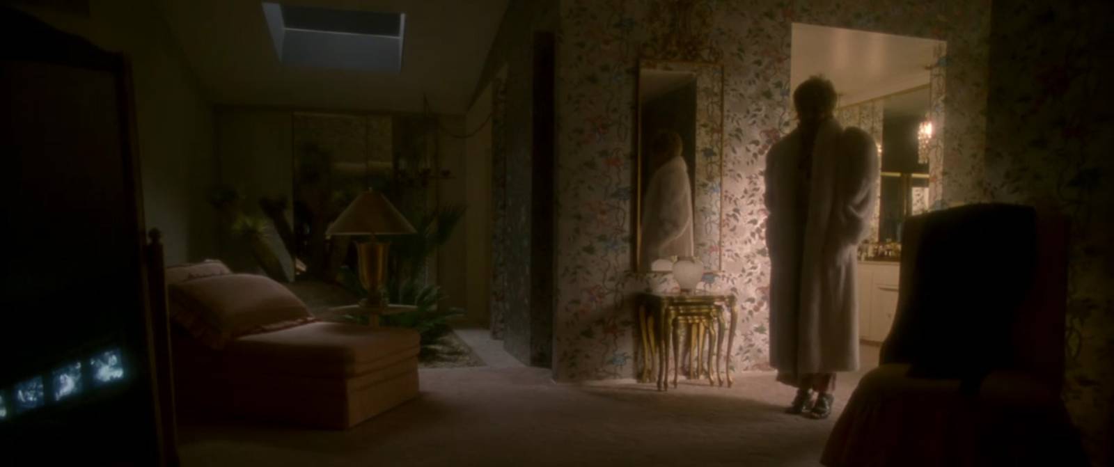
We see the face lit by a low bounced light, giving a soft and creepy quality which is enhanced by the brilliant reflection of the bounce light in his glasses that obliterates his eyes

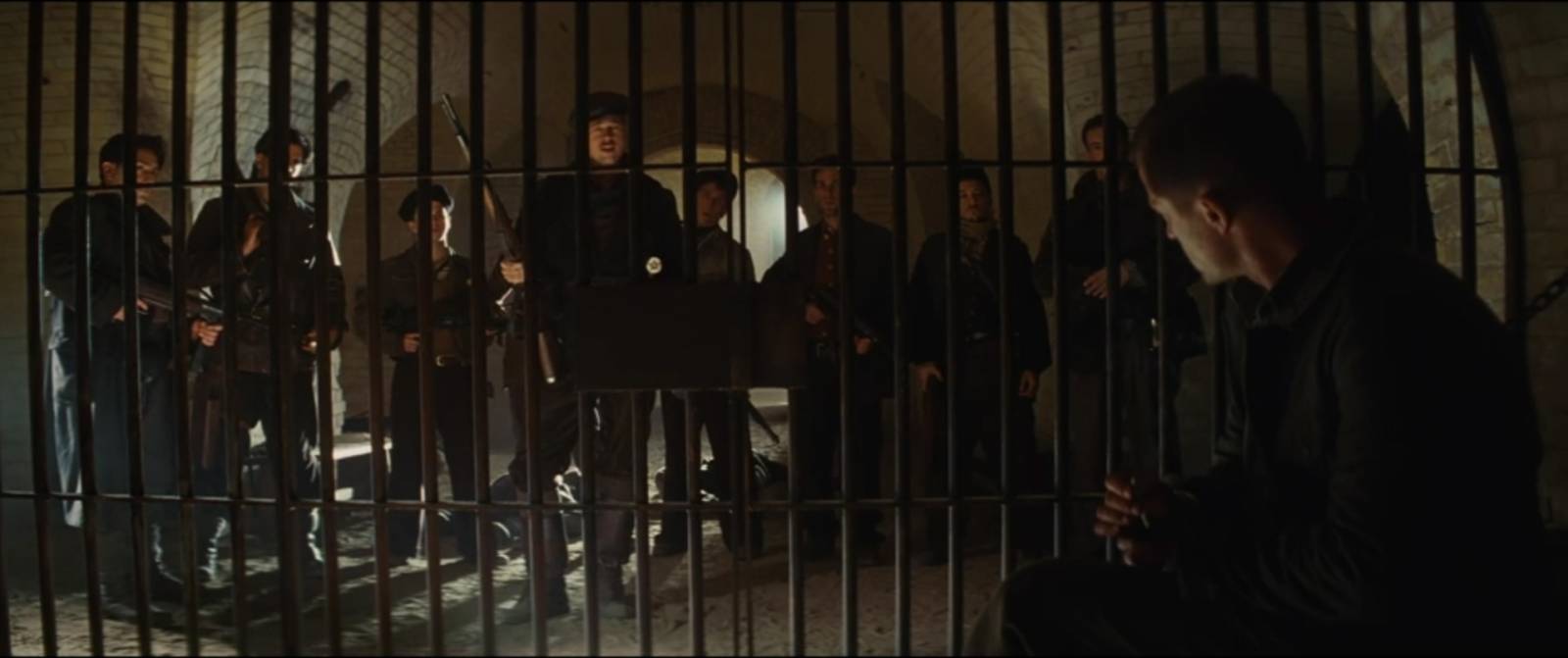
The layers of this composition are very powerful, with the over-exposed foreground figure facing seated men lit by bounced light. Behind them are standing men in dark silhouette against a blown-out background. The exposure of this scene is tuned to the seated men, which pushes all other details either too dark or too bright to see clearly. The arrangement so that the foreground figure faces away from us lets us see from his perspective this intimidating crowd of men and bars.

This composition is very unconventional but adds a great deal to the mood. The entire left half of the frame is essentially empty, forcing our attention right. The converging lines of the hall create a box-like effect which, when paired with the actor’s pose and harsh lighting, produce an uncomfortable claustrophobic result.
Something Richardson seems particularly skilled at is arranging scenes that are packed with actors while still maintaining a strong focal point. It seems this is often done through lighting. Busy areas are lit to group them into simpler shapes. The table lit by over-powered light from above bounces onto nearby figures. The foreground figures are dark against the bright mid-ground. The more peripheral figures are, on average, midtones on a midtone background which is strategically lit to enhance the depth of the scene. Our key figure is just a bit brighter than the others while the background behind him is just a bit darker than the rest.
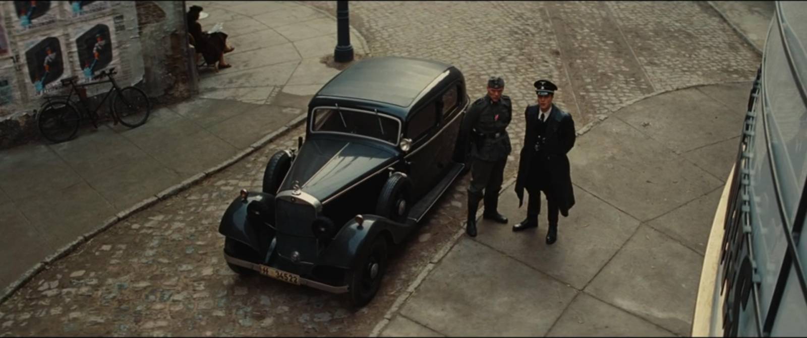
This is a very balanced image that still feels dynamic. The upward angle with normal field of view from the unseen character’s POV places us into the scene. The dark and midtone figures against the bright and midtone background create a strong and interesting silhouette. The environment is lit by bright sun, but the lighting on the actors is softened and this helps manage the value ranges and maintain that simple separation.
Stray observations:
-The soft focus/halation on blown-out highlights is interesting as an across-the-board technique. All three of these movies are 20th century period pieces and I’m not sure if this is something Richardson uses in contemporary settings. That said, it makes me think of illustrators like Bernie Fuchs and David Grove who’s mix of color washes over precise shapes and linework can have a similar effect.
-The hard-light-bouncing-off-of-a-table lighting scheme is the one Richardson technique that I was particularly conscious of going in, but it still showed up more than I expected. It’s a good reminder to not limit light sources to lamps and windows. Also, the way that he calibrates exposure to bring those bounces to a midtone, meanwhile blowing out the highlights, gives a very specific and interesting texture to an image.
-Areas of interest vs areas of rest is what makes an image sing. Contrast not just in tone, but also color, detail, and scale/shape are all part of this.
-The strongest visuals for me are often the most minimalist here.
-In pulling images from these movies (these are paired down from about 100 total images), I sampled very very few long lens closeups, though there were many of them throughout these films. It seems shots like that are essential for cinema, but far less interesting to me in stills. I found myself much more interested in the master shots or wide angle singles that showed more environmental context.
I intend to go indepth on more movies and cinematographers in the future and already have several in mind that I aim to take a closer look at. Shout out in the comments if you have any favorites!
Also, some more favorites presented without comment:


Master class. Beautiful stuff. Makes me want to raise my game. Thank you.
Great post, David – looking forward to more like this. Learning a lot seeing these through your ‘lens’, so to speak 🙂
Absolutely love this topic and can’t wait to hear your thoughts on other films! Roger Deakins and Robert Elswit come to mind as favs of interest. I watched a breakdown a while ago of the cuts/shots in There Will be Blood (https://www.youtube.com/watch?v=7KlopLcNC1Y) and gained a new appreciation for how that contributes to the mood and pacing of a film.
I share your passion for both photography and movies! Robert Richardson’s work is truly inspiring. His collaboration with directors like Stone, Scorcese, and Tarantino showcases his versatility. Excited to explore how Winspirit DE can elevate my own creative projects!
This article is a fascinating and insightful deep dive into the visual artistry of Robert Richardson. I really appreciated the author’s thoughtful analysis of how light, composition, and contrast create emotion and narrative. The detailed breakdown of individual frames is incredibly helpful for anyone interested in painting, photography, or cinematography. It’s inspiring to see how much one can learn by studying cinematic visuals!
Thank you for this article! It is really interesting to read. I believe that lightning and composition are extremely important. Also, as a viewer, it is so pleasant to watch such masterpieces.