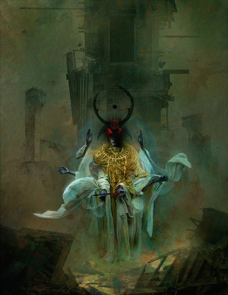
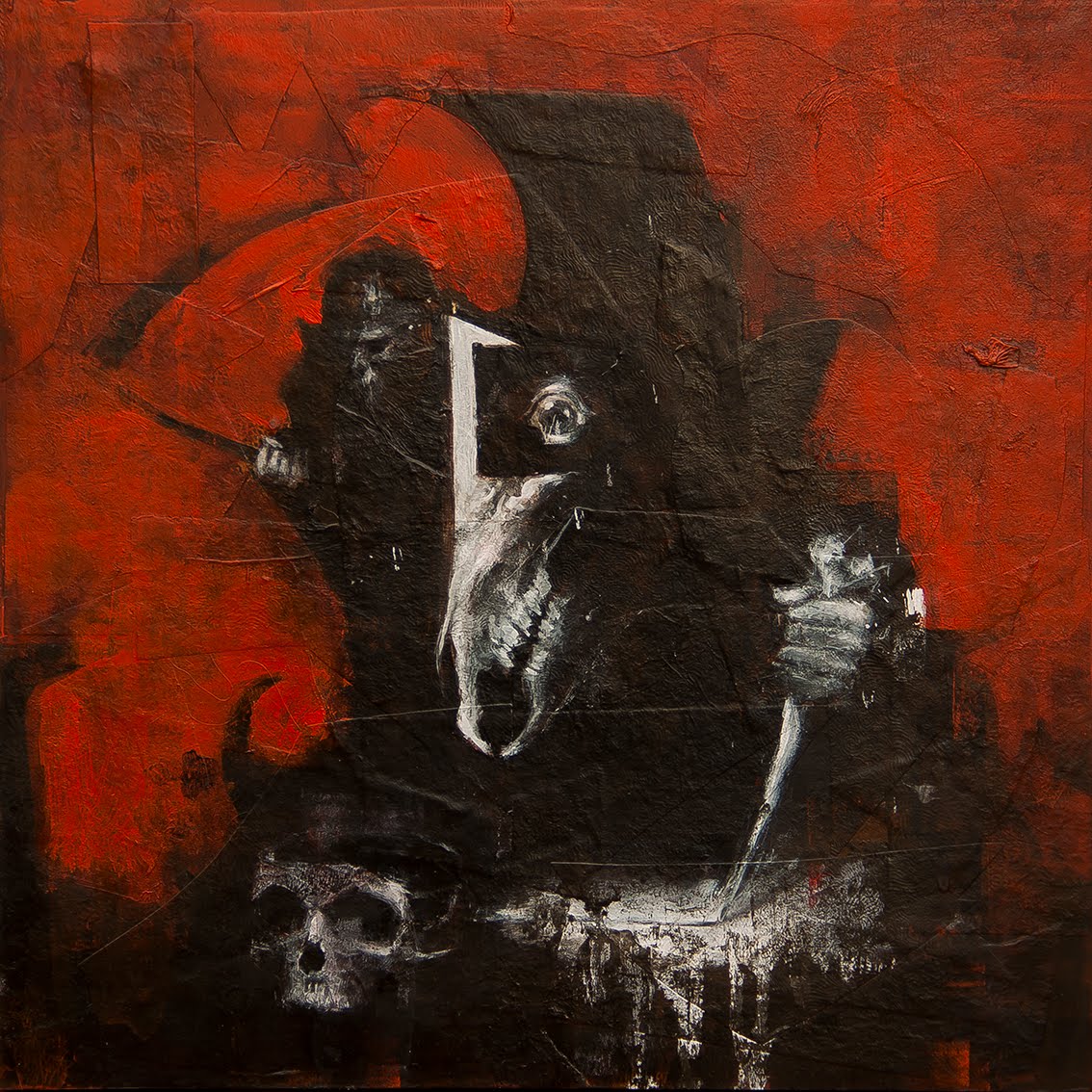
If you’re like me, then I’m certain that image above pulled you into reading this article. That’s a piece by my friend, Sam Araya, and interestingly it’s the first painting of Sam’s I ever saw. I was immediately enthralled.
Sam is mastering the horror theme in his portfolio. I say it that way because Sam is still working and refining his images and every time I look at them he’s been able to get me to see more into them, as if he’s only taking me just far enough to get me to want more of them. He’s playing me because the images leave me with seeing potential. The kind of feeling that’s very subtle but critically important to breathe into your viewer. As if there’s more beneath the image. As if he’s holding back just enough to get the viewer hooked and beg for more. That is an amazing task and he’s pulling it off constantly.
The points below will help you gauge your own horror portfolio. The best portfolios based on the horror theme have copious amounts of class. The tacky ones look like pulp. Obvious and degrading.
I originally had a number of other artists’ work included here, but Araya’s work hit all the marks. I don’t paint horror subjects, but when I look at his work, I feel the desire rising to paint some. I might actually like horror subjects, it might actually be fun. It’s infectious and compelling…because it’s so good.
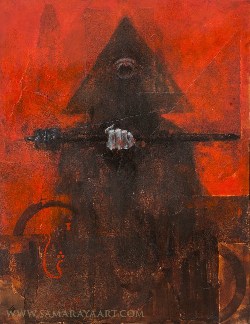
But before you think you can do the same thing, at the same level, remember this: it doesn’t come easily. Sam’s put a lot of effort into mastering his horror portfolio. And now he’s putting those skills into a fantasy portfolio.
Now that’s truly scary.
1. Keep a human element.
Horror needs to be accessible. When it’s too alien we tend to ignore it. The idea is not to have people look away because it’s so awful to look at. You want them to be fascinated. A human element adds a connection to our sensibilities and draws us in. Monsters are not enough by themselves to get this mission accomplished.
2. Gore is less.
When blood drips over everything, a wall, a floor, a sword, a face, we are desensitized by it. The moment of evisceration is most times anticlimactic. Goo and general gore becomes sophomoric and dulls the senses. Similar to being at war. Eventually, soldiers are desensitized to violence.
3. In your face is out of place.
Look out! Comin’ atcha! A poor 3D effect with things in your face is most times uninteresting. Like cheesy haunted house exhibits at Halloween, immature artists think this effect works. It has the opposite effect. It pushes art directors away.
4. Dark gets old.
An entire portfolio of dark images becomes boring to the eye. Soon the viewer expects the same thing and you give it to them, over and over again. Variation is necessary. Change up the point of view, the environment, the concept, the lighting, while staying consistently creepy.
5. Go for the creep.
Tap into universal fears. Study what makes people uncomfortable. Most of us are creeped out by similar things, so find out what they are. But because you find something scary doesn’t mean the same thing affects everyone else. Don’t assume it’s them; that they don’t ‘get it.’ It’s your responsibility to use class and depth to truly frighten. If they’re not feeling it, perhaps you’re not all that convincing.
6. Use light to accent dark.
Study and use different forms of lighting conditions to accent scary situations and characters. Yet, not everything lit from below is horrifying, and candlelight or firelight isn’t always scary. Most times it comforts. Use light, don’t just light all parts of the painting equally. Use it to enhance arresting textures, for example. Make sure things that are wet are not over highlighted. (Didn’t you see Alien?) Pick and choose where to push your audience by utilizing lighting effects.
7. Control shapes.
Shape can be maleficent. Bold is better, simple is best. Complex shapes can be used within general shapes, texture can enhance a simple shape, for example. Pay attention to silhouette and use it to create interest in the overall theme of the piece. This pulls us in.

8. Too crazy is too boring.
Insanity dulls the senses. Like gore, over-the-top, in-your-face things don’t really repel the viewer, it causes the opposite reaction: they don’t care. Anyone can be nuts, but being nuts isn’t enough to express insanity.
9. Make it specific.
To get creepy across in your work, find small ways to add uncomfortable situations to your human subjects. They can be in an awful environment, they can be amongst weird characters, they can be encountering an awkward situation, or using facial expressions that convey fear without expressing overly emotional reactions. Decide the main thought to project and keep to that.

10. Control where they look.
Again, simple is better. Control where you want the viewer to look first, hold them there, then they’ll look around. It can be under strict lighting conditions or as simple as the contrast between soft focus and sharp focus, dark against light, bright color against dull. Get them to look at the most important human subject first; the rest adds to the creep.
11. Leave the humor behind.
Horror is not funny. If you have a portfolio that is mostly scary and creepy situations, and then throw in an oddball piece because you find it funny, even mildly humorous –like a celebrity zombie—the contrast is too great and you steal the effect of the other paintings set against it. Stay with the theme. If you want to be scary, stay with it, and don’t confuse. Humorous horror can be fun though, so keep those images in a separate portfolio. Keep it all consistent.

Great write up! Sam's work is a horrifying delight, and it's wonderful to see it uses so illustratively. You could have done the same with film stills or a potpourri of artist's work, but it's really cool to see so much attention paid to a really excellent portfolio.
Very interesting post! Good horror relies on tapping into our primal emotions so much that it is relevant to almost all other art. Not in what it shows, but how it does it. There is beauty in Sam's work, strong graphic elements … he really knows what he is doing. Great read, thank you!
Fantastic info, Greg! Got lots of work to do but totally (finally :-)) agree about that human element. Even with weird creature design, I'm finding more people responding to a more humanoid type.
great post
Really interesting!
Thanks!