
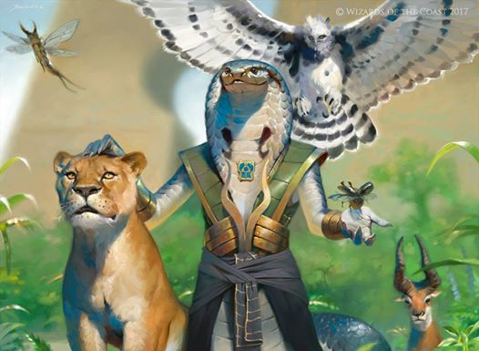
I met Victor Adame Minguez half a year ago at a GP in Rotterdam. I had admired his work for awhile but seeing it all spread out on the table in form of huge posters and playmats I really fell in love with his style. I love his sense of colors and vibrancy to light and atmosphere. His shadows are always filled with colors and the light he paints seems to bounch all over the place. But it wasn´t until this last set of Magic the Gathering: Amonketh that I had my jaw drop. When the mummy procession painting was revealed, I said to myslef; “How the hell did he get the light so believable and cool? I gotta know! but I cannot just ask him. I will sound like a stalker or a fanboy or a fellow artist trying to rip his style and Technic…” Then it dawned on me. I would ask him to write an article for muddycolors about that specific painting and it will not sound weird. Well here it is. in his own words…
-Jesper

Hello everyone! My name is Victor Adame Mínguez and I work as a freelance artist for Magic, the Gathering. Today we’re going over the process of creating one of my favourite pieces of magic art I’ve done; Anointed Procession, for the egiptian-inspired mtg set Amonkhet. Before we dive in I would like to thank Jesper Ejsing and our host Muddy Colors for the opportunity.
A little disclaimer, this was a “simple” piece for me to make, all the elements fell into place smoothly during the initial stages, I was confident with the direction I was going to take and the art description was quite fitting for my style, and goes a little like this:
A procession of servant-mummies are carrying corpses of defeated warriors from inside the monument. The bodies hang limp — they are clearly dead. It looks almost like a funeral procession, except that the dead are being carried so callously, like taking out the trash (not to mention the fact that they’re being carried by undead mummies!). Somewhere in the frame, the Planeswalker GIDEON witnesses this procession of the dead. He is just now learning about this world’s callous treatment of its dead, so maybe he looks deeply concerned, brow furrowed in dismay.
Focus: The procession of dead bodies
Mood: Living warriors went into the monument… dead warriors come out.
Pretty cool right? So one thing I was practicing the most during that time was the making of both thumbnails and maquettes, thumbnails are essential to figure out the composition on a piece and work especially well here since the final outcome is a 4 x 5 cm image. Unfortunately I did not keep an image of the thumbnail but it’s pretty close to what the underpainting looks like:
 |
| Underpainting |
For this one I knew I wanted to use a muted palette and limit it as much as I could, for those who follow my work know I like to go all out on color so this was a welcome change of pace, it would also contrast well with the previous world of Kaladesh. The bright but scattered light, fog, and neutral tones are very reminiscent of the early morning, which was the feel I wanted to convey here, to make a funeral procession an everyday thing, something calm and quiet, mundane for the people in his plane but alien to the eyes of the spectator, and speaking of which, the figure that stands out is that of Gideon, we did not only want to place the planeswalker in this foreign, uncomfortable environment, but rather place us the viewer there, in the place of Gideon watching the scene in awe and horror. After throwing in some lines this is the sketch I sent:
 |
| Line art |
It was approved only with one change in Gideon’s armor. I like sketching this way because it gives me a better understanding of limits and shapes, the lines also help me out posing objects while I shoot reference, which brings me to reference; what I use for the most part are maquettes and models, I often pose myself or have friends pose, this one I had a friend serve as Gideon and the mummies were those 5 dollar anatomic dummies you get in art supplies stores, except painted white and dressed with some toilet paper drapery and cloned times 20 with the magic of photography. How well you use reference will dictate the outcome of the piece, it will provide the light, shapes and even proportions to turn the final image into something believable.
I favor real life reference over 3D, first because I don’t know how to do 3D, second, it allows me to take time away from the screen for which my eyes are thankful, and third, it gives me a better understanding of three-dimensional objects, to go around them, hold in your hand and see how they react to different sources of light will help you have a better feel for those things.
Lastly the final image, this was done digitally like most of my work.
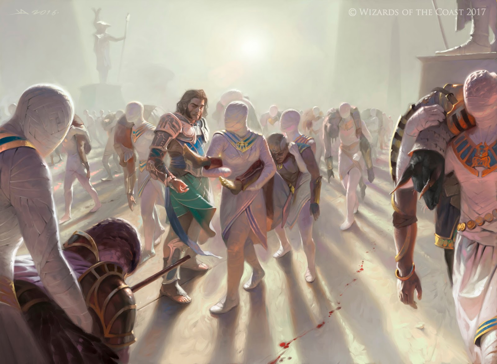 |
| “Anointed Procession” for Magic: The Gathering, ©Wizards of the Coast 2017, Art Director: Cynthia Sheppard. |
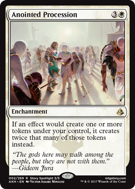
And the card itself. I’m quite happy with the outcome and response from the player base, the colors play well with the white borders of the card, it is readable at that size which is imperative to the success of any MtG painting and to the card itself, the player is able to recognize the card and what it does with just a simple glimpse of the art which speeds up the game. (note that I also play mtg and I shamessly admit that this card being so, so good makes me quite happy as well).
Thanks!
– Víctor


nice post