By Lauren Panepinto
I look at a lot of portfolios, and in almost every review, the artist asks me whether their work is suitable for book covers. Sometimes a gorgeous portfolio just doesn’t have the “book cover feel” I need to commission them. There’s a lot of reasons why a good illustration may not be a good book cover. Remember most of all, a book cover is advertising first, art second. As painful as that simple fact may be to us on the artist side of the spectrum, that fact is undeniable: An “ugly” book cover that is a bestseller is more successful than a “beautiful” one that sells half as many copies. Now of course, those are subjective values, and I’m exaggerating. As an Art Director, one of the main responsibilities I have is to balance the Artist’s priority (make a gorgeous portfolio piece) with the Author/Editor’s priority (sell books), and that can lead to choices that make business sense but not aesthetic sense (ex: making the type bigger and as a result covering more of the art).
Remember, there are creatives on both sides of this equation. Artists on one, and Authors on the other. And I want to do my best job for both. After all, more books sold means more paying work for both the author and the artist. (And, bonus, it keeps your Art Director employed.)
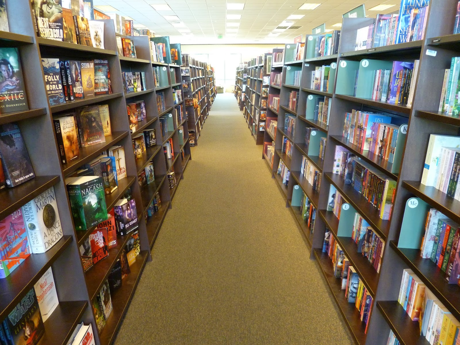 |
| In most bookstores, you’re lucky if you get a cover-out spot, instead of just a spine-out. |
Anyway back to the point. A cover sells the book in a way that concept art, interior illustrations, and gaming art really doesn’t have to. A good book cover needs to be eye-catching more than it needs to be beautiful, because book covers exist in a highly competitive and overwhelming visual market. A viewer of a table or bookshelf at a bookstore only has half a second tops to scan past a cover, and it’s even less on websites.
So what do I look for? (given that skill level is suitable)
—Simple compositions, usually with the Important Thing in the center
—Visual Hierarchy, with a strong focal point
—Control of the viewer’s eye path thru secondary focal points
—Strong silhouettes and graphic use of negative space (because that reads really well small)
Extra Credit: Depicting common genre checkpoints in a fresh way
 |
| Covers need to be visually interesting in thumbnail size too. You don’t necessarily need to be able to see exactly what’s going on, but your eye is drawn to strong colors, shapes, and silhouettes at this scale. |
I think I can probably do a post on each one. I probably should. I already did one on Visual Hierarchy. So let’s pick off an easy one, something that I see mishandled in a lot of student and young professional’s portfolios: Simple, centered compositions.
Now I’m not talking about compositions that are off-center for a definite compositional reason. Again, if you’ve nailed the visual hierarchy and eye flow path, then you don’t need to center the composition. I’m talking about the off-center for no reason compositions. The ones where, if I ask why the character wasn’t centered, I get a shrug at best. At worst, I’ve heard fresh grads state their teachers told them never to center a character or composition because it was too simple. So I end up seeing a lot of illustrations that just look…mis-cropped. They’re not off-center enough to look deliberate. They’re just…slightly enough off-center to look like a mistake.
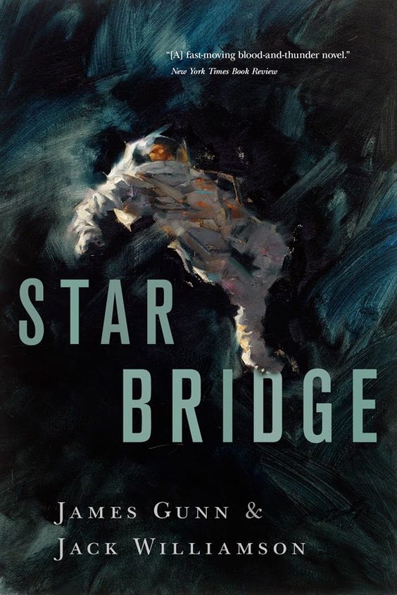
Look I don’t want to shame anyone’s wishy-washy compositions here, so instead I’m going to show you a whole bunch of covers below that are solidly centered. And I’m going to challenge you, next time you’re in a book store, or browsing online, go find an illustrated book cover where the composition isn’t centered. Not too easy, is it? And the ones that are off-center, I bet the type takes over the role of center focal point. That’s most of the big epic fantasy landscape covers right there.
So the moral of the story is, if you don’t have a deliberate reason to have an off-center composition, then just own it. Center that character! Center that planet! Center that giant space slug! (or whatever). Trust me, as I am the one hiring book cover artists all the time. It’s not “too easy”. It’s not “cheating”. It’s not “playing it safe”. When in doubt, just center it.
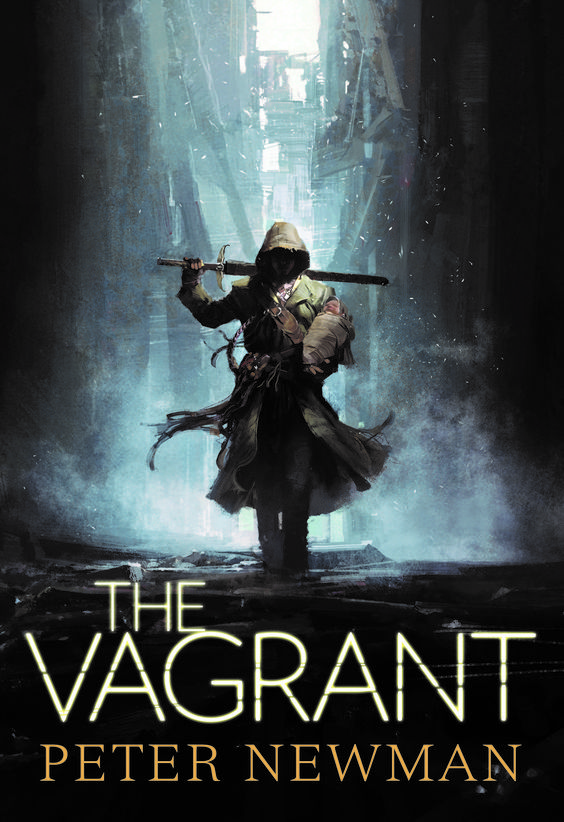 |
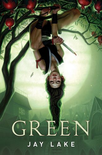
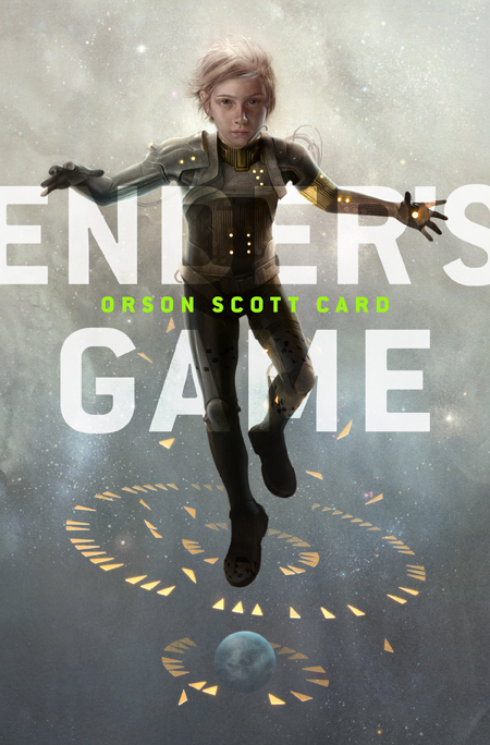
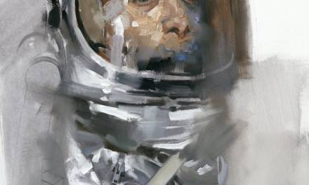
| Jaime Jones |
 |
| Greg Manchess |
 |
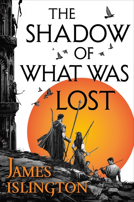
| Dan Dos Santos |
 |
| Sam Weber |
 |
| Victor Mosquera |
 |
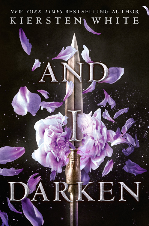
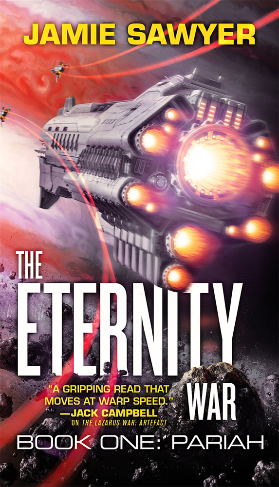
| Richard Anderson |
 |
| Sam Weber |
 |
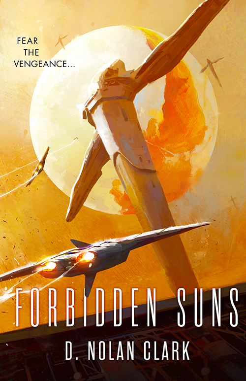
| Dominick Saponaro |
 |
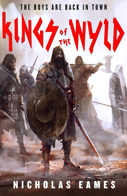
| Ben Zweifel |


Dear Lauren, Thank you so much for taking the time to write this. It helps a LOT when one is second guessing “all the things.” Is this a problem you see more regularly with female cover artists? (I am asking this because all of these samples are by men, I think.) Also, what color trends do you predict may be heading our way that would strengthen a portfolio presentation for cover work? Thank you!
Lauren, your comments are so helpful. Trying to 'get' what makes a piece of art book cover worthy has been an elusive mystery, this removes some of the shroud. Thank you!
Dang I didnt realize they were all men. Crystal Sully's Dragon Lotds and Kirbi Fagan's Cormorant Run are perfect for this list too. Color trends come and go but red, blue, black, & white are the perennial go-tos. Look at series. They check off red blue black white then….orange? Yellow? Green? Purple?
My pleasure! Its not so easy to verbalize…it's such a gut instinct really…
(color line-up) Huh! Things you see, but don't necessarily process. Thanks!
This is a huge help! When I was in school years ago, I took a poster design class (another form of advertising, many parallels to book covers I would think) and the graphic designs in the class would sort of giggle at “us illustrators” for putting the focal point right in the middle. And from then on, I really tried to create more interesting, asymmetrical compositions. Yet…. when you look at the examples you showed above they beauty is that while the focus is in the center they are all so diverse and striking. Great post!
Also Lauren, a question similar to Elizabeth's, do you find that certain subject matters do better than others on a cover? For instance, does a figure on a cover sell better (6 of your examples of figures) vs ships/objects (Like the other 3 examples)? Action vs a quiet piece (or is that a trend that goes in an out of style or is solely dependent on the writing style being in fashion or not?
P.S sorry for the abundance of parentheses!
I can't tell you how much I appreciate your posts! Sometimes, things that seem so basic don't really click until that lightbulb is turned on. Thanks again, Lauren!