 |
|
|
I have to admit that I was never a fan of drawing backgrounds. I’ve work hard to learn the rules of perspective and everything involved in the process of creating a believable environment for my characters, but I was always more interested in the figure drawing.
It’s not out of laziness, I swear. I love drawing and painting and I’ve never shied away from hard work (At least when it comes to art; If you need help moving furniture, I may show up late) but It’s hard for me to get eager about drawing a background.
If I feel like the image needs it, that the background tells an important aspect of the story I’m illustrating and helps the narrative, I do it without a blink but, luckily for me, comic book covers, and specially Superheroes comic book covers, are very character driven and, most of the times, a background won’t add much to the cover.
On top of that, there needs to be room for a code bar, title, credits, and sometimes a tagline so, most of the times, it’s better to leave the image as light as you can so it can read well once the trade dress is added.
But what about those times when you do need a background? Well, as anything you do on the page, you better find a way to make it amusing for you. It doesn’t mean skipping work, it means working differently. You’ll still have to put up time and effort to think about a way to portray the story you want, the way you want.
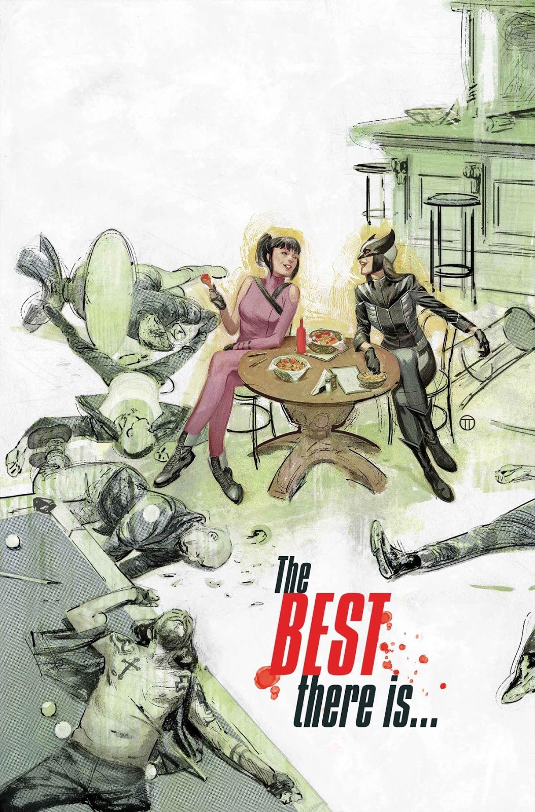 |
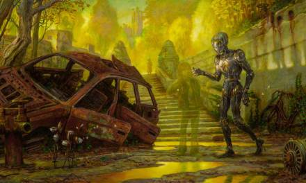
| Cover for “Hawkeye” #12. Marvel Comics 2017. |
One of my ways of making it fun is to, whenever I can, working the background as an element of design. This Spider-Men cover is a good example:
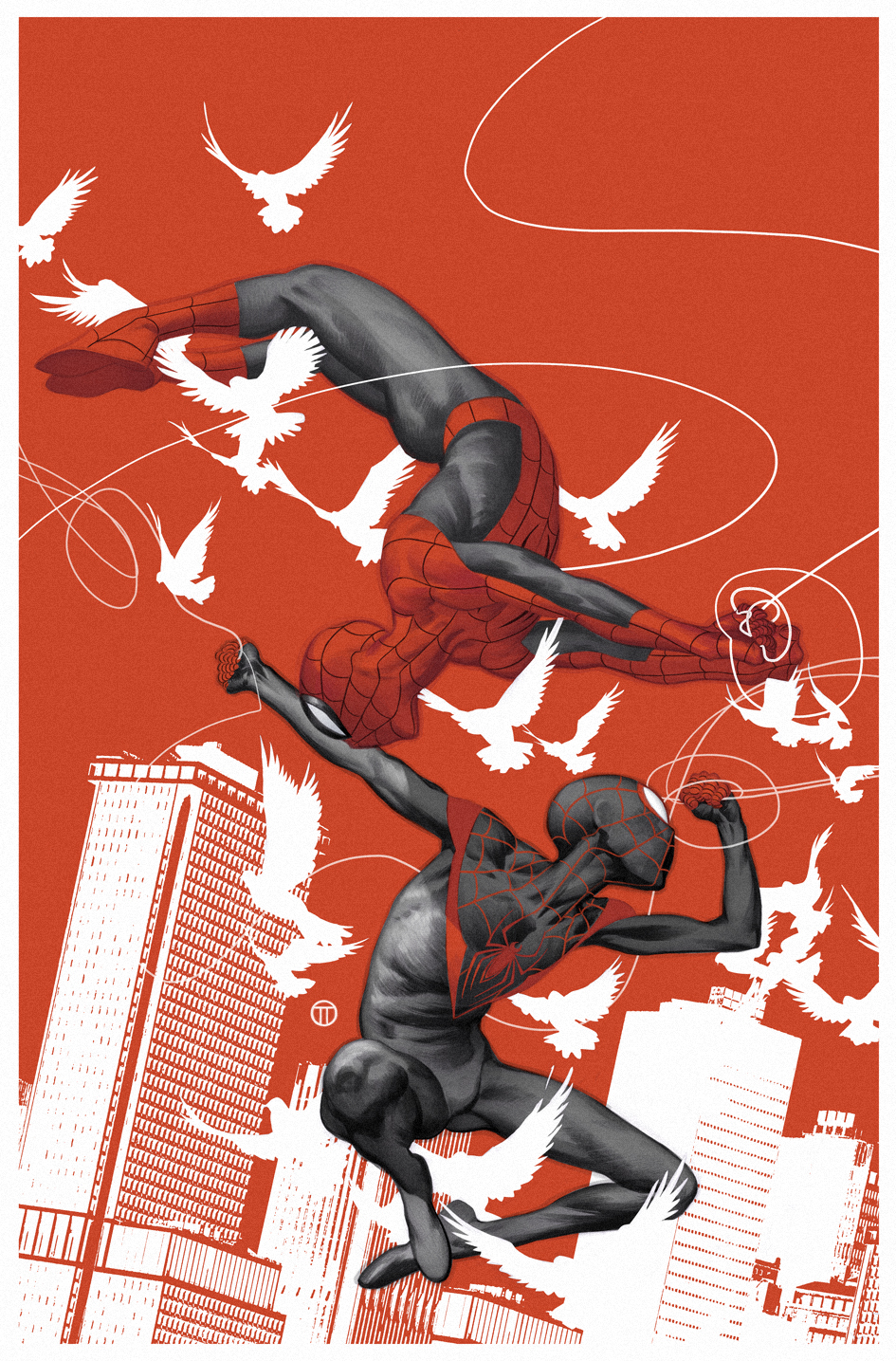 |
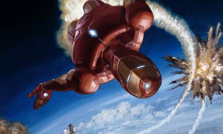
| Cover for “Spider-Men”. Marvel Comics 2017. |
Heavily inspired, you may have noticed, in Coles Phillips‘ work:
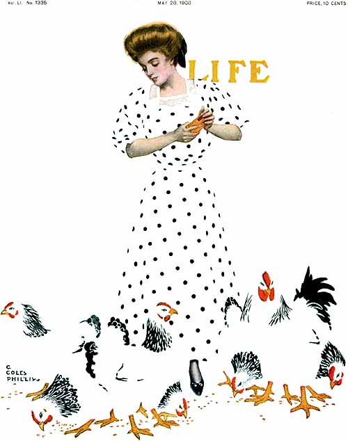
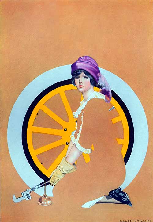
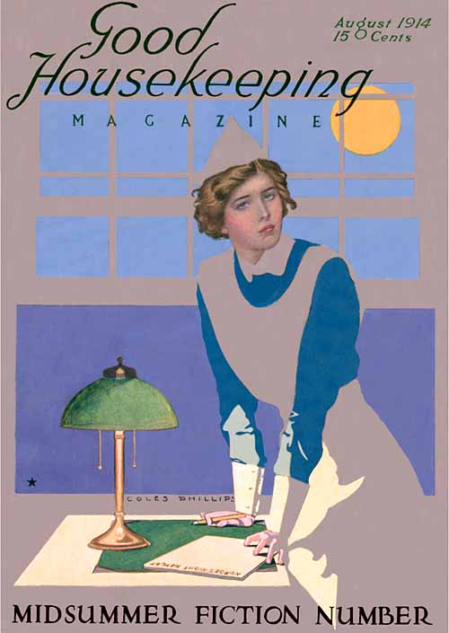
Take a look at how much information he’s giving us, with so very little drawing. He might not have spent time drawing details, but he sure spent a lot of time designing.
The lack of a full background was very common in the covers of the old paperbacks. I assume this was because of, as previously mentioned, the need for space for the trade dress, but I I’m pretty sure that it was also a clever way to meet the deadlines.
 |
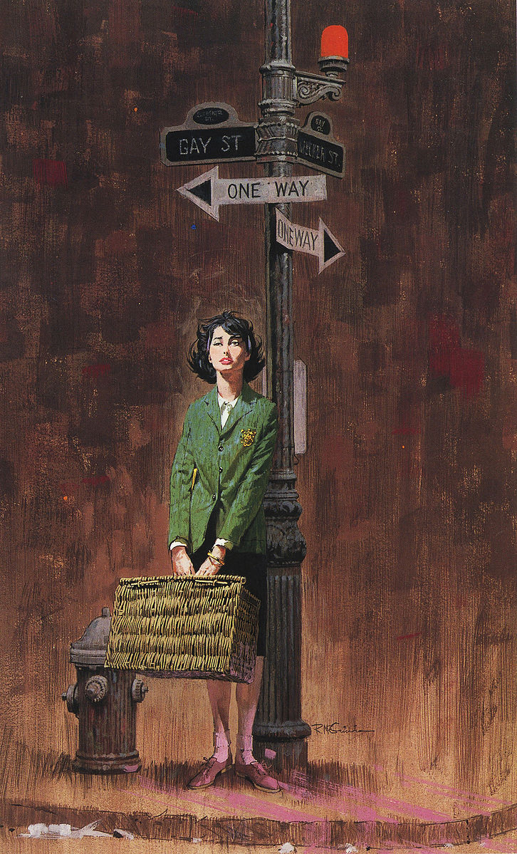
| Robert McGinnis |
This (above) is a beautiful example. It didn’t need more than a silhouette and some circles to convey the idea of a behind the scenes of a TV studio or a movie set.
Mitchell Hooks was a master at this.

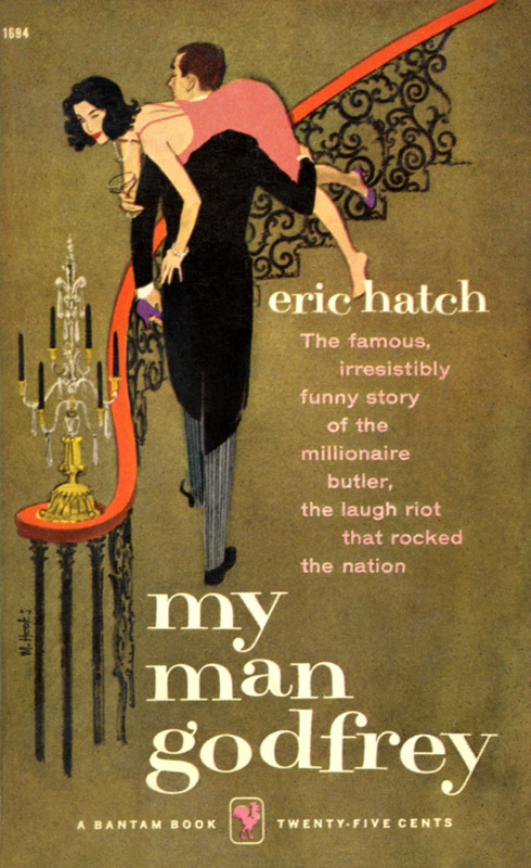
Take a look at the cover of “My Man Godfrey” (Above). While the only background is a stair (A banister, actually; he didn’t even draw any steps) and a chandelier, he made sure to made it in a way where you can immediately tell it’s a mansion. You don’t need more than that. Which reminds me of a saying from the old master Alex Toth that could apply here. You probably heard this one before: “Strip it all down to essentials and draw the hell out of what’s left.”.
 |
| Robert McGinnis |
 |
| Robert McGinnis |
If you enjoy drawing backgrounds, and have the time to do it, then draw the hell out of it and knock it out of the park. But if you don’t enjoy it much, or the deadline is too tight, you can always come up with clever and interesting ways of providing your characters of an environment and give the reader the info they need. As I’ve said before: It’s not about skipping work, it’s about working differently.
I might not be big on drawing backgrounds, but that doesn’t mean that I don’t enjoy seeing other people do it (I’m not a monster!), so let’s end this post with a few samples of wonderful, crowded, beautifully rendered backgrounds.
PS. I’m not lazy!
 |
| Bernie Fuchs |
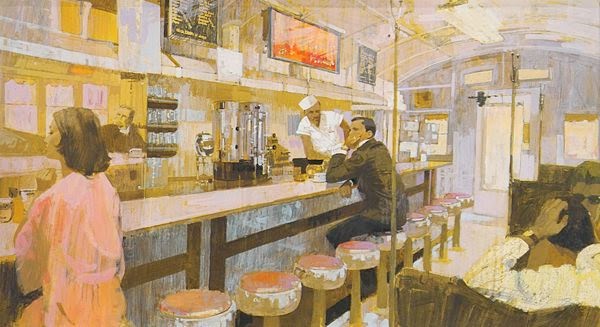 |
| Bernie Fuchs |
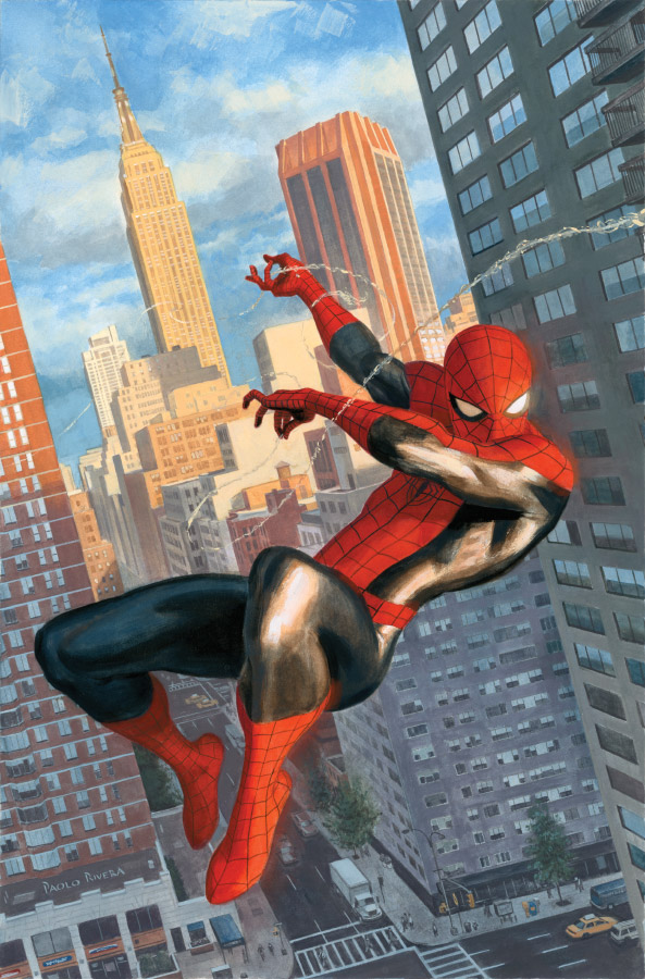 |
| Paolo Rivera |
 |
| Brian Sanders |

That Red Room by Hooks is so spot on for this post. Great collection of master illustrators who only added the elements that were needed for a story. Looking forward to you next post. ( nice Fuchs selection too 😉
fyi that Fuchs Bar scene I think is a sketch for this finish which has a LOT of detail in the background balanced by the negative space https://www.flickr.com/photos/mattdicke/5375858995/in/album-72157625369781729/
Similar angle, totally different piece. Good to see more cool art from him though!
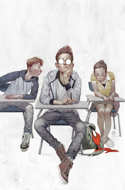
I think the piece is fine without a background. What I don’t like at all are the round glasses. They are distracting, but also immediately remind me of Kevin (Elijah Wood’s character in the movie version) in Sin City.
Thanks, Matt! You can’t never go wrong with Fuchs 😉
I don’t think it’s a sketch. I’m pretty sure they’re two different illustrations with a very similar point of view and subject.
Hello.
Thanks. Really useful!
I was working on a project for a friend and he requested to use this porg background.
Isn’t that funny? 😀