Guest Post By Danny Schwartz
Finding Myself in Some Shapes
For years I’ve looked to this blog for inspiration, and it’s such a pleasure to contribute! I wanted to talk a little bit about my thoughts on composing a fun, dynamic image and how that affects my whole process. When I speak to students, I’ve found that distilling complicated concepts down to their most basic elements can not only be helpful for those students as they learn, but also for me as I grow as an illustrator and picture-maker.
When I was an undergraduate, I learned about the five shadow shapes that can make up a human face. Before then, I had been doing that thing they teach you in basic anatomy courses where you make an egg-shape and through careful placement of axis lines, figure out the general placement of facial features. It was going OK for me, in that I was slowly learning about line quality and ellipses, but I was having this small problem where every head I’d draw would bear a striking resemblance to an egg with some facial features mapped out onto it by an axis. I was just starting to look at illustration and I was interested in more expressive work, so a professor took me aside after class one day and explained to me that it might be more useful to think about things in terms of form and value rather than trying to meticulously measure out three eyes across the center of the face each time. He drew out a head that looked something like this: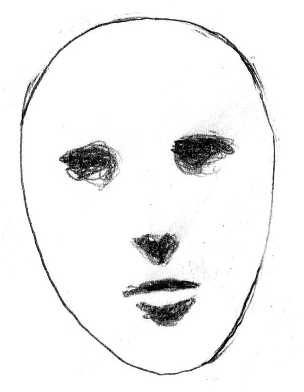 Two shadows for the eyes, one shadow under the nose, one shadow under the top lip, and one under the bottom lip. Done. I was immediately captivated by the idea and started drawing egg-shapes literally everywhere, slapping down five shadow shapes onto all of them. I drew them in all of my sketches for assignments, I drew them in my sketchbooks, and most importantly, I drew them in my notes for other classes. Boredom is one of the best environments for complete wildcard creativity, and I started experimenting with what I could do if I drew those five shadow shapes but ditched the egg. I found that I didn’t even really have to put those shapes anywhere resembling their natural locations for the face to look at least semi-plausible once I built it up a little with some structure. For a while I was pretty hung up on making a long oval and stretching the mid-face area between the eyes and the bottom of the nose, although I eventually learned to loosen up a little bit with trapezoids, hexagons and rectangles.
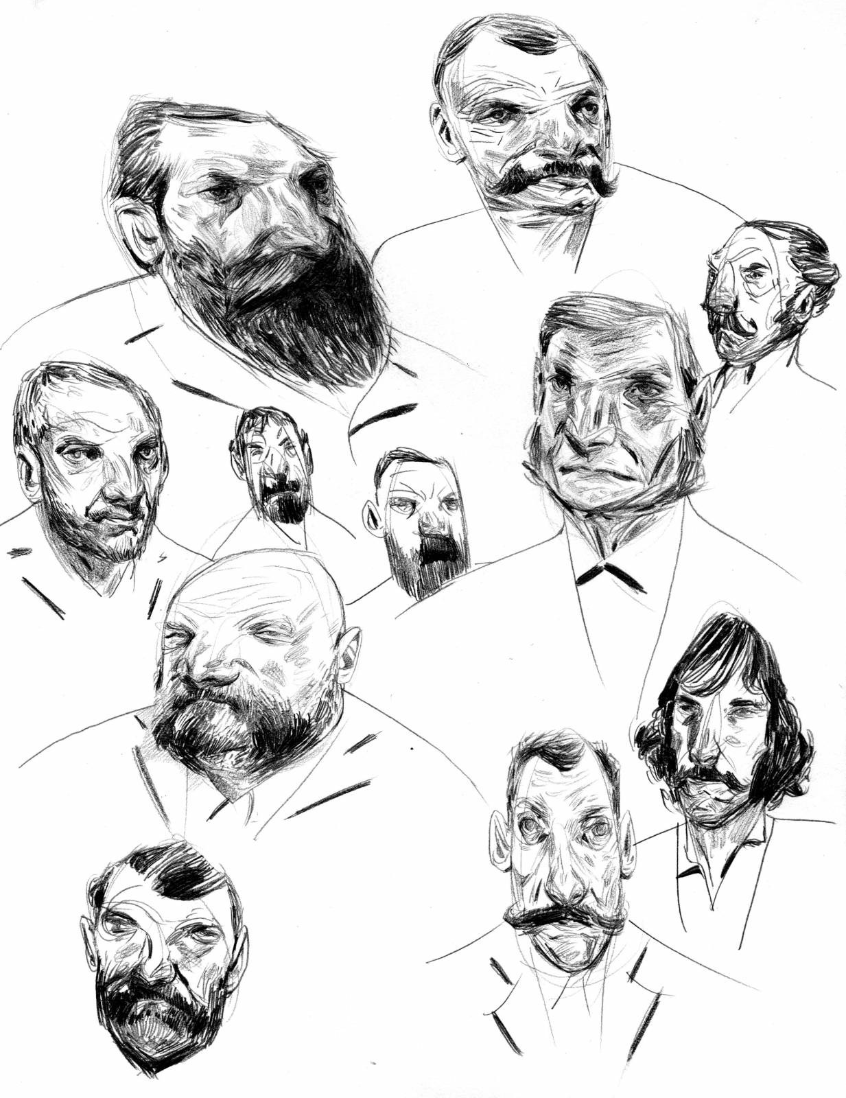
But what I’ve really come to like in the years since then is tiptoeing the line between plausibility and absurdity, trying never to step too far on either side of the divide. I like forms that look slightly off, or even wrong, without looking ridiculous. I’ll usually start with an implausible form, gather as much good reference of a properly lit pose as possible, and then try and merge the two ideas. Before I commit to an image, I’ll often draw up a sheet like this one below, just to see if I can push my character ideas a little bit.
Composition is puzzle solving in space, which is fascinating to me. It reminds me of playing with Legos as a kid – I love the feeling of finding just the right pieces required for a form to work. I like to tell my students that the thrill of the exercise is that when you’re composing, you get to be the master of every inch of the image you’re assembling. And that’s regardless of whether any moment of an image has an active space – like, say, a figure – or a seemingly inactive space, like the sky. The key, then, is to get every moment of the image (even those moments you are not personally as interested in) activated in the pursuit of the narrative while making the whole thing look completely effortless. When you feel you’ve succeeded, it’s a real rush. I struggled with the idea for years before I had a (very minor) epiphany: Why not treat composing an image the same way I was treating my characters? Instead of starting thumbnails by drawing out figures and forms, why not start with broad geometric shapes that have almost nothing to do with reality and arrange them so that they direct the composition as I’d like, and then bring the whole thing back to Earth? Shapes first, and then when it works, form. It’s such a simple idea, but I had needed time to relate.
Approaching an image this way in its earliest stages unlocks a world of possibility and can lessen the pressure considerably during sketching. At the Illustration Master Class in Amherst, Massachusetts a few weeks ago, I enjoyed James Gurney’s lecture on composition and light, and specifically his brief mention of the golden mean and it’s significance. I’ve spent a lot of time experimenting with the idea, and I’ve arrived at a very loose conclusion that’s similar to Gurney’s – that the golden mean can possibly be another useful tool, but the real goal when composing an image is to understand the elements to which a viewer will naturally gravitate, and to then use those elements as finely honed tools to guide the viewer. There is no great rule or cheat for a great composition, because the best compositions need to feel alive. That can happen behind the scenes in a structured way, or organically as you play around with your shapes. So I like to start by just throwing some really rough shapes down in some boxes, and see where that takes me. The hardest part of any project is the sketching in the beginning, and if I loosen up, I can set a great, fun vibe for the whole rest of the piece. It’s about embracing a spirit of play.
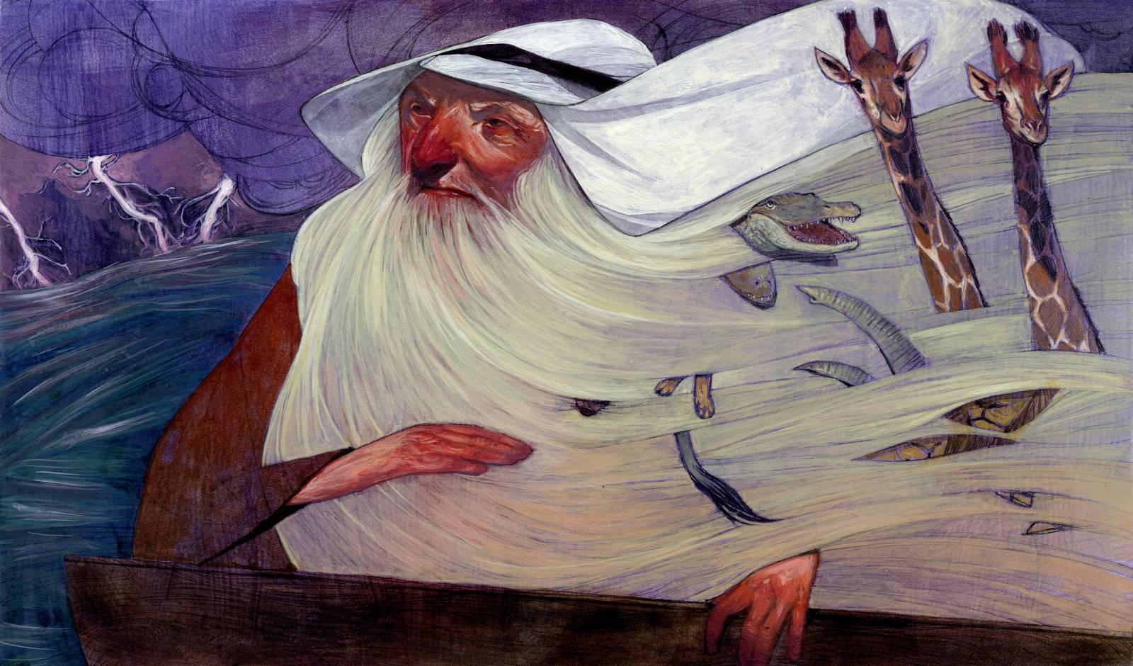
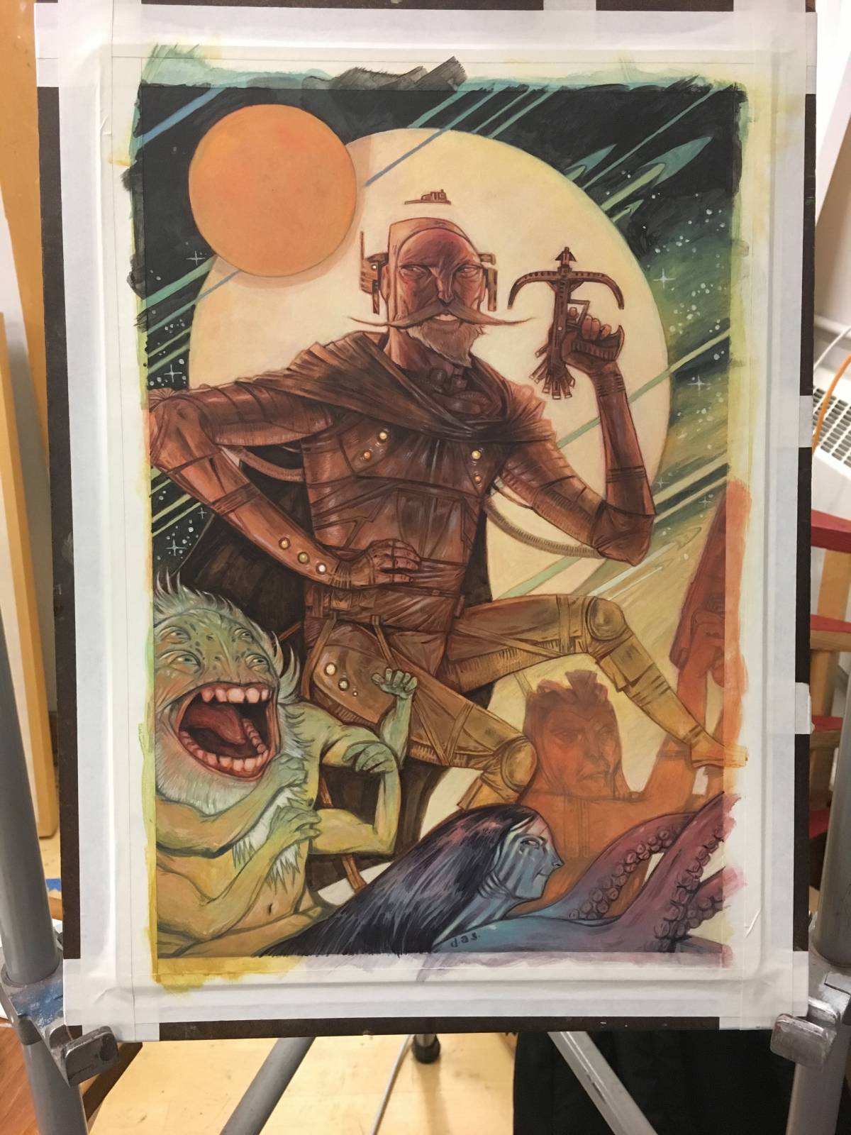
For a light case study, I’ll take you through my process for the painting I completed at the IMC. I came determined to take a painting entirely from start to finish by week’s end. I wanted it to be fun and full of elements I’ve been trying to work on for years – specifically figures in motion and dramatic lighting. I spend a lot of time trying to figure out what my version of any concept looks like so that I fit it into my broader visual language when I make decisions, which can be a little challenging. With all this in mind, I ended up coming to the week with a few pages of sketches that were very tight and a little safe. I’d chosen a Robin Hood prompt, and I had elected to put a Norse spin on the whole thing. I put them up for critique on the first day, and it was suggested that perhaps I might have some fun pushing the envelope a little bit more. I’d never done a proper science fiction-themed piece before, so why not try that? I spent the rest of the session drawing a few ridiculous Robin Hood alien characters, and throwing a few rough compositions together. Here’s the page I ended up with that had all the winning elements I wanted to play with:
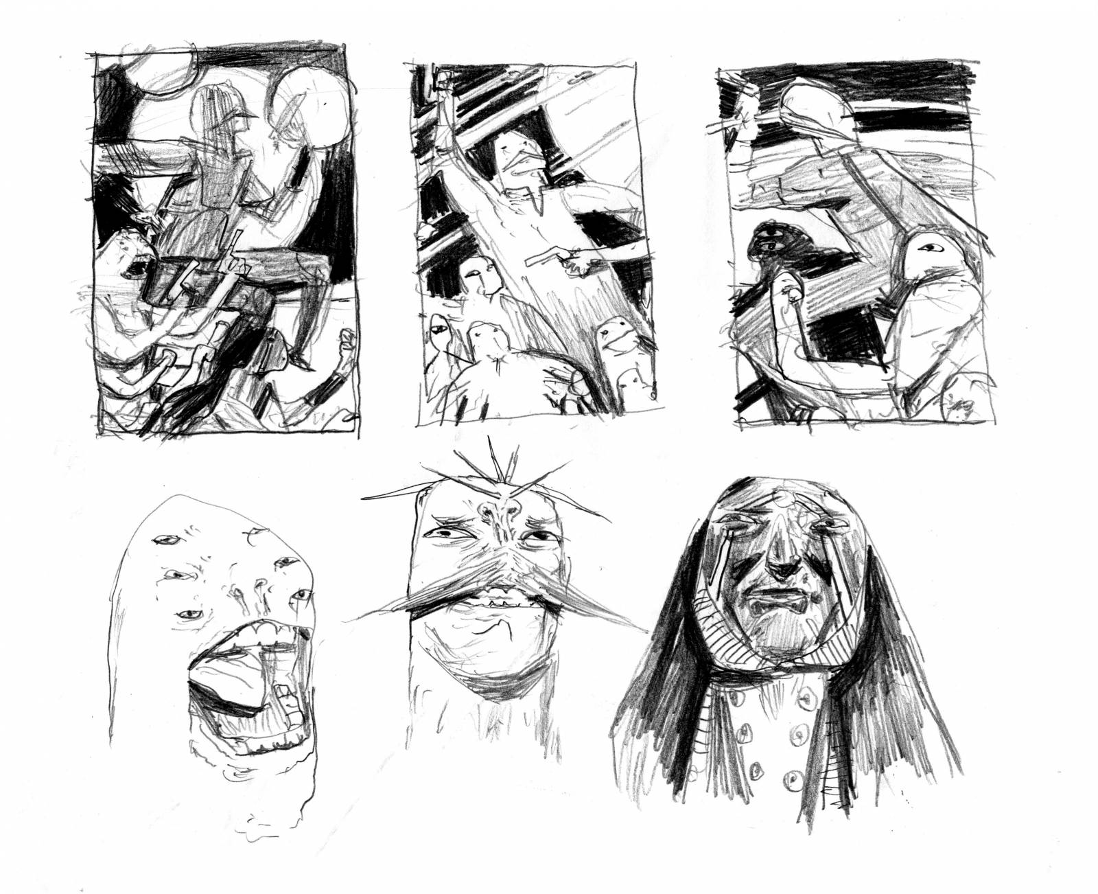 One of the first things I drew was a ridiculous alien with a big mouth and a lot of eyes. I decided I liked him immediately and very much wanted to paint him. He could be Little John. I drew a weird moustache alien who could be Robin Hood, before deciding that I should keep him human for some relatability and make every other figure in the image an alien instead. I consolidated everything I liked into a final sketch later that afternoon:
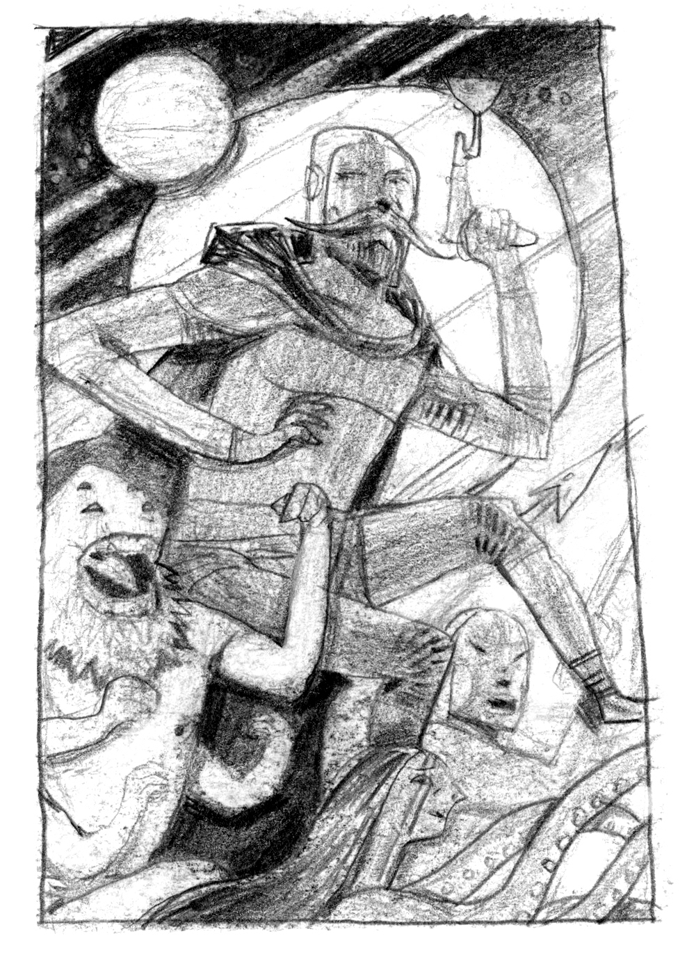 The tentacle-man sketch I had scribbled out earlier became Marian. Fun!
I started the piece in earnest the next day. I’m a little surprised how many pictures documenting the process that I’ve got, given that I wasn’t originally planning on sharing any. I mostly took these for myself, so please forgive them for being a little rough!
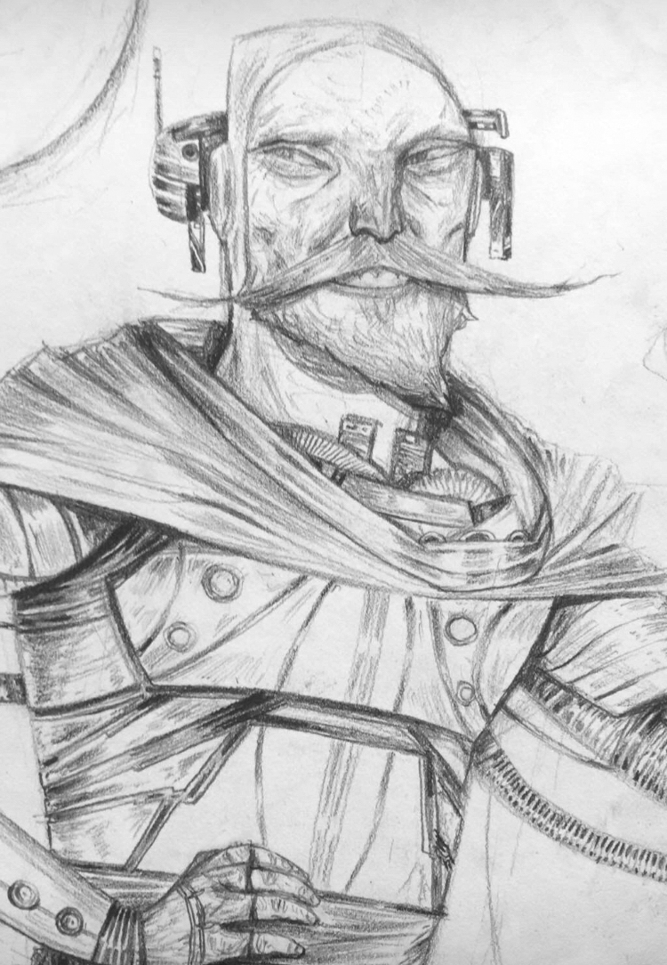
After mapping out the whole piece so that all the shapes match my sketch, I always start by drawing the face of the main figure. It doesn’t matter where in the image that face is located. It doesn’t matter if it makes any strategic sense for the drawing or not. For me, the faces and characters in an image are my window into that image. A successful first face will bring me into the drawing in just the right way. This piece started with space Robin Hood. I’d kept the ridiculous facial hair, because it looked really fun to draw:
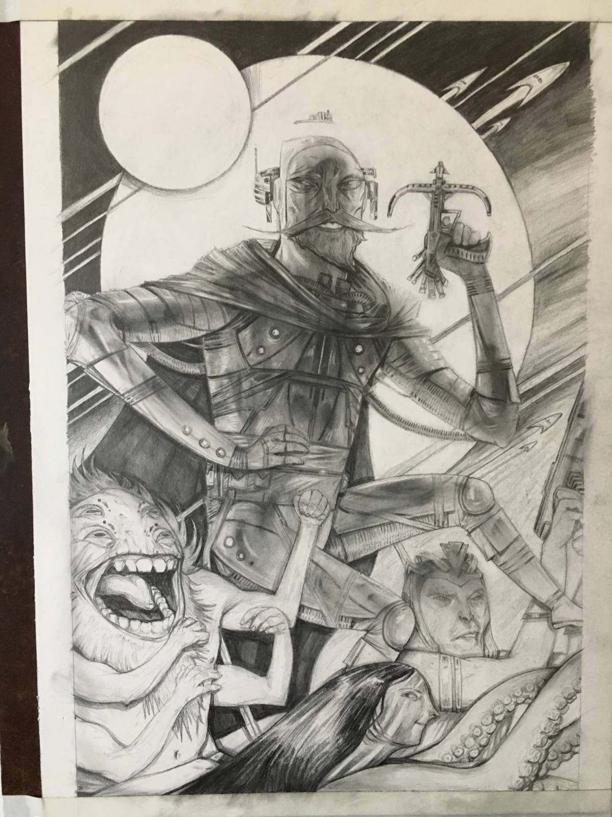
I slowly completed the rest of the drawing over the course of the day, and then re-established my values with graphite powder and a brush:
As I mentioned earlier, I work with acrylic paints – specifically, washes of really watered down acrylic paint on illustration board, over a fully realized graphite drawing. I like keeping as much of my drawing as possible, reserving short paint for the very end of the process. The beginning of my paintings usually look like this:
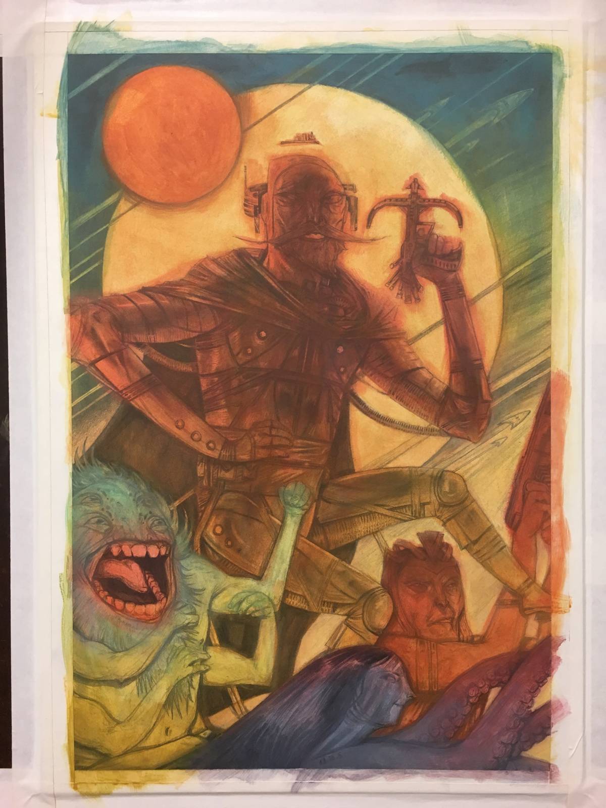
I’ve mapped out all of the color shapes for my under painting, nice and loosely, so that colors can bleed into one another from underneath as I build up my layers and get tighter. I’ve also established some of the main gradients I’ll be keeping as the painting proceeds. The trick is getting them to work with the value gradients, or failing that, to not fight with the value gradients. Here’s what the image looked like after another day of work:
At this point, I’m once again re-establishing the values from the drawing underneath and my final sketch. I bring out the lights first, and then I bring out the darks again, sometimes multiple times. I like to use a three-way combination of Ultramarine Blue, Raw Umber, and Alizarin Crimson for my blacks. Those colors combined can represent the darkest I ever get, but they also give me maximum control to shift the temperature balance of those darks – more Alizarin for warms, more Ultramarine for cools. You may also notice that Little John’s arm moved down from the original drawing, where I had drawn it directly over Robin Hood’s crotch for some reason. I’m unfortunately prone to letting the occasional dumb decision get through – that’s okay! What matters is how you recover from them. I deem this recovery effort: acceptable.
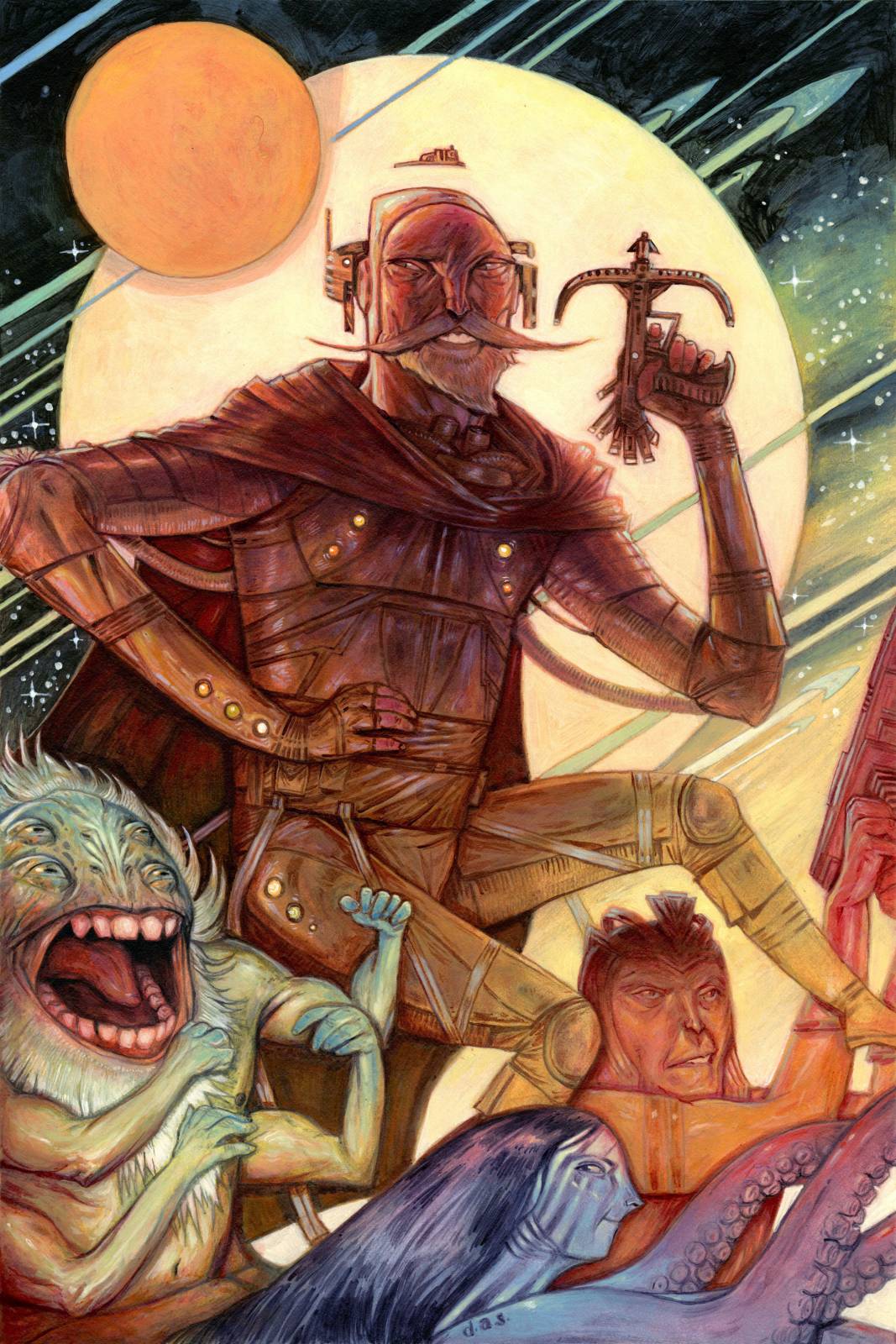
It was also at around this point that it became clear that Little John the four-armed alien was looking a little flat and needed a gradient of his own. The next day I tried a cool gradient first, and when that didn’t work, a red one – which I ended up liking because it gave the piece a nice triangle of warms between the orange character’s arms and Marian’s tentacles in the bottom right, Little John in the bottom left, and Robin Hood towards the top. I also realized here that I had gone too far in a few places with my darks at the expense of color, and I’d need to go in and add some life. Here’s the final image:
Mastering all of these concepts – character design, composition, balancing value against color and telling the difference between the two – is a career-long pursuit, and I’m still working on it. These are clearly not the ruminations of a master. I’ve just gradually embraced the idea over time that I’m a constant work in progress, and I found once I had done that, I became more comfortable making decisions when I work. So I continue to paint. Progress comes in starts and stops, and sometimes it can be years before you really feel as if you’ve made any concrete steps forward. And unfortunately, the one reliable way to keep making progress is to try and try and fail a whole bunch of times along the way. I always think I’ll be the best version of myself three or four paintings from now – but I’ve learned to appreciate that journey more over time, wherever it may take me.
Post written by Danny Schwartz

Danny Schwartz is an illustrator based out of Queens, New York who specializes in whimsical imagery with surreal themes and lively, unique characters. His illustrations have appeared in publications across the United States featuring all kinds of stories — clients have included Scientific American, The New York Times, The Atlantic, The Los Angeles Times, and McGraw-Hill — as well as in group exhibitions in galleries throughout the New York area. He has also taught illustration and drawing as an Adjunct Professor at Syracuse University since 2013. You can follow his work on instagram (@dannyschwartzart) or online at www.dannyschwartz.com.
Wow, this was incredibly helpful, thank you! ( I love the way use color!)
* you use color ?
Thank you so much! I’m really glad to have been of service!!
I can’t wait to try out your exercise with the faces. I love how you use shapes and yet they all still feel real. I’ve wanted to push stylisation in my work for ages and slowly bringing it in but it’s hard as I always seem to want to edge back towards ‘realistic’. Thank you for this amazing post! I love the Sci-fi Robin Hood!
Thank you so much! I’m so glad I could help! I, too, *wanted* to distort forms for a long time, but it took challenging myself with these shapes to really start stretching my mind. I didn’t mention it directly in the post, but whatever other abilities I have with distorting the figure, and anything else, came from taking that shadow-shape idea and transitioning it. Want to draw a distorted figure? My path was to a shape, then use reference to MAKE it the figure. I’d practice at figure drawing sessions… got some funny looks when people were walking around, but then it started clicking a bit, over time. Kep on doing it, until you calibrate a solution that feels right for you!
Really great piece. I wonder why so many artist compose only in line and not value shapes (when value shapes are what will ultimately be doing the talking).
I think there are a bunch of answers to that question, none of them terribly conclusive. My first would be that oftentimes, the very earliest drawing lessons that we give young children (speaking as a former young child) are to think in lines. I remember copying horses and dogs and stuff like that from “how to draw” books when I was very small… they taught how to break things down into shapes, yes, but not value shapes. You’d just connect the shapes with more lines, and end up with a line drawing. The second hypothesis I have is cartoons and anime. Big influences on me when I was a teenager and really beginning to learn more about drawing. Those two things combined, at least in my case, led to kind of a rut where I was incapable of thinking in values until I started learning how to paint.
Hey great article! Just a question…do you gesso your illustration board at all? I’ve found that when I gesso it, it looses the softness with the paint, but without the gesso the paint tends to bleed too much into the surface. Just interested in what you method was as your intitial tones are what I’m aiming for with my paintings!
Hey thanks! I have two answers to that question. No, I don’t gesso, but I do have two different ways that I seal the board. For the longest time, and continuing on into the present for finished illustrations like this, I’ve used workable fixative to seal the graphite drawings before I apply wet media, so that the whole thing doesn’t turn into a runny mess. But I’m anxious about how super poisonous it is. So recently I’ve been experimenting with using unbleached titanium white paint instead — watering it down a bit, and then using a nice, big, flat, soft brush to quickly put a layer of it over the drawing. The obvious con for this is that it can make the drawing run a little bit, but the pro is that once you figure it out, you can use that to your advantage, and start moving around the graphite to get it ready for the painting. I’m still figuring it out, but once I have it down I’ll definitely transition fully from the fixative. Plastic is plastic. All that matters is sealing the board and saving the drawing.
Thanks for getting back to me! I really like these ideas. I know for sure that fixative tends to dislike acrylic paint in general especially if you do a lot of light washing, but perhaps on ungessoed (word?) illustration board like how you work it wouldn’t create a slick chemical barrier as much. I’ll definitely try it. I was thinking on your white paint idea too (which is ingenius!!!) and wonder whether a thin transparent acrylic media such as flow or glaze medium might create the binding without distorting the drawing with white so much? Thoughts? I might try all these out in my next few pieces and see how it goes. I’m definitely with you on not being particular with all the bleeds and smudges as they add character, but the binding thing was something that always bugged me. Thanks again!
Thanks for the lesson. As I am very in charcoal these days, I will try your technique.
대전출장마사지로 쉽고 간편하게 집에서 경험해볼 수 있습니다.