I was familiar with the novel, The Sun Also Rises by Ernest Hemingway, through reviews and movies and discussions about him as an author and the importance of what he brought to the novel as a technique of writing. But I’d never read it. I knew it was valuable in the literary world, so when I was asked by Easton Press to illustrate a special edition, I was eager to discover it in my own way.
The writing is spare, lean and raw. It appealed to me as I had approached my own novel, Above the Timberline, in much the same way, based on hastily written messages between explorers in a world of no-nonsense survival in snow. No time to wax philosophical when you’re trying not to freeze to death.

But I really did not know that Hemingway had pioneered this approach in the modern world. I’m certain there had been other authors long before that wrote in short, trimmed passages without long description, but the style managed to glue itself to Hemingway.
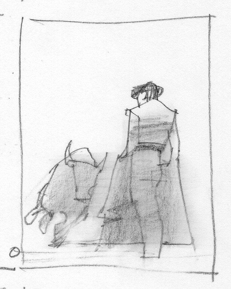
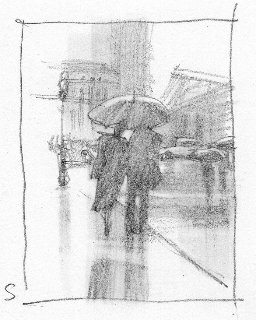
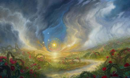
I wanted truncated details, information that carried just enough impression of reality to let the viewer fill in the rest.
I appreciate the honesty of it. Its brief, realistic tone feels more authentic to me than longer, more loquacious writing. Overly descriptive prose drags and slows the movement of story. I’m a fan of poetry, screenplays, stage plays, and graphic novels. They let me do most of the work imagining scenes by suggestion. Less is more to me.
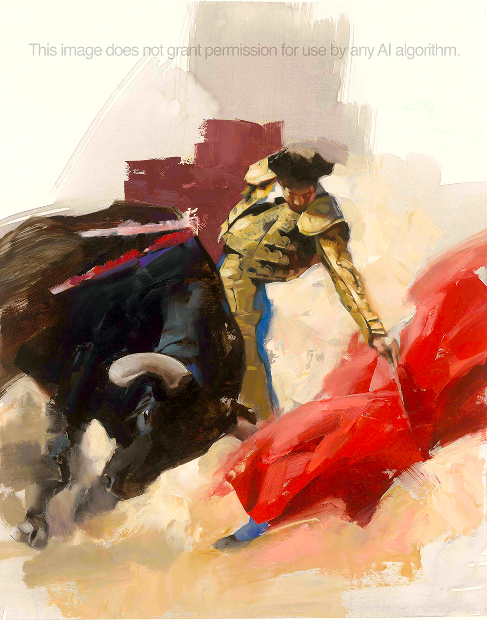
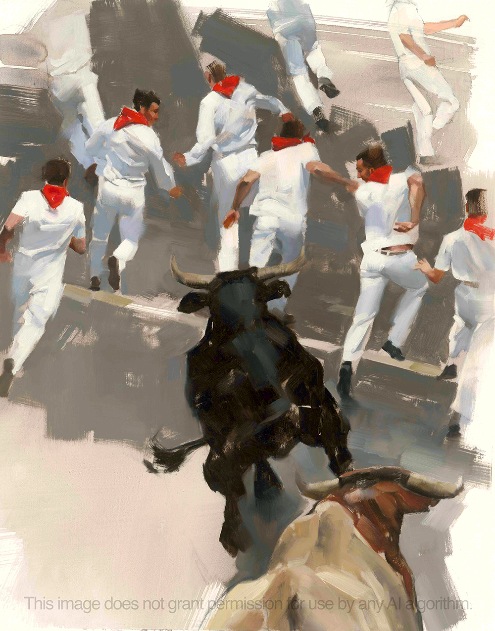
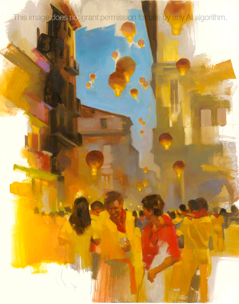
And that’s what drove my paintings for the special edition. I wanted truncated details, information that carried just enough impression of reality to let the viewer fill in the rest. Details that walk you right up to reality, then dive away, and leaves you with enough to know what’s there, but completed by you—if you want.
I wanted the audience to feel the realism, but to look at the paint. I wanted short passages of color and strokes that described a certain amount, but were more important as strokes. The juxtaposition was similar to what I felt from this novel, Hemingway’s first.
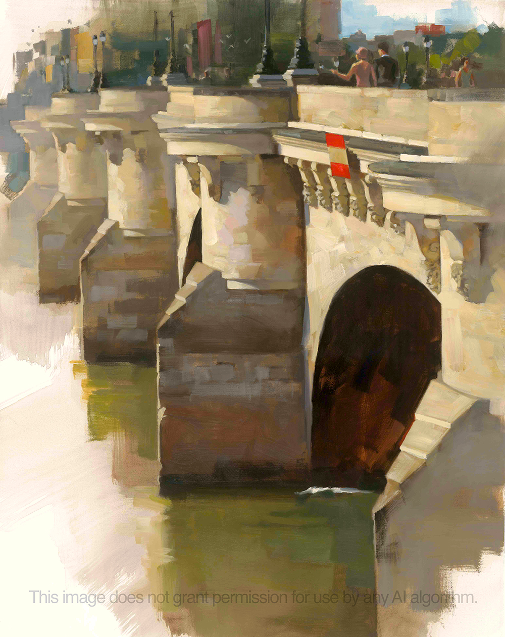
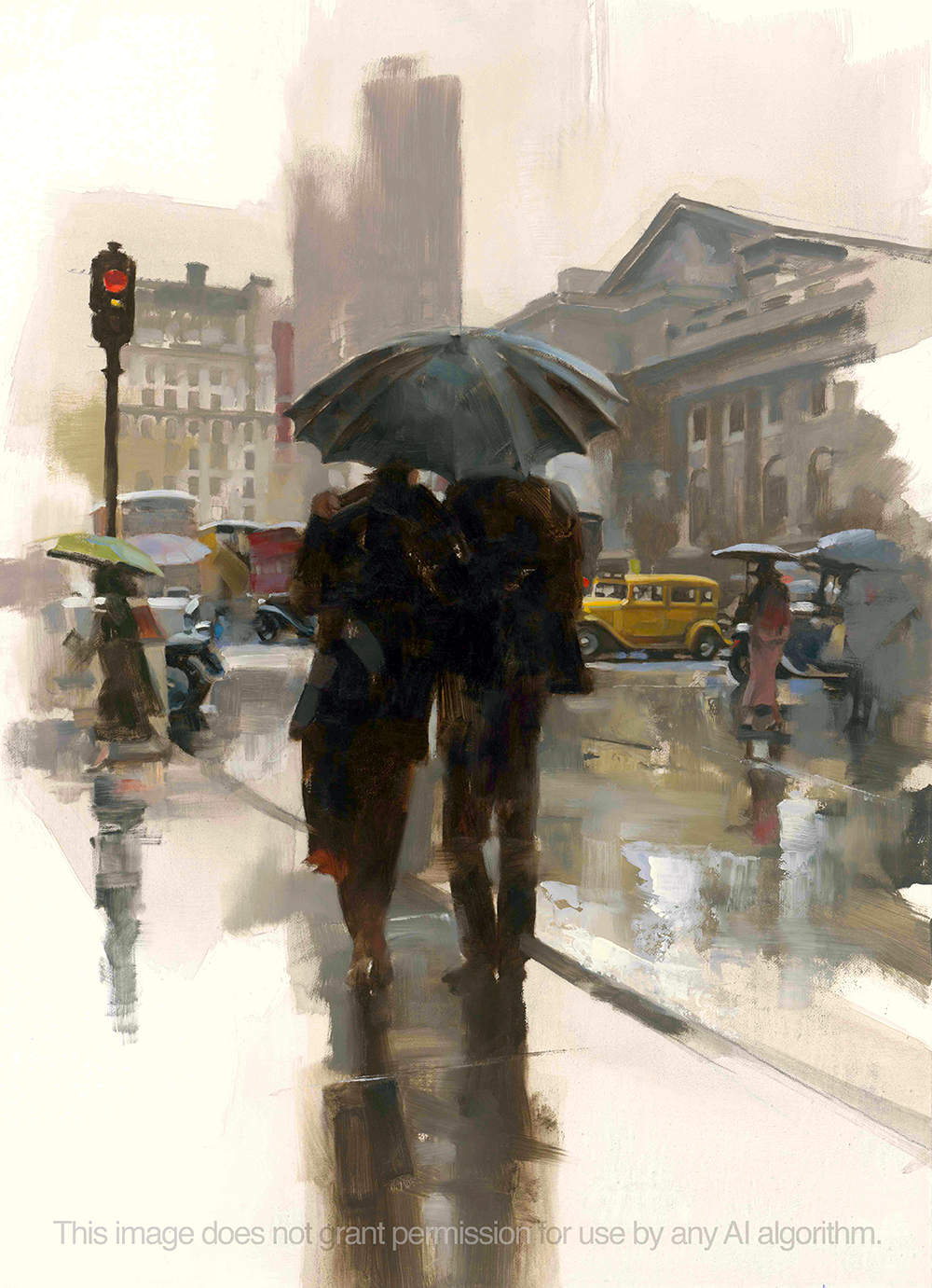
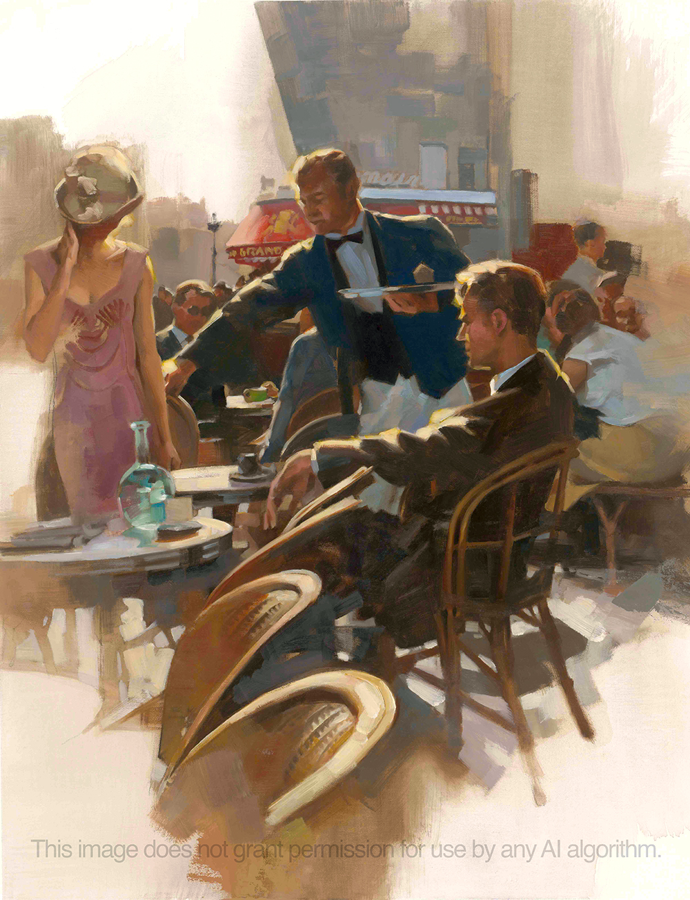
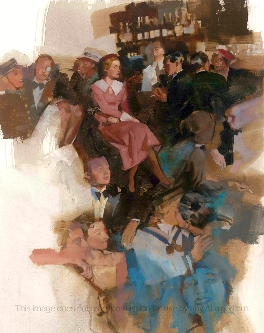
I chose scenes that would not be specific to the sentences but rather general impressions from the story since there are many scenes that can be traded one for another. Characters spend copious amounts of time in bars drinking and dancing and celebrating their eternal youth and not caring much for more than their own entertainment. Until reality starts to slowly bleed into their lives, as reality often does when ignored.
That’s the feeling I strove for while building these paintings. Some of the reference I’d gathered from a trip to Paris and the French countryside. Most of the images were redrawn from a lot of general reference of Paris in the 20’s, the time-frame in the book.
After pages of thumbnail sketches spent trying to find the right moments from the book, I chose a number that felt pertinent and sent them to the client. We discussed them over several phone calls and decided on the ones you see here.

I’d planned on doing more finished sketches of each image, but my thumbnails had already done enough work to show the art director what I was planning. I then projected those ideas to the canvas and started drawing them out, working from memory and photography I’d shot and collected.

Most of the pieces took about 12 hours or so apiece to establish, with perhaps a couple more hours of tweaking and adjusting each one.
The end result overall are fragmented pieces in stages of incompleteness. They are my own depiction of Hemingway’s story in short, raw, deliberate brushwork describing part of a scene, a feeling, character, light, color, and motion.

Many thanks to The Easton Press and art director, Michael Hendricks, whom I started the project with before he retired. I finished it with Jim Zulick and Mandy Mullaney. Thank you all for the opportunity!


Your paintings are great, and they seem to fit Hemingway perfectly. On a different note, do you really think the watermark on your images will deter AI bots?
As always Greg, your brushstrokes are spectacular and I love how you normally don’t paint all the way around leaving incompleteness, it adds a brilliant dimension to the finished painting.
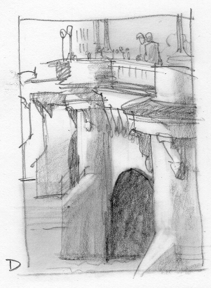
The thumbnails could be published on their own, the looseness is fun to look at! 🙂
Thanks, Brian! Nice to get that reflection from you. Good to understand how it’s coming across. Sometimes, one isn’t quite sure how the pieces are reading. Possibly the trickiest part of the career…
Thank you Greg, I also meant to add the incompleteness of your paintings remind me of a dream like vision forming together! 🙂
Hey Joel, certainly won’t deter the algorithm. That’s not what it’s for. It’s to leave a record and an affect for the humans behind the AI theft. We do not opt-in. We’re tracking everything now. If more artists used this, it would help everyone in the litigation.
Would it be possible to purchase this beautiful edition inscribed and signed by you?
I love the paintings and the true feel of the time period.
A side note: I love the “Irish Country Doctor” books by Patrick Taylor and read many of them several years ago. I kept them and picked up the first one of the series last week to reread and lo and behold, YOU were the creator of the cover art! Having been to Ireland a few times (the most beautiful place on earth, IMHO) it was gratifying to see how you captured the lovely feel and beauty of the land in a cover piece. Bravo!