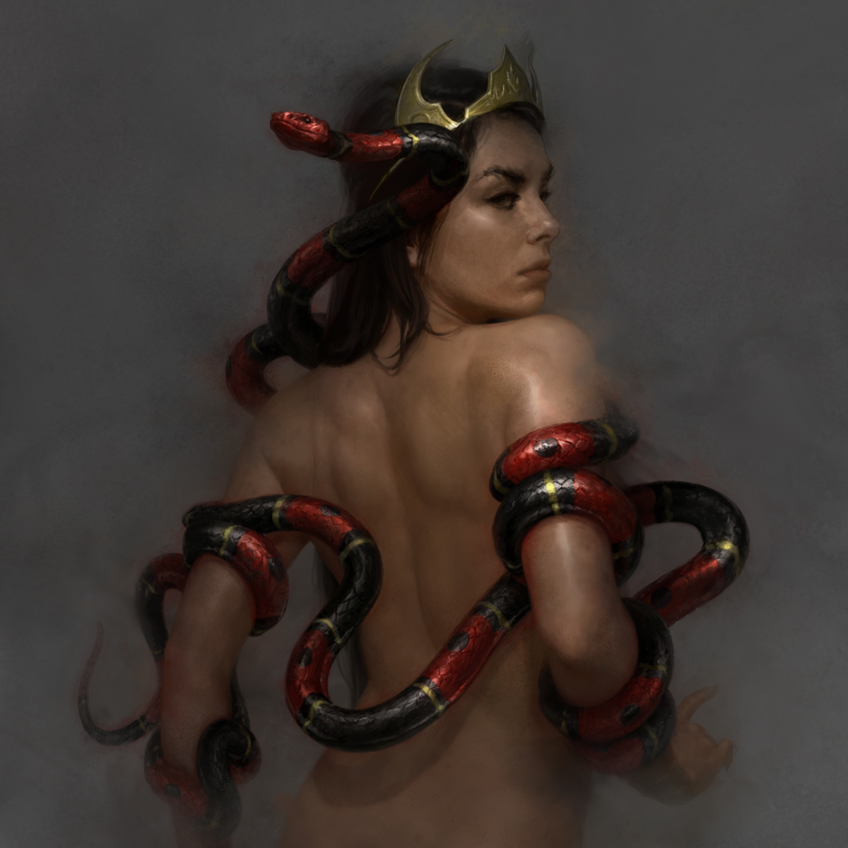
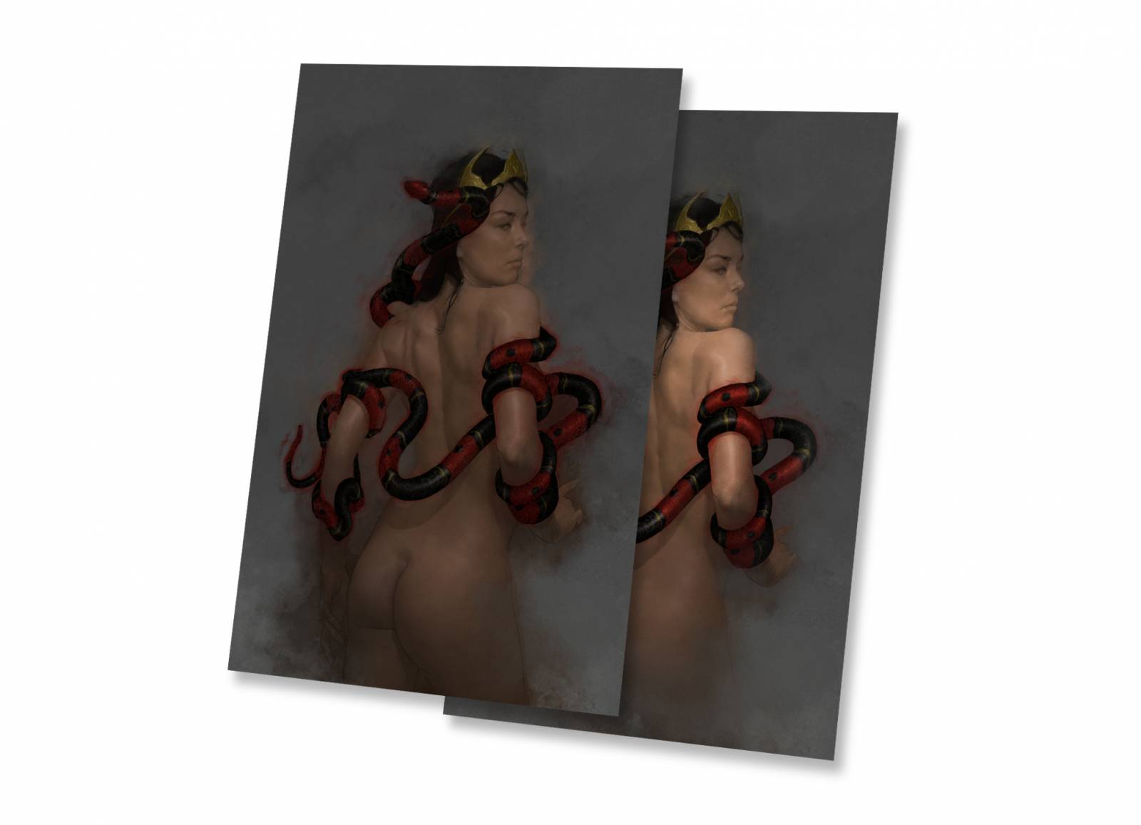
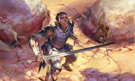
Mother of Slag, Detail
Part 2 of The 10 Art Commandments just isn’t ready. In the interim I thought it might be interesting to take a look at the process from a recent piece of mine, Mother of Slag, and how processes evolve and are passed on, particularly as they migrate between the digital and physical realms.
First, it will be prudent for us to take a look at the work of an illustrator whom I hold in the highest regard: David Grove. David’s work has always been some of my favorite to look at, and while he is sadly no longer with us he did leave a lot of information about his working methods in his book David Grove: An Illustrated Life.

Tommy Hart | David Grove, 1977
The look he worked to cultivate went through several iterations and improvements in his lifetime, and is left to us whole as a great place to start. In summary: David would sketch, shoot reference, and then use that reference to create a linear (not a tonal) pencil drawing on gessoed canvas. Each canvas was custom-gessoed so that its whorls and grooves would shuttle future layers of paint into formations that David felt would harmonize with the work to come – really brilliant stuff. David tinted the gesso with acrylic paint so that the board was an approximate passage of all the highlight colors he would later need.
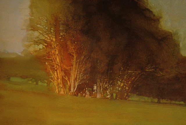
Lincoln Park I | David Grove, 1993
Over his drawing Grove poured puddles of gouache and let them dry completely. The expressive quality of the paint at this stage is a thing of beauty, and surely accounts for the use of this somewhat roundabout way of painting. The abstract paint then had to be reconciled with the original sketch. The pencil drawing was still somewhat visible, and would act as a sort of “container” for the forms that now had to be be realized within the cloud of paint.

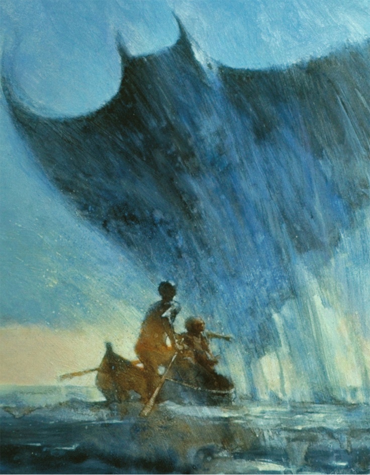
Barre Bleu | David Grove, 1982
Here we get to the namesake of this technique, “The Lift:” Grove would dampen a brush with water and slowly, gently (almost like a paleontologist) lift away areas of Gouache to reveal the tinted board below to varying degrees – this enabled him to showcase form and contrast within the greater environment of the abstract paint he wanted so much to protect. This one pass of paint removal basically is the painting, and you only get one shot. Grove has indicated that “patches” of opaque paint on top of the work were notoriously difficult to combine with the original effect in any convincing way. But when it all came together just right: my oh my.
The Black Pearl | David Grove, 1977
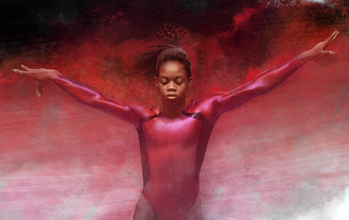
Gabby Douglas | An Early Digital Imitation, 2015
I’ve been experimenting with emulating this technique digitally for a number of years now, and have found it to be useful when an image needs to be particularly expressive. I want to be clear that I don’t think digital paint should ever bother trying to look like actual paint – I’m more interested in borrowing the mindset that comes from laying in the expressive passages first (getting this wrong is part of the failure of the above example).
For a time I tried just doing tight paintings and then messing them up to make them more expressive, but that never really works because in the end the forms and the expressive parts aren’t harmonized; they’re worked out separately and they feel separate, which is no good. Also it takes a lot longer. No; the mess has to come at the beginning. The expressive paint serves as an antagonist to your intentions in some ways, and it’s in finding a way to resolve that tension that the painting becomes interesting. Let’s start:
Process
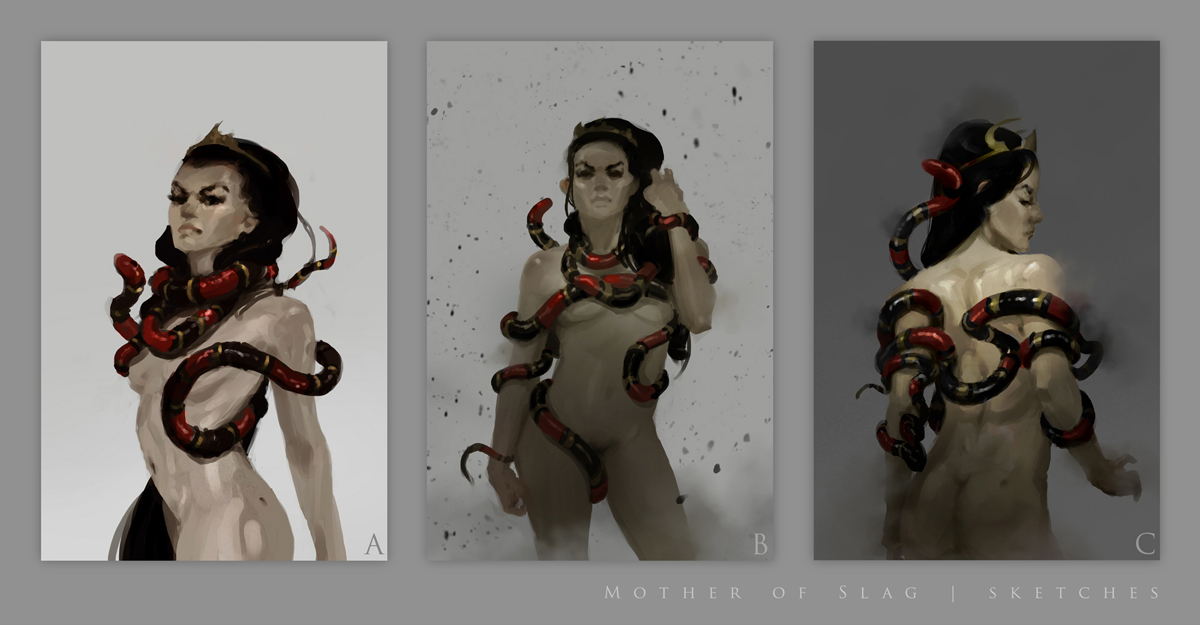
The Sketches
Every good piece of music must be written; illustrations are much the same. I talked a fair bit recently about my sketching process so I won’t go into it again here other than to say these were a lot of fun to do, and that the client chose ‘C.’
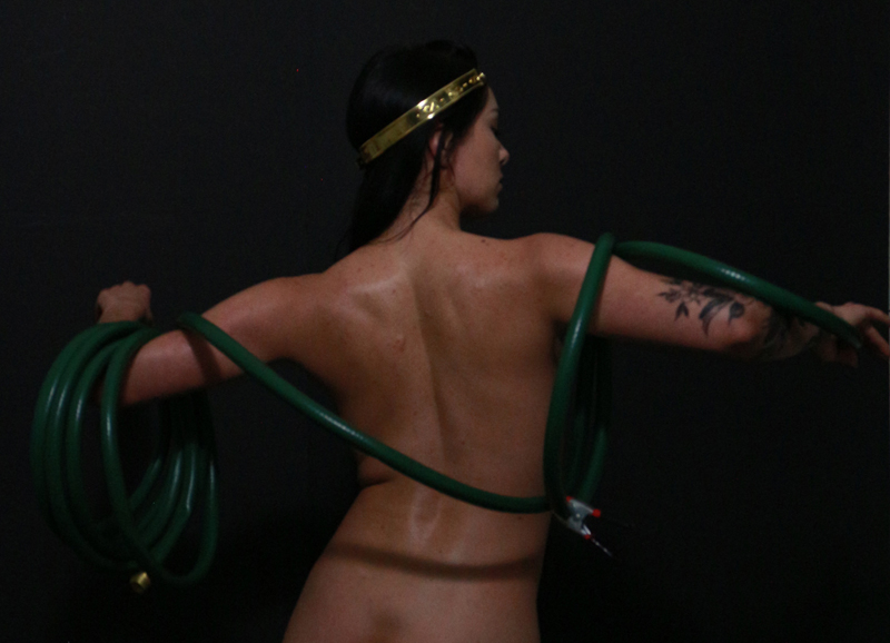
Reference
For the uninitiated: Sam Weber’s recent article on working with models covered reference excellently. Here I took some extra pains to shoot snake-equivalents (read: hoses) and their shadows over the torso in the lighting situation. The lighting was everything on this one. The model rather generously let me use an entire bottle of Bactine trying to keep her shiny throughout the shoot (I wanted her to seem a bit snake-like in her highlights).
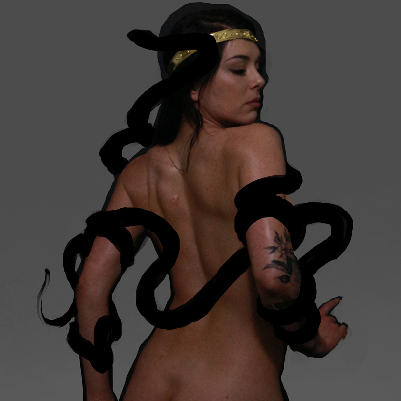
Reference Composite
The final piece of reference I used for the painting involves a number of grafted sections from different photographs, though I try to use grafts as judiciously and carefully as possible. I’ve indicated the basic snake shape for myself to make sure things harmonize.
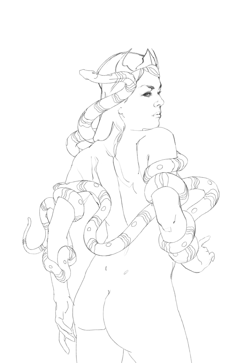
Drawing
The drawing isn’t meant to look pretty (and oh boy does it not), it’s more like a roadmap for lifting paint later. I tackled this drawing in Procreate on my iPad, as I like the drawing feel so much better than Photoshop, where all the rest of the work is done.
The Expressive Passages
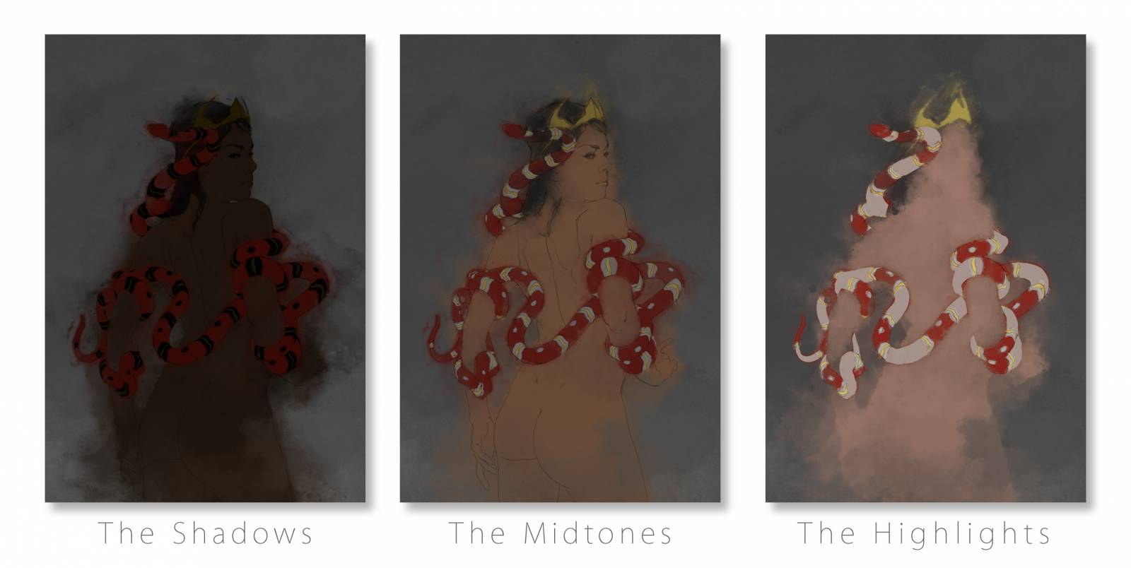
One advantage of working digitally is that one can easily achieve multiple layers of lift. Grove had to modulate the opacity of his gouache perfectly inside passages of paint if he wanted to create gentle gradations of light, and larger gradations are largely absent from his finished work. While his physical method works excellently for silhouette-based work, here the drift from light into shadow is a key design element of the piece, so I wanted more control. I worked up a layer of expressive paint for the shadows, another for the mid-tones, and a final passage for the highlights. Each variation is flattened – in Photoshop they’re stacked like this:

Now I can take the lifting in stages, working my way down from dark to light.
Lift 1: Shadows to Midtones
It’s a pretty common mistake to go too light with the shadows and too dark with the highlights at the previous stage, but don’t hold back! Look how nicely the garish darks give way to the midtones underneath once we start to lift them away. I do the lifting with a layer mask, so that I’m not really erasing the paint away for good.
This is another big advantage digital has over the physical process; using a layer mask to do my lift means I can re-apply the paint if I take too much, and my expressive passages will always perfectly realign. It’s basically cheating.
Lift 2: Midtones to Highlights
Now I can lift through the combined darks and midtones into the brilliant highlights. You’ll also note another little bit of cheating here: some new, darker passages of paint start to show up. It’s a lot easier to get these ‘patched’ areas to reconcile when working digitally, because digital transparent paint won’t disturb the work underneath – this keeps all the expressive paint looking unified.
More Transparent Work
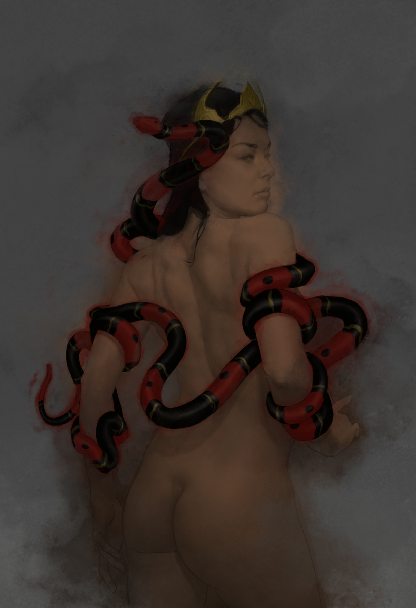
I’ve continued ghosting back some of the expressive passages to help clarify the figure’s silhouette, as what I’m after is a bit more on the literal side. I’ve also used a levels adjustment to heighten the bloom of light hitting her back. Once all this is done, I slide the resulting image back under the previous stage (more digital shenanigans) and lift out a third time into this more extreme blooming effect:
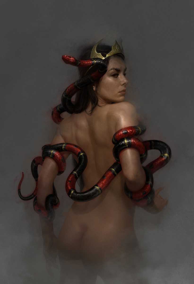
Lift 3: Combined Stages
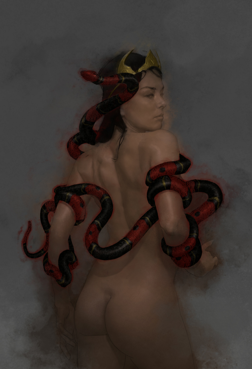
Now I’m getting somewhere. You’ll notice I’m starting to transition into using opaque paint in the face. Eventually, once a harmony between form and expression is reached direct paint becomes the best choice – no more tricks. Digital paint lets me keep things looking clean, even where I’m painting right over the delicate lift. With gouache, this just wouldn’t be possible.

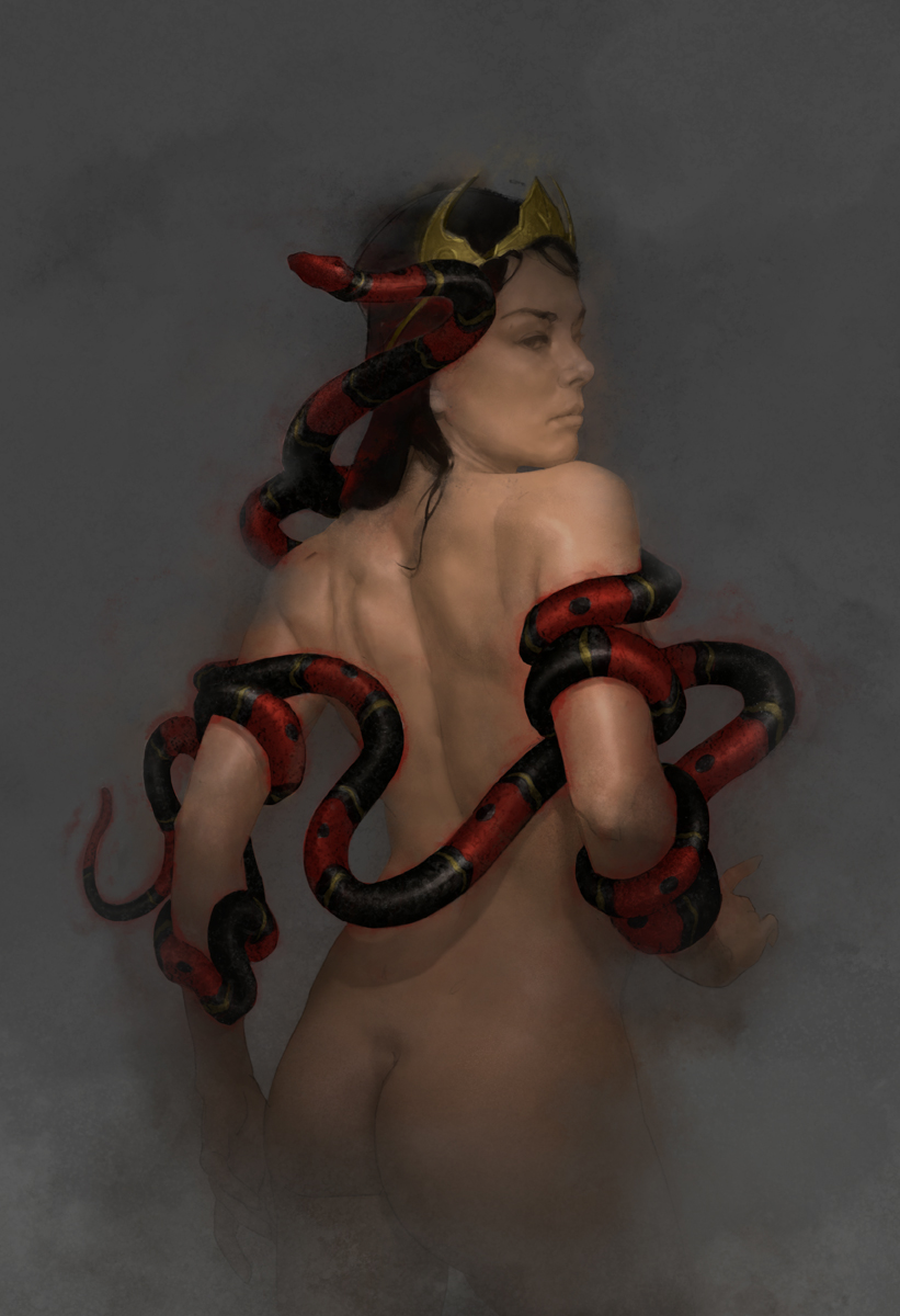
Opaque Painting 1
From here things are pretty straightforward: I just keep painting it to be more like how I want it to look, and try to preserve what’s working.
Opaque Painting 2
More small adjustments and drawing changes. I used to call these types of paintings “done” a lot more quickly, succumbing to the spell of the expressive paint. Don’t stop until it’s exactly what you want. It’s telling that on the rare occasions when Grove taught, he encouraged students to slow down.

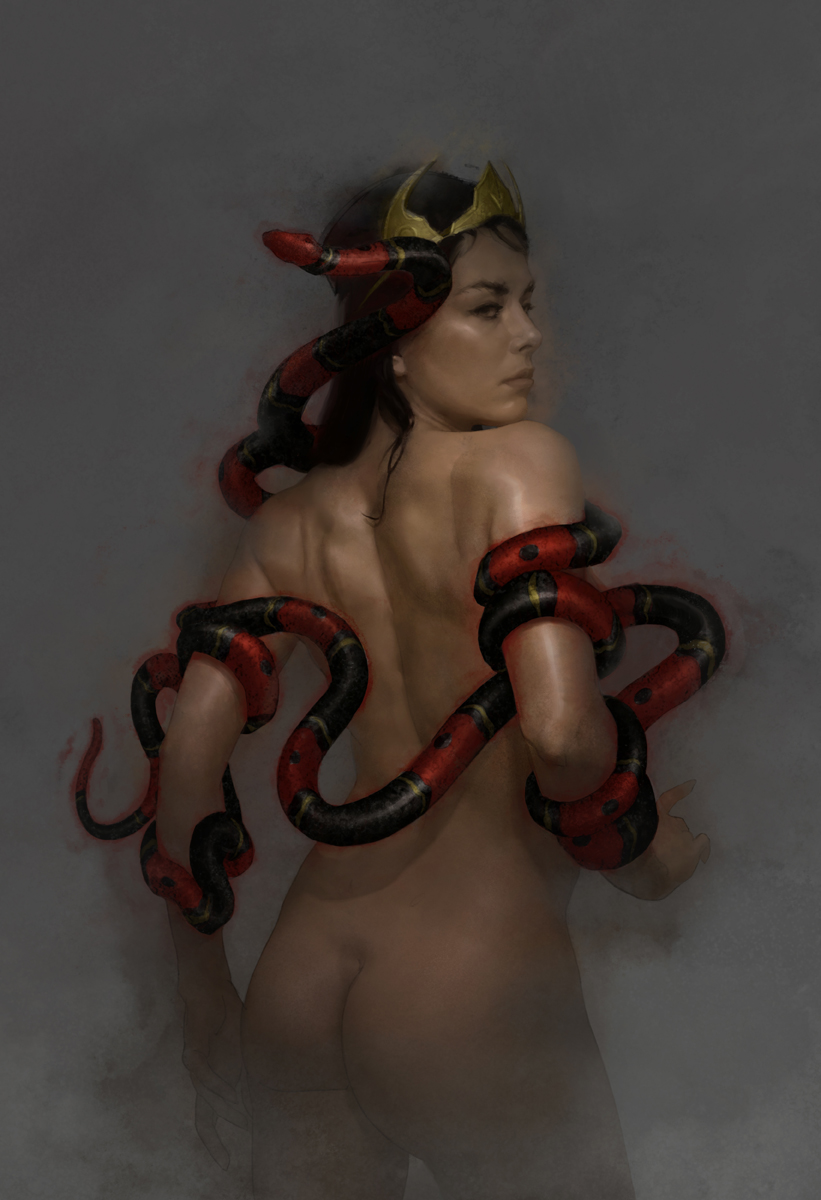
Mother of Slag: Final
At the eleventh hour the smoke from the sketch makes an appearance, bringing with it the darker values that really make the highlights gleam. I do a bit more work in the snakes’ scales to set off the effect.
Parting Thoughts
Throughout the discussion of this process I’ve talked a lot about what’s possible with the digital medium that isn’t possible using the original gouache technique Grove left us, but I want to be clear that I don’t see all of these things as advantages. While the level of control afforded digitally is wonderful, it does come at the expense of risk, and risk is probably the surest route to resonance in painting. The pieces of artwork that really soar seem to live almost on the edge of being a mistake. I have no doubt that when you can’t take a mark back, you paint differently. Painting is such a low-stakes activity that I think injecting a bit of tension can be a good thing – maybe a great one. If you’re a digital artist, think about how you can up the stakes.
Lastly, when adapting a processes to fit your needs, consider that each painting must be conceived as a whole: its process and its intent must be in unison from the beginning, and the former must enable the latter. Liking a certain look doesn’t mean it will work for every painting. Be flexible. Don’t look simply at how a thing is done, but consider why it was done, to see if it can help you get where you want to go.

Beautiful work and a wonderful explanation of your process. It’s great to learn more of how Grove worked. I’ve long admired his technique but never heard about how he created it. I especially think that “Lift 2” has a distinctly Grove vibe to it. Thank you for your lovely post.
Sarah check this out https://gumroad.com/l/VftEr
Tommy, great article. If you haven’t seen it Thomas Blackshear does a video demo of Groves technique and he is able to go over it with opaques after the initial lift. Was very informative and will definitely feed into your digital work. https://gumroad.com/l/VftEr
Excellent Post. Was just thinking of Revisiting Thomas Blackshear’s videos I own and incorporating these techniques into acrylic/ oil paint process. Very inspiring Thank you
Brilliant process. I’ve never heard of building tones as a subtractive technique, and I’d love to try it!
Excellent, Tommy! Nailed the approach. I think your observations about the overall approach, coupled with the element of risk is quite valuable. The new painter would do well to consider this, and then embrace it.
David was brilliant, and not only enthusiastic, but a great lover of visual things. His taste in art was high class and over the years of our friendship he inspired me to follow the things that drove me about illustrating. He had a great love of history as well, and especially illustration history.
We had many wonderful late night talks about book covers, cinema, photography, and stories. I miss him and the work so very much.