A while back, I shared some starts and finishes of my paintings (here), and I thought I’d share a few more that I’ve done since then. Each one is a little bit different but the overall method of creating abstracts first and then painting into those is the same. Also, I’m highlighting a few paintings here that are similar in color scheme being low chroma indirect paintings. This sort of process can be done with any other colors too. I’ve painted many more colorful paintings using this same process. That link I shared above has some examples with different colors used.
The Acquisition Of The Sun
oil on panel, 11×14″
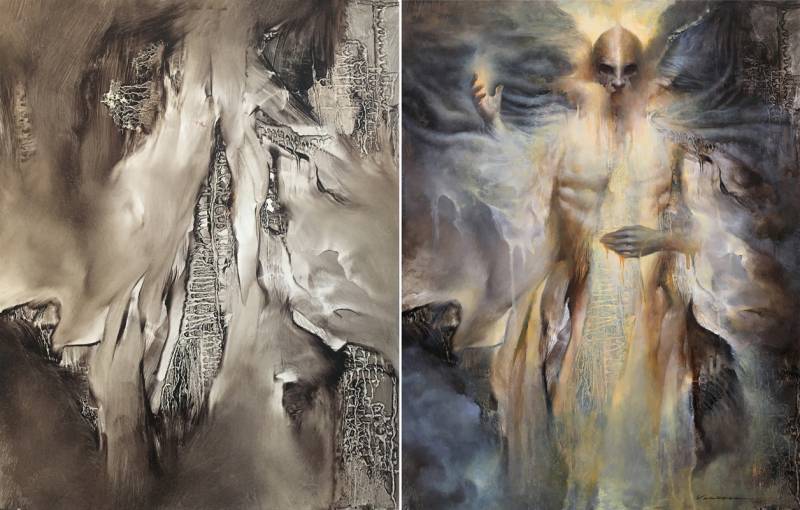
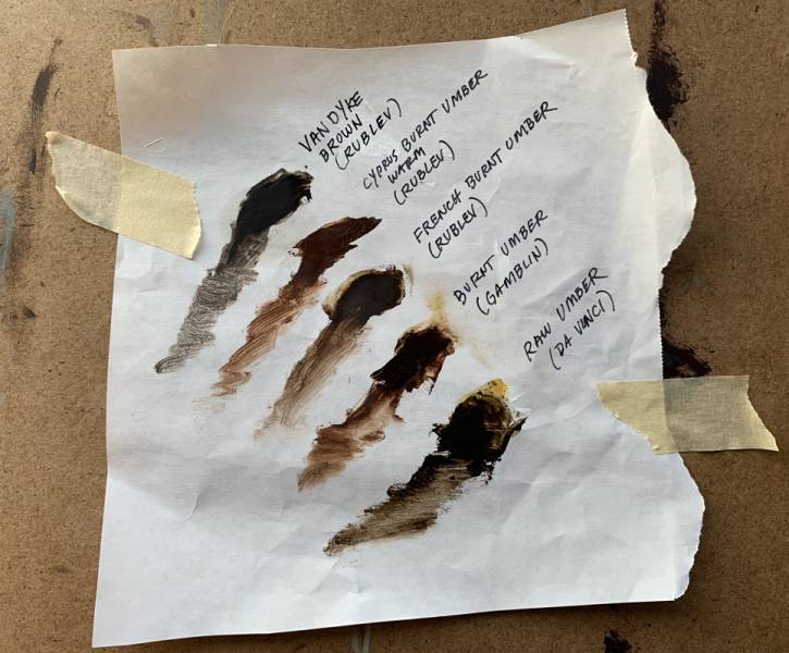
For this initial abstract on the left, I was testing out a new tube of VanDyke Brown by Rublev. I had compared a few umbers/browns that I had to see what they looked like in comparison to each other, and used different panels for the different abstracts. This one was the VanDyke Brown.
I first coated the entire board with the brown mixed with a little bit of linseed oil, and then wiped away areas with a spatula. I dripped a combination of paint and gamsol to get the root-like texture between the areas I’d wiped away. The drips were done by turning the panel in both horizontal and vertical directions. I also used a very soft mop brush to soften some larger areas as well as edges in places.
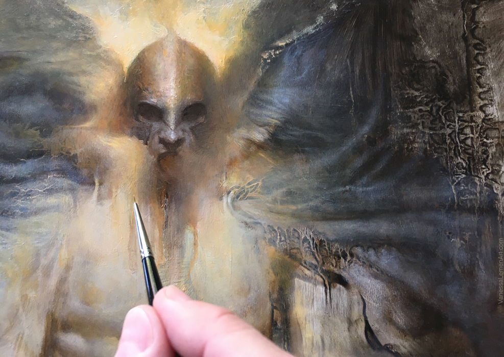
In the abstract, I saw a cloaked figure, with the cloak whipping in the wind around the figure, and as if smoke or fog was in the atmosphere, and industrial-looking pipes and structures in the background. The painting was built up in layers very similarly to how the initial abstract was painted, translucent layers over the top of the dry underpainting. I went with a low chroma atmosphere that leans a bit towards cool (no use of any blue in this painting though) to emphasize the warm figure and glow. There are many layers in the painting, and most are translucent with a bit of what’s underneath showing through, with the exception of the head and hands which are more opaque.
This painting was painted for a group show that had the theme 7 Deadly Sins. The sin I was depicting was Greed.
This detail above shows an area where you can see how opaque some areas are and how some areas are the underpainting showing through. The most opaque areas in this finish are the head and hands. Most everything else is still pretty translucent.
The Mage Of Candor
oil on panel, 9×12″
The abstract start here on the left was done in burnt umber and pthalo blue, then I let it dry before painting on top. To make these marks, I first coated the surface with a mix of those two colors (oil) mixed with a little bit of linseed oil, and wiped away using a combination of spatulas, rags, and my fingers. I also splattered gamsol with the panel laying flat so that the splatters didn’t drip but left some round spots (instead of dripping lines). I finished the abstract using a mop to soften edges and knock back some striations in the larger dark areas.
I saw a character with a large headpiece that appeared to be wrapped around its neck. The character I first saw was more of a creature, but as I defined the edges of the figure using the lighter background grays, the figure started to become more like a human than a creature.
I glazed the areas of the headpiece that are more gold using transparent gold ochre and transparent red iron oxide. The gray skin tones and background also make the warms in the headpiece appear warmer just by being adjacent to one another. There are areas of the headpiece that I defined a bit more using small rounds and wiping back with a spatula to create hard edges. Most of this painting is a building up of translucent layers, with the face, shoulders, and some of the background being the most opaque.
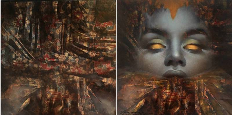
Do Not Go Gently
oil on collage on panel, 5×5″
This abstract on the left started with a collage of book pages with printed patterns on them. I sealed the surface by coating it with a water-based polymer/gloss medium, and then let that dry. Once dry, I painted over the entire surface with burnt umber mixed with a little bit of linseed oil, and then picked out harder-edge areas with a spatula. I softened areas with a mop, and added some grays a bit too, and then remembered to take a photo before I kept painting. Once I had that gray in the lower corners, I had immediately seen the lower portion of the abstract as either a large kind of robotic moth or a swarm of them, and got the idea to paint the face with these glowing eyes as if the moth is drawn to them and both end up consuming or devouring each other as a means of habit or ignorance. The face was built up in translucent layers with the edges and brows still showing a bit of the abstract underpainting through a bit, but the center area of the face is opaque. While the face was still wet, I used the spatula to pick out some marks on the outer edges that cut back into the paint. Because the overall painting is predominantly warm, it appears as if I used blue for the face, but I did not use any blue in this painting (nor in the Acquisition Of The Sun).
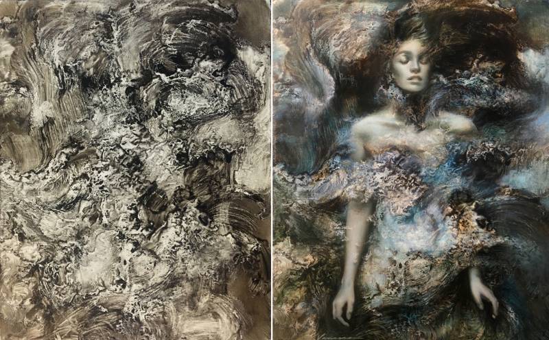
Song Of The Blue World
oil on panel, 8×10″
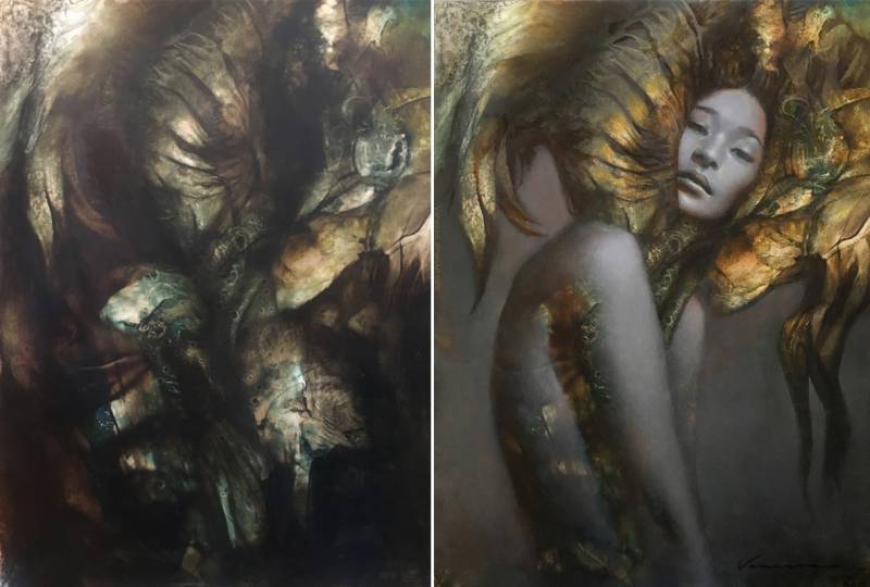
This abstract start on the left was done using the Raw Umber by DaVinci (on that sheet test above) with a little bit of linseed oil mixed in. I used a cheap bristle chip brush, and left the striations in the painting (I didn’t soften with a mop on most of this). The pickout of lighter areas was done using large splatters (spills, really) of gamsol with the panel laying flat. Then I picked it up and turned it in different directions for the splatters to drip and the gamsol to mix with the paint and linseed on the fringes of the drips to create these little squiggly edges that look like the edges of ocean waves/foam. I saw the dark swoosh of strokes in the top portion of the painting as hair being swept around, and that’s what was the impetus for the addition of the figure and its placement. I definitely wanted to keep the abstract areas as visible as possible as if the figure was surrounded by it on all sides, as if swimming among the abstract marks. I wanted to give the figure a calm expression and stance, as if floating, but not disturbed by the chaotic surroundings.
This detail here above shows a better view of the layering from underpainting to lighter, more opaque paint, as well as the depth and depiction of figure floating/swimming among the abstract.
In addition to this article and the one I linked above, I’ve posted several other articles here on Muddy Colors showing process, tools, and painting progressions as well. Here is a link (here) to one in which I show images and talk a bit about the tools I use and the marks they make. Some of the tools I explain in that article were used to make these paintings here.






These are all remarkable works, unique in their own way. The top one “Acquisition of the Sun” reminds me of a Frazetta piece “Dark Kingdom” though abstracted. I really love all of your posts Vanessa, are there any plans on putting out a monograph of your art?
hi Michael. Thank you for the good words about the works here. I don’t necessarily have a plan to put together a monograph of my art, but I do have ideas to publish a specific collection of work in a small book sometime in the near future. I will definitely be announcing that when I do! Thank you again. 🙂
I love seeing the before and afters of these pieces. Sometimes (as with the Mage of Candor) I can kind of see the beginnings of the shapes that you build up, and sometimes (Do Not Go Gently) it’s a complete mystery. But you saw something there, and made a connection with it, and I think that’s part of the beauty of the art.
hi Francesco. Thanks for the comment. 🙂 To see them side-by-side like this does leave out quite a bit of evolution, so it’s understandable to feel like sometimes it just seems like a complete mystery. The connection is much more like a spontaneous conversation, and so once there is an established connection (or visual cue), where it goes from there could take different turns – all somewhat related, but turns nonetheless – and yes, I agree, that is the beauty it – that connection or conversation, a reciprocity. Anyway, thanks again! 🙂