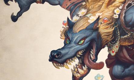
In recent years, I’ve gotten way more into glazing and working in a more layered approach. It started with all the tree stuff, but past few months I’ve been experimenting with a similar grisaille approach toward portraits, and its been eye opening.
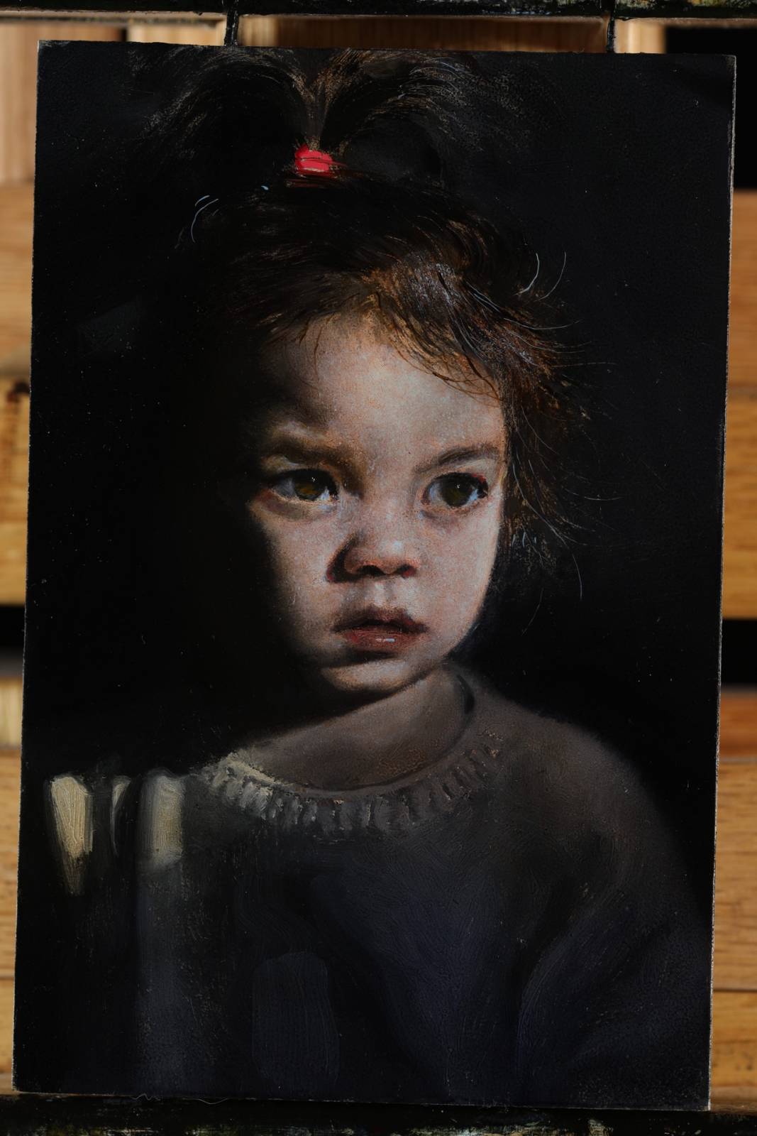
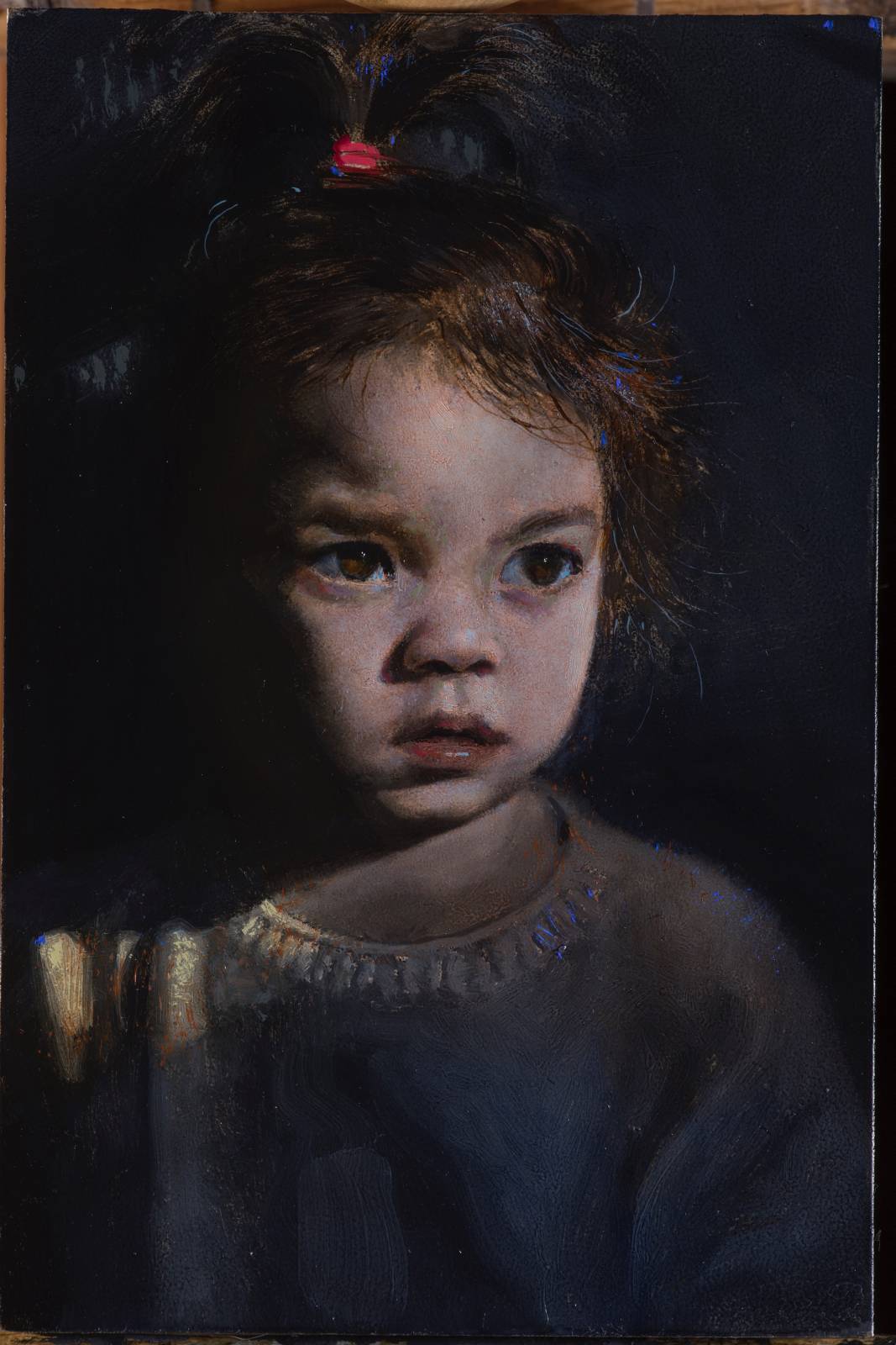
While the end goal of having a finished portrait is the same, the path to completion is fairly different from the more direct approach I’ve always used. The first one I did was this painting of my daughter. I wasn’t sure how it was going to go so i used a 4×6 inch panel in order to keep it small and less committal. i found it to be enjoyable concentrating only on the values. its funny how fundamental stuff like this can be enlightening 20 something years in. theres a level of subtlety in the volumes that i don’t think i get working in more of a direct method. i like the slow buildup of layers and the interesting textural stuff that starts happening when you begin laying color in. i found thin very diluted layers tend to work better than using a lot of paint, not only does it keep you from going too dark and saturated too fast but it also gives you more control and subtlety with color.
Here are a couple of process walkthroughs:
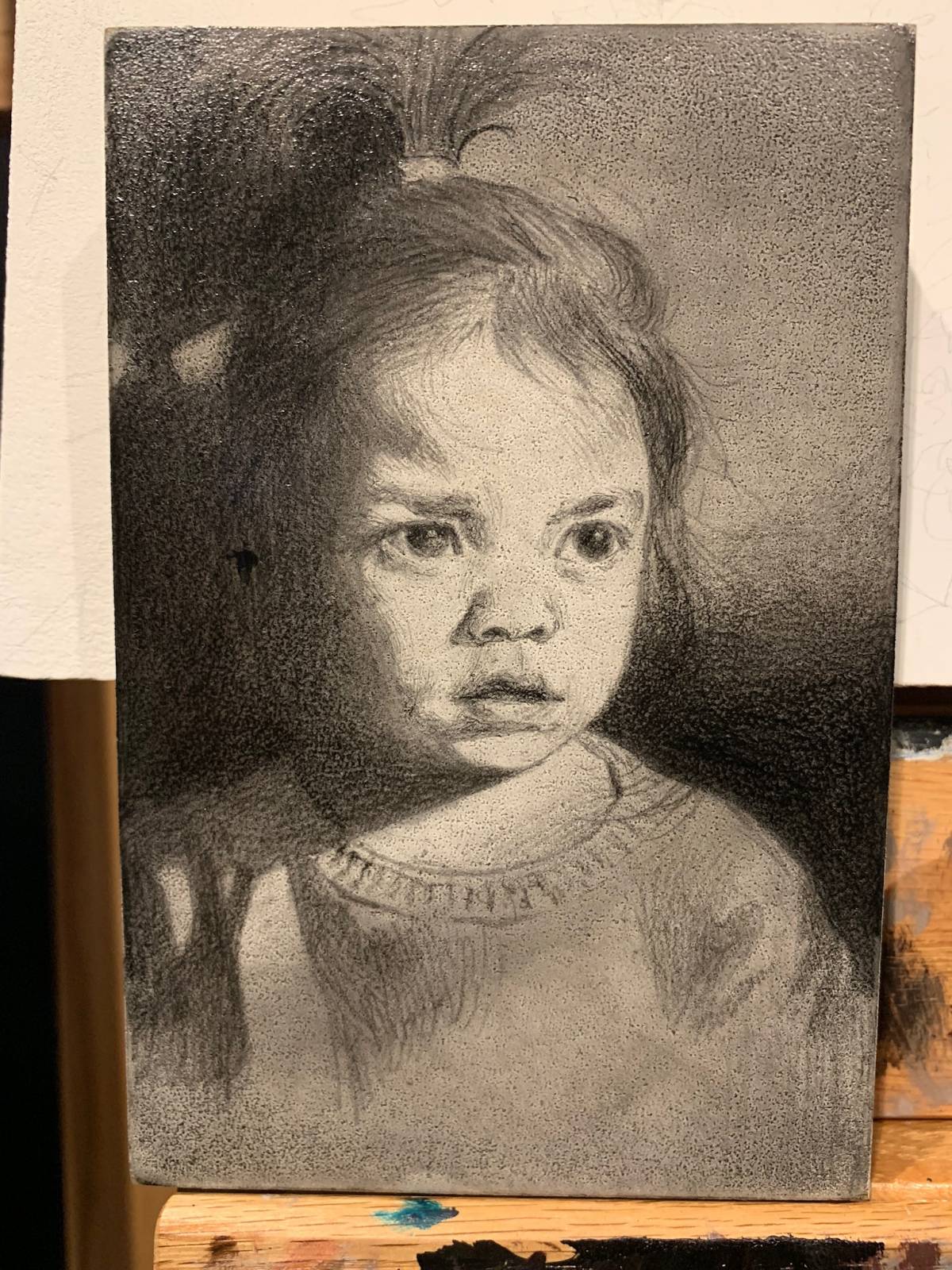
Started with a light charcoal drawing I spray fixed and then applied some light washes of ivory black to tone things down a bit. At this point I was more concerned with locking the drawing in and knocking the values down to more of a mid range.
I then came in with opaque paint to detail things out and build the volumes. This is probably the most important step because once this is in the goal is to work mostly transparently on top of it, so you really want to make sure you can live with the drawing as much as possible.
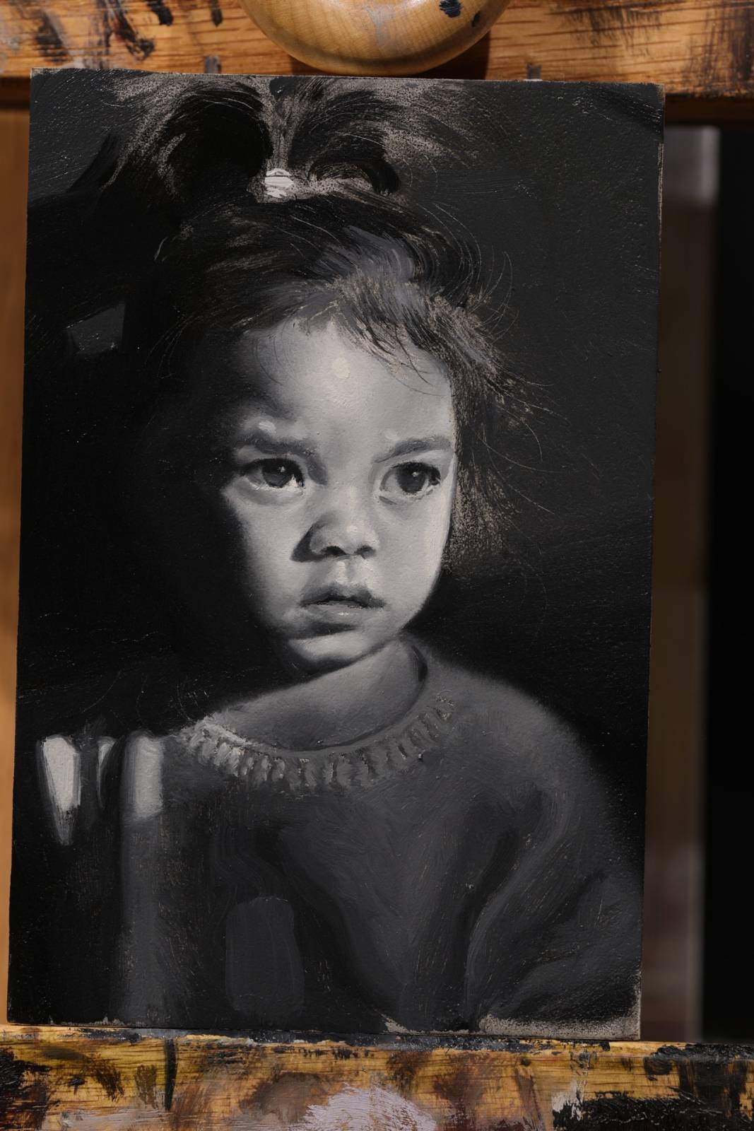
Started glazing very lightly, almost more temperature than anything and avoiding any strong saturated colors. It’s worth holding back and using diluted paints in order not to go too dark or saturated too quickly. It also seems to have more depth the more thin layers you apply. Takes longer, but it’s totally worth it.
At this point I have the local colors laid in. Again I’m abstaining from going too saturated, because I always get too saturated and I’m trying to control that a bit more these days 🙂
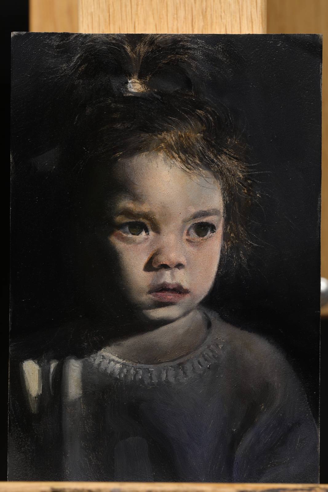
Areas began feeling a little monochromatic, So I glazed a very diluted robin’s egg blue over the skin tones, and use the same colors to apply the highlights and whites of the eyes. At this point I’m feeling pretty good about it, so I paint some opaque details here and there, making subtle adjustments to the drawing and trying to direct focus to areas. some areas, like the hair for instance i keep almost entirely transparent…think more just so i didn’t have to deal with it.
Last step I came in with more opaque paint in order to unify some of the local colors and do final adjustments.
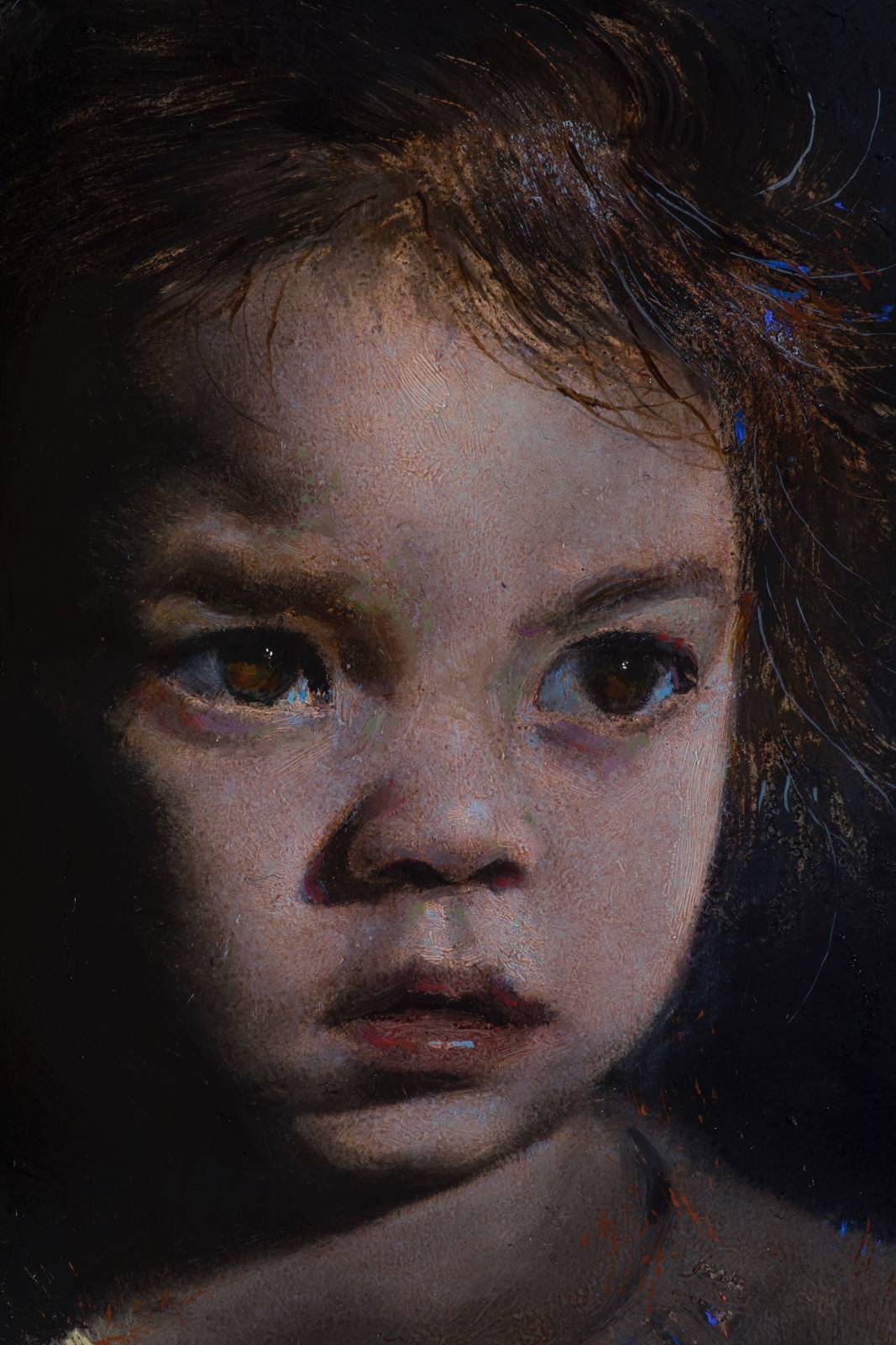
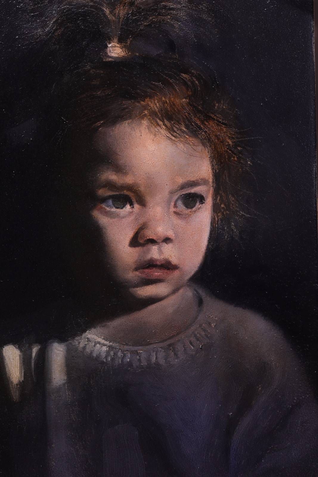
close up
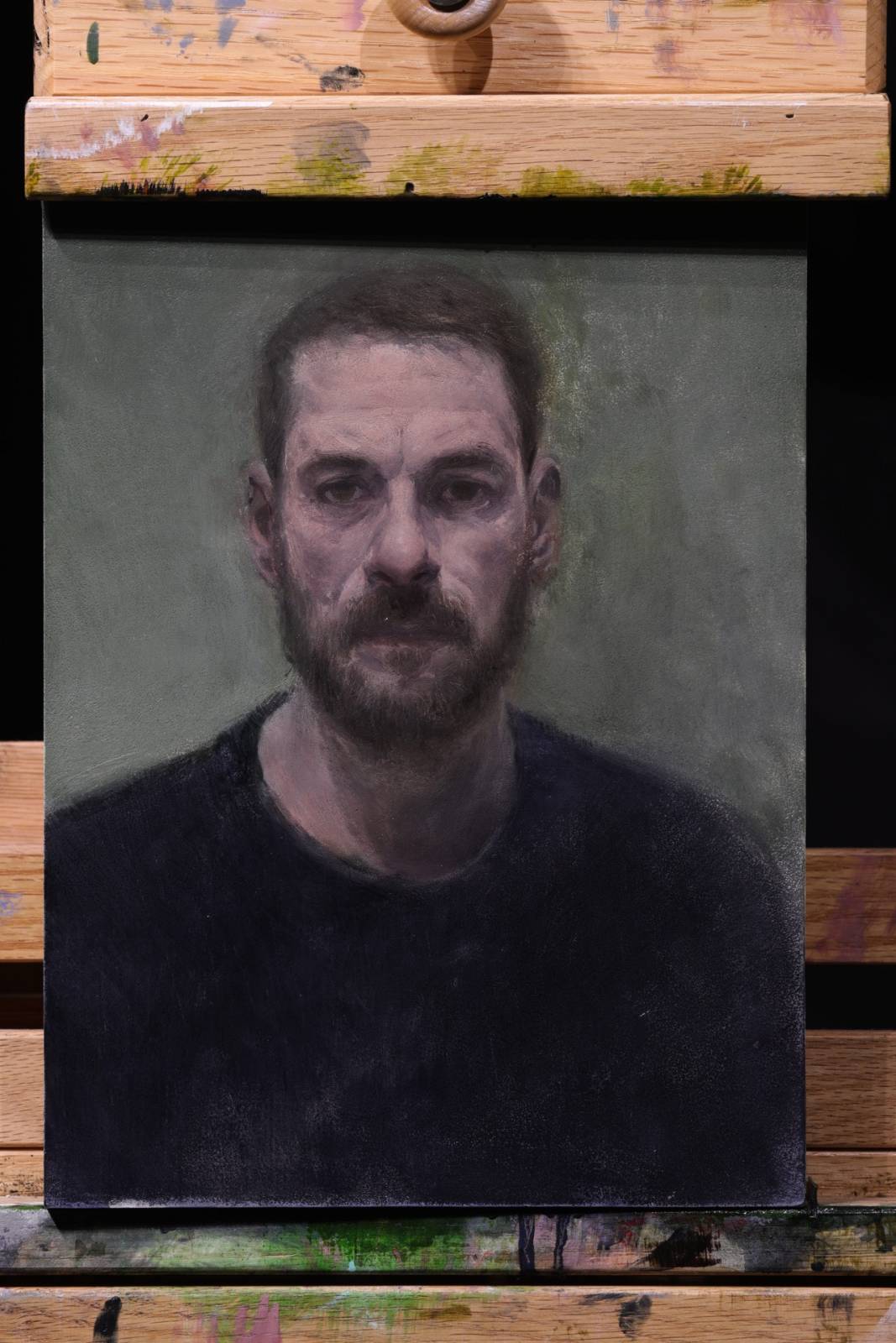
I was happy with the last painting, so I decided to try it again, only slightly larger, and working from life this time. I used my most convenient sitter (me).
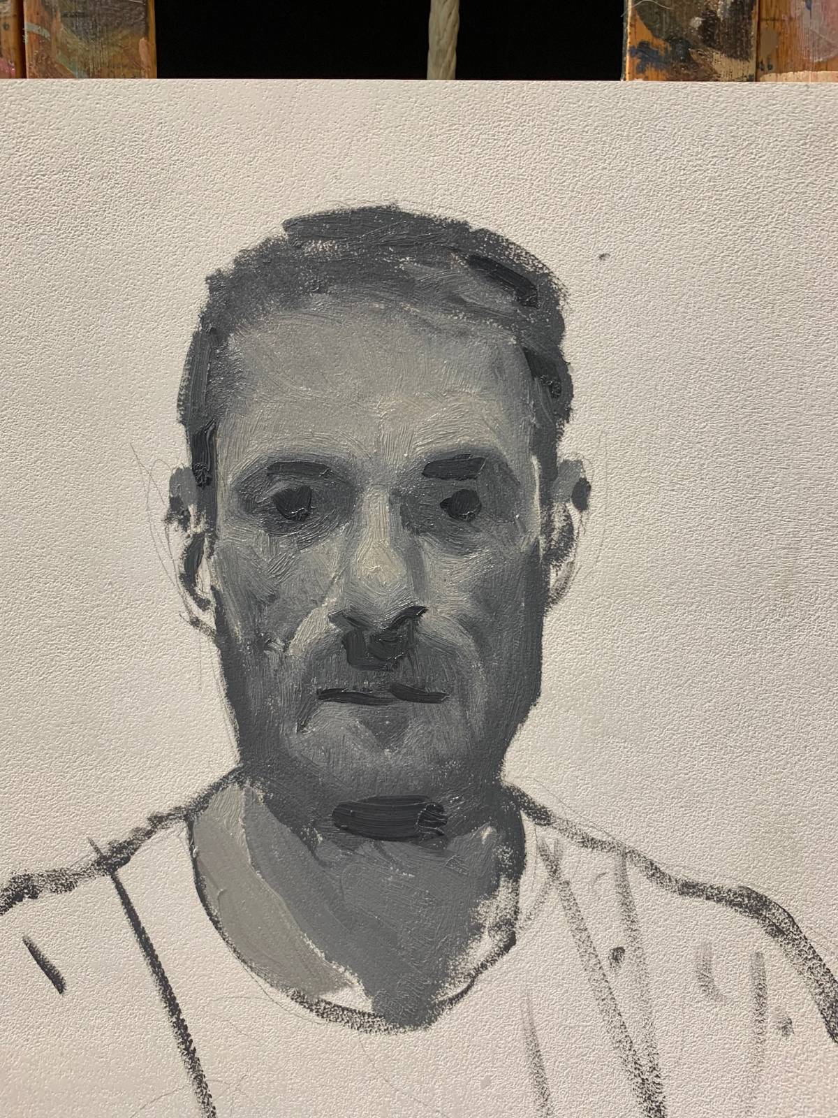
started directly, massing in shapes and values…
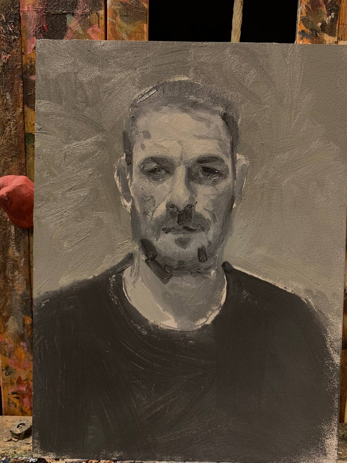
I try to keep things fun and push stuff around on self portraits a bit more than I might if I was painting someone else.
First pass things are still pretty contrasty and values are all over the place, but proportionally it feels generally in the ballpark.
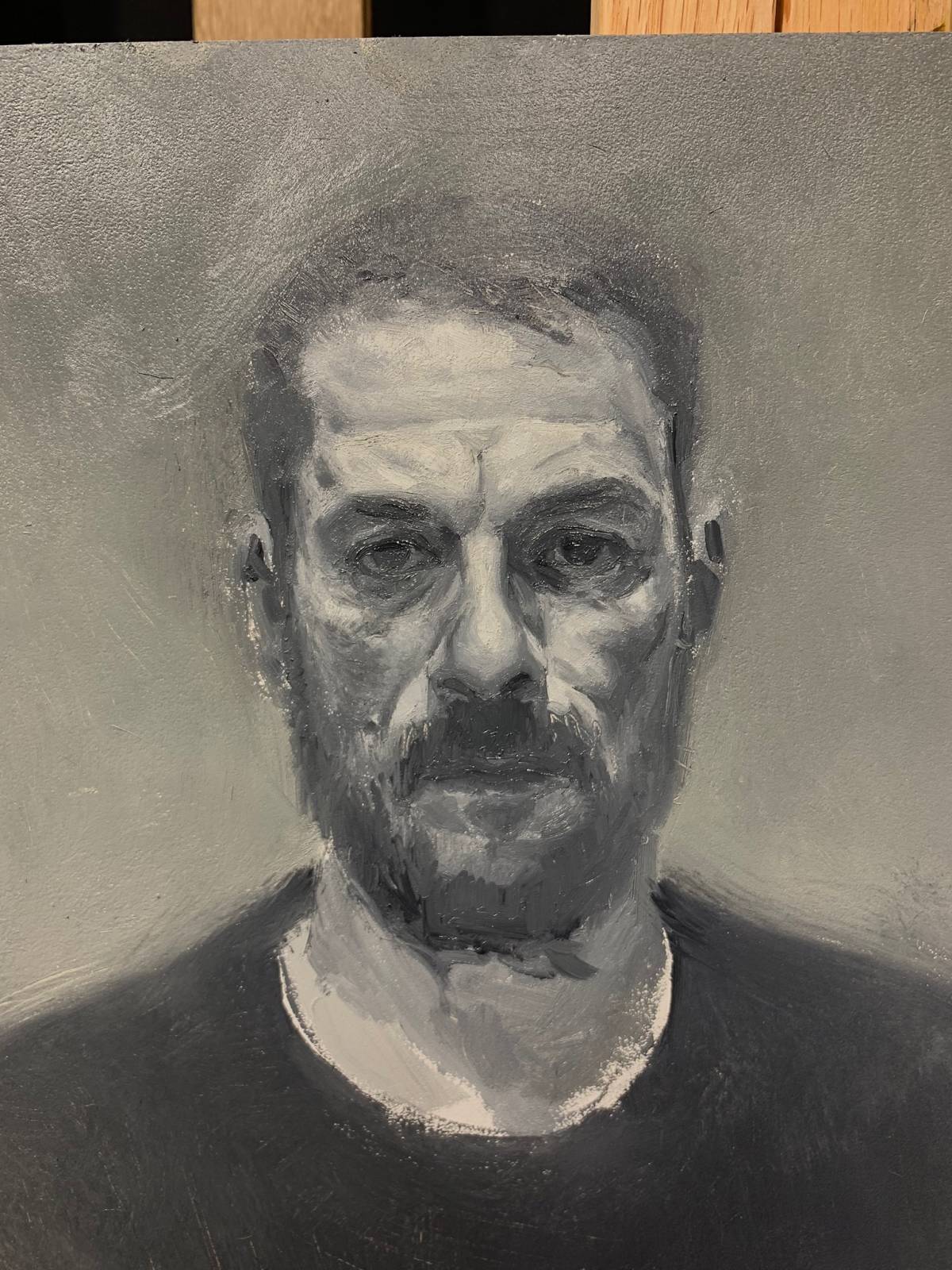
Once it dried, I hit it with some 600 grit sandpaper in order not to remove too much paint. Then I glazed some payne’s gray shadows in, and also applied a thin translucent layer of white in order to unify the skin values. I feel like this pass helped a lot to get it to a point where it was ready for some color
close up WIP
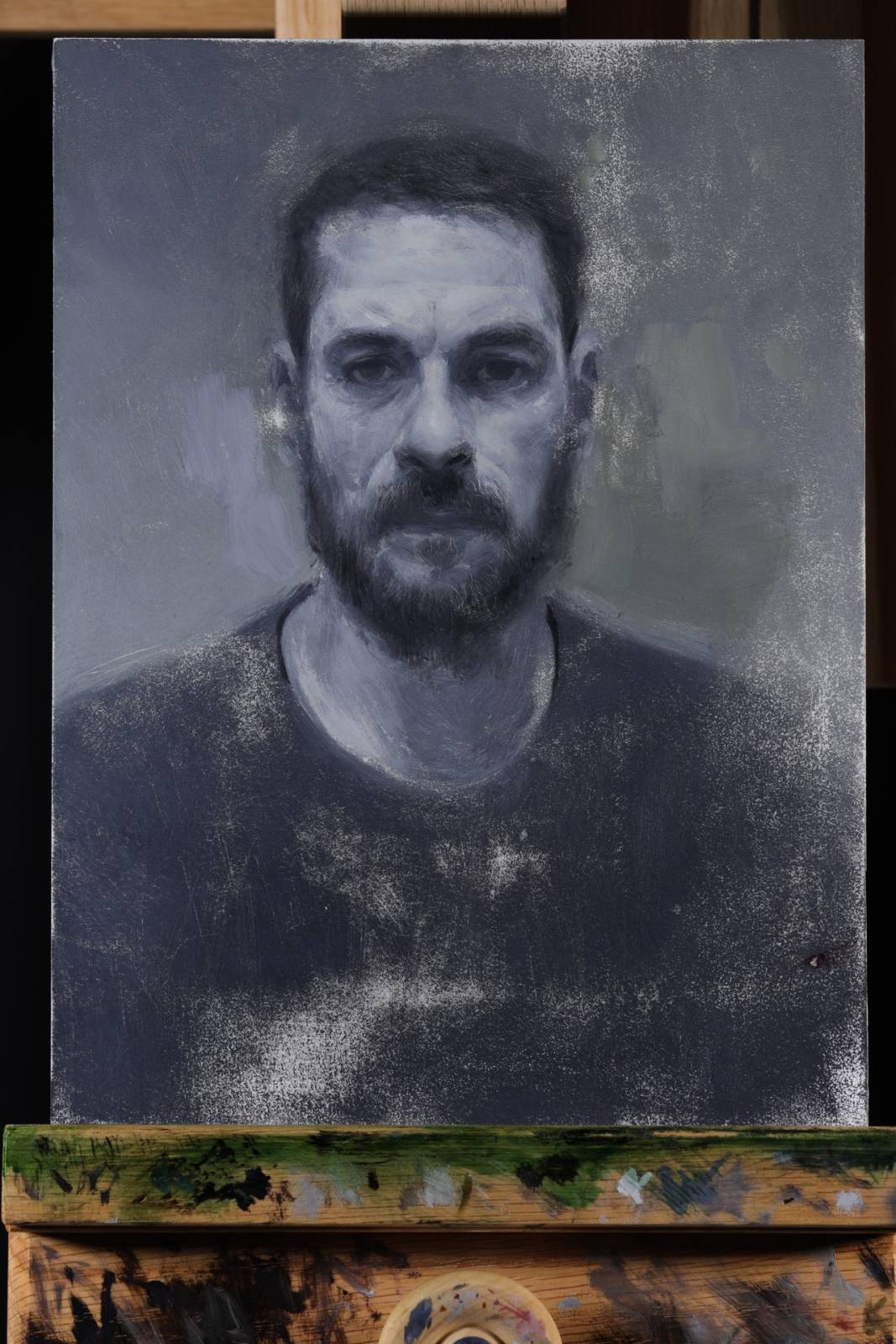
Started glazing with several light layers focusing mostly on local color
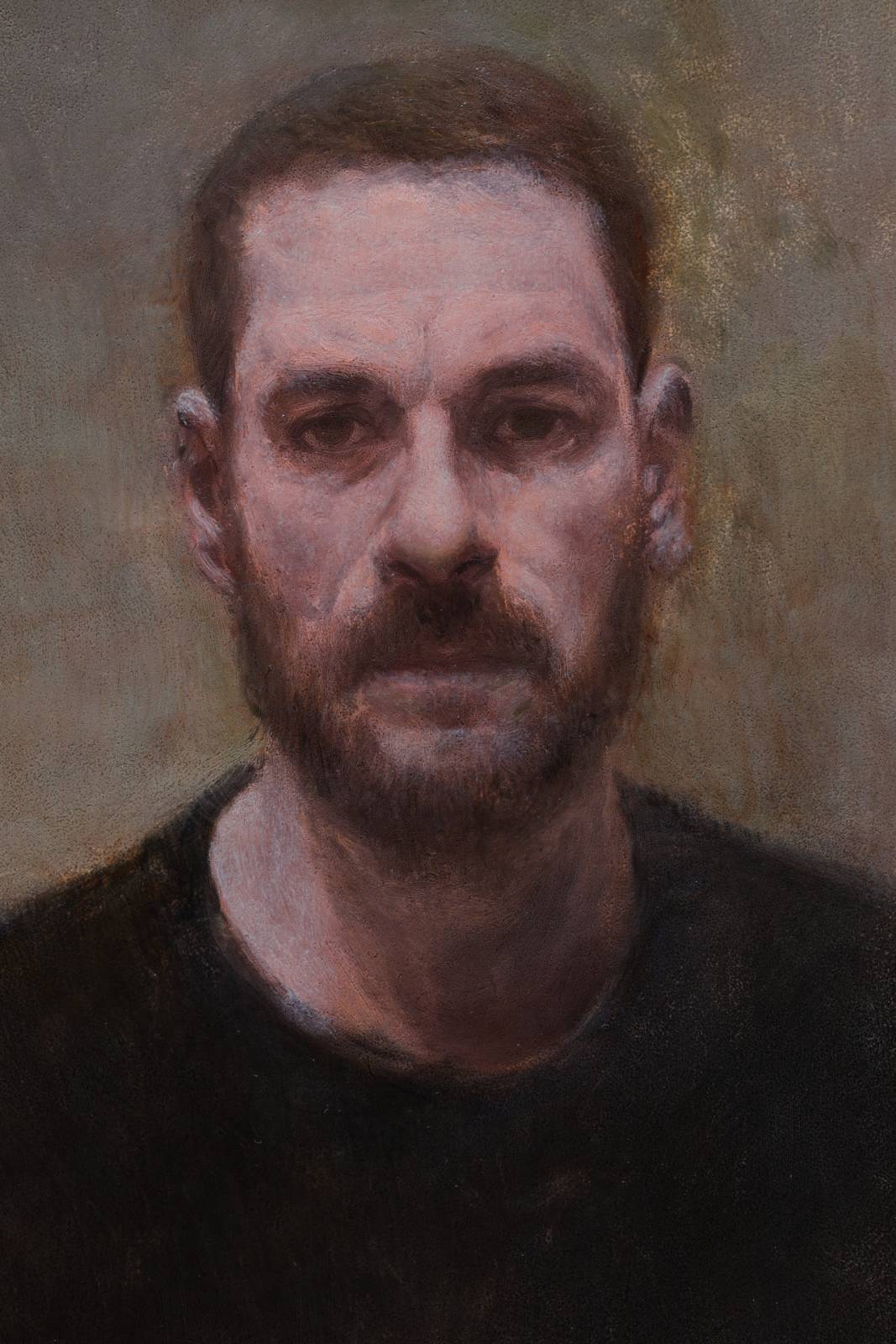
Then came back on top with a similar light blue to help add a little interference color on top of the local color
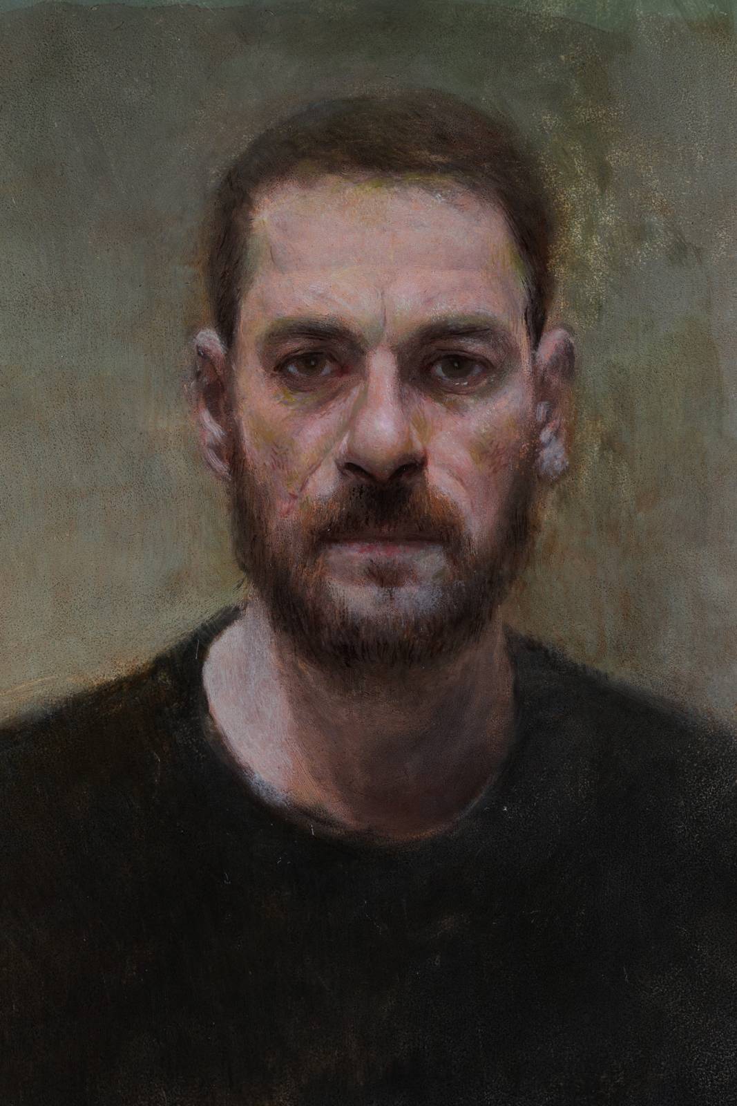
From here, I began laying in some opaque paint, adjusting the drawing and adding more subtle color notes

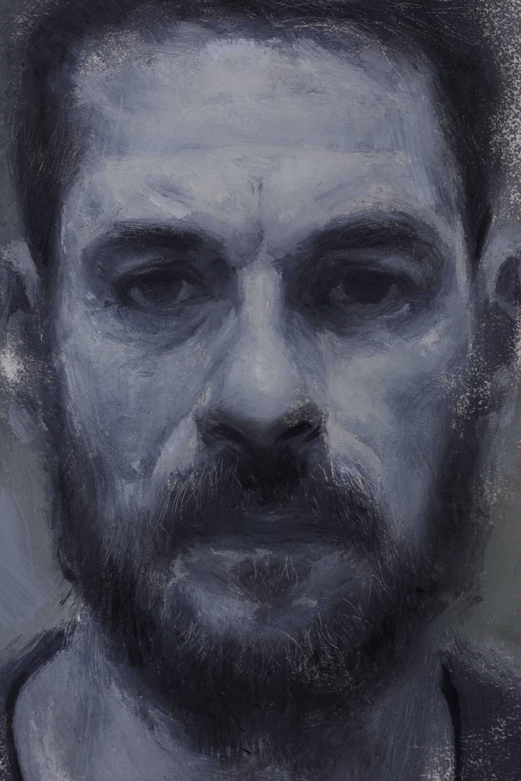
Came back in and glazed some more shadows in, to help restate the big shapes
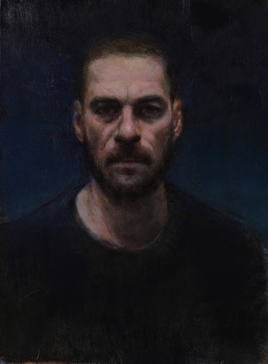
Last details, more glazing and added in a background…

By the end I think I probably overworked this one, but I’m okay with that. With self portraits especially I will push things further than I should because I feel less pressure to end up with a decent painting. Regardless of the outcome, it was a valuable exercise and I learned a lot from it.
After finishing these up, I’ve found myself encouraged to try some more elaborate efforts using this technique. (which I hopefully wont overwork next time :))
Thanks for sharing the process on these, dude. It’s cool to see the pushing and pulling and experimenting, and how rich the results are. Every level that you zoom in, there’s some new interesting detail too see. I had to do some major surgery on a piece recently, and sort of accidentally rediscovered how much fun it is to paint into a wet glaze. You really can get results with the layering and paint effects that you miss in direct painting!
hey Sid glad you liked the post. oil paint is nuts because it never ends…theres always something to be learned and a different way to approach a problem. funny how sometimes those emergency surgeries can lead to some breakthroughs! hope you’re doing well these days man…you gearing up for inktober i hope! 🙂
You know it. Got my Dr. Ph. Martin IV drip ready to go on the 1st.
So gorgeous Justin! Do you mind if I ask: When you’re glazing those local flesh tones onto your cool, monochromatic underpainting, are you mixing some white into your paint to get that pink, or is it purely transparent pigment?
thanks so much Sam! so the first 3-5 layers of color are all transparent. i use alizarin crimson, indian yellow, and paynes gray and find that the three mute each other out really well so you can get a great range of subtle colors with them. once the local colors are in, ill apply a super light glaze to the skin with white and some blue in it to help break up the pinks. it does this cool color vibration thing that i find to be really effective. thanks for commenting! always cool to hear from you.
You’ve got a very pretty daughter.
Thank you so much Justin! I’m obviously biased, but I think she’s just the cutest little thing ever! I predict she will eventually become sick of sitting for portraits haha
Nothing wrong with that sort of bias. I think your prediction of the future is one of the most accurate I’ve heard in a while. 🙂
Really beautiful stuff Justin! Very inspiring.
Great demo, I appreciate you sharing it. Wanted to ask about the what glazing medium you used or are you just using transparent colors? ?
Very interesting.
Very interesting technique, thank you so much for sharing.
Sorry this out of topic, but how did you photograph the painting without making any glare? Because dark painting get glare more easily.