These are the ten secrets of mixing color for oil painting that have been hidden away for centuries.
Deep within a cavern in Sienna, Italy, the original formulas for color mixing were rediscovered in 1928. Found in an obscure wooden chest, a thick leather-bound codex, written in the author’s secret hand, was finally deciphered.
Unfortunately, the archeologist who discovered it was poisoned on his circuitous route through Morocco, where the manuscript was stolen and later turned up in a dumpster in Queens.
pause
Oh, c’MON! There’s no codex. There’s no secret cabal guarding the mysteries of the Universal Code of Prismatic Color Ambulation.
F’cryin’ out loud, you guys, get over it. Sheesh!
So let’s break this thing open. No more color secrets, no specialized color tricks and methods. What you see below are mixtures that give you consistent results all the time. You modify from there. Plain and simple.
Oil painting is the easiest medium out there. Don’t complicate it. It will respond to exactly how you manipulate it, every single time. The only thing that affects it …is you.
Painting is not formulaic. Although, it can be. Color is not formulaic either. Although there are recipes that work well.
The color you observe and mix is the color your eye receives, your brain detects. In the end does it really matter how you got there? When learning, though, it does make a difference. That’s if…y’know…you want to spend less time failing and more time getting it nailed.
You’ll want to learn to be good at mixing color for two reasons.
1. if you want to capture reality
2. if you want to work creatively with color
And I think that just about covers it. Two.
Mixing is testing. Mixing is discovery…Mixing is memory.
Let’s look at the first problem most painters have with color: mixing mud. It’s easy to do. Ya just turn off your mind, swirl colors together hoping the colors themselves will coalesce into something lovely, and voila! Mud.
A lot of artists will “suddenly discover” the beauty of yellow and smear it straight from the tube onto the canvas, thinking they’ve convinced the audience they are making a brilliant color statement. They go on to discover more primary colors, (exactly two more) and create the same impression. They need to spend some time in the 5th level of mixing hell, where everything they squirt from a tube becomes Nightmare Mud. That’s called: training. Spending time in frustration will allow a painter to finally appreciate a good yellow.
The general idea of greying a bright color is fairly sound: mix its complement into it. Though, as mentioned in the last post this tends to deaden the color a bit, and that’s ok if you need a dullish contrast to a bright color next to it. This seems like a simple process, when staring at a color wheel. But mixing actual pigment gets a little stickier.
It’s because oil colors get specific, not generalized as “yellow” or “blue.” Yellow can be cadmium yellow deep and blue can be Prussian or Ultramarine. So if you ask yourself ‘what’s the complement of red?’ and your answer is ‘green,’ your next question is, ‘yeah, but which red and what green?’ (I’m titling all colors in the post in lower case. It’s less threatening that way.)
So, I’ve simplified some mixtures for you. They’re not meant as definitive mixtures for certain subjects by any means. They are guides to get you rolling. I think having a recipe to start with is fun. Try mixing them on your palette and your mind will ‘read into’ the color mixes and start to ‘see’ the subjects before you even paint something. Then you can modify those colors as you observe and learn. Sort of how you would use a recipe for your favorite cookie. Eventually you’re going to modify it to suit your needs…or your cooking genius.
There are no rules here other than the experience you gain from mixing and then making up your own rules and formulas. Remember, nature and reality or graphic imagery are the goals. If you get the result it shouldn’t matter how you got there. And yeeeees, that includes working from photos or your computer.
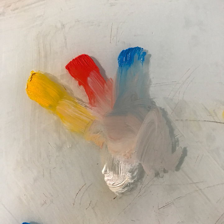
All of these mixtures below require some amount of white mixed with them. Start with the colors first, then mix in white slowly until you match the color you need. If you throw in too much white, increase one or both of the other colors to bring the white down. Go back and forth.
Mixing is testing. Mixing is discovery. You’ll remember combinations easily once you see how colors grey each other and how they effect and brighten each other. Mixing is memory.
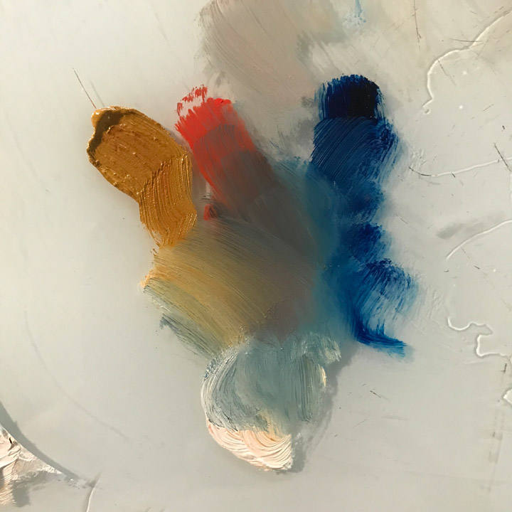
When mixing, you can pull your colors together. Look at the range you can achieve. They all affect each other.
The colors above, cadmium yellow medium, cadmium red medium, cerulean blue, make great cloud colors.
These colors, yellow ochre, cadmium red light, prussian blue, make great dried grasses or the side of a barn.
The smaller group of colors (below) is a very basic palette to start with. Some professionals still use the least amount of colors they can and achieve a huge range. Notice how these pull together for a range of greens. I mean, look at that! I did that in a few seconds. So can you. (I’m still convinced that the Impressionists came together because they looked at their palettes and said, “why can’t we use those colors? Those’re great!”)
Notice how you can ‘pull’ your colors together to find the right values and chroma.
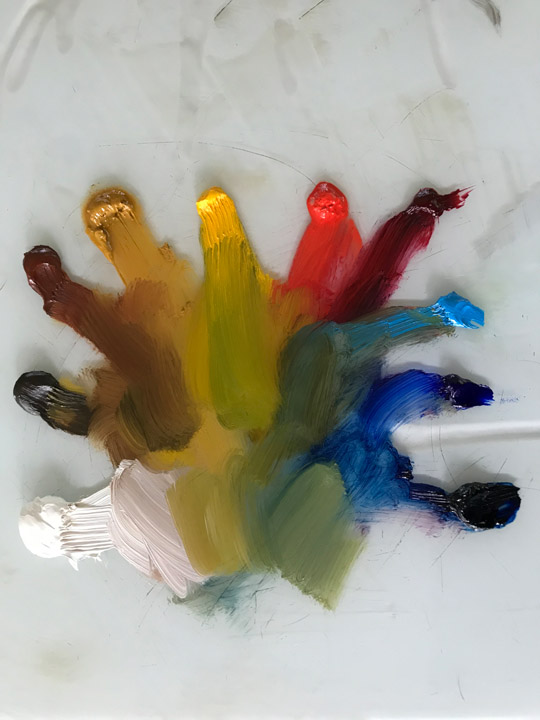
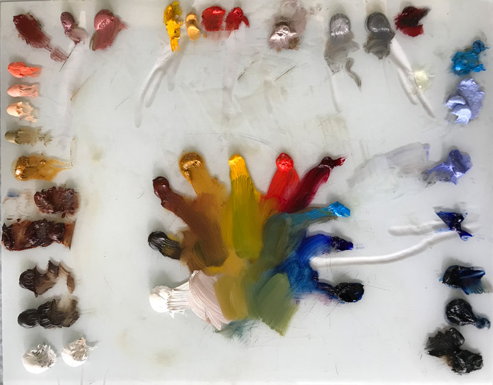
Next is a shot of my expanded palette. You can see the ‘extra’ colors I use. I lay them out in kind of a dirty rainbow around the edge. This is just the way I like to do it. You’ll eventually have your way.
New generations have their own things to say with their color, their ideas, their pictures.
Going clockwise from bottom left: titanium white, raw umber, burnt umber, transparent earth red, burnt sienna, yellow ochre, monochrome tint warm, juane brilliant, naples yellow reddish extra, coral red, indian red, rose grey, deep rosace, cadmium yellow medium, naples yellow, cadmium red light, cadmium red medium, portland greys, alizarin crimson, cerulean blue, blue mixture, violet grey, ultramarine blue, prussian blue, payne’s grey, ivory black.
And should you discover The Ultimate Way To Set Up And Use A Palette of Colors, or you happen to discover The Unified Theory of Correct Colors To Use On Your Palette, well then, by gum…I’ll be happy for you.
What I haven’t shown here is how to layer colors from these mixes. Ooo, that’s where it gets complicated. (Maybe that’s another post.) For example, mixing duller cloud colors to put down first, and then brighter cloud whites, from the same set of colors, to lay on top.
LANDSCAPE
sky & clouds:
cerulean blue, cadmium red light, cad yellow medium
cerulean blue, indian red, yellow ochre
cool grey sky:
cerulean blue, cadmium red medium
paynes’s grey, burnt sienna
warm grey sky:
cerulean blue, cadmium red light, yellow ochre
dark grey sky:
ultramarine blue, indian red
blue skies: (some folks use a straight cerulean blue, but I think your skies will look much better with a second or third color mixed in. Then you must work it so it gets lighter as it comes down to the horizon in your piece.)
ultramarine gradated through cerulean to cerulean mixed with alizarin crimson on the horizon.
moonlight:
ultramarine blue, burnt sienna
ultramarine blue, rose madder, viridian
smoke:
cerulean, or ultramarine, or cobalt blue, burnt sienna
distances:
cerulean blue, alizarin crimson
ultramarine blue, rose madder
foliage:
viridian green, alizarin crimson, cadmium yellow medium
viridian green, cadmium yellow medium
viridian green, raw sienna
ultramarine blue, cadmium yellow medium
grasses:
viridian green, yellow ochre, cadmium yellow medium
prussian blue, cadmium red light, yellow ochre
viridian, yellow ochre, alizarin crimson
raw sienna, ultramarine blue
tree trunks:
viridian green, indian red
burnt umber, cerulean blue
indian red, ultramarine
roads & paths:
yellow ochre, cadmium red light
burnt umber, cerulean, viridian
paynes grey, burnt sienna
brick bldgs:
cadmium red light, burnt umber
stone work:
brunt umber, ultramarine blue
raw umber, ivory black
stormy waves:
cerulean blue, raw umber
prussian blue, raw umber
large waves:
viridian, ultramarine blue
(more green when closer to shore)
trough of waves:
viridian, alizarin crimson
FIGURES
skin tones:
Some companies still label color as ‘flesh,’ but this is changing, as it should. The old mixture is close to yellow ochre, cadmium red light, and white. That’s an easy mix to remember, or you can get a tube of juane brilliant and add to it. Look at how many tones I get from one general color mixed with other colors.
In fact, you can do this for every color. (Well, duh.)
You can use the basic color mixture above to get general light skin, and you can add to that same mix for darker skin tones by mixing umbers, sienna, or earth colors into it. Then you can modify any tone to change the skin temperature with other warm and cool colors. It may not be easy at first, but it is simple. Just takes a light touch.
darker shades:
raw sienna, indian red
raw umber, yellow ochre, cadmium red medium
transparent earth red, raw umber, burnt sienna
lighter shades:
yellow ochre, cadmium red medium, cadmium yellow medium
rose madder, yellow ochre
indian red, raw sienna
vermillion, yellow ochre

Look how many different colors I can get from starting with a typical tube of juane brilliant and adding…alizarin crimson for some pinkish skin; yellow ochre or cadmium red light for warmer skin; any touch of blue to cool it down or indicate veins; green to cool it down as well or create ‘olive’ tones. Browns easily mix into this as well for dark tones and shadows. And of course white is mixed with all of them to adjust for values.
lips:
men: burnt sienna, alizarin crimson
women: burnt sienna, alizarin crimson, cadmium red medium or light
eyes:
white of the eyes: cerulean blue, cadmium red light, yellow ochre
strong shadows:
indian red, raw umber(raw umber is wonderful for deep shadows on light skin; burnt umber for shadows on dark skin)
hair:
burnt umber, raw sienna
indian red, ultramarine
yellow ochre, raw umber
OTHER OBJECTS
swords:
paynes grey, burnt sienna
ultramarine blue, transparent earth red
leather belts:
burnt sienna, raw umber
transparent earth red, raw umber
(add reflections last: cerulean blue or prussian blue and sometimes add burnt sienna)
……….
Mixing Examples
The mixtures called out in the paintings are linked to the numbers below, which are in the basic sequence I used to paint the dang things, moving from dark to light, and sometimes back to dark again at the finish.
The list only contains what colors were used, not the amount of each. White is added in various amounts (don’t go crazy) for nearly all of them. I figure you’ll know how much by test-mixing them. If you get close enough to the colors pointed out, you basically have it, and can adjust from there.
If they’re slightly ‘off,’ mix other colors to adjust and get closer. You’ll see that your mixtures will eventually become your own.
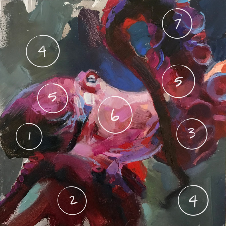
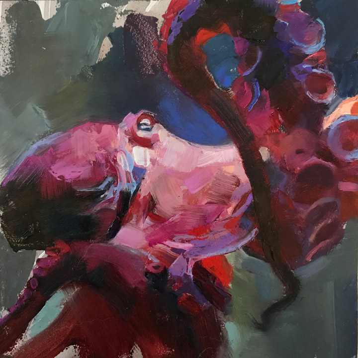
The Octopus
1. prussian blue, paynes grey, transparent earth red. (See note below about mixing blacks.)
2. alizarin crimson, cadmium red medium, touch of cadmium red light
3. alizarin crimson, cadmium red medium, touch of cadmium red light, cerulean blue
4. turkey umber, cadmium yellow, ultramarine blue, cerulean, raw umber
5. cadmium red light, violet, alizarin crimson, touch of yellow ochre
6. flesh or juane brilliant, coral red, violet, alizarin crimson, touch of yellow ochre
7. ultramarine blue, prussian blue, burnt umber, violet grey, cerulean
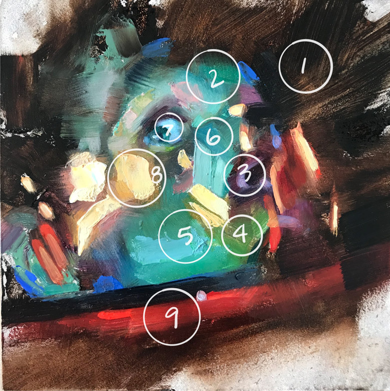
Bowman: Mind Blown
1. paynes grey, transparent earth red
2. ultramarine blue, yellow ochre, cadmium yellow medium, cerulean blue
3. alizarin crimson, paynes grey, cerulean blue, violet grey
4. ultramarine blue or cerulean, cadmium yellow medium, or any green mixed with a yellow
5. cerulean blue, cadmium yellow medium, prussian blue
6. prussian blue, cerulean blue, yellow ochre
7. prussian blue, cerulean blue, violet grey
8. yellow ochre, cadmium yellow medium, juane brilliant
9. alizarin crimson, cadmium red light, transparent earth red
Mixing Blacks
You can mix your own black from all the intense colors, two or three together. Ultramarine blue and alizarin crimson full strength makes a nice black color….now add some transparent earth red…wow! Beautiful. Now…try some white into that mixture for a gorgeous grey color. You can do this with any other color you like and study the grey or muddy colors you get when you add white back into that dark mixture. Makes me want to chew on my palette….
Overall
When you have a gentle but curious approach to mixing color, anything you mix gives you ideas, chills, and insight. Just imagine yourself as the color explorer. You’ll find the treasure if you slow down, try some mixtures, and then….long study.
My point is to take the stigma off this idea that color is complicated, troublesome, hard, too scientific, or beyond your understanding. When humans began exploring with color and making color statements in some of the art movements, what followed right behind it was the idea that to master color you must be some genius that knows all the right theories and mixtures and balances. This is just flat-out false.
Color is experiential.
In fine art, the myth of color complexity has grown over the past one hundred years. It was natural to get to this point, after all, as we were bound to come to it eventually. We tend to discover things and then develop theories about how they work. Experience first, study next, right?
It can become nonsense as we try to one-up the other’s knowledge and try to gain attention for how ‘amazing’ we are to be mixing color in the first place. We are a competitive species, but we shine when we share.
The younger generation today doesn’t have to suffer through this next phase of expressing their artistic visions. It had been explored and trampled over even before I got into the business. But we break new ground constantly, going forward. New generations have their own things to say with their color, their ideas, their pictures.
When challenged about his oil painting methods, Norman Rockwell once said, “Let the next generation paint their own pictures.” Or something to that effect. I’ve taken a lot from this idea. It allows us all to live in our time and not worry about whether we “get it right” but whether we do it at all.
If you don’t like your color methods, then your mission is set for you: stop, slow down and study someone else’s methods to get you back on track toward your own approach or evaluation.
But that’s the case for all learning: stop, shut up, empty your cup, quiet your brain, breathe deeply, relax, observe, research, move forward.
Want more information? There’s a ton out there. Everybody has a method, and doesn’t that make sense? My favorite: pick up James Gurney’s book on color, Color and Light: A Guide for the Realist Painter. That’ll get you fired up, too.
Now, go paint something. And do me a favor? Get rid of that ‘tortured artist’ approach as fast as you can. It’s boring.
Just so you know, The Codex of Color is still missing since taken from that dumpster. If you happen to find it, it’s worth about fifty cents. Y’know, in today’s dollars.

You’re my favorite person.
LOL! How do you mean, David?
I don’t know. You paint good, seem pretty chill and say things like “Makes me want to chew on my palette….”
This post….is the treasure map. Thanks Greg.
We will be in touch.
Soon.
Thank you for this amazing wealth of knowledge Greg, although I paint with acrylic for time restraints, I still try to keep my method of mixing colors & painting as if they are oil paints! 🙂
I am goin to read and re-read this, but my immediate takeaway is to start playing with your ‘sword’ palettes’ as I have a helmet that I made the most boring grey! ?. So it’ll be fun to play with those immediately and then really dig in! Thanks!
This was actually really interesting to read/try out — I have your above mentioned palette approximated in digital (Photoshop) swatches, so I was able to take each color recipe, then mix with a mixer brush and try to get the same results. It actually worked surprisingly well! (And was a heck of a lot more fun than just using a color picker!) Definitely saved this page to my favorites for future reference/experimentation!
You’re awesome
First of all, thanks for this post! I’ve worked with several limited palettes before and I’m attempting to expand my capabilities. I had never heard of monochrome tint warm, or juane brilliant before. There are 4 different categories of juane brilliant produced by holbein (and I can’t tell from your palette which one you use). There are 2 yellows and 2 pinks of juane brilliant. Is the one you typically use more yellow or more pink?
Thanks.
Without looking at their line of colors, I think the one I use is more yellow, Matt.
Love the humor in this piece — and the honesty. There really aren’t any hidden secrets, just observation and experience. I’ve noticed the same thing in 3D design and printing color, texture, and lighting all come down to how you see and apply them.