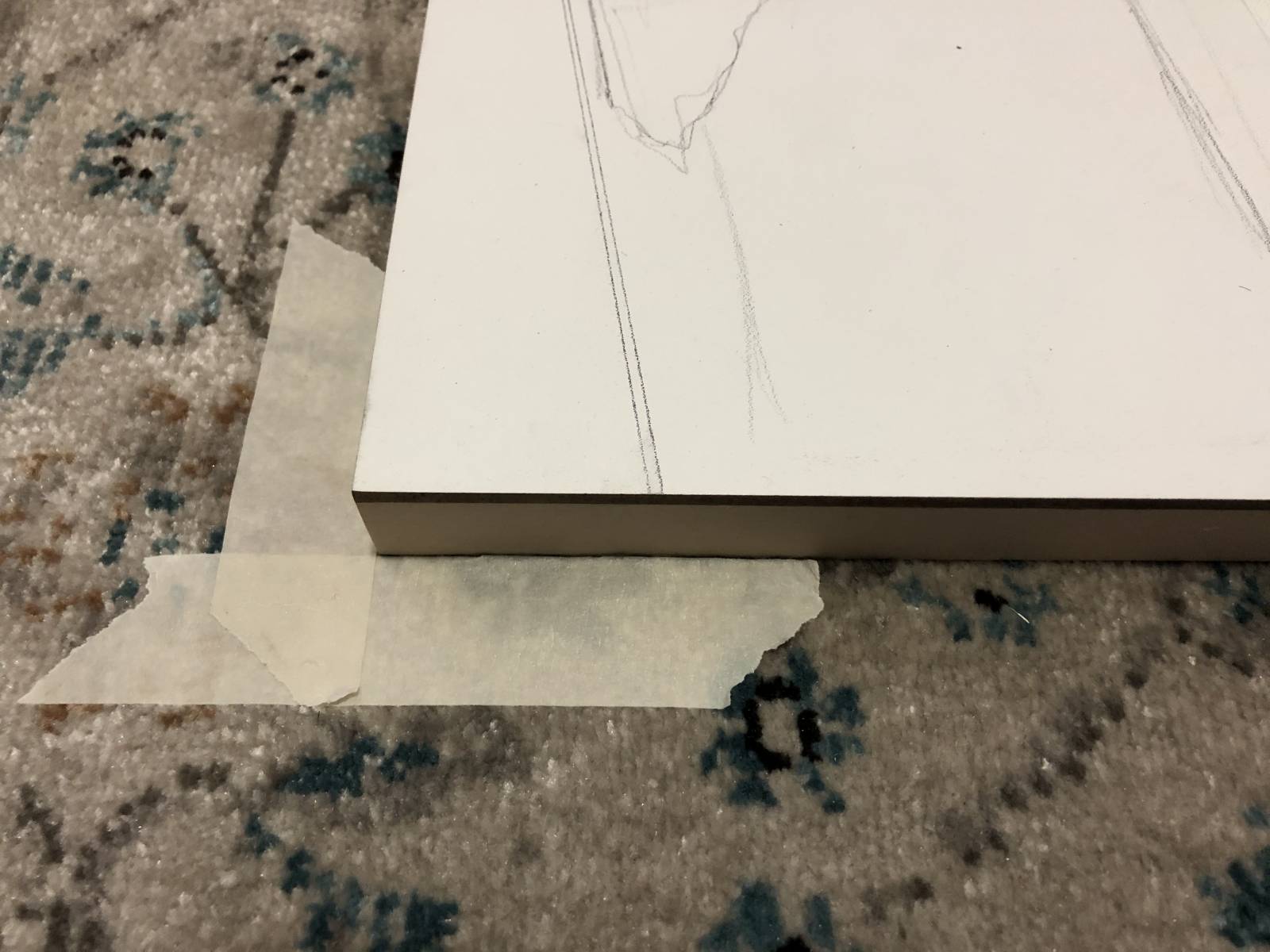
In order to explain aspects of this piece, I’m going to break from the norm and provide a peek of the painting in progress in order to show you a pattern.
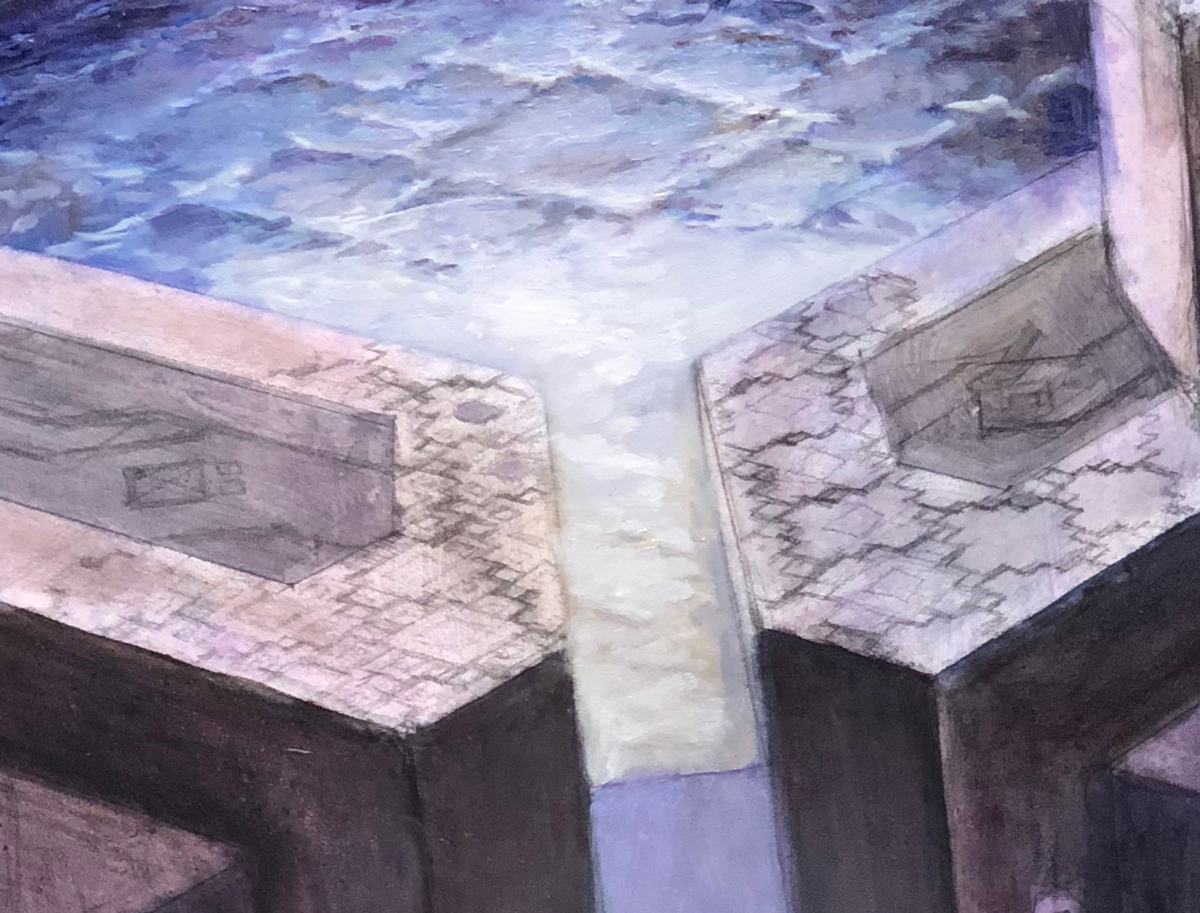 The pattern in question is done roughly in pencil directly to the left and right of the whitish rectangle at middle (though the pattern at left is a bit more fleshed out than that on the right). Out of necessity for the image, I’ve drawn the repeating pattern in perspective, but laid flat it’s a riff on squares, squares within squares, and rectangles. Why show this to you first? Well, the pattern is kind of key to the image—not only from a design standpoint, but also from a conceptual one. The central “gag” of the image literally depends on and references this pattern. So, with that out of the way, I hope that some of my thinking in the early stages of this assignment will be a bit clearer.
Now, on to the assignment…
The image I was asked to paint a pool of water whose surface was rippling in some semblance of the aforementioned pattern, which is specific to Magic’s plane of Zendikar, which has lots of floating bits of geography. This geometric pattern pervades certain locations within Zendikar (at least as I understand it), affecting the shape of architectural forms and even covering the floors, walls and ceilings in some form or another.
The central concept of this piece was that the very nature of the pattern is so pervasive that it not only affects the structures, but also the very water of this pool itself, and so I’d have to find a way to sell water rippling in a seemingly artificial way.
Despite being a landscape, the piece was mostly going to comprise of architecture—some of which was floating and at odd angles. Normally, architecture gives me a bit of a headache, but this time I was really interested in the challenge because the overall quality of said architecture was quite a bit more abstract than anything I’ve done before. I knew it was going to be difficult at times, but I figured it might be rewarding in the long run. And so I dug into sketches with a good deal of excitement.
I knew I wanted to go for something a bit moody and that became a consistent aspect of all of the sketches. I like the idea of the staircase of architectural chunks leading into the pool, but the rest of this one feels…bland.

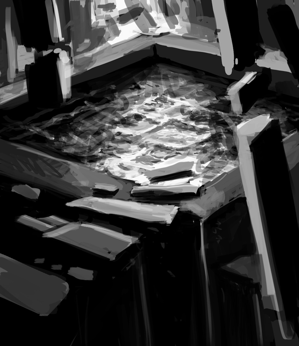
These are all quick and dirty, and they’re mostly about exploring the shapes and seeing what works. I really like aspects of this one—the idea of a spotlight coming down on the water and then having everything else fade into darkness. I don’t like that chunk of floating column on the left and I think the piece could have benefited from small bits of architecture floating in the spotlight, catching glints and casting shadows. But I didn’t do that, and this version was rightfully passed over.
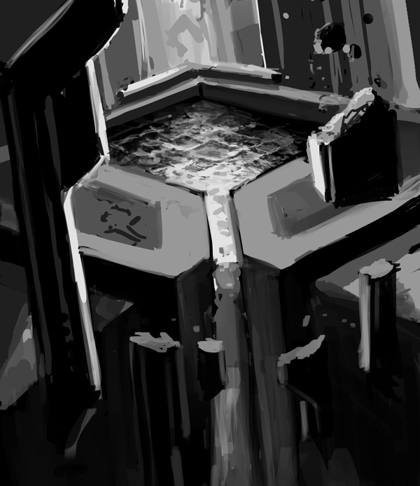
This one feels more together than the others. It’s not quite as dark and moody as the others, but it still allowed me a chance to do some interesting things with the light.
In the end, the fine folks at Wizards liked that last sketch and asked for some tweaks. The card itself needed both an island and a swamp influence. While it was felt I was getting the island influence in there, there clearly wasn’t enough swampy, muddy gunk to sell that aspect of the piece. And so I did some quick changes and resubmitted.
This was approved with a suggestion that I push the swampiness even further and so off to paint I went. Well, not really.
Because this required architecture in perspective, I needed to kind of draw it out. While I did project the image above onto my surface, it was only very lightly indicated so I could get the placement and proportions correct. The perspective was worked out based on that sketch and then used to clean the whole image up and make it more “correct.”
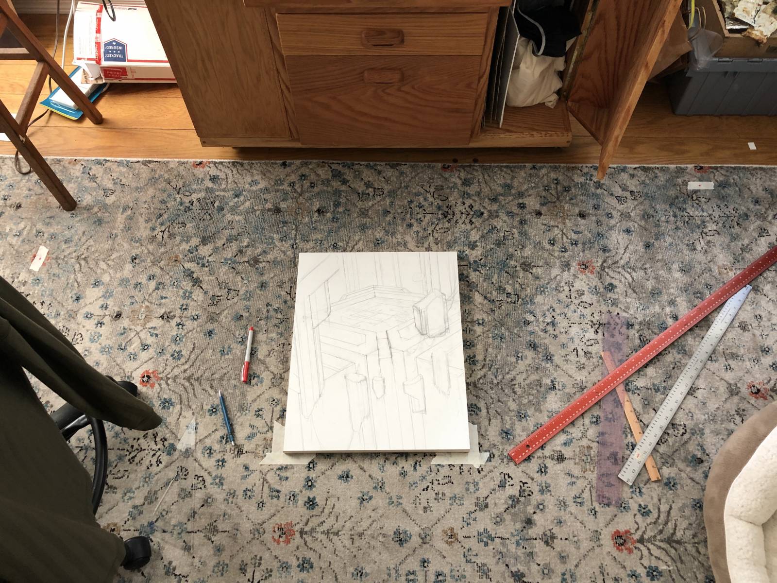
This was my setup on the floor while doing my final drawing. The floor was basically the only place I had enough room to nail down the perspective. And so I figured it all out with a bunch of tape, some red Sharpie and a yard stick.
As I wasn’t sure whether I’d need to reestablish the perspective at any point during the painting process, I marked the edges of where the piece was on the floor with tape and kept my vanishing points taped down until I completed the piece. I ended up not needing any of it again, but if I had, I wouldn’t have needed to recreate the setup and I’d have saved myself a good deal of frustration.
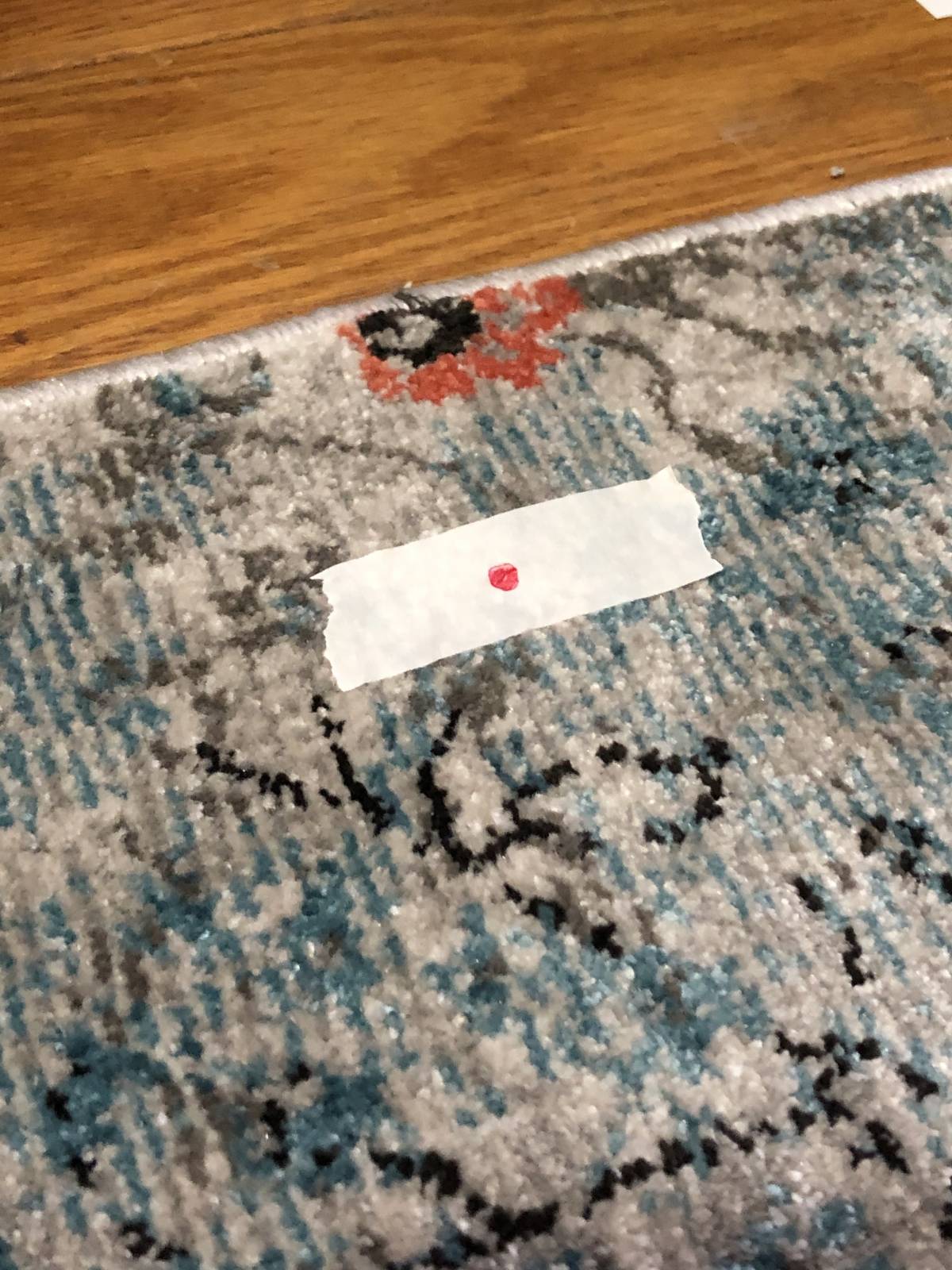
Behold my mighty vanishing point!
All that line work eventually resulted in this drawing: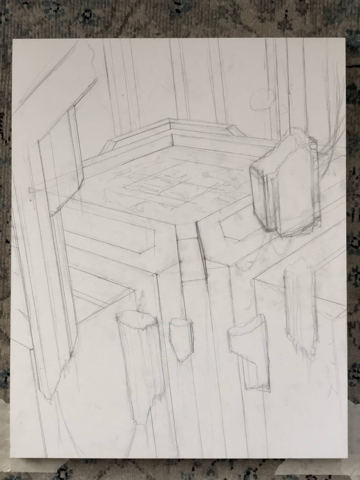 Keen eyes will note that the water level on this final drawing differs from that done in my sketch above. Originally, I thought it would be interesting to indicate that the camera wasn’t actually at an angle by making the water level with the viewer’s eyes, thus revealing that all of the architecture was at an angle. However, it never quite worked for me. For one, it kind of didn’t feel like it was on purpose, and second, it made the waterfall—which would flow vertically—look really wrong. It’s possible that if I had skewed the architecture further that the idea might have worked better, but I think it’s probably something that I’d have fought no matter what. Regardless, I decided to make the water level consistent with the angle of the architecture.
With that, I started to throw some paint down.
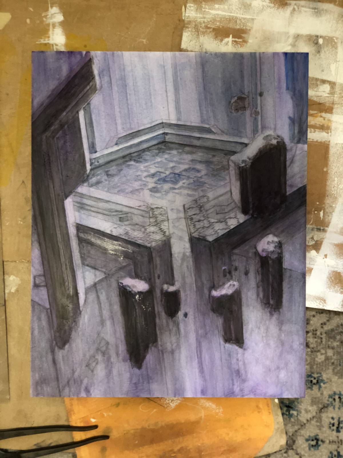
This is after some quick acrylic washes I used to lock the drawing in place and to start establishing some values. It’s shortly before doing this that I began to draw out the pattern. I’m not sure why I didn’t do that part when I was working out the perspective, but I didn’t. So rather than nailing it down right and then being in a position where I could have thinly glazed oil paint over top and allowed the drawing to do all the work, I ended up having to correct the drawing in opaque paint and with tiny brushes.
With the acrylic down, I started in oil.
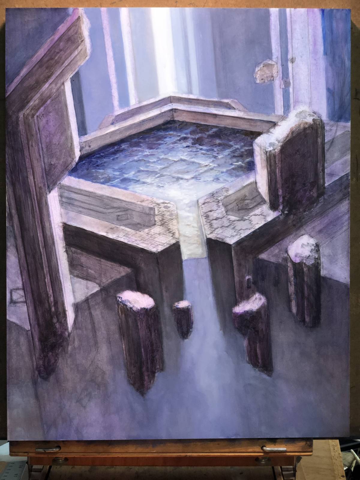
This is the first pass, mostly for the sake of reinforcing my values, but also to start figuring out the water. I was a bit nervous about selling that bit, but I got off to a better start than I expected.
A second note about the water. While the notion of square waves seems unnatural and outlandish, Mother Nature once again became a valuable resource. The very real phenomenon called “cross sea,” (but sometimes known as “squared sea” or “square waves”) is well documented and there are some excellent images of it out there in all kinds of lighting conditions. Not surprisingly, that helped a lot.
As an aside, should you see this phenomenon in person, you should probably skip swimming—square waves can indicate some really dangerous waters.
Anyway, I kept painting…
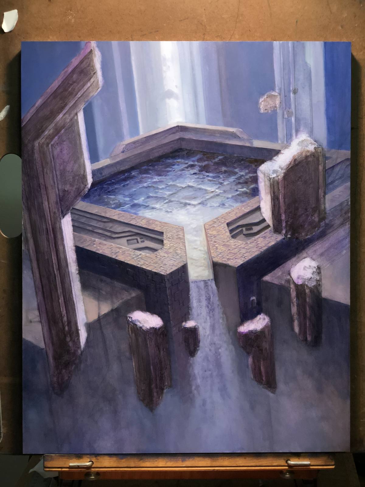
By this point, I started to tackle the pattern. Oh boy was that a challenge. My primary difficulty with it was that I kept getting lost in the pattern. It’s not a difficult pattern to figure out, but it can be visually confusing at times, so remembering where in the pattern I actually was at any point could be frustrating, and I found myself constantly needing to reorient. That I was applying the pattern in perspective and often in strange angles, really increased the level of focus required.

With each pass, I’m figuring more and more of the piece out and at this point I’m finally introducing some of the greenery and swampiness. Unfortunately, this meant covering up some of the pattern that I’d worked so hard on, but this way the pattern is contiguous wherever it peeks out.
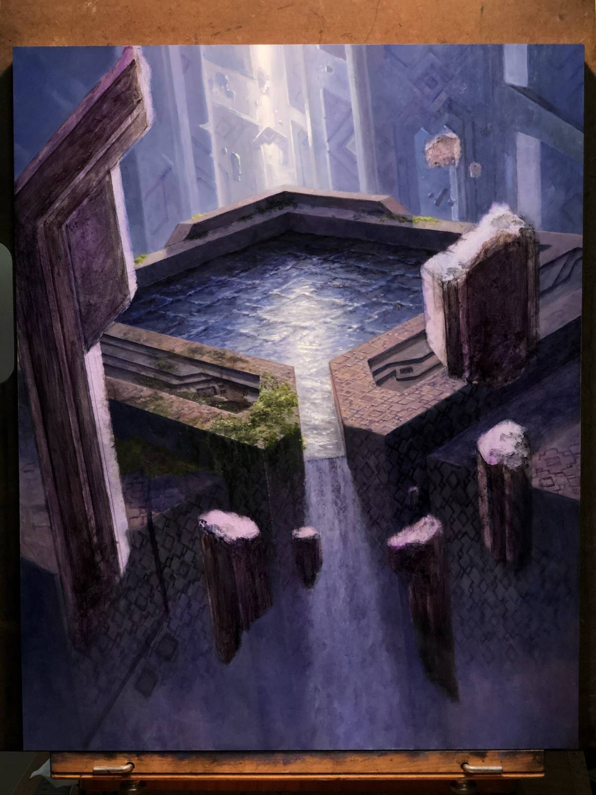
Closer…
And closer…

And closer still…
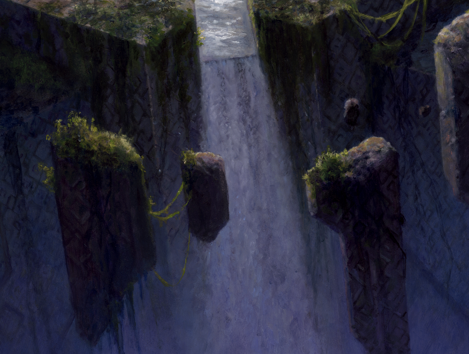
And finally this:
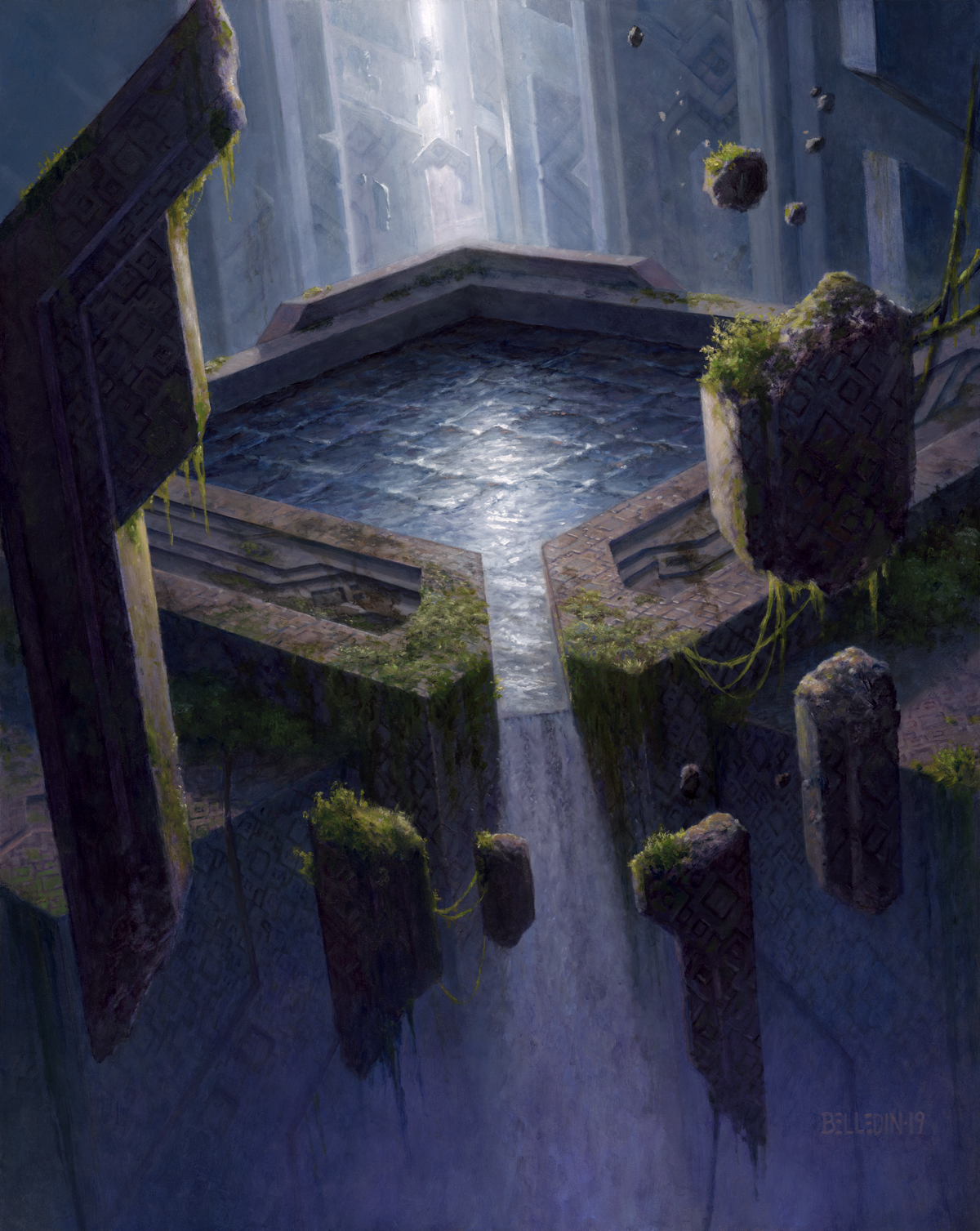
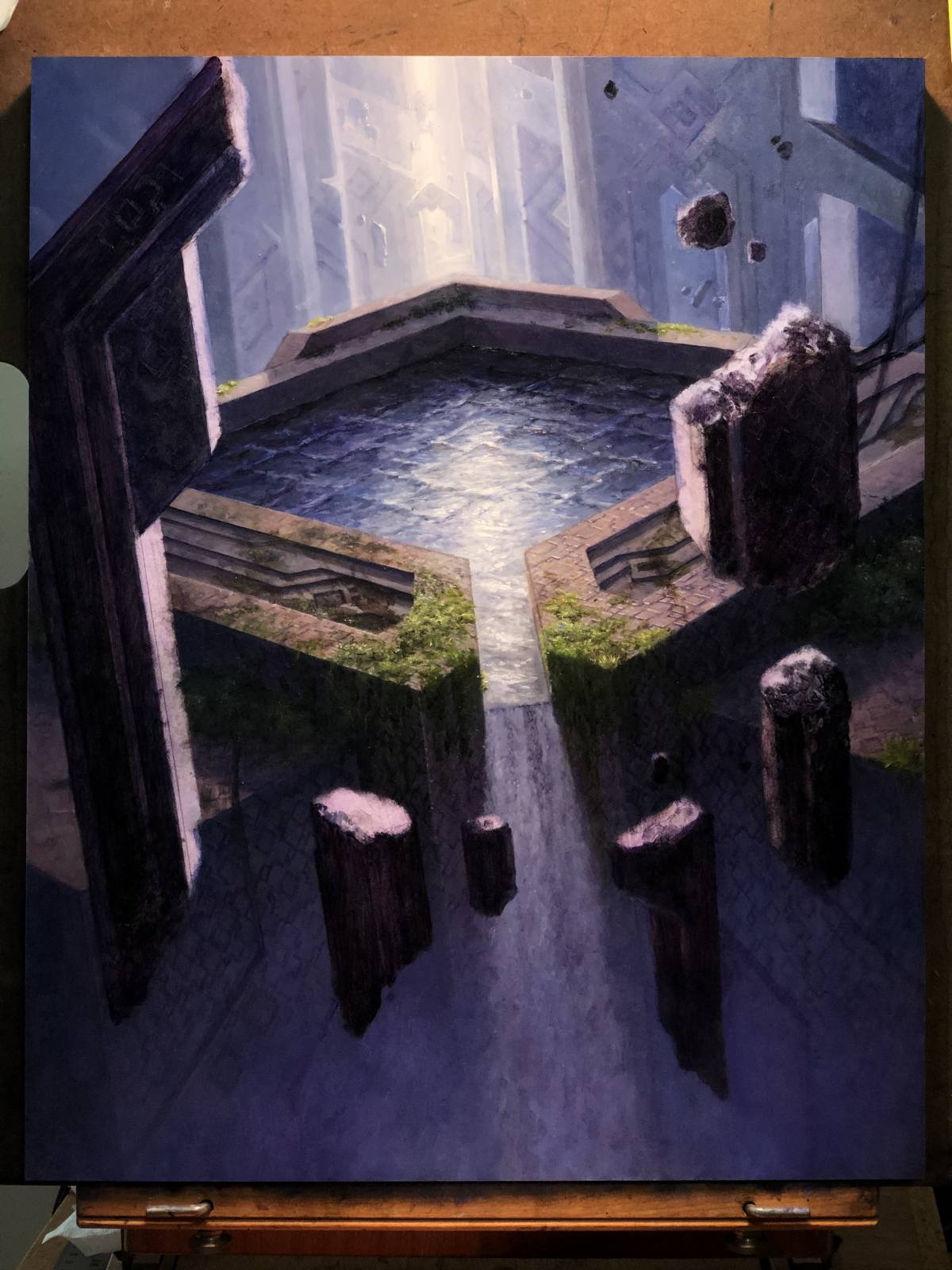
The final is sixteen inches across by twenty inches tall and was art directed by Taylor Ingvarsson.
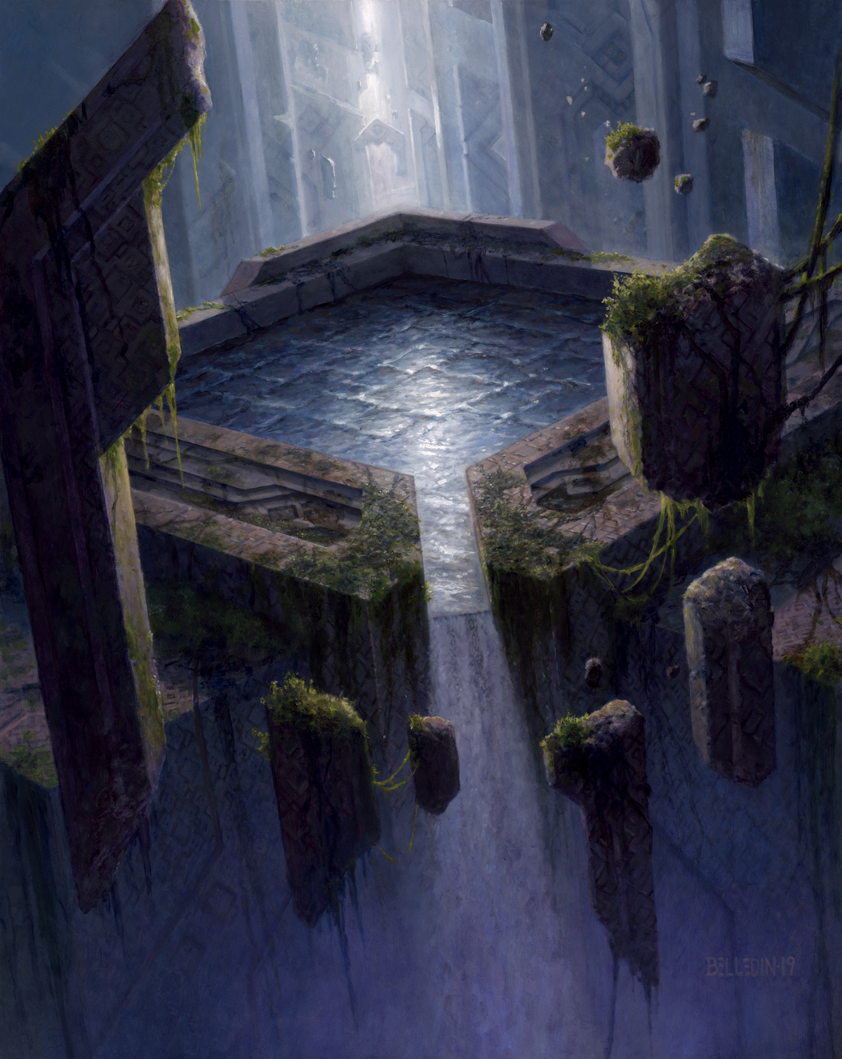
Except this isn’t the final. It’s close. But it needed a little extra push. It was felt that the piece wasn’t quite swampy enough, and so I was asked to push that a smidge further.
And that’s how we got here:
The final is still sixteen inches wide by twenty inches tall. Oh, and did I mention it’s oil on cradled gesso board?
The changes that brought us to the final are pretty subtle. But if you look closely, it’s murkier, muddier, and a bit more dour. Whether one could tell the difference at card size is a beyond me, honestly. Regardless, the client wants what the client wants. And so I that’s what I gave them.
None of that matters to me, though. I like the piece and I’m happy with it. It provided a lot of noodly irritations along the way, but I think it was all worthwhile. And that’s not something I always feel—certainly not immediately after completing a piece. But in this case, I liked it as soon as I signed it, and that hasn’t changed at all since.
Personally, it doesn’t get much better than those occasions I’m able to make both my client and myself happy in a single piece. Don’t get me wrong, my goal at the outset of any given assignment is to make something that pleases the client, but is also something I would be proud to hang on my own wall at home. That…doesn’t always work out for one reason or another. But it’s always something I reach for, and sometimes I’m lucky enough to pull it off.
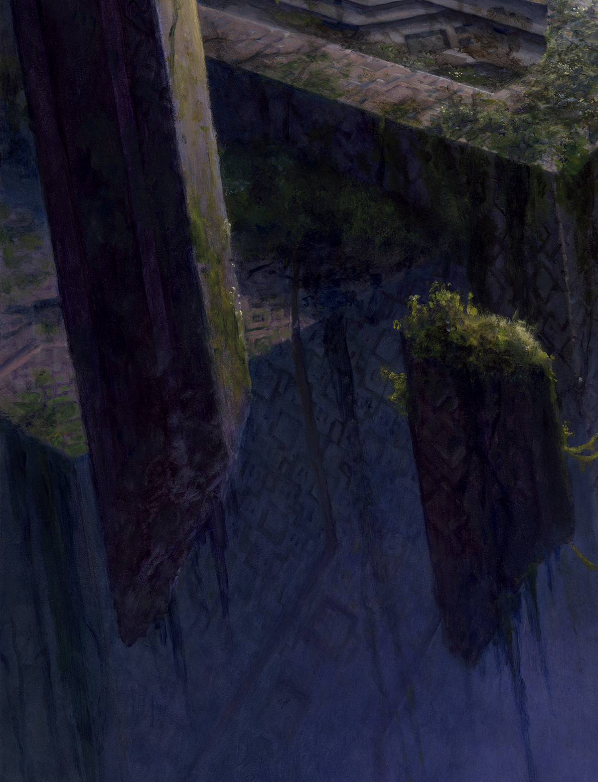
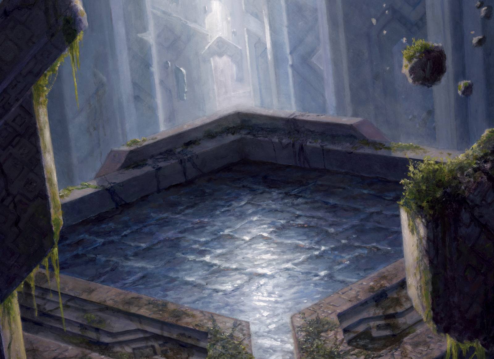
Here are some closeups if you’re interested:

Crazy cool! What a great insight to the creation process! The final result does indeed beg to question of the work that went into the patterns were worth it, but seems the effort was well invested. A really fine piece, will look out for the card and add to collection.
Thanks for the article! More, please.
Thanks for that. The question of how worthwhile the time invested in the pattern actually was is a good one and something I try and balance. Were the image destined to be printed solely at card size, I would say that it wasn’t worthwhile at all. But as the image will live on as a print, as a part of my portfolio, and as a physical painting that will one day hang on someone’s wall, I consider it well worth it. If nothing else, it rewards those who will take the time to see it at another scale or in a different context. And artistically, it was well worth pushing myself to see if I could do it, and then breaking that process down as the painting wen on to understand how to do it better, faster and more easily.
Plus there is always the chance WotC may use it for promotional material where it will be used larger than card size.
Would love to have that piece hanging on a wall 😀
This is beautiful! I like all the versions, from the bright and clean and down to the dour and grey.