
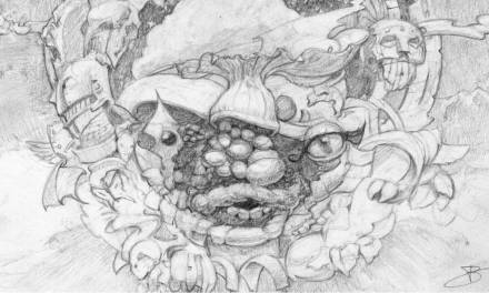
Last year I was asked to paint a sliver for Magic: the Gathering. “What is a sliver?” you may ask. Well, it’s a weird kind of creature that’s specific to the game of Magic: the Gathering and rather than try and describe it, I’ll just show you. Slivers usually look something like this:
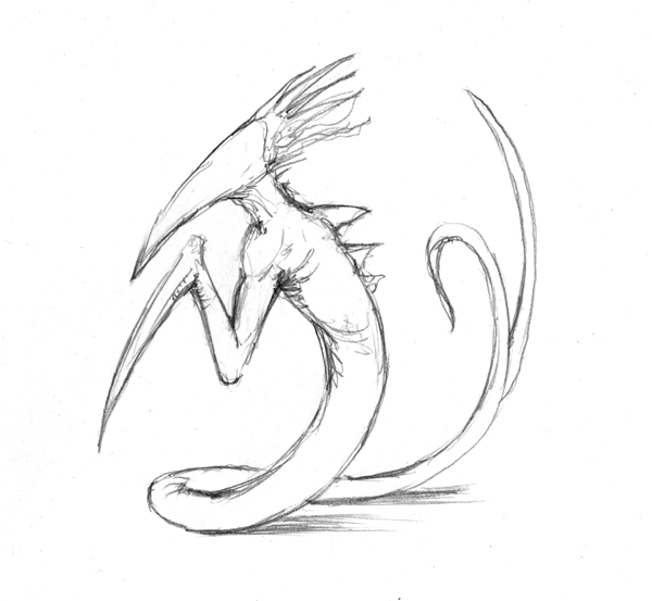 They don’t always look like this, of course. But generally speaking they have a long, pointy beak for a head with no features to speak of, tentacles or spiky hair things, a snake-like body that diverges into twin tails, and a single arm that ends in a spike where a hand might otherwise be. While they come in many varieties with widely varying appearances, this sliver would look as though its skin were made of chrome. It needed to not feel like a machine, however. It was important that I keep the weird, alien, organic feel that Magic players are used to seeing.
Seemed simple enough, so I dug into reference that included everything from armor to insects, from lizards to metallic sculptures—might have looked at some Terminator 2 stills while I was at it, too. I took all that and used it to knock out a couple sketches.

©Wizards of the Coast
©Wizards of the Coast
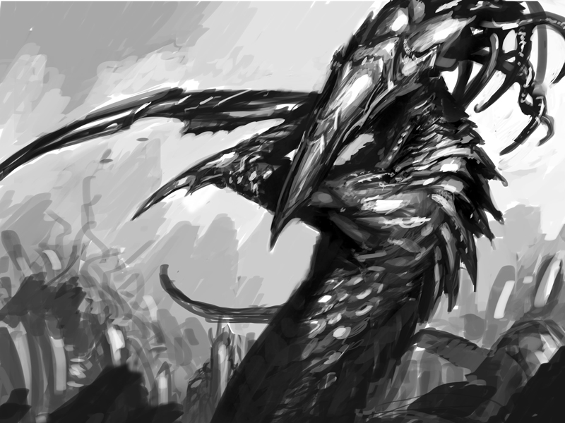
Painting slivers can be a challenge—even without the metallic skin. The primary difficulty for me is that I find it hard to make that single arm work. It’s easy to depict the arm hanging there, perched under the “chin.” It’s another thing entirely to make that arm feel threatening in a believable way. The intention with both sketches was to take that issue on directly (though with varying degrees of success). Beyond that, I was just hoping to nail the metallic skin. The fine folks at Wizards of the Coast suggested I go with the first sketch. With that, I went to paint.

©Wizards of the Coast
The finished painting is called First Sliver’s Chosen, measures fourteen inches wide by eleven inches tall, and is oil on gessoed hardboard. It was art directed by Cynthia Sheppard.
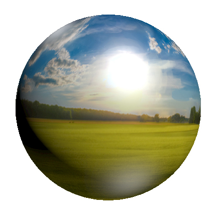
While I could talk about the process in more depth, I instead want to concentrate on one aspect: what I used for reference when painting the metal. As I said, I looked at a lot of stuff, but the reality is that the thing I looked at the most was a spherized landscape photo that I made in Photoshop. I’m sure that doesn’t make a whole lot of sense, so I’ll try and explain the hows and the whys.
Since I started doing fantasy art, I’ve collected a bunch of random metal and reflective items for reference. Chief among these items is a Christmas tree ornament that’s just a plain, silver ball. That is my most photographed object (and now badly in need of replacement as it has fogged over the years). The reason I primarily use a reflective sphere as reference for painting all things metal, is that a sphere reflects everything within a given scene, and has a predictable volume. And so, any time I have to paint a lot of metal, I usually end up photographing my Christmas ornament in the same lighting conditions as the rest of my reference.
The major problem with doing this, of course, is that a photograph of the reference ball results in a distorted reflection of me, my camera, and the environment I happen to be in (which is usually my basement or backyard). That’s not always going to work for what I’m painting. In reality, the reflections of the metal should be consistent with the environment its occupying, and sometimes that needs to be created. To solve this issue, I turn to Photoshop. The first thing I do is figure out what I want to be reflected in that metal (which again is usually just the surrounding environment that goes with the subject). I then create an image that depicts what I want reflected. Mind you, it’s not always perfect. I’m not always creating photo-realistic images. I’m just trying to get the general shapes, colors and lighting down. Granted, the more highly-reflective the object, the closer to realism I need to get this image, but generally I’m not painting crisp, mirror finishes and so I can be a bit more quick and dirty with it all.
Anyway, once completed, I take my environment image (which is square in proportion) and bring it into Photoshop where I do two things with it. First, I use the “spherize” function on the image which results in a version of the image that looks as though it’s been wrapped around a sphere. Second, I take the image and use it as a texture on a 3D sphere and align the lighting on the sphere to match the image (or at least as best I can). How this is done is going to depend on your version of Photoshop, but I suggest looking it up on Youtube and finding instructions specific to your version. It wasn’t difficult, though, so there’s that.
Anyway, what I end up with is two versions of the image with proper spherical distortion, both with and without lighting. However, it should be noted that the version of the sphere with lighting applied is not accurate since the program treats the photograph as a non-reflective surface rather than a reflection. Shadows don’t work that way with reflective surfaces, but it gives me some value notes where shadows start to come into play. Taking these two spheres, along with the original image of the environment, as well as photos of my Christmas ornament tend to give me all the information I need to move ahead.

Reference image “spherized.”
Reference image wrapped around a sphere with lighting.
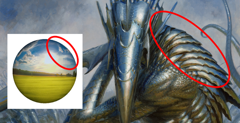
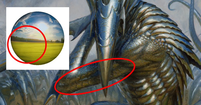
Okay, so I’ve got these spherical photos. What do I do with them? How are they more helpful than the original, undistorted image of the surroundings on it’s own? Well, this is the part that requires a little mental math and an understanding of spacial relations. I start thinking about both the sphere an the object I’m painting in terms of three dimensions, how they exist in the spaces they’re in, how they are angled within that space, etc. I think about the sphere in terms of quadrants and I think about what I’m painting in terms of planes. From there, it’s all about trying to figure out the direction that each plane I’m painting is facing in space and then finding the corresponding quadrant or quadrants of the sphere that match that angle. I then use the contents of those sphere quadrants and “map” them onto the plane I’m painting.
 For example, the planes on the various plates of the sliver’s “shoulder” correspond with the quadrant of the sphere at the top right because they are similarly situated and similarly angled. So that part of the sphere is the part I looked at for painting the shoulder. Once that was figured out, I then added reflections of each shoulder plate to the one it overlaps, and added some ground reflection towards the bottom of of each of those plates to help describe and sell its volume and curvature. But the circled part of the sphere was still my starting point.
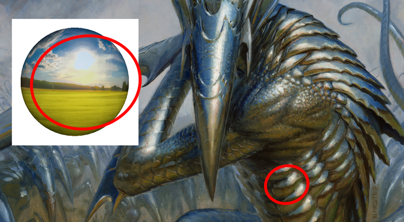
Here, the arm is mostly derived from the sphere’s bottom left due to the way the arm angles slightly back into space. The plane that indicates the musculature angles slightly upward, creating a slight reflection of the sky above. Then the planes angle in such a way that they again reflect the ground and finally transition to the tree line reflection and finally the sky.
And while the first two examples feature relatively large areas using a relatively limited part of the sphere, it’s important to note that sometimes the size of a plane doesn’t correspond with an equally proportionate quadrant of the sphere. Here, the musculature of the torso creates repeated reflections that utilize most of the sphere’s reflection to describe them.
So essentially, there’s a lot of thinking involved in terms of the dimensionality of the subject and the relationship of all its parts to the sphere. With each new plane on the sliver’s body I was trying to describe, I had to revisit the sphere and extrapolate to the best of my ability what should be reflected there. Additionally, I had to think about how the head would reflect in the planes of the forearm and shoulder, and how the arm might reflect in the planes of the torso. Admittedly it’s not all 100% accurate. Sometimes strictly adhering to what might actually be reflected in the various overlapping parts can create a visually muddled mess. The key then is to simplify things a bit to bring clarity to the large shapes. But, for me, the sphere is always the starting point.
I confess that to some this will seem a rather primordial way of doing things. One could, for example, not just create a sphere but wrap the reflection around several different volumes in Photoshop like a cone or a cylinder to help flesh out the reference even further. Or it might be better to take the sphere and in Photoshop repeatedly cut out the appropriate reflective areas and morph them onto the various planes over top of the sketch so as to create a more realized and fleshed-out bit of reference to paint from or on top of. It’d be a lot of work, but the results might end up being a bit more accurate and consistent. For others, the path of least resistance might be to create a 3D sculpt of a critter like this and render it with a chrome skin in some 3D program or another. Either of those ways (or the myriad others I’ve not mentioned or don’t know about) are totally legit. The key is to start thinking about metal in a realistic way so that when you go to paint it it feels believable and part of the world you’re depicting.
A couple of additional notes:
1. The more polished the metal, the more precise the reflections will be (which is obvious). But, that also means that light sources reflected will more well-defined and not diffuse. A lightbulb reflected in a mirror surface will remain light-bulb shaped. The more rough the metallic surface is, however, the more of a haze that lightbulb shape will become. The light will become more diffuse and generally a bit less intense.
2. The more polished the metal, the broader the range of values reflected will be. If the metal surface is more rough or has a brushed finish (think the surface of a stainless steel refrigerator), the shallower the range of values reflected will be.
I tend to think of it simply this way: the more polished the metal is, the more depicting it becomes about the reflections. The less polished it is, the more depicting it becomes about describing the metal the object is made of and selling its surface. In this case, had I decided to go with more of a brushed, stainless steel kind of surface for the sliver, I might have altered my reference to be something more like this: 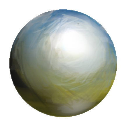 While seemingly not particularly helpful due to its inherent mushiness in terms of color, it’s still a valuable resource that I would have spent a great
amount of time pondering because it’s important to keep a consistency of reflection throughout in order to keep visual cohesion.
3. Remember that the reflection is also an indicator of eye level. Making sure that a sphere (or any other volume) you might create is consistent with the perspective of the image is paramount. If the point of view is inconsistent, the reflections in the metals won’t feel like they exist in the same world as everything else.
Anyway, hopefully there’s something in here that helps, or at the very least gets some mental juices flowing. At the very least, maybe I demystified how something like this might be done, or maybe helped make something you’re working on a little bit easier down the road.

What a thoughtful explanation of a difficult process! I know Donato has mentioned a similar method (also using a Christmas ornament?) but it’s so helpful to see it fully described! Cheers!
Very insightful! I am currently working on a reflective painting similar to yours. My process so far has been looking at numerous reference images. The idea to use a single one, then find where a surface most closely matches the sphere is very helpful. I might only add that other common shapes such as cylinders seem to have a more linear reflected feel. Also, many reflected images in this manner are defined by bands of contrasting light and dark. Thanks for the help!