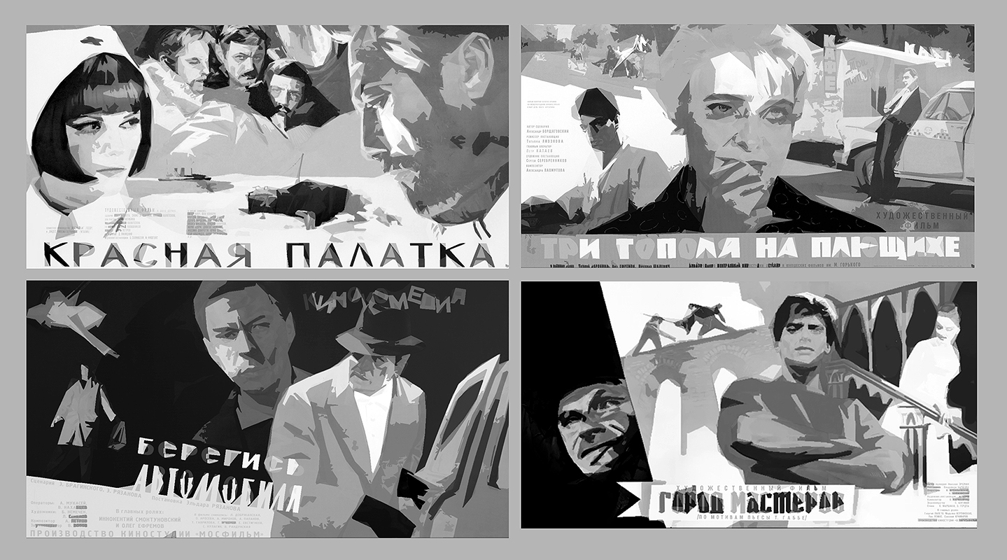
One of my favorite illustrators is the movie poster artist Evseev Anatoly Nikolaevich (Russian 1932-1998). He’s rather obscure and there isn’t too much information on him unfortunately. What I have been able to track down is thanks to Anatoliy Kotlinsky!
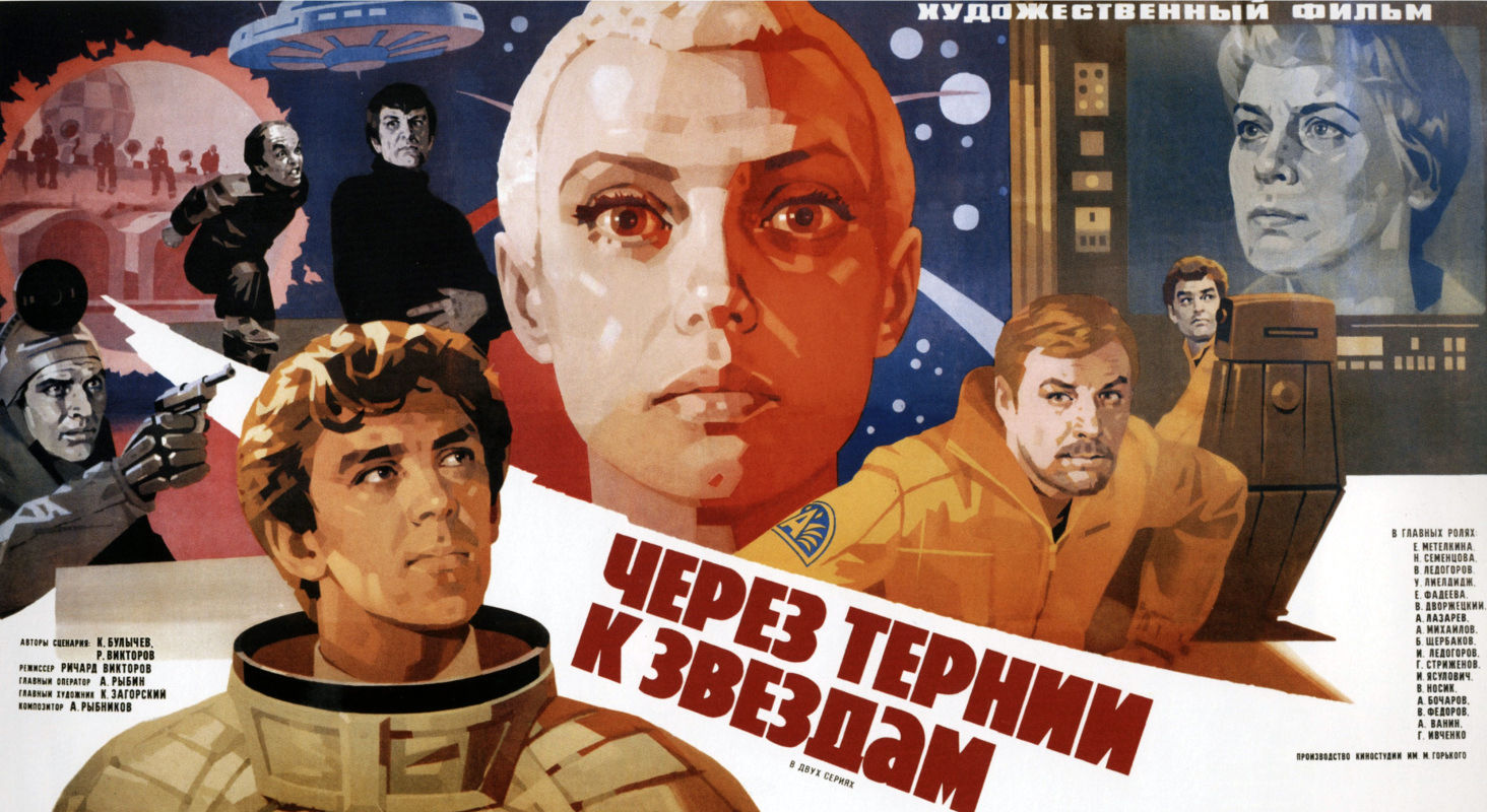
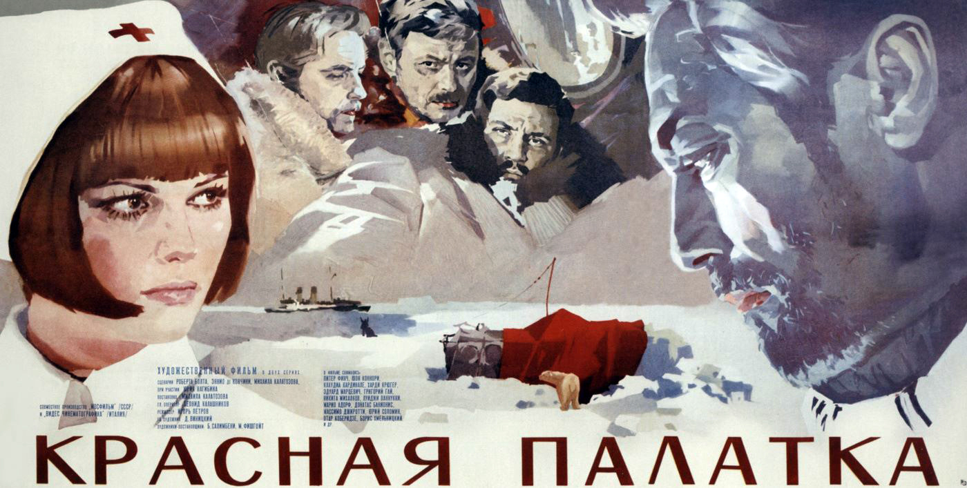
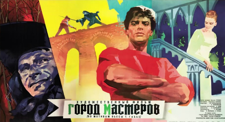
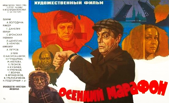
Nikolaevich graduated from the School or Arts and Crafts in Vladimir, Russia in 1949 and found work illustrating for local cinemas. He then went to work as an artist in the Russian army for a stint but later spent the bulk of his career working in advertising and film posters. Nikolaevich’s most well known work (created between 1961-1983 and the bulk of the imagery shared today) was created for the studio Reklamfilm and was designed by Zolotarevsky Pavel Dmitrievich.*
*Note: I do want to give Dmitrievich his due, I imagine much of the bold design was at least partially due to Dmitrievich’s input.
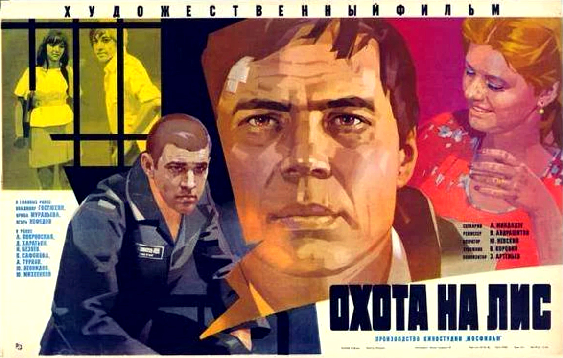
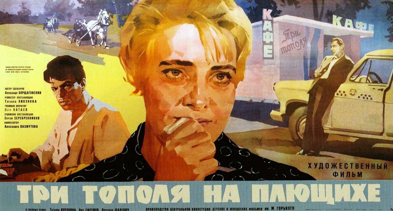
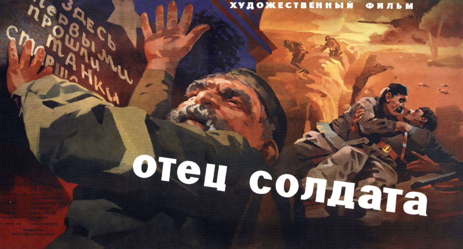
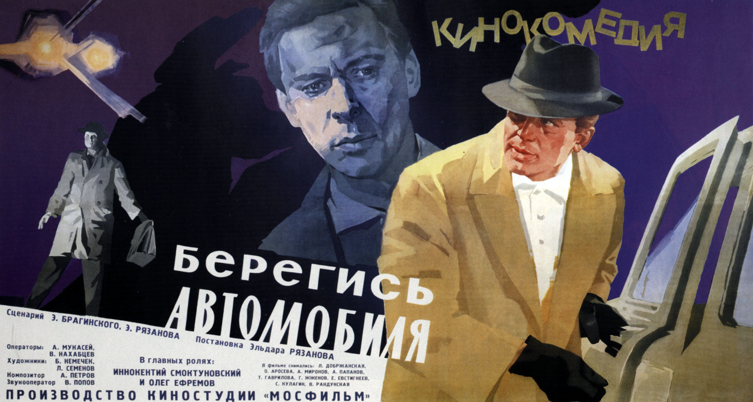
This work just seems so fresh even though it is 60+ years old! The designed mark marking seems akin to Rich Pellegrino, the rich acidic colors remind me of Mary Blair color keys, the layouts are classic innovative Soviet design, and the lighting is appropriately cinematic. The majority of these are painted in gouache.
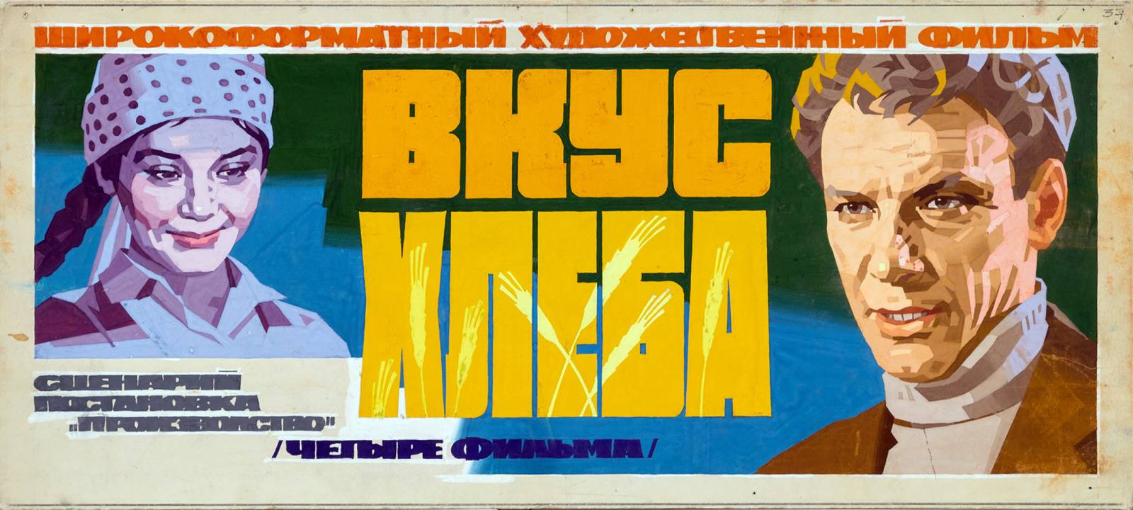


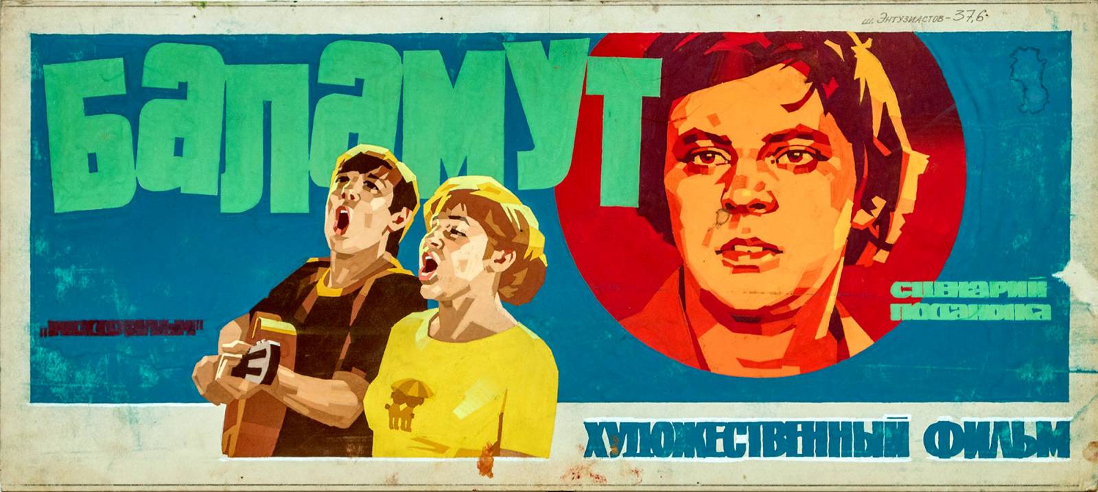
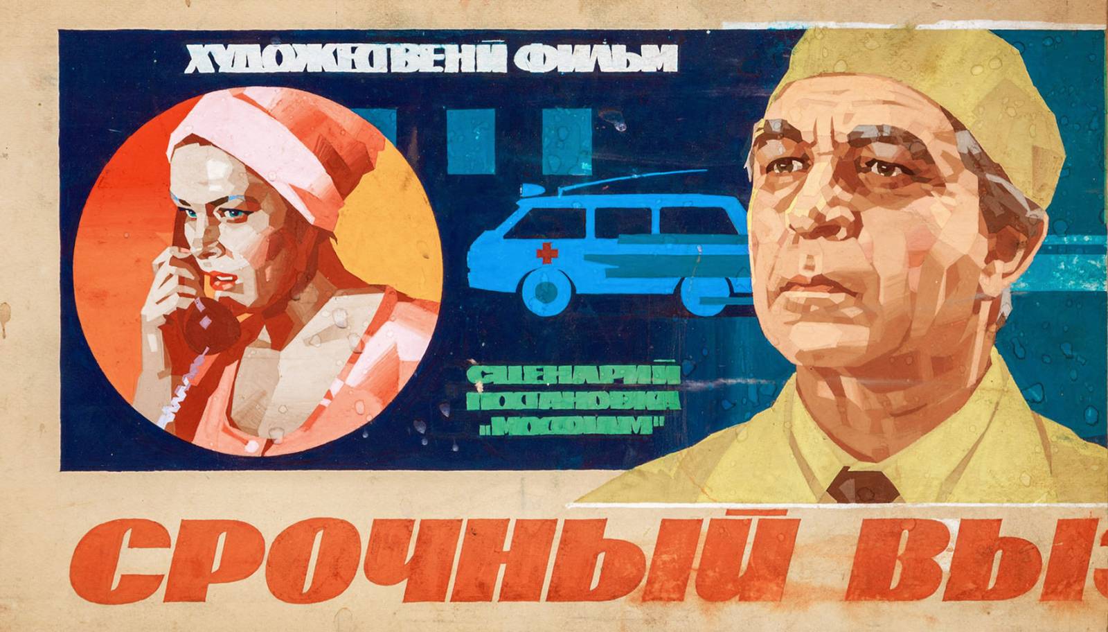
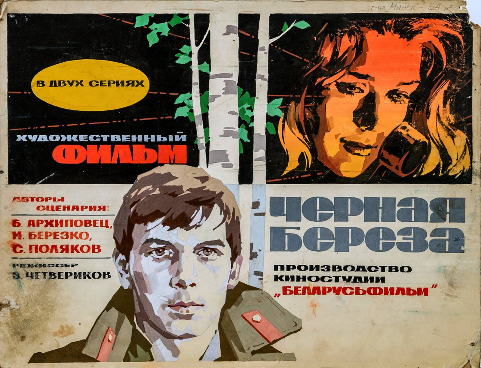
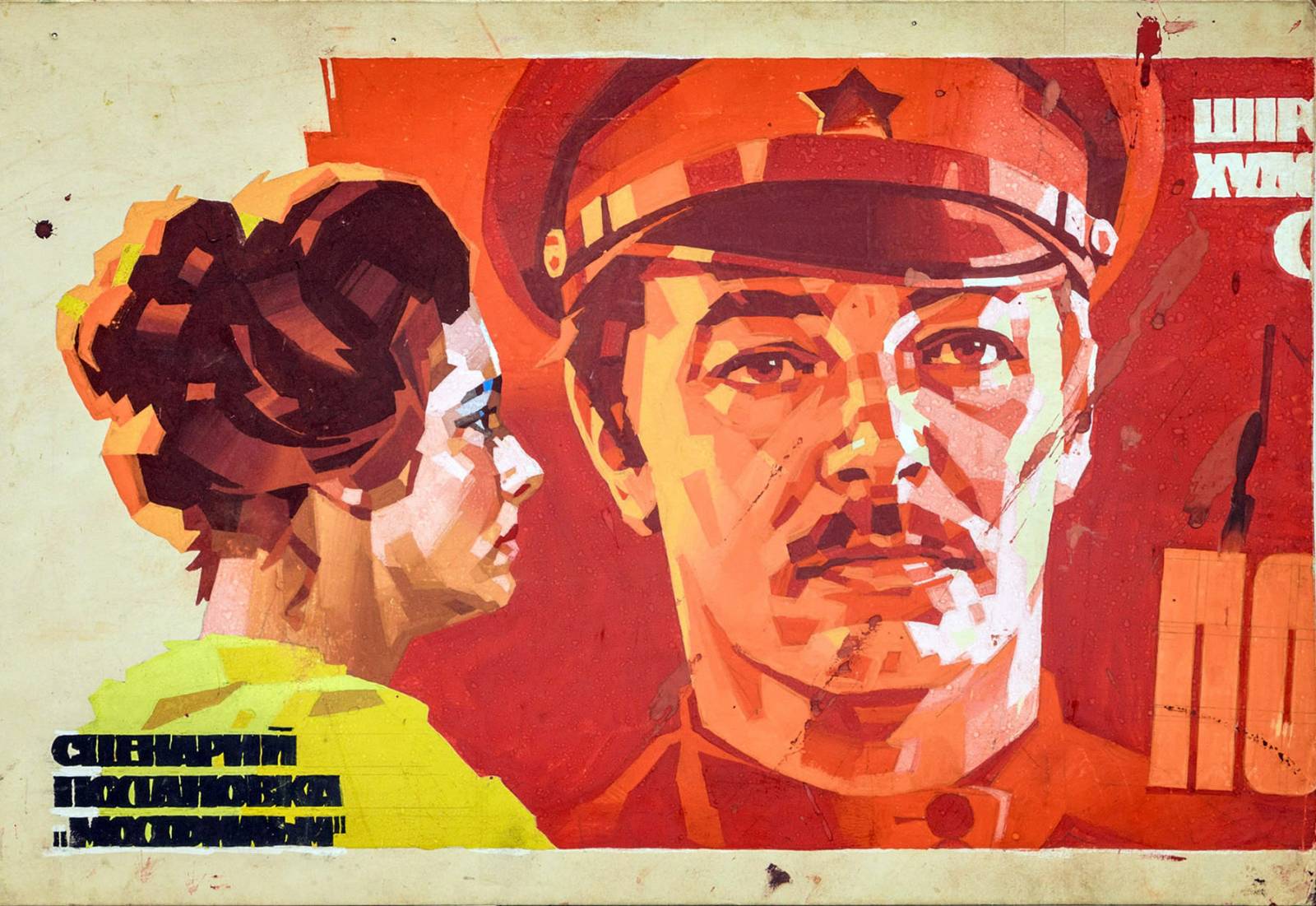

Also note the typography and how well it is integrated into the design and palette. White shapes are also used regularly to light forms and graphically cut through and separate the various elements of the piece. I remember Dave Stewart talking about how white was such a useful design tool when coloring his legendary comic pages and that always stuck with me. I tend to notice my favorite composers use graphic white (or at least a very light tone) very effectively in their pictures.
I’ve zoomed into the pieces below to focus on the designed geometry used to render the forms. So well designed and hard to do. No soft edges to hide superfluous shapes. Evseev commits to the design of each shape, color, and value. Such a useful lesson in developing a voice in your rendering.
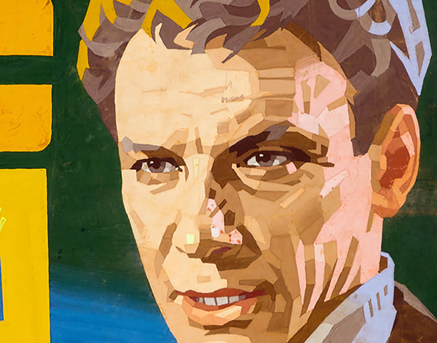
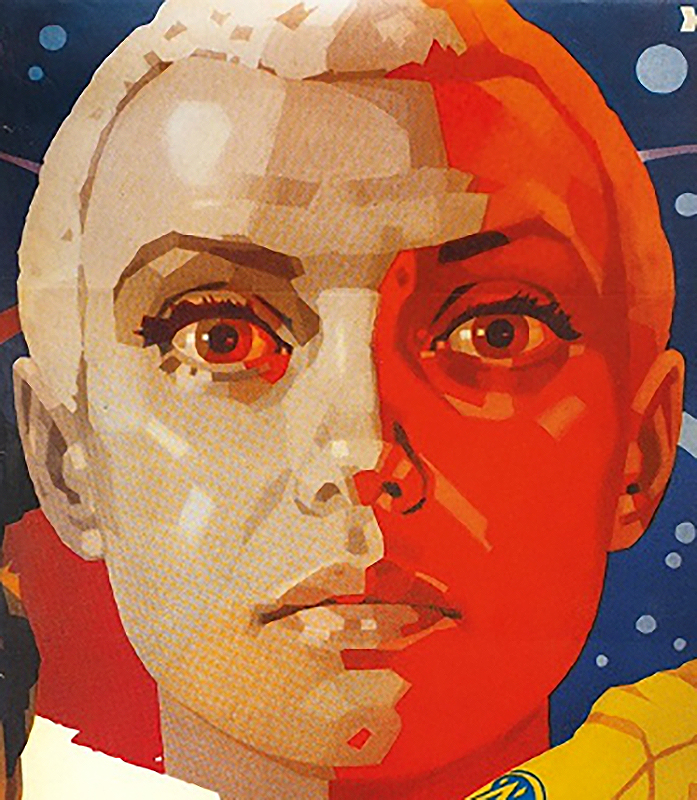
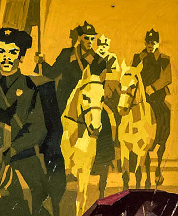
I compiled the following image in an effort to study the picture making and values of Nikolaevich. Each piece reads very clearly utilizing 4 values (white, black, and 2 midtones). The various shapes are grouped utilizing the aforementioned values and fit together like a sophisticated puzzle. In other words, smart picture making!
I hope you enjoyed looking over Evseev’s work! Admittedly, I’ve shared 90% of his work that I’ve been able to track down over the years. Here are the following resources I’ve utilized for this post: LINK + LINK (click archive of lots sold). His name is spelled “Евсеев Анатолий Николаевич” in Russian in case anyone wants to research him further. Speaking of, if anyone has any leads on his work, or additional samples, please shoot me a message, I would LOVE to see it!
Thanks for the discovery. First time I see his work. It’s kinda strange as actors and movies are not known, it’s like fake movies.
Outstanding artist! I remember browsing through editions of Sputnik as a kid. It was youth magazine promoting USSR’s life style with really high quality photos and paintings of happy young people living in dreamland of Soviet Union. I always loved their gouache techniques.