Pro level tip on how to improve the lighting in your concept paintings. Besides painting from life to improve your understanding of how light and color work, I highly recommend doing quick studies for lighting, color and composition from screenshots to help learn what a good frame of film looks like. If you want your work to look filmic study film. Film has specific aspect ratios that don’t necessarily show up in painting or other photography, thus making their compositions different. Also with the extremely visual directors every shot in the movie has been designed to tell a story which is something we can learn from as illustrators and concept artists.
Some months ago I found a website called Shotdeck. I don’t work for them and I don’t get any kickbacks or anything but I really like the set up and functionality of the website. And I also find it very useful in my work.
Here is the opening page. You can see a search field dead center as well as categories on the upper right.

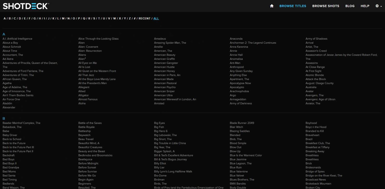
In the browse titles area you can see just how many titles they have and how much work they’ve put into the site.
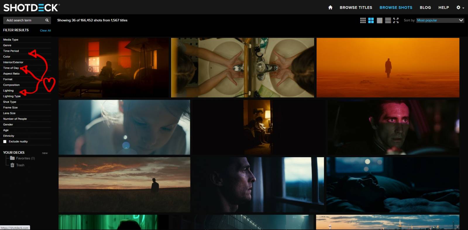
In the browse shots area there are many subsections with radio buttons to fine tune your selection. It’s really amazing how you can break the search down into smaller and smaller categories. This is really where the magic of the site is.
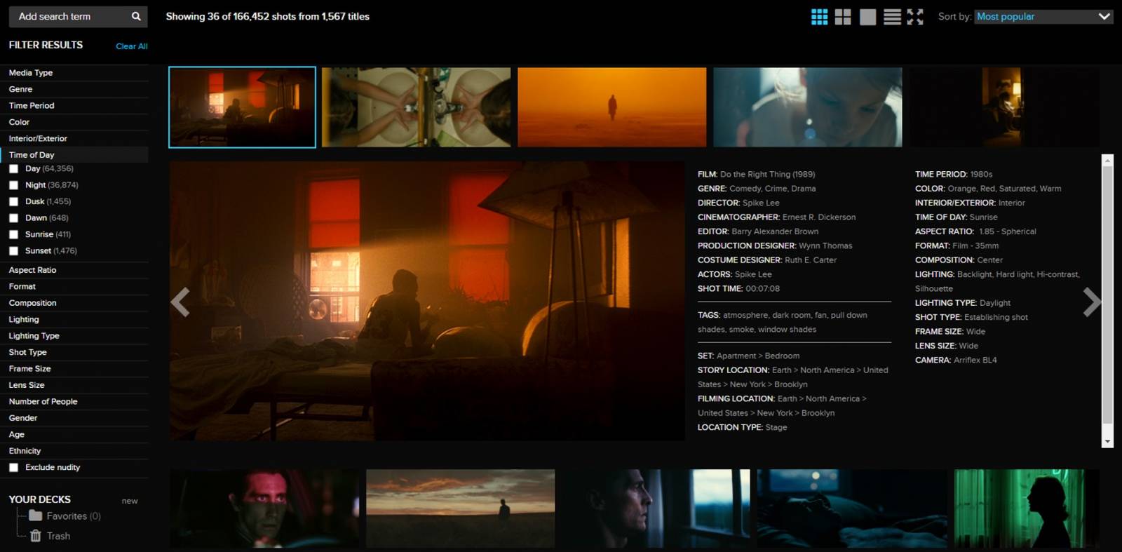
As an example here is how they break down time of day into its subcategories.

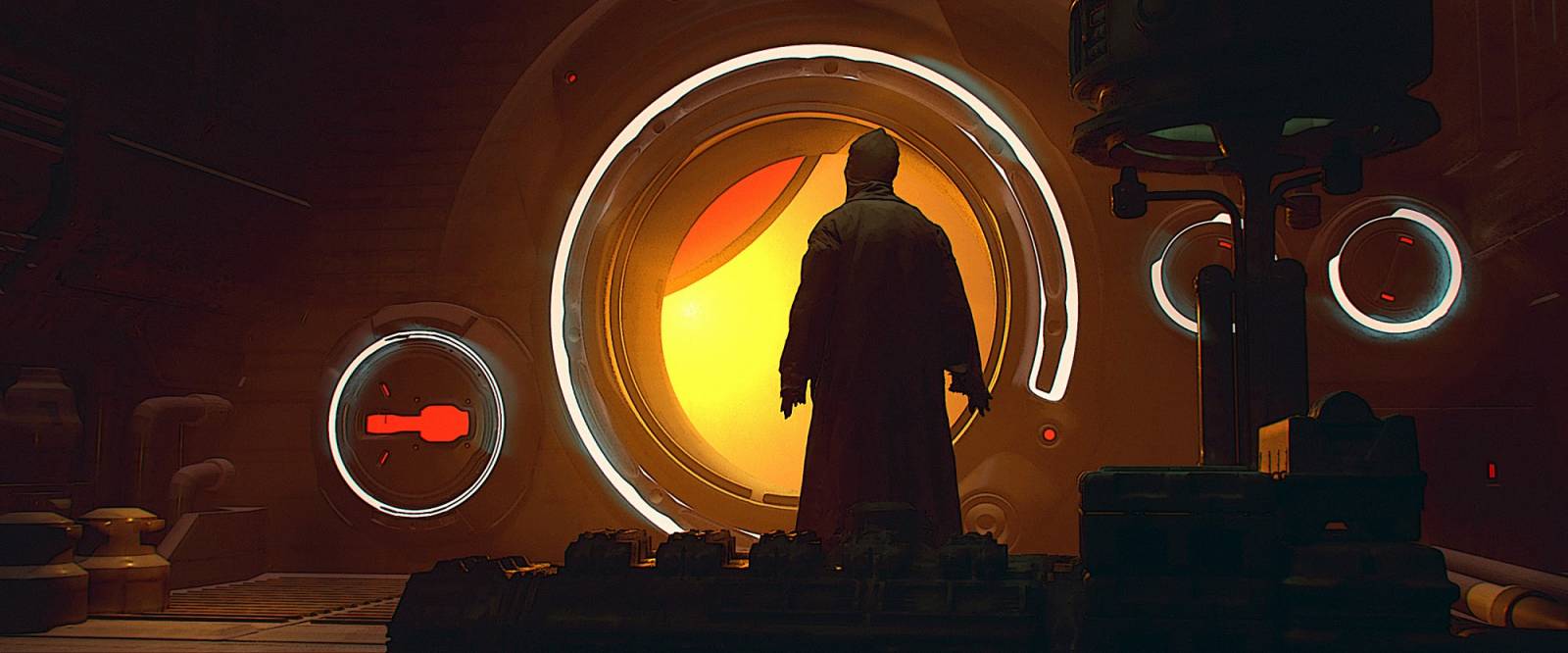
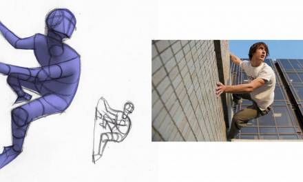
Here is the first frame that came up. I used it as reference to make a little 3D render and paintover to show you how I might use something like this for a concept piece. Being honest it’s a little more one to one than I’d probably do but I hope you get the point.
Here is the quick image I created with that original reference image in mind. Especially using the color from the reference.
Recently Shotdeck started charging, monthly and/or yearly, for the service they provide. And they do offer educational discounts. Uploading and categorizing all of those images obviously takes a lot of work. Before Shotdeck I had folders of screenshots of my favorite movies. I sorted them to the best of my ability but I usually ended up using the same dozen or so. Of course that’s always still an option for those without the means for something somewhat extravagant like this. The bigger point of this post is if you want your work to look filmic study film!

This is one of my favorites too https://www.evanerichards.com/
Thanks for sharing!
https://www.muddycolors.com/ amazing site!