In case anyone reading this was unaware, Magic: the Gathering recently unveiled a crossover with another game that is housed under Wizards of the Coast’s roof: Dungeons and Dragons. The set, called “Adventures In the Forgotten Realms”, was something I was unable to contribute much to, owing to other obligations. In fact, I was only able to paint the single piece that I’m going to talk about today. Still, I was eager to be a part of the set in any capacity I could manage.
Why?
Because Dungeons and Dragons is/was pretty important to my career, and I wanted to revisit a world I have not spent time in for a long, long time. See, back in the day, doing interior illustrations for Dungeons and Dragons books was my bread and butter. In fact, D&D was the client that helped me become the full-time freelancer I continue to be to this day. During my tenure on the game, I contributed art to more than twenty books, with each book containing anywhere between three and seven of my illustrations. So, I painted a lot of pictures for them over the years.
Once I got into Magic, though, I wasn’t able to take on as much work for Dungeons and Dragons. and before I knew it, I couldn’t spare any time for that game at all. Still, there are aspects of working on D&D that I miss quite a bit. I miss the story-telling and the chance to inject humor and whimsy into even the most horrifying imagery. I miss the variety of imagery and the constantly changing aspect ratios of the spots the work needed to fill. And I miss the big, old tomes I used to receive in the mail that had my art inside. Magic’s great and all, but D&D represents a simpler and very fun part of my life.
So, it was with great relish that I managed to set enough time aside to take on this one piece. During a conversation with the Art Director, I explained what I really enjoyed about my time working on that game. The assignment he sent really nailed not only what I loved about working on Dungeons and Dragons, but what I love about working as an illustrator in general.
The assignment was to show a gnome character named Oswald Fiddlebender (a character that appeared in two video games a while back) on his airship. The airship needed to have a great, big balloon hanging above it per a design that was provided from the video game.
Seemed simple enough. But I did have one important question before starting to sketch:
Was the airship gnome-sized or human sized?
This was a good question, so I was told. The answer was that it was up to me. Human-sized then. Makes for a more interesting image. Off to the races I went.
A couple of notes about Oswald: there’s really only one image of him that has ever been produced before mine—it’s a really interesting and loose ink (maybe digital ink?) illustration of him at the wheel of his airship, but it doesn’t provide a lot to go on. Oswald’s description in the art assignment wasn’t 100% in keeping with that illustration, either. So, between that lack of detail and the aspects of the description that ran counter to what was in the only image of him, I felt like I had a lot of room to maneuver.
Also, Oswald Fiddlebender is an artificer. As such, I needed to nod to his ability to make alchemical brews, magical and mechanical devices and the like. And outside of that, I could basically do what I wanted. So I did this:
For me, the setting provided a lot of opportunity to add interest to the piece, and for me, when it comes to ships (or airships, as the case may be), the rigging is among the most interesting things, visually. So, I pulled out a lot of images of ship rigging, started watching a LOT of movies that feature tall ships, and started looking into 19th century air balloon rigging (which I’ve always assumed were rigged by folks who also knew a lot about ship rigging (though I could be wrong)). Once I filled my head with a ton of that, I put it all away and started putting an image together.
Why didn’t I keep all that reference out and strive for accuracy? Well, because it’s an airship. They don’t exist and so there’s no such thing as accuracy. All I could ever do is make something that felt plausible. And so that’s what I shot for. Mostly.
The downside of rigging is that there’s a lot of it. And the reason that’s a downside is that it makes for a high likelihood of tangent lines and shapes, which are things artists are generally taught (for good reason) to avoid. And so I had to be careful about my rigging design and the placement of the figure within it.
The design of the figure was pretty straightforward. His clothes were to be practical and his vest needed to contain the tools and potions of an artificer. The design of the pauldrons (shoulder armor) was the only real nod to the original illustration of him.
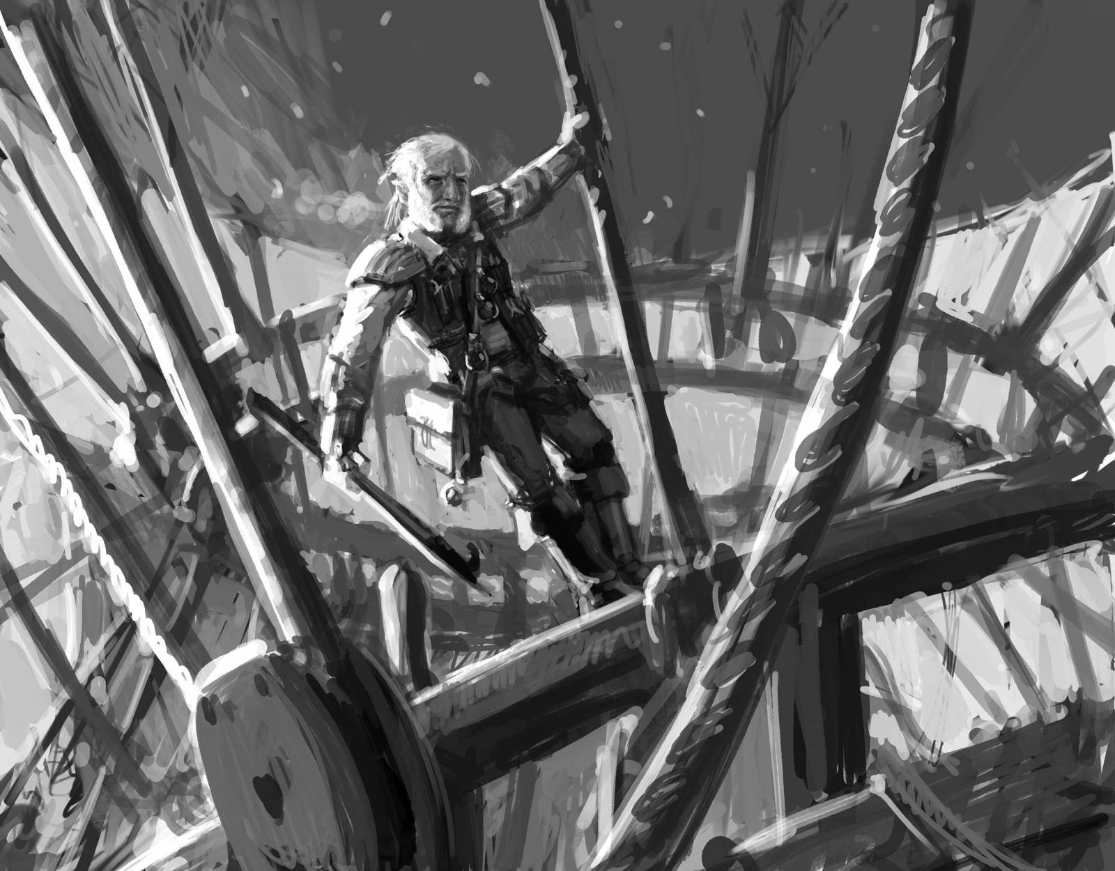
Anyway, the sketch process took a lot of time and were it not for the support and suggestions of two of my fellow illustrators, I’d have banged my head against the wall for much longer than I did. The above sketch was something I ended up being quite happy with and I was most relieved to learn that the fine folks at Wizards were happy with it, too.
Before running off to paint, I decided to do a quick color study and rework the value structure a bit while I was at it.
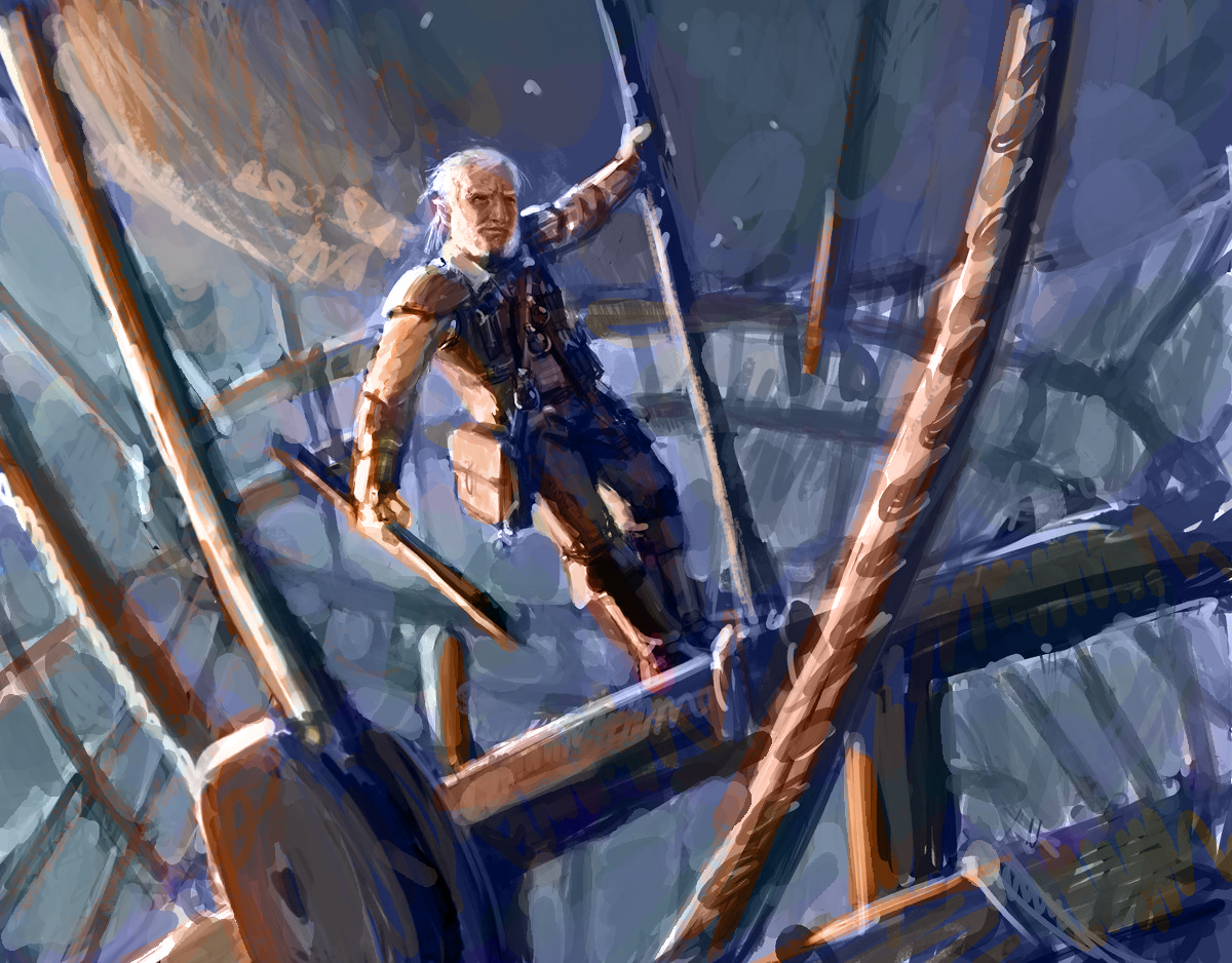 While I think I did a better job updating the value structure in the color study, I wasn’t completely sold on the color choices. One of my fellow illustrators suggested that maybe I push the colors toward something more akin to a secondary palette of primarily orange and violet instead of the complimentary orange and blue I began with. I rather liked that idea and decided to implement that change in the finish (though I think it evolved more into a pink and purple image, more than anything).
Regardless, with the (poorly) colorized sketch in hand, I went to work in oils.
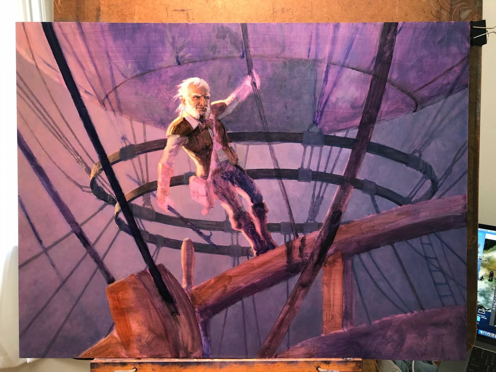
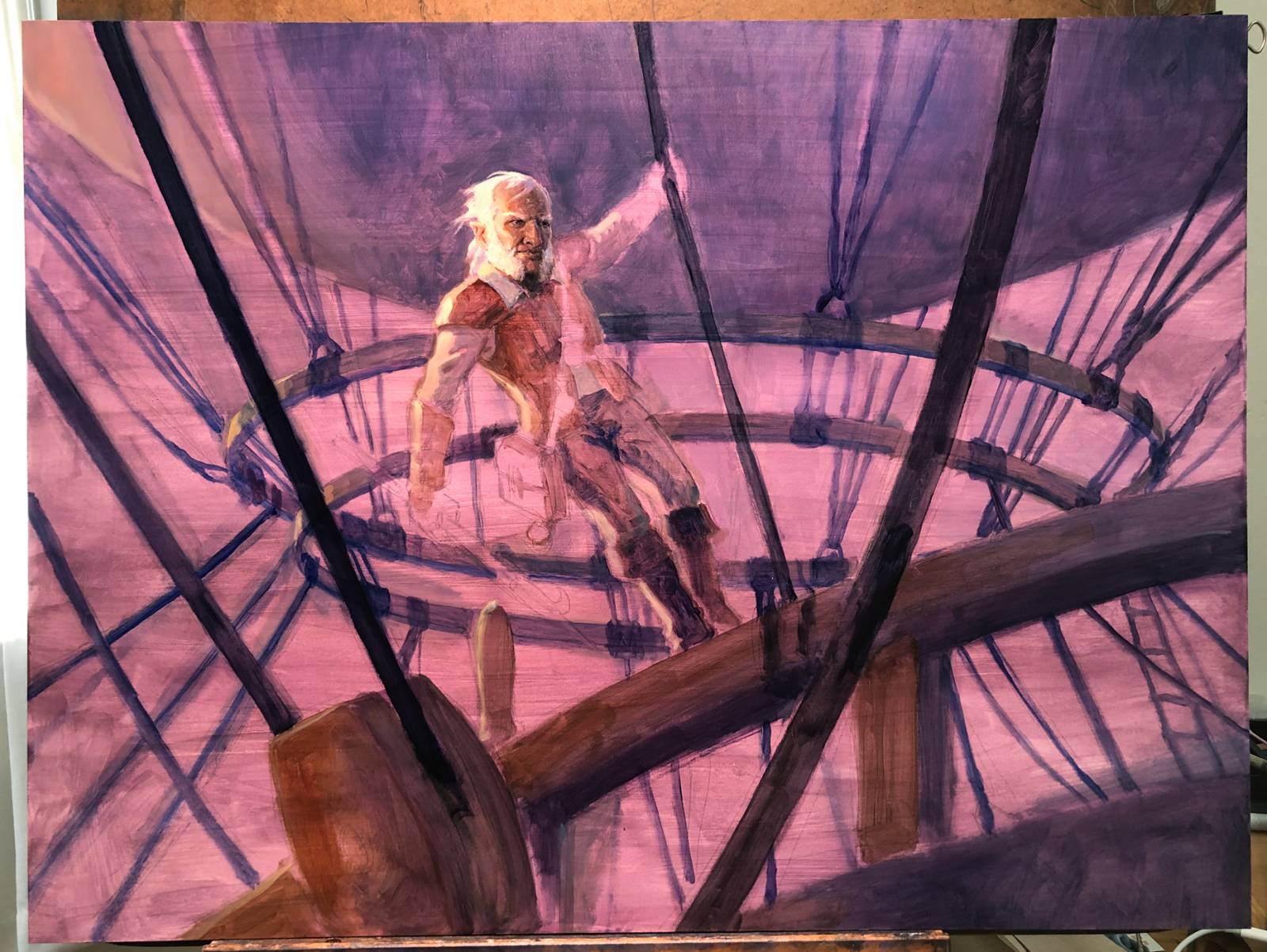 After tracing a projection of the sketch onto the board, I threw down a quick bit of color. I then started doing a very basic block in of all the major shapes and spent some time trying to nail down the rigging. Then I kind of got caught up in the face.
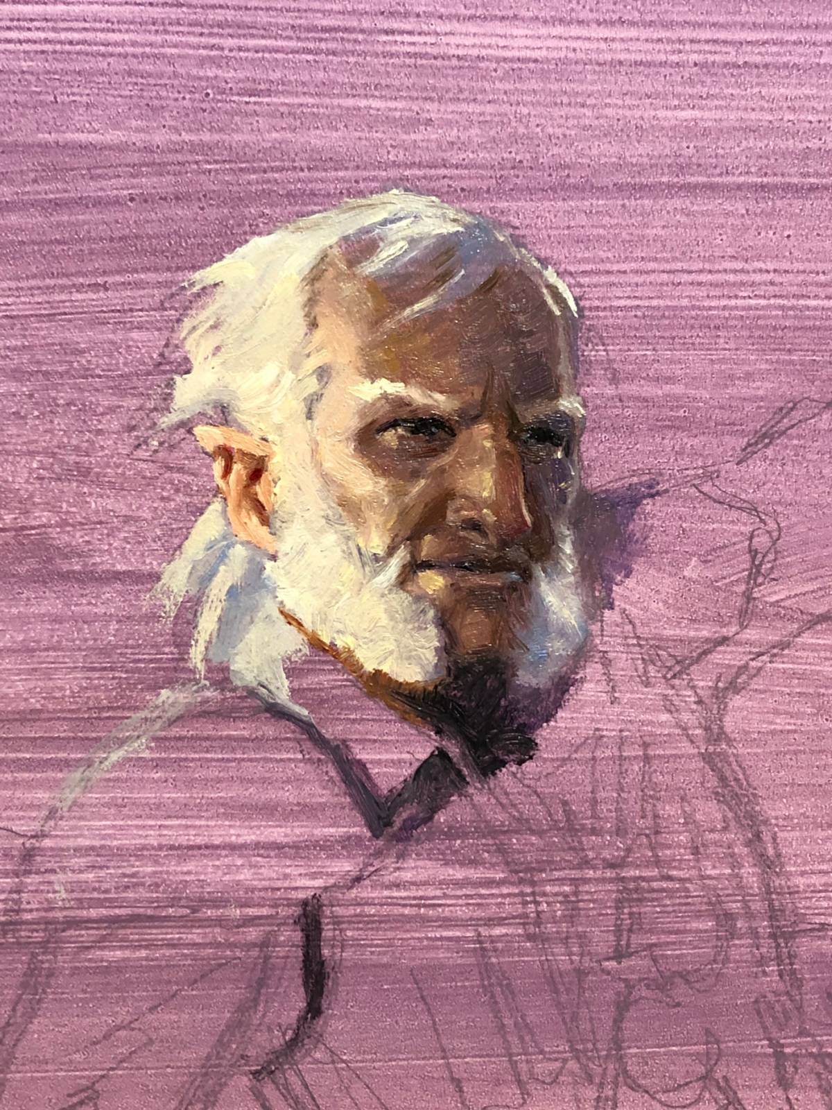 Okay, I lied. I started with the face. And then I realized I should probably do all that other stuff. I don’t know why I did that, but I did. I often find myself trying to nail down a very specific part of a painting and then expanding out from it and in this case, my focus was the face and head. Funny thing is that th face ended up changing quite a bit anyway, but the foundation of it was nailed down by the end of the first day.
 A big advantage to getting that rigging blocked in was that I could paint over it and still see it. Well, I was able to do that mostly because I’d painted the rigging darker than it would end up being. Point is, I tried to keep it visible so I could quickly paint over it rather than painstakingly painting around every single rope. This also meant that I wouldn’t have to redraw the rigging on top, once the larger fields of color were blocked in.
 As I was doing the initial color study, I was thinking that it would be fun to have a really thick, foggy atmosphere—perhaps as though flying through a cloud. I wasn’t sure how thick I wanted to make the fog, so I started to toy with that at this point, and seeing how far to push it.
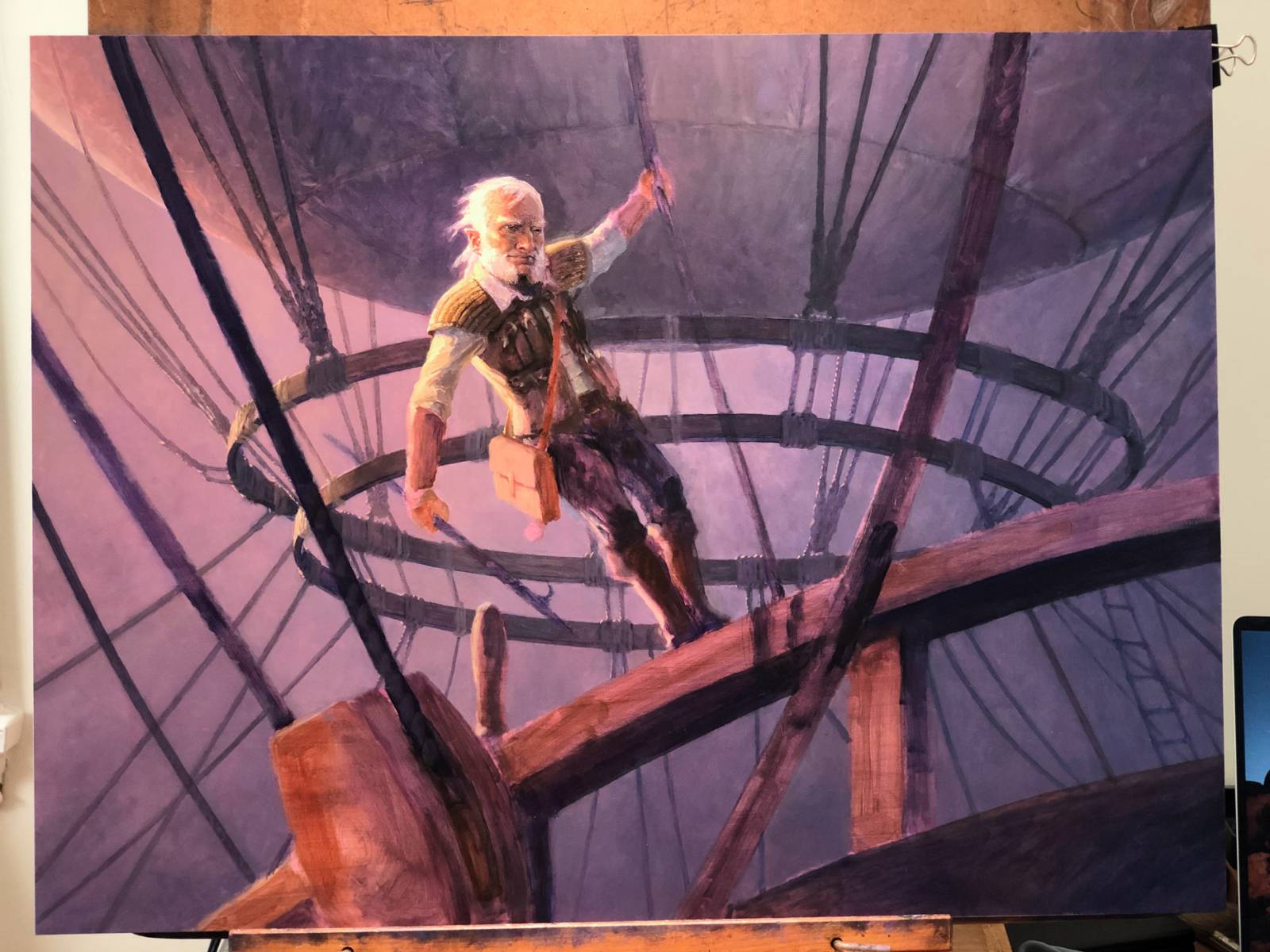 Still just blocking in and refining, as always. Each day, the face gets a little tweak, and more elements within the piece come closer to completion.
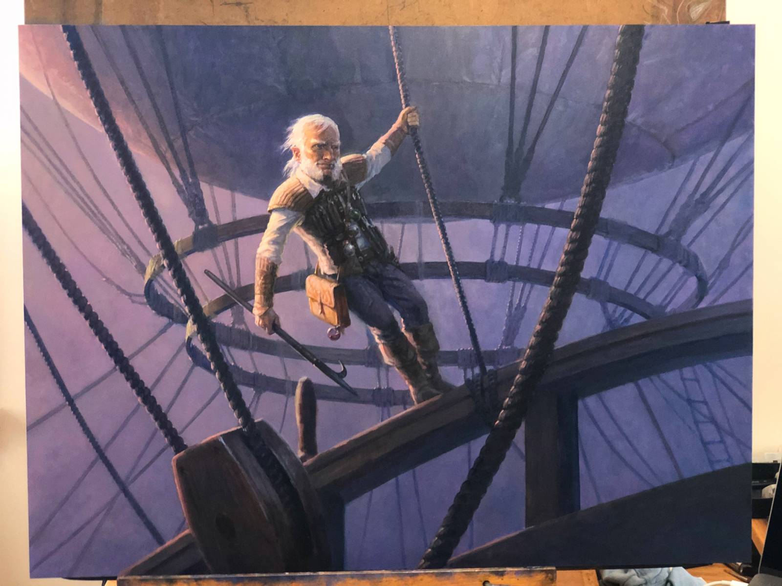 Admittedly, this image is a bit jarring, both in the color shift and the amount of things completed. The color shift is just something that keeps happening with my phone images (I need a new grown-up camera and I’ll hopefully get one sometime in the future. The skip in level of completion is to do with forgetting to photograph the piece for a couple days. The figure took a good chunk of a day to complete and the ropes took a complete day, as well. The funny thing about the ropes, though, is that despite being quite numerous, they went quite quickly. Once I got into a rhythm, I was surprised by how fast they were completed.
Also, at this point, I started to be really bothered by the peg that sticks out of the hand rail just behind the large pulley in the foreground. I don’t know why it bothered me, but I decided it needed to go. And so I painted it out and painted in a whole back of the ship to boot.
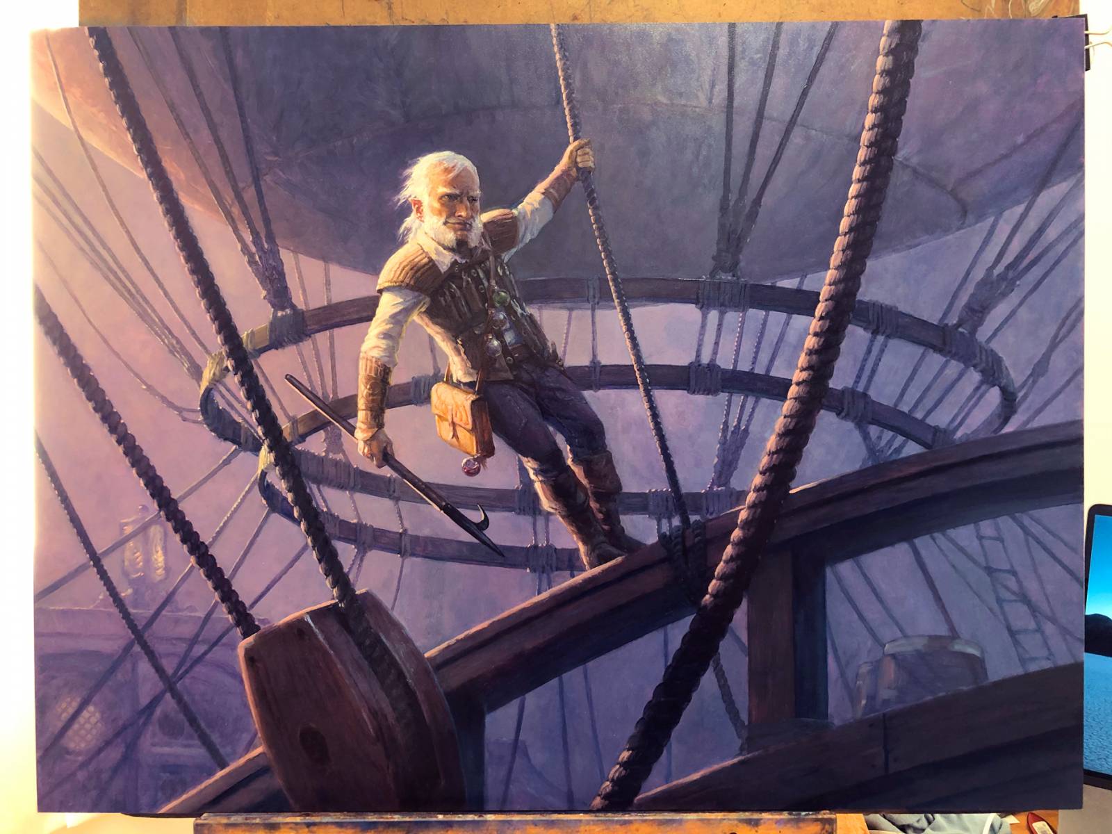 Another jarring color shift I know. Color aside, al the parts of the painting are finally present at this point. The peg is almost completely gone (another pass did the job), the barrels at front needed some additional refinement, and I needed to do some final push and pull to get the atmospherics just so.
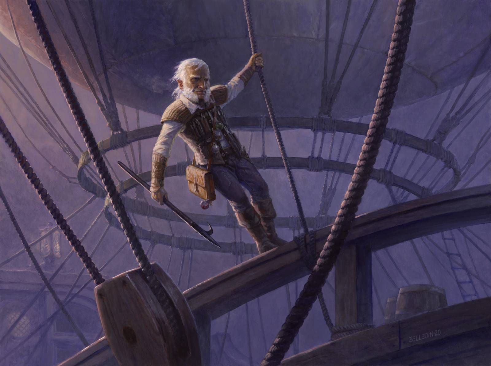 This is what the final looks like. I know, it’s a bit darker, a bit murkier an image. But this is pretty accurate. Part of the final push and pull was glazing some of the background further back. Lots of glazing…so much glazing…
The final piece is oil on hardboard and measures twenty-four inches wide by eighteen inches tall. It was art directed by Zack Stella.
This is probably among my favorite pieces that I’ve done in quite a while. I really love it, in fact. I’m originally from Pennsylvania and I grew up about an hour and a half from Chadd’s Ford, where N.C. Wyeth (and the rest of the Wyeth clan) lived. His work had a huge impact on me (and still does) and this was the rare piece that I’ve done that I feel actually touches on the kind of work he did and captures a little bit of a similar spirit. That’s not to say that I think this is anything nearly as good as what N.C. Wyeth ever did. I’m just saying that this is a good example of what my adventure pictures might look like. And I think that influence is plain as day.
Long story short, I am quite proud of this piece, and I really hope that I get the chance to make more like it. If I don’t, then I guess it’s up to me to create such chances.

Fantastic piece and awesome article! Thanks for sharing the process in such detail.
Good card to boot!
Great piece, thanks for the thorough breakdown on how it evolved! It’s really helpful to hear about the trial and error that goes into the development of a final illustration. Sometimes looking at an artist’s body of finished work it can seem like they must have a completely streamlined process free of any real hiccups. I appreciate your openness and detail about the push and pull it can take to get to a really solid final image