Something that happens to me somewhat regularly is that I will come up with a sketch that I’m pretty excited by, and then start working on the finished piece only to find out mid-painting that there’s some inherent flaw to the sketch that I just didn’t see before. Invariably, it’s the kind of flaw that threatens to derail the painting completely. The piece I’m going to talk about today was an example of this and hopefully talking about it will help you, but also help me to redouble my efforts at spotting such things earlier in my process.
The piece in question is called Shipwreck Marsh, done for Magic: the Gathering. The assignment was to depict a stream flowing into a marshy inlet on the coast. A shipwreck—or parts of one—can be seen rotting in the marsh. Additionally, the scene needed to include a candleguide (kind of a supernatural, humanoid guide post).
Unlike the majority of Magic work, this was to be a vertical piece—the bottom portion of which would have a text box over top of it. That meant that the artwork for that portion wouldn’t be seen well in card form, and that the top half was where the illustration needed to be solved. However, what this kind of situation also adds a level of difficulty, because I essentially need to solve the composition of the piece twice—both in the top half for the visible part (or “active” part) of the illustration, and for the entire painting as a whole.
And that’s where my problems mostly stemmed from. I think.
For clarity’s sake, I’m going to show you the image of the card up front in order to provide context and clarity since the focal point of the illustration and the text box will be important later on.
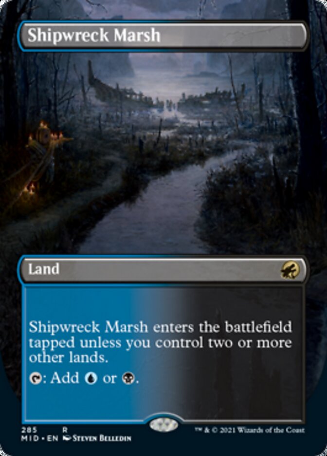 This if very difficult to see, but the painting is somewhat visible through the text boxes. This is primarily why they wanted a vertical piece of art—to include it under the text (not to mention to give them the ability to make it a full-bleed image and take the art all the way to the edges of the card).
Anyway, with the ingredients listed above, I sketched out a couple of versions. I picked the two I liked the most and handed them in. This is the one they chose:
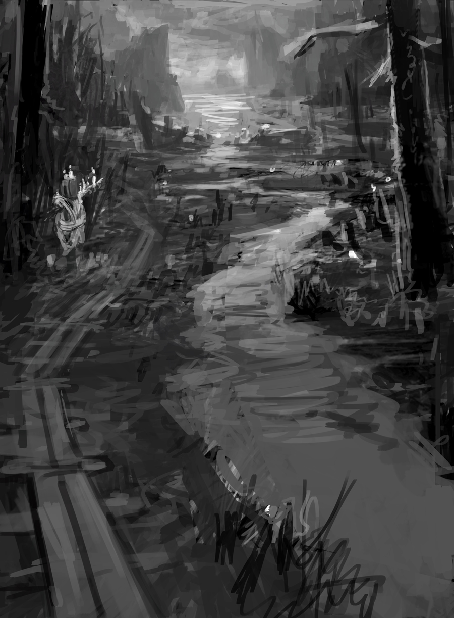 The idea is pretty simple and straightforward. While they asked to depict a stream going from foreground to background, the presence of the candleguide kind of insinuated a path was necessary. And so, I decided to include both. Given that this was a swampy area, I thought rotting plank path would be not only setting appropriate, but appropriate to the world of Innistrad, as well—which is where this image is set.
Also, I was hoping that if one thing running from foreground to background could guide the eye to the focal points, then two things running from foreground to background would work twice as well. Unfortunately, I never managed to get it to work right. But we’ll get there. I don’t want to get too far ahead of myself.
With sketch approved, I went to paint.
 Unfortunately, I failed to take a snapshot of the initial drawing transfer and quick value painting I did over it. But it was a lot like what you see here, only it was all purple. That quick value painting was covered up almost entirely the very next day with what you see above.
 Bit of a shift photo-wise, but this gives a better idea of what was going on in the painting. Still fleshing things out and adding details here and there. For the most part, I’m working from the background to the foreground here—at least I was trying to. Still, I was throwing down some super basic colors and values here and there to try and keep things in check structurally. This was going to be a dark piece, and I was determined to keep it as readable as possible.
 Still developing things. Still picking at the image, doing new passes on both large areas and small details alike. At this point, I wasn’t exactly sure whether I was going to keep the trees in exactly the same locations, so I felt it better to start painting over them and then drop them back in later.
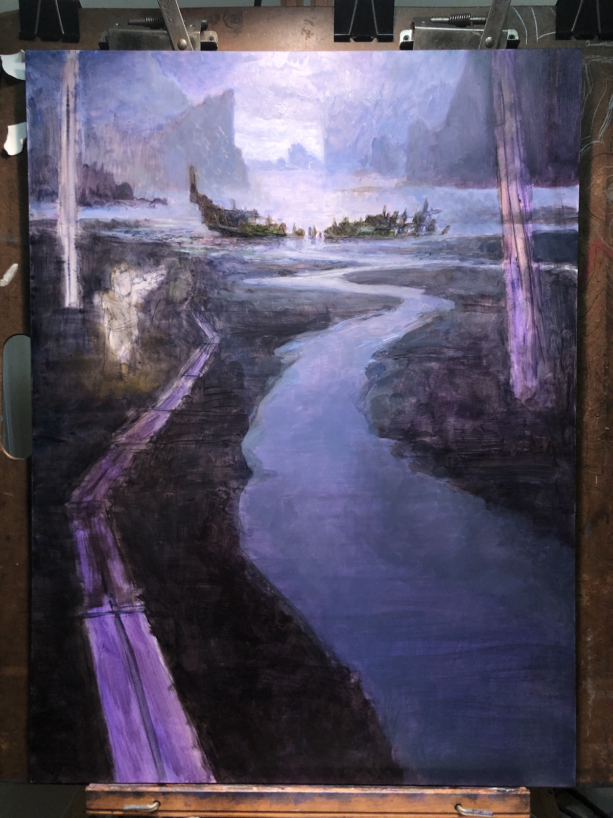
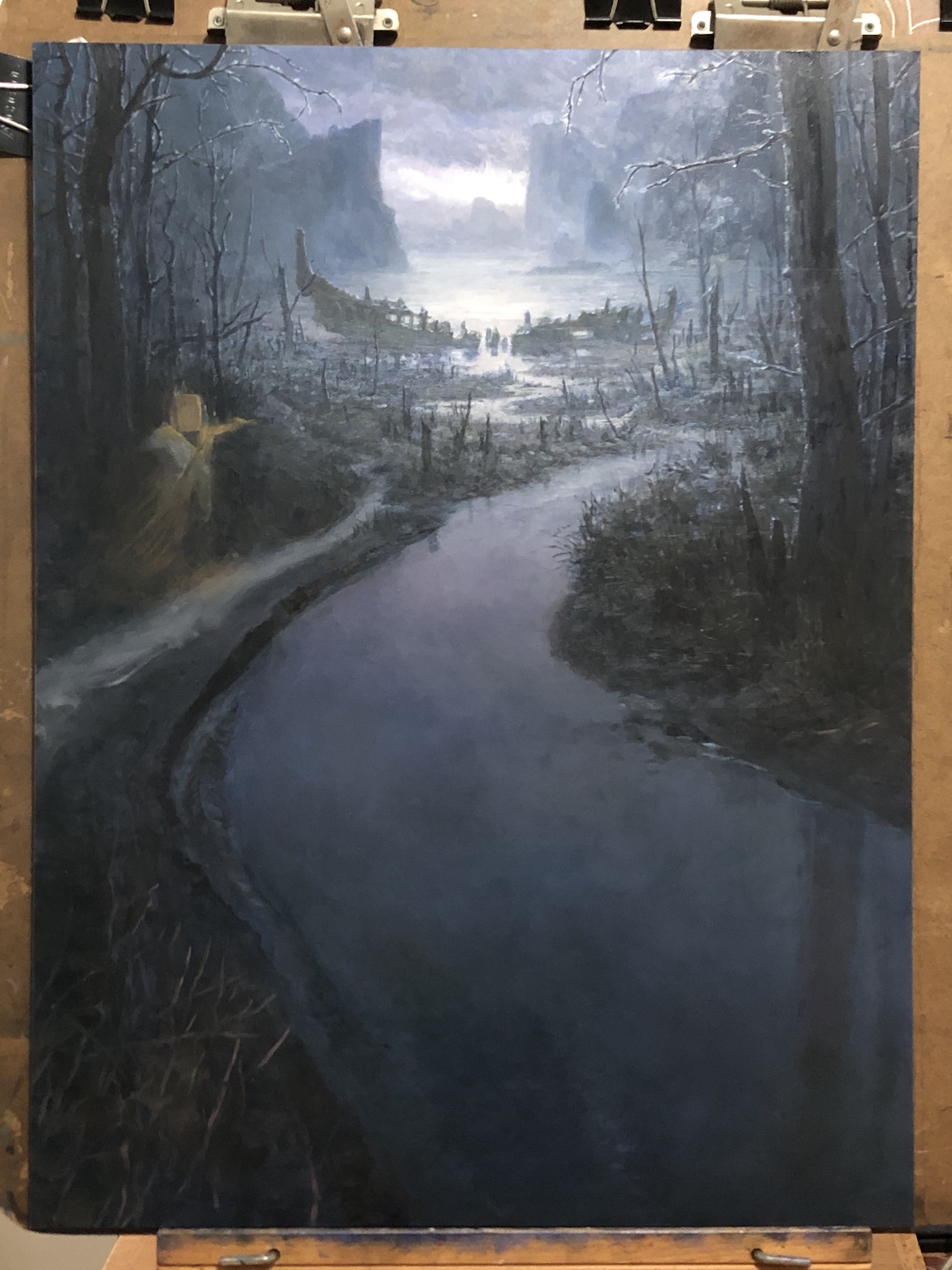
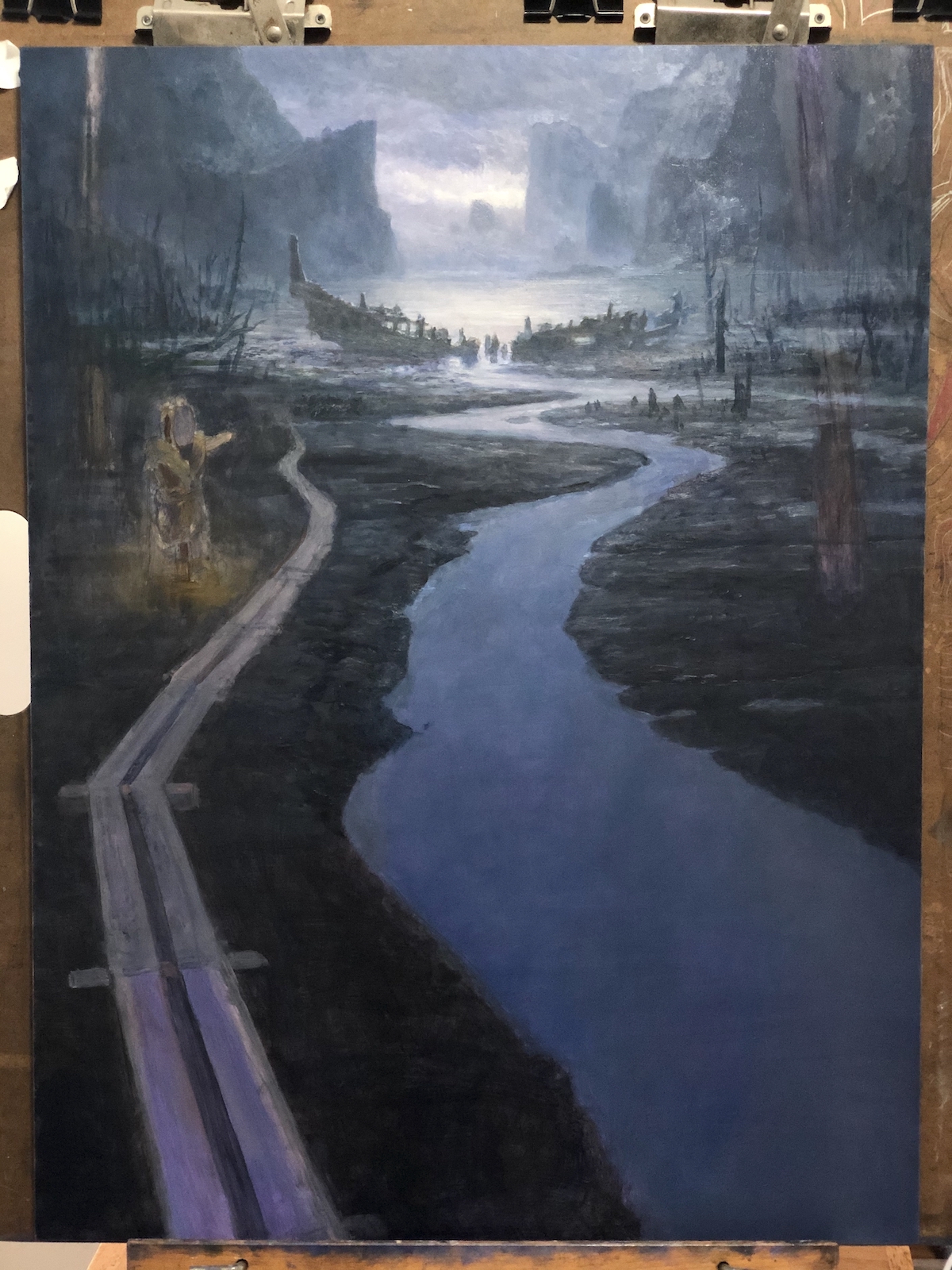 This is where the piece began a drastic change. It ceased looking like this very shortly after this photo was taken. You see, there was a problem of perspective.
As it existed in the image above, there were issues with the perspective and how it affected the scale of the piece. The problem (as I saw it) was this that the scale of the candleguide (which is scrubbed in and slightly brownish on the left hand side of the piece) felt off. If you look carefully, the candleguide feels a bit too large. Indeed, there’s a weird miniature quality to a lot of the piece because of the candleguide’s scale
To address this, I could have shrunk the candleguide, but I was concerned that making it much smaller than it already was would prevent it from reading clearly at card size. The other way to go would have been to increase the scale of the plank walkway. However, that ended up causing that plank walkway to dominate the bottom of the painting in a way that I found…unpleasant. It also began to compete directly with the stream, which was actually an element that I was asked to include, whereas the walkway was not. Alternately, I could have let the walkway awkwardly go off the side or bottom corner of the piece, but those options felt off to me, as well.
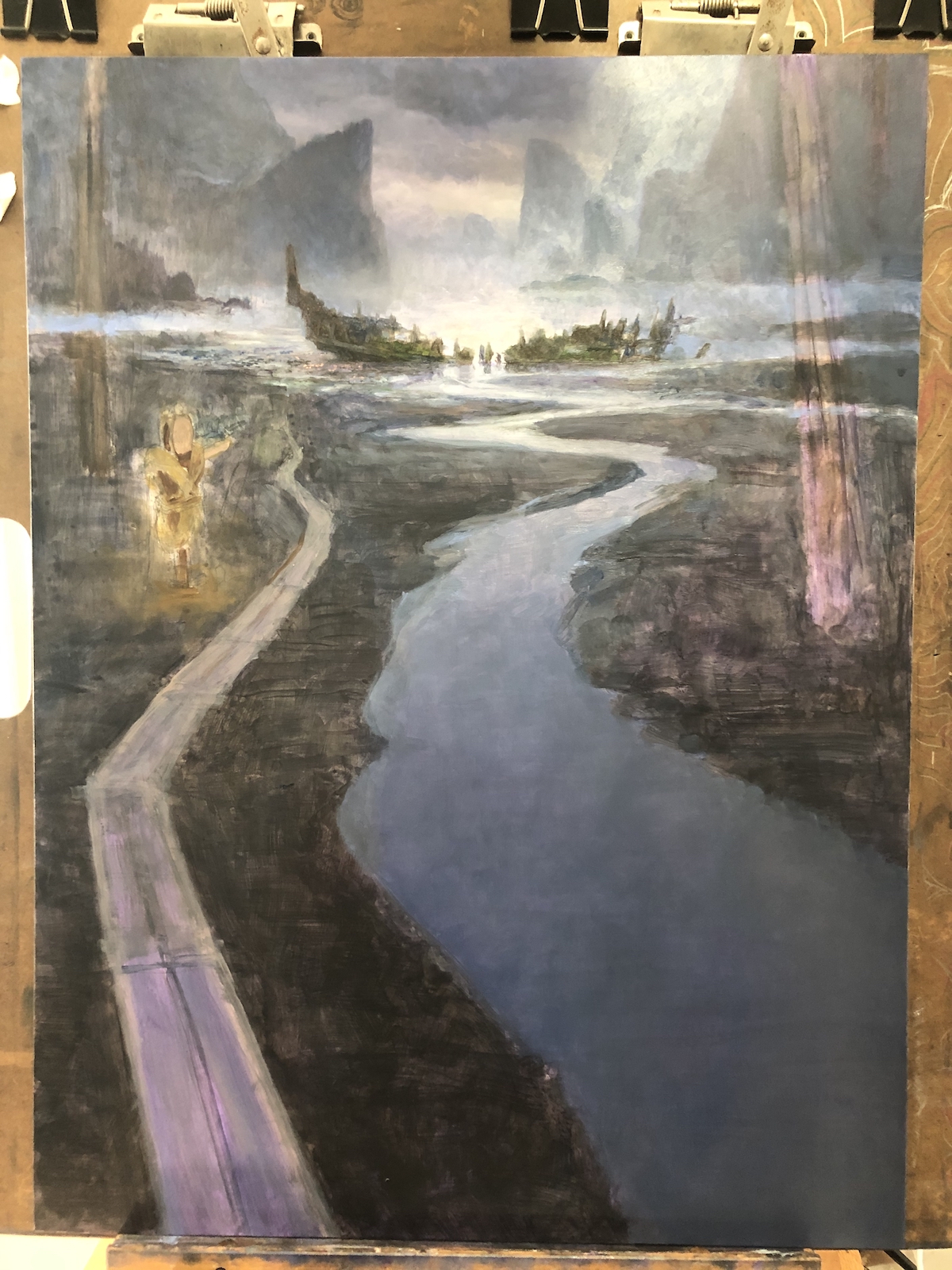
So, I decided the best way to deal with it was to fudge it. Rather than have a path that was geometrically rigid and something folks would instantly scale in their heads, I decided it best eliminate the planks and go with a simple, mud path, which was more organic in shape and therefore less obviously at conflict with perspective of the piece.
Unfortunately, that didn’t solve all the issues I was seeing, and I realized that the width of the stream was contributing to the wonkiness of the perspective, as well. My solution was to widen the stream more drastically as it approached the viewer. These changes helped to make the perspective feel more “right.”
Before pulling the trigger, however, I got in touch with my art director. I wanted to be sure he was cool with the changes, since they changed fundamental aspects of the piece (though largely stuff that would be covered by a text box). I submitted the following revised sketch for his consideration:
 Fortunately, he was cool with the changes and I began the final push to complete the painting.
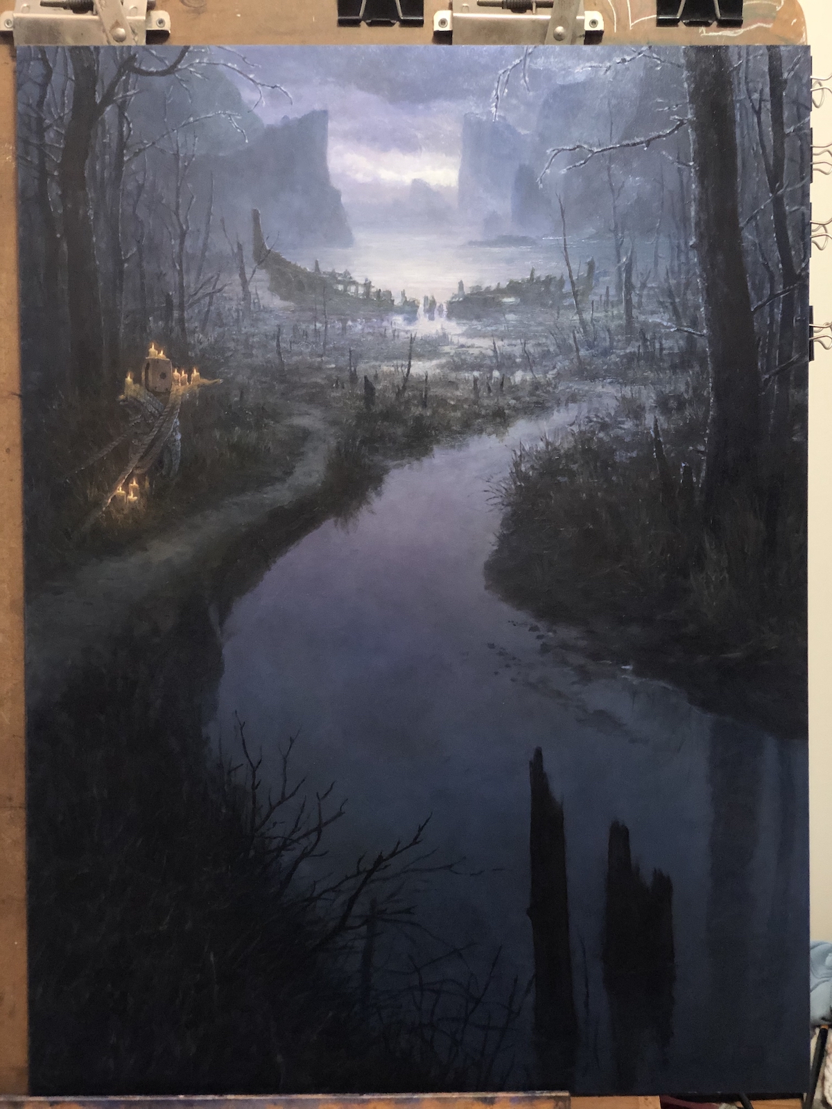
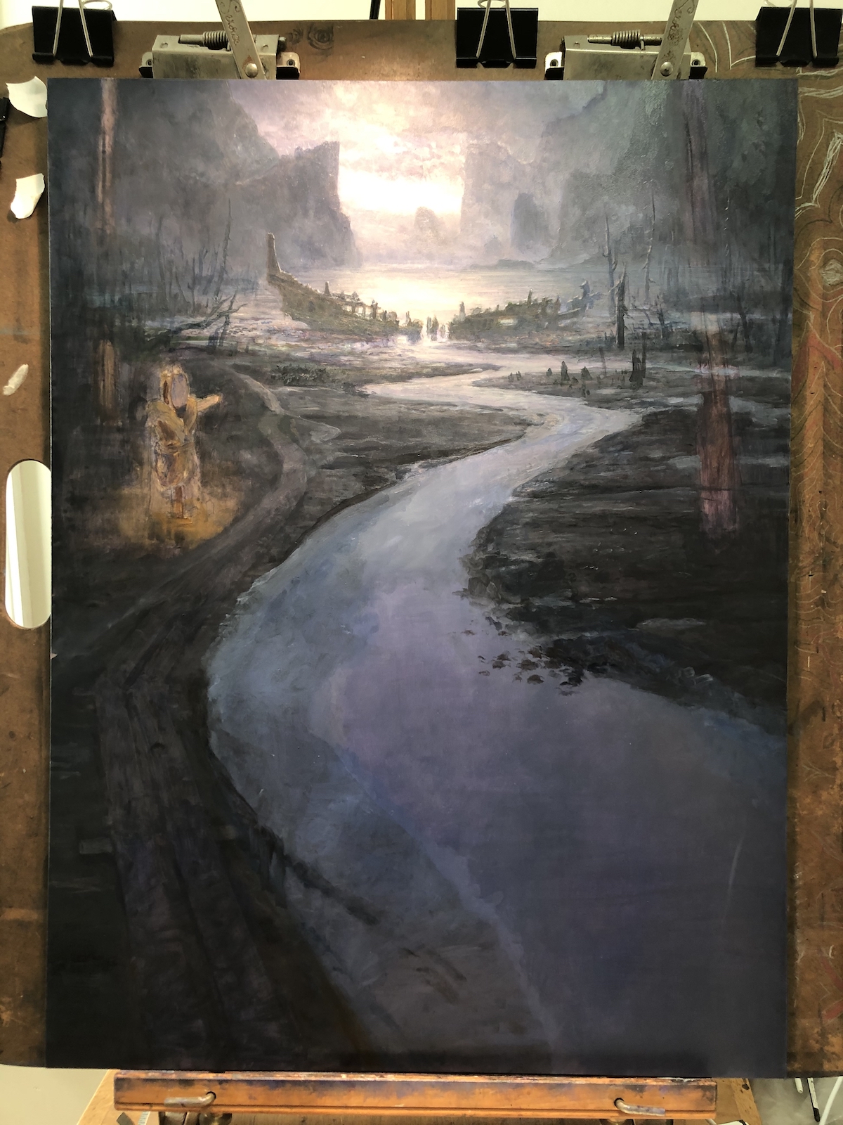 The above image is super blown-out, but the area that’s important is clear. I started nailing the revisions down immediately. Despite looking like I was confident, I believe the actual banks of the stream changed regularly throughout the remaining days of work. I was constantly tweaking them and fighting to make the painting feel consistent throughout.
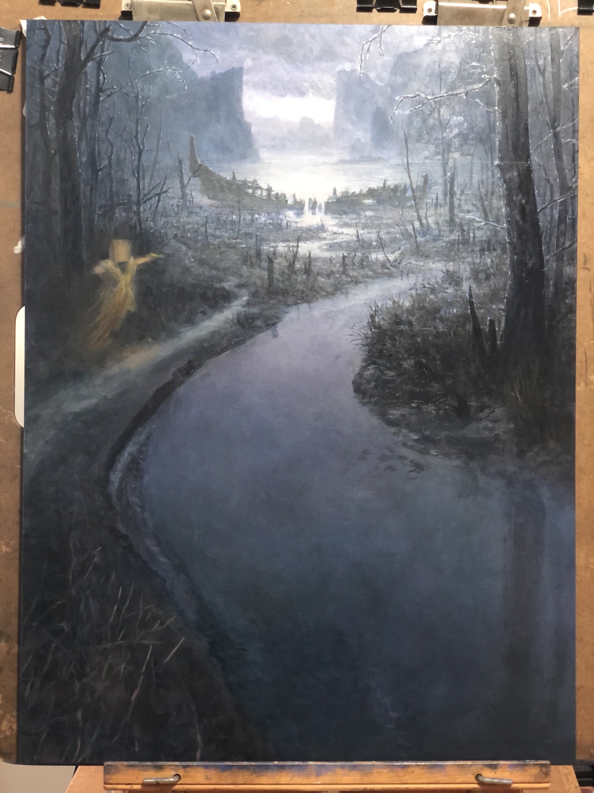
 Putting the trees in changed the piece enormously and pretty much on every level. I may have waited too late to add them, but once they started to appear, I felt a bit more confident in where the piece was headed.
 A bit of a jump here, but I think it’s easy to connect the dots with how I got here. Just a lot of work with small brushes to add detail, and large brushes painting thin layers to add more atmosphere.
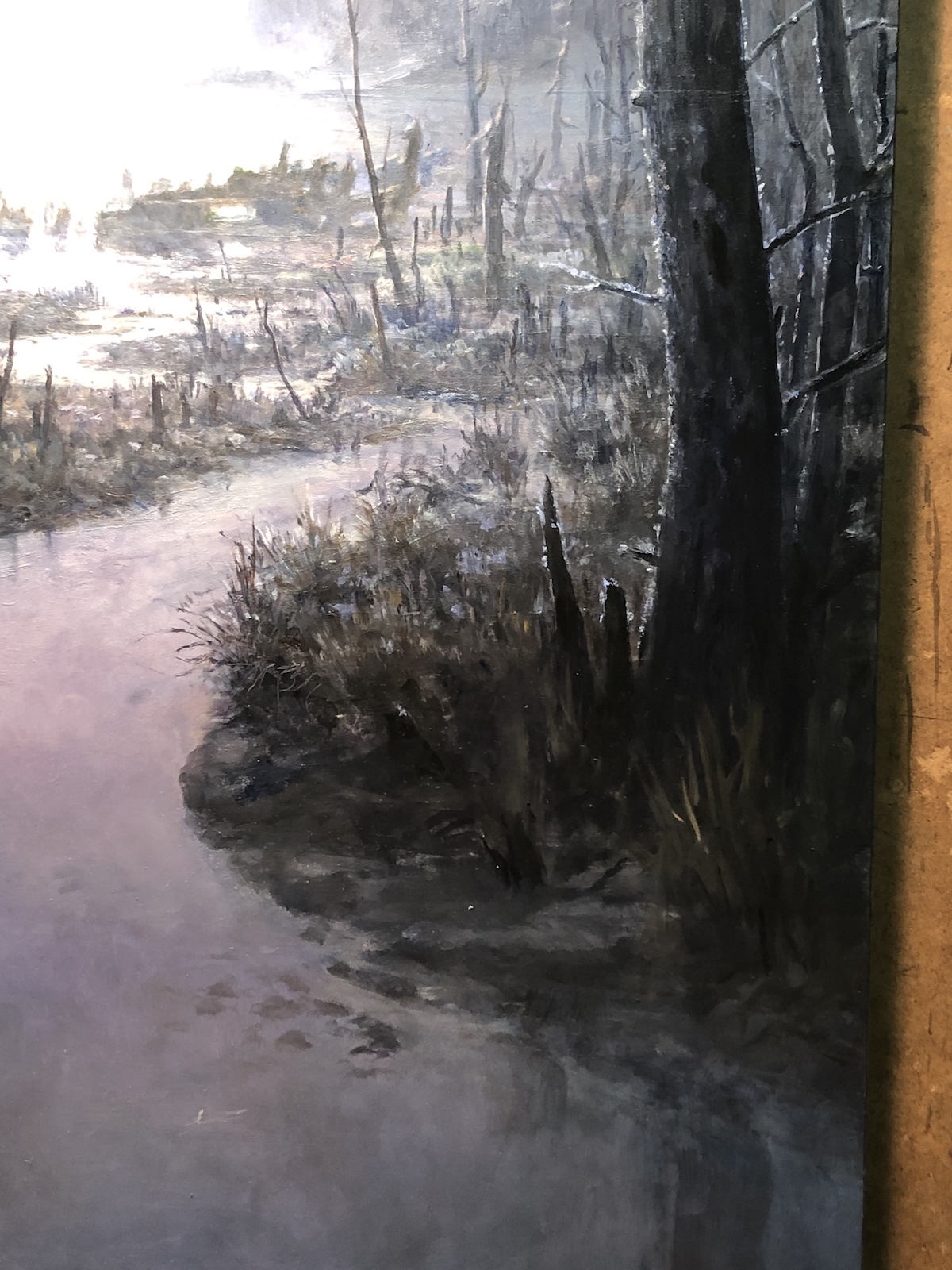 Here’s a closeup of an area in progress. The light haloes around the trees and stumps are meant to indicate a spiky hoarfrost that has accumulated on everything.
 I waited until the last minute to actually paint the candleguide. This is frankly due to the fact that I really didn’t love the idea of the candleguide even being there in the first place. To me it felt…obtrusive. The irony is that when I finally DID paint him in there, that area became my favorite part of the painting. Weird.
 Here’s the piece from the day before it was completed.
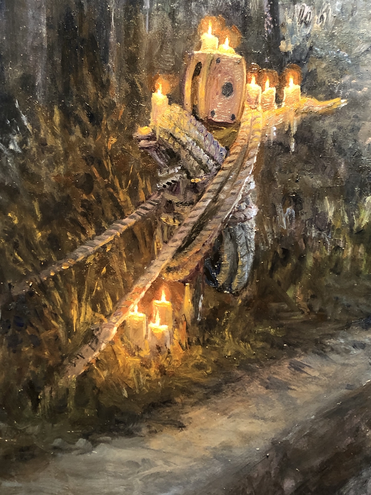 Here’s a shot of the almost finished candleguide.
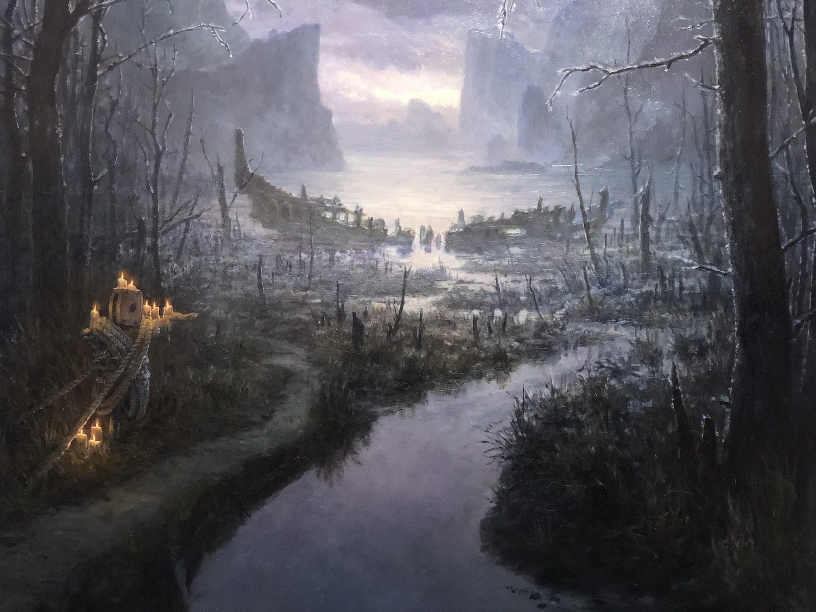 And here’s a shot of the part of the piece that would be visible above the text box on the card. Took this imaged just to be sure that area was working cropped in from the rest of the piece.
An aside: this also provides a good view of a very subtle, abstract face that I intentionally added to the piece. Holes in the shipwreck create two eyes, the bits of shipwreck in the middle of the “eyes” create an almost skeletal nose, and the branches and stumps closer to the viewer form a spiky, toothy grin. As it wasn’t called for in the illustration, I didn’t push it very far. But it’s there… Or, if you happen to be one of my art directors and dislike the very idea of it, then this is all a lie. There was never a face there and you’re not reading this.
Anyway, here’s the finished painting:
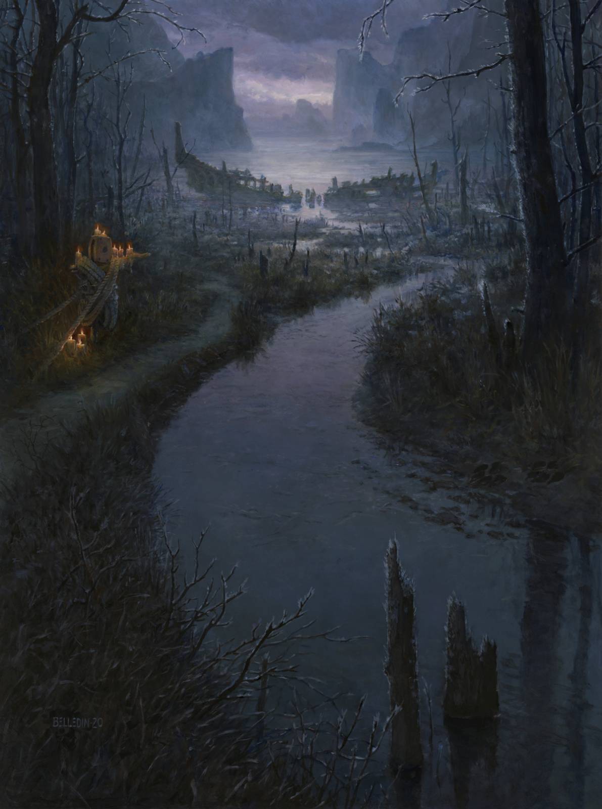 Again, the finished painting is called Shipwreck Marsh, is oil on gessoed hardboard, and measures eighteen inches by twenty-four inches. It was art directed by Taylor Ingvarsson.
I really liked that plank walkway and I tried to save it. I tried hard. But the reality was that the competition with the stream and the wonkiness of the perspective made it a liability, and in the end, while it was a nice bit of world building, it didn’t really add all that much to the piece.
Now, is the final version “right” in its perspective? Probably not. But it works way better, and honestly, perspective on flat planes can be deceptive and very difficult to read to begin with. While not a completely flat plane, a marsh doesn’t tend to have a ton of topographical features to help disguise or enhance perspective. So I did the best I could, hoping throughout that I could get the image to work in the end. And frankly, for me it works well enough. The fine folks at Wizards didn’t seem to disagree and they put their stamp of approval on it.
One of the harder things I’ve learned over the years is that when things aren’t jiving well in a piece, sometimes the only answer is to get rid of elements I absolutely love. A simpler image that works is always going to be better (at least in my mind) than a more complex image that doesn’t. In writing parlance, getting rid of elements that subtract from the whole is often referred to as “killing your darlings.” The plank walkway is a darling that clearly needed killing and the end result is a better piece. That being said, I still like the idea of the walkway and will likely revisit it in some capacity at some point—even if it’s in a personal piece. I also think it’s something that deserves to be a primary element, not just another thing thrown into a piece because I thought it was neat.
I absolutely wish I’d recognized the issue earlier in the process. I absolutely wish I’d been able to make it work and capture better what was in the sketch. But that’s not how it went down. All things considered, compared to other pieces I’ve done, the changes this piece required are mild.
So there you have it folks. Hopefully you fine folks are better at recognizing when darlings need killing and earlier in your process than I sometimes do. And if not, hopefully I’ve reminded you that killing your darlings is sometimes the best option. Or, as a professor of mine used to say, sometimes you have to amputate a limb to save the body.
Until next time…


Great read, killing your darlings is hard. I really like the atmosphere you made in that one.
Loved checking out the progression of this piece. Looks amazing. Thanks for the warts and all tour.
Is the face sticking the tongue out as well?
Wonderful work on this and thank you for sharing the process and struggles with it.