Never before has an insurance clause and policy wrought SO much drama, heroism and greed… but Billy Wilder’s Double Indemnity does it all and set the course for every single Crime Noir film to follow. DI is one of the great bedrock classics of old cinema and to my great honor and delight, I was asked to illustrate it for Criterion’s restored and elegant new 4k/Blu Ray release due to hit shelves in May 2022. It was almost immediately on the heels of the Piano, in a lot of ways an exhausting time, but I don’t say no to their call ever and even before I knew the subject, Eric Skillman had me at “noir classic”. Now, I grew up watching all of these films when a weird low budget local channel in Houston back in the 70’s & 80’s used air almost nothing but these old films- (like as not because the license to do so was so cheap). And I spent most of my waking life plopped in front of our old tv soaking up all the Godzilla films, old westerns, Abbot and Costello and noir classics like this. At the time, I was a huge fan of Jack Benny- (which was not exactly getting me all the ladies in 5th grade I can tell you)… so getting to as an adult express myself in its most foundational form was a no brainer.
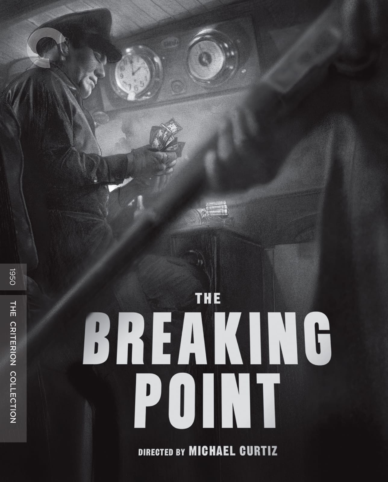
I think much of the hesitation was surrounding the brief from the producer who wanted us to not invent new imagery for the release but really almost exclusively upon the source material for literal and actual reference. I get it- it’s in a lot of ways more then an exercise in technical achievement than a creative attack… but I never saw it that way. We had a similar challenge for their release of BREAKING POINT, wherein they had needed a still from the film for the cover, but the still on its own had some compositional problems that only a complete redraw could fix. Plus it left room to add some subtle meaningful details. Art can do anything when the other stuff fails, so in that case it was a mission both born of speedy needs and the desire to show that practical art making at the end of it all, even in marvelous times of high technology, still was the only true solution. A black and white noir is my entire wheelhouse of joy, so I jumped upon this like a junebug.
Sometimes it’s the greatest restrictions that breed the most creative freedom. But really even if there wasn’t little places to tweak the source or re-contextualize the material, the simple act of drawing hard core film noir as an exercise ALONE would be worth the price of admission. I could literally do this all day long. Now, this was at an especially busy time so I didn’t get to overindulge in QUITE the same volume of work as I usually like to do for these releases… There are at least two images I just never got a chance to tackle that I wanted to attend to, but alas. Only so many hours in the day…
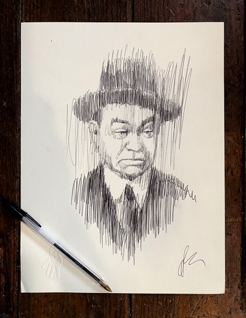
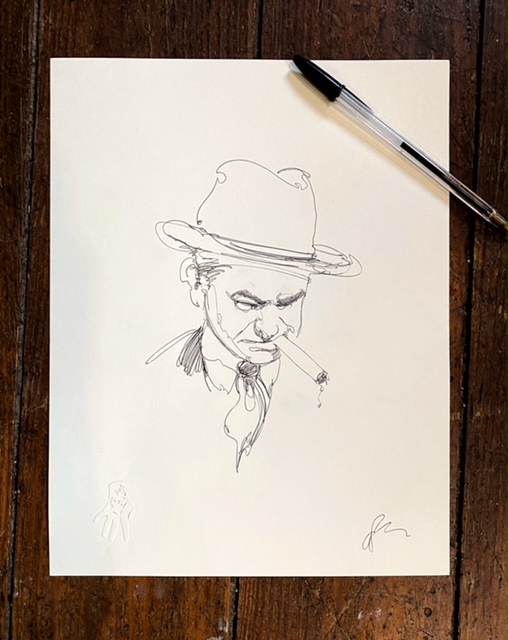
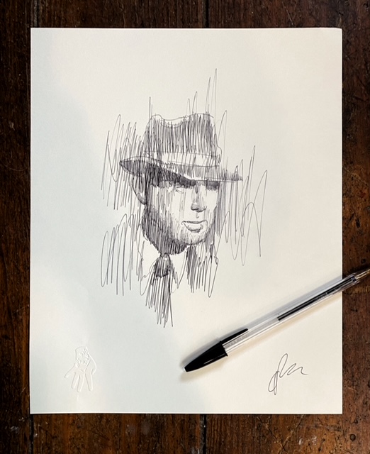
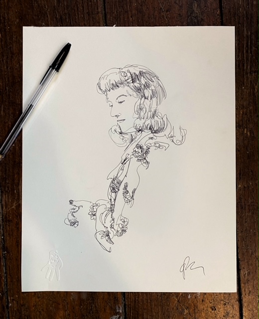
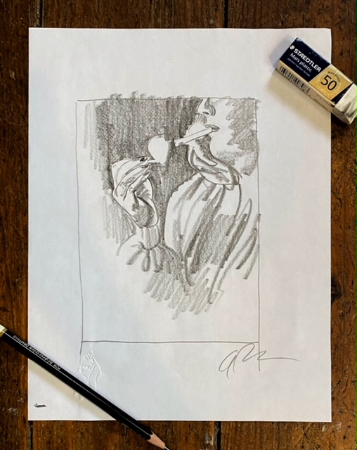
One of the things I always start with is after the first viewing, I like to do some character studies, recursive, pencil sketches… whatever to start to get a sense of the subjects and get my brain engine running at full speed. I find in the act of this kind of prelim work I get a lot of notions for other pieces to use or whatever may be needed. Sort of mental virtual space in which to get things sorted out etc…

As per usual it all started off with a batch of thumbnails and the cover. The cover itself was largely preordained as a concept early in so it was much more about finesse and execution at this stage. And as per the usual the interior pieces, while still needing to follow the mandate, could be a little more wild and woolly subject wise.

I’ll say it even though it’s overpaid always and everywhere… ALWAYS leave room for the copy. If you’re doing a cover, never let the incoming title escape your mind and compose your compositions accordingly. Selfishly, this tends to get in front of some unhappy results of secret special portions of the work getting blocked out, or letting a designer with a greater need and fealty to the copy’s purpose make those compositional choices for you. Now with someone like Skillman… that’s actually a positive. But even so, it’s still a kindness to make way for the needed material. So many of these spread notions as you can see come with that in mind. Double Indemnity is a major tentpole of classic cinema and there’s going to be a LOT to say about it. So, a project like this it’s key to anticipate a lot of material going in.
These were all done at around 5″ x 3″ more or less- just concept thumbnail style so rough but clear on intent is the idea. You never really know what might get rejected or picked so unless you’re cool with making the piece in full whether it sees press or not, best to keep things simple and quick at this stage. Plus, it helps to bang out a lot of ideas quickly so you can get down to business. Also make sure to always follow the golden rule: NEVER submit a dummy sketch or a bad one, because they might pick it. Make sure anything you submit, you’ll be happy to take to final. I speak from terrible experience on this.
These two above I was desperate to see done, but time conspired against me as did the backlog of private commissions I need to chew through, so they never grew into adults. While of course I don’t encourage being taken advantage of overworking on a project, particularly if that overworking is being commanded down from the Editor or AD, this is a case of me volunteering it always. With each and every Criterion release I’ve worked on, Eric always picks three or so pieces plus the cover to pepper the layout with, and I ALWAYS add at least three more to that pile… these bits can wind up as on screen menu ills, or the disc itself, anywhere art can get planted, if he has a lot to work with, Eric will water that garden ferociously. He’s fine and all good not doing this, but the end result is just simply more. In the end, when you’ve spent the fee money and gone to the other side of the grass, all that remains is the work anyway, so don’t be stingy. At least when you’ve got an earnest partner on the other end of the process.
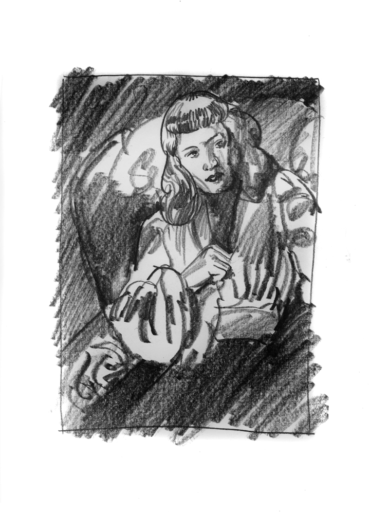
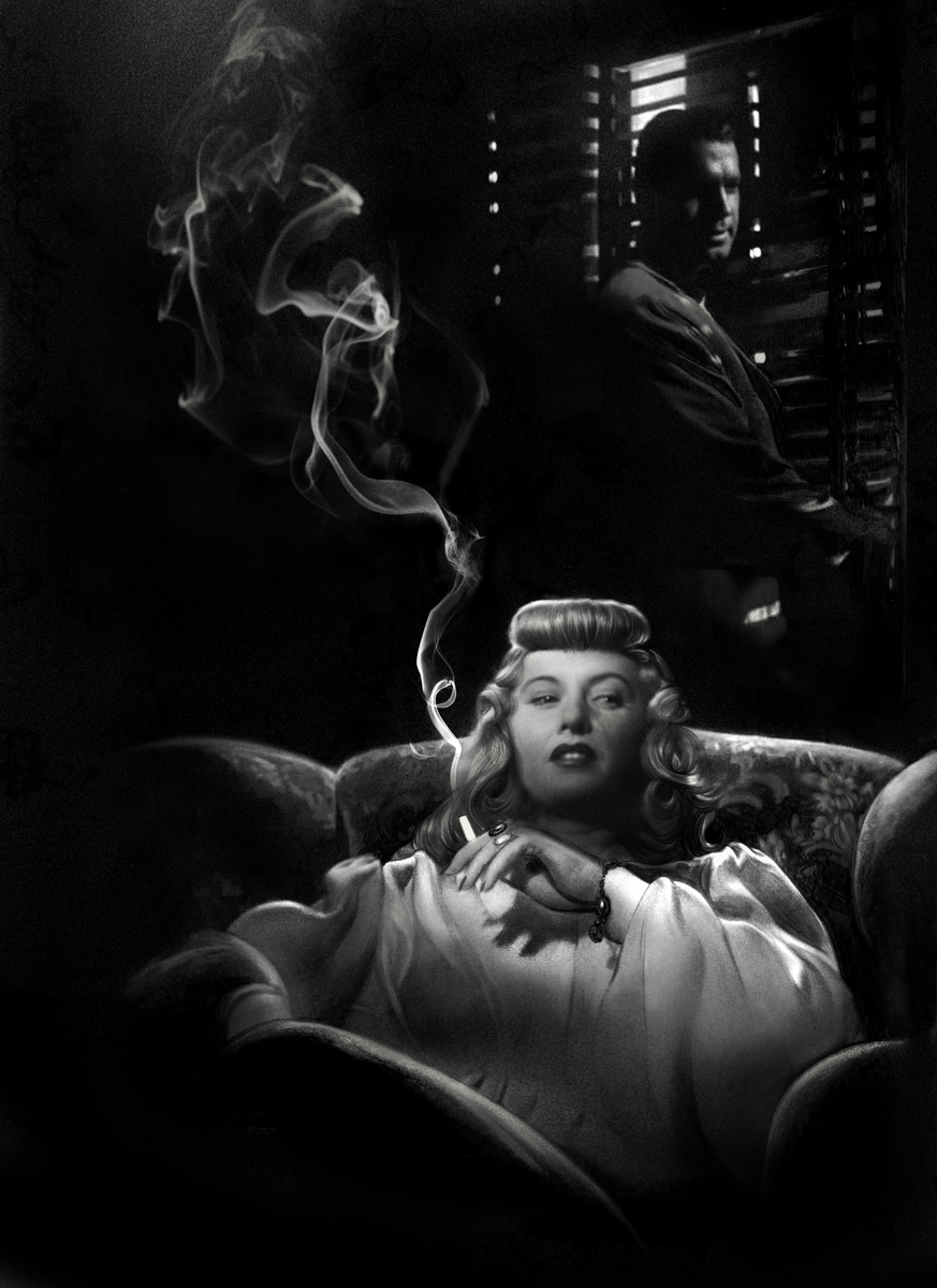
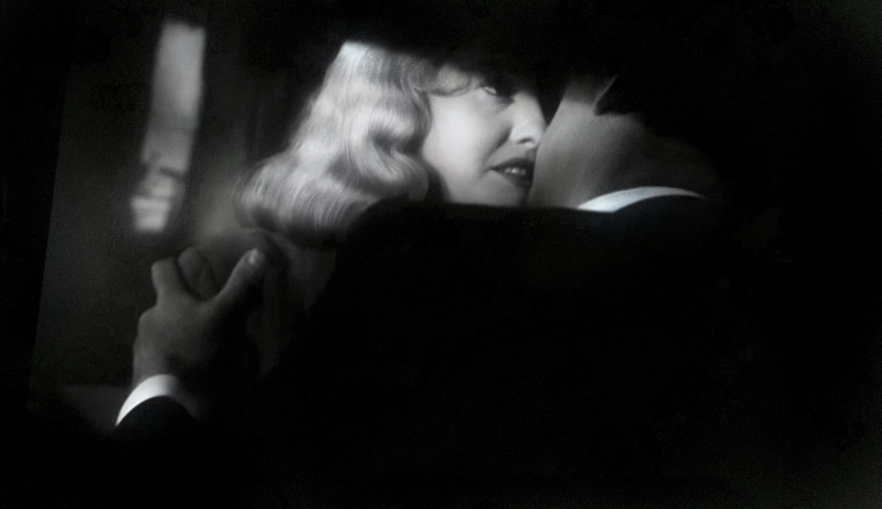
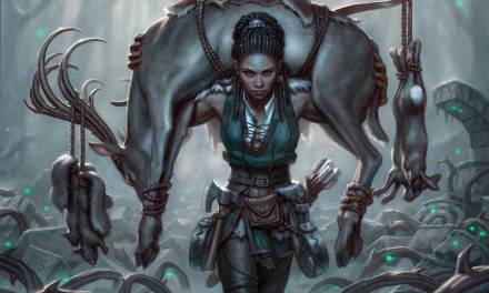
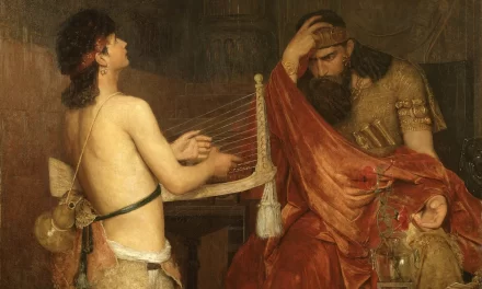
There were a LOT of Stanwyck largely because she’s the centerpiece of the film, but visually speaking, her platinum blonde hair and ivory skin pops like a firework against the nourish gloom of the film tremendously. There were a lot of these that are technically direct pulls from the film, but not one is an exact yank. This is the tiny crack in between the brief and my devilish desire to be contrarian to it can find purchase and thrive. Plus, the derivations from the actual imagery are both minor and not done willy nilly for my own ego or gratification. The distinction is an important one with this kind of work. Again, this maybe art, but it’s not your own studio art- you’re here to serve a purpose, and in this case, that purpose is to sell the movie, entice and reward the buyer of the blu-ray with your best expressions of it. This isn’t to say you’re just the organ grinder’s monkey here, but that your core purpose needs to be the project. Keep that true north set in your compass, and THEN you can run amok and fulfill the second and in my opinion, the more important task at hand: tell us something new about the thing you’re illustrating. Tickle something out that might be there already, a theme or a promise, or a character moment… even if it’s a personal desire like my spread here of Stanwyck hugging her bewitched costar into her crimes and smiles a devilish grin for us but not for him.
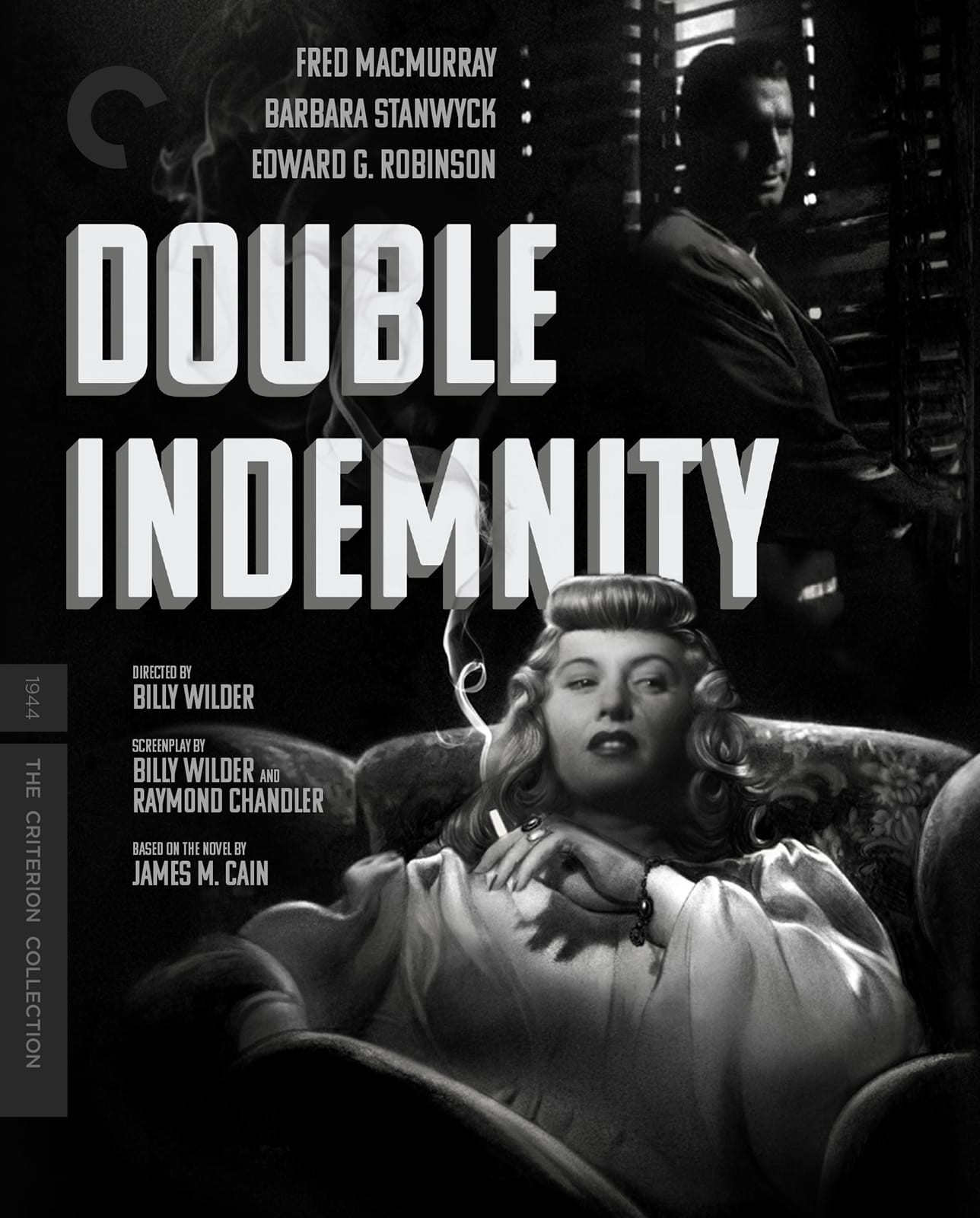
For the cover approach I tried a few compositional changes and some other approaches to deliver the cover’s narrative- Stanwyck looking off to turn over her own evil schemes in her mind while her patsy looms behind her, completely cuckolded, but still carrying the ultimate weapon to bring her down. Some of the changes were compositional and I remember altering a different expression on McMurry’s face. Had to redraw Stanwyck too and drop her in because I just didn’t quite lock down her likeness properly. She’s got a hard likeness to capture- no real distinguishing hard features, soft cheeks and chin, and really her beauty here is a collection of parts that on their own may not be until in concert together to deliver the goods. Sometimes too, when working on these… the original drawing below is 13″x19″ which isn’t exactly small, but given her size on the page, a little too small to easily grab ahold of a delicate likeness easily. So as you also see below I redrew her portrait a bit closer and dropped it into the final.

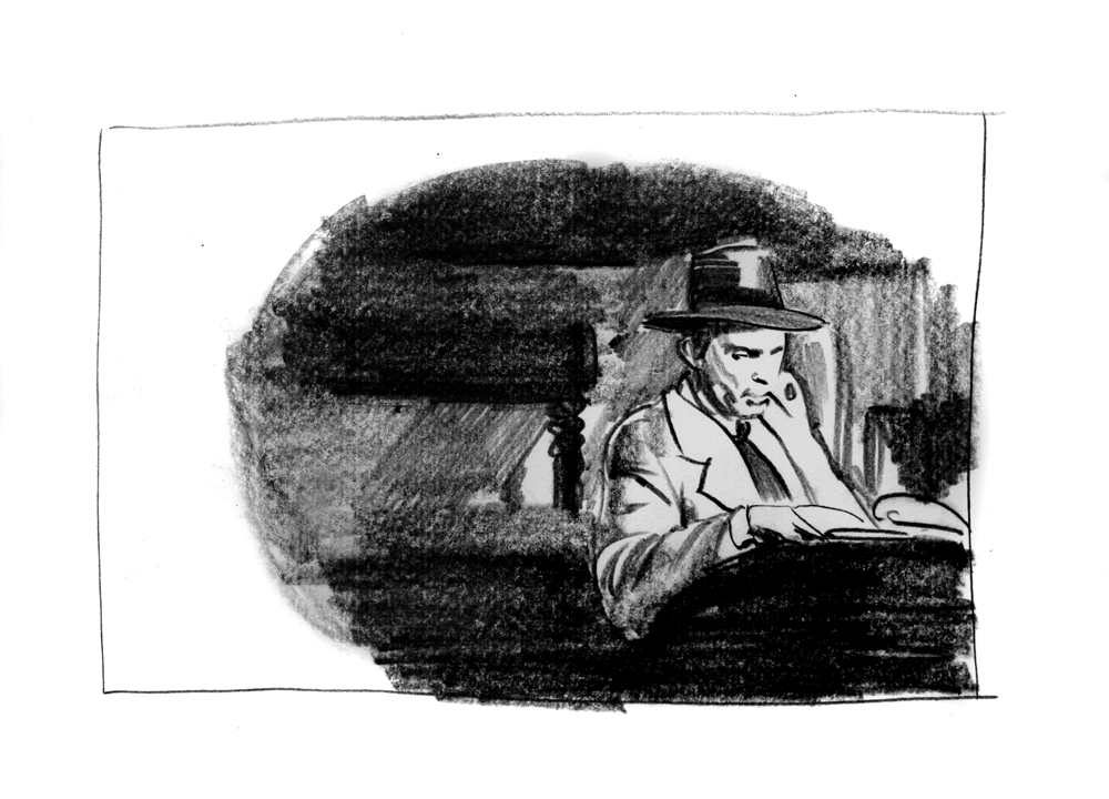
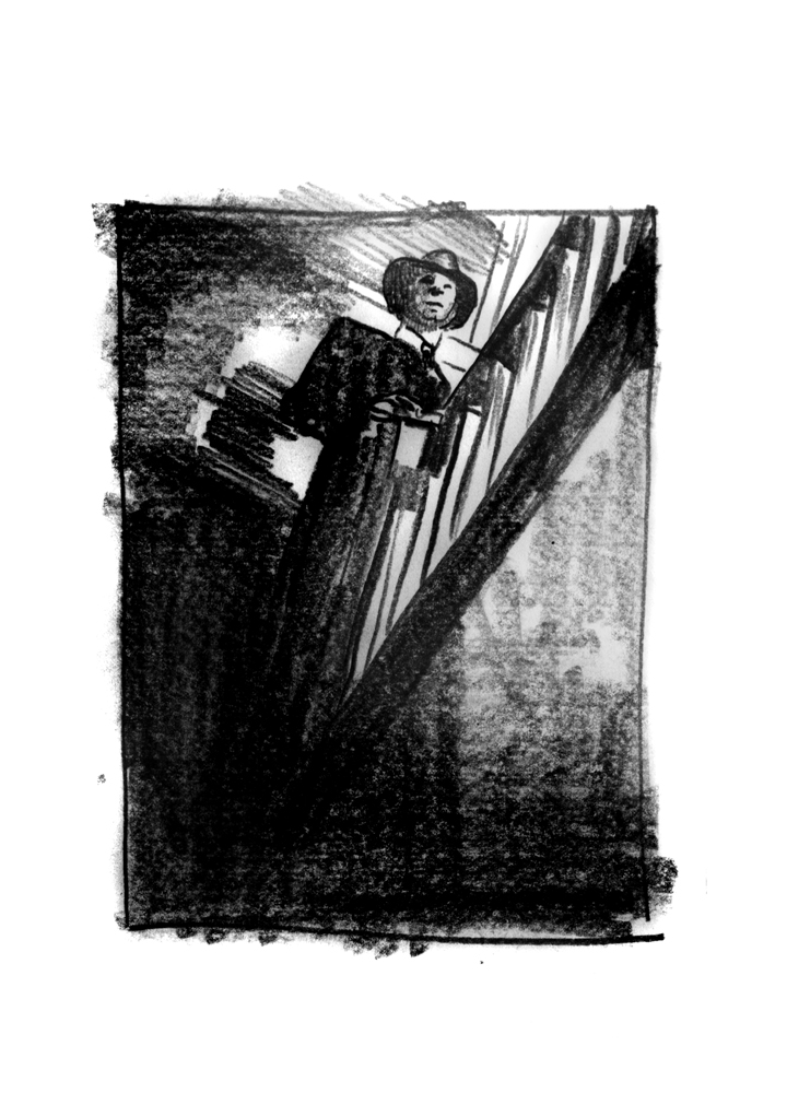
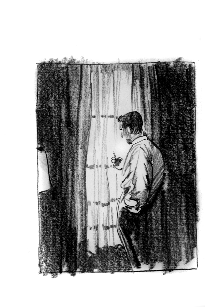
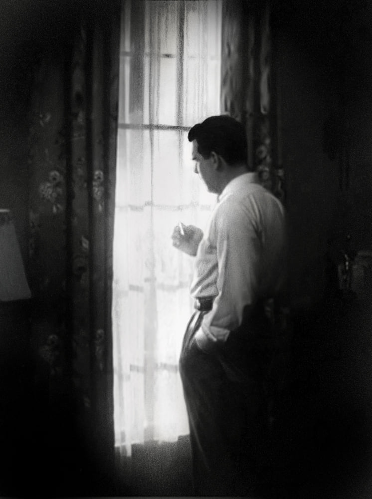
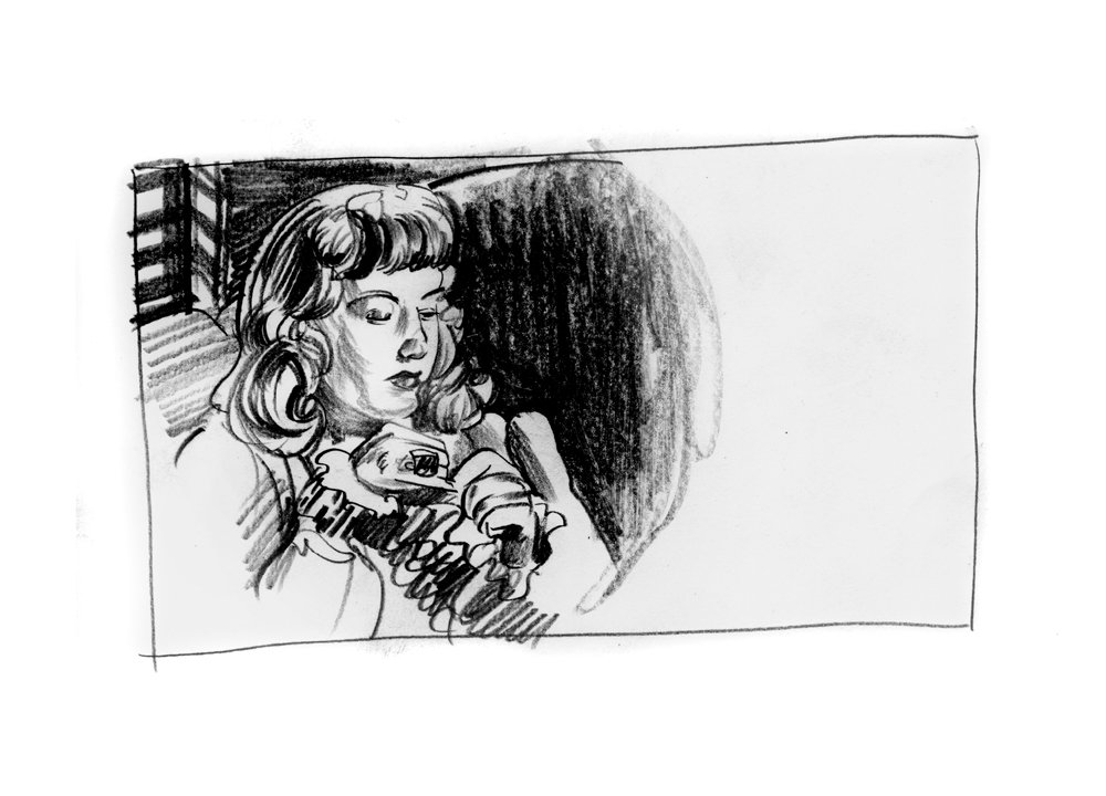
Moving on to the final interior pieces was the downward rocket slide part of the project. There’s just a LOT more freedom and less own the line with an interior so it’s a bit more relaxed. Plus, having set the course, manner mood and themes from the cover, the rest is just about fulfilling, flipping or affirming that DNA. Fred McMurray by the window was one that I really championed for as so much of this film is his own reflection on his surprising turn to crime.
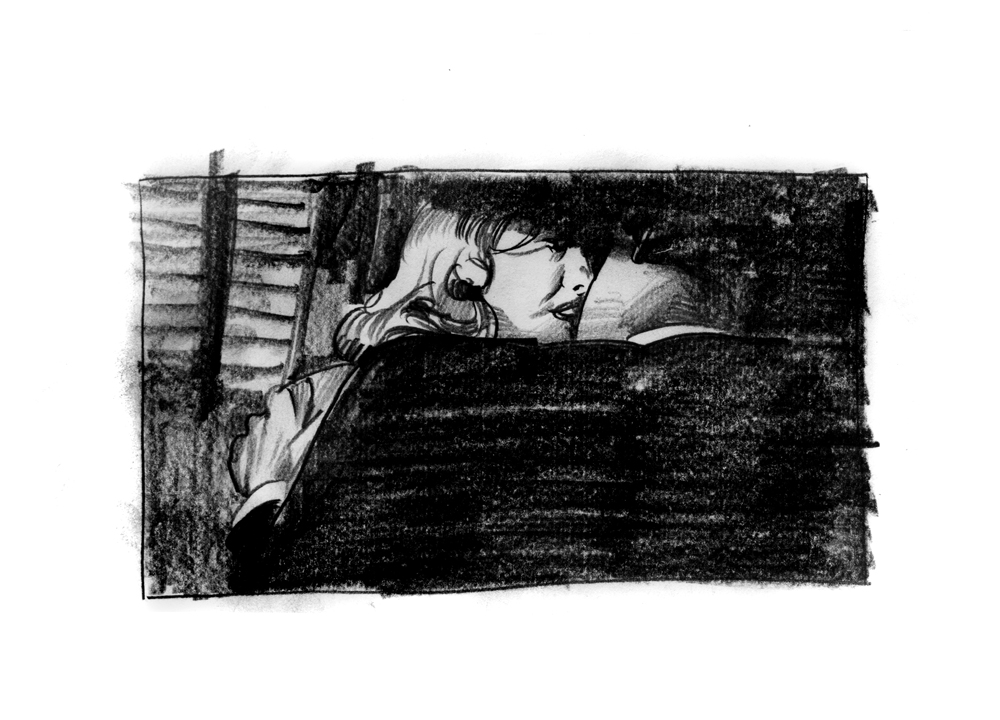
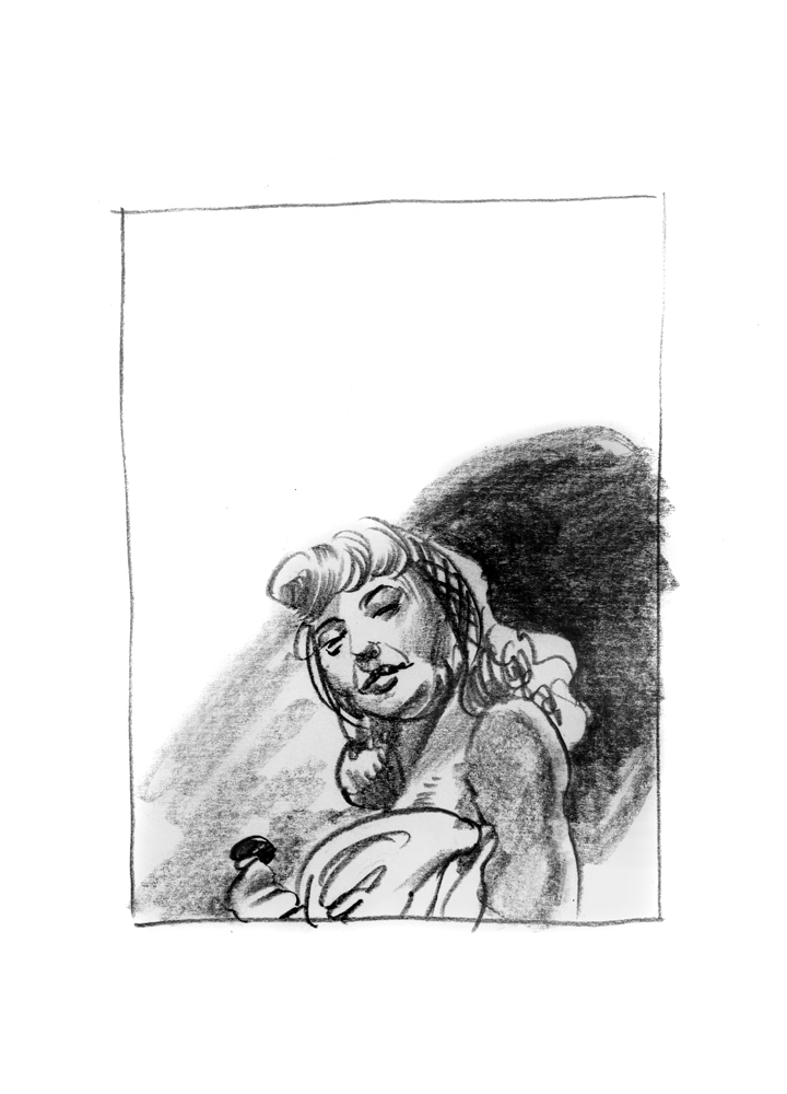
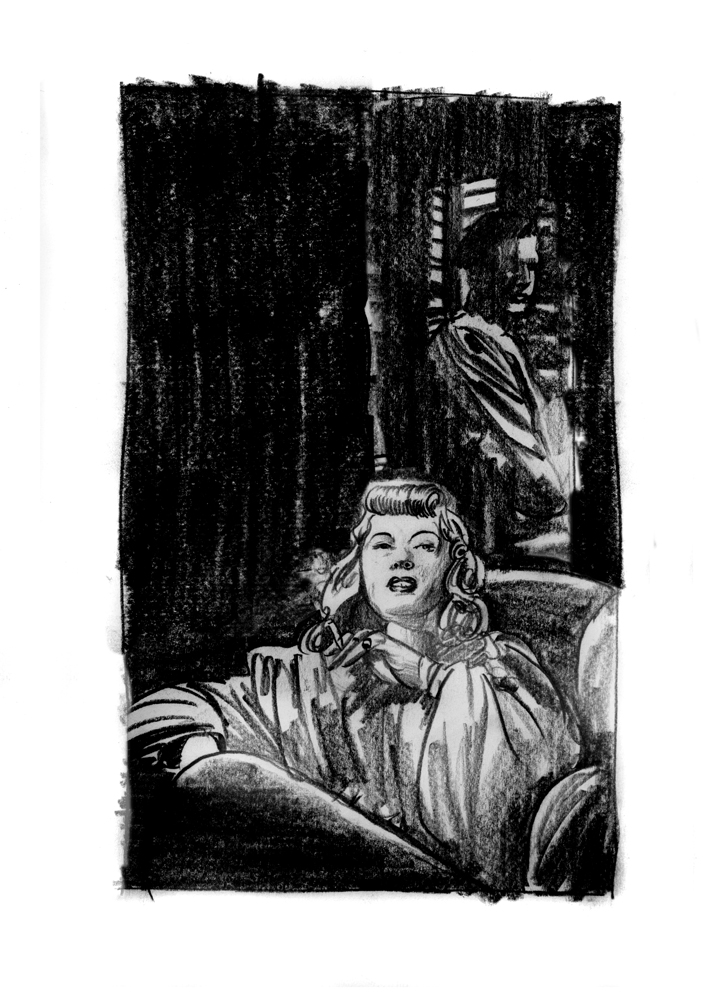
I wasn’t sure this would hold interest but the lighting of the ciggie, but making it about the act and cropping out the person performing it was a dodgy enterprise. It’s easy to get caught up in the glam of showcasing fabulous golden age of Hollywood actors in projects like this, and I am no innocent when it comes to that basic desire. But, sometimes, it’s better to think bigger than just a pinup or a portrait, and sometimes even more weirdly, bigger can mean smaller. A tiny stolen moment a glance of the eye, a hand placed or misplaced…. to me this was the spider building her web. We didn’t know in meeting her that we were coming in halfway already, into her scheme, and when we found out, it was already too late.

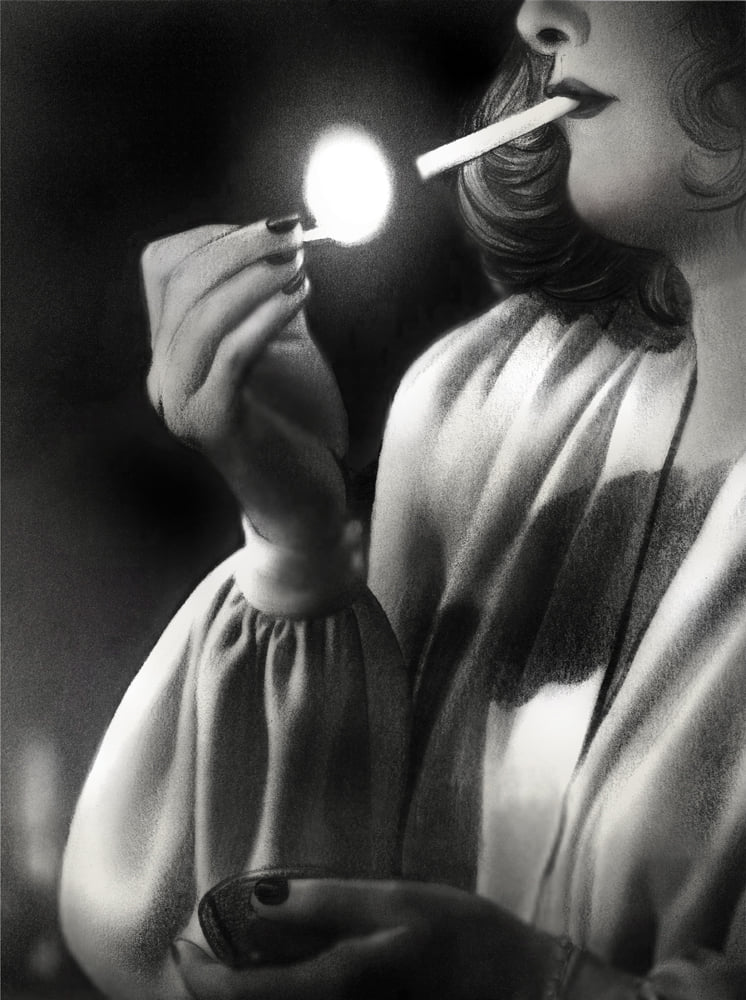
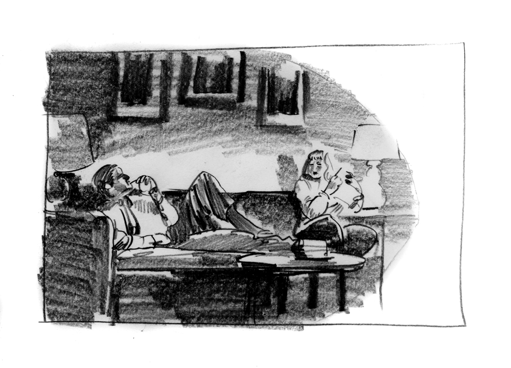
This one was the one I essentially declared as essential because it’s the only opportunity to really showcase her villainy here and how she entices her victims towards her designs. McMurray is just any Joe here, faceless and unspecific, but she is the master of her world, the spider at home in her web. She’s watching him desire her and using out like a stiletto to achieve her aims.
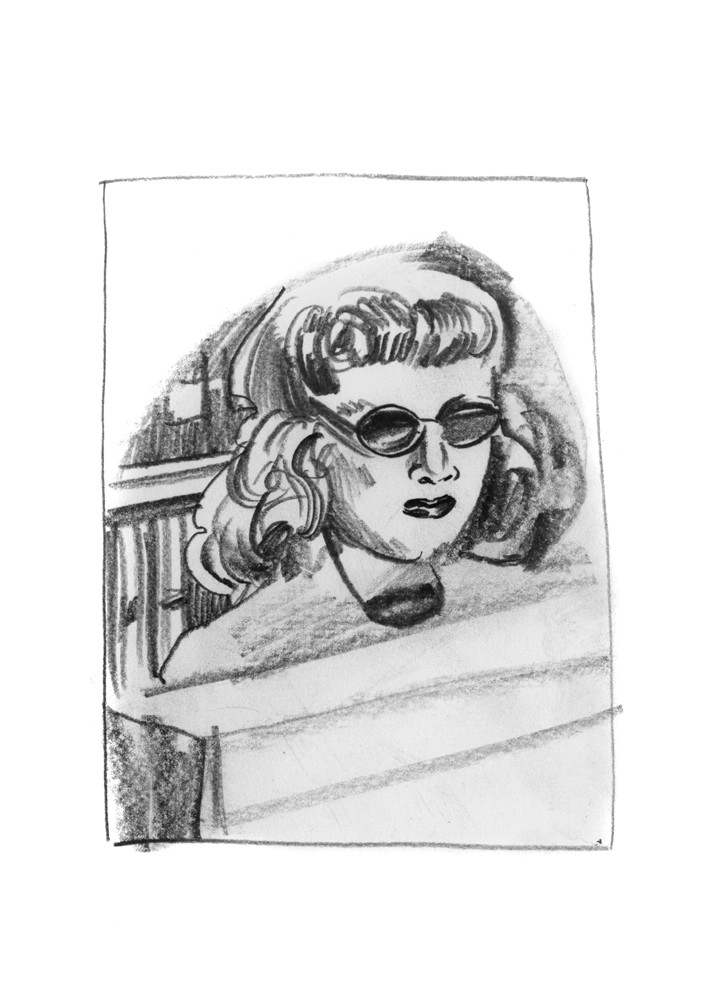
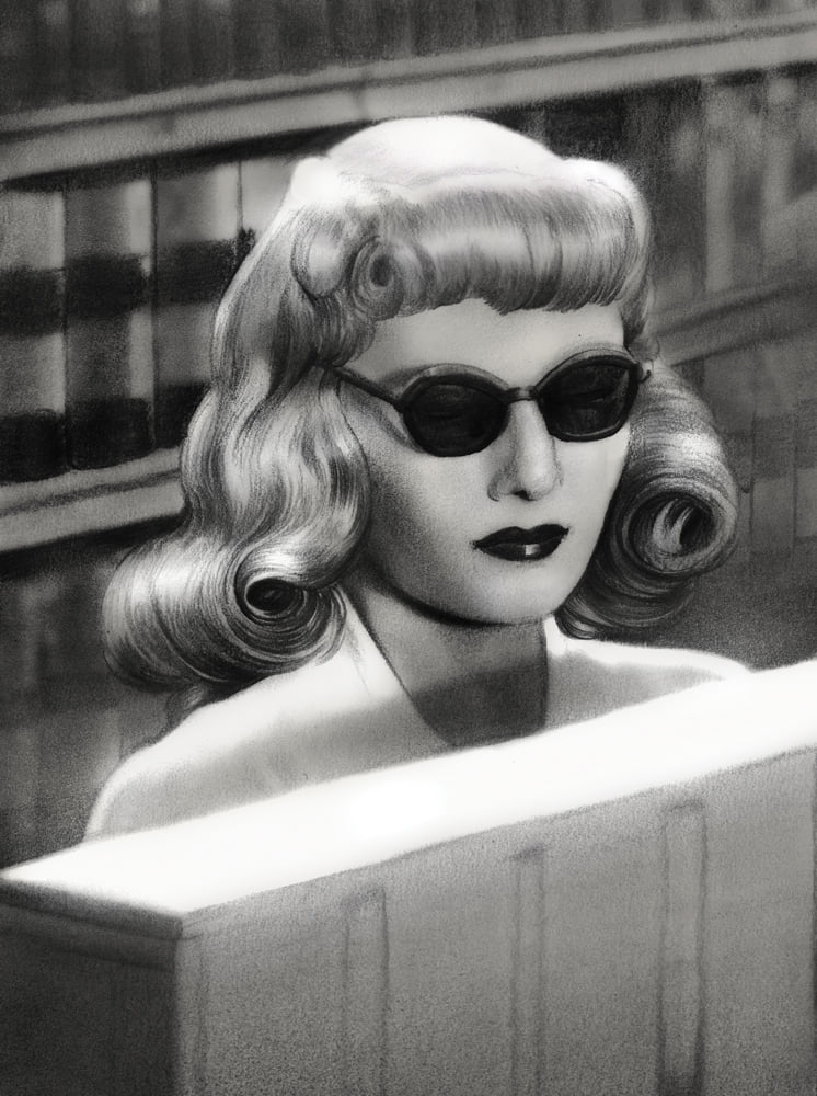
I’ll be honest and say that Stanwyck holding a suspicious meeting in a shop by hoisting these badass glasses always struck me as funny but also sort of magnificently awesome… as if she didn’t give two poops who might know that she was up to no good. The criminal who winks at the bank’s security camera as she robs the bank is a favorite thing of mine. And happily a shared desire of Eric and the rest of the team.
And that is IT! The newly restored 4k/blu-ray release of DOUBLE INDEMNITY is now available for preorder right HERE.
AND, also today, the release of all the remaining originals, recursive studies and sketches from the project on there gregthings shop, right HERE.


Recent Comments