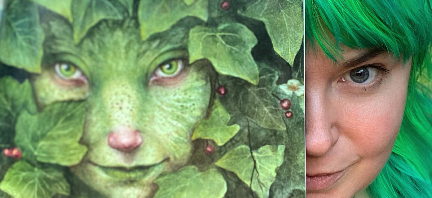
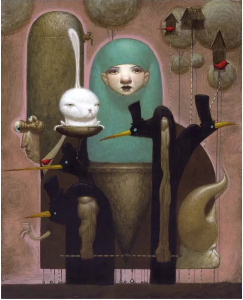
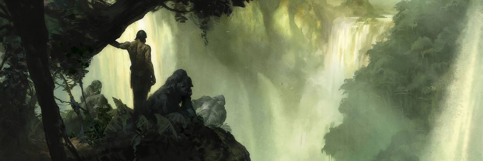
Happy St. Patrick’s Day! In honor of The Emerald Isle, today we give the green light to all things viridescent in art (plus a few snakes in memory of the story of St. Paddy). No discussion of green could even begin without mentioning our banner artist, the queen of green herself, Iris Compiet, creator of “Fairies of the Faultlines.”
Iris says, “I love green and I love this hag so much. One of my all time favorites. She’s straight out of the Faultlines and definitely related to a Jenny Greenteeth. I must visit her again, see if she will share more of her stories with me.” Starting from this enthusiastic perspective, let’s dive into some of the complex history of this most ubiquitous of colors.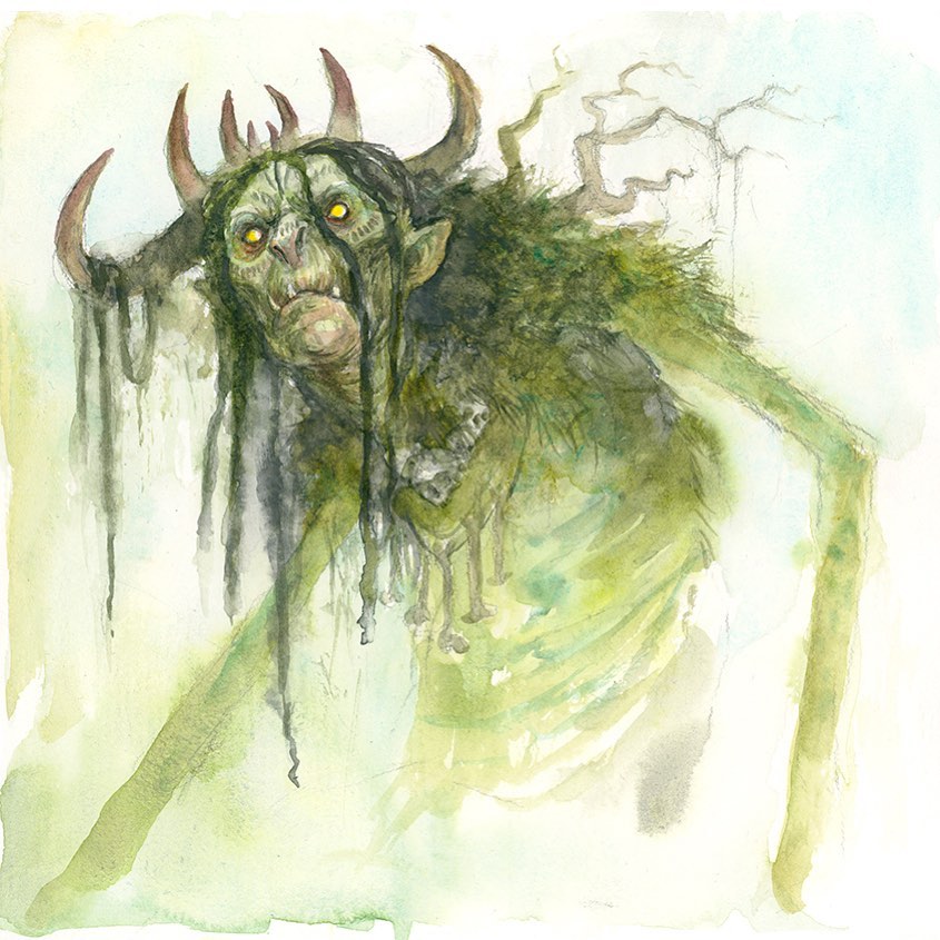
Artists and Green: It’s Complicated
As Kassia St. Clair writes in The Secret Lives of Color, “In Latin the word for green is viridis, which is related to a large group of words that suggest growth and even life itself: virere, to be green or vigorous; vis, strength; vir, man; and so on. Many cultures associate the color positively with gardens and spring.
The expression “to be green,” meaning inexperienced, was already being used by the Middle Ages. Minne, a Germanic goddess, who, like Cupid, was fond of shooting people with mischievous arrows of love, habitually wore a green dress, as did fertile young women-this is one interpretation, for example of Jan van Eyck’s Arnolfini Portrait (c.1435).

Ms. St. Clair continues: “Artists had to deal with inferior green pigments. The Dutch artist Samuel van Hoogstraten wrote in the 1670’s: “I wish that we had a green pigment as good as a red or yellow. Green earth is too weak, Spanish green too crude, and ashes (verditer) not sufficiently durable.”
Through time, artists often had to blend their own pigments in an attempt to come to the perfect green. Even this had its challenges. According to The Secret Lives of Color: “Verdigris was prone to reacting with other pigments and even blackening on its own, and terre verte had poor tinting strength and luminosity.”
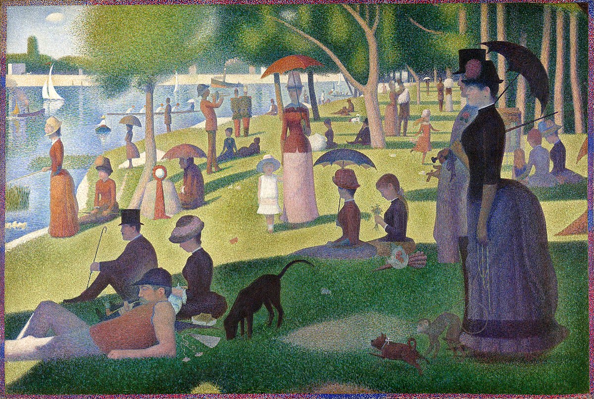
If you’ve ever puzzled over some of the slightly withered looking grass patches in the foreground of Georges Seurat’s Sunday Afternoon on the Island of La Grande Jatte c. 1886, it’s said to be due to some obstreperous green pigments he was using.
“Paolo Veronese, who worked in Venice for most of his career during the sixteenth century and was, like Titian before him, an extremely skilled and resourceful colorist, was famous for being able to coax bright viridescent colors out of recalcitrant pigments. His trick was to apply a precise mixture of three different pigments in two layers and to protect green areas with layers of varnish to stop them reacting. Even he, though, had the occasional green mishap, and as late as the nineteenth century artists were struggling to produce a reliable green.”
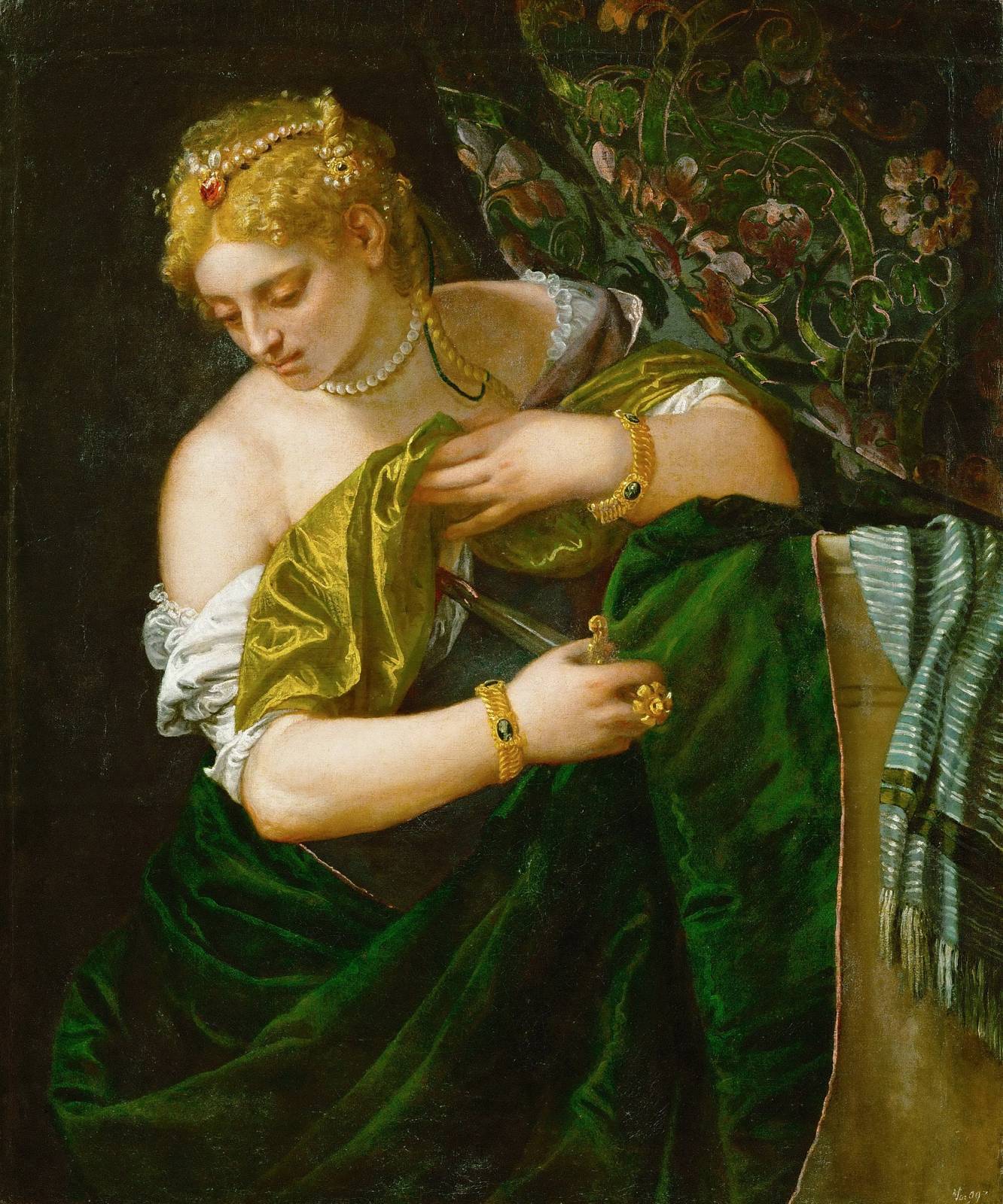
Clearly, Veronese’s techniques were “flourishing like a green bay tree” by the time he painted Lucretia, c. 1585
Going Green
Short of unintentionally creating a pea green sky due to a yellow ochre under-painting bleeding through the cobalt above, artists from the latter part of the nineteenth century through today face few such challenges.
Green pigments abound, from the vivid punch of Phthalo to the muted softness of Moss. When we think of green in paintings, landscapes may first come to the forefront, but artists and this versatile color stir our imaginations to countless experiences. From glowing preternatural fire to cool watery glades, green has the capacity to create a mood and awaken the senses like few others.

Fabulous Frazetta and the painting that launched a thousand imaginations
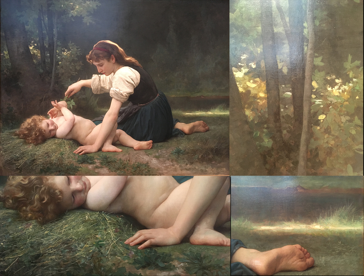
Bouguereau, the undisputed master of skin tones, uses greens to subtle and magical effects in this gentle scene. The delicate reflection of the green tones of the grass onto the child’s skin is a master class in itself
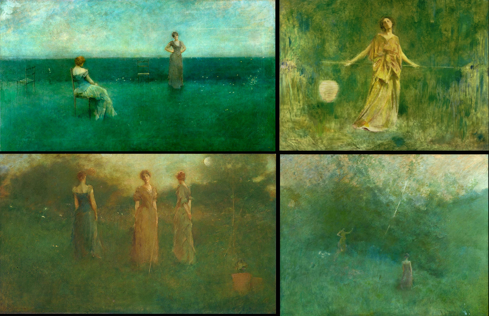
Thomas Wilmer Dewing rocks the greens like few others
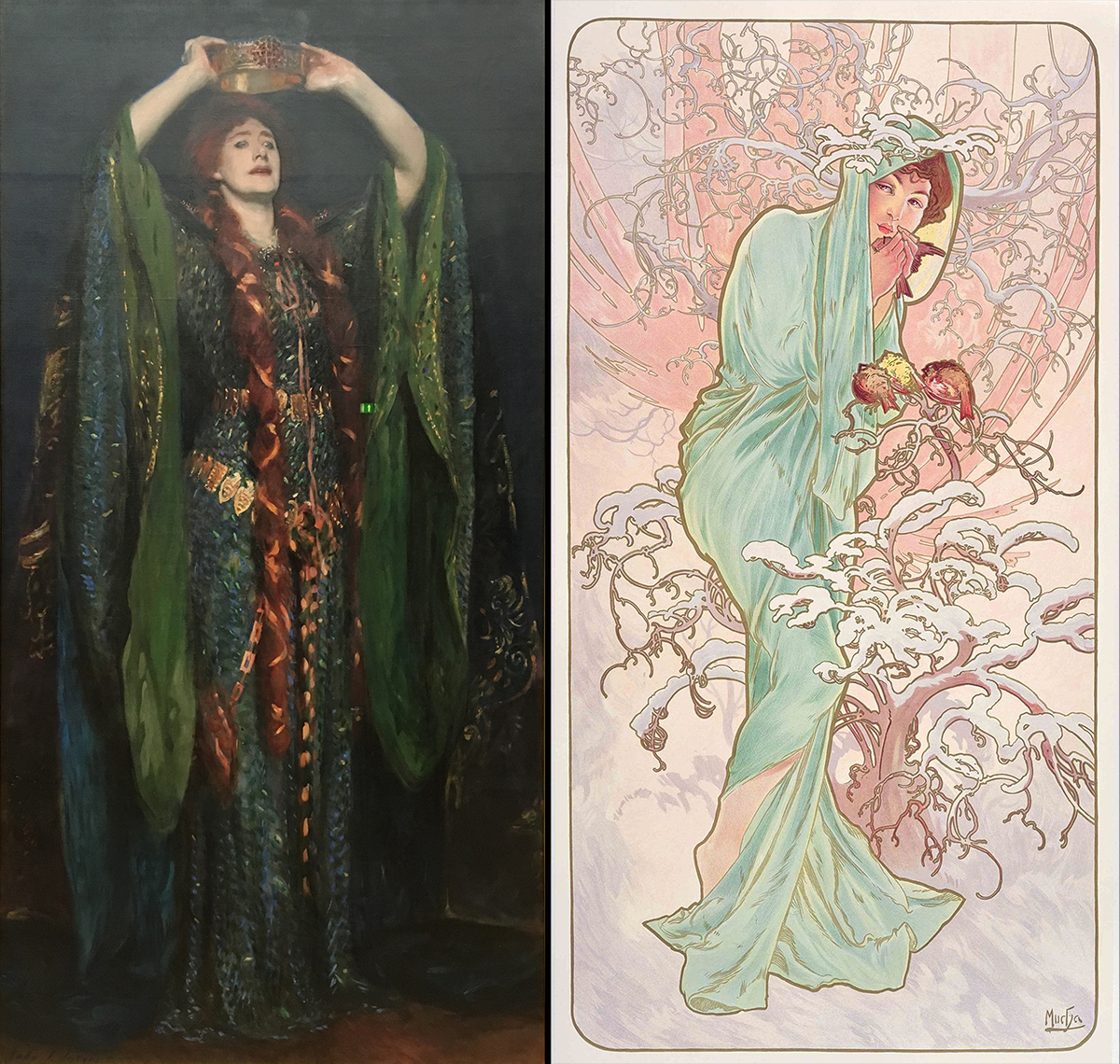
In these paintings, John Singer Sargent and Alphonse Mucha both use green flowing robes, but to very different effect. Sargent’s choice of the heavy olive to drab green sleeves, reflected in her wild eyed look, seems to reveal Lady Macbeth’s sickened state of mind. And who ever would think of using a light, bright spring green in a painting about winter? Only Mucha, of course.
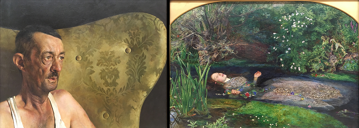
In Jamie Wyeth’s Portrait of Shorty and John Everett Millais’s Ophelia we see two very different impacts created by framing the subject with either muted or brilliant green palettes.
Green Nouveau
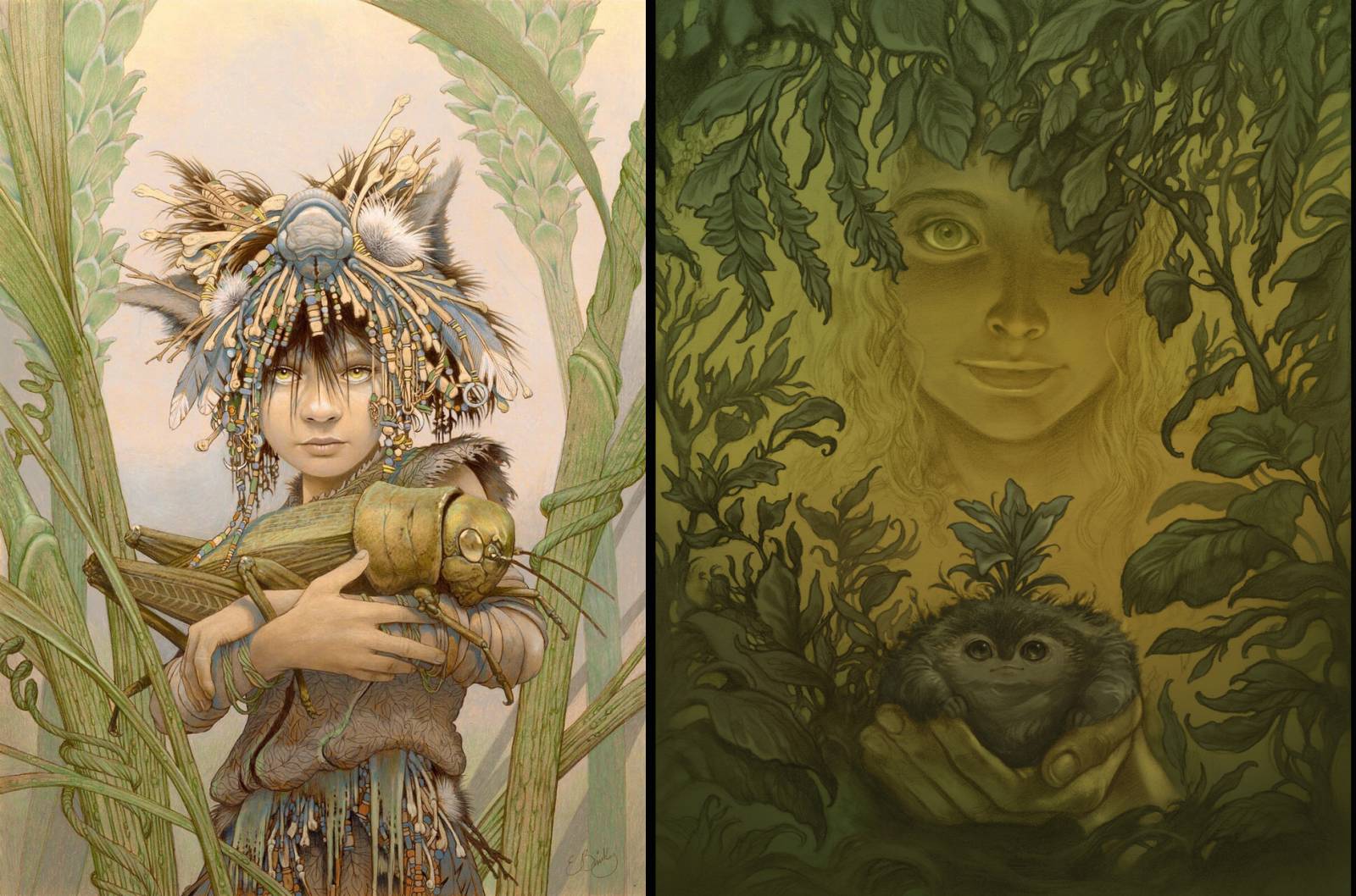
And on the topic of some contemporary artists rocking the green theme…
Keeping on the subject of using color framing to guide the viewer, Bill Carman’s contrasting of a muted palette with a jewel-like copper green beautifully sets off his subject.

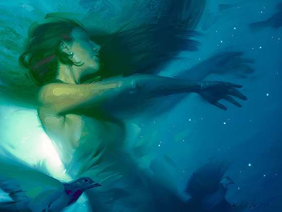
Eric Velhagen uses muted green undertones to create a dynamic, emotional atmosphere
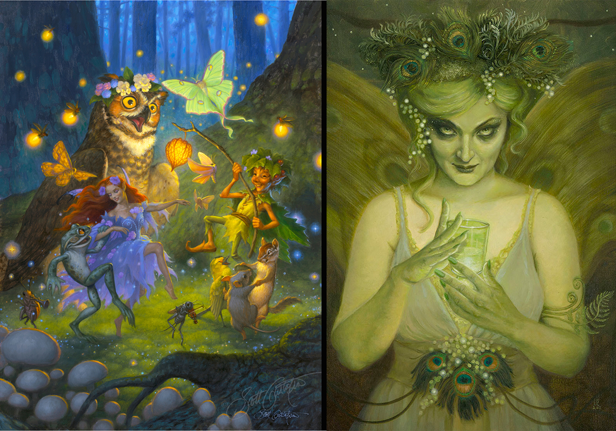
Varying tones of green can be used to evoke joyous childhood dreams or frightening nightmares, beautifully demonstrated by Scott Gustafson and Laurie Lee Brom
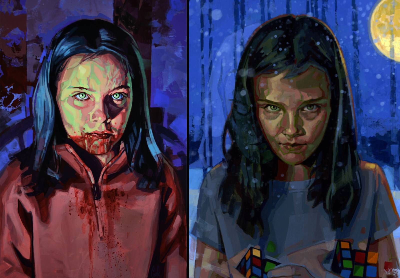
Bud Cook Portrait of Eli and Eli’s Solution (detail) use varying green accents for very different yet dramatic (and creepy) outcomes
Rob Rey does incandescent tones ablaze with energy and feeling like few others
Matthew Lauffrey uses the various shades of green to accentuate the depth of field and play of light in the distance. I think it’s super cool!
Ed Binkley and Cory Godbey each offering their own master’s class in the use of subtle green tones to evoke a love of nature

And finally, photographer Shannon Cotterill infuses a green glow to create an ethereal, otherworldly image
Green-Dimensional
Green is, of course, a natural with bronze sculpture. The copper in bronze wants to oxidize so yup, it wants to be green (think Statue of Liberty). Patinas accelerate and enhance this process. As seen here in Colin Poole’s bronze sculptures, the color can vary from a vibrant aqua green to a more muted and subtle sage green. He uses the color as an integral part of the story.
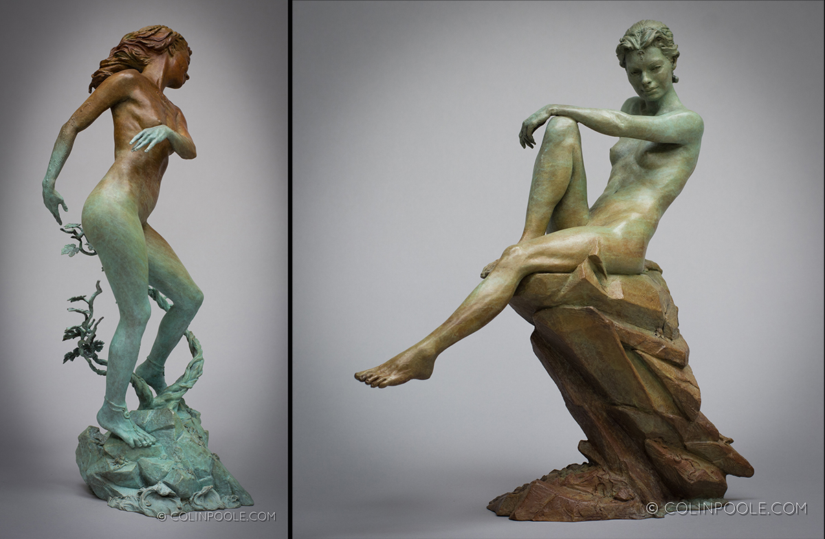
On “The Vine Dance of Blomai,” the green of her hands emphasizes the spiraling movement of the vines and reveals the vines being encouraged to grow through her dance. In “Born of Root and Stone,” the blending of the stone color into her body and her body color into the stone highlights that she has come into being from the rock she sits upon.
Snakes on the Brain
Sculpture got a little bit of a short shrift in the green section. The story of St. Patrick goes that he is honored for driving the snakes out of Ireland despite the fact that there were no snakes around for him to banish. As a final nod to St. Patrick, here are a few sculptures featuring snakes.
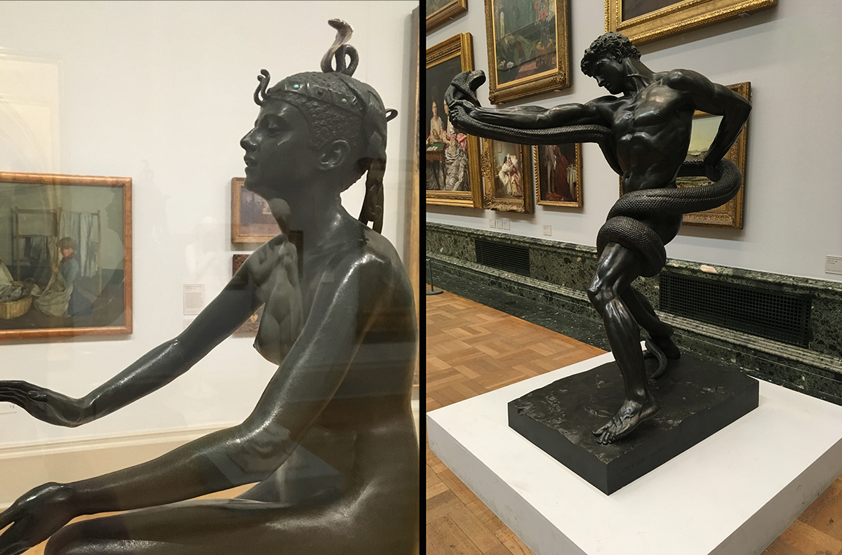
From bitty snake headdresses in Edward Onslow Ford’s “Applause” to mighty big serpents like “An Athlete Wrestling with a Python” by Frederic Lord Leighton (okay, so way too much talent in one human with this one), love them or hate them, snakes play a big role in our collective imaginations. No wonder they’d honor a guy who expelled them from their country.
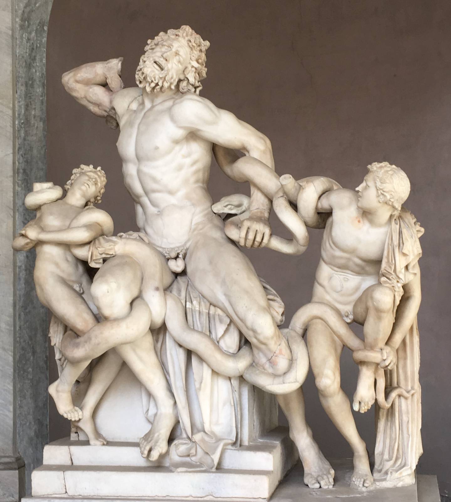
Seriously, what else? Of course… Laocoon is THE iconic sculpture of a snake influencing centuries of sculptors.

Jean Antoine Idrac – Mercure Inventant Le Caducée (Mercury Invents The Caduceus)
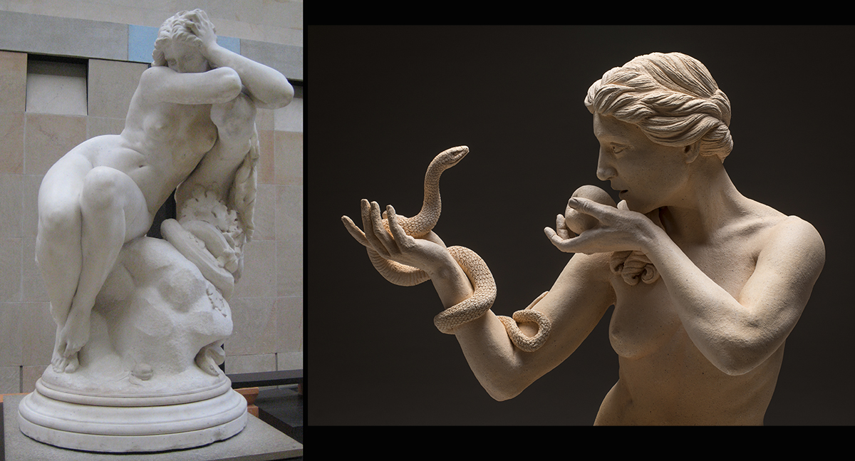
A classic sculptural theme featuring a snake is Eve. In a historical sculpture by Eugène Delaplanche, “Eve After the Fall,” the snake takes a more subtle role, skulking around the base of the sculpture as any snake might do, especially this particular snake. In my sculpture, “Eve Chooses Choice,” the snake is front and center, Eve’s partner in the moment of her decision to choose for herself.
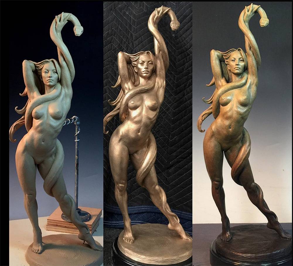
Mark Newman’s “Snake Charmer” seems to me to be something of a contemporary Eve figure, standing in her own strength and sensuality, embracing the snake symbolism of creativity and transformative power.
Speaking of charms, the four leaves of the shamrock are said to stand for faith, hope, love and luck. May this St. Patrick’s Day bring bits of all of these into your creative life.


OK, I want to hang up my brushes and paint no more. So much excellence represented here. Sometimes I feel like an art amateur in every respect. Still, I want to learn and grow. Thank you so much for posting this. Despite the intimidation of these ancient and modern masters of imagination and execution, I will continue to create. Rather than discourage, they inspire and deepen resolve. Thanks again.
I personally am familiar with this feeling of which you speak: the first time I saw Bernini’s sculpture of Proserpina and Pluto at the Borghese Gallery, I cried in the face of its incredible presence, mastery and beauty. I felt like I didn’t understand a thing about sculpture up until the time I saw this work. Stone transforms before your eyes into tactile flesh and fur, pure raw emotion and a moment caught in time – stunning. I agree that the challenge of contributing something in the face of such greatness can seem daunting, but I firmly believe that those who feel the call to create will inevitably bring something of value and contribution to people. In some ways, it might be our duty to walk the miles of exploration to uncover what exactly that thing is. Thanks much for writing and happy creating to you! 🙂
Haha I love that you beat me to the idea of an “all green” post! <3
Lol! Who would have guessed? But… there’s still LOTS more to say about green! 🙂