Is a work of art ever done? Is this a rhetorical question? Sort of, yeah. I know I’ve for sure been guilty of pushing a piece further than I should have and totally ruining it. It’s hard to know when to call it quits sometimes. Over the years I’ve found as I head toward the finish line, I go through kind of an internal checklist of things.
Drawing. Is the drawing off? I know you’re supposed to get that done first, but things can drift or sometimes it just didn’t pan out to be as strong of a start as you thought you had. When I’m going down the final checklist, this is the first thing I’ll try to grapple with. It doesn’t have to be perfect, and honestly sometimes I like a little exaggeration or character. It just has to be solved to the point where I can live with it.
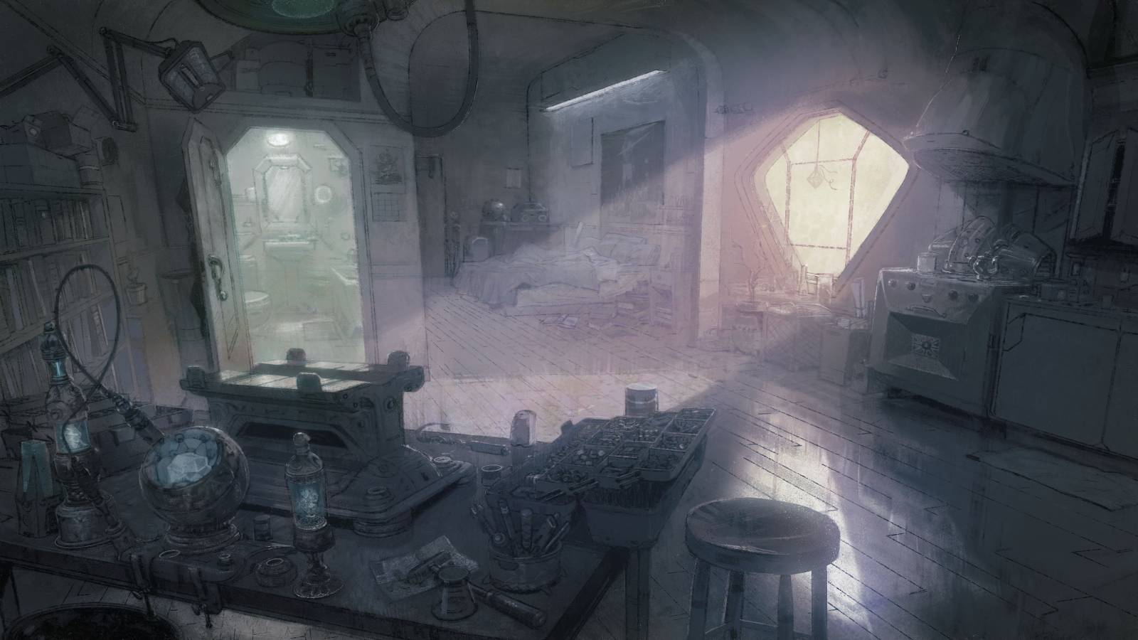
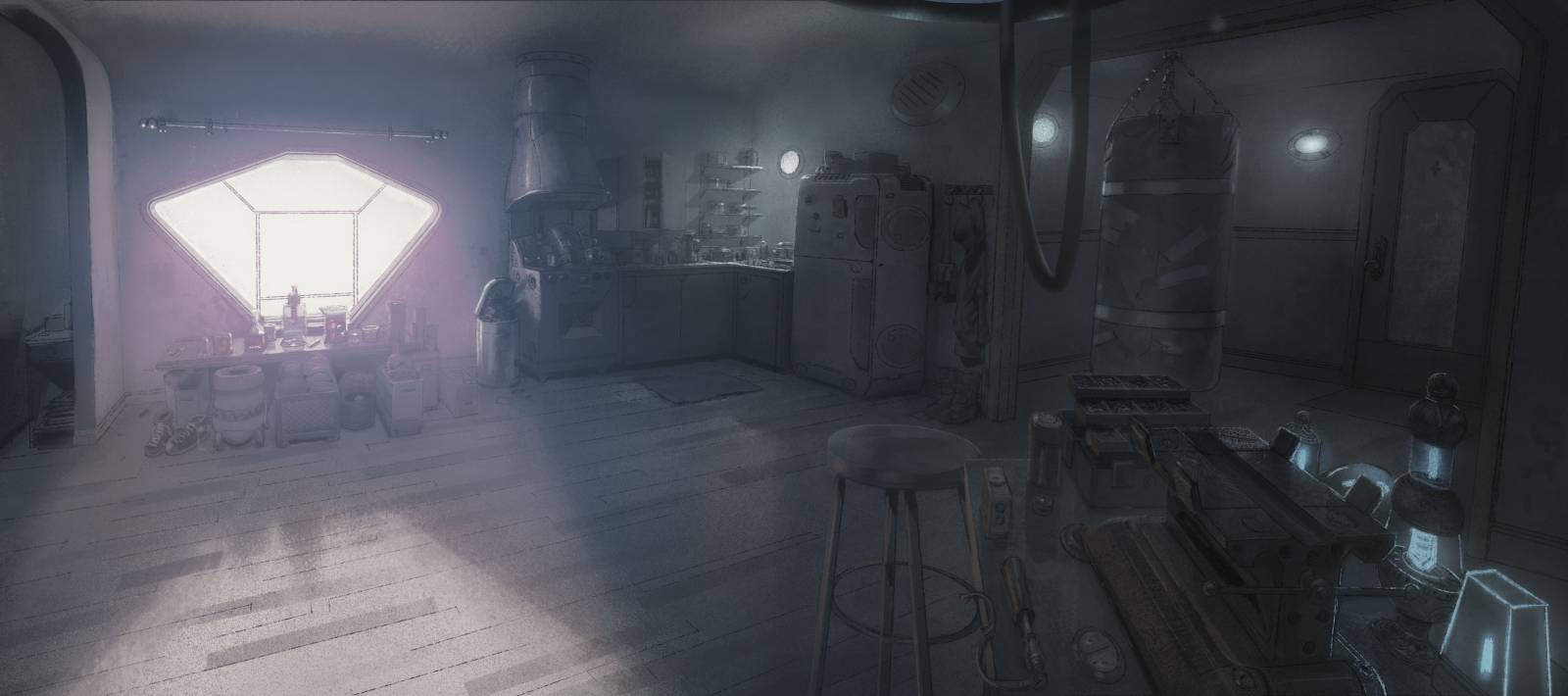
When I did these room concepts for a client 10 years ago, I remember really stressing getting the drawings solved first. I made it a point to get everything drawn in before adding value or color. By getting the drawing to work first, the rest kind of fell into place.
Value. Do the volumes read? Walk across the room and look at your piece out of the corner of your eye. Look at it upside down. In a mirror. Are the lumps in the right place? Any weird shadows? Again I’m not looking for perfection. Just nothing too glaring. If there’s something off I won’t hesitate to make a global change like roll the whole thing with an eraser, scrape the entire surface with a palette knife, or hit it with sandpaper to unify and take things down. Simpler is always better.
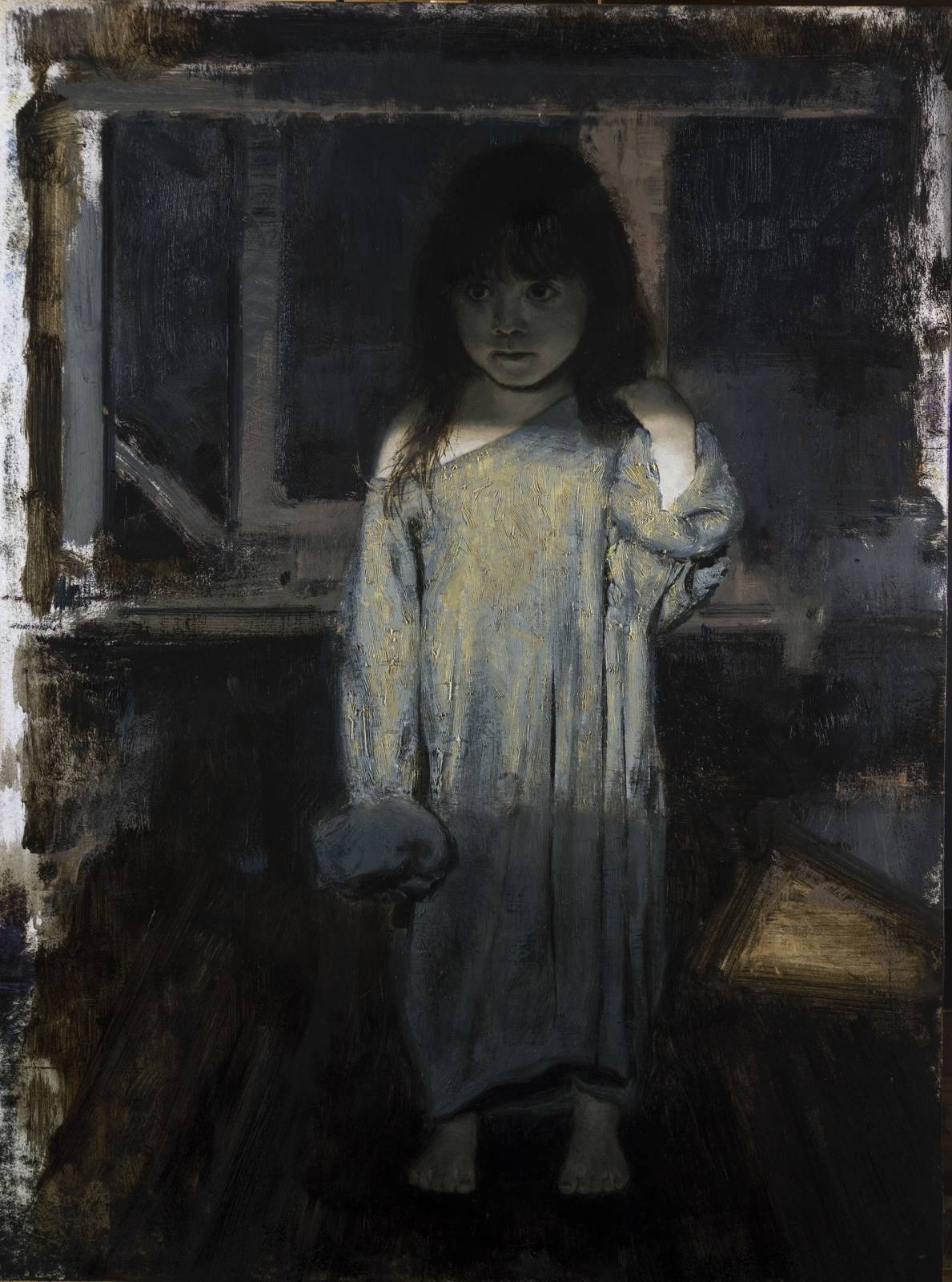
I must have repainted her face 10 times, trying to get the lighting on her face to work without losing her likeness. For me, it’s the subtle value shifts like this can be the most difficult to get to work.
Edges/transitions. Anything too hard can draw too much attention. Go too soft and things get mushy. Exploiting either one of these can produce interesting results, but I find personally I get the best results when there’s a balance to these things. A try to make sure I have a few harder edges where I want people to look, softer edges where I don’t. I try to be intentional about it where I can.
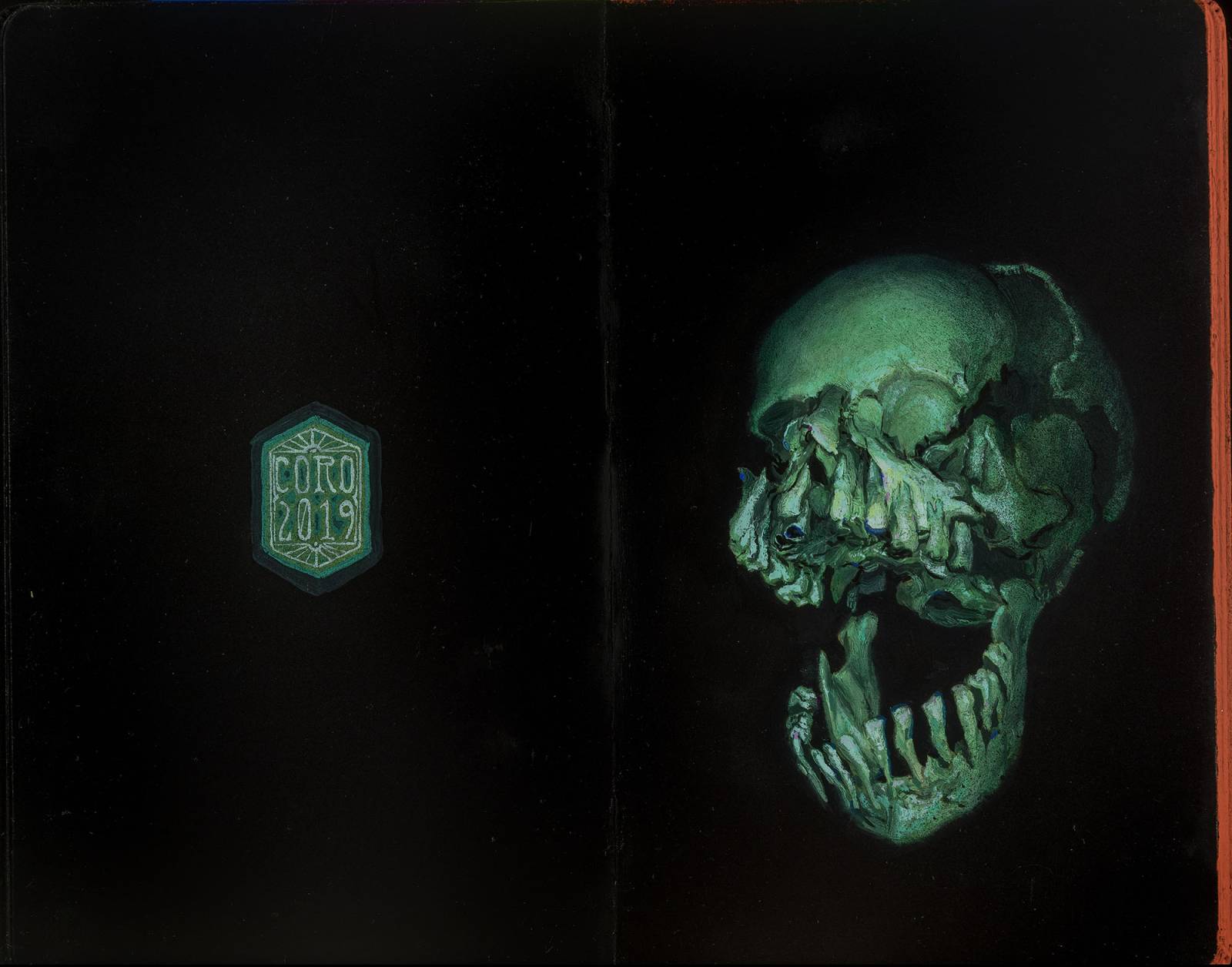
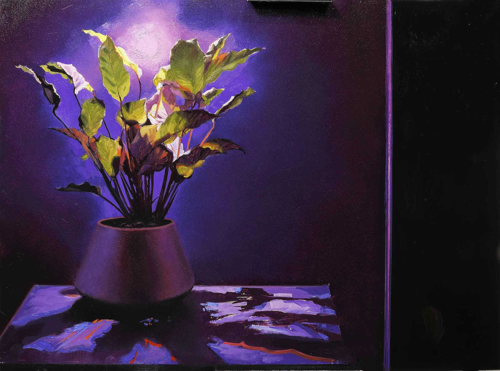
I really wanted to get that sense that it was emerging from blackness, so I softened the edges and pushed it back even more with lightly stippled spray paint .
Where’s the flair? This is a harder one to articulate, but I’m always searching for ways I can help drive home what the “point” of the piece is. Is this a love letter to the color red? Will softer edges create more of a quiet feel I’m looking to create? Where the yin/yang? Are there places I can place a few pops of color to make them more interesting? This is the most fun part of the process to me, because it’s the least concrete whether it’s right or wrong. This part is up to you. When I’m working on a piece, any piece, I’m always listening to it. What’s it saying? What’s it want to say? Sometimes I have a set idea or concept in mind from the start. Other times it happens organically. Every piece is its own adventure, its own experience, and it pays to be as much in the moment as you can to help communicate it.
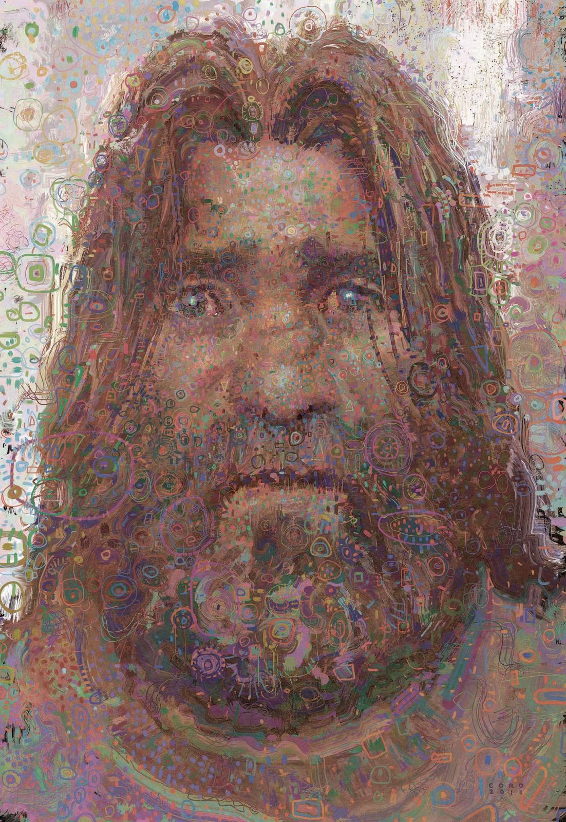
I’d been kind of “going through a phase” exploring this more decorative approach, and it was very fun tackling a portrait in this style, messing with edges and turning forms through patterns it becomes this balancing act. The web really does some funky stuff to the colors its much less saturated in its native file.
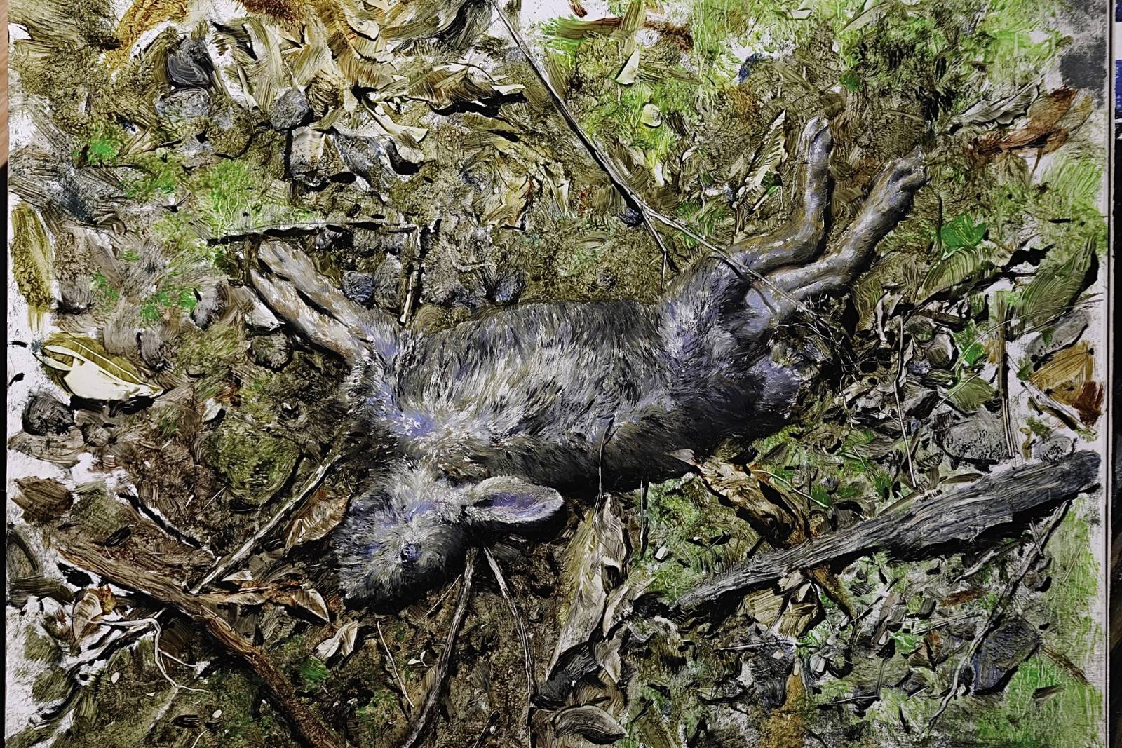
If it’s not working, change it!
This plant started off innocently enough. I had hight hopes for it. Just didn’t work out so it became this rabbit. This is kind of an extreme example, but I’ve learned over the years that if it’s really not working, don’t get precious with it or be afraid to try something drastic to get something you’ll be happier with.
If possible, Let it sit. I normally try to let something sit overnight so I can look at it with fresh eyes. Sometimes it’s alarming the stuff missed the night before. I think this is an important step because as artists, we can get swept up in our own bullshit. It takes a little time and distance to allow for a more objective review.
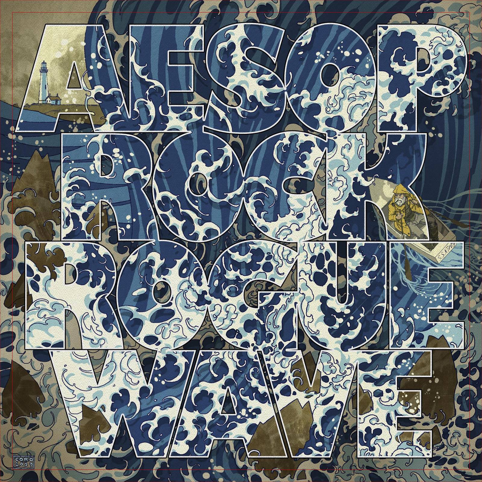
Got dangerously far into this album cover with no idea how I was going to handle the text. The composition was so busy and I didn’t want to lose the movement in the wave. I remember it hitting me one morning after a long night of really struggling with it, PUT THE TEXT OVER THE ENTIRE IMAGE! Totally lucked out on the placement of the guy that he fell mostly inside a letter.
If something is still bothering me about a piece, there’s no substitute for getting someone else’s opinion. I have a few close friends (and surprisingly critical kids)! Who I share work with to get impressions. I find it’s almost always helpful to hear someone else’s take. You might not like what they say, but you can get too close to a piece and miss things that may be obvious to a fresh pair of eyes.

Yes indeed, going too far can be a problem, especially if time is not a constraint. Lots of good tips here! By the way, I really like the “decorative approach” portrait. It looks hallucinogenic!