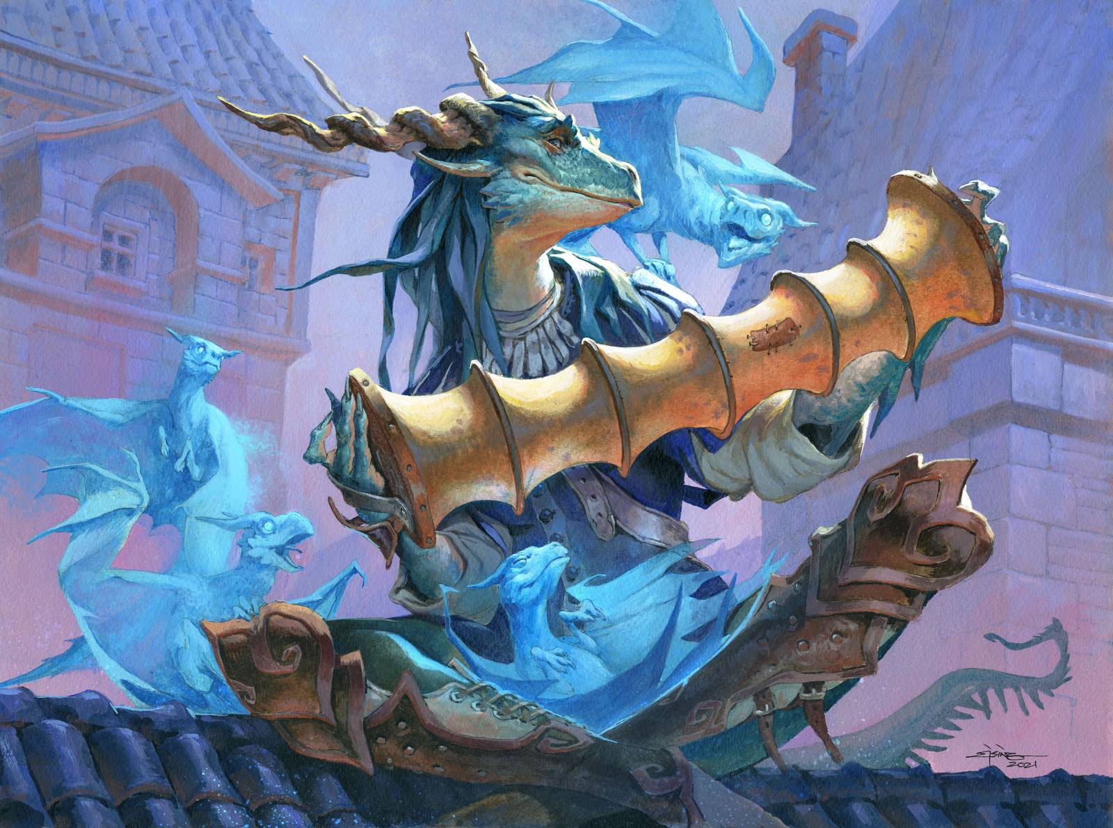
I was very happy to be able to design a new character for this magic set, and for the Baldurs Gate world. Because this magic set takes place in the DnD universe. She is a Dragonborn bard singing from the rooftop of the richer part of Baldurs gate. Her music attracts the small spirit dragons.
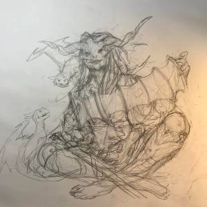
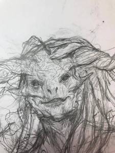
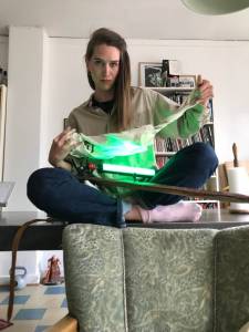
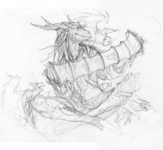
The brown sketch with the green dragon spirits was the first one I send in and it got approved so I could continue. But as it sometimes happen, what works in sketch doesn’t seem to work when I start to finalize it or try to “really “sketch it, so I can paint it. My problem was the snout-foreshortening. It looked too much like a demon face. I tried changing the face and really solve the different elements of the face structure, but I think it became even more flat looking than the first one. To be honest the more I sketched on the face the more I thought it looked like a real woman rather than a dragon, and not a very pretty one. Annalea Hartelius , who used to be an artist at our studio, was visiting, and I asked her to pose, so I could get the cross-legged position right and I hoped for something else from the photos to pop up to help me make a decision.
what I noticed from her pose was the slight tilt to the one side. it really made the pose better looking and more believable. But it also called for a face position that was counter weighted. the juxtaposition of the face turned away from the tilt made the balance in the pose perfect. That made me try a different face. Even if I had already gotten the straight face approved I went on with a side turned head, and it turned out to be the perfect solution. Now there was no doubt as to her race, the horns showed better, her smile became readable and it suited the pose way way better creating an S-shape rhythm that I think fills out the composition better than my first attempt.
In my color test I tried to be as simple as possible. I went with green/blue for the main figure and a bluish to purple background – all of it lit by a subtle bounce light of orange. Especially in the buildings in the background I think it gives a nice 3dimentionality to have the 2 colors in opposite temperature accompanying each other. For the main figure I dialed up the saturation of the orange to pull focus up to her face.
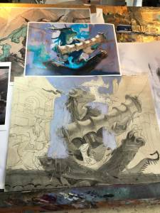
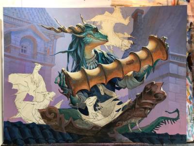
I have added a couple of photos from the progression so you can see how I work from background and forward.

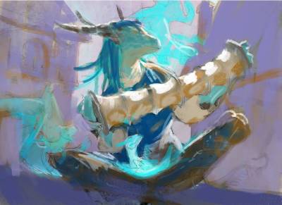
Color comp created in photoshop
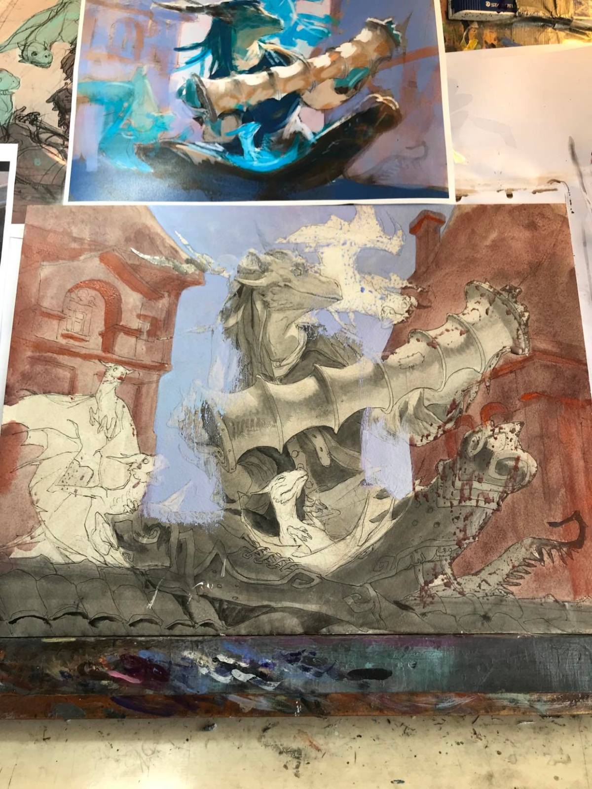
The building are painted in a burnt umber wash to create a warm underpaint. Then I paint the cold purple and blue on top leaving the underpaint as a bounce light
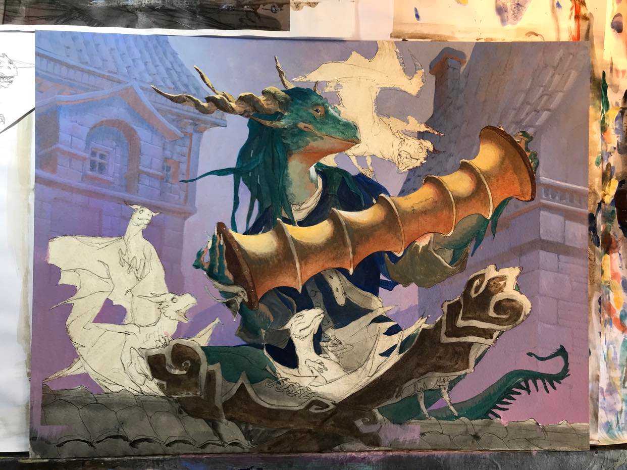
Darkest area of the face is blocked in and I have started to establish the texture and shape in the shadow area
What I would give to see a movie, game, series, show, comic… Anything with just characters like this. I LOVE anthro reptile characters like this and I LOVE dragons and seeing you paint this style of character (which I find can be surprisingly niche.) is just *chefs kiss* perfect. I’m happy you redesigned the face, I love the textures you did and how there’s just SO many great narrative things going on here from the patch on the accordion to each gesture of the dragons listening and I love the blue of the dragons too. The warmth of the back buildings and the cool overall color palette give me a nostalgic dreamy feel to it. Images like this are a huge inspiration to me and I hope to one day create ideas and be as skilled a painter to make narrative illustrations like this one day. Love everything about it! Thank you for sharing with us the process!
I’m in the Navy, specifically a submarine, we had a MTG draft/commander tournament. Commander rules applied and I came across this card. I didnt pull anything great, so I ended up choosing her as my commander because she was a dragon and cheap to play. This meshed very well with my limited dragon based deck and in combination with a few other cards, playing her let me draw more cards and boost my life points so I was never under supplied. Even when my opponents were killing off my big creatures, she kept me going by just pulling out more and more. I ended up winning the entire tournament with 2 win/0 loss streak against all my opponents and won a mat signed by the crew’s participants with included our Executive Officer and our Commanding Officer. I credit this card to my success.
I do like how you started with a warmer palette and slowly made it green/blue to match the mana colors. I do agree that the facing forward nose fore shortening would have made it a little undefined as to what the character was and how clearly it carries over the dragon-like feeling by turning her to a side profile. Very good work.