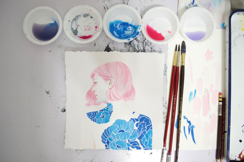
 I paint traditionally with acrylics and colored pencil on paper, with a little bit of watercolor for subtle tinting in between. For my acrylics, I enjoy Golden paints that come in three different viscosity levels — heavy body, fluid and high-flow. For colored pencils, I prefer the Prismacolor brand, particularly their Premiere and Verithins, though I’m slowly trying out the Caran d’Ache pencils. For my substrate, I absolutely love painting on 300lb Arches hot press watercolor paper. It’s smooth and there’s barely any buckling that occurs.
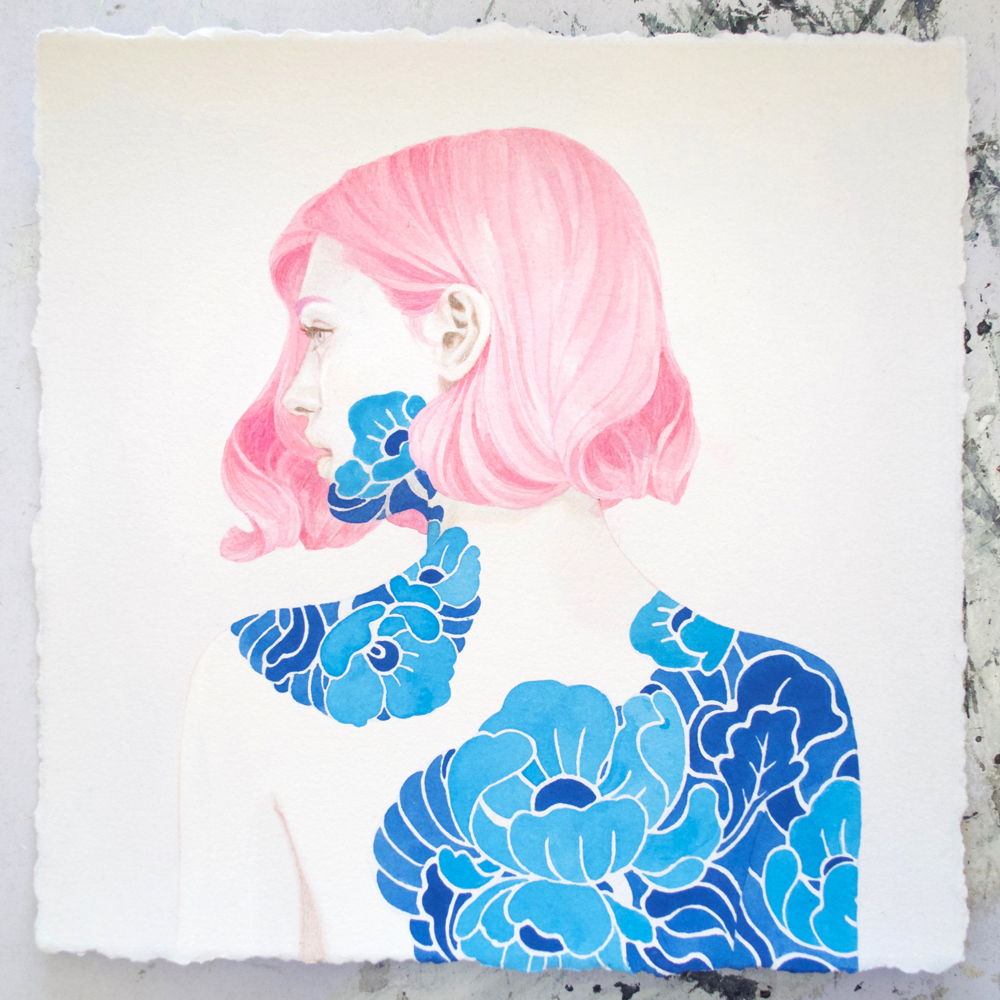
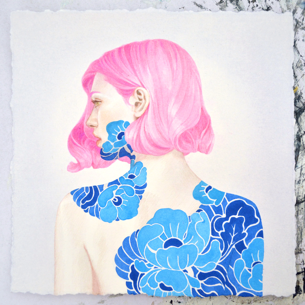
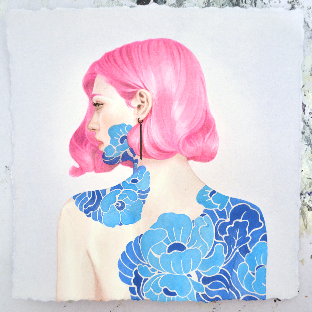
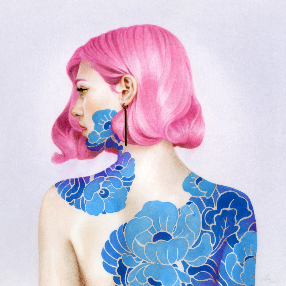
Below you’ll find a step-by-step breakdown of how I used the mentioned materials to painted “The Magenta Maiden.” It’s a 9×9″ painting I created for a group exhibition in Hawai’i in 2017.
STEP ZERO:
 This is where I do all the prepping before I start applying paint. I refine my sketch into a line drawing, scan, digitally enlarge, print directly onto the watercolor paper, then retrace it with the Verithin pencils.
STEP ONE:
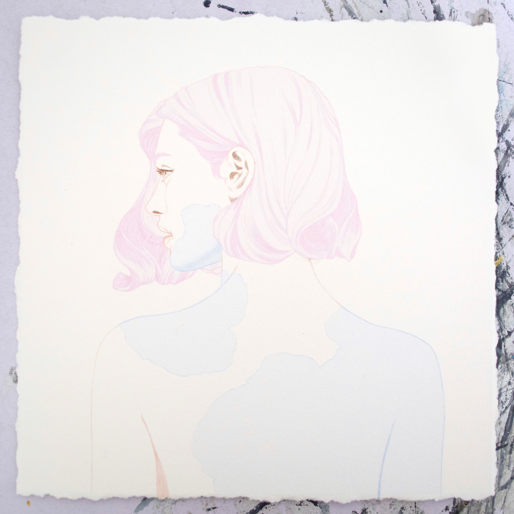
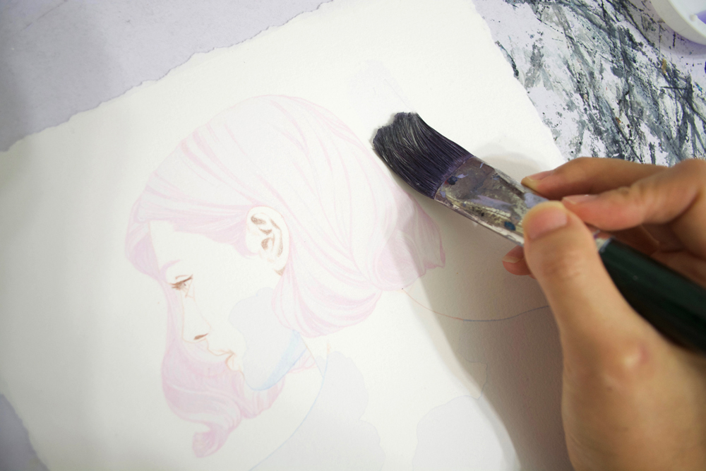
After the above, I apply the first layer of acrylics. The technique I use is called glazing which is when you dilute the paint pigment with water. Mixing blue and violet paint then diluting it, I get a nice light wash of cerulean blue. Though it’s hard to see in the photo, I overlay the entire paper with 3 washes of this hue. This helps neutralize the natural warm color of the paper while giving it a somewhat bluish tint.
STEP TWO:
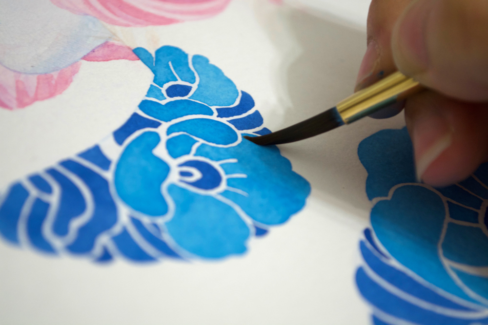 Once the initial glazes are laid, I start blocking in sections with flat color. Again, the pigment is heavily diluted so it’s difficult to get rich, dark values in the first few layers. In order to create value, I overlay glazes on top of multiple glazes (as you can see in the hair). A painting has around 50-80 glazes of paint and pencil. The acrylics are quite permanent, unlike watercolor, so the pigment stays put. Also note that I work on all the sections simultaneously, letting everything culminate at the very end of the painting process.
STEP THREE:
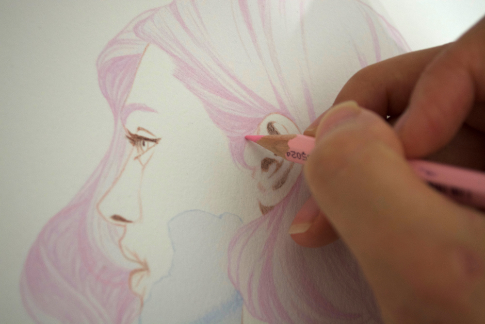
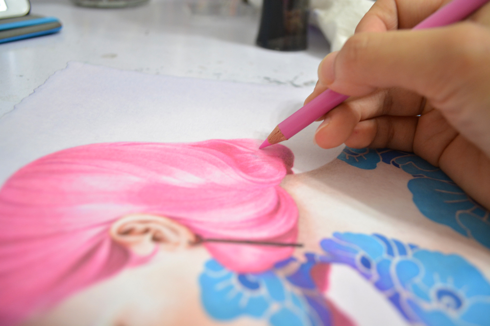
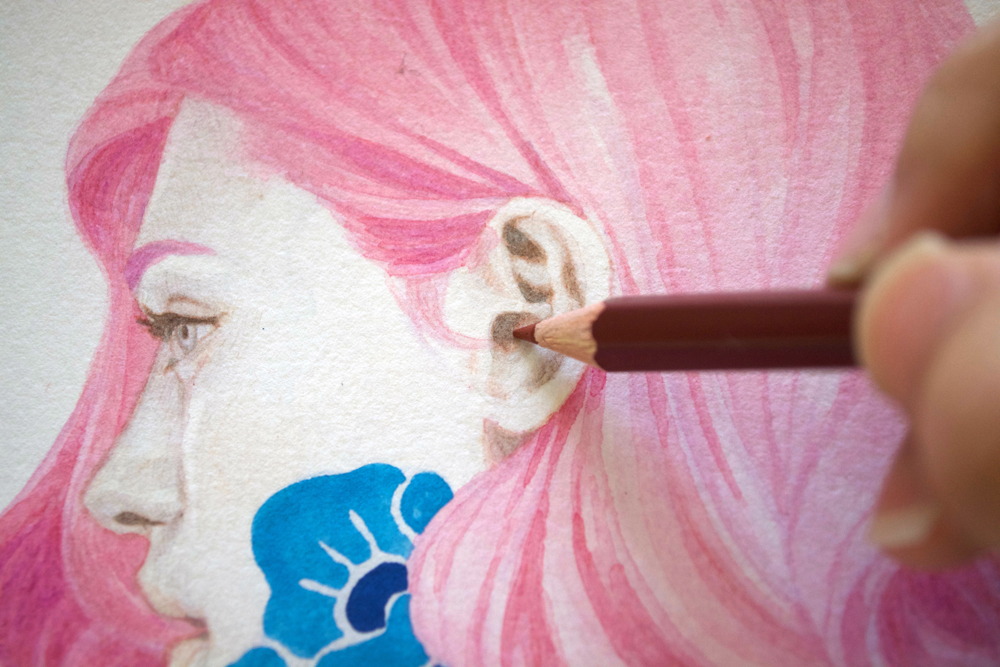 Once I’ve blocked in most of the color, I switch over to the Verithins to help push the dark values. This includes areas such as the shadow in her hair, the dark creases within the ear lobe, and her nostrils. Verithins are made of a harder lead so it’s great for establishing crisp edges and fine details. They’re also water-soluble so they work immensely well with the acrylic washes.
STEP FOUR:
 This is when I switch back to the acrylics to push the areas of dark value even further with glazes of paint. I actually switch back and forth several times between the paints and pencils until I achieve a level of refinement that I’m satisfied with. It’s definitely a slow process for building form, but it’s great if you want soft, subtle gradients.
STEP FIVE:

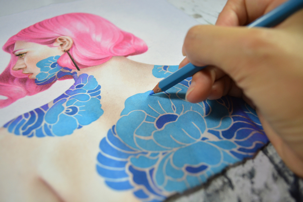
 The last bit is when I apply light layers of the Premiere pencils. These are more opaque than the Verithins and has a thick, waxy texture so be sure to be done with your paints. They’re extremely waxy so it’ll repel all water-based media. The Premieres are meant to finalize details and fix little mistakes like stray paint strokes and minor accidents. I have a tendency to get wet paint on my palm while I work which usually smears itself onto the paper, so the pencils are handy for this kind of dilemma as well as adding last minute details such as wispy hair strands.
STEP SIX:
 Depending on the painting, I’ll sometimes add varnish at the very end to help protect and harmonize its sheen. I’ve been experimenting with quite a few, and my current favorite is the Golden Gloss Polymer Varnish w/UVLS. As for digitization, I prefer having my paintings scanned with a Cruse scanner which is the best when it comes to capturing the nuances of paint pigments without the annoying grainy glares that you often get from scanning works on watercolor paper.
THAT’S ALL FOLKS
I hope you all enjoy my technique! I think the best teacher is to go out and try it for yourself, whichever technique you’re wanting to learn. Trial and error has been my go-to mentor for the past 10 years. So far, so good!


Very nice work.
I am curious on what you use to print onto the watercolor paper. Is there a favorite type/model of printer you use? Does the printer pigment get activated by your washes? And, last, do you know if this would work on the rougher cold pressed watercolor paper? Thanks.
Thank you Del! I use an Epson R2000 printer for my smaller paintings. For larger ones, I go to my local printer to do the printing for me. I haven’t tried cold press paper but I think it could work. It may not print the line art as crisp but should do a decent enough job.
Thank you.
Wait, how do you print on 300lb watercolor paper?
You’ll have to help push/feed it into the manual feeder but it’ll work. It does slightly ruin your printer over time so I wouldn’t suggest doing it with your fancy home printer.
Great post! Love seeing your process- I too am curious how you are printing on 300lb watercolor paper but even more so about the Cruse scanner. Never heard of those before and googling a bit it seems that they really aren’t for individual or home use and that you must go to a shop to have the art scanned? Thanks.
Thank you! I looked into buying my own Cruse scanner, too, but sadly, you’ll definitely need lots of space to accommodate it and around $100K in your wallet. There’s a local printshop in my town that has one. They charge according to the size and I usually pay around $100 per scan.
Woww really it’s awesome techniques of painting it’s help alot for clearing our concept about painting.
Thank you so much
Very, very interesting post. Thanks for sharing. I never mixed color pencils and Acrylics and the result is very interesting.
Love it! Was looking for a few different process guides for acrylic/pencil when this popped up. Your results are fantastic and quite motivating for me! Thank you!
I love your process! Excellent result!
Do you also use acrylic pencils?
I am trying to find acrylic pencils (not paint), but all I get in my country is either: watercolour pencils or coloured pencils.
I am not sure if there is a difference between coloured pencils and acrylic pencils.
Thank you for sharing this. I am interested to tryout some of your processes. I am curious to find out if acrylic washes make the paper impermeable.
This is fascinating! I’ve mostly worked with one medium at a time, but combining acrylics with colored pencils sounds like a game-changer for speed and detail. When you’re using the acrylic washes, do you typically wait for them to be completely dry before going in with pencil, or can they be slightly damp for certain effects?
I’ve tried something similar with gouache and colored pencils, but the acrylic wash idea is much smarter for larger areas and quick coverage. This article perfectly articulates why these two mediums complement each other so well – the quick blocking of acrylics and the fine control of pencils. Thanks for the validation and new tips!
This looks amazing, but I’m a bit intimidated by trying to combine these. Do the colored pencils scratch or pick up the acrylic layer if it’s too thick, or does it need to be a really thin wash for the pencil to adhere well? Any specific pencil brands that work better with acrylics?
도티 청기 백기 링크