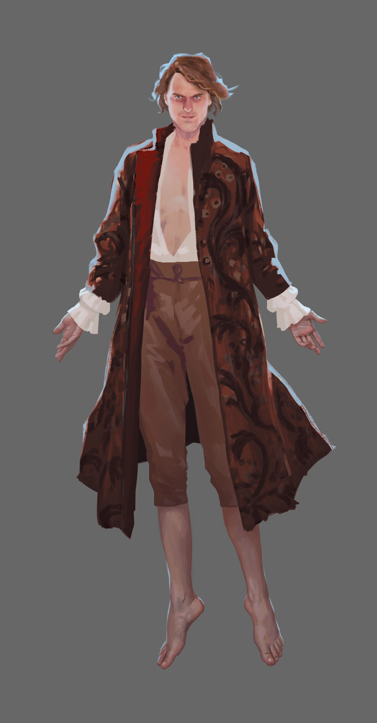
Phew, it has been a busy couple of months, but I’ve got a quick chance to dive back into this guy. He’s getting close to finished, the colors and general design are in place. The expressive parts – the face, hands, and since he’s barefoot, his feet – are in place. But there’s quite a bit left to render. We often think of rendering and polish as adding more detail. In deciding what details are needed, I check back in with my goals for this design.
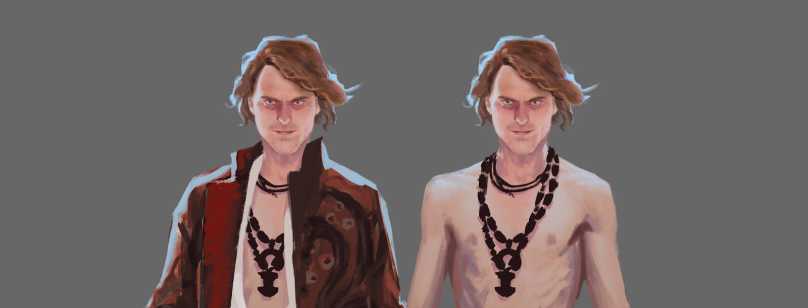
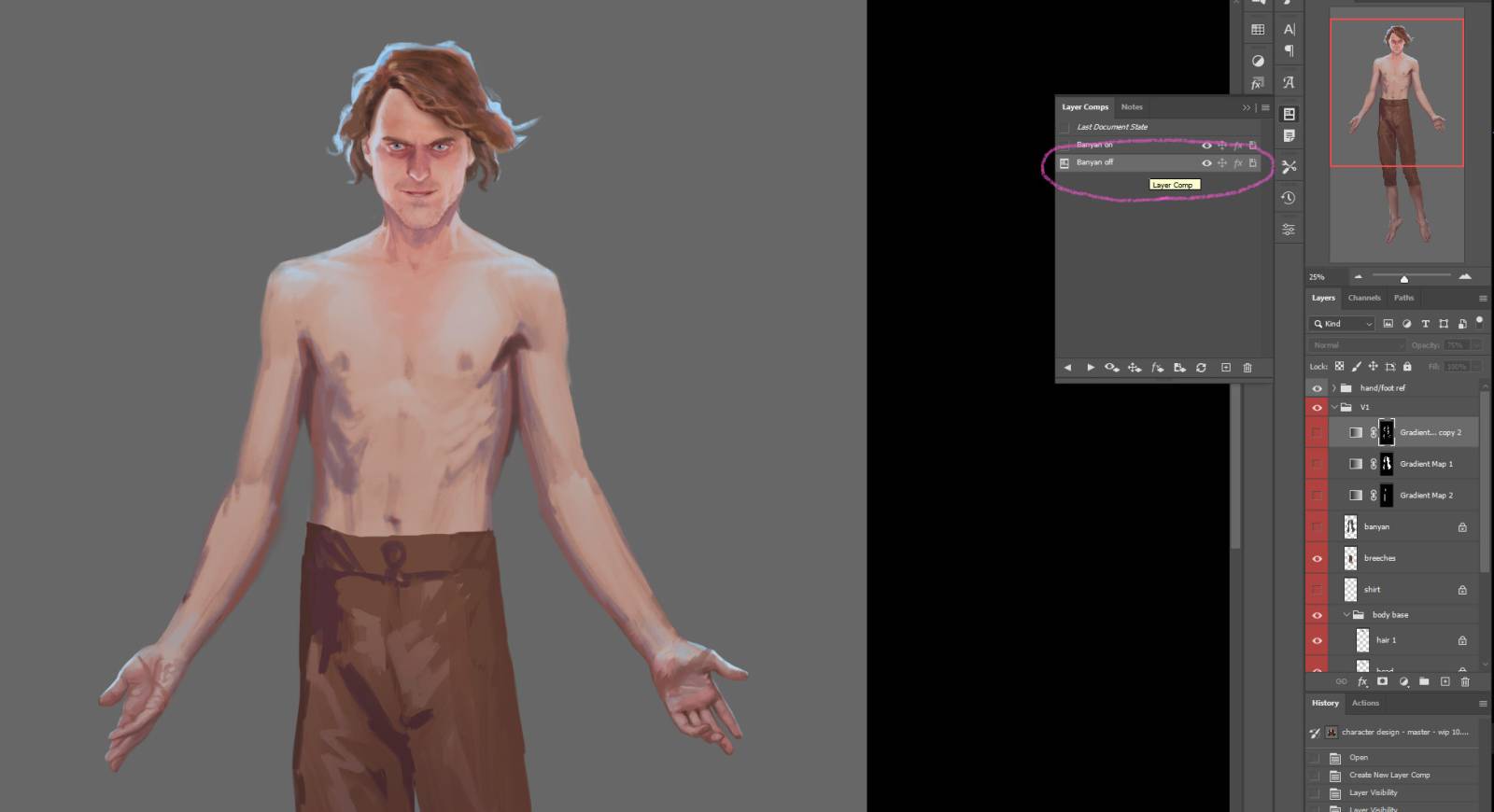
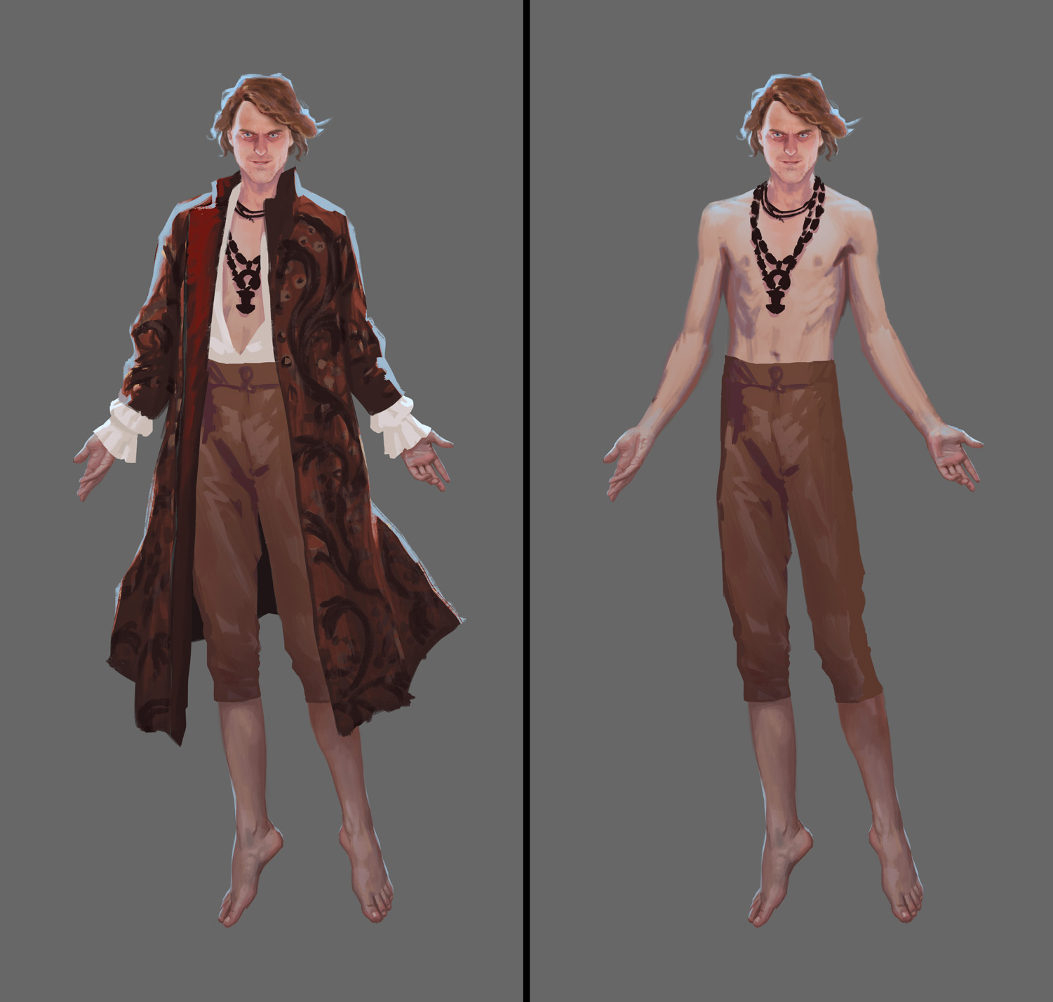
I also know this character will sometimes be shirtless in my story, so one of the requirements of this concept is that it allows for a couple of variations with elements removed.
He is looking a little plain, is he not? I had planned to give him some more occult accessories, particularly necklaces, and have not yet done so. It’s why I bared so much of his chest, but – there’s another motive there.
I want him to be creepy sexy.
I mentioned before that I wanted him to be evil-looking but handsome. But getting more specific, he is a villain, and I don’t want people to feel unconflicted about finding him attractive. It shouldn’t feel good to ogle him. It should feel kind of gross.
That means I need to make sure I don’t feel unconflicted about it. I want there to be a dark edge to every aspect of him, and once I get specific with about that goal, I can lean into it. It really helps to have a keyword, or a touchstone idea, to help keep the goal in mind.
In this case, it feels like a good analogue for the feeling might be an over-ripe fruit. Something that was, a short time ago, delicate and sweet, but is now fermenting; it will intoxicate you but also make you sick. Even the definition of the word “intoxicate” means “to poison.”
A lot of the time if you pause and connect again with the goal of the piece you’ll find another aspect of your chosen keyword, or a twist or different flavor to the idea that can give you a foothold for some more specfics. This doesn’t necessarily mean adding additional narrative so much as it means simplifying and fine tuning what’s there. You don’t do a final render by adding any and every detail you can think of; you get more specific and add details that reinforce the touchstone idea or keyword.
So, going forward with the idea of this guy being an intoxicant: he should be both enticing and rotten. I’m going to push the thinness of his physique to keep him looking delicate, and try to capture a sickly look to his flesh, for that hint of poison.
Here’s where we’re starting for today:
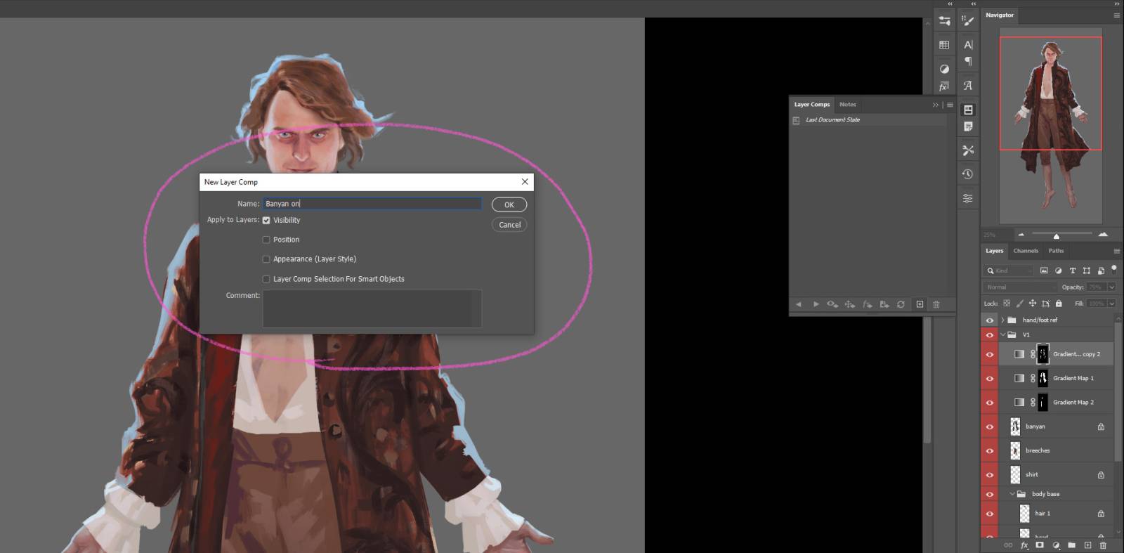
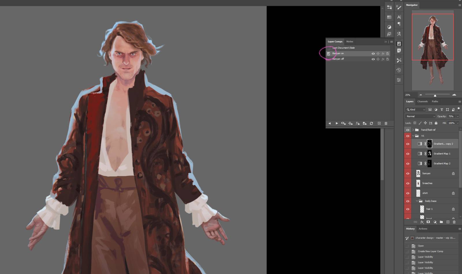
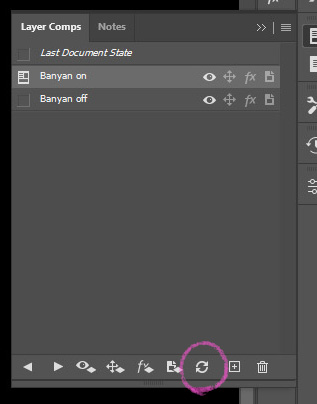
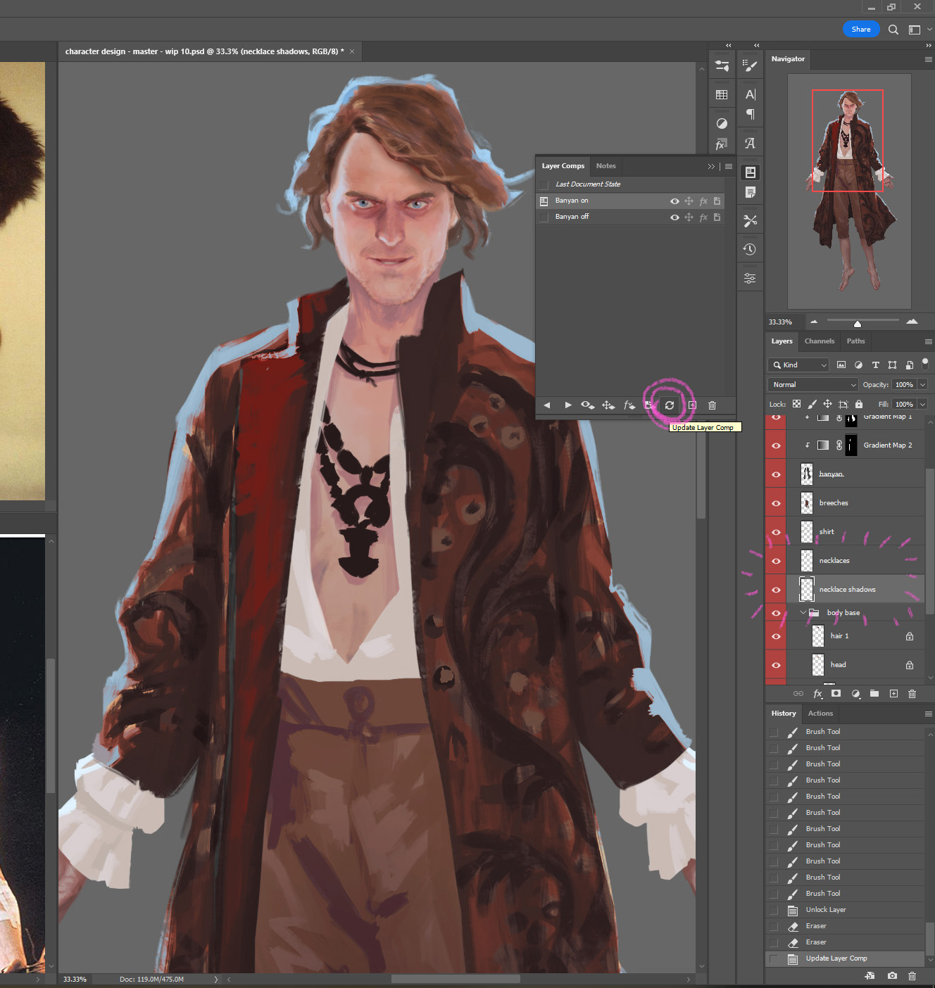
I’m going to hide the layers of his robe – and since I am going to want to turn those layers on and off, and one layer is underneath the body layer so it’s not as simple as putting the layers in a folder I can hide or unhide, I’m going to make a couple layer comps instead. Layer Comps are kind of an obscure Photoshop tool that is extremely useful for precisely this task – character design with multiple costume variations. The Layer Comps window might not be one of your defaults, in which case you can find it in the Window menu.
If it is in one of your toolbars, the icon for it looks like a little newspaper. Once you have the menu open, you can click the little + button to create a layer comp. This saves your arrangement of which layers are visible. Click the + button to create a new comp:
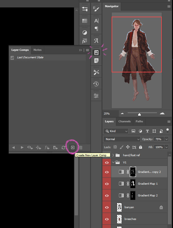
A window will pop up allowing you to name the layer comp (you can rename later just like you can with layers)
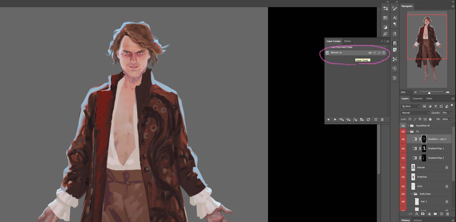
The named comp now appears in your Layer Comps window.
You can then go and hide layers, in whatever arrangement needed…
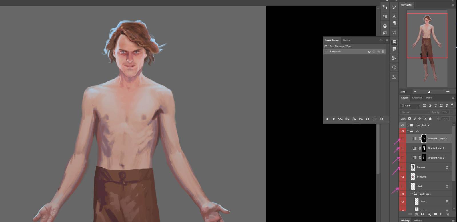
Then go to Layer Comps window and hit the + button again…
Name the new layer comp, and then you will see two of them in the Layer Comps window.
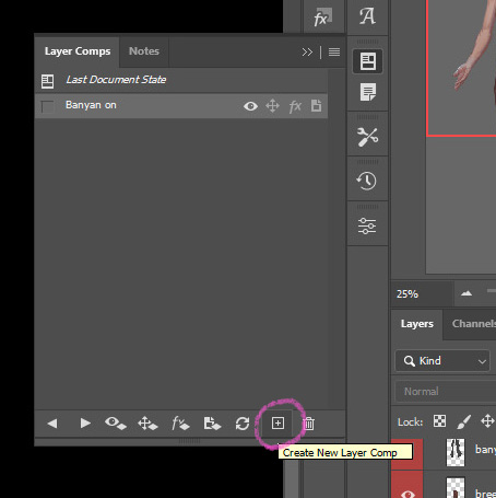
Then you can quickly switch your arrangement of visible layers between the two by clicking the checkbox left of the named layer comp.
If you need to update which layers are visible later, say if you add a new layer to the robe for another layer of detail, you can click the Refresh button at the bottom of the Layer Comps menu.
Now I can open up some reference, and easily hide or unhide the banyan/robe layers.
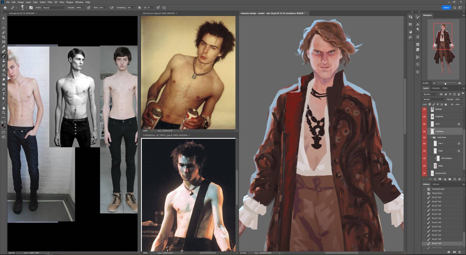
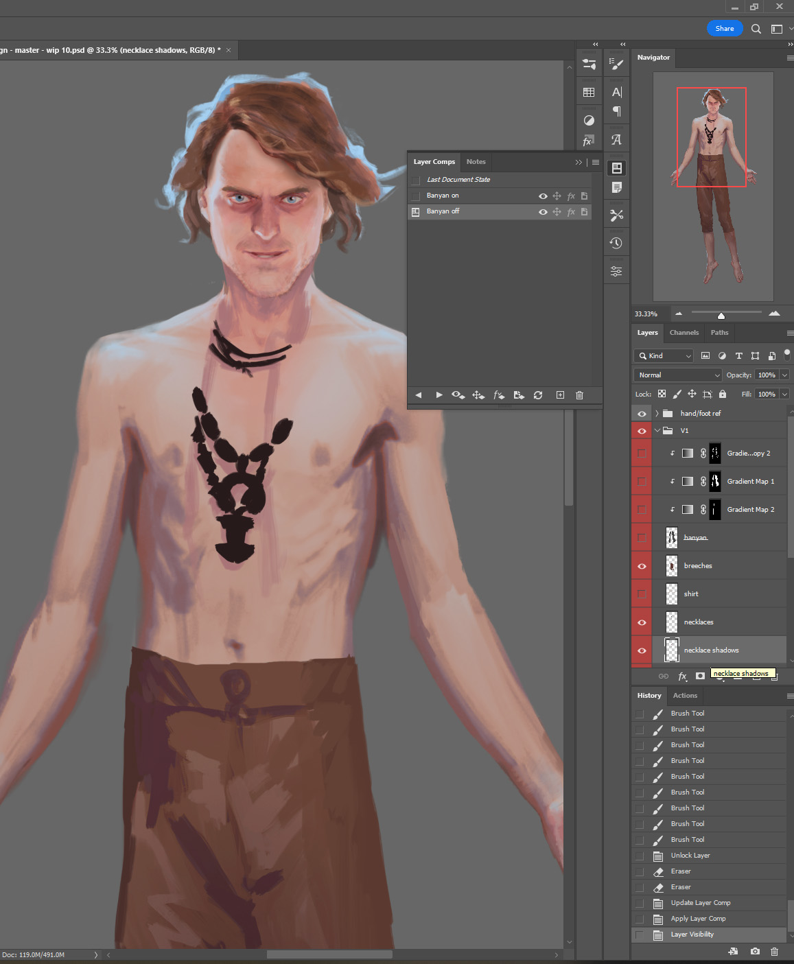
I’ve started to scribble in some necklace shapes, with the idea of them being sort of mismatched. Perhaps one of these necklaces on its own would be an interesting design, but together the shapes are a little jumbled, a little visually icky, to fit with my idea of wanting a dark side to the details.
I have added a layer for shadows cast by the necklaces too – and I’ll take a moment to update the layer comp:
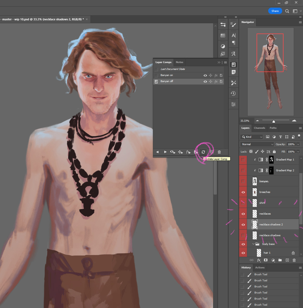
Then switch to the other layer comp, unhide the necklace layers so they will be visible with the robe off, and then update that layer comp as well. But oh – the shadows aren’t right, the shirt’s shadow is visible.
I’ll just copy the layer and erase that part of the shadow, so we have two different shadow layers for the two alternative designs. Then I’ll continue the parts of the necklaces and their shadows now visible with the robe hidden, and update the layer comp again.
I’ve got to wrap up for today… This design piece, plus the time to document the steps, is turning into an exercise in chipping away at a personal project bit by tiny bit – but now I’ve got the two alternate views set up with layer comps, and can continue with the render process next time.
I swear I will never stop learning new things you can do in photoshop. I had no idea about layer comps and they would be so incredibly useful to my workflow when I’m testing out variations of an idea. Thank you for sharing!
Ditto!