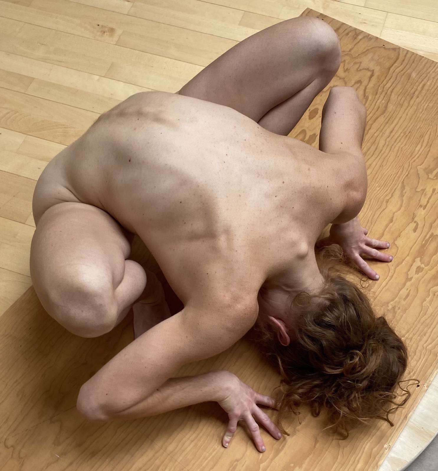
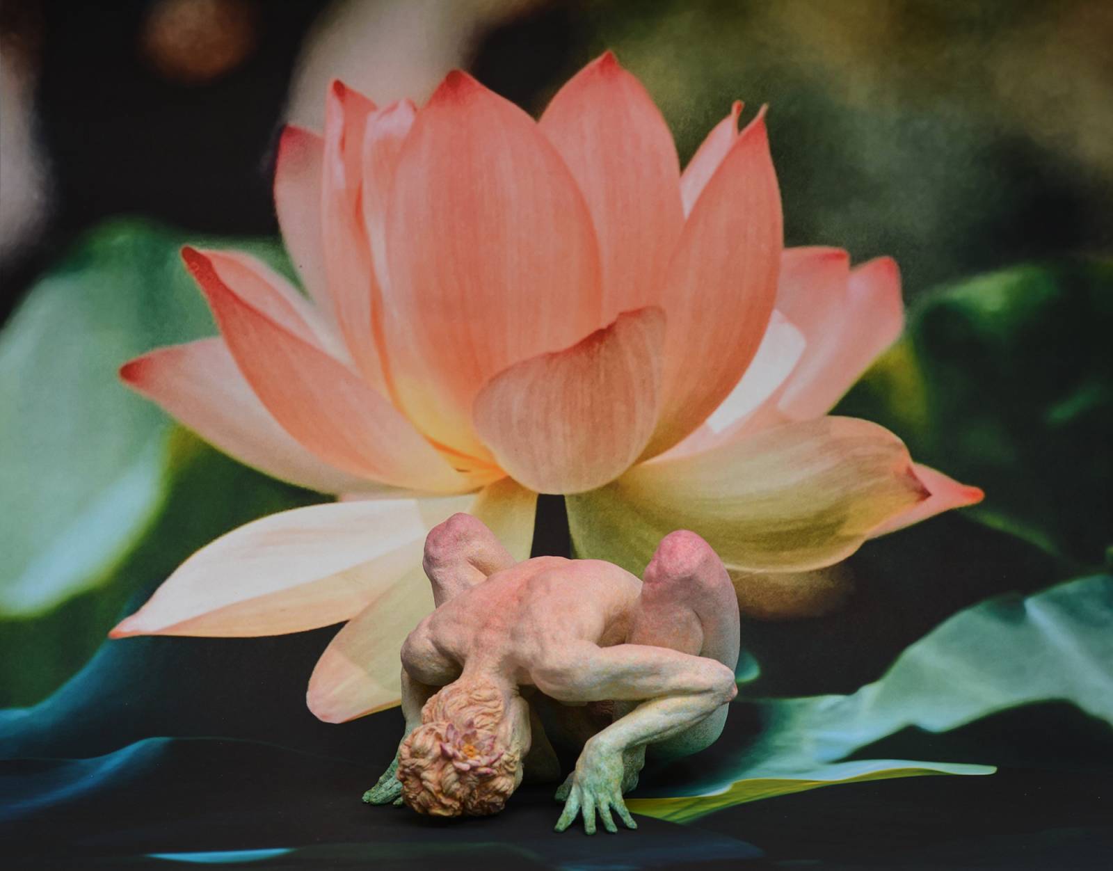
A few months back, Colin and I did a side-by-side online sculpting demo. For my part, I chose to work from photographs of one of our favorite models. Believe it or not, she was resting in this position between poses. I happened to glance over and just about lost my mind. “Wait! Please don’t move – stay right where you are!” I exclaimed and snapped many pics of this most curious and intriguing pose.
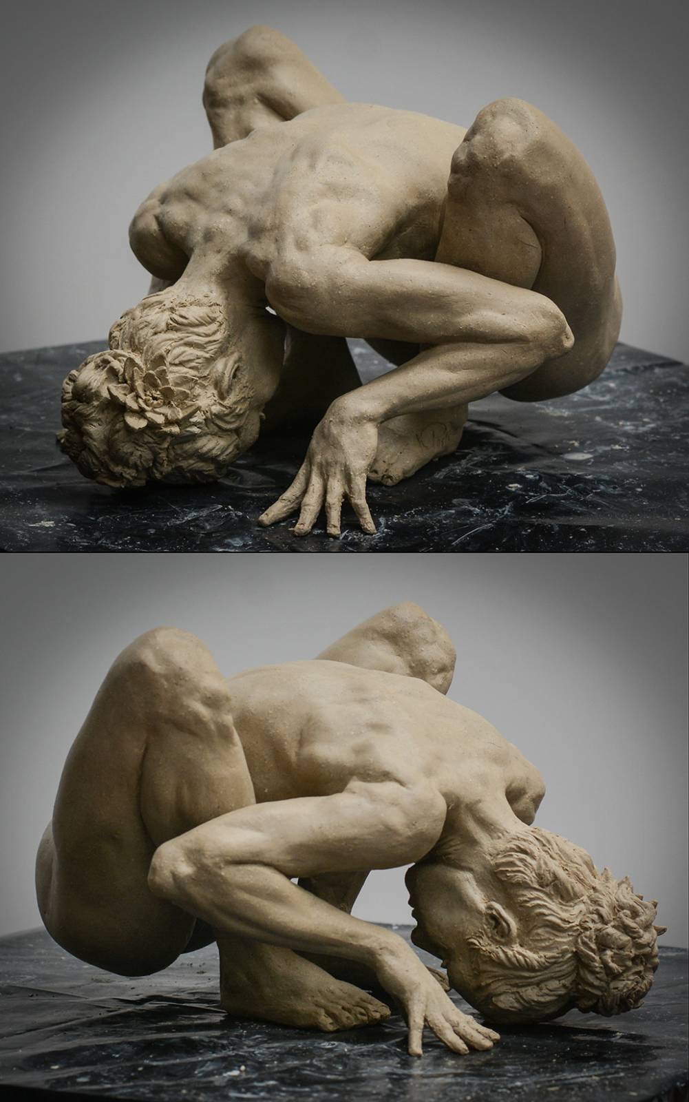
 For the demo, I wanted to work with a couple different clay bodies and also show how a pose can be adapted for different concept development ideas. The first sculpture followed the pose quite closely.
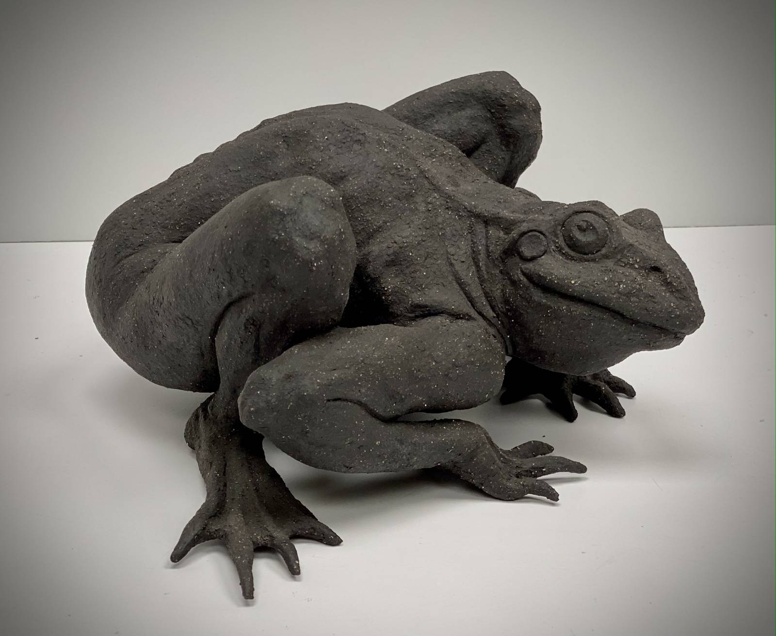
 For the second variation, since the pose has innately frog-like characteristics (among other things), I adapted the anatomy *a bit*. Besides the obvious changes to her head and feet, I also redesigned the spine to more closely resemble the sweep and forms of an amphibian back. The skin folds on her underside are also very frog-like.
This clay body (Laguna’s Dark Horse) is dark red when wet, but when fired in oxidation, it turns this delightful black color with a very light sprinkle of dots from the grog in the clay. It transitions to this color with no additional treatment (no glaze, slip, under-glaze or colorants). So Frogster got to stay as she was out of the kiln.
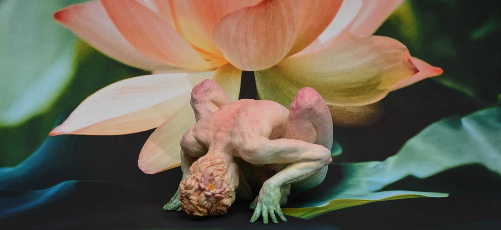
 But what to do with the first sculpture? When the other clay comes out of the kiln, it’s a rather neutral, insipid tan color. I had taken to calling her “Golden Lotus” as I was sculpting her and even added the lotus in her hair. We were looking at images of lotus flowers for color inspiration and Colin recalled a photograph that he’s had for decades. He has the original photo print, but cannot recall where he got it from. If by chance anyone knows who the photographer is, we’d love to give them attribution.
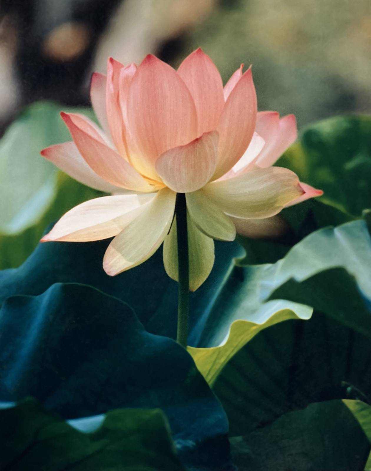 I was immediately smitten by the soft tones and gradation of color in the petals contrasting with the deep, rich greens of the foliage. It was an unusual color choice for a sculpture, but we couldn’t help following the instinctive direction based on the concept. Colin had a very clear image in his mind of how to translate the theme to the sculpture, so off we went on our next adventure.
We used acrylic paint. Given that acrylics often tend to get shiny plasticky in thicker applications (not to our taste on sculpture) and our preference is to avoid any surface on a sculpture being one solid color, we opted to use a splatter-stipple technique.
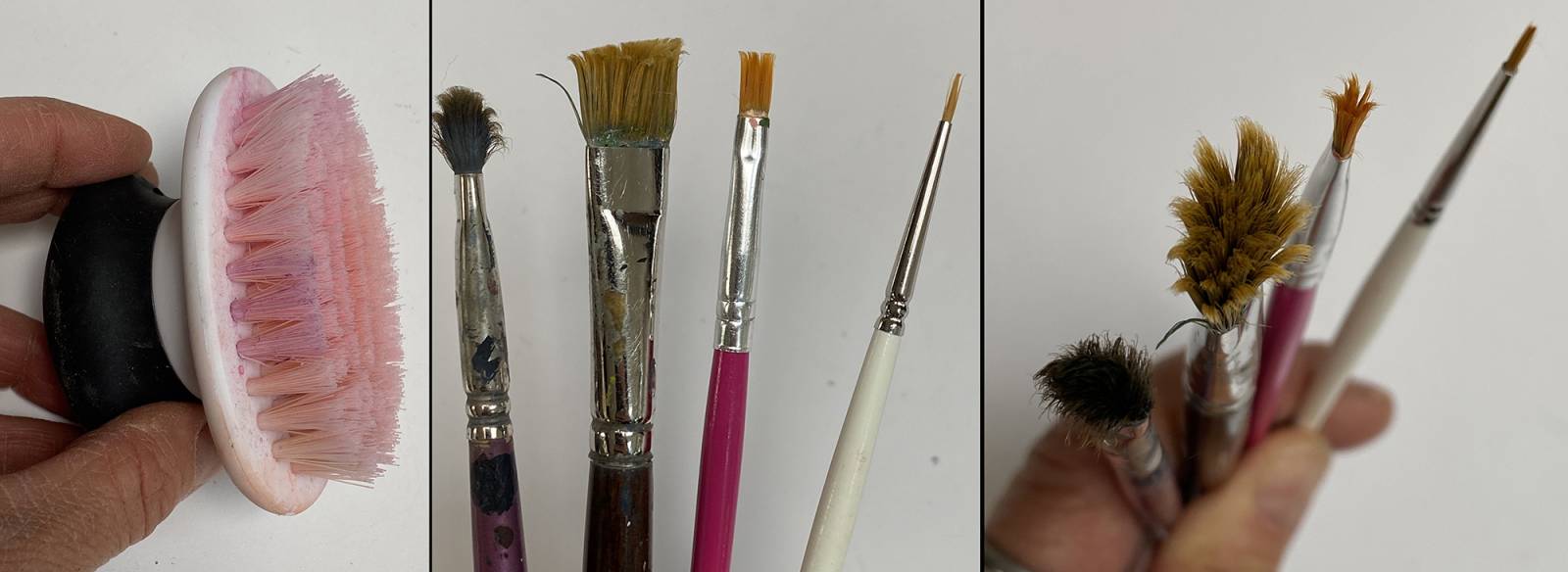
We began by creating a foundation layer by splattering paint using brushes, spray bottles and (this worked the most effectively) a stiff bristled vegetable brush. This very much has the feel of a toothbrush, just a big toothbrush that can spray more paint more rapidly.
After getting a good base coat, we use a our very best selection of crappy old brushes. The bristles are splayed so as to leave wonderfully random stipple patterns which we use to shift the colors, refine transitions and break up larger splashes. These are actually perfect for this task and live in their own very special spot in the brush cabinet. Colin also uses a small spray gun to even out, shift and soften colors and transitions. As the paint is being atomized during this part of the process, we only use colors with a non-toxic rating.
 Here is a time-lapse video showing the process of applying the finish. People often ask how our collaborations work, and this is a really good example. You’ll see that throughout the process, we’re working on the sculpture simultaneously, handing tools and brushes back and forth. We find this a very natural way for us to work together, both people contributing throughout the process to the final look. It’s also much more fun when you’re doing all those little dots to be doing it with someone else!
This second short video shows how the colors shift throughout the process.
We enlarged the inspiration photo and used it as a backdrop for our photoshoot, playing on the frog feeling of the pose. I love how she looks like a little human-amphibian sitting under her lotus flower.

Recent Comments