The easiest and fastest way to get better at painting is to understand your tools. The most important ones to get to know are your actual tubed paints!! Knowing your tubed paint and its personality will allow you to make informed decisions. For example, a direct painter who works alla prima will prefer a very different set of paints than an indirect/layered painter would prefer.
Understanding the personality of the paints you buy makes a world of difference when it comes time to juggle the 8 million variables we have to deal with when doing any kind of painting. The exercise I am going to walk through is for oil paint but you can do similar exercises with watercolor, acrylic, etc. Most people have heard of or done color mixing charts, but what I’m talking about is understanding each paint as an inidvidual with a plethora of properties/personalities to explore.
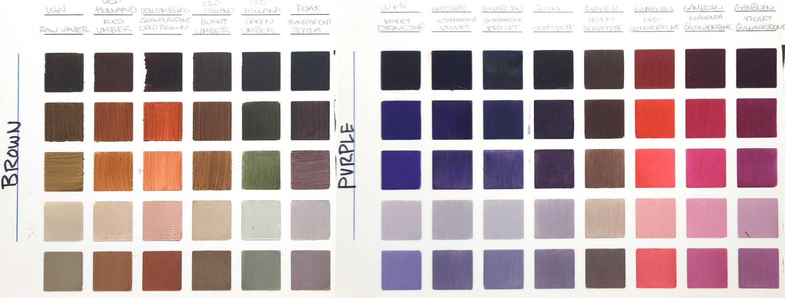
Brown and Purple color charts. Each paint is so different!
What You’ll Need:
- A white canvas or panel – OR – These fancy color chart panels. Color Frontier is the business that makes these oh-so-satisfying charts with peelable grid stickers.
- Tubed oil paint you are testing out.
- White oil paint (whatever white you use most often)
- Linseed oil
- Paper Towels
- Cleaning tank (if you’re testing multiple paints in a single session)
- SOFT filbert, flat or bright (not a bristle brush)
- Palette knife
SQUARE 1: THE GLOM (FULLY OPAQUE OUT OF THE TUBE)
This is where it all begins. What is your paint like in its natural state? This square can give us a deep insight into the real power of our paint.
How to apply: thick solid application of the paint, preferably using a synthetic filbert or flat or bright. Trying to avoid variations in the topography of the application. Also try to avoid putting the paint on too thin… you want a full thick application. Palette knife is also an option.
You can clock the vibrancy of the pigment most in this square. With finer quality paints the pigment still maintains its luminous properties even when thickly applied.
Questions I ask myself for this square:
- First, how does it feel? Is it tacky, sticky, smooth, runny?
- Do I really need to glob it on to get full opacity?
- Does it fully cover easily and therefore is naturally very opaque?
If you are finding it hard to do this, it’s probably because the paint you’re using has natural transparency to it! You can also let a thin layer dry and then apply another layer.
The amount of layers to achieve full opacity can greatly affect how you use your paint.

Square 1 – Fully Opaque out of the tube, no medium.
SQUARE 2: TRANSPARENT – SCRUB A DUB
When paints are applied over white (especially thinly like in a glaze), the light reflecting through the layers can accentuate the depth of color, making the chromatic appearance more pronounced. The next 2 squares explore the chroma capabilities of how the paint will act when glazing over white which is the MAXIMUM chroma you are getting out of this tube of paint.
How to apply: First, I try to scrub the dry paint out of the tube evenly across the dry square and get full coverage. I often like to use a small Trekell Mop brush to do this or even just my soft synthetic. If it needs encouragement, I would add a TINY bit of linseed oil.
Questions I ask myself here are:
- How far can you stretch your paint without Oil?
- Is it easy to move the paint around?
- Do you need to add oil to achieve transparency?
Some pigments require more oil to be paint and certain brands are just more pasty than others. The flow of the paint into its transparent stages is important to feel out to really see how far you can stretch your paint.
This also allows for you to begin to explore the maximum CHROMA capacity of your paint. As mentioned before, glazing over white is going to amplify the colorful nature of the tubed paint. Also notice you can control the value of the paint by varying how thin or thick it is!

Slightly Transparent
SQUARE 3: MOST TRANSPARENT – SCRUB A DUB DUB DUB (OPTIONAL)
How to apply: Same as square 2. I may introduce some oil at this stage as well depending on the application of the last square. In my experience, the paint that requires more oil to flow in will continue to need more oil for the best results.
Questions I ask myself here are:
At what point do I hit the most colorful appearance without it looking weak or splotchy?
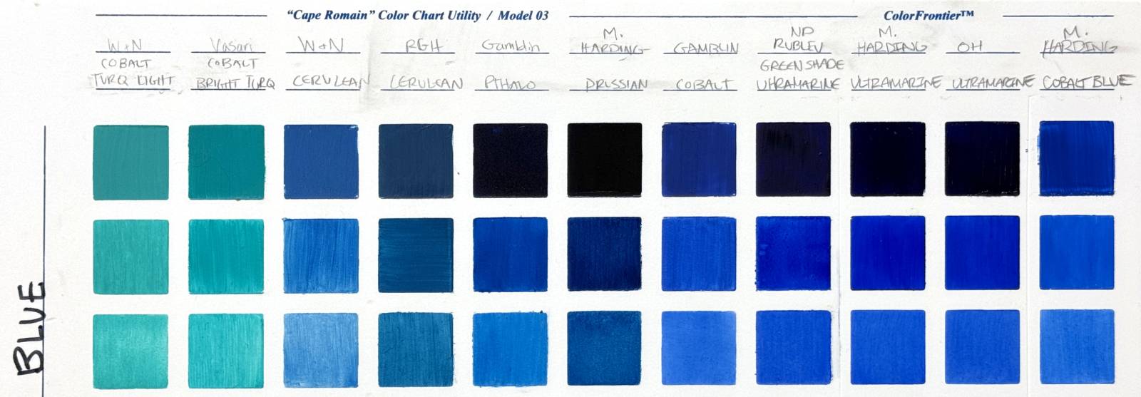
Extra transparent!
SQUARE 4: PARTY TIME! – HOW OUR PAINT ACTS AT A PARTY (IN A MIXTURE)
Use the white you use in your paintings for this. The white I use is Natural Pigments Lead White #1. This is when we begin to see how well our paint plays with others. Here I pay attention to the tinting strength of the pigment at hand. This gives you clues as to how your tubed paint will act in mixtures.
How to apply: First mix up a very light value with your palette knife. The mixture is mostly white with a little pigment. I shoot for a rough value 2. Apply with a clean soft filbert, flat or bright. Make sure your application is like square number 1: fully opaque. If you see variations in the square you either did not mix up the mixture good enough, or you are being too thin with application. Palette knife is also an option.
Things I ask myself:
- Is this paint a bully? Is it DEMANDING to be noticed and overtaking the white immediately?
- Is this paint a wall-flower with a weak tinting strength? Do I need to dump A LOT of it into the white to make a difference?
- How does the color change significantly with white added? Did the chroma or intensity of the color drop off quickly?
Notice that your mixed color is VERY DIFFERENT than your glazed color. Adding white will drop the chroma and shift the “temperature” or your colors no matter what, but different paints will react differently to your white.
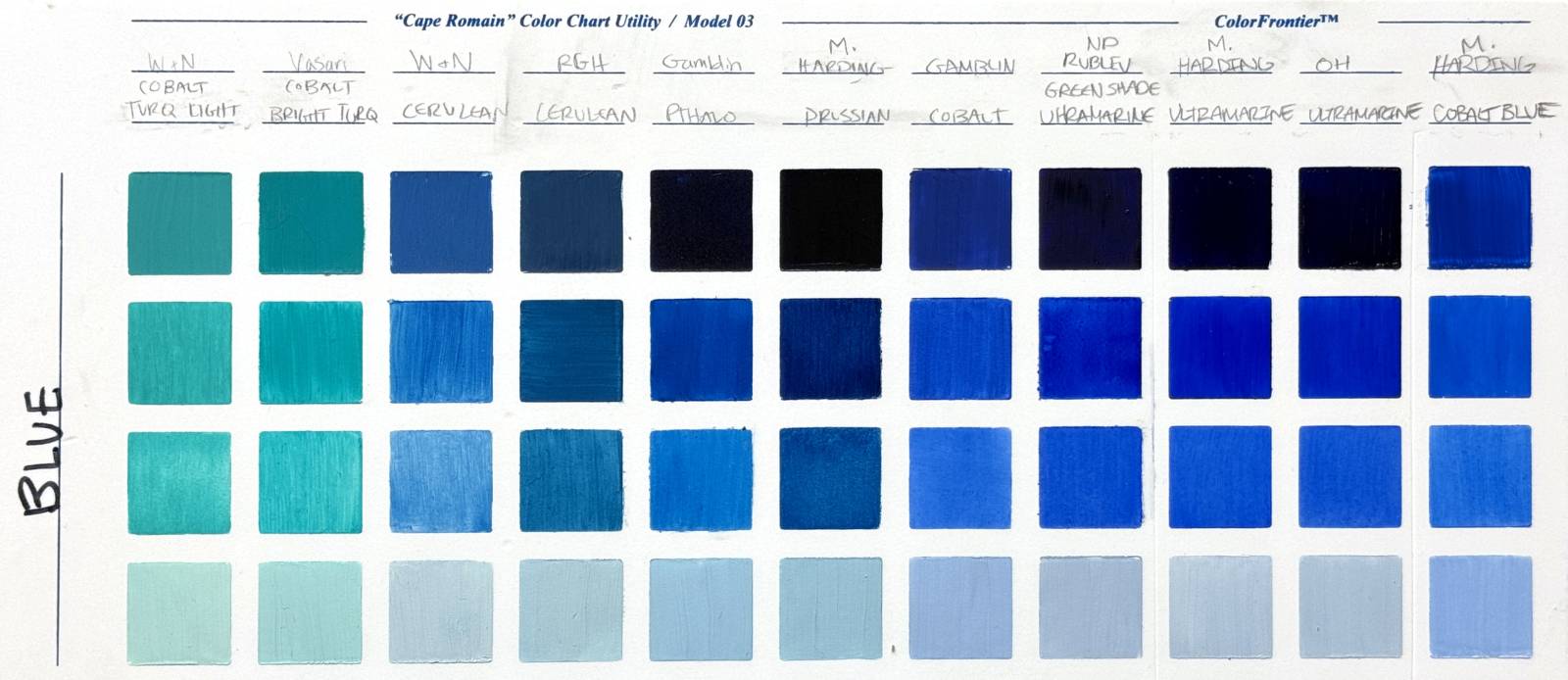
Square 4: Fully opaque, mixed with white
SQUARE 5: MORE PARTY TIME! – (OPTIONAL)
Same as square 4, except we are making a midtone value.
How to apply: Same as square 4.
Things I take note of: The amount of paint added to your white at this stage is crucial for finding the speed at which your color moves up your value scale. It takes a measured approach to gracefully ascend your value scale so less is always more. A little too much and you can overshoot your desired value quickly.
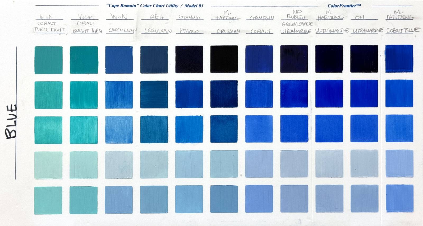
Square 5 fully opaque, mixed with white, mid value
Why should you take the time to become BFFs with your paints?
If you’re looking to get certain effects in your paintings, the choices of the pigments you use can make a big difference. Brands or pigments that offer an opaque application right away can be a better option to get coverage quickly (Example: use a cadmium yellow versus an indian yellow). Whereas if you are trying to retain a thin, transparent/glaze-like quality to your shadows, you may decide to use naturally transparent colors (Example: using a Quinacridone gold-brown versus venetian red).
Here’s a short video that shows how I do this!






Great information, Julie!