When I was a young boy, my family would gather around the black and white TV set to watch, every spring, the re-airing of the 1939 movie, The Wizard of Oz. Each year it was a special event both as a really fun movie and as a happy family moment in time.
During commercial breaks my parents would talk about which scenes had been changed or cut and how they’d remembered it differently. I remember listening to my parents’ reactions as I sat riveted to the screen. Their discussions during the commercial breaks kept the reality of making a film about fantasylands important to the process. I was learning, even then, of what it takes to realize a vision, to build a dream.
This affected how and why I paint.
I paid attention to subtle aspects of the story. The way the witch terrified me for some time, and how I felt a strange attraction to the character that later grew into her being my very favorite. The twister remains the best portrayed, most convincing severe weather events in all of film history, to my eye, and never quite topped for its fear-inducing, almost languid brutality.
There are many such scenes that have stayed with me over the years, cementing those characters and story into the fabric of my imagination. So I was a little stunned to find out years later, when I decided to read the original book by L. Frank Baum, that the movie stretched much of the story to accommodate a ninety-minute film.
But reading the original just reinforced what I’d already loved about the tale, and I thought at some point I’d love to paint my own version of what I read.
“It’s in COLOR?!?,” I said.
Years later, while working with Richard Tong and Marcelo Anciano of Lyra’s Books in the UK, they’d asked me to give them a list of books I’d love to illustrate if I had my wish. The Wonderful Wizard of Oz was on my wish list, but I hadn’t thought that anyone would want to actually do it. They thought it was a worthy selection of books and before long, we were visualizing what the book could look like.
I started researching multiple illustrated versions of the children’s novel, the Judy Garland movie and several others, and reread the book several times, studying W.W. Denslow’s magnificent illustrations. I even watched the movie a couple of times to study designs, motifs, and costumes. All of it was fascinating to a boy who had never known the movie was in color until that same boy attended a cinematography class in art school.
“It’s in COLOR?!?,” I said.
Perhaps one reason why I understand the use of value in painting is because of watching countless hours of television in black and white. (Heck, watching the original series of Star Trek may be even better in black and white, no question)
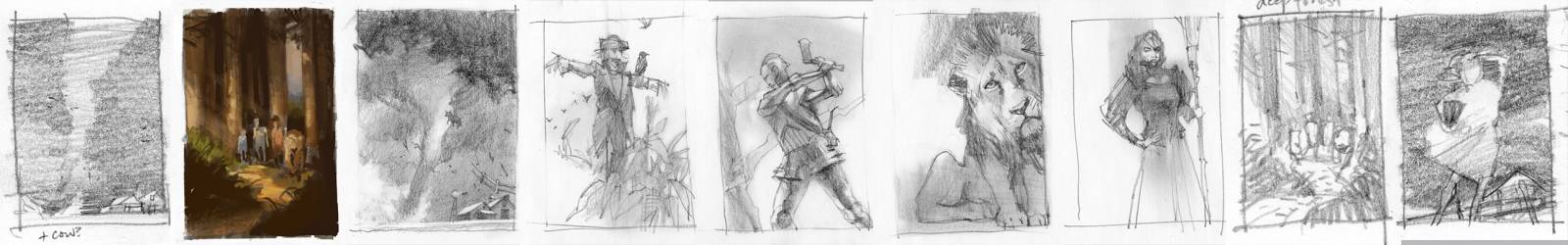
I began visualizing with the barest of thumbnail ideas. The thumbnail is a critical step in developing a picture, even when vague, because it captures all of the emotion and suggestion of the idea that we complete in our minds. The magic is in the initial drawing and keeping it close by helps me to maintain it.
I wanted all the characters to have my own particular look and feel, visuals I’d thought about since childhood. So I set out to design them…my way.
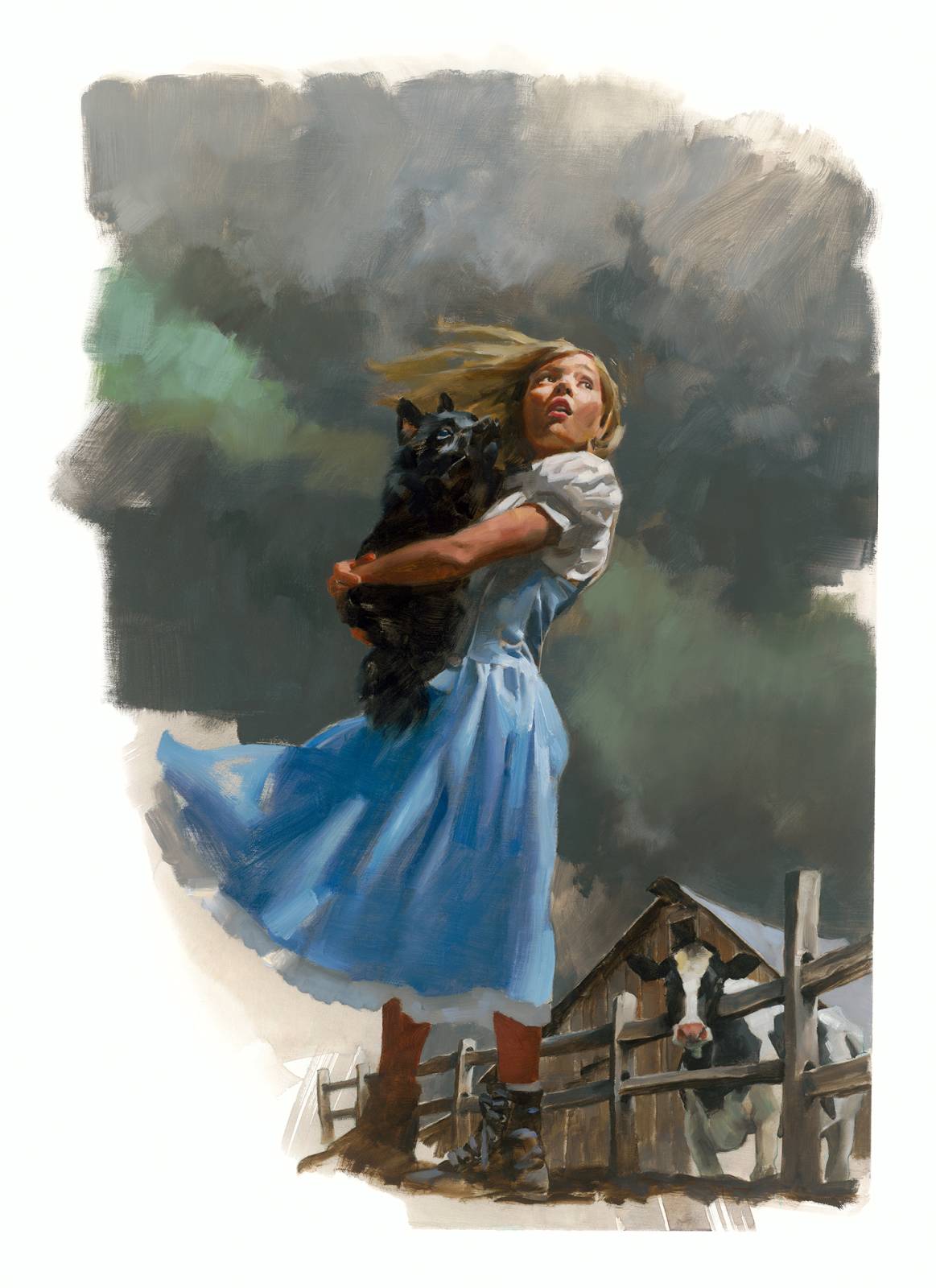
For years, I thought my next door neighbor’s daughter would make a perfect Dorothy Gale. By the time I was ready to make final drawings, she was just the right age for the part. I asked her mother about having her pose. She’d never modeled before, but they were excited to take part. So little neighbor, Isla, came over with her mother and played my Dorothy. She was brilliant and pulled off every emotion I needed her to perform, even while holding a dusty old stuffed animal as a stand-in for Toto.
As for Toto, I didn’t want the typical over-fluffy dog type. Baum described him simply as a little black dog. I researched and found a Schipperke to be more believable for Toto’s depiction.
I learned a lot from watching all the main Oz characters as a kid. They were shining examples of how to conduct oneself in the world. I learned about courage and friendship and how to keep trying even when things look bleak. How to stay observant and look for ways to succeed, how bad things happen to good people, and how good people rally to overcome bad things.
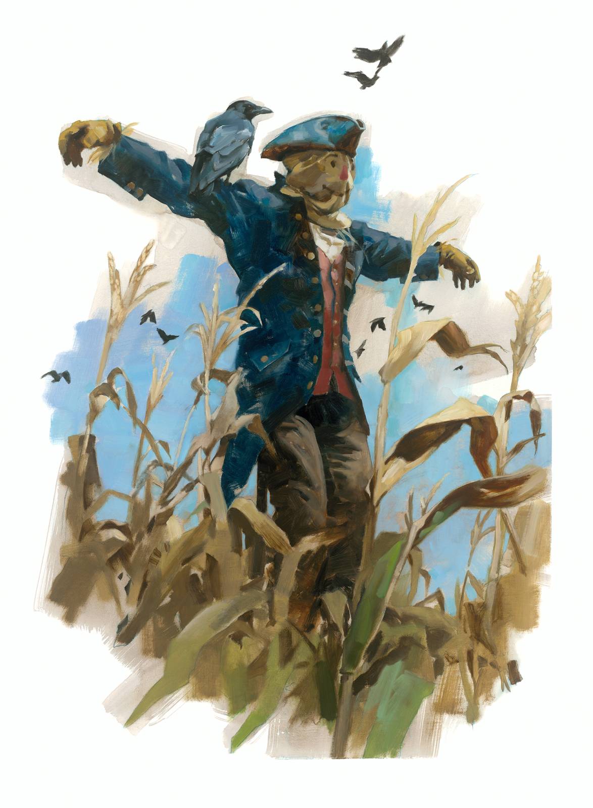
The Scarecrow, for all his goofiness, still needed to look slightly dapper in his clothes and so I chose an old frock-like coat and tricorn hat that might’ve been sitting around in any Munchkin’s closet left there by some ancestor.
I worked from a shot of me hung up on a ladder with a pillowcase on my head.
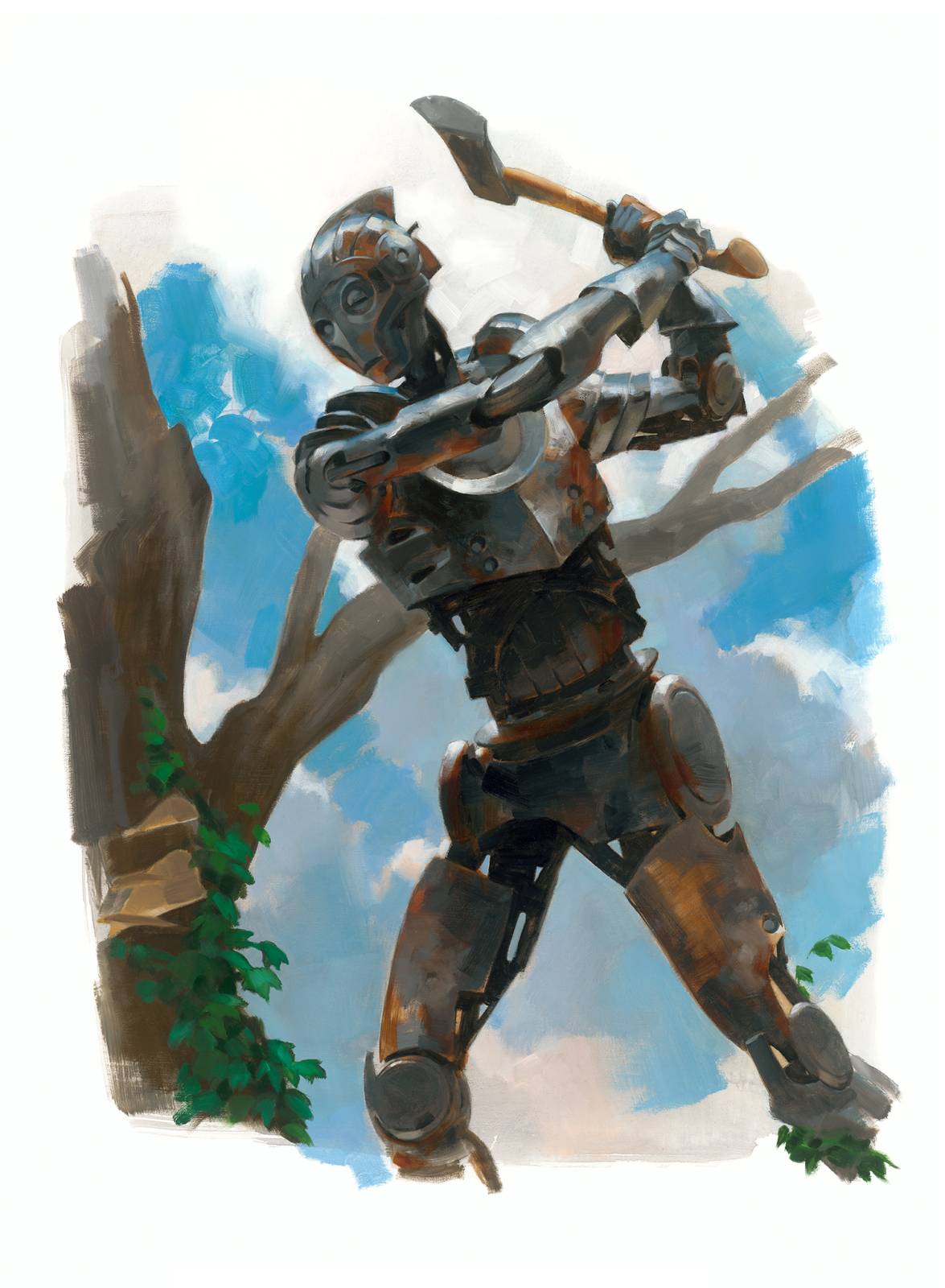
The Tin Man was always a favorite because he kinda bridged the uncanny valley, mimicking human behavior. Much like a robot. I pictured him built from scraps of metal and bits of machinery. I wanted him to look like he could actually work. His magic is practical. I modeled for him to get the body language right, and then redrew it.

I wanted to portray the Lion as realistically as I had imagined him as a child. Bert Lahr’s costume in the film was magnificent, except I wanted to see in the face a real lion. Scary, and yet a wimp. I studied lion anatomy and worked out drawings to capture him as a real, but oddly shaped, cowardly lion.
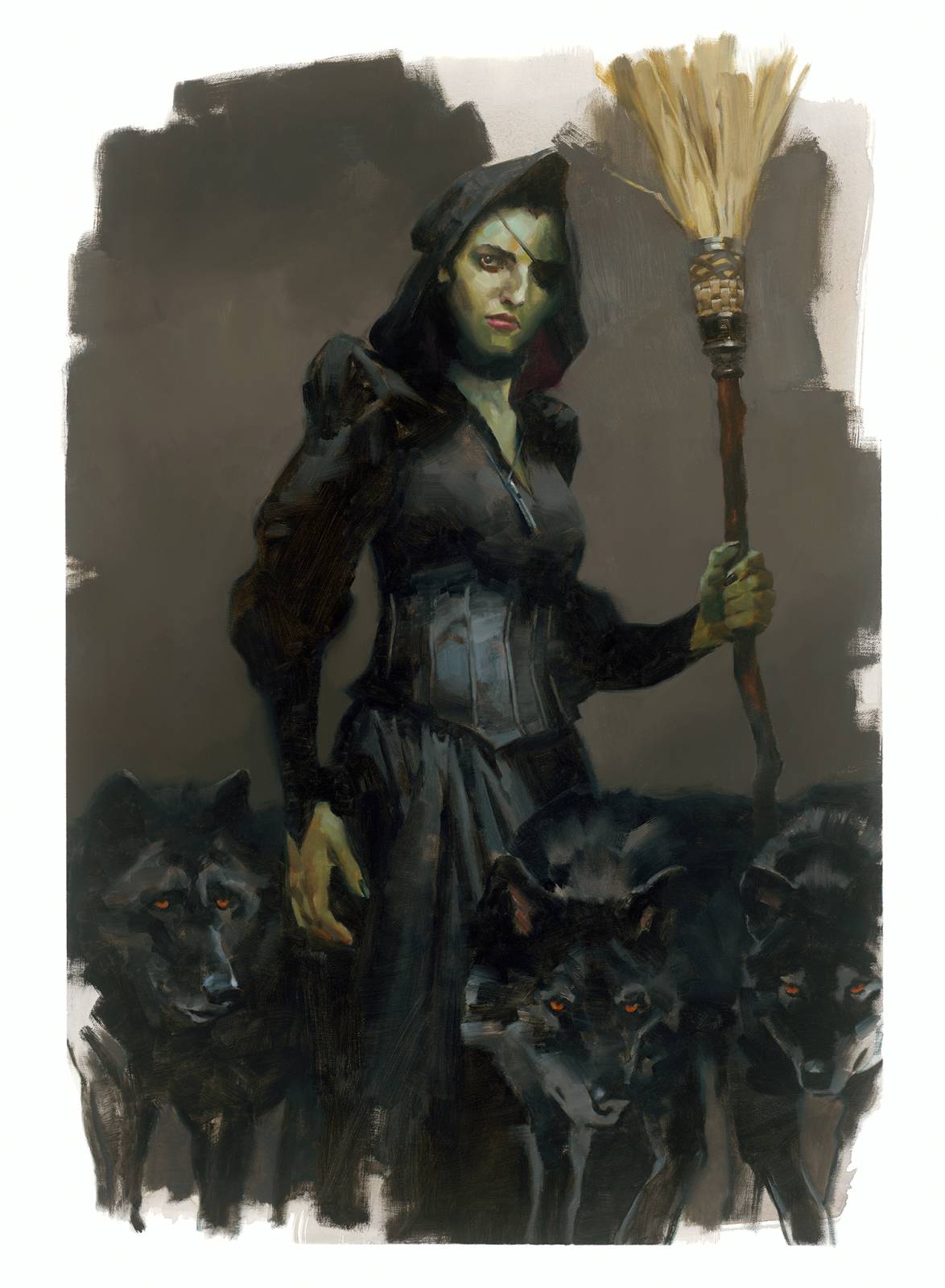
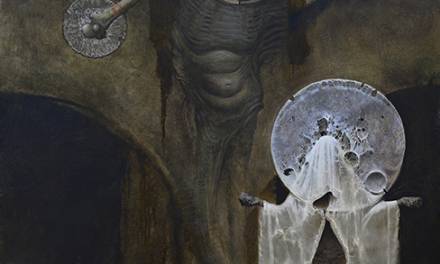
I derived the witch, one of those ‘bad things’ mentioned above, from several references of women, to capture general shapes, then drew her from scratch. No pointy hat, or crooked nose and elongated chin for my witch. Baum doesn’t describe her much in the book, other than seeing with one eye, so I gave her a patch. She commanded wolves—how cool!—and I just had to include them. I kept a little of her greenish skin and I think that’s about as typical a witch aspect as I allowed my Wicked Witch to have.
I was truly scared of the Witch when watching the film. But as the years passed, I became more entranced by the Wicked Witch of the West, and she became beautiful to me. Another lesson learned about how things can become lovely if one is given enough time to ponder the idiosyncrasies.
The strength of a good story is built on great visuals. They inspire stories, not the other way around.

Sometimes the environment becomes a character. I worked the twister over and over to capture that languid swing of the funnel, vacuuming it’s way across the prairie, clouds of dust hiding the destruction at it’s base, and the sky turning that sickly green when you’re in for a real walloping. The dark skies nearly touching the ground, but way off in the distance a bit of sunlight promising a hopeful end. The cow was in the picture with Dorothy and so I let the poor guy get taken up as well in the painting.
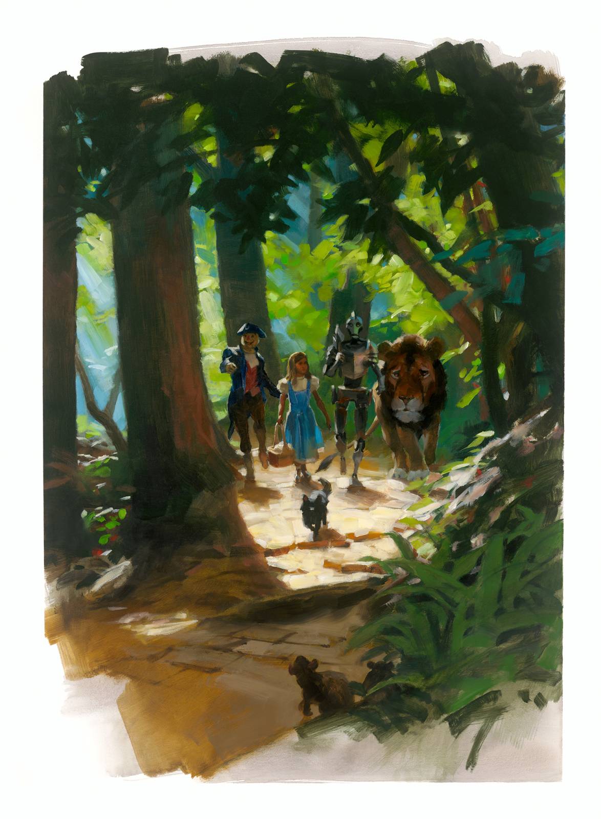
I love adventure stories where we get to go places we may never experience. One of the brightest paintings in the book started out as a gloomy portrayal of the type of forests they travel through in the novel, weaving in and out of the trees. Baum describes lots of the Oz country in the book and I had several ideas for showing the crew easing on down the road of yellow brick. The road isn’t made of gold, as some readers think, but of sometimes broken and tattered old bricks. It’s been there that long.
I changed my initial vision to bring in some sunlight, building the scene from several references to capture light penetrating the thick woods.
……
The strength of a good story is built on great visuals. They inspire stories, not the other way around. I work diligently and teach specifically to capture the essence of an author’s vision. As an illustrator I become part of the team that brings a story to life.
This is just a handful of the twenty-one paintings I completed for the limited edition. (The book sold out quickly during pre-sales) In my following post I’ll show more of what went into re-creating my version of the Land of Oz.

The Wizard of Oz will always have a special place in my heart in terms of storytelling and filmmaking, I’ve seen it countless times for decades and it’s still as exciting as when I first saw it as a child. The colors in the film were way ahead of anything else in 1939 and it’s almost like we got to experience Dorothy’s vibrant dream first hand. Your reimagining of the characters are amazing and it’s always fun to see your models and your own poses turned into finished paintings! 🙂
Daaayum Greg – these look terrific!
I know what you mean, Brian! I watch it a bunch, too. Only these days, I can’t keep from getting choked up. LOL! Glad you like the pieces…more to come!
And thanks, too, Charlie! It was such a good time painting these. Every day was joyful…
Always excited to see what Greg has been working on and every single time I read one of these I am inspired to pick up my brush.
Fantastic insights on painting Oz! Loved the detailed approach and creativity