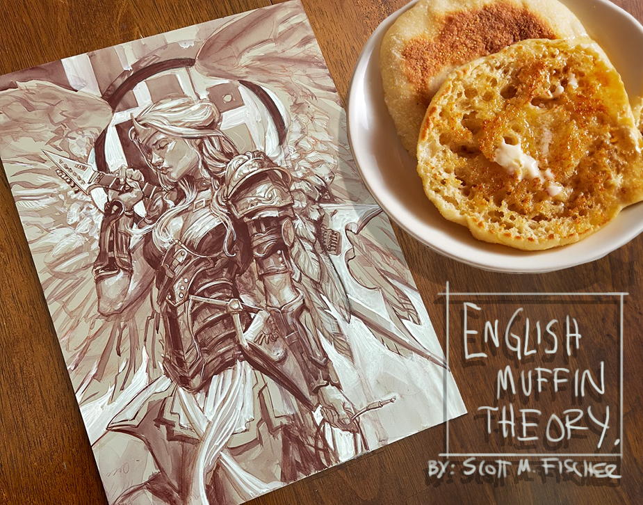
 “Hit those accents like the buttery nooks and crannies of an English Muffin.” you will often hear me say in SmArt School and in my videos for Muddy Colors.
I guess my brain likes having simplified ways of remembering things. But I thought I’d take this post to dig in a bit deeper.
Basically what I am saying is… you know when you butter an English Muffin… how the craters are random, and some fill up with little pools of butter, while some of the raised areas- no butter, or at the most a micro-thin coat of melted goodness to give it a bit of shine?
(Sorry my vegan and gluten-free friends!)
Those craters and raised areas are buttery accents of deliciousness. Sometimes you even plan your first bite on where they are located!
In paintings, I like to see accents of deliciousness too.
(But not everywhere! If you use the same brush accents on every square inch of a painting, it can taste a bit same-same- like if a muffin was one huge crater, it would just be a bowl of butter.)
Take for instance, this muffin.
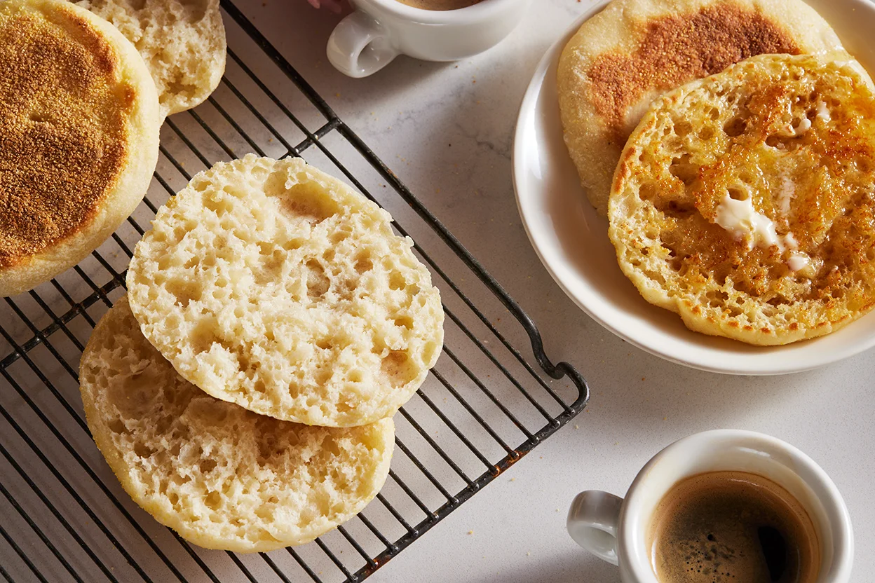
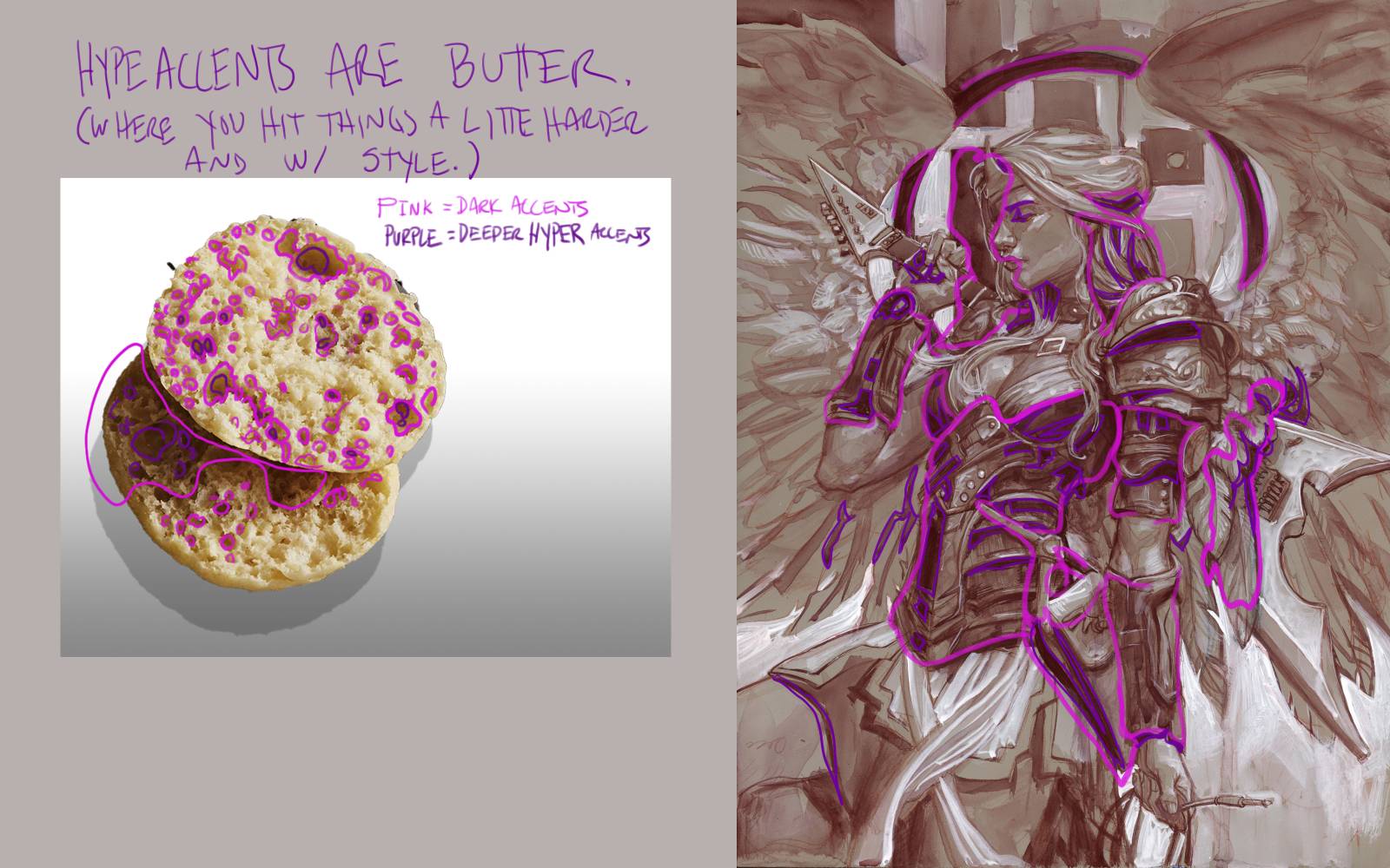
Notice how the craters and raised areas are a bit random? How they sort of fade in and out of each other in gradients?
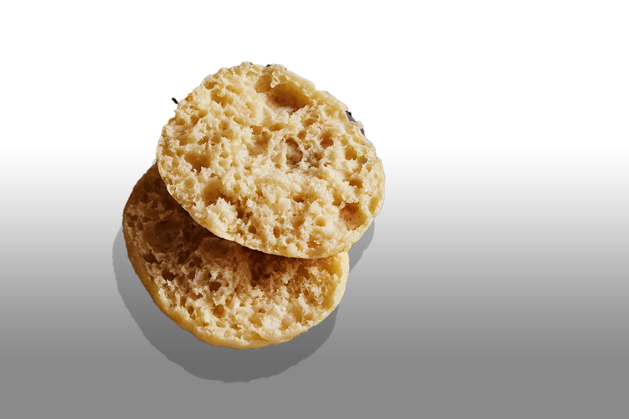
Squint and notice how the the darker areas sort of meld together? But they are not distributed evenly across the surface. They are not all the same size and distance from each other.
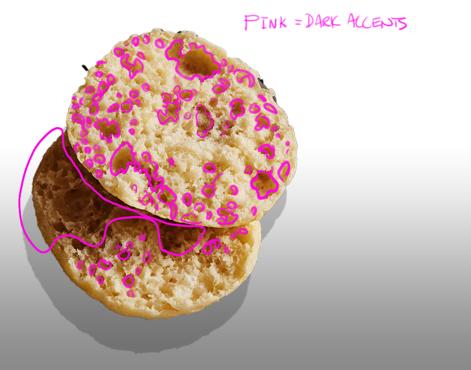
Now here is where it gets interesting, see how within the dark areas, there are even DARKER areas? I call those “buttery nooks and crannies”, but in painting terms you can think of them as HYPER ACCENTS.
Those sweet spots where you can just attack a little harder. Accent. Think about a designed stroke that says something. Show you were there, baking (I mean making.) bold decisions- rather than just adding to the soft mush. You don’t want to eat raw dough do you? Bake that thang!
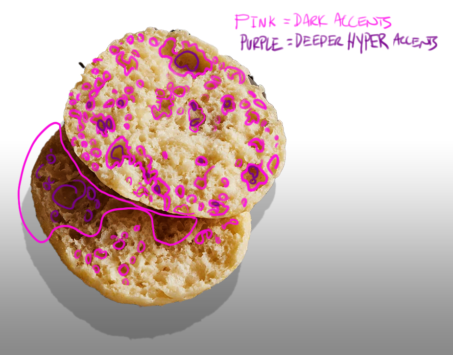
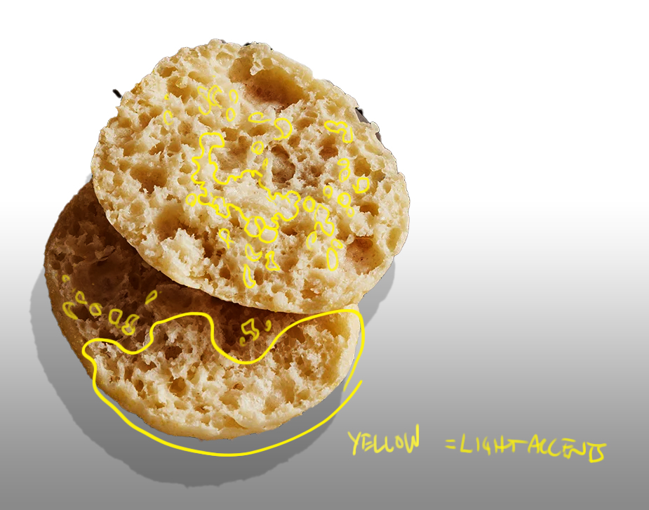
Guess what? It also happens in the light areas.

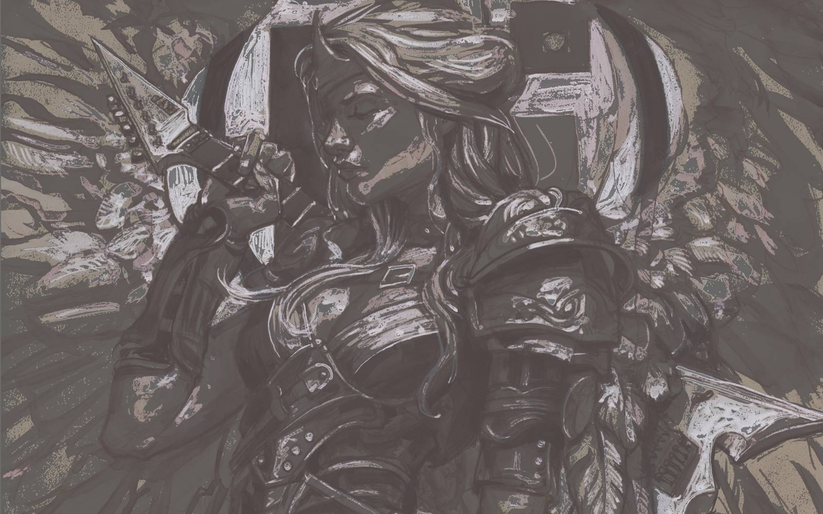
Now, let’s apply ‘English Muffin Theory’ to this monochromatic painting. (Eliminating the distraction of color.)
See the correlation from muffin to painting of dark areas- where butter would pool when you squint?
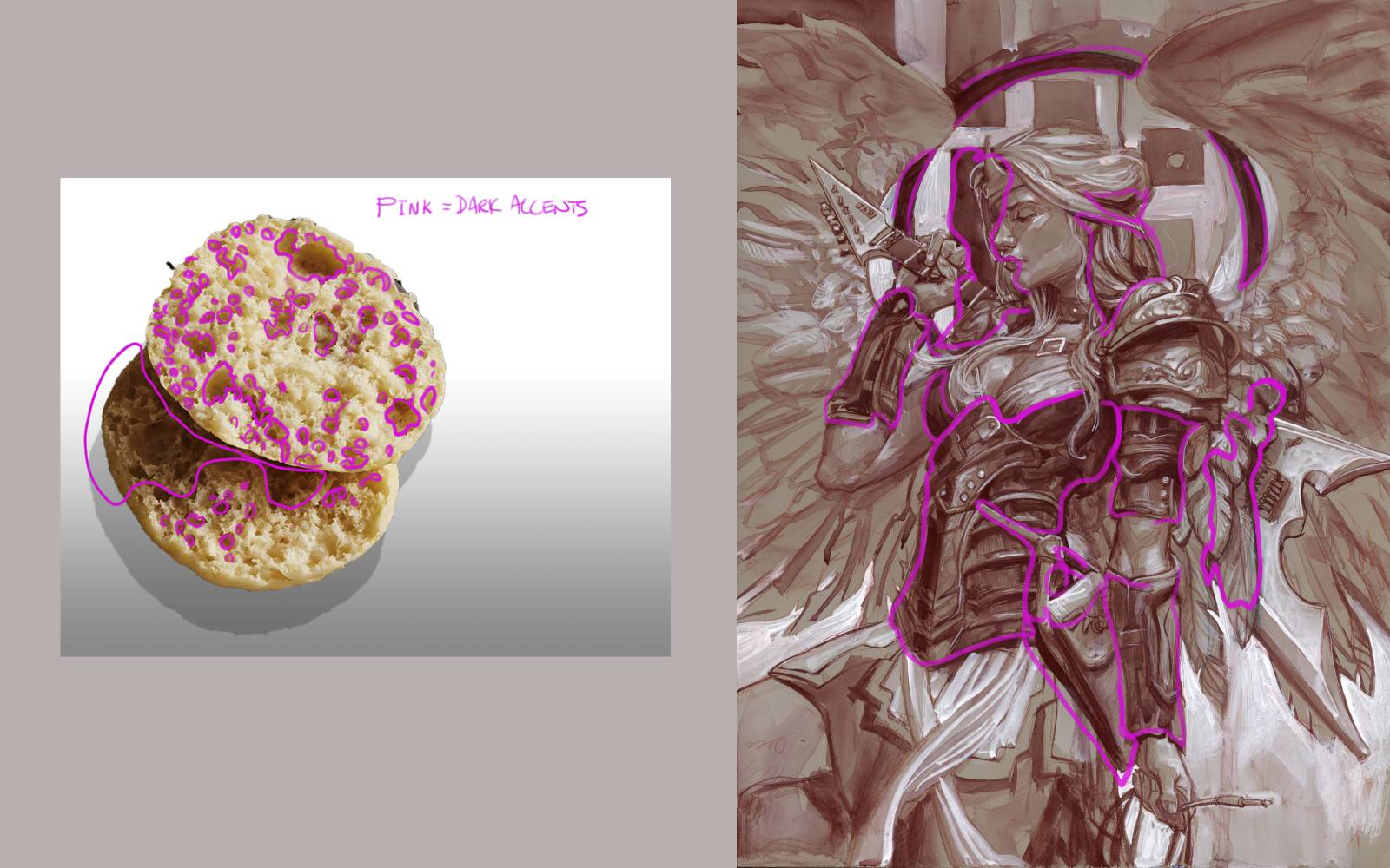
Ok now look for the hyper accents of dark. Look how specific I was with those strokes.
And into the light, the same thing.
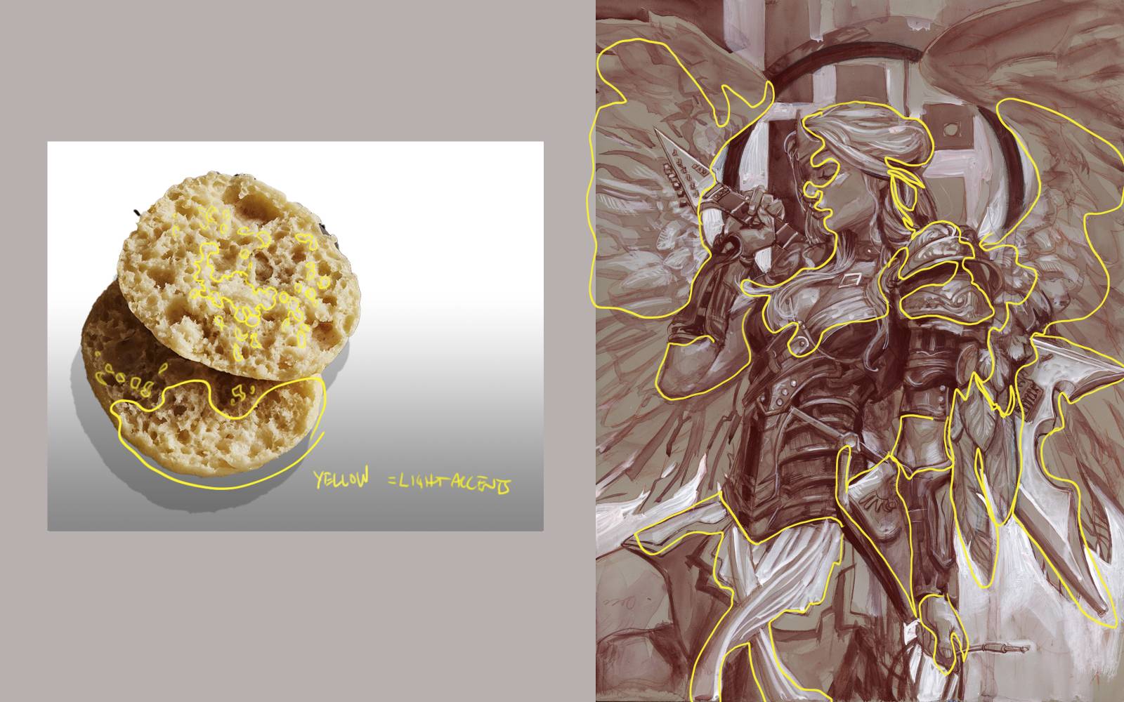
Try to find areas of value and accents that are similar to the muffin. (Not literally, but in vibe.)
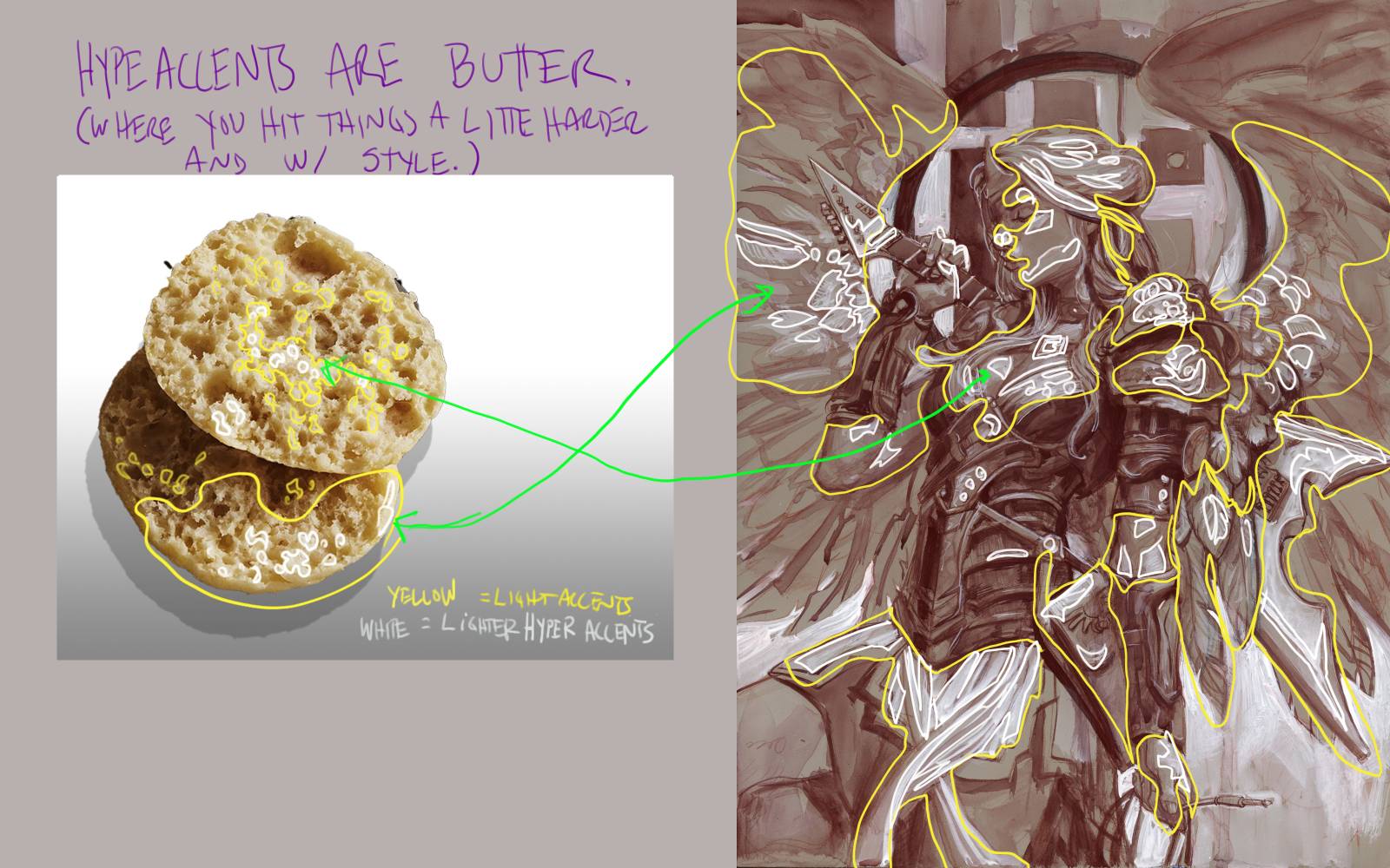
It is with those hyper accents that you can have a little more fun. You often will find them in the very last moments of painting. After you’ve established all your middle values and you’ve set up the tonal hierarchy. Maybe you feel your painting is too soft and mushy? Here is where you give it that final pop.
Is the hyper stroke thick and stout, forming a drop shadow from shoulder armor? A thin line of edge light on a shield? A single dot ‘highlight’ on a button? Ooo maybe it is a single stroke that goes thick-to-thin that you pull in one stroke with a twisting motion of a flat brush? Maybe that single stroke defines the corner of something that has a thicker drop shadow on the bottom than the side? And you hammered it!
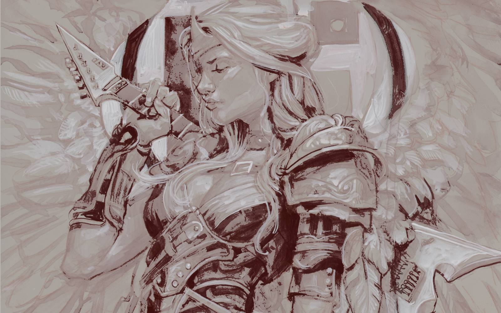
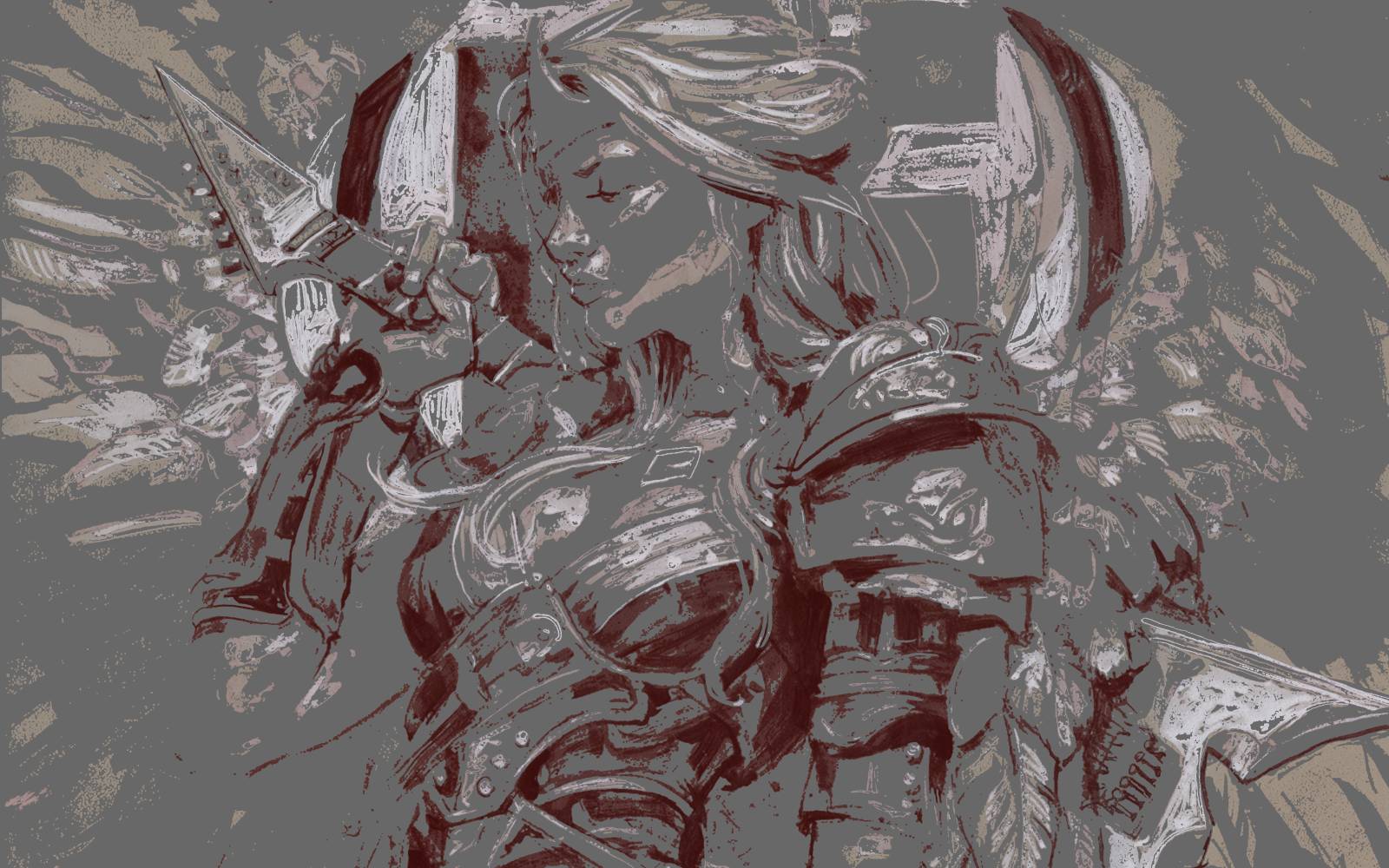
Check this out. I have isolated out the strokes, both dark and light, so you can see how they are designed strokes. not just random marks.
Dark hyper accents.
Light hyper accents.
All together now. Notice though the greyed out middle value is flat and opaque, you can still read the image. Even with all that lost information. It is like a dance of light and dark, playing off each other, fading in and out of each other. Concentrated in one area then often fading away.
Where the light and dark accents are touching each other, we get contrast. It forces one thing to come in front of the other. But if we had that contrast everywhere, the piece would fall apart.
Even if you are a super renderer, maybe don’t blend every stroke out. Let some of those final strokes stand out. Is it the specular highlight on a piece of armor? The dark shadow in a crease of leather?
If you are a loose painter, your bliss is here my friend. This is where you make deliberate strokes. And if you’ve done it right, you would have established the values UNDER those strokes, so there isn’t too much contrast when you give it the pop.
(Isolated strokes can be distracting if the value beneath them is too light or dark causing too much contrast. (Unless you WANT us to look there.) The middle values are what glue the buttery nooks and crannies together.)
Remember, what is under the stroke (or hyper-stroke), is as important as the stroke itself.
Get baking!


My breakfast at Muddy Colors is getting better every day!
Funny how we all think in similar processes, but all have different words for those processes. I like the muffin analogy.
LOL indeed Dos, indeed! Manchess and I teaching the same class at the same time in Smart School, it is down right funny how universal some of these things are. Like when we open a piece we both race to fix the same thing before the other can get it.
Now I’m both inspired to paint AND really craving English muffins with soft melty butter…mmm *Homer Simpson face*
What a brilliant analogy! The ‘English Muffin Theory’ perfectly captures that subtle yet impactful element in art that just makes a piece sing. It’s so true how those ‘nooks and crannies’ of hyper-accents are where the real magic happens and hold the viewer’s attention. I’ll definitely be thinking about this when I’m working on my next piece.
This is a great way to articulate something I’ve instinctively tried to do but couldn’t quite put into words. How do you decide where to place these hyper-accents without making the piece look too busy or over-rendered? Are there specific types of details that work best as ‘nooks and crannies’?
YES! This is exactly what I needed to read today. It’s so easy to get lost in the big picture, but it’s those tiny, unexpected details that truly elevate a piece. I’m so inspired to go back to my current WIP and add some more ‘buttery nooks and crannies’!
Interesting concept, but I wonder if overthinking these ‘hyper-accents’ can sometimes lead to an artificial feel? Isn’t the goal often to make the piece feel cohesive, even with detail? I find that sometimes the ‘less is more’ approach can be more impactful than adding too many ‘cracks for butter’.