
Colin and I have had the wonderful opportunity to be on the jury for numerous art contests over the years, including Spectrum: The Best in Contemporary Fantastic Art, The Beautiful Bizarre Art Prize, Infected By Art and The Walter S. Baird Prize, along with other local and regional competitions. To be sure, we’ve looked at a lot of entries in all kinds of subject matters and mediums.
To start with, here are some things to keep in mind: every jury is different and everyone has their own predilections and preferences. We all know of a piece that got rejected from one contest only to be an award winner in another. We’ve all entered an artwork that we thought was one of the best we’d ever done only to have it rejected – we are intimately familiar with that stinging ouch!
A counterpoint to consider is that in entering, your work will be seen by one or more people that are respected in your field. If a jury has five people on it and your work doesn’t get in, it’s very possible that three of them voted for it, but you needed four to be accepted. It’s self-defeating to listen to that little voice that says, “see, everyone hates your work,” because it’s simply not true…ever. If you’re passionate about it, other people out there will be too.
Here are some facts: when judging, we have to look at hundreds or thousands of artworks and make an assessment of “in or out,” sometimes over a month (when we’re very lucky), sometimes in a day, sometimes in a few hours. One contest had over 4000 entries and we had five hours to choose – the math on that is insane! It comes out to under five seconds per entry, if all entries received the same amount of time. This means your entry needs to stand out, both in its full size, but also, unfortunately, in a thumbnail too. I know of judges who choose from thumbnail images – that’s rough if your work has tons of detail that is gorgeous full size, but doesn’t register when it’s viewed at a tiny scale.
The conversation on presenting sculptural works for publication came up recently when Alexander Gustafson contacted me regarding some sculptures he wanted to enter into this year’s Infected by Art. They’re in the precast stage – still in the material they were sculpted in, so there are supports and stands still in place, which creates some challenges. Some competitions embrace raw sculpture and some prefer finished works only. Infected by Art’s entry fees are very reasonable compared to any other contest I know of, so for me, it’s worth taking a chance and entering. If they don’t get in, the finished versions could be entered another year. Later in the article, you’ll see the development of his images, our conversation, my recommendations and what he ultimately entered. Here are some of the topics we chatted about:
Respect the time and effort you’ve put into your sculpture – do the work necessary to show it in its best possible light. Keep in mind that the images are for publication. They need to be of a quality that will represent your work well in print.
On Backgrounds
A background should not distract from your work, ever. It should either disappear completely or enhance the piece as a beautiful frame might complement a painting. The background you use will ultimately become part of your branding presentation. A simple solution is to photograph on a seamless backdrop (i.e. roll of paper that can be purchased for under $40 online). There are a variety of available colors and each can be adjusted with lighting. For example, if you are using a grey seamless under studio lighting, you can manipulate the gray with the angle of the lights to look grey, almost black, near white or a gradient. As far as seamless with a printed gradient, so far, we have not had any luck with those. The images always come out with weird horizontal lines across the background. Black backdrops look super cool, but make sure the exposure doesn’t get messed up sorting out the sculpture from the background. Post-processing in Lightroom and Photoshop can be useful in dialing up the drama or vignetting to control the focal area.
Here are some examples of different ways to use lighting and post-processing on a grey backdrop. Whether you choose to go a bit warmer/cooler to complement the coloration of the piece or neutral to disappear, the background should always help your work to stand out. Moving clockwise, the background on the left is a bit bluer to lightly suggest nighttime. The Nightmare has a greener grey that suggests nighttime, but also feels intentionally a little uncomfortable – it’s not a happy bright color. Leapfrog also refers to night in the sculpture coloration, but the background is lighter and brighter spotlighting the sense of fun. The neutral gradient, moving from light grey at the bottom to dark grey or black in the last two pictures draws the focus to the face, head adornments, hands and jewel. Subtle shadows around the base help the piece feel grounded. These are all pretty subtle shifts, but to our eye, the little adjustments make a big difference, especially when the 2D image is the only experience a viewer will have of your work.
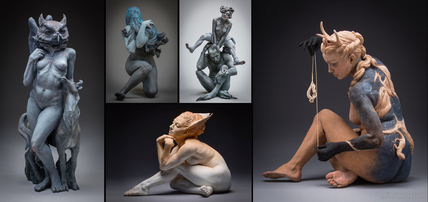
Your approach may need to be shifted in order to show a different color or scale sculpture to best advantage. Chromatic, medium black or white sculpture may work well on a medium grey background but grey sculpture may be lost on the same color. You can see how a white vs. black background creates a different feel and look for Dorothée Vantorre’s sculptures. I appreciate that in both images, I can see a hint of shadow which gives the work some visual weight and anchors it in the space.

Sometimes, for various reasons, the only choice is to cut the sculpture out in Photoshop and put a background in. Cropping and dropping a sculpture onto a seamless backdrop in Photoshop takes a fair bit of time and skill to make look real. Replicating believable shadows is complicated, especially with multiple light sources, but usually it’s worth it to give the piece a sense of solidity. In the case of Scutteri_Portrait, though, I feel like the lack of ground or gravity works well enough. The stand itself creates a sort of horizon line and Berube’s blended composite image (more on that in a bit), give me a feeling of the piece being on a turntable that allows me to see various views.

Ceci N’est Pas Une Clothes Hamper
For us and our work, no wrinkles, no exceptions. We really dislike the “old wrinkled sheet” backdrop – we feel it’s distracting. Especially when it’s a dirty sheet and more especially when you can still see the folds in it. This example from a Facebook group, while not a sculpture, does a good job showing how distracting a “wrinkled with folds” background can be. Suggestion: if you have to use a sheet, get an iron or a steamer.

This quick mock-up using “The Monkey” as an example shows how the background can detract from the work. We want all the attention on the sculpture, not the crazy goings-on behind it. That said, if “wrinkled sheet environment” somehow adds context to the work, great! Just be certain the viewer will be looking at what you want them to. 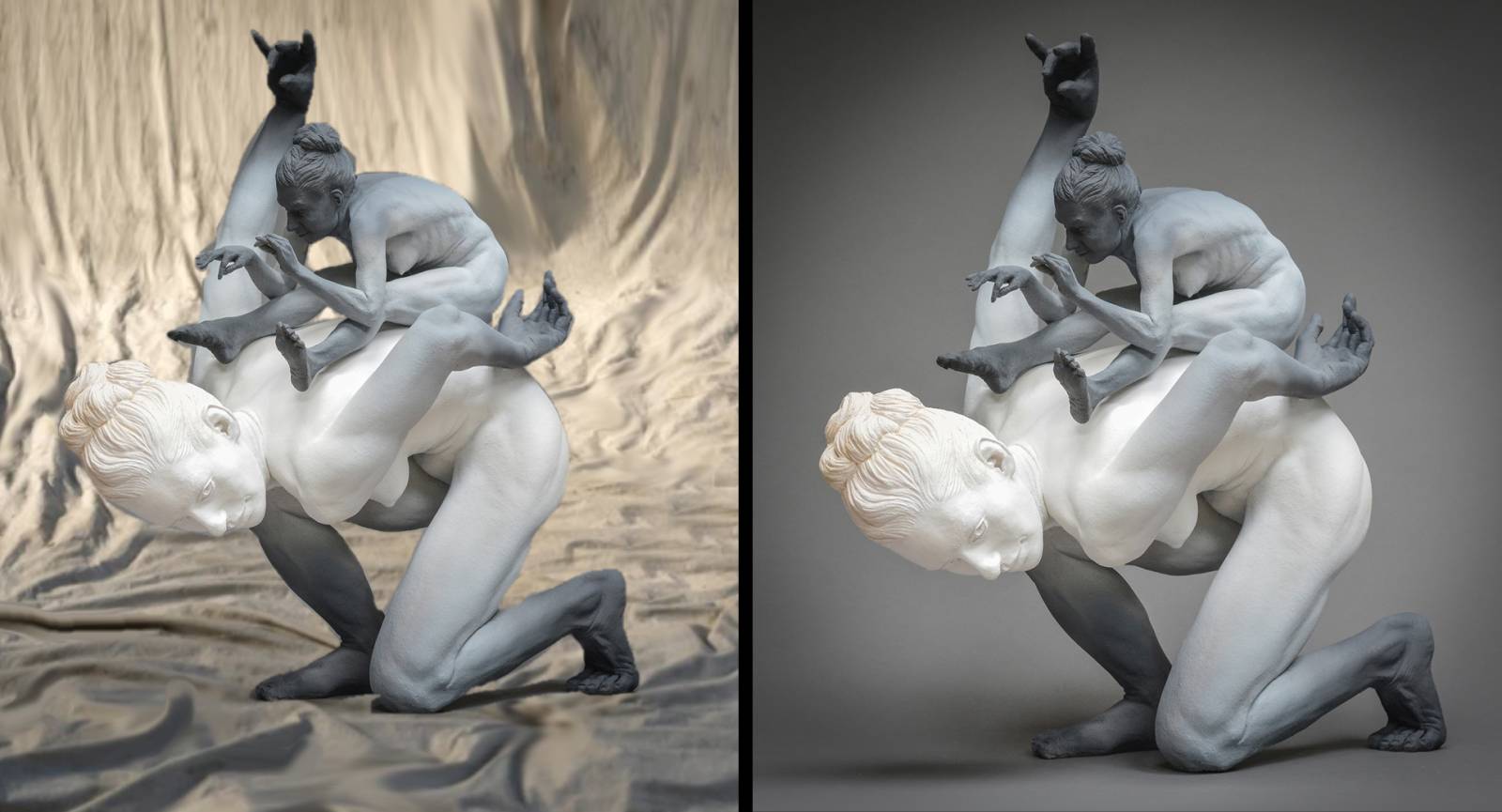
On the note of environments, if you feel your work will be best presented outdoors, that can be very effective. It’s generally a giant step up from buying plastic plants from Hobby Lobby and hoping it looks real, but bear in mind that environment scale needs to be appropriate. Your pixie or fairy may look great peeking out of your peonies, but King Kong and T-Rex may look odd in your spider plant. Think of the environment as a full on diorama – pay attention to every detail as you did when you made your sculpture and, be sure that it complements your work and doesn’t diminish it. You would be hard pressed to find someone who presents sculptures in natural environments better than Scott Radke. A few of his images are shown below and you can see more here: http://scottradkeart.com/ Think of these as the paragon for works about nature and in nature. If you’re inspired by what he does, don’t copy it – use it as a standard by which you can elevate your own vision.

Lighting
Of course photographing a sculpture kind of sucks. Taking your wonderful dimensional creation and squishing it into a two-dimensional medium will always fall short of the experience we have when face-to-face with a sculpture. Good lighting can help mitigate the negatives of 3D viewed through 2D goggles. While you could spend thousands of dollars outfitting your studio with professional lights, you really don’t need to. We’ve seen some pretty usable lighting setups, both strobe and LED that are reasonable, if not the top of the line. With studio lights, you can create great dramatic lighting that highlights textures, your sculpting and the story you’re telling with your piece. While the background is a critical part of a successful image, controlling light (direction, amount and color) is essential in being able to see your work accurately, and that is the most important thing.
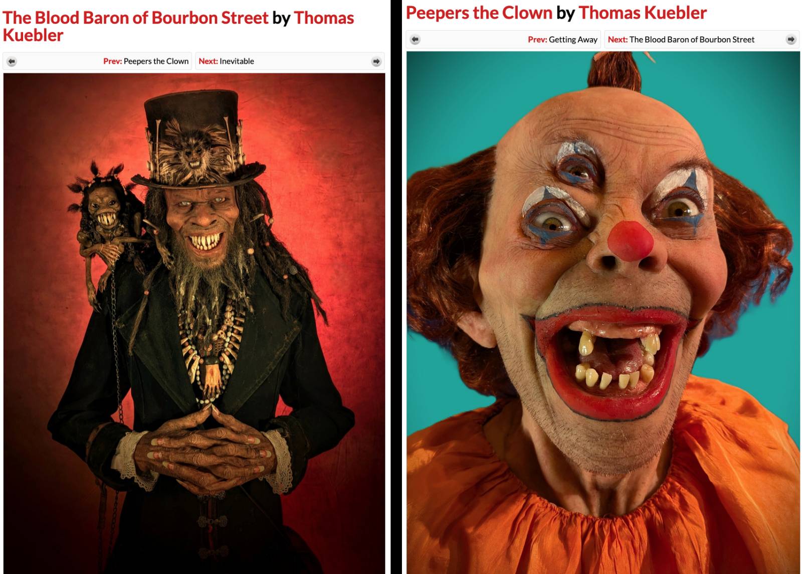
Tom Kuebler’s entries are a great demonstration of this. Not only do his sculptures look great, the backgrounds are so well done also. The fiery background of The Blood Baron of course subtly suggests blood, makes the skin seem almost luminescent (and alive) and the contrast between the orange and black of his hair and costume draw your attention to the faces. The teal background of Peepers seems like it should make you feel fun – circuses, swimming in the Caribbean, springtime…but the contrast between the happy background color and the sculpture really exaggerates the creepy factor.
Similarly, Dug Stanat’s lighting adds drama while subtly controlling areas of focus. In Raised by Lies, he skillfully uses the brighter area and complementary colors in the center to draw attention to the swirling creatures, while still highlighting the main figure through contrast of light and dark. For comparison, The Keeper’s Dilemma has a similar lighting color, but the gradient to high contrast at the top focuses the viewer on the detailed head.

If you don’t have professional studio lighting, no problem. We often photograph under natural light – we have skylights in our studio where the light is diffused and we can easily see all the details. With a sheet of foam core, we can bank the light to brighten up shadow areas. Mainly, choose a lighting source that shows the texture and sculpture to its best. Be careful of foreshortened angles that distort your proportions. Choose the angle that best represents the work – sometimes called “the money shot.” While I don’t recommend it, we know of success stories of getting work into contests that weren’t quite finished by carefully selecting an angle that hid the unfinished bits.
Compositing
For sculpture, we often do a composite image of 2-3 pictures because with many contests, you can only upload one image. If there is one image that shows your work beautifully and no further information is helpful, do one image. It the simplest, tidiest and most effective. However, oftentimes, seeing the back view or a detail can enhance the viewer’s understanding of the work and in those cases, a composite image is useful. Check the rules to see if they specifically say you can or can’t use composites – some competitions forbid them (as with any competition, application or grant, it should go without saying, but I’ll say it: Follow the Rules you are provided with. It will save yourself a lot of heartache and will save the organizers time and grief having to reject good entries on a technicality.)
Wolf Rider is an example of a composite showing several views. There are a ton of interesting details everywhere you look. It makes sense that Patrick used a composite image to give the opportunity to see the piece from various angles. As a bonus, the way he arranged his composite made his image work well for the Infected by Art’s competition site thumbnails – we can see the center image clearly, but have a little piece of the other views so we know we can click to see more details.

Another reason to use a composite is to zoom in on a specific part of a sculpture to highlight particular details. With The Frog Prince, we wanted the viewer to have a better chance of noticing the combination of human and amphibian anatomy, so included the detail shot from a similar angle. If the image is viewed small, it’s less likely those details might be noticed.

In this composite, Erica is able to focus attention on the main view of her work but also includes several details that provide more information that you can’t see in the primary picture. She keeps the main focus on the money shot and if you want to see more details, they’re there for you.

For The Monkey, we included the back view for several reasons: I love the curious anatomy on the back side of the lower figure, it gives a clearer view of the expression of menacing delight on the top figure and it provides a better angle on the top hand which is foreshortened in the main image. There was not a single view that showed both faces clearly, the interaction between the two figures and all the anatomy with no foreshortening.

Adapting Images
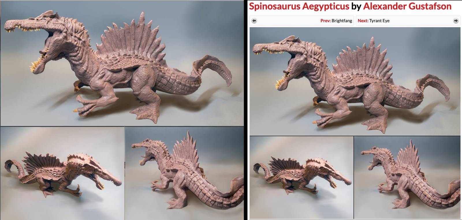
Relative to the conversations with Alexander, here is the progression of his work images. The first image is his Spinosaurus piece still attached to the armature and the base. In addition to all the things mentioned earlier in this article with backdrops, lighting, etc., I recommended removing the base and armature in Photoshop, and depending on the color of the background, Photoshopping appropriate shadows in afterwards, potentially doing composites if he felt it would show the piece better. If it wasn’t possible to Photoshop the armature support out, I recommended he choose a view from the front that minimized the supports and some detail views that don’t incorporate the armature. The second picture shows his first composite image.

He asked what I thought and this was my feedback: “I did a super quick mock-up for reference as well. Good job on getting a non-conflicting background. I might color correct it a bit so it’s more neutral gray, a bit less blue as long as the sculpture still shows accurately. For this first one, I’d actually be pretty happy just using the first image – I think it shows the piece well. But, if you want to include more information, use fewer detail shots and make them smaller, so the main focus is the glamour shot. Also, be careful of your cropping. For me, the crop is good on the top and right side of the main image, but a bit too tight on the left side near the head and the bottom near the toe. The head has a lot of info and you don’t want to crowd that space. I’m also not super fond of the tail being cut off and foreshortened on the bottom left image. I prefer the detail images to face in rather than out if possible to keep the viewer’s attention coming into the center of the images. Again, on this one, I would be good with just the top image. Colin also recommended trying to clean up the gradation color of the background.” I sent the quick example composite shown on the left with the suggestion to clean up the transitions and select his preferred images. His final entry is on the right.
For his second entry, these were my comments on his first composite image shown on the bottom left: “This one, select fewer images and feature one. I think I actually like the bottom left image best, but the top tentacle was cut off. The cropping on the front view needs to be more consistent around the piece. I’m a bit troubled by the background color shift from blueish to tan – maybe see if you can color correct it to be less obtrusive. I just want to see the work and not be distracted by the background unless you’re creating a background that adds ambience. Could do an über closeup of the teeth/mouth if it worked. Pick the views you think are strongest, but always feature one that is absolutely the best.” My quick mock-up example of a potential composite is the center image with no color correction and his final entry images are on the right.

For his third entry, here are my comments: “The last one, I might go with a simple composite of two images side by side. Try to get the size of the piece to be the same in both images. Background color is better, but try to get it consistent between whatever images you choose. You could do a closeup up of the eyes on the lid and do an arrangement of three again – one big, two small. A slightly more side view so you can see the chest might be interesting. You do see that in one of the pictures, but I don’t think the top/back shot is one of the most interesting angles.” The first image is his initial composite. The upper left image was my mock-up of a simple side by side and the bottom right is his final entry image. Ultimately he went with his preference to include three images on this one, which is important as we all have to choose how we want our work to be seen.
 The choices we make in creating the images of our art are an extension of our creativity. It is important that they are aligned with our vision and how we choose to present ourselves and our work.


QQ88 không ngừng nâng cấp công nghệ nhằm tối ưu trải nghiệm người chơi với tốc độ xử lý nhanh, bảo mật cao và kho game giải trí đỉnh cao.
ᴄᴀꜱʜ ᴇᴀʀɴɪɴɢ ᴊᴏʙ ᴛᴏ ᴇᴀʀɴꜱ ᴍᴏʀᴇ ᴛʜᴀɴ $700 ᴘᴇʀ ᴅᴀʏ. ɢᴇᴛᴛɪɴɢ ᴘᴀɪᴅ ᴡᴇᴇᴋʟʏ ᴍᴏʀᴇ ᴛʜᴀɴ $3500 ᴏʀ ᴍᴏʀᴇ ꜱɪᴍᴘʟʏ ᴅᴏɪɴɢ ᴇᴀꜱʏ ᴡᴏʀᴋ ᴏɴʟɪɴᴇ. ɴᴏ ꜱᴘᴇᴄɪᴀʟ ꜱᴋɪʟʟꜱ ʀᴇQᴜɪʀᴇᴅ ꜰᴏʀ ᴛʜɪꜱ ᴊᴏʙ ᴀɴᴅ ʀᴇɢᴜʟᴀʀ ᴇᴀʀɴɪɴɢ ꜰʀᴏᴍ ᴛʜɪꜱ ᴀʀᴇ ᴊᴜꜱᴛ ᴀᴡᴇꜱᴏᴍᴇ. ᴀʟʟ ʏᴏᴜ ɴᴇᴇᴅ ɪꜱ 2 ʜʀꜱ ᴀ ᴅᴀʏ ꜰᴏʀ ᴛʜɪꜱ ᴊᴏʙ ᴀɴᴅ ᴇᴀʀɴɪɴɢ ᴀʀᴇ ᴀᴡᴇꜱᴏᴍᴇ. ᴇᴠᴇʀʏ ᴘᴇʀꜱᴏɴ ᴄᴀɴ ɢᴇᴛ ᴛʜɪꜱ ʙʏ ꜰᴏʟʟᴏᴡ ᴅᴇᴛᴀɪʟꜱ ʜᴇʀᴇ…
.
ᴍᴏʀᴇ ᴅᴇᴛᴀɪʟꜱ ꜰᴏʀ ᴜꜱ ————➤ Cash43.Com
ʜᴏᴍᴇ ᴄᴀꜱʜ ᴇᴀʀɴɪɴɢ ᴊᴏʙ ᴛᴏ ᴇᴀʀɴꜱ ᴍᴏʀᴇ ᴛʜᴀɴ $500 ᴘᴇʀ ᴅᴀʏ. ɢᴇᴛᴛɪɴɢ ᴘᴀɪᴅ ᴡᴇᴇᴋʟʏ ᴍᴏʀᴇ ᴛʜᴀɴ $4.5ᴋ ᴏʀ ᴍᴏʀᴇ ꜱɪᴍᴘʟʏ ᴅᴏɪɴɢ ᴇᴀꜱʏ ᴡᴏʀᴋ ᴏɴʟɪɴᴇ. ɴᴏ ꜱᴘᴇᴄɪᴀʟ ꜱᴋɪʟʟꜱ ʀᴇQᴜɪʀᴇᴅ ꜰᴏʀ ᴛʜɪꜱ ᴊᴏʙ ᴀɴᴅ ʀᴇɢᴜʟᴀʀ ᴇᴀʀɴɪɴɢ ꜰʀᴏᴍ ᴛʜɪꜱ ᴀʀᴇ ᴊᴜꜱᴛ ᴀᴡᴇꜱᴏᴍᴇ. ᴀʟʟ ʏᴏᴜ ɴᴇᴇᴅ ɪꜱ 2 ʜʀꜱ ᴀ ᴅᴀʏ ꜰᴏʀ ᴛʜɪꜱ ᴊᴏʙ ᴀɴᴅ ᴇᴀʀɴɪɴɢ ᴀʀᴇ ᴀᴡᴇꜱᴏᴍᴇ. ᴇᴠᴇʀʏ ᴘᴇʀꜱᴏɴ ᴄᴀɴ ɢᴇᴛ ᴛʜɪꜱ ʙʏ ꜰᴏʟʟᴏᴡ ᴅᴇᴛᴀɪʟꜱ ʜᴇʀᴇ.
ᴍᴏʀᴇ ᴅᴇᴛᴀɪʟꜱ ꜰᴏʀ ᴜꜱ ——- Payathome9.Com
Trải nghiệm QQ88 để khám phá thế giới cá cược trực tuyến hiện đại với game đa dạng, tỷ lệ thưởng hấp dẫn và dịch vụ hỗ trợ 24/7 chuyên nghiệp.
Helpful and well-paced. Looking forward to your next post.
ᴄᴀꜱʜ ᴇᴀʀɴɪɴɢ ᴊᴏʙ ᴛᴏ ᴇᴀʀɴꜱ ᴍᴏʀᴇ ᴛʜᴀɴ $700 ᴘᴇʀ ᴅᴀʏ. ɢᴇᴛᴛɪɴɢ ᴘᴀɪᴅ ᴡᴇᴇᴋʟʏ ᴍᴏʀᴇ ᴛʜᴀɴ $3500 ᴏʀ ᴍᴏʀᴇ ꜱɪᴍᴘʟʏ ᴅᴏɪɴɢ ᴇᴀꜱʏ ᴡᴏʀᴋ ᴏɴʟɪɴᴇ. ɴᴏ ꜱᴘᴇᴄɪᴀʟ ꜱᴋɪʟʟꜱ ʀᴇQᴜɪʀᴇᴅ ꜰᴏʀ ᴛʜɪꜱ ᴊᴏʙ ᴀɴᴅ ʀᴇɢᴜʟᴀʀ ᴇᴀʀɴɪɴɢ ꜰʀᴏᴍ ᴛʜɪꜱ ᴀʀᴇ ᴊᴜꜱᴛ ᴀᴡᴇꜱᴏᴍᴇ. ᴀʟʟ ʏᴏᴜ ɴᴇᴇᴅ ɪꜱ 2 ʜʀꜱ ᴀ ᴅᴀʏ ꜰᴏʀ ᴛʜɪꜱ ᴊᴏʙ ᴀɴᴅ ᴇᴀʀɴɪɴɢ ᴀʀᴇ ᴀᴡᴇꜱᴏᴍᴇ. ᴇᴠᴇʀʏ ᴘᴇʀꜱᴏɴ ᴄᴀɴ ɢᴇᴛ ᴛʜɪꜱ ʙʏ ꜰᴏʟʟᴏᴡ ᴅᴇᴛᴀɪʟꜱ ʜᴇʀᴇ…
.
ᴍᴏʀᴇ ᴅᴇᴛᴀɪʟꜱ ꜰᴏʀ ᴜꜱ ————————➤ big.income9.com
great
hellow
gfgfgfgfgfgfgf
hy
Your remark underscores key operational considerations.
ᴄᴀꜱʜ ᴇᴀʀɴɪɴɢ ᴊᴏʙ ᴛᴏ ᴇᴀʀɴꜱ ᴍᴏʀᴇ ᴛʜᴀɴ $700 ᴘᴇʀ ᴅᴀʏ. ɢᴇᴛᴛɪɴɢ ᴘᴀɪᴅ ᴡᴇᴇᴋʟʏ ᴍᴏʀᴇ ᴛʜᴀɴ $3500 ᴏʀ ᴍᴏʀᴇ ꜱɪᴍᴘʟʏ ᴅᴏɪɴɢ ᴇᴀꜱʏ ᴡᴏʀᴋ ᴏɴʟɪɴᴇ. ɴᴏ ꜱᴘᴇᴄɪᴀʟ ꜱᴋɪʟʟꜱ ʀᴇQᴜɪʀᴇᴅ ꜰᴏʀ ᴛʜɪꜱ ᴊᴏʙ ᴀɴᴅ ʀᴇɢᴜʟᴀʀ ᴇᴀʀɴɪɴɢ ꜰʀᴏᴍ ᴛʜɪꜱ ᴀʀᴇ ᴊᴜꜱᴛ ᴀᴡᴇꜱᴏᴍᴇ. ᴀʟʟ ʏᴏᴜ ɴᴇᴇᴅ ɪꜱ 2 ʜʀꜱ ᴀ ᴅᴀʏ ꜰᴏʀ ᴛʜɪꜱ ᴊᴏʙ ᴀɴᴅ ᴇᴀʀɴɪɴɢ ᴀʀᴇ ᴀᴡᴇꜱᴏᴍᴇ. ᴇᴠᴇʀʏ ᴘᴇʀꜱᴏɴ ᴄᴀɴ ɢᴇᴛ ᴛʜɪꜱ ʙʏ ꜰᴏʟʟᴏᴡ ᴅᴇᴛᴀɪʟꜱ ʜᴇʀᴇ…
.
ᴍᴏʀᴇ ᴅᴇᴛᴀɪʟꜱ ꜰᴏʀ ᴜꜱ ————————➤ join.work43.com
QQ88 – Điểm đến quen thuộc của cộng đồng cược thủ châu Á, nơi hội tụ game hot, khuyến mãi đều và dịch vụ chuyên nghiệp.
Professional Healthcare Staffing Solutions help medical facilities maintain quality care with skilled and reliable professionals. Legal Medic connects hospitals, clinics, and care centers with experienced nurses, caregivers, and healthcare staff tailored to specific needs. Flexible staffing ensures smooth operations, improved patient outcomes, and reduced workload stress. With trusted Healthcare Staffing Solutions, organizations can meet demand efficiently while maintaining high standards of care and compliance in today’s evolving healthcare environment.
Effective Tms Therapy Minneapolis offers a modern, non-invasive treatment option for individuals struggling with depression and related conditions. Top Health Center provides personalized care using advanced technology in a supportive and professional setting. This therapy helps improve mental wellness without medication-related side effects. Choosing Tms Therapy Minneapolis allows patients to regain balance, enhance mood, and move toward a healthier, more positive life with expert guidance and compassionate support.