-By Peter Ferguson

Once upon a time, (hereafter refered to as Thee Grayte Voyd), if one were to casually remark at a dinner party discussion of fine art , ” Y’know, heh, I actually quite LIKE representational art” , the GrownUps would roll their eyes and before you knew it you were sitting hunchbacked at the kid’s table talking Archie Giant-Sized Digests.
Oh, well, at least you’d get pudding. Yay, pudding!
Then 20 years or so ago, something changed. Maybe it was some art investor , staring glumly at a huge canvas on his living room wall depicting a big black square in an ochre rectangle he’d taken out a second mortgage to buy, saying ” God , I hate that thing , makes me feel like my willy’s retracting into my body “, and so unknowingly set a revolt in motion.
Suddenly, the fine art world was starting to recognise artists who could actually draw for a change . ( I should mention at this point that I don’t necessarily hate most contemporary fine art ; but just like while I’m happy that some people enjoy cricket or The Jersey Shore, I don’t get it, and my mind starts to get squishy and itchy when people are talking about it.)
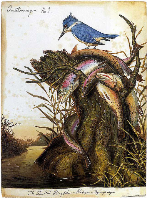
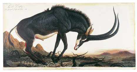
Most of the people reading this blog are probably familiar with Walton Ford. I remember first stumbling across his huge Audobon-style watercolours in the pages of Juxtapoz, sandwiched between the skater and tiki art.

I’m not a sniffy type , I like all kinds of art/illustration/comics, but it’s still rare that I come across an artist that hits me on the visceral level, and makes me go, ” Oh. My. God.”. Not only could Ford effortlessly pay homage to (or mimic) Audobon and other 19th century naturalist painters, and infuse it with an atmosphere of wonder and malevolence; but using metaphors and allegories , also had something important to say on different levels about humans and their relationship with the world around them. He had bridged the chasm between the draftsmanship of illustration and the depth (or what have you) of the fine arts (or what have you).

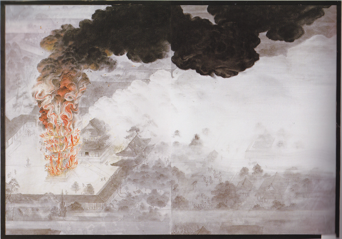
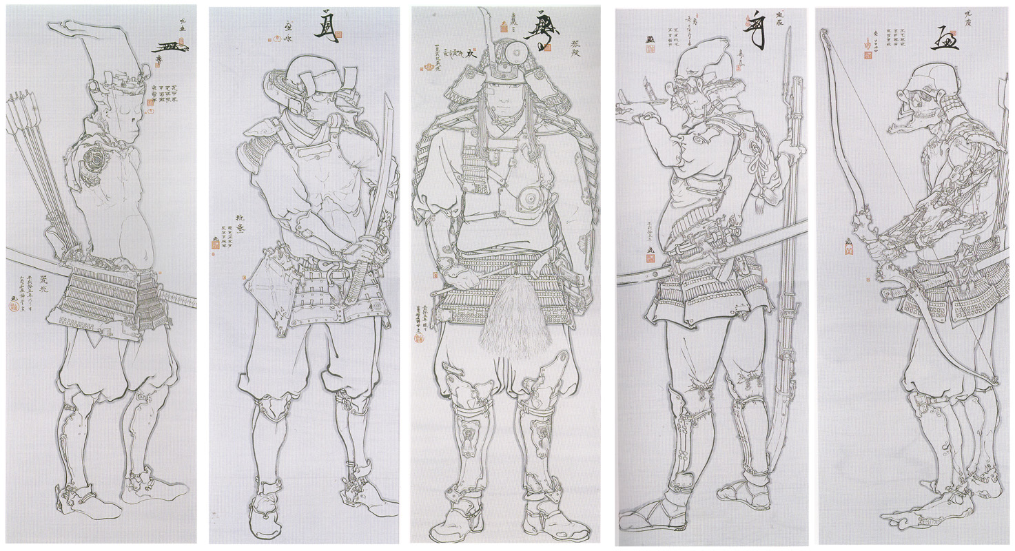
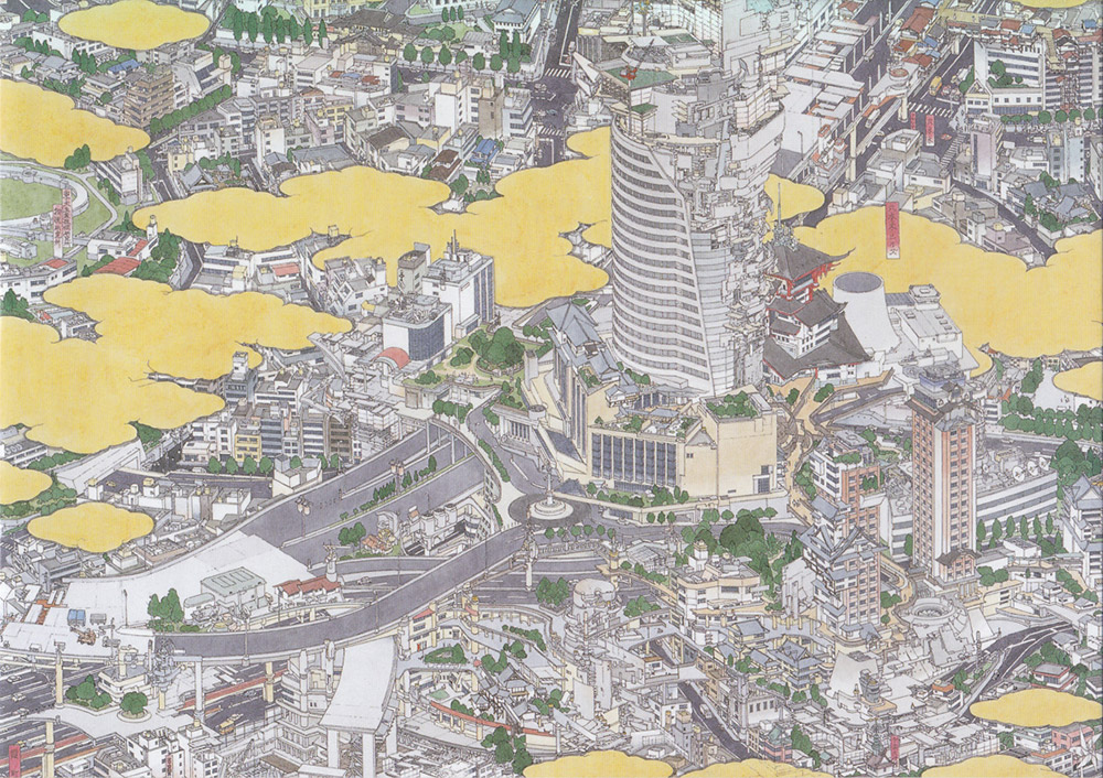
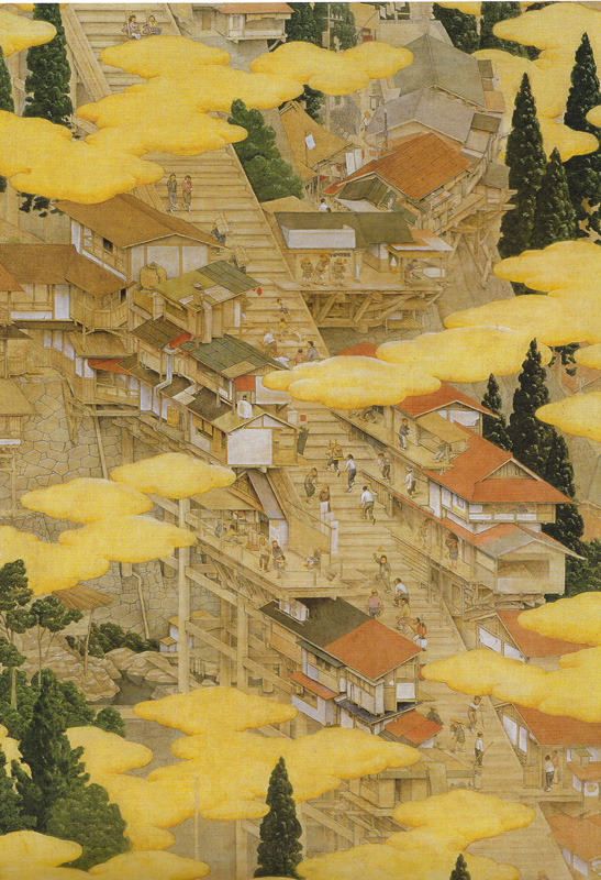
I’ve been living in Japan for the last year , and one artist and illustrator that really stood out for me here was Akira Yamaguchi. He`s classically trained in traditional Japanese painting (Yamato-e), and his incredibly detailed oil and watercolour pieces, in the style of the old Japanese masters, blend in modern and fantastical elements, tweaking the subject matter. Alternating with the traditional Japanese style(mostly ink and Watercolour) are oil paintings eerily reminiscent of Brughel and Bosch.
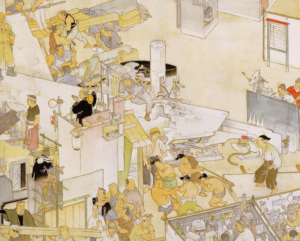
Recently I was looking at Yamaguchi’s stuff and saw a similarity with Walton Ford’s. While their subject matter and tone is wildly different( Ford`s work is quite grim, while Yamaguchi`s is more whimsical), both have mastered archaic painting styles from their own respective cultures and have injected them with modern themes and allegories.
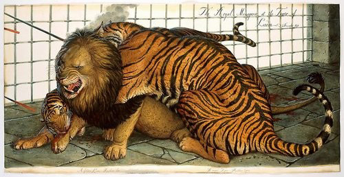
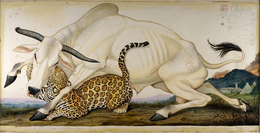
There is a trompe l’oeil effect in their work ; at first the viewer is expected to see a run -of -the mill image in the style of 200 years ago; only a closer look reveals something much stranger going on. In Ford’s “Chingado”, a Spanish bull is being mauled by a jaguar, but on close inspection are actually copulating , whilst Aztec temples burn in the background, a comment on the Spanish conquest of the Americas.
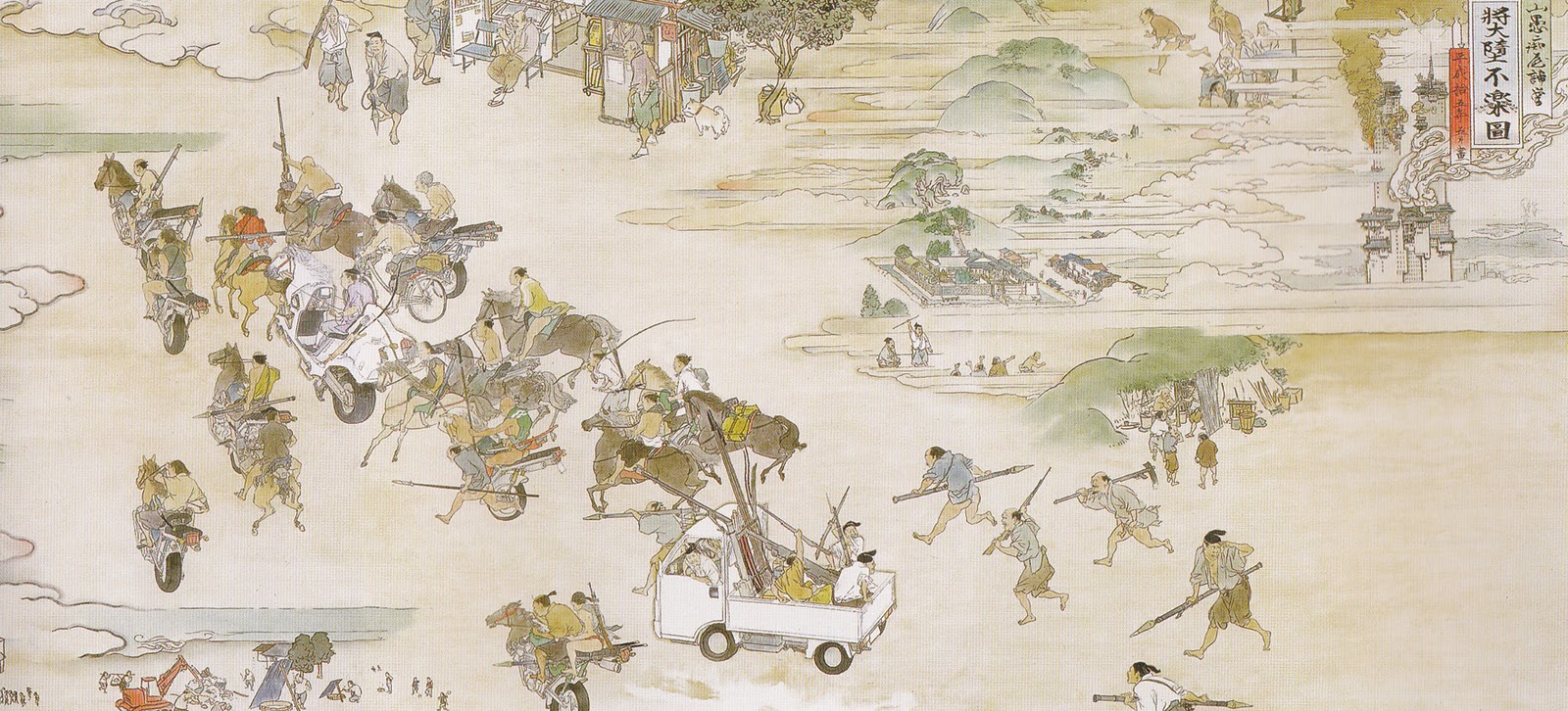
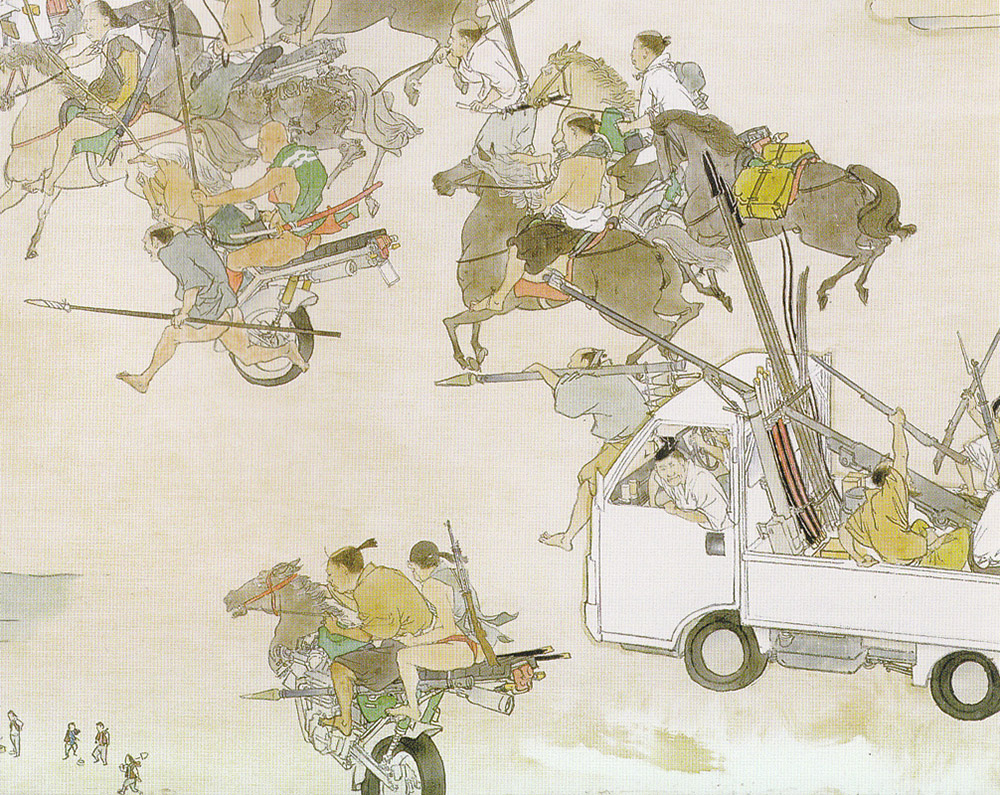
In Yamaguchi`s `Show The Flag“, what appears to be a common Edo- period scene of samurai rallying for battle, but then you realise that some soldiers are riding in the back of the ubiquitous little white farmer`s truck, or on the back of a horse/motorcycle hybrid.
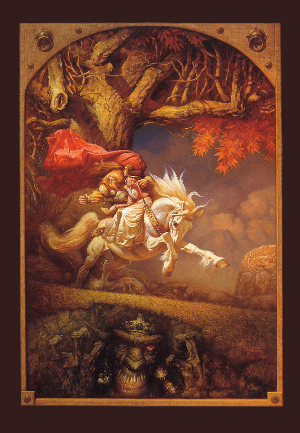
Here`s some more of his stuff, enjoy!


All good stuff, thank you. I really love your work by the way 🙂
This is a wonderfully insightful post Peter. I will be looking for more of Akira's work. I did get to see a show of Walton Fords a while back, and you are so right, it was jaw dropping in scope, scale and craft.
Beautiful work. Thanks for the insight. By the way, love your work too.
Hi, everybody, thanks a lot ! I was a bit nervous, I`m not much of a writer…Jon, you saw his stuff up close? I`m so jealous!!!
Great work! We own the Balloon Ferguson and are SO proud !
S&A
Great stuff! I think a lot of people are still resistant to liking contemporary representational art, like it somehow dumbs them down. While Mark Rothko certainly gives me shivers every time, I think it's important to see the other side of things. Art that has content is a different thing from art that just ineffably is.
oh may god! akira is such an amazing artist! he rocks! please upload more of his imaginative creation!!!