-By Dan dos Santos
Getting a good quality print of your work can be really difficult, especially when you are not there to personally oversee the printing process. I struggled with this for years, as achieving a good print seemed to be some sort of alchemy… consisting of an elusive combination of scanning, color-adjusting and file formats.
In this post, I would like to focus on some of the technical aspects of preparing your art for print. Photographing/Scanning your work will be addressed in a separate post very soon.
 Whether you are preparing your scan for web display or print, the biggest culprit seems to be the same… Gamma.
Gamma correction is quite involved, consisting of differing encoding and decoding rates (which you can read all about here)… but you don’t really need to know all of that. The important part for illustrators is this: A typical PC monitor works at a native gamma of 2.2, and until very recently, a Mac works at 1.8. This means that any given image will display slightly brighter on a Mac.
This extra brightness is great when you are working digitally, because it allows you to see more details in the shadow areas than you would be able to see on a PC. The downside is that the rest of the world, including your Printer, is seeing it darker. The result is that an image which looks well balanced on a Mac will typically print dark.
Now here is the good news…
If you have a newer Macintosh operating system (after 2009), this difference is no longer an issue. Apple finally gave in to peer pressure, for once, and now uses a native gamma of 2.2 as well. The operating system, Snow Leopard, is the first to support this change and has adapted all of the graphics to accommodate the change. However, if you have an older OSX, you can still make due. There are three simple solutions to the problem:
1. Go into your ‘color calibrater’ and change the gamma of your display to 2.2. Viola, your monitor will look dark and shitty like the rest of the world.
2. Save a special display calibration setting just for print proofing, and toggle between it only when necessary.
3. Adjust your print file to compensate for the difference.
Now, adjusting a print file is not just a matter of lightening an image. Even though a higher gamma will result in a darker image, the darkness is not consistent over the entire value range. That is, the whites are not any less intense. Likewise, the blacks are not any darker. It’s the midtones that are truly affected. So if you just lighten your print file, you will blow out the highlights in your print and lose a ton of detail (not to mention chalky color).
What you need to do is adjust the levels of your print via Photoshop. Go to you toolbar up top, and select Image > Adjustments > Levels. Here you will see a box that looks like this:
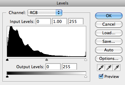
The middle slider is the midtone slider. This controls how wide the range of your midtones are. For instance, if you push the slider to the right (towards white), you are narrowing the value range between those two sliders. That means you’re decreasing the range of light midtones, and are increasing the range of the dark midtones. This creates a darker image overall.
Conversely, if you slide the midtone slider to the left, you are narrowing the range of your dark midtones, and expanding the range of values between middle grey and white. This results in a lighter image overall.
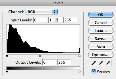
The great thing about adjusting the midtones, is that it does not affect your true white and blacks. Your white will not get any brighter or darker, just the middle tones surrounding it. Ultimately, this is what gamma does to your display. So to emulate what a file will look like on a display with a 2.2 gamma, all you need to do is adjust the midtones. Personally, I have found that moving the slider 0.12 points to the left (for a value of 1.12) seems to be just about a perfect level of compensation.
Utilizing this method, I always prepare two files. One is for my personal use, and is calibrated for my display. The other, is a file saved especially for print with the necessary adjustments. I label these accordingly so as not to confuse them. ie. “warbreaker_hi_display.jpg” and “warbreaker_hi_print.jpg”
Now, as I stated, if you work on a newer model Mac, or a PC, this shouldn’t be so much of an issue. What you see on your screen is pretty much what you’ll get. However, there is always going to be some print discrepancy since your monitor is illuminated, and thusly produces much richer color and vibrancy… vibrancy that may not always make it to print. So how do you know what your piece will print like before sending it to your client? Three words… Instant. Picture. Maker.
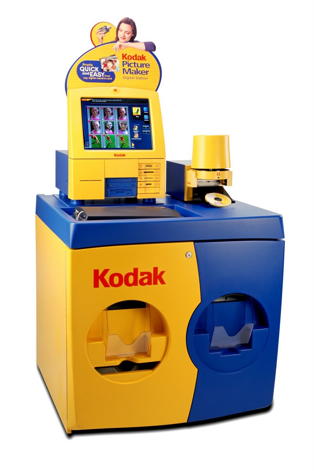
Just about every Wal-Mart or pharmacy near you will have a Fuji or Kodak instant picture maker. These prints aren’t perfect and shouldn’t be used as color proofs, but they are a really close approximation to what your file will print like on an offset machine. So if you have major monitor problems, this is great way to find out about it! The really great thing about these machines, is that they read images in an RGB format. So you don’t need to worry about converting to CMYK and preemptively (and possibly unnecessarily) killing your colors. Just bring your file on a flash drive, and for just $4, you can rest easy knowing that your print file is pretty close.
Typically, you are told to convert your file to CMYK before printing. This is not always necessary, and I rarely do it. Many short-run printers these days are digital, and are actually designed to work off RGB files. Further more, it’s important to remember that the CMYK color proofing in Photoshop is an approximation of what an off-set printer is capable of. This means you are literally removing colors from your print file, with the expectation that those colors can’t be printed using a traditional CMYK process. But what happens if you are printing a vinyl banner for a convention, and your Printer is using a high-end Canon which works on 9 different inks? Well, you just took out way more color than you needed to!
My feeling is this, your Art Director and Printer know what they need better than you. A good Printer is intimately familiar with his machine, and knows exactly how it’s going to react. Your AD prints dozens of covers a year, and invests as much love into their design as you did your painting. Give them an RGB file, and let them convert it if they need to.
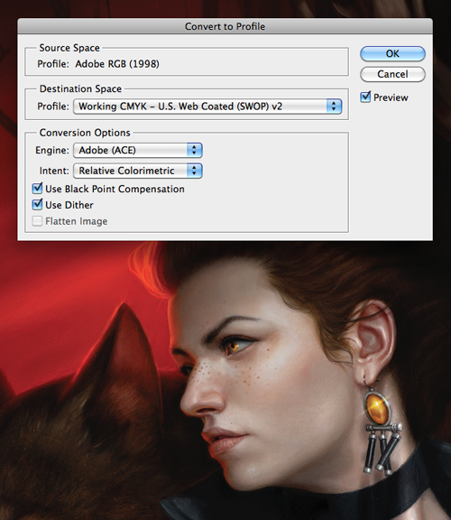
The last issue to address is Color Profiles. Color profiles (also known as ICC profiles) are data that tells a computer how to display a certain image. If you do not add a color profile, you image will be displayed in the default setting for any particular computer, often to horrifying affect.
If you are dealing with a client that is gang printing your work, and they specifically request a CMYK file, then I suggest using the profile: U.S. Web Coated (SWOP) v2. (unless they state otherwise). To convert an RGB file to CMYK, do not just change the image mode. Instead, go to: Image> Mode> Convert to Profile. Select the appropriate color profile. For best results, be sure to select your ‘intent’ as ‘Relative Colorimetric’, and turn ON ‘Black Point Compensation’. There are of course situations where you would use Perceptual intent, but 90% of the time, Relative Colorimetric reaps better results for me, especially when dealing with difficult reds.
Balancing your image for digital display is an equally imperfect science, but quite a bit more cut-and-dry. Ultimately, you can’t control what is going to show up on someone else’s screen. As I mentioned above, you don’t know what gamma any particular person is viewing things at, so all you can do is balance your file with the masses in mind, and hope for the best.
For professional prepress work, Adobe RGB 1998 is the standard profile for your workspace. This is also the color profile I use when I send a print file to a client. The profile has a very wide gamut, and can achieve some very intense colors. The downside is that those colors are not only outside the range of most home printers, but often outside the range of a web-browser!
Every web-browser has a different list of color-profiles they support, though most support none at all. If your particular color profile is not supported (almost always the case), the browser displays the image using it’s default setting, which can alter the saturation of colors drastically. As the recommended color space for the Internet, sRGB should be always used for all images intended for publication to the World Wide Web. When preparing a file intended for an ebook or my website, I simply take my Adobe RGB 1998 print file, open a duplicate canvas, adjust it’s size for web-display, and reassign the color profile as: sRGB IEC61966-2.1
These color profiles remains tagged to an image, regardless of the ability to read that tag. So even if someone drags an image from a web browser to their desktop, when they then open it up in Photoshop it will still be displayed correctly.
For more information on color balancing digital images, check out this article.

And after all that … they still mess it up, lol!
Regardless, after working 10+ years in the repro (back then) and printing industry, I can say that this write-up is sound and should at least give you confidence that from the artist's side everything has been done correctly to assure a good print.
One last thing that has become important and feasible lately is a monitor / screen calibration tool. We all perceive colours differently, so doing the manual Windows / OSX calibration has pitfalls. These 3rd party tools, at the very least, ensure that your screen is set to a good brightness (most are too bright outta-the-box).
Fantastic article. I can say I did not knew any of it and need all of the facts. Thanks Dan.
THANKS! This explains more than a few %^#! moments;) VERY helpful.
Wonderful and so very very important. I know it isn't sexy like some new technique or conceptual practice, but good color management can help to target in and reduce a lot of if not most discrepancies from image to press.
And if you think of it as still being too much to bother with, think of it like taking care of and cleaning your brushes… stop cleaning your brushes for about 6 months and see how good your work looks. Color management is very similar.
Very useful. I also recommend keeping the histograms palette open in Photoshop if you work digitally, it gives you a good idea of the spread of tones and if you're in danger of blowing out on either end – this habit has secured me from the occasional bad printing results I used to get early in my career.
Really great post, Dan.
Ow man, perfect post, this is a great help for us. Thanks for that.
Great post and helpful indeed. The only recommendation I would dare to disagree is the CMYK thing. You might have no trouble with the most colors on the U.S. Web Coated (SWOP) v2, but there are some Cyan and Red colors that can be a pain to convert. I´d recommend the FOGRA 27 or 39 Standard that is part of any Photoshop CS as it comes close to sRGB even with the difficult colors, you can preview the differences with CTRL+Y. Before sending a final file to print, make sure you give an extra brightness to the overall image of around 10-15% because the 4 color printing process always adds tonal value increase -this doesn´t have anything to do with the screen-gamma.
Glad you liked the post guys! I edited it a bit to add a little more information about the CMYK conversion process.
@Fantasio: The US SWOP profile is favored much more in the US than it is in EU. Like you, I've noticed it's definitely not perfect, but it's a fairly standard industry default when no other profile has been requested.
God bless you sir! I was under the impression every AD would want CMYK, and switching it over does it make it less awesome.
I've owned my own color printer for years. When it comes to printing, the colors are super important. CMYK is traditionally what you'd want to use for print while RGB is for projected light. That's the theory, anyway. I find that experimenting with your own printer helps you hone in on the subtleties.
http://www.xeroxagents.com/user-cgi/products.cgi?cid=23&sid=48&lid=
I like your post because i got it everything in your blog which i am searching for. Thanks Orange County Printing Services
My sister is printing out a bunch of flyers for a school event that she is helping with. The problem is that the flyers have to be in color and my sister doesn't have a color printer. She is going to have to hire a print shop to print the flyers for her. It shouldn't cost her too much money. http://www.brainerdprinting.com/Services.html
Awesome article, it was exceptionally helpful! I simply began in this and I'm becoming more acquainted with it better! Cheers, keep doing awesome! Club Flyers
Really informative and useful information. quality clubflyers
Great post. I like it
High-quality printing depends on the quality of ink and printer as well. There are some settings which have to set before printout.
i am browsing this website dailly