Color is a fascinating and challenging part of painting. It can be defined as hue, saturation and value. Today, I am going to focus a little more on saturation. Saturation being how intense or gray a color is.
Before I get going though, I think I need to add a disclaimer to this post. Painting from life is the best way to understand color. Also, photographs of paintings are by no means the same or close to observing a painting in person and only capture a small range of color and value discernible to the eye.

With that out of the way, I do think there are some important things we can learn about color using the computer and photography. Also, photographing paintings for later study can help to reinforce or add to observations made in person. I mention this along with the disclaimer because I am going to use a photograph of a Bouguereau painting to make some observations today.
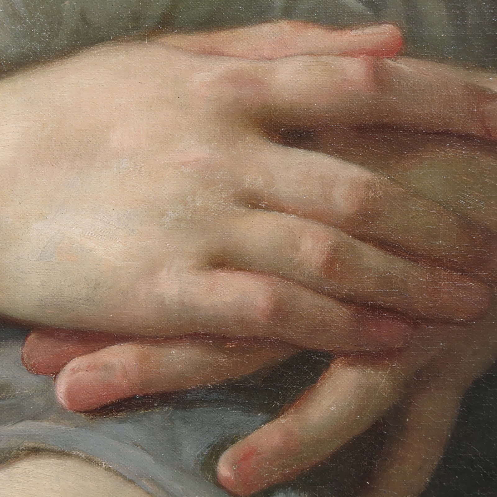
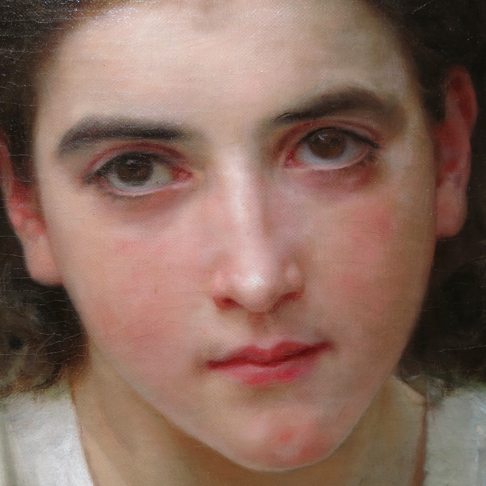
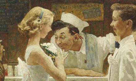
I have long been fascinated by William Bouguereau’s paintings. There are other artists whose work I admire more for their artistry and subject, but I am hard pressed to think of another artist who achieved such a high level of technical skill. He could draw with great accuracy and had a wonderful eye for value and beauty, but for me it was ability to paint skin with very subtle shifts in hue and saturation that draws me in.
When Bouguereau was at his best, the flesh in his paintings looks like there is blood flowing just under the skin, vibrant and alive. You also see so much color. There is no ‘flesh color’ but many slight changes in hue and saturation that work together to create the impression of flesh.
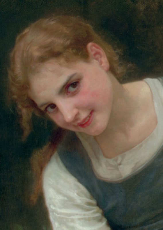
In an effort to understand color a little better, I came up with a way of examining a photo of one of his paintings. I did this a few years ago and posted it on my site, but I did a little variant this time and I think it is more useful. Again, it is full of limitations, but maybe it will further cement knowledge you have or generate some new thoughts.
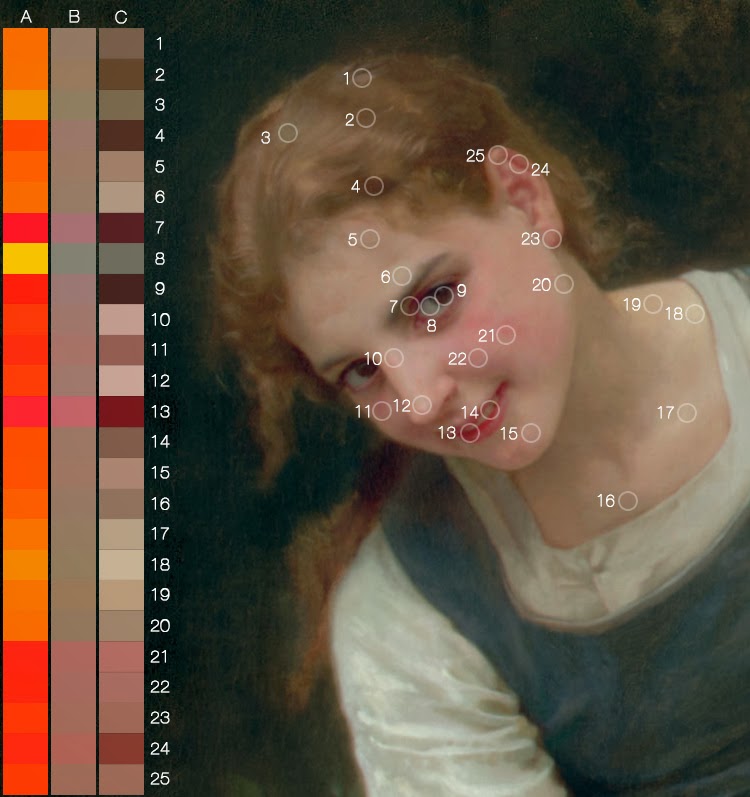
What the heck is going on here!? Let me explain. I am sampling colors from the face and hair. Each number and circle on the right show where I sampled a color. On the left, in column ‘C’ I filled the square with the sampled color and corresponding number. Column ‘B’ shows each of the colors, but with all of their values more of less equalized to a middle value. Column ‘A’ shows the colors with their saturation levels maxed out.
For me, column ‘A’ is the most revealing. When the colors are all shown at full saturation, the narrow range of hues used is much more obvious. Look at row 8. That color is from the white of her eye! It is really a very gray yellow, but it isn’t as clear until the color was pumped up to full saturation. It is also neat to see the progression from swatches 5 – 19, from the top of the forehead to the chin and up the neck and see the small shifts from orange to red and back to orange.
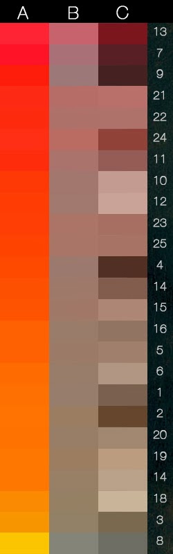
In the image above, I have arranged the same colors descending from red to yellow to show the spectrum of colors used in a clearer way. I kept the original numbers paired to the swatches. Again, we have the sampled color in column ‘C’, the colors almost equalized (there is a little variation) to a middle value in column ‘B’ and the full saturation in column ‘A’. Now, column ‘B’ stands out to me. Look at the top three rows, where the reds are nearly the exact same hue, but vary in saturation. They appear more blue or purple, warmer and cooler mostly due to their different saturation levels (they aren’t the exact same hue, but quite close). Look down the rest of column ‘B’. See how the colors vibrate and pulse in and out based on their saturation? More so than the fully saturated column ‘A’. The variety you can get by changing the saturation just a little is very exciting to me.

Color starts to do some interesting things as you drop out the saturation. You can achieve a sense of blue, green and purple by dropping the saturation of red, orange and yellow. It is as if grey starts to take on the properties of a compliment when placed next to a color of similar value. The gray gives your more saturated colors life that they don’t posses on their own. By working the saturation, you can create the appearance of blue veins under the skin, the purple flesh some complexions have around the eyes and cheeks and the cooler tones around the mouth and jaw.
If you are curious about giving this a try, next time you are painting flesh work in a neutral gray of similar value to the color you are working with and see what happens. See if you can create the appearance of color beyond those you squeezed out of the tube. That isn’t to say you should or shouldn’t use a full range of colors to paint flesh, but it is a worthwhile approach and exercise to try it if you haven’t.
Of course this won’t make you paint like Bouguereau, but hopefully it will either remind you or help you see how wonderful gray can be in adding life to your work.
*The photographs in this post are from the Art Renewal site and the Truth in the Bright Light of Day blog.


Great Howard, I love your posts! It should be interesting to analyse the background hues related to the subject too, and how they interact. In this case a low chroma “turquoise”, almost a complementary to the skin tone.
Keep it up!
So cool- Thanks Howard!
Ah, just what I needed to study this week 😀
I was thinking why 12 and 10's light value is more saturated – though subtle – than the skin tone on 17,18 and 19. But I guess it is because of the blood flowing under the skin that gives it that color.
What great insight. Thank you, Howard!
Marco – I almost included that, but I thought I would keep the focus narrow. You are right on though, it is pretty simple palette applied with great sophistication. Thanks for the response!
Thanks Sal!
Audio – Glad that this post was a timely one. 🙂 Because people are so different and complexions vary (and are affected by time in the sun, diet, health…) there are no hard rules about how to choose colors for painting flesh, but generally speaking you do find more saturation on the nose, cheeks and lips, and less on the forehead, chin and neck.
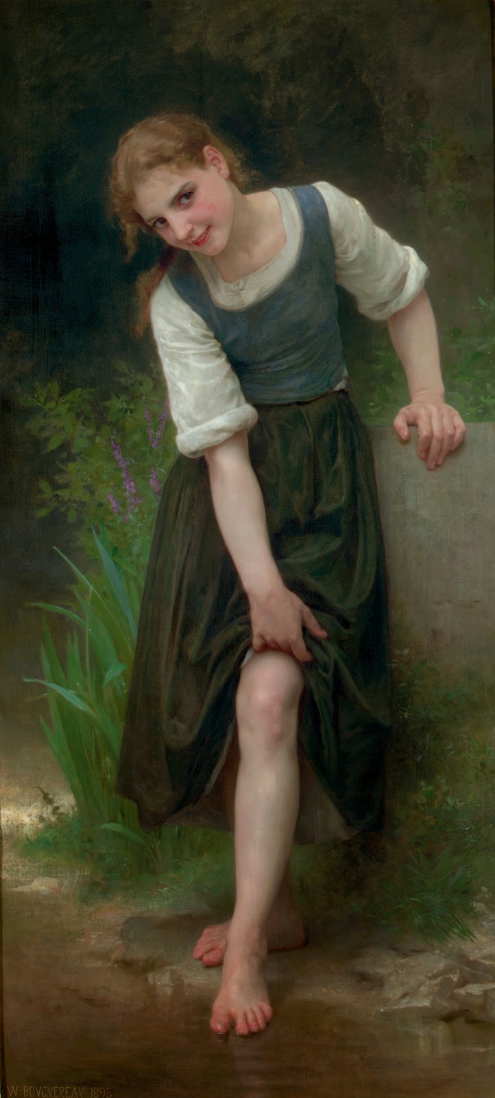
Also, as the artist, you will make editing decisions and you might divert from what you observe for artistic reasons, dropping saturation to push part of the figure backwards, or increasing it to create contrast or advance the form. In the full view of the painting, look how saturated the toes are, the skin full of blood. The stronger color, the crisp shadow under the foot and the contrast with the dark water all create a great sense of depth. The foot looks like it is projecting out from the picture plane.
Thanks for the reply!
Thank you Chris! I am glad it was helpful.
Hint for your next article – Delacroix once said: “I can paint you the skin of Venus with mud, provided you let me surround it as I will”. It would be an awesome post, as usual 🙂
Awesome information, thank you so much for the insightful post!
Thank you Howard! I recall reading your article about Building Harmonous Color too – it was a really inspiring article that kept my curiosity about color going! This one was excellent too – thank you sincerely! (:
Howard, you are right, no one paints flesh like Bouguereau. Your analysis is amazing. You give detailed insight to the work of a master. It made me think how much harder Bouguereau had to work to get his flesh effects considering the technical level of his paints and pigments. He didn’t have the hundreds of colors ready in a tube that we have. I also wonder about his brushes and how he achieved such flawless realism (or perfection, if you prefer) of the surface of flesh. He was an awesome handler of oil paints and brushes. Anyway, thank you for the amazing article.