I took my Christmas vacation a bit late this year, so I’m still away from the studio (i.e. I’m being lazy). That being the case, I thought it might be a good time to combine a few older posts from my personal blog. The following excerpt is from my 2009 Brooklyn Public Library lecture:
The heart of human perception is contrast. Through the comparison of various sets of information, our subconscious minds are able to construct a visceral model of the environment that enables us to navigate through it. But this benefit has its costs: because our sensations are based on relative comparisons, our subsequent interpretations are not absolute. One major consequence of this is that we are easily fooled by context.
My favorite example of this has nothing to do with vision, though the same principles apply. Let’s say you submerge one hand in cold water, and the other in hot, allowing time for each to adapt to the temperature. Upon touching the same object with each hand, you will feel opposing sensations: one warm, the other cool. This means you are the world’s worst thermometer—you have no independent scale for judging assorted values and are at the mercy of circumstantial evidence.
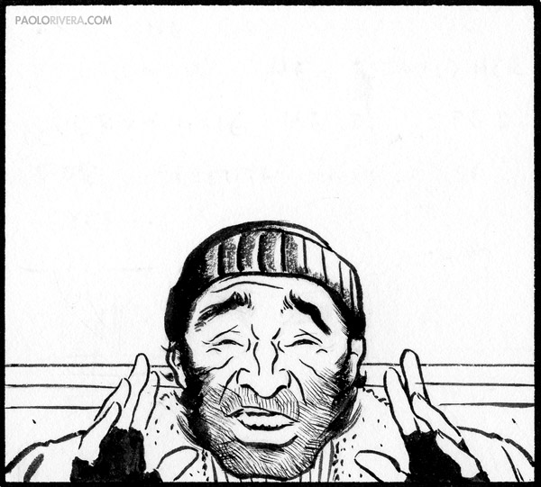
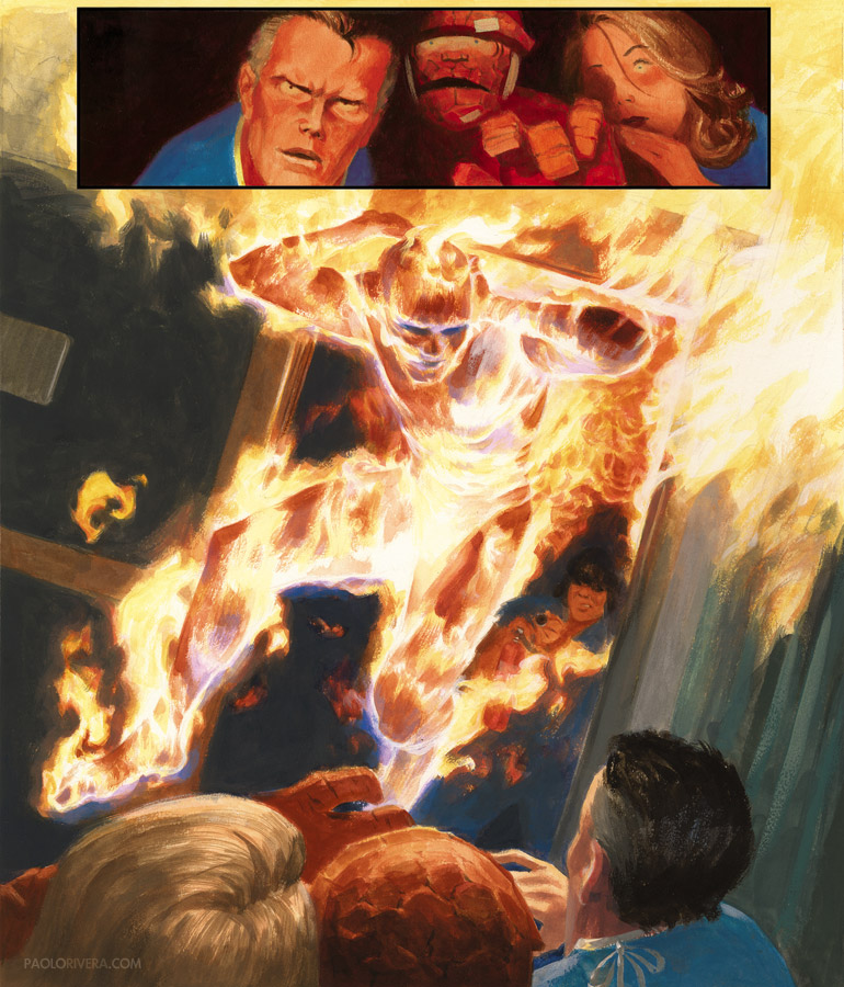 Mythos: Fantastic Four, page 17, panels 3-4. 2007.
Acryla Gouache and gouache on bristol board, 11 x 17″
In this scene from Mythos: Fantastic Four, the Human Torch, flaming on for the first time asks, “Is it cold in here?” I’ve always liked that line from my collaborator, Paul Jenkins, because it reveals the level at which he’s immersing himself in the situation. For someone who is burning (comfortably), the world must feel frigid, much like someone who is running a fever.
I bring up this image for another reason as well. I am often asked how I paint fire—how to make it glow. It’s all about context. By controlling the visual situation, I can let people know that white—the brightest option I have—means light. The surrounding gradient indicates the light’s color. Every other value in the composition is significantly darker. In my own nerdy mind, I call this the lightsaber effect. The light source (the blade) is the brightest value, surrounded by color, surrounded by dark of any kind. I’ve pixelated the following image in order to exaggerate and, hence, clarify the relationships among the color values.
![]()
The effect is further promoted through reflected light, as in the image of Yoda, below. This is why some of the human jedi in Star Wars movies might look a bit off: the glow is added in post-production, so no light is actually emitted from the blade; whereas the computer generated characters are appropriately lit (even if I prefer puppet yoda).


An analogous situation occurs with our vision. Let’s take a look at some carefully controlled situations below. When presented with a graduated gray scale, the mind receives the available information, organizing it according to the extremes. The brightest field is interpreted as white, while the darkest—the background—looks black.

However, this proves false when seen in a wider context. In the next image, I’ve added a “true” white square to the top of the scale, shifting our former brightest value down a notch. But had I not done this, our previous set of values would have been just fine for a fully-rendered painting. This is one of the main reasons why it’s a good idea to begin with the middle tones. By saving your most extreme “notes” until the end, your decisions will be all the more apt because they were made in context. Alternatively, you can do a preliminary color study so that you can paint more directly on the final work. The example that I most often use is with portraiture: if you want the highlight on your subject’s nose or eye to really gleam, every other color must be lower in value, even if it’s not pure white (again, your brightest option).
 |
| I should note that this demonstration is really only effective in slide form, where the environment is dark, as opposed to here, where the blog background is white. |
This principle has serious ramifications when it comes to color (although we are still mostly concerned with value at this point). It means that any and all color is subject to environment: an orange dot on a gray background is construed differently depending on the surroundings. In the context of an illustration, the same color stimuli (physically identical light waves) are interpreted as both an orange painted dot on a black square, as well as a glowing orange dot on a white square—same colors, opposite interpretations.

The image on the right was created by extending the gray squares to encompass the entire background, thus revealing the dots’ true relationship. Here’s the original source of the image.
This is a well-established phenomenon, but what does it mean for representational artists? First of all, it means that we have jobs. If this were not true, then paintings would be a very poor description of the surrounding world because the artist’s palette is so small a portion of the physical light gamut. We can’t even look at the sun without damaging our eyes, yet a daub of lead white can faithfully represent it (if placed in the right context). Second of all, we (meaning artists) shouldn’t think of colors the way they are generally taught to us. The names we assign to them can actually be a burden because it associates those colors with certain phenomena, implying an absolutism that mentally prevents us from seeing the reality and, therefore, reproducing it. However, paint is more or less absolute, so the trick lies in your orchestration of the available options. By formulating — and sticking to — a heirarchy of value, the mud you slap on a flat surface can create the illusion of space.
In another post, I described value as being primal, which has two meanings, both of which were intended. Value is primal in the sense that it is the most significant and fundamental of color’s attributes. It’s the foundation of our understanding of the world around us because it reveals what, if anything, lies before us. It is also primal in the primitive sense: it was the first part of our visual system to evolve.
Because of this, I give it greater weight in the balance of color composition. As I mentioned previously, I begin most paintings with a monochromatic underpainting. It’s the foundation on which I construct the rest of the painting. It is the axis upon which the globe of color spins!
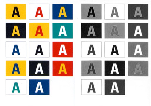
But let’s take a nice trip down Pragmatic Blvd. to the local Kinko’s. In this command center of paper clips and photocopiers, they thoughtfully display an informational poster (pictured above). It is provided to customers as a general guide for selecting colors that are best suited for creating legible text. To see the reason for this, all we have to do is convert the image to grayscale. It is their great hope that you don’t end up making something like this:

The point is that contrast, not what is commonly known as “color,” is what we see. People (and, quite possibly, anything with eyes) see change, which is the key to understanding — and reproducing — the myriad of images that life brings us.
As representational artists, we must balance many factors, sometimes conflicting, in order to arrive at our goal. But by isolating one of color’s three variables, value, we can significantly reduce the guesswork from the total equation. Furthermore, through diligent practice and repetition, a more natural sense of relationships will eventually develop, meaning we can “skip” that step physically because we have already completed it mentally. I liken this to using cylinders to construct the human form: it’s not that I don’t think that way when I’m sketching, but rather that I’ve surpassed the need to record it. The process happens without much thought because I know the rules of perspective and believe in the space (and forms) that I’m trying to represent on a flat surface.
There’s more I’d like to say on this subject, but I am out of time for the moment. I would, however, like to leave you with my favorite chapter from one of my favorite books, The Ancestor’s Tale by Richard Dawkins. It provides a concise summary of how our vision works on the molecular level, but more importantly, it was instrumental in shaping the way I think about color and perception. The Howler Monkey’s Tale explains how a chance mutation can provide unexpected benefits. The larger question—how a brain can cope (brilliantly) with such changes—remains unanswered. Fortunately for us, the opaque process does not need to be fully understood to be enjoyed.
For more excerpts from the same lecture:
Solid Color
Lightsaber vs. Darksaber
Blue Line Pro
Isolated Details


Those added bits of blue you have added into Jonny's flames makes it read “hot”……love it!
Thanks! I looked at a ton of photos of burning things to try and get it just right.
Hot DAMN, Paolo….those flames are fantastic. All in straight oil, no? Remarkable. Love the pinks and yeah, Jared–look at those blues!
Way to observe, P! You amaze!
Wonderful post Paolo! Love the way you break down values and the concept of it being primal –
Thanks!
Thanks, Greg! It's actually all Acryla Gouache… although nowadays I pretty much paint everything in straight gouache. I hope to do some more posts on painting in the future, but the truth is I rarely paint anymore.
Thanks, Sal! Glad you found it useful.
대전출장마사지로 쉽고 간편하게 집에서 경험해볼 수 있습니다.