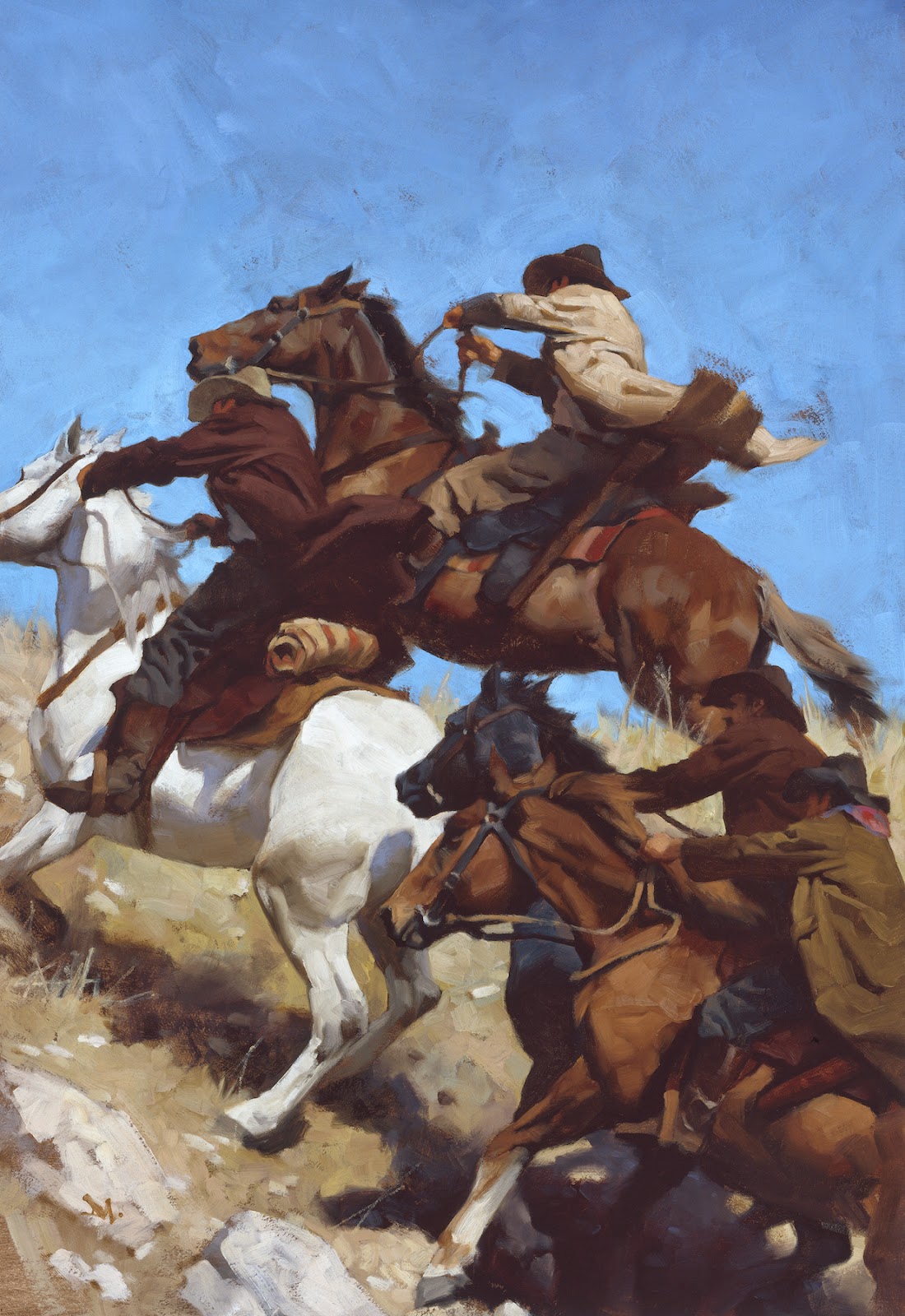
These aspects of painting may at first seem complicated. They become joyful the more you recognize, learn, and use them.
Of course, painting is a combination of all of these things working at once and not often isolated. Remember that working through a painting demands a balance of these aspects, with some striking louder cords than others in the same piece. This push-pull provides interest to engage the brain.
I’ve lined them up in order of priority, but as you use them, you’ll find that some can overwhelm or even support the others. Each of the points on this list tend to blend with the point before and after it.
No matter where we start in the structure of a painting, whether thinking of color first, or composition, we always circle back through the list to, basically, where we started.
1. Composition
Composition, has the highest priority because this is generally what we recognize, what hits the eye, first. Strong composition can draw attention to the painting before the subject matter. It can create mood and atmosphere simply by the arrangement of elements. A composition that stretches the imagination, pushes us to consider points of view we aren’t familiar with, drives curiosity. And that drives people to remember.
Simple enough, right? But how often do you use composition for the authority it commands?
2. Value
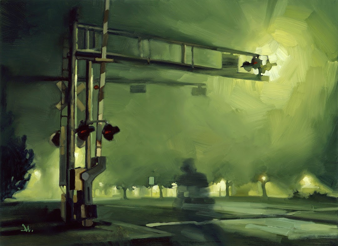
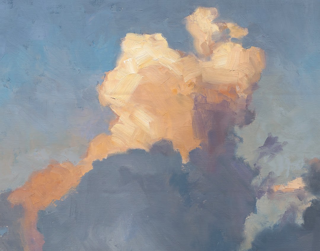
Controlling light and dark in a painting grabs attention. Even in a subtle lighting situation, how the overall light lays across a composition will control where we look. Called chiaroscuro, it is the play of light on a page. How the artist manipulates the light describes a scene, mood, or idea.
Push and pull the light as if you are sculpting it. You control it based on natural light.
You should constantly be observing light in the environment, including manmade.
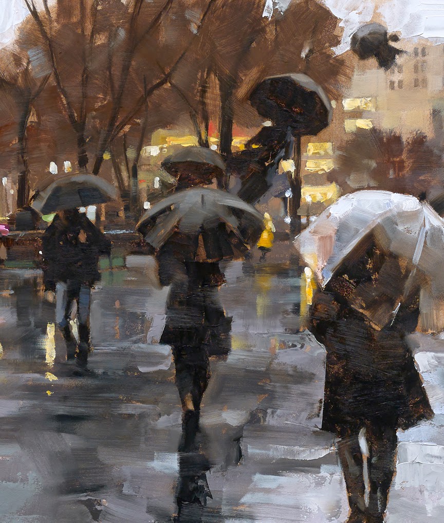
3. Contrast
Paintings are a play of contrasts between elements if nothing else. How lines vary in thickness, how shapes vary in size, how light varies, how color is counterbalanced, or how edges vary, all create ways our eyes move through a piece. This can be accomplished through extreme comparisons or through very, very subtle passages within the same painting.
Contrast between characters or contrast between costumes, even textures, also creates interest.
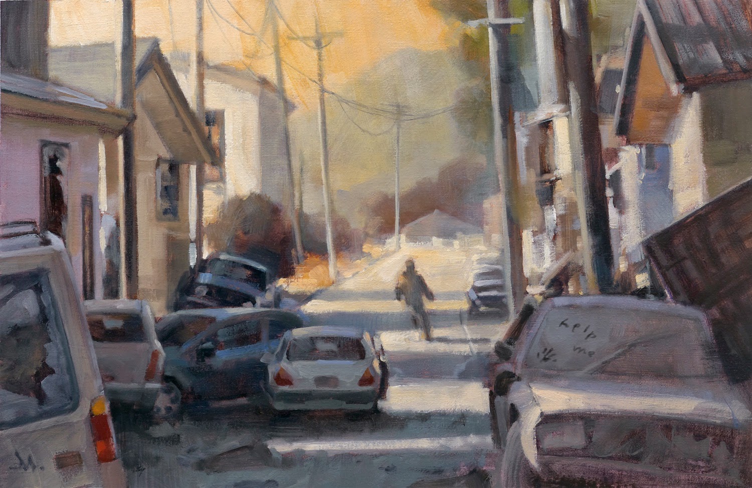
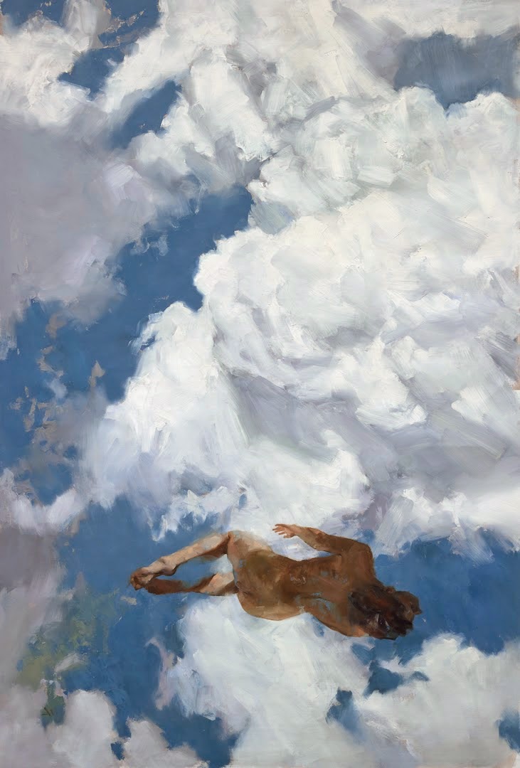
4. Visual Depth
Paintings can have a range of effects, from flat graphics to trompe l’oeil. Paintings of scenes benefit from a sense of depth. The artist is generally creating an illusion that the painted surface is merely a window into a three dimensional scene. This demands using elements to create that illusion. Elements that stay separate set up the brain to think that they are laid on the surface instead of placed within the picture. This is effective for flattening out the surface, but the failure of depth when needing dimension.
Our eyes see depth in nature by translating individual flat picture signals sent to the brain from each eye and then blended (each eye sees a slightly different angle of the world than the other). Objects repeat and overlap other objects giving the illusion of depth.
An easy way to remember how to create depth is to simply think of foreground, middle ground, and background in a picture. The relationship built between them creates depth.


5. Chroma
The intensity of a color is generally called, chroma. We label it today as ‘saturation’ of color because of the influence of PhotoShop and other painting programs. Controlling the brightness of a color in a painting will control the focus and mood. Our eyes tend to go toward the brightest color first, but if the painting is all bright colors, then our eyes will gravitate toward the more greyed versions of colors in the same piece. The contrast between the two ranges is the line of interest our brains search for. Conversely, broad areas of grey color punctuated by one or several bright colors will drive our eye right to those striking colors.

6. Rhythm
A copse of trees, patch of flowers, leaves, birds flying, clouds…repetitive forms gain interest by designing them to flow. In nature, forms repeat, overlap, clump. Why do we consistently try to organize them? This creates pattern, not flow, and pattern stalls rhythm. Allow the forms to move through a composition as if they are dancing rhythmically, leading the eye to move about the frame.
7. Brushwork
Brushwork is calligraphy. Straight and simple. The edges of the brush, how it’s held, how it’s loaded, how it’s applied to the picture determine what kind of interest you bring to the idea. Brushes are not magic participants that suddenly transfer your innermost desires onto the canvas. Learning to move a brush benefits from learning calligraphy. You project your ideas through the brush by telling it exactly how to move, how to bend, how to twist, turn, and apply.
Learning to handle a brush well does not make you look like everyone else. To the contrary, if you think you’ll find your original style by not controlling the brush, you are mistaken. The brush is neutral and will only give you what you tell it to give.


8. Edges
Controlling the edge of elements in the picture, whether in the main subject or in the background will direct the viewer’s eye to grasp or look away from something. Soft edges drift backward into the composition like an out of focus picture. Sharp edges spring forward and command attention.
Directing these edges like a symphony, where you are the conductor, gives a composition strength, and prods the viewer where to look.

9. Theme
An idea itself does not take precedence over the ability to produce that idea. If an idea, or theme, is worth showing, then it’s worth the hard-won training that is required to manifest that idea into a statement, a story, a point of view. While the theme is important to a picture, it is the balance between the theme and it’s execution that provide strength.
Ideas are everywhere. Ideas are cheap. Ideas are good and bad. Ideas come and go, and come back again. A good idea is great, but has no strength if it can’t be compelling. A mediocre idea can be made remarkable, even luminous, and is much better than a great idea poorly manifested.

10. Balance
Elements in a composition must balance and counterbalance so that the overall feeling of the image is purposeful. Certainly a painting can unsettle the mind and stir emotional responses both positive and negative. But to get an idea to be unsettling, one must first understand balance. Otherwise, it is simply guessing.
This isn’t as hard as it sounds. In fact, it’s quite fun. Simply, move things around. Place them in a composition to break the space evenly or unevenly. But allow the composition to balance as if being pulled by gravity at the bottom of the picture. Before long you’ll feel how things can be weighted for visual impact. Do this with abandon, because you will find compositions you hadn’t thought would work.


Great stuff, Gregory. Thanks for sharing.
=s=
Yet again, I learn so much from posts like these! Invaluable information, broken down in bite size pieces.
-Tawny
(sketchinger.com)
Love it! Thanks so much for the breakdown!
Brilliant work
Wonderful post. Thanks for putting it together!
A very helpful post, lots of important information broken down into “easily digestible” points, proving it doesn't have to be overwhelming.
Also, the energy and texture in all your pieces just leaves me staring at them, studying them, my eyes moving all over the place, to take in all the little brush strokes and color/value shifts.
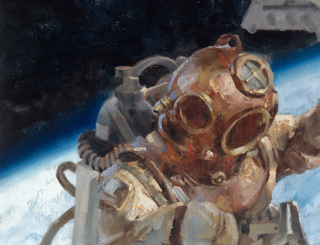
Thanks for this, repairing space station and 10000 leagues under the sea are quite possibly my favorite pieces from you.
Thanks Greg, you put to words so many thoughts I had almost surfaced to the edge of formulating. I learned a lot from reading this. This is one of these articles I think we should layout together with the image examples so that people ( Including myself ) can hang it in front of their working space.
Great post Greg, thanks for posting.
Great post!
Great post!
Always good to read your posts Greg!