-Ron Lemen
Welcome back and I hope all of you in the states had a great holiday and for all of you much study time and leveling up your skills between work, rest, and play.
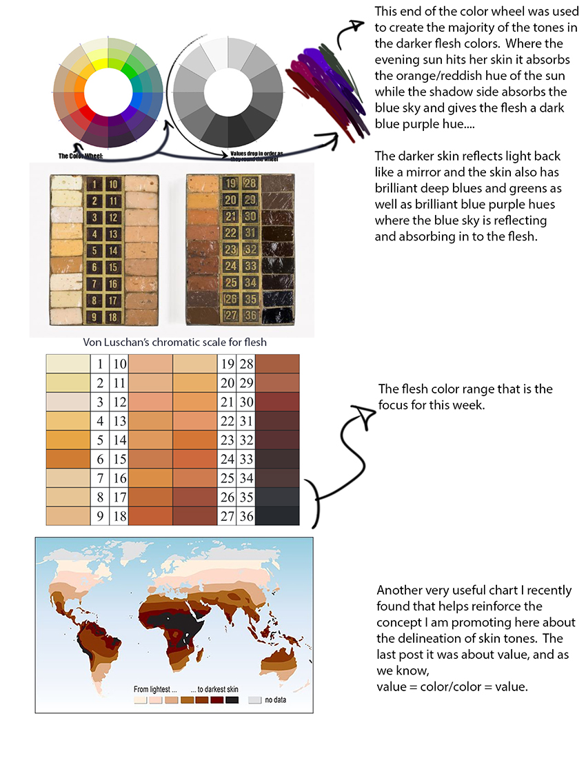
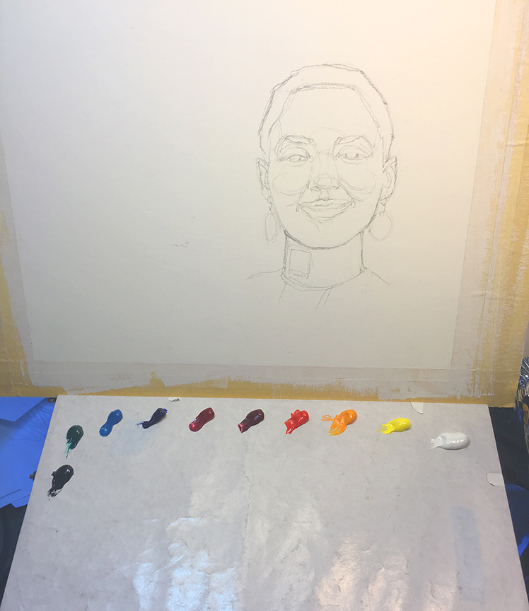
So the first skin tone range to tackle on the Von Luschan scale of skin tones is the range between 32 – 36. I had intended to paint both of these pictures, one in low sun light and the other in high sunlight, but the day got busy with other things so just the one was completed for the time being. I intend to complete the other as well and take a shot of the palette before and after. The range of hues will certainly shift as I change from zone to zone, and from lighting condition to lighting condition.
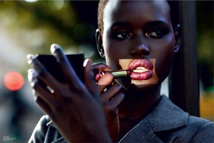
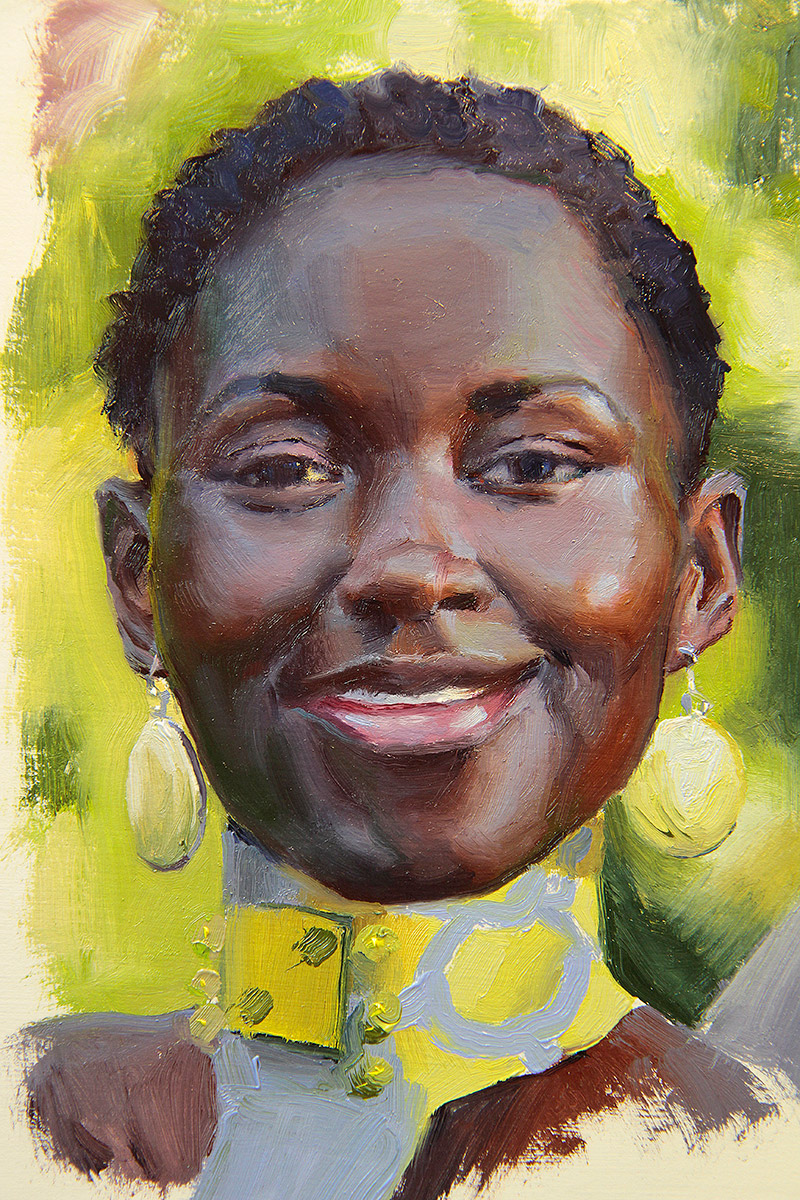
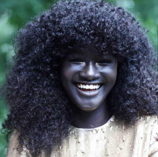
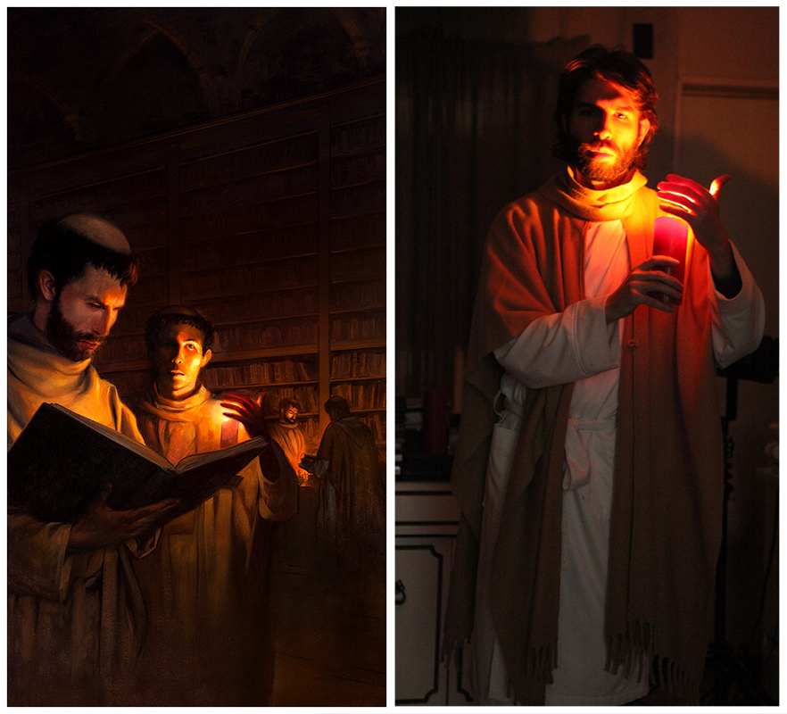
This image that I did has both warm and cool lighting in it which helps identify the color differences of two different lighting conditions although nothing beats this amazing photo below. If I tried to tackle this reference as a painting it would probably never look correct, or believable.
This is such a great photo that reveals how much light plays a part in how skin is seen and how it changes the color of skin so much that it really is just as much about the temperature of the light (kelvins) as it is about local color. Doesn’t this all sound familiar?
Here is a breakdown of the palette that I am using. I have written this up before but here it is again just so you know what I am using:
Titanium White
Cadmium Yellow Pale
Cadmium Yellow Orange
Cadmium Red Light
Alizarin Crimson
Red Rose Deep
Ultramarine Blue
Cerulean Blue (Hue)
Viridian Green
Ivory Black (Not in this painting)
DaVinci Paints only for this color theory palette. There is no other brand that has the rich hues that DaVinci has with the color consistency that they have. It is also the only brand that still makes a true Cad Yellow/Orange. I have had Eric Silver at Blue Ridge Oil Paints make a very very close substitute, but it still didn’t quite perform the way the DaVinci colors do. Did I hear a brand PLUG here?
This is the Munsell palette minus a 3 of his colors. This was a palette developed to help teach color theory in the colleges, and the colors that are involved here are the truest hues you can find that will give you an entire range of chromatic mixtures, as well as all the earth tones necessary to paint any type of painting. Using white, gray(s), and black as agents to tint, tone, and shade respectively, the colors that can be achieved in the lower chromatic ranges is amazing.
So when I do any oil lectures here in the Muds I will be using this Munsell palette to teach color theory with it.
THIS MEANS, I DID NOT USE ANY BROWN COLORS TO MAKE HER FLESH, NOR WILL I TO MAKE ANY OF THE SKIN TONE STUDIES TO COME.
I look at it like this, brown is another name for gray, and I certainly do not want to paint anyone with gray flesh save for a zombie or two, therefore I will not paint the skin of anyone with brown pigments unless all I am stuck with is mud to paint with. Besides, sienna, umber, etc. is very easy to mix and if mixed, it can be color biased, much like the difference in the base hue between burnt umber and raw umber.
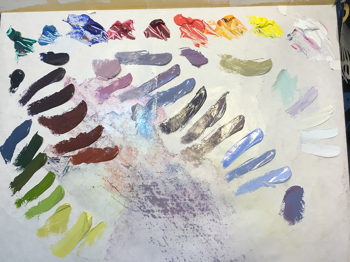
So before I paint the subject, I mix all the colors I think I will need to build the biggest portion of the painting. Subtle color changes will come later so I am not as concerned with spending time honing in on the subject to really scrutinize the subtle changes and mix all of them.
These are mixed in what are called strings. These strings are both value and temperature driven. If you notice, minus the greens that are used for the background, all of the primary hues are on the lower end of the color wheel. Take note of this as we move up the Von Luschan scale.
Also note that there is still plenty of paint in my initial piles up top. Never let the supply run dry.
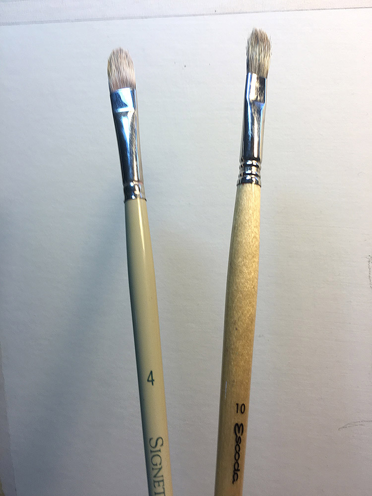
Here are the two brushes I painted 90% of the painting with. Actually, 89% was painted with the one on the right, the other one was in my other hand with the paper towel that is always in the other hand as well serving as a maul stick when I needed one, thus the 1% usage.
These are bristle brushes. I know many illustrators use sables to get those slick thin brush strokes, however, if you learned how to paint academically then you learned to roll through your grades of brushes from the shovels to the mops for each stage of the painting. These bristles are considered the shovels, and for me they are also extremely fun to use.
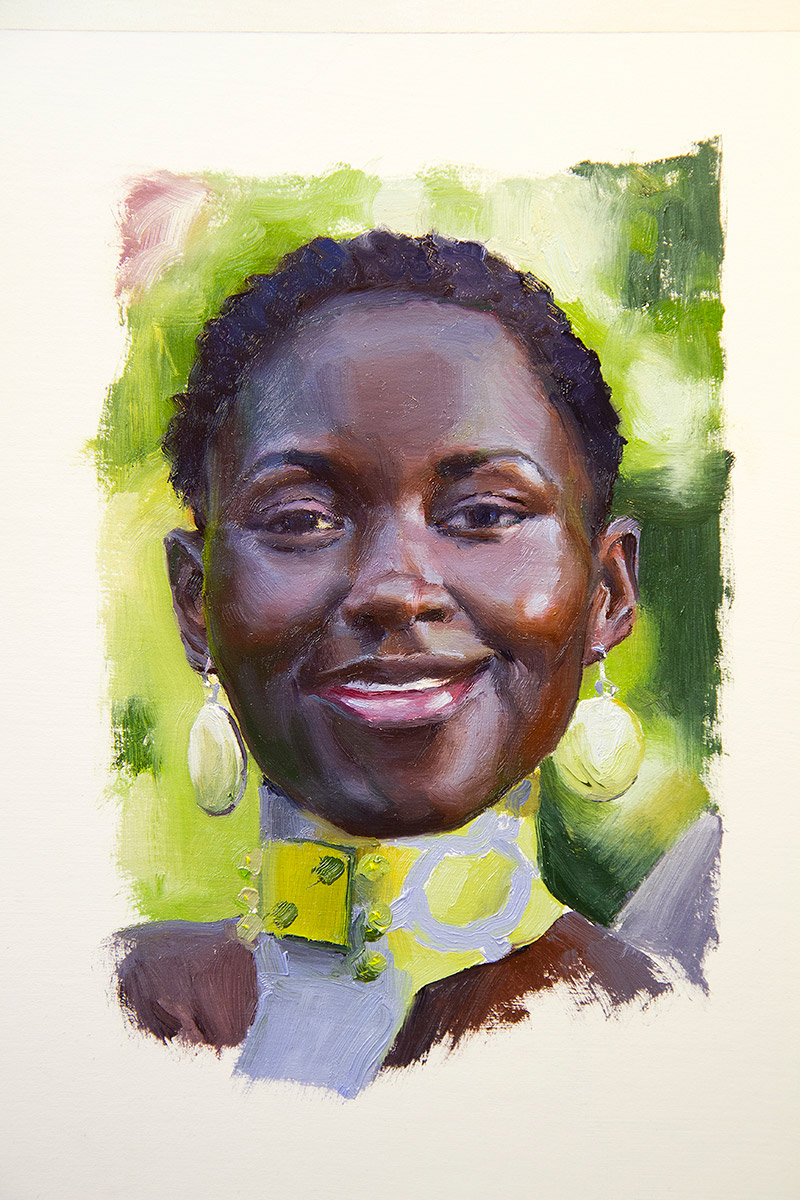
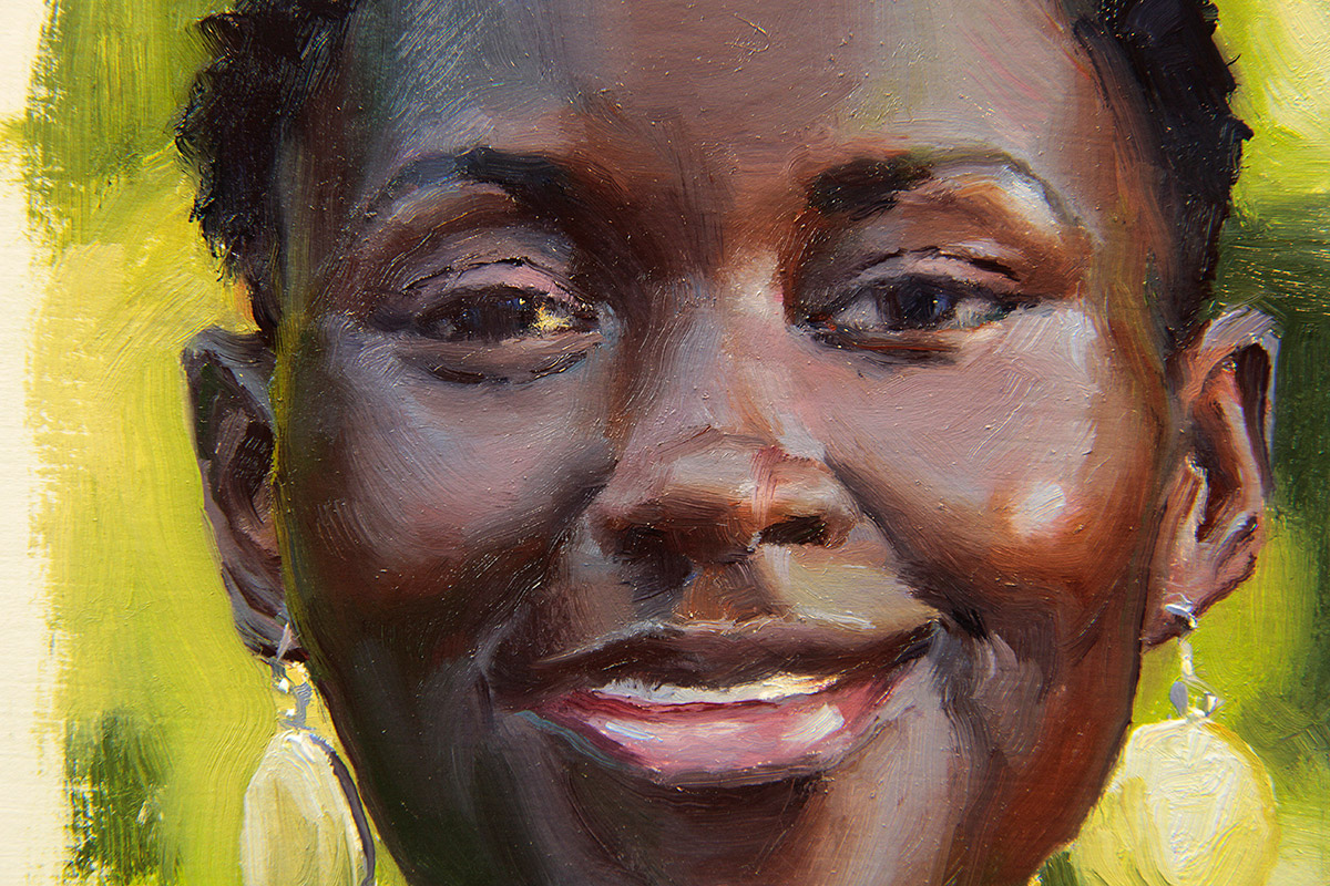
I liken impressionistic painting to sketching and I love to sketch. This demonstration painting is a sketch, it was done very quickly for a painting and by no means is it finished. But as a sketch, I really like it and it serves the purpose of this demonstration. It captures the essence of the model and I have played up the lighting a little more than the photo shows here in its JPEG compressed state. Each compression down it loses more information. The version I have on screen has so much more sky color in her face and more obvious reflective light color information.
Here are the stages of the painting early on. My apologies for the lighting, I have very little control over the sun, sometimes I get my way but usually there are greater forces at play that steer that beast across the sky too quickly to keep a constant color range for shooting photos. So as the painting progresses it slowly yellows as the lights in my studio take over as the dominant light source.
The method I am using here is called tiling. It is a fast method for applying color, very fast if you have premixed your palette as I did. The initial block-in was done very fast. Developing the broken colors and softening the edges took the most time of the entire process.
The idea with the block-in is to get as much of the canvas covered before judging any color value choices too harshly, UNLESS the choice you made/make is so horrible that it will steer the ship towards the brutal rocky wave swept shores. Notice, the over abundance of browns, ehem, I mean no browns.
Here are some shots of the finish. Because this image was so incredibly hard to shoot, I shot it with two different temperatures of light on it to show the range of colors that were involved. The warmer lighting in the studio favors the warms as does the cool lights with the cooler hues, just as light does when we move from one lighting condition to another.
These are super reflective and do not really do a quality job of capturing the true values of the hues.
If a colorist style painting, or a color painting that has an optical realism to it, the paint will do what flesh does under the different colored lights of the day, sun included. The skin will glow with the radiance of the light source and the painting will really never appear flat and dull as a tonal driven image can. But we will save that dialog for another time.
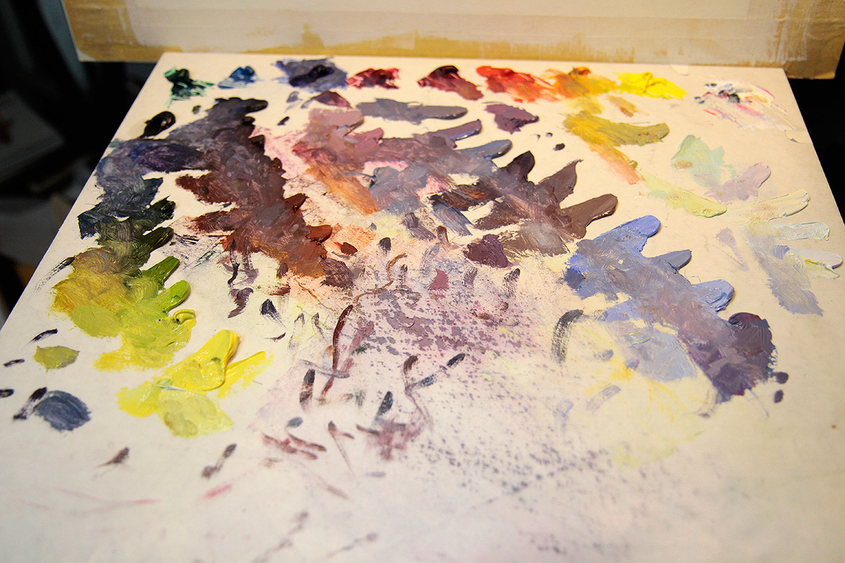
Here is the palette after the painting is completed. Notice there is a little bit of palette blending, but for the most part these colors go on to the surface straight out of their piles and if there is any more blending to be done with them, it is done on the surface and the colors are kept broken up. So when I say blending, I do not mean “wax on, wax off” blend blend blend away. I mean “take one swipe through the paint and leave it alone” blending. If I over flatten a color blend I will get new paint and tear it open again until it feels “fresh”. Too much blending drops the chroma of the color which is usually why a color goes bad in a painting.
When the colors mix together optically, a brownish hue might be perceived, but honestly if you stand in front of this painting there is no hint of brown anywhere on it, and yet the camera cannot separate those colors well enough as the broken colors they are, and as a result the colors have flattened out to some extent and appear brown. But look back at the palette and the colors I mixed, there is no brown anywhere.
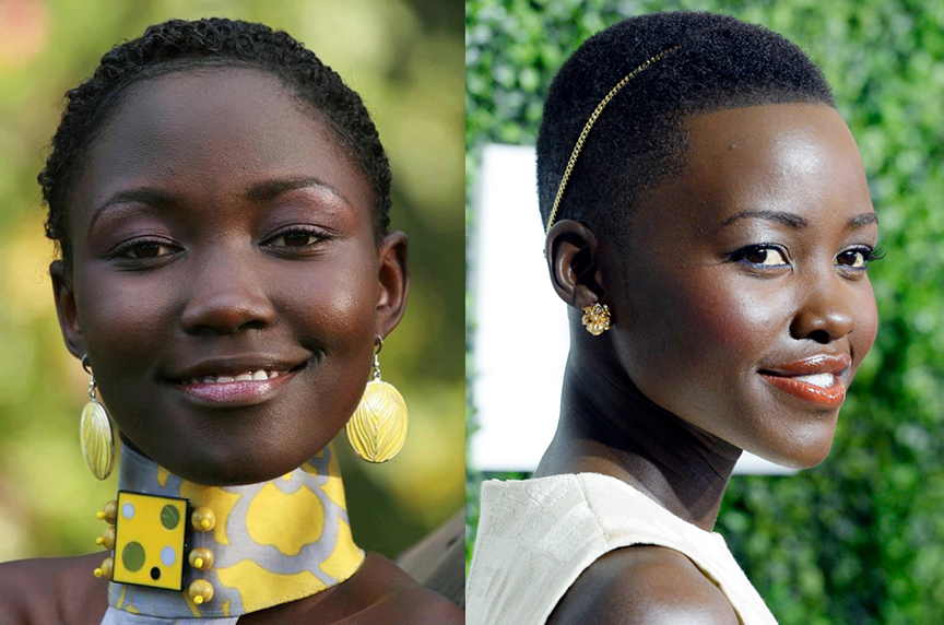
Darker skin acts as a mirror and reflects color back more than we see its true hue on many of the surface planes of the body and the head. Darker skin absorbs light as much as lighter skin does as the first few images show on this thread, but those reflective properties act like a foil and throw back a lot of reflective light making it sometimes difficult to figure out what the true hue really is, especially when the lights are so intense, as on this beautiful model, Khoudia Diop.
Here she is under intense blue sky conditions and is wearing a gold reflective dress as you can see in her chin and cheeks.
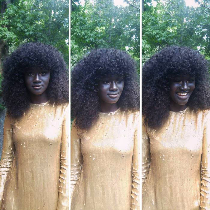
Here she is again with a ray of sunlight hitting her skin. Notice the extreme difference in the temperature range of her skin when the sun hits it. She is also under some kind of canopy that prevents the blue sky from hitting her and the sun as well as her yellow/orange top are major color influences in this immediate space as well as what the camera’s optics could focus on. The colors have a warm bias as a result.
For the next segment I will try and have more paintings completed so that I can get through a broad range of tones. I would like to try and complete this series in 3 more installments covering the 6 zones on the world map above. This one covers the deep core of the equatorial region, the next installment will be moving out into the next two zones.
If you have any questions about the palette I am using in these demonstrations, please feel free and write here on this post or you can send me an email if you have a hard time posting questions on forums. It is an invaluable color theory tool and a great diverse palette if you choose to continue working with it in your professional career.
Happy holiday season to all, now go get muddy.


Really nice post. I learn a lot with this blog. Thanks for that study material.
Great post Ron! So useful.
I'm surprised by how smooth the final image is even though you are still tiling.
Does it take a long time to learn how to discern the “non-brown” hues? Or are they more so chosen through knowledge of color theory (rather than picking up on subtle color shifts through sight alone).
I tried to do an oil portrait without training and the colors got washed out sooo fast. I can see what you mean by over blending, but I'm not great at color mapping. I'd love to take your classes when they're offered again!
^that was me, hoping to get schooled at the Rev academy 🙂
such a great post. Really like that one image with the woman applying lipstick- that light on her mouth rally shows how light effects skin color. Going to try out making skin tones with now browns! thanks for the challenge.
Great painting with beautiful colours, thank you for the detailed information and reasoning.
I've only been painting for a couple of years and have just recently started expanding my palette from a cyan, magenta and yellow.
I've just started using the earth tones for paler skin, and was pleased with the warm natural hues they were easily making.
I get confused when master artists avoid a particular colour, would you generally avoid the earth colours all together? They seem so friendly, such refreshing change to not having to muddy down to an earthy hue from a “primary”.
Before reading this tutorial I would have said, brown is just a dark low chroma red, Yellow Ochre seems so useful, umber so warm and dark. burnt sienna such a natural orange. Indian red and ultramarine make that pleasing soft violet.
Why is brown a grey, and aren't low chroma, earthy colours useful for realism or contrast?
After years and years of master level painting, do you see it as just a plain fact of paint that the earth colours are muddy, and best avoided?
ChatGPT said:
This lesson on Muddy Colors is really insightful — it breaks down how to paint realistic skin tones using light, temperature, and value rather than relying on preset “flesh” colors. Ron Lemen’s approach teaches artists to observe how lighting and environment affect skin, making it a great read for anyone looking to improve their portrait painting skills.
That’s a really helpful article — it breaks down skin tones in a way that goes beyond just “using brown.” I like how it focuses on light, temperature, and subtle color shifts instead of relying on flat base tones. The idea of experimenting with lighting and avoiding over-blending really makes sense — it keeps the skin looking alive and natural.
BFlix offers a wide range of movies, but users often mention intrusive ads and risky redirects. Because unverified streaming sites may expose devices to harmful content, many viewers prefer licensed platforms that provide safer browsing, consistent video quality, and reliable performance.