With CG and all the new materials at Hollywood’s disposal, there are all these new shows with aliens that are blue, purple, green, yellow, orange, etc. It is fun to see a new breed of Star Trek Human Hybrids but hyped up in color and costume decadence. It certainly adds a new element of surprise to the artist when they try to control the forms of a totally alien color scheme. Here are some thoughts on controlling the colors especially if the image is supposed to feel “realistic”, whatever that means.
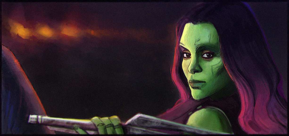
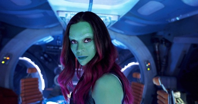
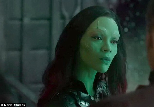
I have taken Gamora from Guardians of the Galaxy as my test subject for this demonstration. She has fantastic coloring for her makeup and she has one of the more difficult colors to control, as opposed to the blue hues like with Yondu or the Asari in Mass Effect or many other hues for that matter.
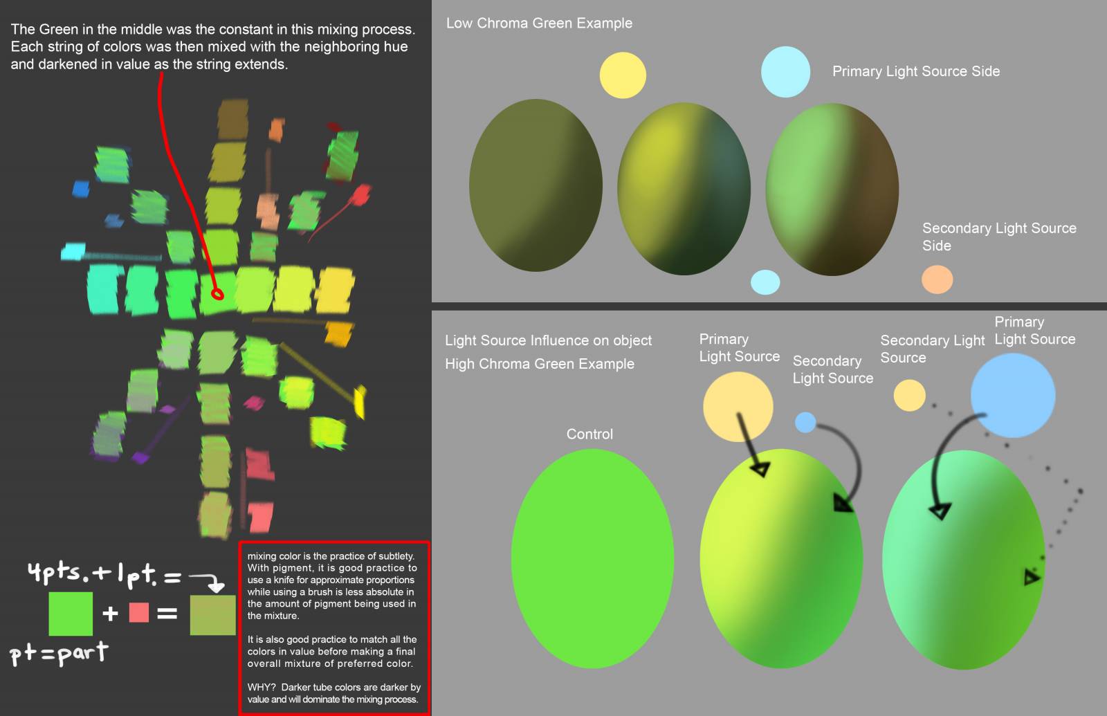
Green has the most visible range of dimension in the color spectrum over any of the other hues and can be the most troublesome and confusing color to work with; ask the landscape artists about this one. Nature provides us with too many options that continue to add confusion to already difficult painting process, let alone all the new synthetic colors we are concocting in the lab, and add to that the rest of the visible and unprintable color spectrum best seen on screen to make color matching a very tedious and frustrating process.
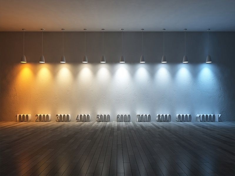
The most obvious place to start is with the light source(s) and identifying the dominant light source temperature, (kelvin) and then determining what the indirect light source temperature is, along with the intensity of the light, distance from the subject, and the time of day if outdoors. This is the formula for determining what colors to mix and if you are familiar with your own palette then it is also the formula for how to mix the colors.
I will make a sky clock chart as soon as I can. It helps to have visuals to explain some of these concepts considering this might be the first time ever hearing of some of these concepts.
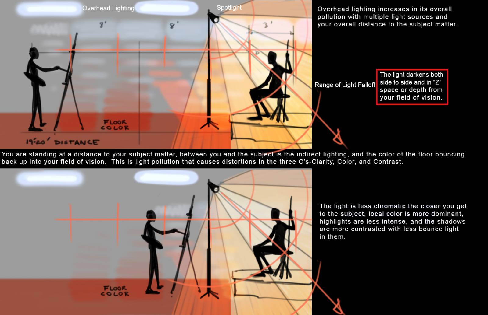
With light on the mind, another consideration is the falloff of light as can be seen above with the diminishing color cones on their edges or penumbra of the cone. When a light is cast, it has a certain distance from the source light that it will be intense and strong, then it weakens in wavelength and diminishes in its color strength, its intensity and when this occurs the indirect light and/or the bounce light takes over as the dominant light source. Because light is not constant, all forms should be considered under the influence of this concept and when the value drops so should the hue.

Something I have found myself doing more likely because I understand what I am looking for, I find that I break down the image and decode the lighting from all around the reference to determine what the eye is seeing in the recorded mud, and what the eye cannot see because the camera could not record it. I have found that time of day, conditions in the areas off frame, and sometimes the location (indoor or outdoor even when difficult to spot from the lack of visual reference clues) can all be determined once one understands light theory. It helps tremendously if you are relying entirely on the reference to get you by with color and form.
Here are a few examples of decoding the image, referencing the photos from above.

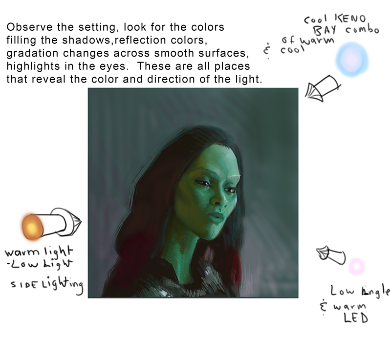
Remember that you are not looking for a likeness in the drawing, you are looking for a similarity in color/hue/light temperature. Once this has been determined the image is so much easier to craft to a finish. These are both staged shots and what I have found that consistently Gamora is shot with a Pink/Warm LED soft fill on her far side or cool lit spaces. The cool lighting tends towards a blue hue with some warm bulbs intermixed in the Keno boxes. And the fill light in the shadow spaces tends toward the color opposite, or in many indoor settings, a warm fill, either pinkish or orange-red. The third light triangulates temperature on her form and helps model her without feeling fake and painted. At work here is definitely an experienced set designer who understands lighting painted forms vs. lighting flesh.
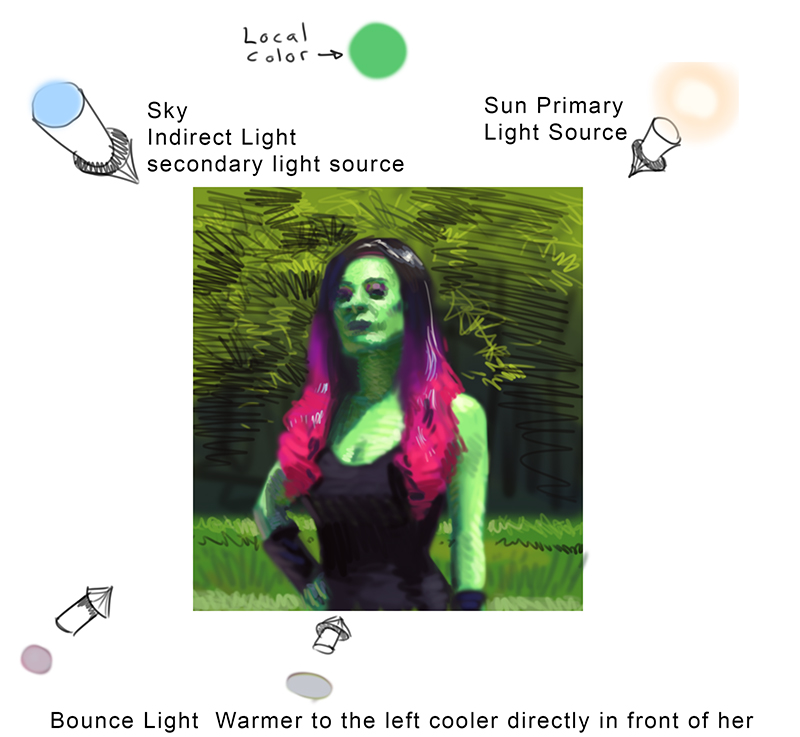
And to double check this, let’s look at fan photos of cosplayers who are lit with natural light, in this case the sun and how damaging it is on the surface of her skin and how uncontrolled the shadow spaces are. But this natural lighting helps reveal the errors many of us face when we use our own reference or shoot cosplayers without controlled lighting conditions and how badly the colors turn out because of these not so favorable conditions.

and here is the color dissection of the photo, determining the light sources and adding back a little color where the camera might have lost some of it from the intensity of the sunlight.
Here is a page of mixing colors in an attempt to figure out the difference between warms and cools with several different colors from the palette I have assembled to paint this type of flesh tone. There are many other types of pigment out there, but my base hue for the local color was viridian green. Normally I try and mix the greens with other hues other than an out of the tube green but this one felt right for her local tones in so many of the reference shots I found.
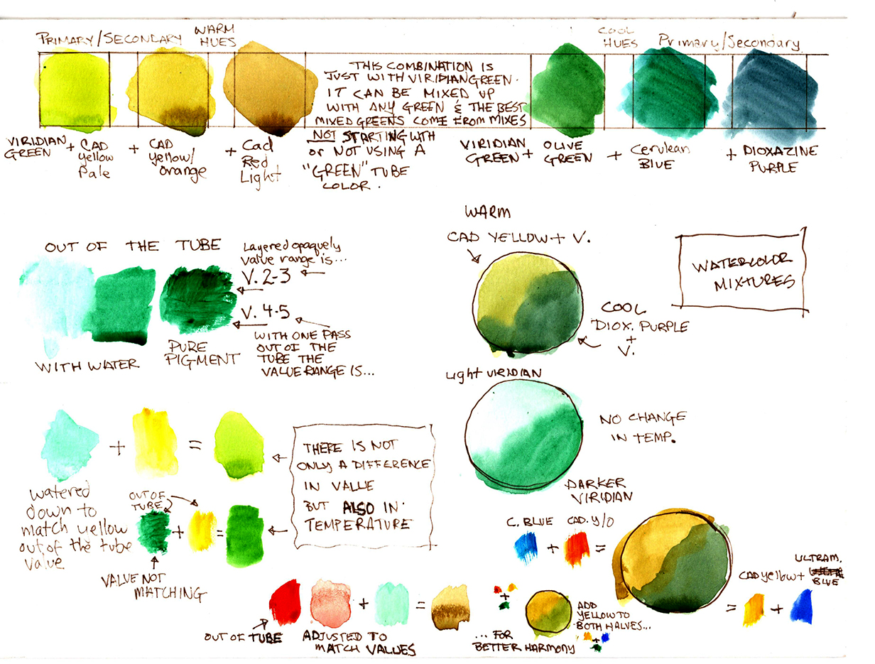
Identifying which hues to use is so much easier traditionally than digitally. We can compile a swatch batch over time, but to know what hues produces the colors for the painting is such a valuable tool, an intuitive tool that helps problem solve so much quicker, instantly when you recognize it. Deadlines are real and the time spent on problem solving can eat up valuable time finishing the image. The more that is known about painting and the more that is known about the tools the easier it is to get things done in a timely fashion. It also helps to recognize what to look for in the digital color wheel and how to find what you are looking for when you can relate the wheel to temperature, light sources, and so much more.
Knowledge and practice help hone in these intuitive skills and are invaluable to the longevity of the artist’s career. Be curious, observe, discover, practice, and output. I would love to hear your thoughts on color and/or your confusion with it. This could lead up to more articles on the practice of color, how to practice training in color, and learning to see it with an observational understanding of the conditions that lead up to what you see, or something like that.


As always your articles are in depth and for practical use.
When painting a scene from imagination, I find it difficult to choose a color palette, as opposed to letting at still life dictate a palette for you. I gather ref for a scene, but to pull all that toghter to get a uniform feeling of light, is giving me trouble. I would like some advice how to choose the right pallet for a certain subject that would actually enhance the picture…..does that make sence? I see plein air artist change the colors that they see because it feels better, how do they make these choises?
color is the most important part of life, without color humans cannot feel the beauty of the world. even a woman with green skin can be a very interesting art