When I first started out as a book cover artist, because of my training in film and my experience with Photoshop, my images were very photorealistic and detailed, similar to a matte painting. However, over the years, I’ve found that I’ve shifted to a more graphic and impressionistic style.
Book covers allow me the creative freedom to break traditional molds, break rules, and experiment with different methodologies in a way that film and theme parks cannot, due to their technical requirements. Through these explorations, I found myself increasingly drawn to the abstract.

Unbreakable, by W. C. Bauers
I’ve had an attraction to graphic art since school, with visual influences ranging from the Renaissance to comic books. In particular, I’ve always been drawn to the technique of 20th century American illustrator J.C. Leyendecker. His paintings are uniquely stylized, and I was particularly attracted to his precise angular brush strokes.
Snow Crash, by Neal Stephenson (SFBC 50th Anniversary Collection)
Embracing a more graphic aesthetic opens up whole new possibilities about how to re-interpret shapes and angles, defying rules of physics and perspective. For example, the character’s pose for the cover of Snow Crash by Neal Stephenson is extreme and overacted, but in combination with the movement and glitchy textures in the background, it achieves a level of directness commonly seen in the animation industry in Japan.
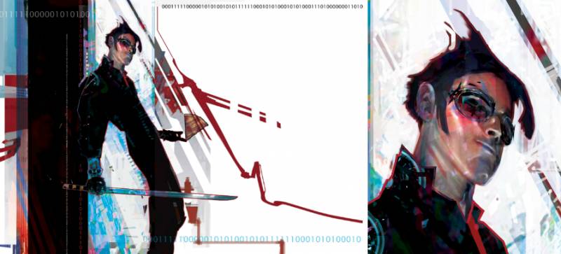
23 Years on Fire, by Joel Shepherd
What I like about an abstract approach is the challenge of communicating an idea with the simplest visual cues. It’s a rewarding process to get to the essence of an image, without overwhelming the viewer with too much information. In the case of 23 Years on Fire by Joel Shepherd, the abstract lines are what give the illusion of movement and speed, not the character himself.
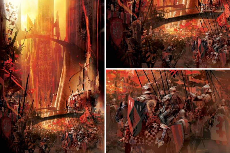
An Autumn War, by Daniel Abraham
An Autumn War by Daniel Abraham was the first image that really changed my understanding and appreciation for the potential of abstraction. It was not a conscious decision – it came as I was building the painting. Something about how the different layers were reacting to each other appeared particularly impressionistic, and drove me to convey the areas with most complexity with elements that were more minimalist. While the brain reads an army in the image, it’s actually just shapes, colors, textures, and patterns layered together. The appeal of seeing the style emerge drove me to repeat the same aesthetic in other areas of the painting, until it ultimately came out as something totally different than what I would have traditionally done.

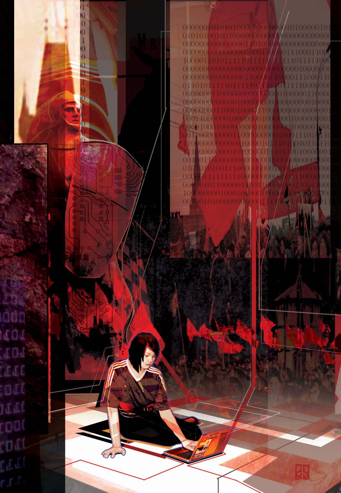
The Dervish House, by Ian McDonald
The Dervish House by Ian McDonald was another opportunity that was ripe to explore the abstract. The story explores themes of multiplicity – how multiple narratives and characters intersect in rich, complex ways. Because of this, I wanted to represent the story as a collage of elements, each carefully layered atop one another to achieve more stylistic lines and shapes.
As I’ve gotten older, I’ve reflected on how important it is to be able to evolve as an artist. While it’s always good to strive for a unique and recognizable style, it’s critical to experiment with different styles and techniques. Otherwise, you risk the artistic process becoming too easy, boring, and consequently stale. Without actively challenging yourself, you might be missing out on a great new opportunity, or whole new chapter for yourself artistically.

Recent Comments