Hey folks, check out the genius that is Coles Phillips!
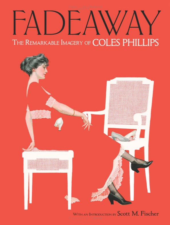
Fadeaway: The Remarkable Imagery of Coles Phillips by Dover Books.
(Available for pre-order now wherever you buy books.)
If you want to up your composition skills, do yourself a favor and study this artist. Though he is an exceptional draftsman, there are no shortage of artists I can look at for painting technique. I am looking at Phillips for the way he saw things, even more than the way he painted them.
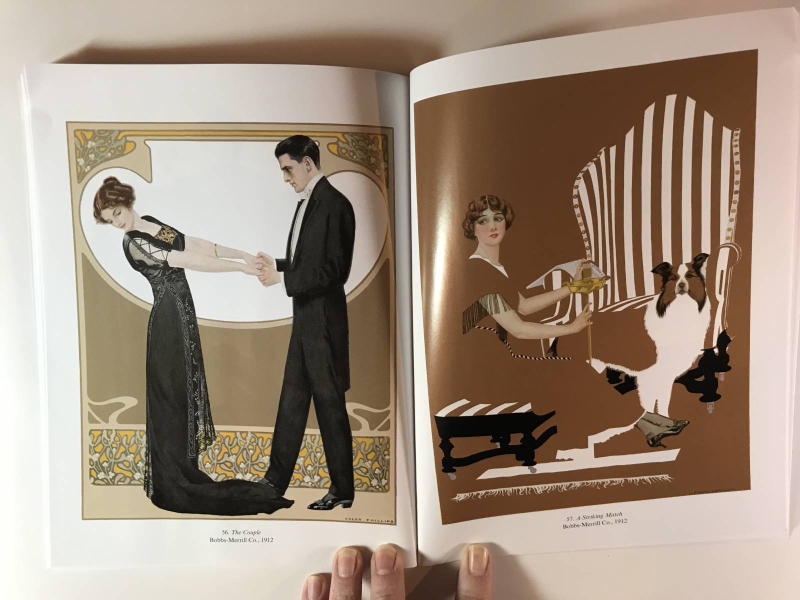
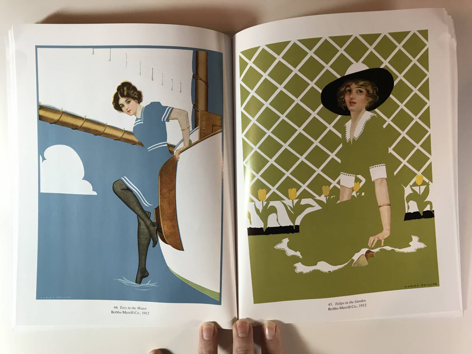
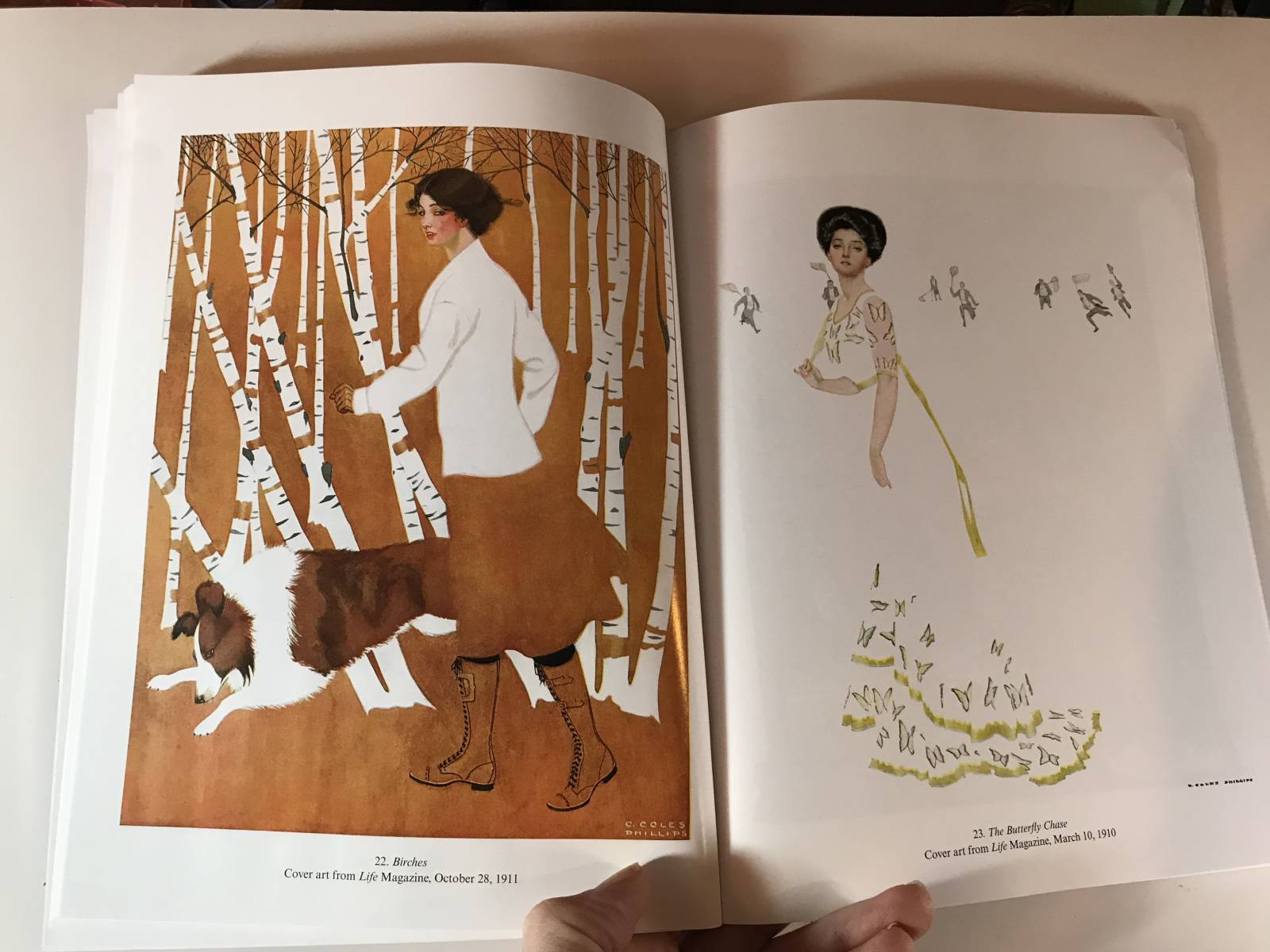
Phillips became a sensation for something called ‘fadeaway girls’ which is where he would choose to drop elements of his paintings into the flat of the negative space. So everything had to be in just the right place in order for us not to lose the composition. And if you know me, you know I preach the silhouette. On that he is a master. He had to be. Just look at the cover above. Look how little of the line of the upper leg he gives. Just a bit where the shoe is on her lap, and a bit more where the hand and arm of the chair meet her. The biggest clue being the line of the dress that meets the seat of the chair. And lets talk about that chair for just a second. It is flat white right? Flat as you can get. But notice how we read the depth of space in the arm of the chair on our right as it cuts in front of the wicker back of the chair. Silhouette, silhouette, silhouette. This is math people. And if you can get this much just from the cover, imagine what awaits inside.
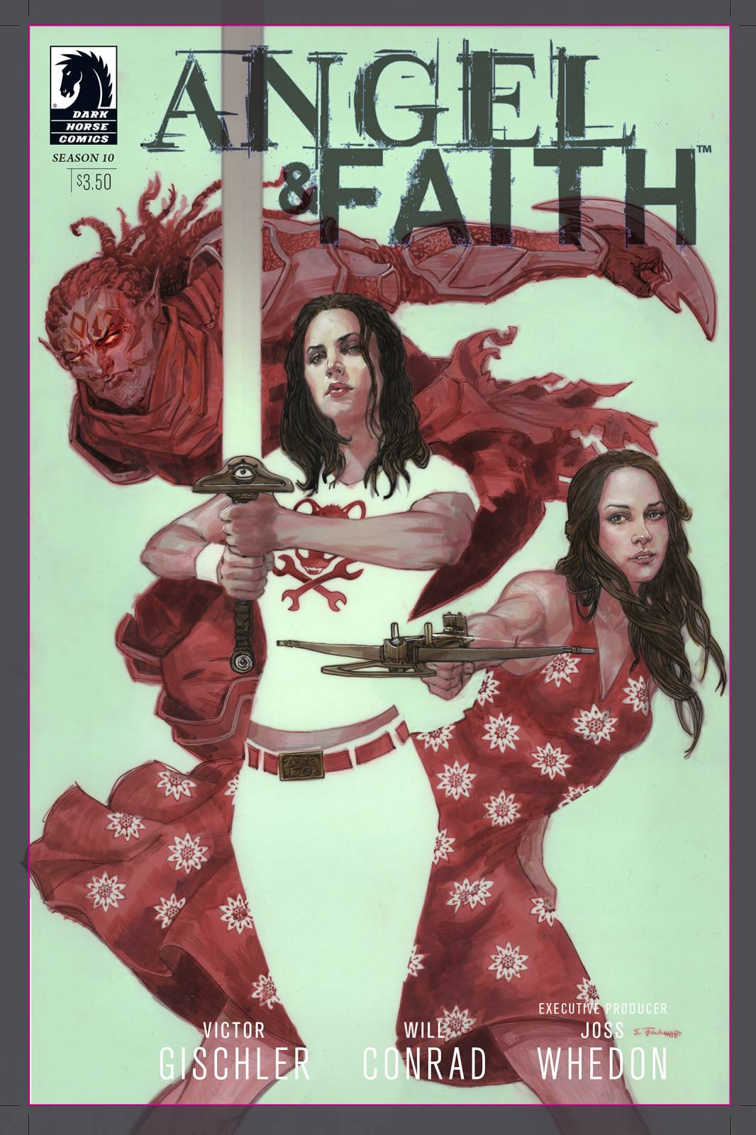
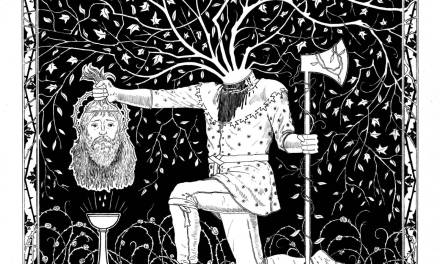
I have played with this fade away effect many times, but most recently on this cover for Angel and Faith for Dark Horse Comics.
It was my great honor to write the introduction to this book for Dover, but even if I had not, I would still be shouting from the rooftops to get one of these on your shelf. As I say in this introduction video, Phillips was a huge influence for me. I first discovered him in 1994 in Vol. 10, Issue. 1, of a fabulous magazine called Step By Step Graphics. Though, truth be told I bought that issue for the fantastic step-by-step by the legendary Drew Struzan. (A worthy pick-up if you can find it.) Little did I know the article in the rear of the magazine on Coles Philips would have just as profound an impact on me. And I would slap myself if I was told back then I’d be writing an introduction to his book 24 years later. Such an honor.

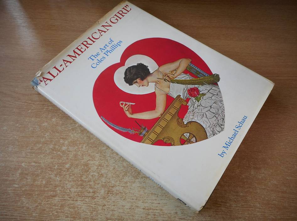
As far as I know this is the first serious book on Coles Phillips since the 1970’s. And that book (Shown below) is long out of print.
“Absence makes the heart grow fonder.” While this phrase is not usually associated with art, in the case of illustrator Coles Phillips (1880-1927), it certainly applies. No mater how you get your hands on his imagery, get your hands on it.
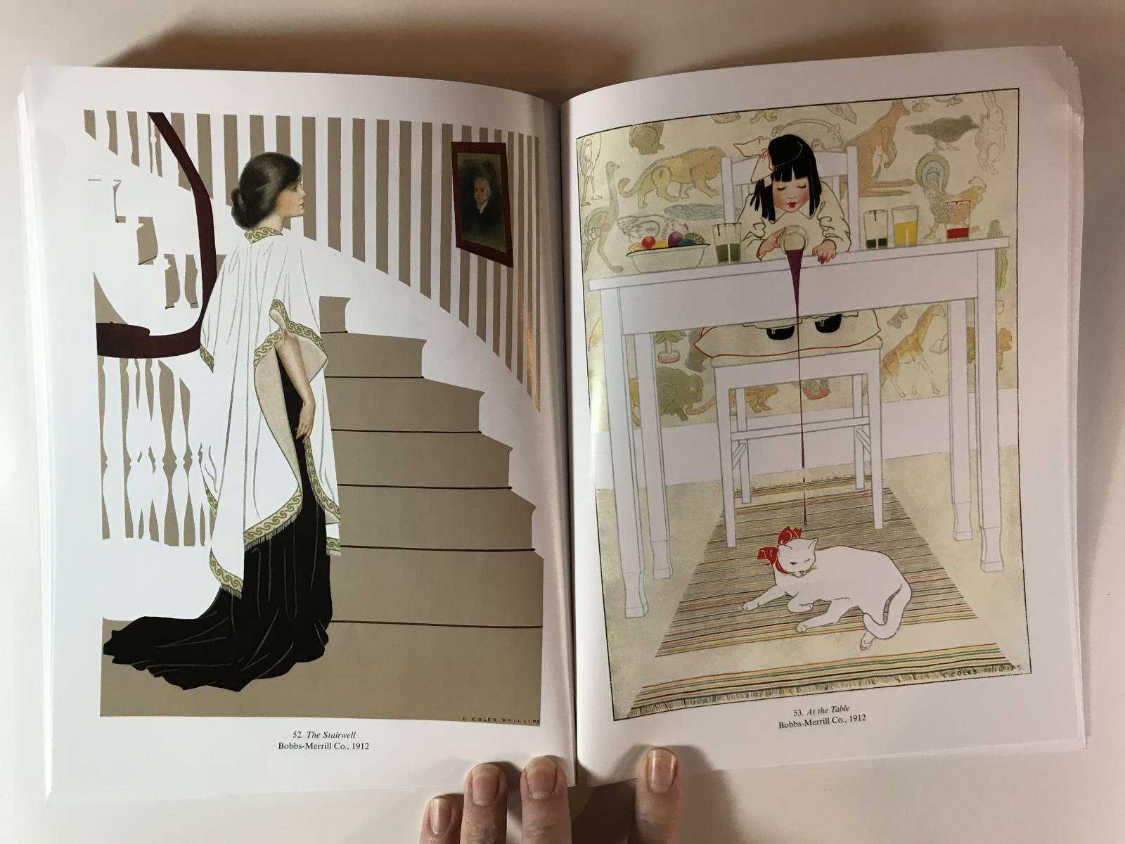
In viewing Phillips work, one is immediately struck by what isn’t there. We quickly understand that what he chose not to paint, is as important as what he chose to paint.
Myself, being an artist that is obsessed with the mechanics of great picture making, I might even argue that what Phillips left out of his paintings is actually more important than what he put in his paintings. Sure, an art director needs an illustration to have a subject by the very definition of the word ‘illustration’. But today, some 80 years after Phillips was working, would we still be talking about him with the same reverence, if he had made the choice to paint every element in his work?


Agh, how have I never heard of this guy?? I will be ordering this, for sure!!!
I also love how seamlessly he blends realistic elements with graphic work, and some exceptionally tight color palettes. I’m putting this on my wish list.
Scott I love your energy!
Absolutely adorable artwork.