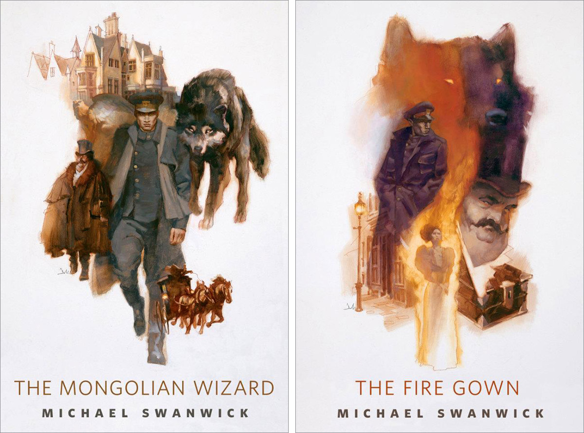
Next up in Michael Swanwick’s Mongolian Wizard series is “The New Prometheus.”
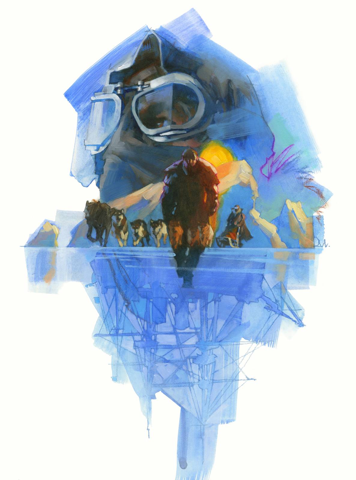
In keeping with the series’ direction, I designed a montage of visuals from the story. The locations are widespread, but I chose the high latitude polar region that occurs in the story (are you surprised?). This gave me an overall blue color scheme to work with.
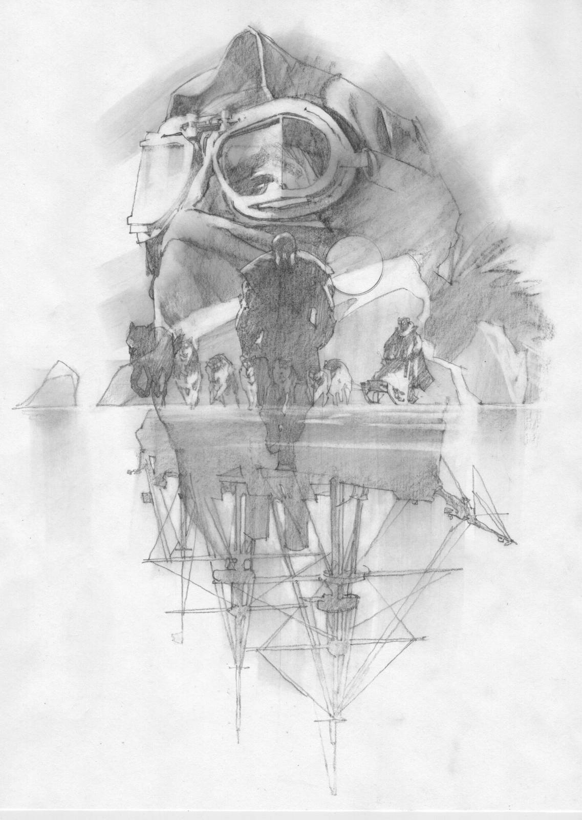
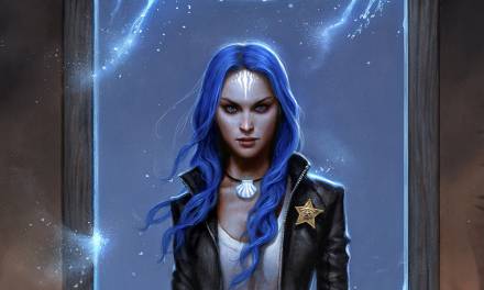
A few studies got me going for the main theme of the work. Let’s see, the focus character came first, building to the larger head of one of the stars of the series, Ritter. He’s a tough, smart and practical guy and I wanted to give him a bit of the Shackleton look. The dogsled would be a nice touch for movement, with Freki leading the pack. Freki is Ritter’s telepathic wolf and the two send mental impressions back and forth.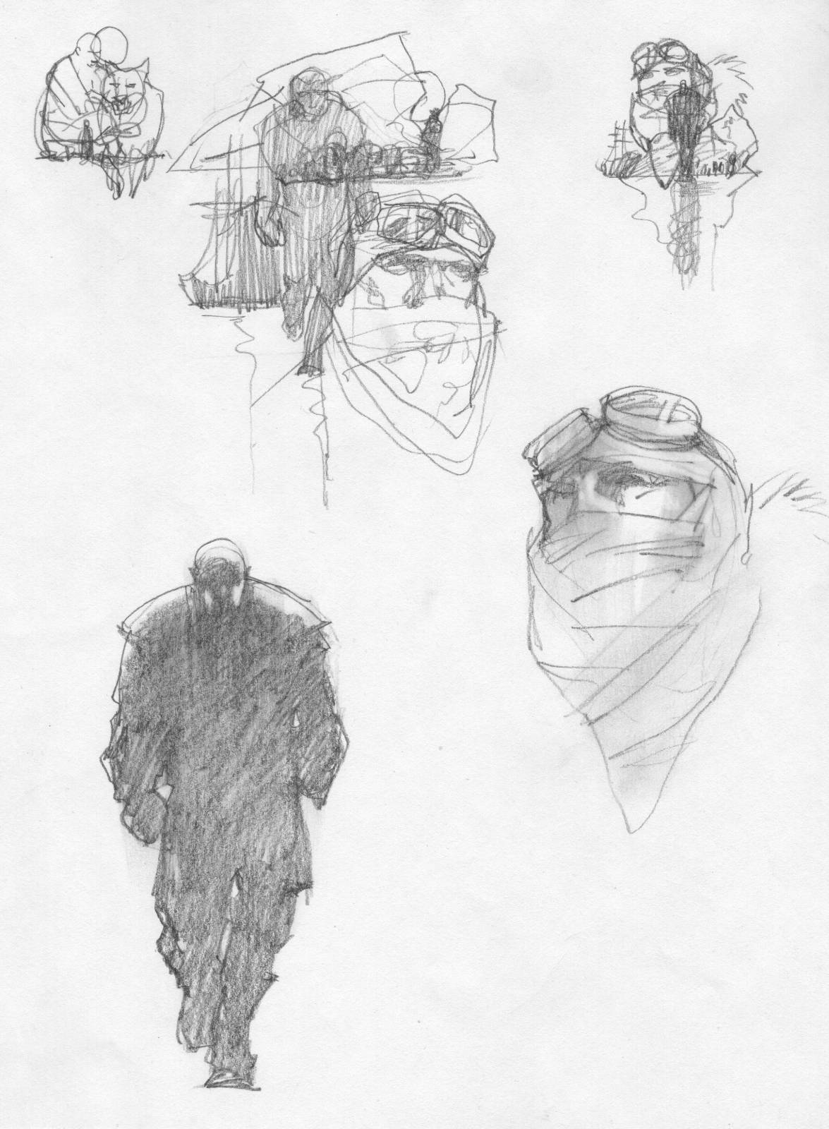
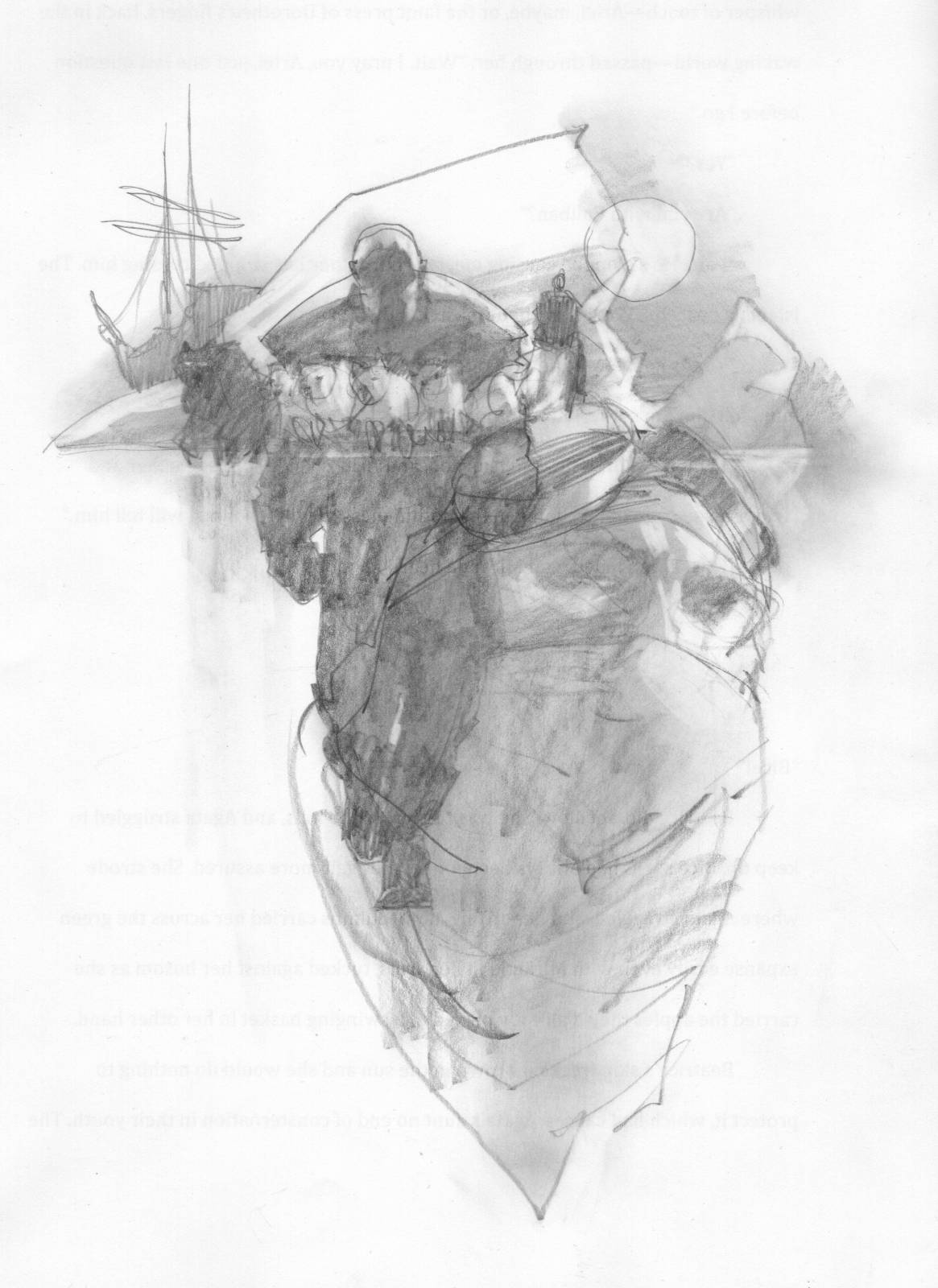
There’s some traveling by ship in the story and I wanted to include an old one, a square-rigger, and tucked it behind the shapes of the icebergs. But I needed more depth, a more vertical design to counter the horizontal line of the ice. At first I thought I’d show the iceberg bottom underwater, but instantly my mind flipped the ship to allow the masts to creep downward. This made it more visually interesting.
I did a second more finished thumb anyway, to explore. And I ended up liking it a lot. Grrrr. I hate when that happens as it makes it more difficult to choose the right one. The art director, Irene Gallo, ended up liking that second one right away, too.
Oh brother, everything pointed to the second thumb. But I felt that the first thumb was more about the character and not the setting, and I really wanted to paint that flipped over ship. Irene was fine either way, so I used the first one. I’ll keep the general composition of the second thumb to use for another of the stories coming up. I can just change the elements.
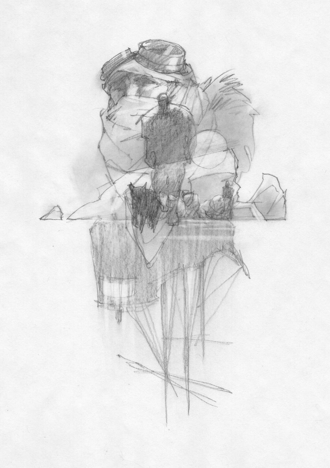
I went through my stack of ice and snow reference from my novel, Above the Timberline, looking for color and shape ideas. I photographed myself in a towel, with goggles, and a scarf to mimic a head wrap. I really wanted to do the leather cap thing, but I didn’t want to confuse the image with my novel. I suppose in the end it shouldn’t really matter.
I looked up a bunch of material for sledding competitions and drew the dog shapes while loosely drawing a guy driving it. I added a sun for mostly shape and color. A bright spot of drippy yellow would look great in the right place.
I drew the finish sketch with a Blackwing pencil, projecting the photo of me with the goggles, and my sketches of the Prometheus and dog sled. The ice shapes were free-drawn, as well as adjustments to the main face, adding the fur collar, folds, etc. But I didn’t like my ship reference. It was too old.
To fit the story much better, I found shots of ships from about 1912 which were kind of a combination of steam and sail, with tons of steel and even more rigging. A juggernaut of sorts. That would do nicely for the period…which of course is weird and wonderful.
Irene ok’d the sketch and I took that and projected it onto a piece of Gessobord, drawing quite freely to achieve more character in the line work and shapes. I used different colors of Prismacolor pencils, plus a standard B pencil for certain areas. I wanted to get the lines to reflect a feeling of moving in and out of color.
Next I mixed up a bunch of acrylic colors of blues, purples, umbers, and the bright yellow. (Cadmium yellow MEDIUM…none of that cad yellow “light”. Ugh. You would do well to avoid that weak and silly color until you know how to use it.) I mix the colors richly, yet it always seems like it’s not strong enough, but with acrylics you can layer and build up the intensity.
I dropped a splash of rich yellow into the area of the sun and let it bleed down the board, sometimes invading other colors and in some places mixing. Sometimes the Prismacolors bleed when I hit them with water, and I’ve learned to let that happen.
I moved colors about, and when dry enough I added another layer for richness here and there.
Once dry, I was ready for laying down oil. I use the oil opaquely and in some areas as thin strokes, to give movement to the piece. Bolder strokes work for the large face, but bold shapes work for the sled dogs. I usually use a large brush for quite awhile until the general shapes are established, then I work my way down to smaller brushes to capture only those details I feel are necessary for information or narration.
I enjoyed painting the spaces between the lines of the ship and made sure they weren’t evenly distributed. Generally, I think about the space between elements rather than filling in empty space by painting the lines against it. It is the space that’s interesting, not the object. Oddly, that’s what gives focus to the objects. Pretty zen, I know.
I hope you all enjoy the short stories. I think the characters, the writing, and the world is very fun. Looking forward to Michael’s next installments!

Glad you are helping to keep the montage alive Greg! It’s always a treat getting to see a new illustration from this series.
Awesome work! Very interesting to hear how you mix medias. Is it because of speed you start out with acrylics?
Hello,
I like your article about this artist. Is there anyway I can submit my work to you for similar headlights? Thank you