Hello Muddy Colors readers, Micah Epstein here. One of the questions I get asked most frequently (aside from the ubiquitous “what brushes do you use?”) is “how do you get that texture in your paintings?” So when Dan invited me to write a guest article for Muddy Colors, I figured it would be the perfect opportunity to address that topic. But any explanation of ‘how’ is incomplete without an explanation of ‘why,’ so before I get to the tutorial, I wanted to share with you some of my thoughts on the use of texture in illustration.
Part I: Some Thoughts on Texture
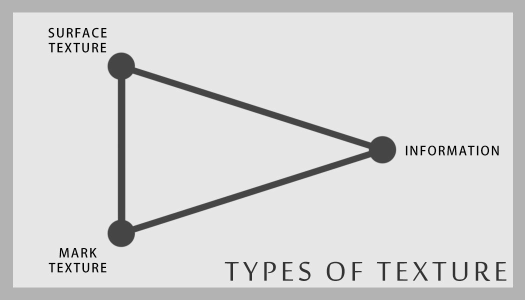
There are countless ways of bringing texture into an image. I could start listing them now and keep going until the site runs out of bandwidth, and I would still have barely scratched the surface. Thankfully, I don’t need to. I’ve found that generally speaking, any application of texture will fall into one of three categories: information, surface texture, or mark texture.
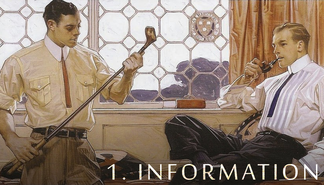 |
| Image by J.C. Leyendecker |
Let’s get the tricky one out of the way first. Two of the terms I’ll be using throughout this article are “texture” and “information.” They’re two sides of a spinning coin, and it’s not always easy to draw a line between one and the other. But there are cues we can use to help us draw distinctions.
Texture – for example, the bumps and ridges on a pieces of watercolor paper – has no meaning. That’s not to say that it isn’t useful to the illustration—just the opposite—but in most cases it doesn’t actually give us any specific information about the figures, forms, or materials in that illustration.
“Information,” on the other hand, does have meaning. These are the marks placed intentionally into an image to convey something particular. Think of the brush strokes that make up the folds a starched shirt in one of Leyendecker’s Arrow Collar ads (above). Or the pattern of light and shadow that defines the figure’s face in those same images. Or, on a smaller scale, think of the pattern of brush marks that describe the rust on a sword in a fantasy painting. All of these tell us about the shape and feel of the forms being described. The more specific the meaning, the more it constitutes information. If it has less specific meaning, then it leans more toward texture.
The exact difference between the two is not necessarily fixed. At their core, both texture and information (and everything else in a two-dimensional image) are simply arrangements of light and dark values, and the line between can shift based on how the image is made and how the image is viewed. For example, if you stand far enough away from a painting in a gallery, then the entire image will essentially become pure, nonspecific texture. Stand closer, and some of that texture will start to take on specific meaning and become information. Like matter and energy, information and texture are essentially two manifestations of the same thing, and they’re constantly in flux. Both use segments of contrast to bring something to an image, but exactly what they bring to the image varies by where and how they’re applied.
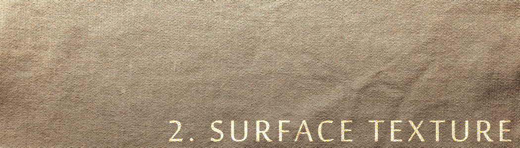
Fairly self-explanatory, right? This is simply the texture imparted by the surface on which we make an image. The toothy grain of cold-press watercolor paper, the smoother, more regular pattern of Belgian linen, and even the blank white of a new Photoshop file. Yes, no texture at all counts as texture, just like pure white is still a value! Zero texture is simply the bottom of the texture spectrum, just like white is the bottom of the value spectrum—more on that later.
On its own, surface texture is inherently non-informational. Unless you’re painting a picture of watercolor paper on a piece of watercolor paper, the texture of the surface—in its basic, unaltered state—won’t have much to do with the figures and objects being depicted. Although, once we start layering marks on top of it, we can sometimes use it to help do just that.
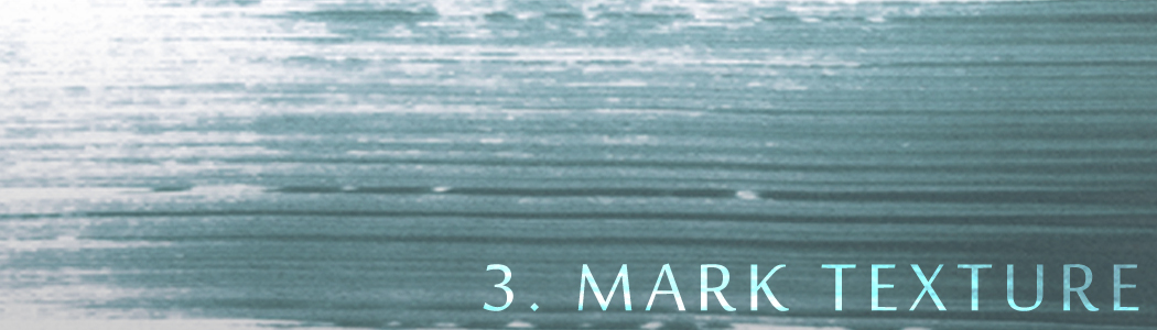
Another fairly simple one. Mark texture is the texture imparted by whatever tool you’re using. Whether it’s something fairly dense and complicated like a sponge or bristle brush, or something smoother like an airbrush, technical pen, or Photoshop’s basic round brush, every tool has its own texture.
Mark textures can run the gamut from pure meaningless texture (like a toothbrush used to splatter dark paint to add a little extra grit to an image) to more specifically meaningful information (if we used that same toothbrush to splatter white paint to create a starry sky).
Between the native texture of a tool and its interactions with the surface texture, and between pure texture and information, we have a basically infinite array of possibilities at our disposal. So what do we do with this awesome cosmic power? How do we wrangle an infinite spectrum into a useful tool for creating an illustration? I’m glad you asked.
The Texture Key
Let’s start by thinking about value. When we put together a plan for an illustration, it’s one of the very first things we have to consider. We start with the full value spectrum from pure white to pure black. What values will we place in which locations? How will we manage contrast? Which values will we use, which will we leave out, and how will we keep those consistent?

This last question sums up what we refer to as an image’s value “key”: the range of values used in an image, and how those are grouped in a consistent manner. If we’re creating a “low key” image, then we’ll mostly restrict the values to the darker parts of the value spectrum. If we’re creating a “high key” image, it’s the reverse. A value key can be wide or narrow, high or low, and each of these arrangements comes with its own set of advantages and drawbacks.
The same goes for texture and information. We can think of texture as a spectrum, just like value, with 0 being no texture at all (say, a perfectly blank Photoshop file), and 10 being highly dense, high-contrast texture (think static on a tv screen, or a photo of dense foliage). And just like with value, we can use this fact to create a textural “key” for our image: the range of textures we choose for a piece, and how we arrange them. Managing this key is one of the critical steps to creating an effective illustration.
In many ways, managing a texture key and managing a value key are quite similar. Let’s take arrangement and contrast, for instance. It’s possible for a great illustration to include every value from 0 to 10. But what makes an illustration work is how they’re arranged. An image benefits from a range of texture; informational or textured areas can be juxtaposed with smoother areas to create contrast and emphasize focal points. But if that contrast becomes too great, or is applied inconsistently, we risk the image feeling patchy and disjointed. This is especially the case when we consider the fact that texture and information are closely related to focus. So, for instance, if we were to have a loosely-painted focal figure juxtaposed against a background full of photo textures, the background—not the figure—would end up feeling like the focus of the piece, which would hurt the composition. What’s more, if those photo textures aren’t integrated into the piece by painting on top of them to bring them more in line with the informational key of the figure (or vise versa), then the image will feel off, because the transitions between areas of differing texture and information are too abrupt. We can use contrast to our advantage, but we have to do so wisely and deliberately, just as we do with value.
Conversely, we have to guard against too narrow a texture key. Again, let’s think of value. If we painted an entire painting only in shades of dark gray, it would be unreadable. The key is just too narrow to work. But if we then throw a brighter light on the focal point, suddenly we have a highly-effective, narrow-key value scheme. All of the subtle darks now work because they’re justified by their contrast with the lighter area. The same goes for texture. If the entire image is too low-texture and low-information, it can appear flat or plastic. If it’s too high-texture across the image, it will appear noisy and illegible. Managing your texture and information key is as important to constructing a solid illustration as is a good composition of values.
Basically, to have an effective texture/information key, we have to treat it like value. Use contrast of texture and information to emphasize what needs emphasizing, and reduce contrast elsewhere to reinforce that. If there’s too much textural variation, and it’s too random and patchy, the image will suffer just as if the value composition were similarly haphazard.
The Secrets of Surface Texture
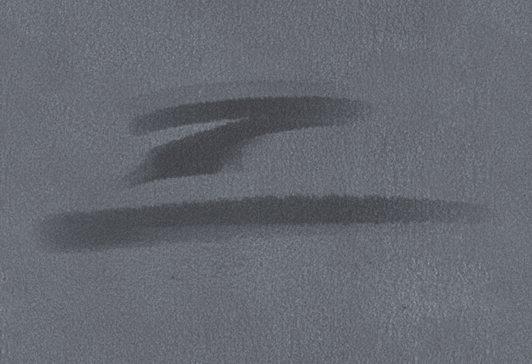
Surface texture is the great equalizer. One of the greatest benefits of a native surface texture (which many digital media lack) is that it places a solid floor on your texture key, and prevents you from going too low on information in any one place. And in many ways, this is great news, because it helps to smooth out the transitions between areas of different levels of texture.

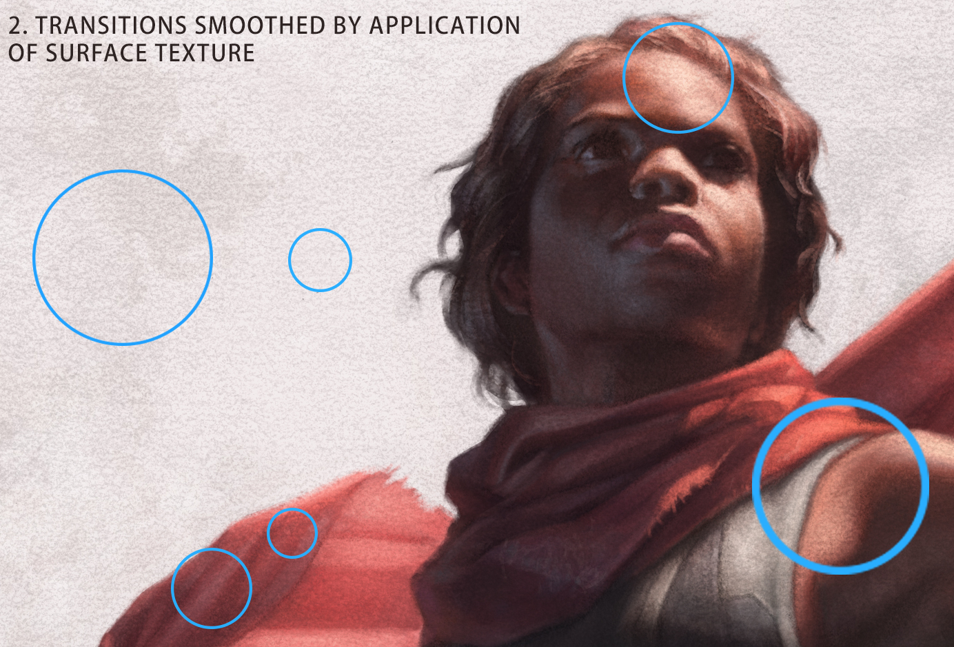
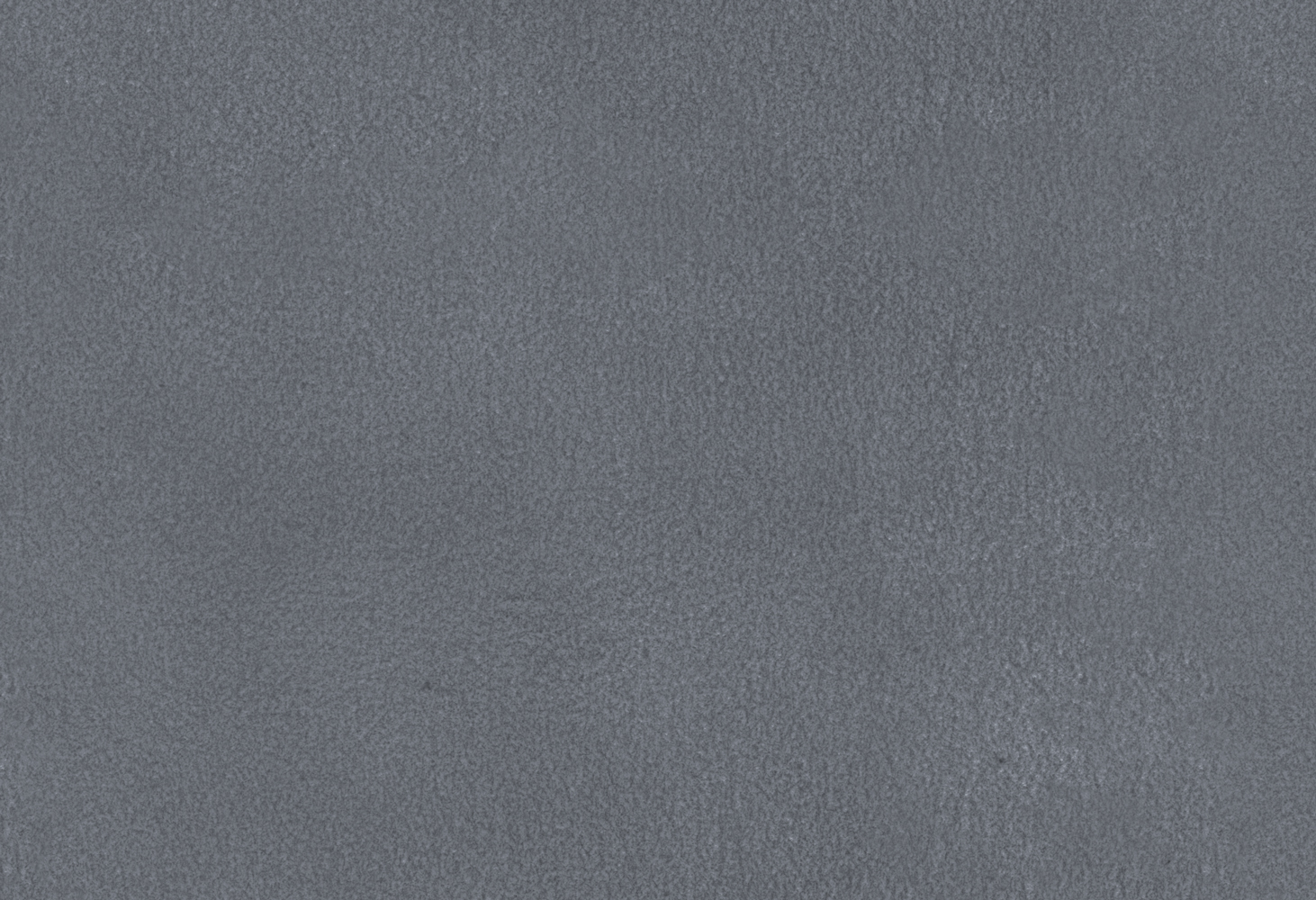
Let’s look at the example above. With absolutely no surface texture, the transitions between the highly-textural brushstrokes and the smoother brushstrokes seem abrupt. If this is happening on a larger scale, especially in a piece that uses more visible brushwork, it can hurt the texture key by introducing that patchy, haphazard look I talked about above. Surface texture can go a long way toward solving that problem. It eases these transitions by preventing some areas from going too low-texture, and others from going too high-texture. It subtly equalizes the appearance of the piece because all textures—painted texture, information, and mark textures—now all interact with this one unifying feature, regardless of their individual appearances.
What’s more, surface texture adds interest at every level. Looking at an image at screen resolution might put the information in the piece on display along with the larger and more obvious sections of pure texture. But what if the client needs to zoom in to make a banner for advertising the product? Having a nice, subtle surface texture ensures that even as we take a closer look and some of those larger, macro-textures lose some of their impact, we have a whole other level of texture and interest lying underneath.
Of course, this is a double-edged sword. As I said before, it places a ceiling on your texture key as well as a floor. Just as you can’t go below a certain level of texture, you also can’t go above a certain level of sharpness and definition, due to the equalizing effects of the surface texture. We don’t want the surface texture to be too coarse if, as in the example above, we know we’ll need to make the image viewable at a larger size. A traditional painter likely wouldn’t choose a coarse watercolor paper over a fine Belgian linen for a highly-realistic, detailed portrait (this is also why it’s generally recommended to work larger rather than smaller to achieve a high level of detail, as the size of the surface grain relative to the information in the piece will be much smaller). Similarly, a digital painter using this technique also has to consider the pros and cons of different textures to determine whether they’re the right fit for the task at hand.
Part II: Creating Artificial Surface Textures in Adobe Photoshop
Alright. Now for the good stuff. Remember way back at the beginning when I said I’d be doing a tutorial on all this? Well now your patience has paid off. The technique I’m going to outline here was adapted from one taught to me by Muddy Colors’ own Justin Gerard. I’ll be going through how to create the appearance of a surface texture in Adobe Photoshop, as well as how to replicate some of the behavior of brushes interacting with that texture.
Step 1: Choosing a Texture
Choosing a surface texture is largely going to depend on your own preferences. This is going to be the first of several times in this tutorial where I’m going to recommend experimenting with different textures, whether created or found, to find one that works best for you and your project. Generally speaking though, I recommend a fairly simple texture with a decent amount of repetition to it. We’ll be making it into a seamless texture file as part of the process, and the more uniform the texture, the easier the that step will be.
I spent quite a while trying to find a surface texture that I liked. In the end, I arrived at one of my favorite drawing papers. If, like me, you decide to scan in your own physical texture, make sure to do so at a fairly high resolution—and I mean something ridiculous like 1200dpi. It sounds like a lot, but trust me, it’s worth it when you can apply it to a large painting without having to worry about the image looking too much like a set of tiles. I lightly scrubbed over the entire sheet with a pencil to make the details of the surface texture easier to pick up in the scanner.
Step 2: Creating a Seamless Texture
Once we have a texture picked out, we need to convert it into a seamless PAT file. Not only will this allow the texture to be used in things like texture overlays, it also lets us incorporate the texture into our brushes. More on that later.
The process of creating a seamless texture seems a bit daunting at first, but it’s not particularly complicated once you get the hang of it. That said, it is a bit involved, so for the sake of brevity I’ll forgo describing the process here. I used the following tutorials to walk myself through the process. It can take a bit of trial and error, and not every texture is well-suited to the process, but it’s easy enough with practice and well worth the effort.
- http://blogs.adobe.com/jkost/2015/01/how-to-create-a-seamless-pattern-tile-in-photoshop.html
- http://www.obsidiandawn.com/creating-seamless-textures-in-photoshop-tutorial
- https://medialoot.com/blog/how-to-make-a-seamless-texture-in-photoshop-redux/
Step 3: Pattern Overlay
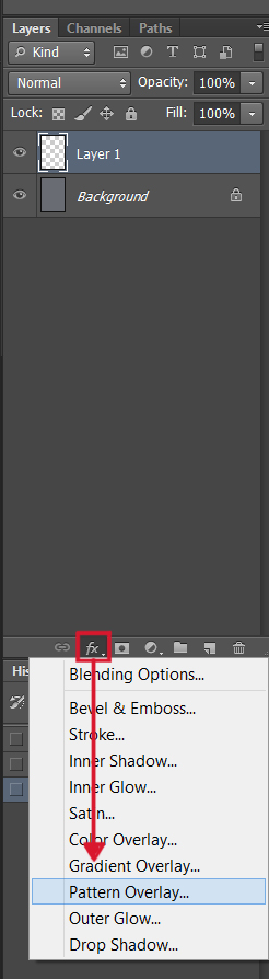
Alright, now we have our PAT file. The next step is to create a ‘Pattern Overlay’. Create a new layer at the top of your Photoshop document, and look to the bottom of the Layers menu. Click on the ‘fx’ button, which brings up the ‘Layer Styles’ dropdown menu. Select the option for ‘Pattern Overlay.’
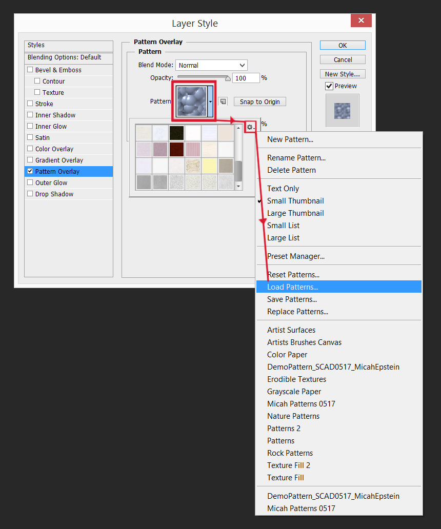
This will bring up another menu, predictably titled ‘Pattern Overlay.’ Select the pattern thumbnail in the center, and then follow the menus below to the ‘Load Pattern’ option. This is where we’ll bring in the PAT file we just created.
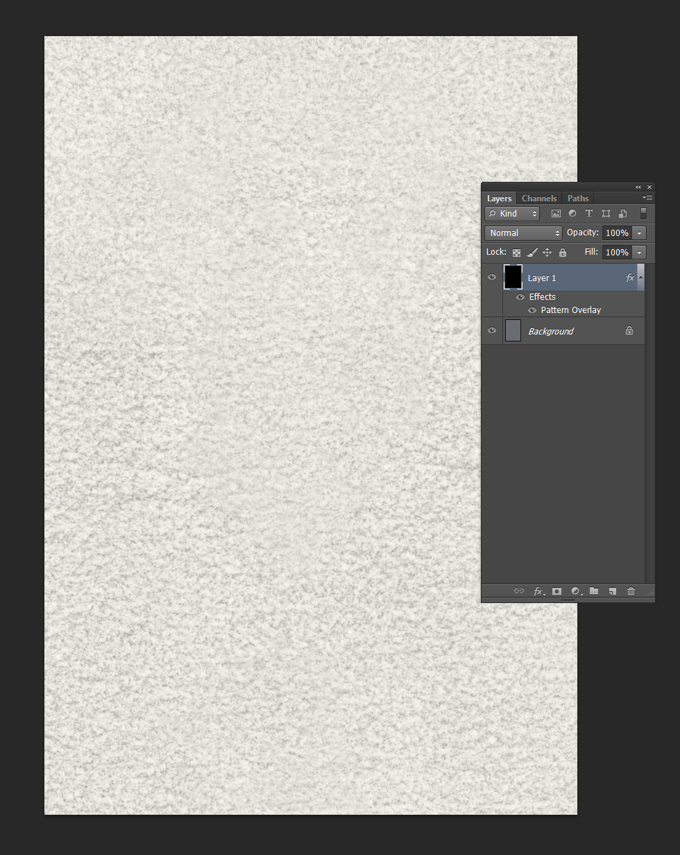
Click ‘OK’ and……nothing happens! But worry not, it’s all according to the master plan. Layer Styles like this are masked by default. The texture will appear wherever you paint within the layer. Since we want a texture over the entire surface, go ahead and fill the entire layer with black and hey presto, we have our texture!
At this point I recommend going back into the Layer Styles menu and adjusting the scale of the texture. The ideal scaling here depends heavily on the specific texture used in your PAT file—for mine, I generally find that 55% or lower is ideal, so experiment with the texture you’re using to find the right scale for you. Lower scales result in a finer texture that allows more detail, but is less noticeable and risks visible tiling. Higher scales risk creating a texture that is much too large and distracting, and will prevent building detail and definition in the image. Experiment with different scales to find one that suits your individual texture and project–this is where the principles we discussed earlier will come to your aid.
Step 4: Shadows
Now for the really cool part. The “trick,” such as it is, to emulating a physical surface texture lies in the “physical” part. A real textured surface is made up of both shadows and highlights, and so step one is to create the shadows.
Make a copy of your texture-filled layer (Select all, then Ctrl/Cmd+Alt+C) and paste it down onto a new layer, then hide the texture fill layer. For this step we just want the texture, with no layer styles or anything else attached. If your texture has any color color in it, go ahead and use a Hue/Saturation adjustment (Ctrl/Cmd+U) to convert it to greyscale. Make a copy of this new layer, then turn the copy off—this is what we’ll be using for the texture highlights in the next step

To create the Texture Shadows Layer simply set the first of these new layers to Multiply. Things will likely be a little dark and muddy at first, so use a Levels adjustment (Ctrl/Cmd+L) to lighten and bump up the contrast of the texture where needed. The exact amount of adjusting needed will depend on the specific texture you’re using, so spend some time pushing the sliders around until you have something that works for you.
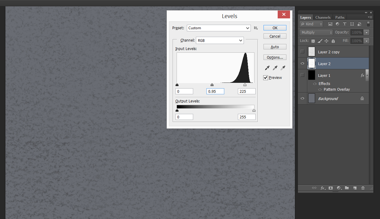
Depending on the texture, you may want to adjust the opacity of the layer so that the texture doesn’t become too overpowering. And there you have it! Onward to the highlights!
Step 5: Highlights
The process for this one is nearly identical to the last one. Turn on your other copy of the texture layer, and set it to a lightening layer mode. I’ve found that Color Dodge is usually best for this part, but depending on the texture you’re using, you may also get results with Screen or something similar.
Odds are good that once you did that, everything turned bright white. That’s good! The retina-searing brilliance means it’s working. Once again it’s off to the Levels command. This time we’ll be moving the values in the opposite direction from what we did with the shadows layer. Use Levels to coax the texture down from uniform white to something that resembles a light version of your shadows layer, forming the highlights of the textural overlay.
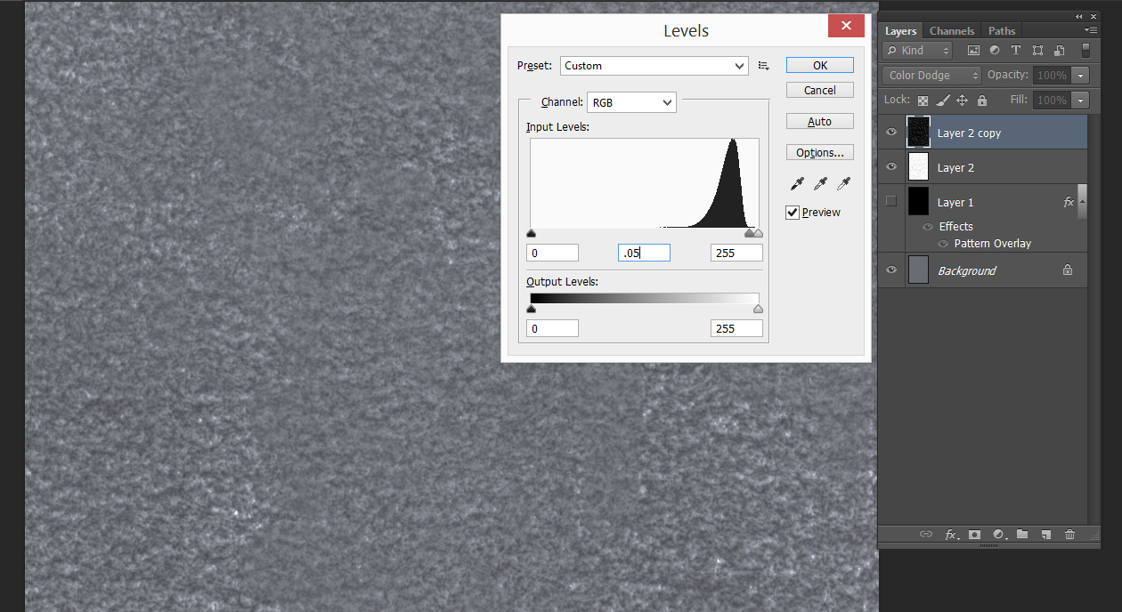
As before, adjust the opacity to an appropriate level, and we’re done! Throw the texture layers into a layer group, place it at the top of your Layers menu, and it’s smooth (or rather, not smooth) sailing from here.
One key point to remember is that in order to maintain the consistent appearance of surface texture, the entire painting needs to be done underneath these layers. In order to be able to paint normally, make sure to set your eyedropper tool to ‘Current & Below’ so that you won’t accidentally pick up bits of the texture overlay when sampling colors.
Step 6: Brushes
I’m going to cover this step fairly quickly, because frankly it’s one that to this day I blunder through via trial and error, and the finer points of brush creation could be an entire post in and of themselves. But there’s one key point that bears mentioning. Remember that PAT file we created earlier? That can be loaded into your brushes as well! I recommend doing so, then experimenting with different settings to create a few different brushes and erasers that have your new surface texture worked into them. If you sync up the scale of the brush texture with that of the original Pattern Overlay, you can create a fairly convincing approximation of the interaction between brush and surface texture in traditional media. Depending on the texture you choose, this may not have to be an exact match. I’ve found that the finer and more uniform a texture is, the more forgiving it is at this stage.
And that’s a wrap! A huge thank you to Dan dos Santos for inviting me to contribute to the blog, and to the entire Muddy Colors crew for all these years of amazing articles, tutorials, and educational opportunities. As a long-time reader myself, I can’t adequately express how honored I am to have the chance to contribute to the fantastic store of knowledge on the site. And thank you, readers, for taking the time out of your day to read through this article! If you have any questions at all, feel free to let me know in the comments. Onward and upward to the next painting!
Post Written by Micah Epstein


I’ve really struggled with replicating convincing textures in PS. This article has provided solutions for a lot of the problems I was having. Thank you so much for sharing.
That’s great to hear! I’m glad the article was useful–best of luck!
Whoa, a great one! Thank you 🙂
This was phenomenal! Very helpful information for achieving a consistent “finish quality,” and well articulated – thanks so much!
Really helpfull information and well detailed too. Thank you and thanks muddycolors
This post is so darn clearly written, and I love the balance of conceptual information (I’m going to be thinking about texture keys so much now) and practical tutorials. I also didn’t know that you could map textures to brushes – this is really exciting. Thank you so much!