One of the things I love about traditional media is its built-in texture. While digital artists have to go to elaborate lengths to achieve the grit, scratches, and subtle surface variations that mark a piece “finished,” the traditional-media virtuoso can accomplish the same and better by spilling the occasional cup of coffee on their workspace, and storing their paintings in the same drawer they keep the pennies in.
The downside, of course, is that not every assignment is going to be a good fit for that gritty, handmade look. There are times when I want to turn off my texture layer, just like the digital artists do, and upload something more polished. Especially infuriating, my favorite method of digitizing my traditional work — flatbed scanning — tends to exaggerate traditional textures in the least flattering ways possible.
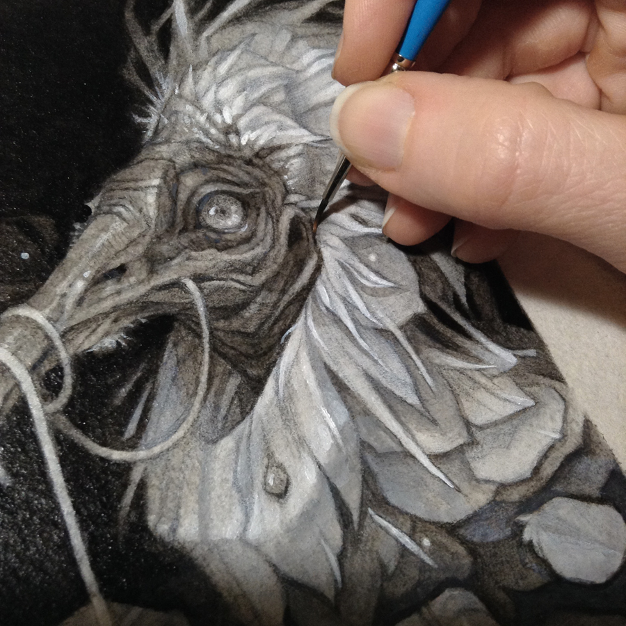
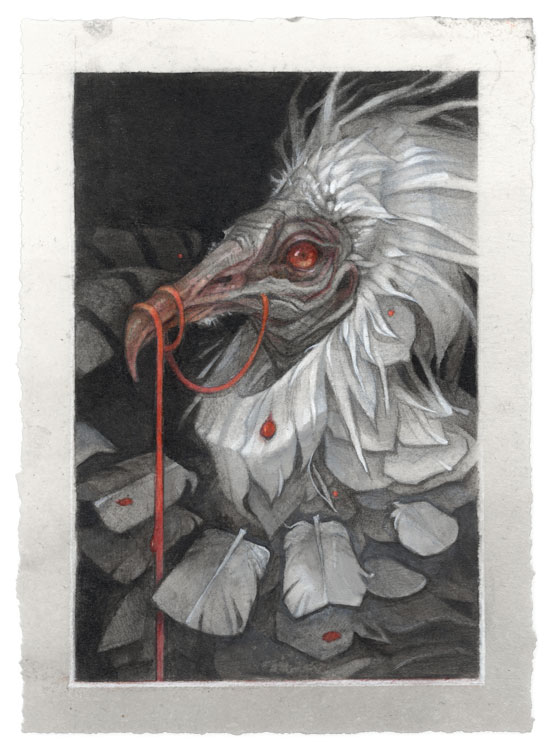
By way of example: here’s a work-in-progress shot of a painting on Arches watercolor paper that’s pretty true to life — you’ll notice a glimpse of the paper’s texture where the light hits the piece, but the details of the painting itself are still crisp and clean.
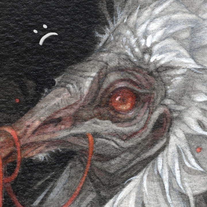
Unfortunately, my scanner sees things differently. Because it blasts the paper’s surface with intense, one-directional light, every little peak and valley of the paper ends up casting a shadow, which means the scanned surface will look much craggier than it does in real life (or in a photo). Here’s my scan of the finished painting (no changes from the progress shot above except for the addition of spot color).
The exaggerated texture is most obvious in the solid-colored background, but it’s also obscuring the fine details behind a grainy haze:
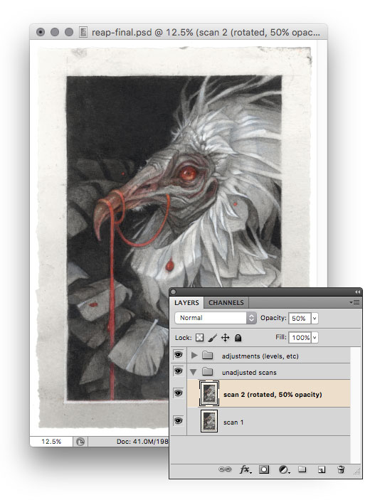
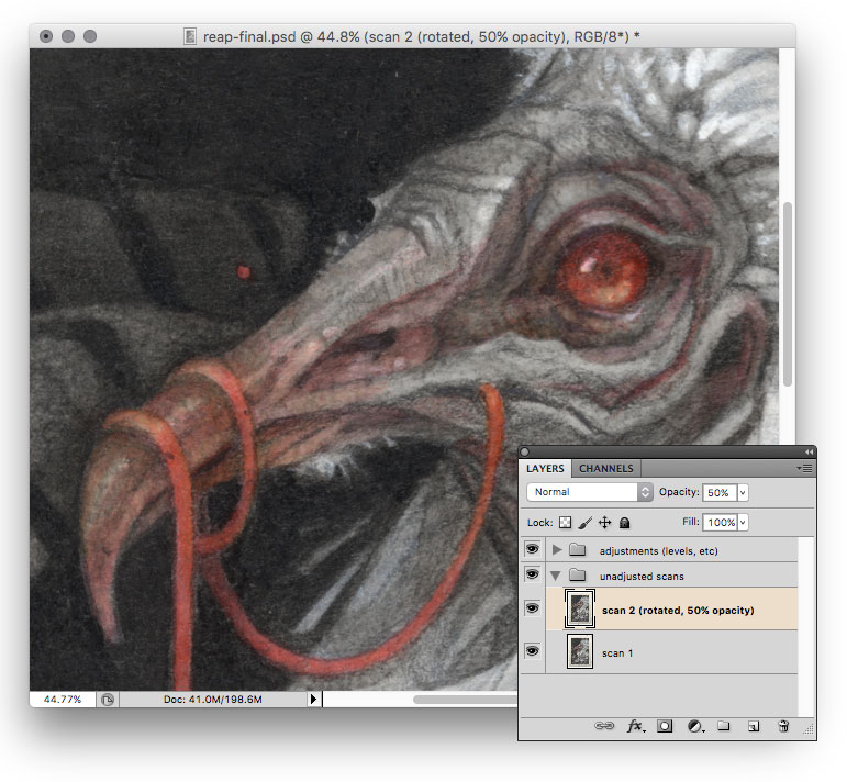
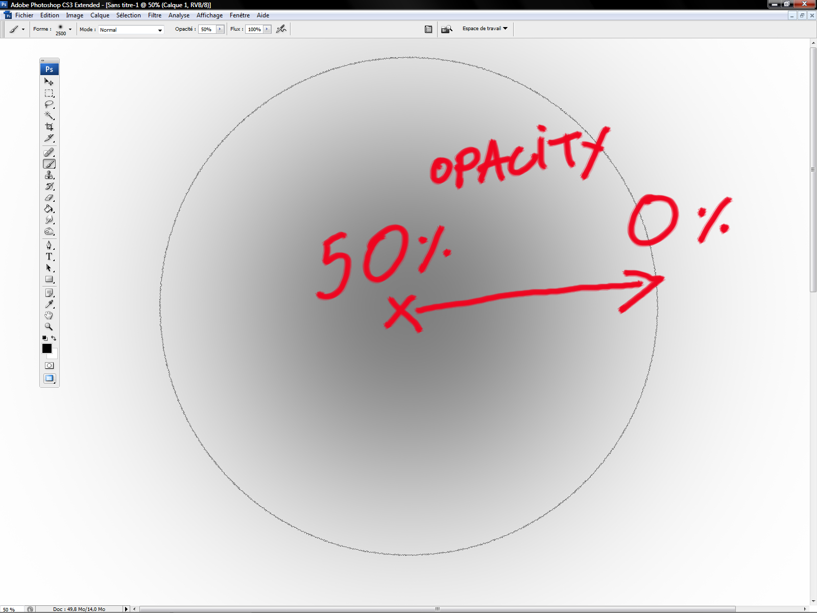
Luckily, there’s a simple workaround to this issue. The key is to scan your painting twice: once upright as usual, and once with the paper rotated 180° on the scanner bed.
Then, rotate the second scan so it’s upright and drop it into a layer of its own on top of the first scan. Set this layer’s opacity to 50%, and scoot it around as necessary to get it to line up exactly with the first scan (I’ll often draw faint registration marks (⦻) in the corners of a painting before scanning to make this a little easier.)
Further adjustments (Curves, Levels, etc) can be made on separate adjustment layers (Layers>New Adjustment Layer) over top of everything to avoid having to prematurely flatten your scan layers.
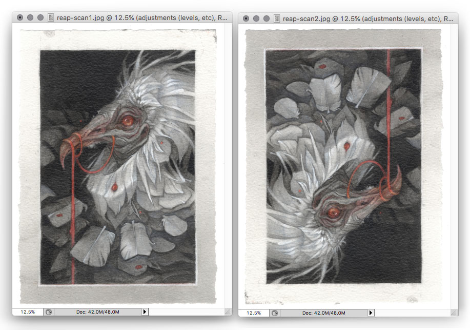
By overlaying the two scans, the textural shadows of one scan will cancel out the textural highlights of the other (and vice versa). For comparison, here’s my initial scan, with texture in full force:

…and here’s how it looks with my second scan dropped on top at 50%. You can see that the texture has been completely eliminated:
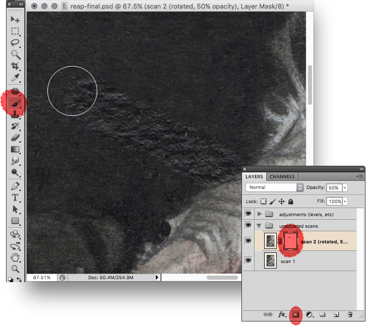
Of course, sometimes a little bit of texture in an image can be a good thing. I usually find the full 50% texture-cancelling layer to be a bit harsh; it tends to rob the image of its traditional-media charm, and it can draw attention to less-than-perfect paint handling. Fortunately, it’s easy to control the effect by adjusting the opacity of the second scan — I usually settle somewhere around 30%, which gives me nice sharp details while still preserving a hint of traditional texture. For even more control, you can add a layer mask and manually paint out any areas where you want to retain the original textured effect:
I’ve also found that this technique can solve some of the other annoying “tells” of traditional media (for example, the notorious sheen of graphite or the inconsistent gloss of unvarnished oil paints.)
And that’s all there is to it! Next time you find yourself in the lunchroom, maybe the digital artists will let you sit at their table.


Wow! I’m totally mind blown by this! I’ve been a digital artist for over 20 years and no one ever came to me with a simple solution like this.
It’s like when after a hole life eating avocados someone told me the easiest trick to remove the seed without making a mess.
Thank you so much for sharing this!
Amazing! I’ve tried all sorts of tricks to remove the texture, but this looks so much easier and so much better! thank you so much for sharing this!!
When you’re trying to line up the two layers, I find it helpful to set the upper layer to “difference” and then nudge it around.
Thanks so much for this post. I do like having a little texture in my work and your tips are great to get best of both worlds!
Hey, you had me with the original and that close up with the brush. Gorgeous work. Some day I hope to be in a place to get one of your beautiful pieces. Is this one based on an Egyptian vulture? Magical work.
This is fantastic. What I am running into is some issues due to photomerge not being perfect. Since I am scanning multiple scans and stitching together with photomerge, things don’t quite line up when I place the reflected image on top. Thoughts?
I wish I’d read this a few days ago! I scanned some old photos for a coworker that has an almost leathery texture… not like normal matte photo paper texture. The scans looked like they were covered with tiny lint fibers. I didn’t think about trying to make an inverted scan to cancel the noise! I wonder if I can get the photos back to give it another try. Even if she’s okay with the final reprints, I just want to know if it works! 😀 Thanks!
What’s the best way to rotate the 2nd scan so that it overlay’s perfectly. Which free software is best for rotation? Any comments about Picolay for a free stacking app?