Recently, I parted ways with a painting that I liked very much. I considered it to be kind of a breakthrough piece where certain things really started to click for me with these nature paintings. Despite this being a good thing, It was hard to let it go, but it went to a good friend and I know it’ll be well cared for. It’s not always easy, but it’s cathartic to let go of pieces that you care about. With it gone, there’s space for new efforts!
Also had a conversation a few months back with an illustrator who’s opinion I respect greatly, where I was crying about how my tree paintings never seem to garner much interest with collectors, and he suggested to me that perhaps I should try painting them larger. Bigger paintings have more of a presence, and with this nature themed stuff in particular, a larger format could help pull to the viewer in a bit more effectively.
So when I was scheming on what to paint next, I thought it might be fun to paint a scene similar to the painting I recently parted with, only BIGGER!
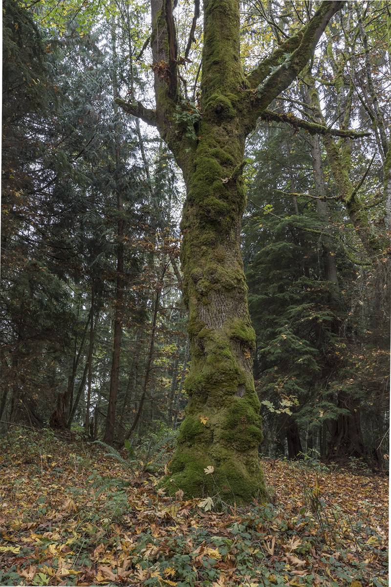
I waited for an overcast day, and walked around the tree until I found new angle that I liked. I framed it up similarly where the trunk is the central element, and shot a bunch of reference.
The first painting is fairly small at 12×24 inches, so I thought it’d make sense to roughly double that to 32×48- a little bit wider but still vertical and very similar framing.
It came down to a few shots I liked so I ended up combining elements from a few different photos, but this is the main one I worked off of.
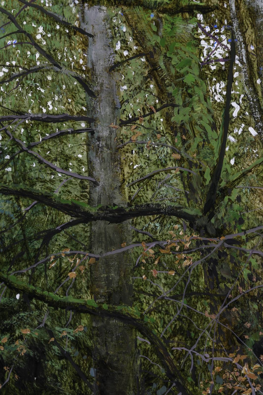
Started out with a light pencil under drawing where I’m really just concentrating on contour shapes and getting elements framed up the right way.
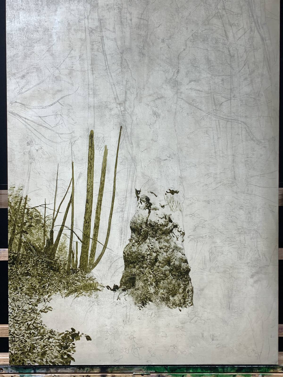
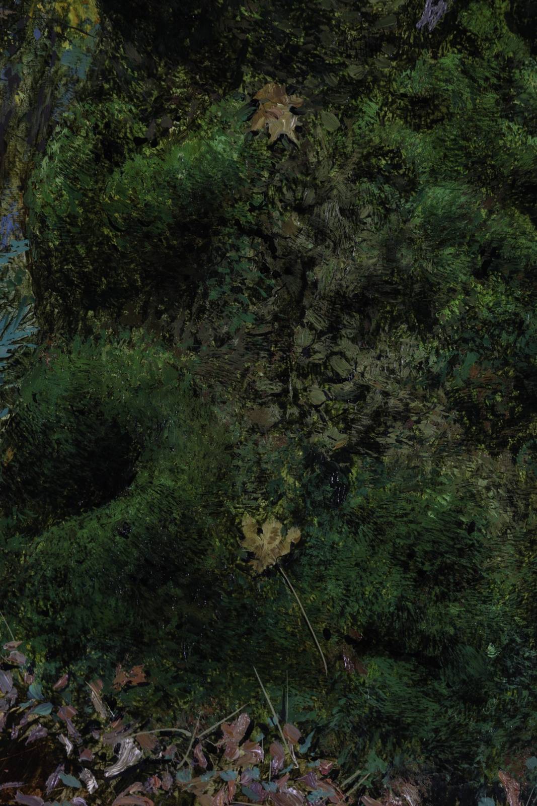
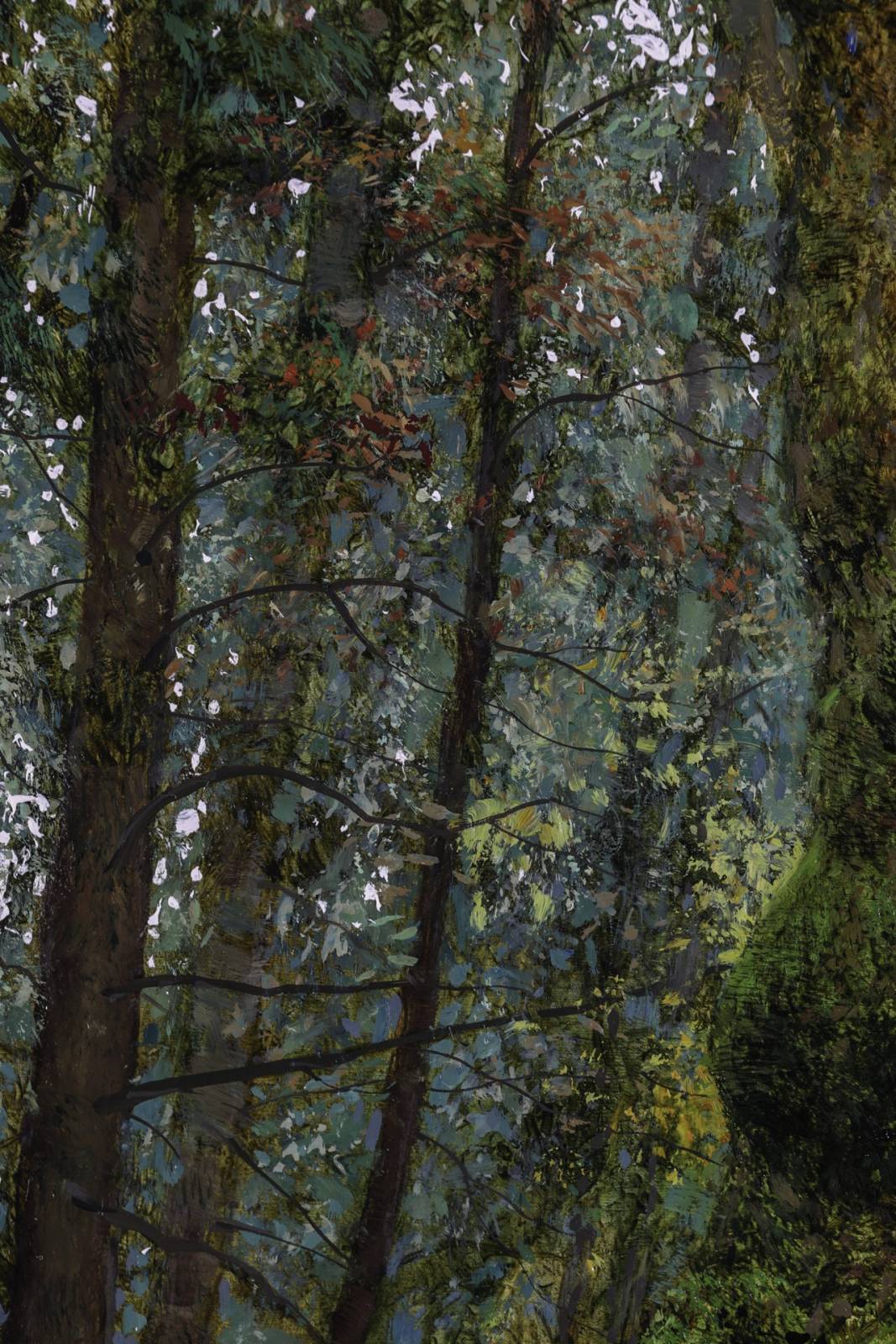
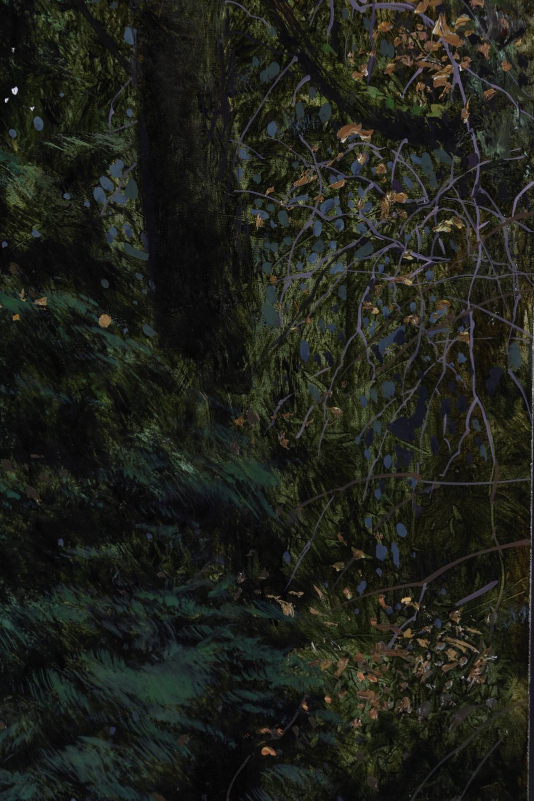
Used olive green and refined linseed oil to lay in my under painting. I use a lot of hogs hair brushes and silicon scrapers to push the paint around and get a good variety of edges and textures. This is the hardest part because I’m pushing hard to get a good solid foundation in which I can build up on top of.
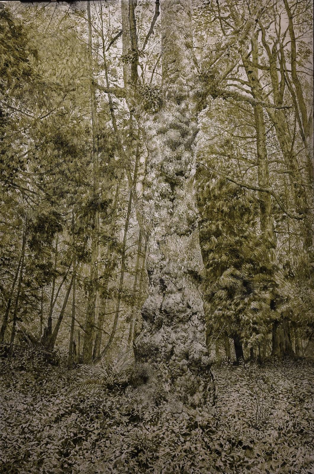
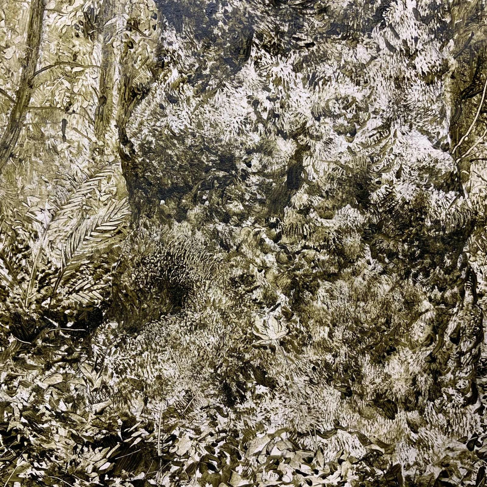
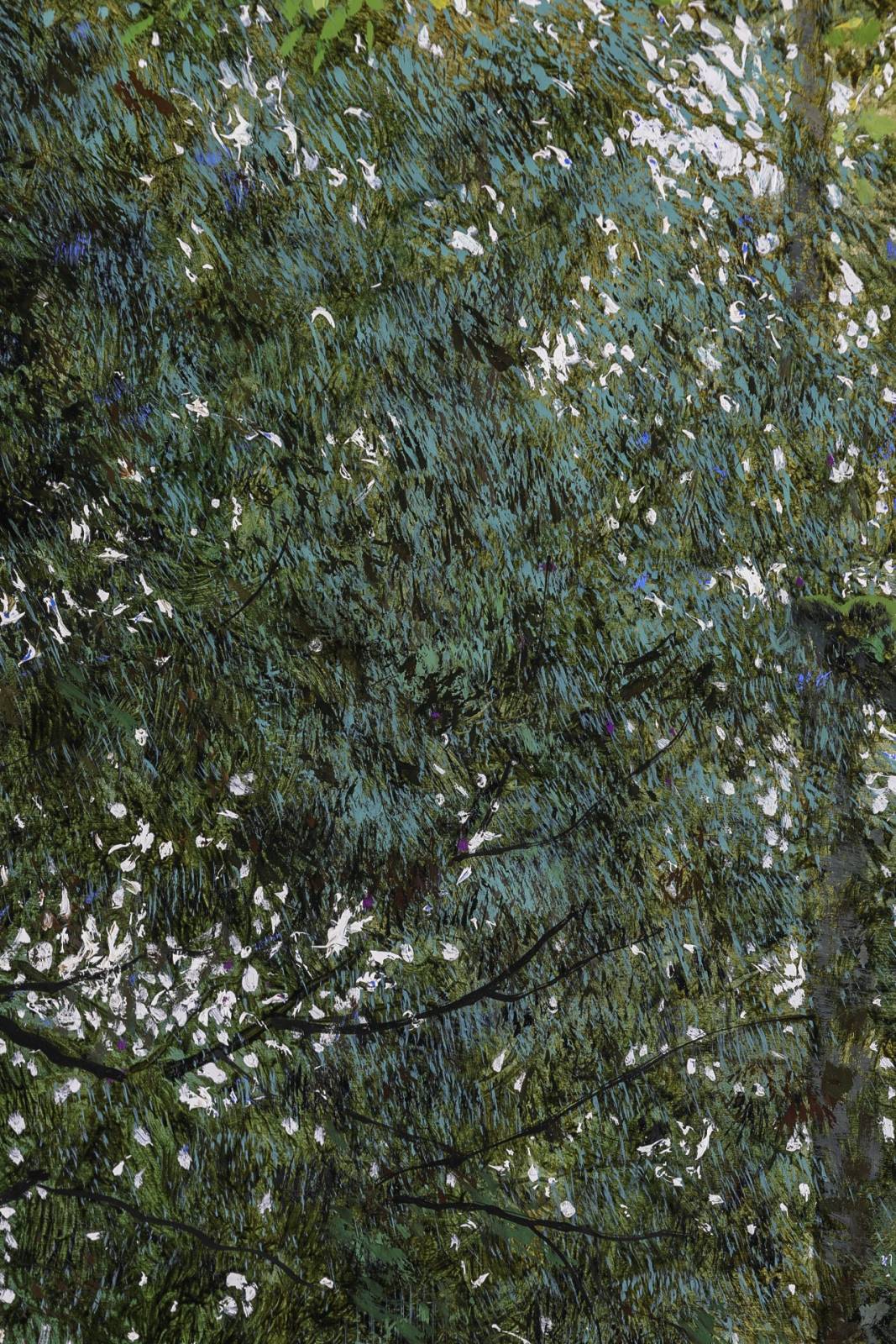
After the underpainting is dry, I’ll glaze transparent colors in. I often do one pass where I’m dropping in local colors, and then another shadow pass to help pronounce the forms and lay in the softer shadows. I use olive and pthalo green, Indian yellow, Payne’s gray, alizarin crimson, and ultramarine blue for this stage, and usually mix compliments to mute the colors down a lot so things don’t get too day glowy.

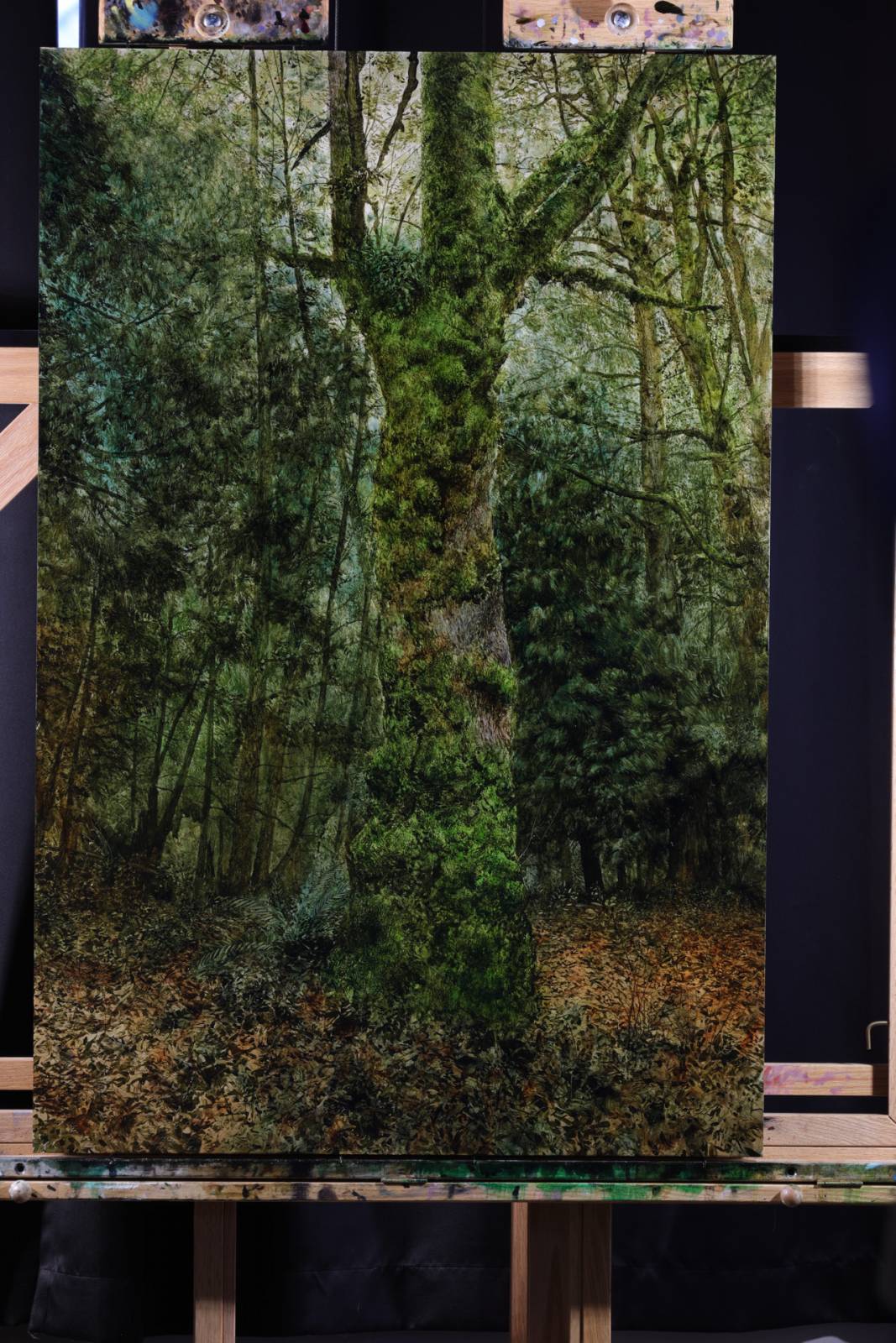
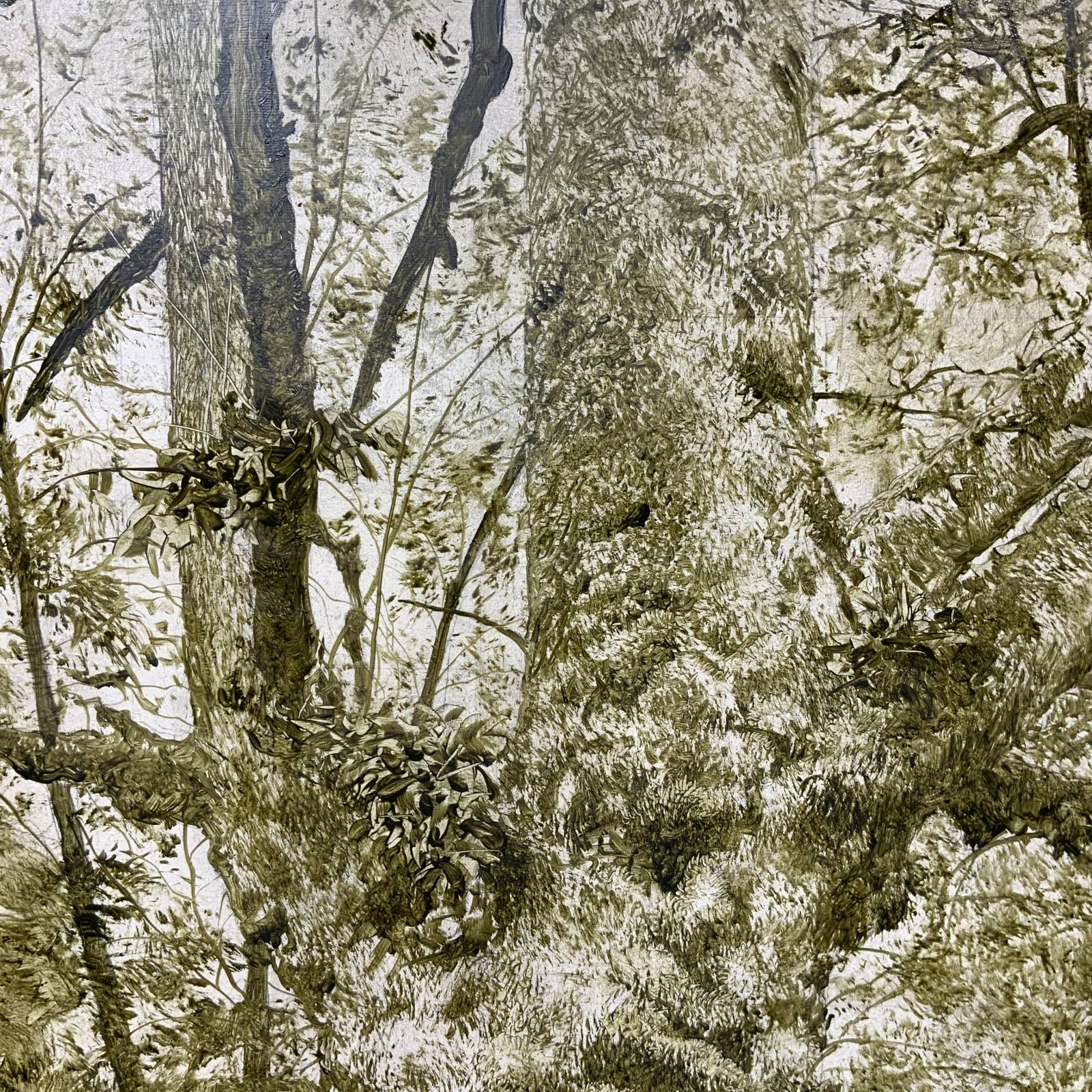
Then it’s off to the races with the opaque paint. With a solid underpainting I can work on refining and often times even dialing back textures and surfaces. I try to let mark making do most of the work, as opposed to doing a lot of form rendering. I put a lot of thought and effort into not repeating myself and finding the right stroke to best describe what I’m trying to say visually. Repetitive strokes so a lot to break the realism. Nature is chaotic and random, and its best to lean in and try to channel some o that. The further in I get with this stage the less actual painting I do, and instead it’s more about looking, measuring, taking my time with it.
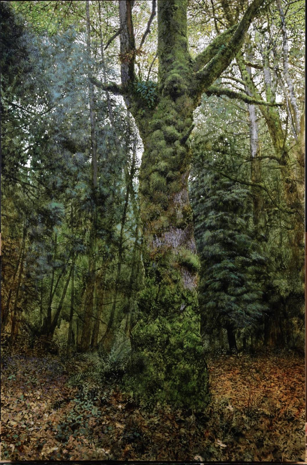

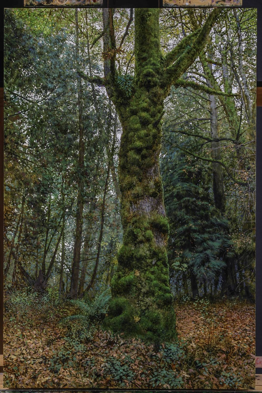
One of the things I enjoy about painting stuff like this is that because they’re such busy complicated images, I can’t possibly hope to knock one out in one or two sittings. For me this makes it easier to compartmentalize and work things more in stages without getting super stressed out about it. With our kids this young it’s a lot easier to work on things you can just pick at here and there.


I’m close to being finished with it, or at least I’m in the home stretch. I found it to be really enjoyable revisiting our big maple in the fall. there are things i still like about the first one, but there’s also stuff I like about this new one too. I try not to compare paintings too much because each one is its own journey, and in the end takes on an identity of its own. had a lot of fun with both and thats the most important thing.
Hope you all have a wonderful Holiday, and all my best to you in 2020.

Justin, I really love your nature/tree paintings. I am an artist, and a relatively new collector, but serious. would you be willing for me to visit your studio and look at a few of these in person? If so, please contact me at Divanthompson@gmail.com.
These are so incredibly beautiful! I love the detail, the rich brushwork, the feeling it evokes, it’s all so GOOD! Thanks for sharing your process.
Mind-blowing. Amazing work, Coro! Your discipline is inspiring!
Painstakingly, incredibly detailed piece. Thank you, Coro, for your patience.