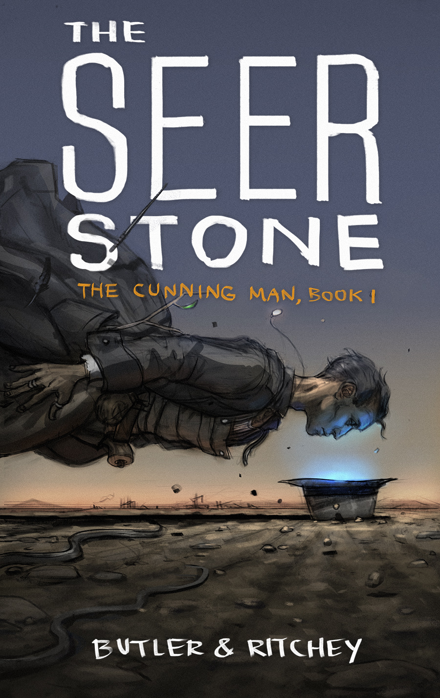
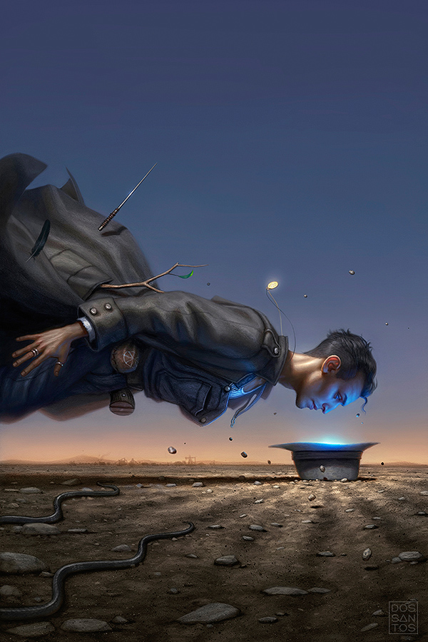
Here is a cover I recently painted for ‘The Cunning Man‘, a novel by D.J. Butler and Aaron Ritchey, published by Baen books.
The story takes place in Depression-Era Utah, and follows a man named Hiram Woolley. Hiram is a man with mystical abilities derived from the commonsense application of Scot-Irish folk wisdom and German Braucher magic. He possesses an arcane Bloodstone that allows him to see a lie the moment it is spoken.

I felt like this book had a very unique blend of magic, religion, and superstition, set in early America, that resulted in a really cool vibe, not quite like anything else I’ve had a chance to illustrate. For whatever reason, that sensibility immediately evoked a sense of light and color in my imagination. Something about my notion of the West, and dusty mining towns, is intrinsically tied to a certain quality of light to me.
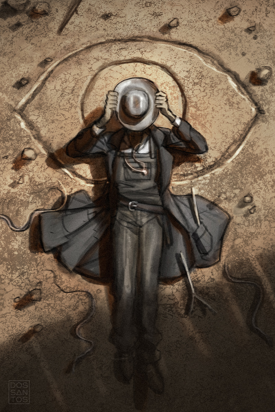
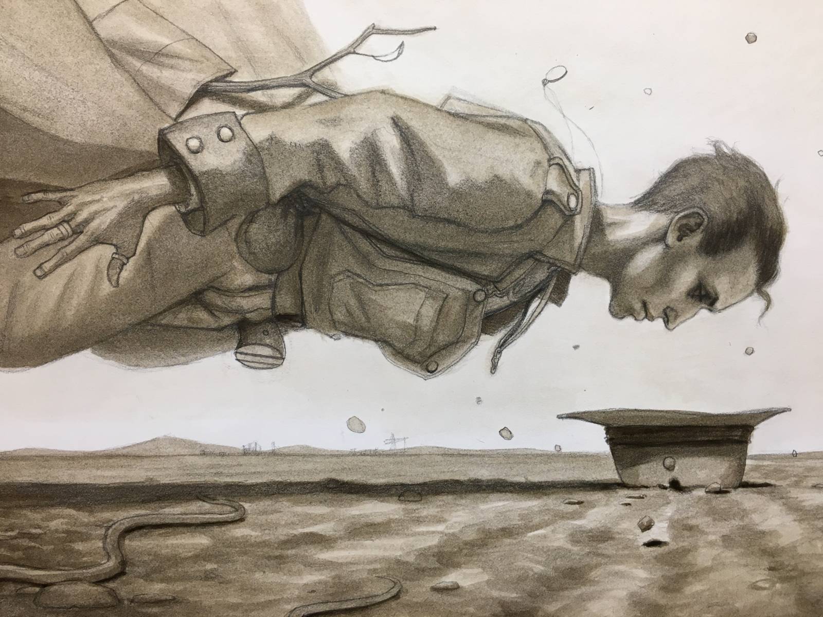
Because of that, I sketched with a lot more attention to color than I typically would at such an early phase, just to make sure I was getting the feeling I was going for. Here you can see some of the sketches I submitted to the client.
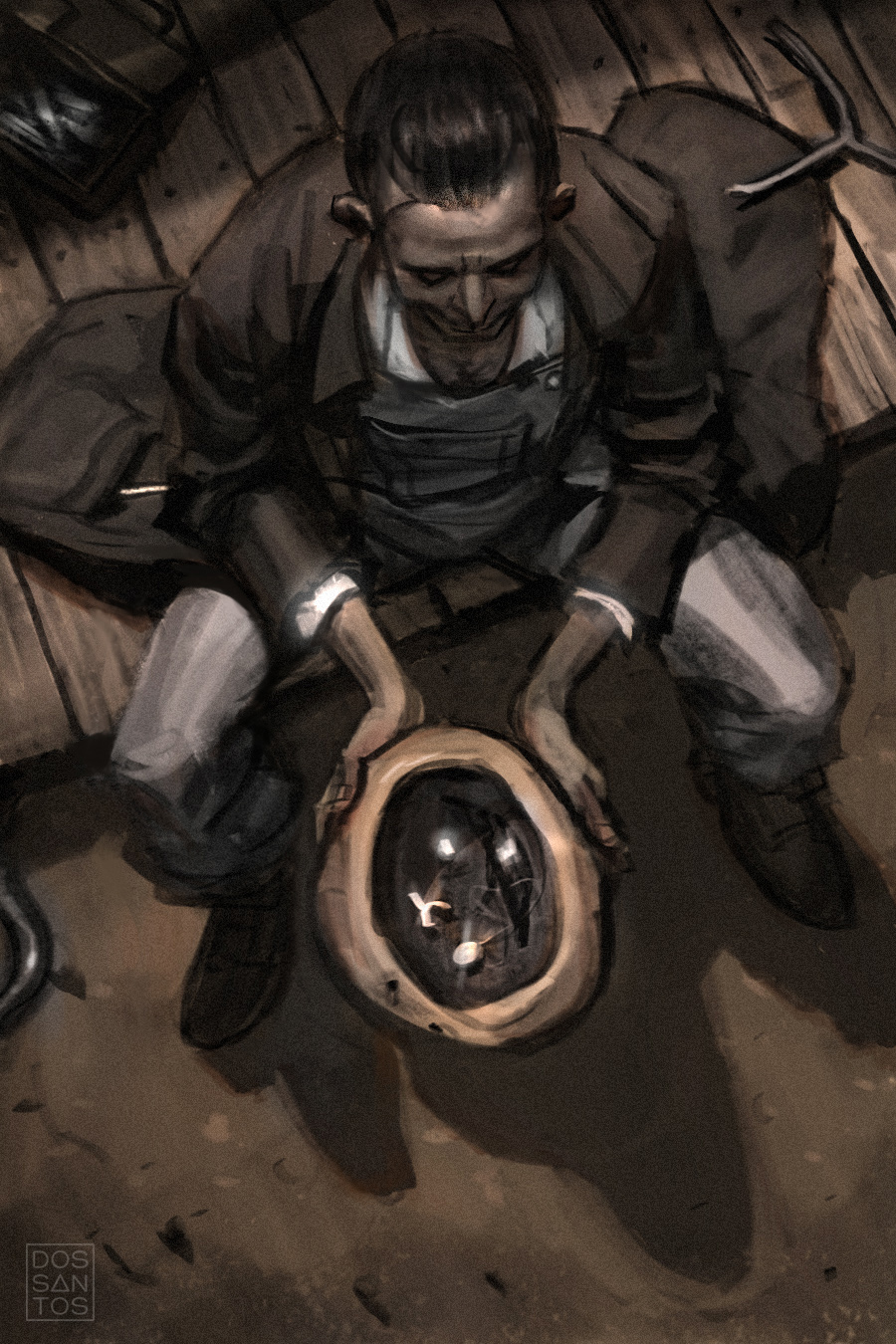
Hiram can also use a Seer Stone to turn his hat into a ‘portal’ of sorts. When he place his hat over his face, his face emerges on the other side in a different realm, where he can speak to demons and the like.
I really liked the notion of a something so small being a gateway to something so much larger, and more magical. It also served as a wonderful vehicle to depict something supernatural on the cover, helping potential buyers understand what kind of book they purchasing.
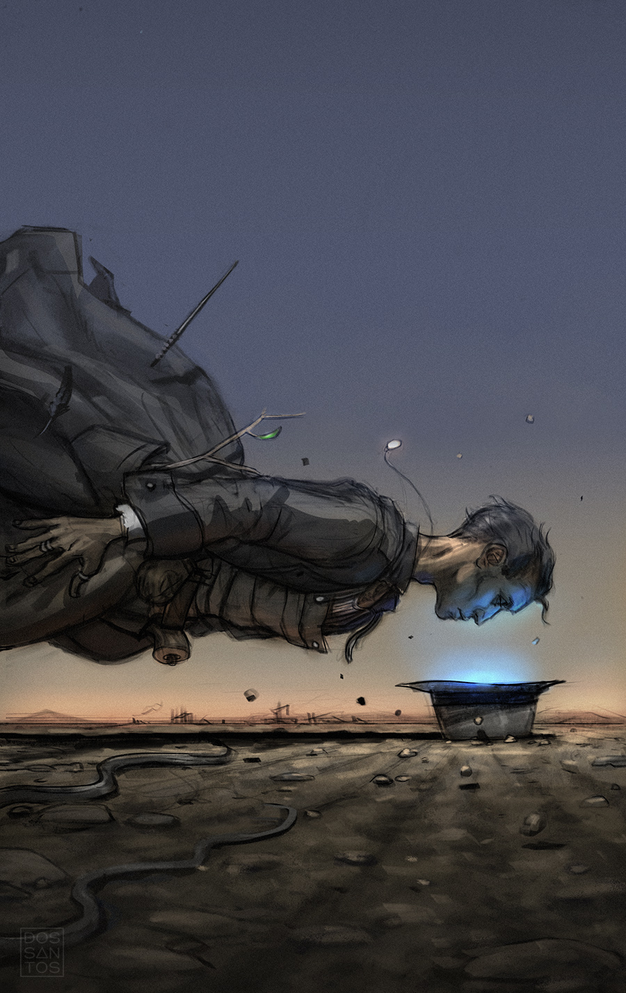
The client chose the last sketch, of Hiram floating about his hat, which I was really pleased with. Although there is something I loved about every sketch, I felt like this one would make for the most eye catching cover.
I also liked some of the distorted, almost comic book-esque sensibilities that the sketch had. I decided I wanted to keep that sensibility and not make the final feel too realistic. So rather than do my typical photoshoot, I simply took a few snapshots to aid in some problem areas, and trusted myself to draw most of the image from imagination.
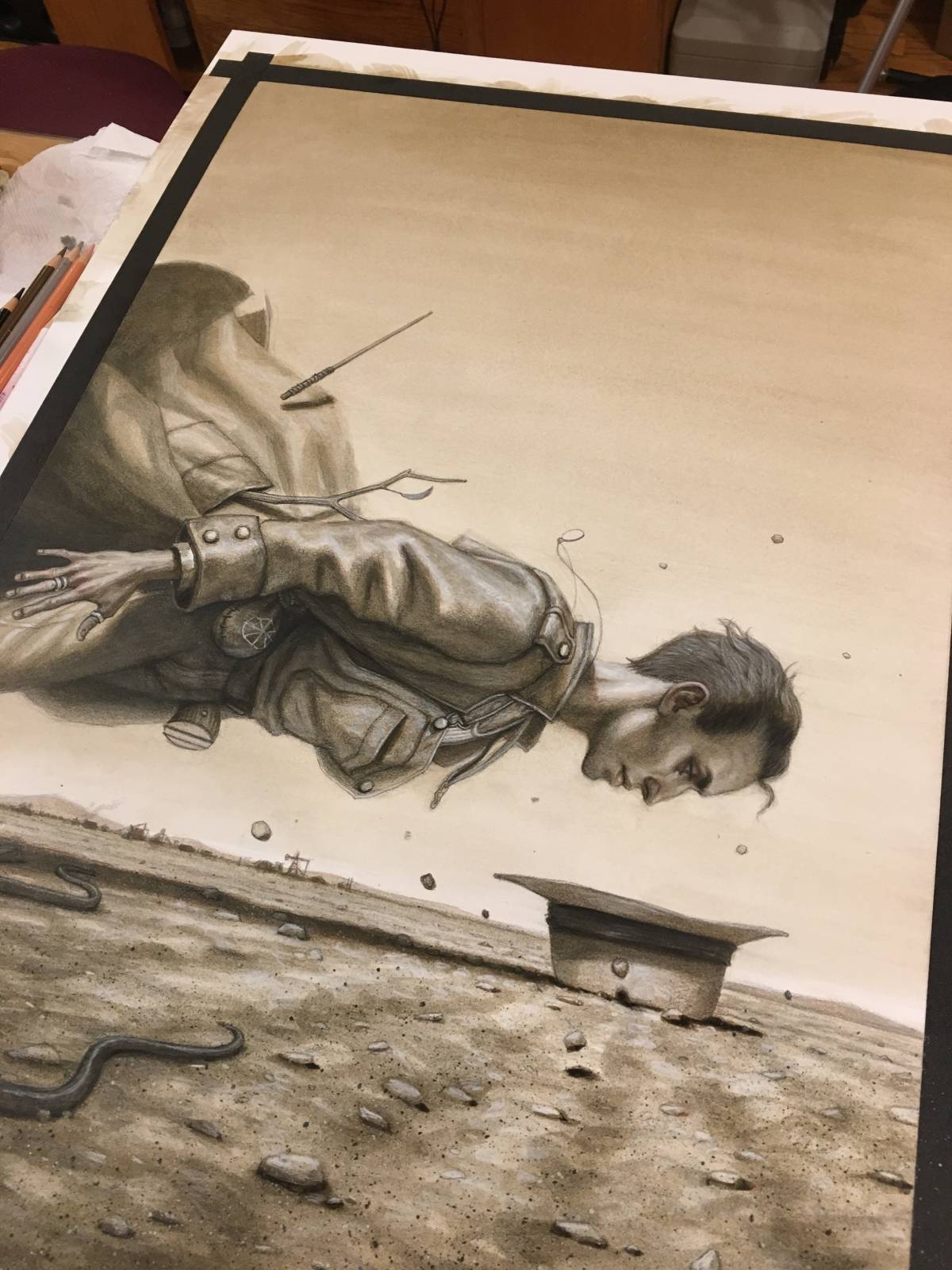
I started with graphite on illustration board.

Once I have the drawing refined enough, I often times start with a few washes of sepia acrylic, just to establish a sense of value, and also help conceal some of the rough graphic texture.
I’ll keep developing these washes until I start to establish an overall value schema to the piece.
From here, I finished the painting off with a combination of oil painting and digital painting, resulting in the finished piece you see below.
Thanks for reading!

I have often wondered after seeing contributors posts here of COVER ART, whether you read the book being illustrated, or if you are just given a summary or outline of it’s content.
Also, if the material is interesting to you personally, does it have an influence on the ease in which you arrive at a finished concept ?
So you paint right over your drawing, Dan? I figure you coat it first, to avoid smearing and the oils don’t seep into the board? This has sold me on the book BIG TIME. Just gorgeous…
Terrific piece. Thank you, Dan.