For me, one of the hardest parts of any assignment is the sketch phase.
Early in my career, I alloted myself far too little time to do concept sketches, thinking that because they are so loose I can do them quickly. When in fact, they are the most important phase of an assignment, and often times demand more time than the final rendering. If I rush a concept, I frequently find myself rendering a piece for days on end, all the while knowing that it will never be successful because my plan was flawed from the start. Over the years, I have learned that lesson the hard way… repeatedly. Now, I try to spend a minimum of 2 full days sketching concepts. If it takes me 4 days before I come up with something good, so be it.
When I sketch, I am not only looking for an interesting image, but for something that really captures the flavor of the story. Of course, everyone’s tastes are different, so what I find appropriate does not always work for someone else… most importantly, the Art Director.
Over the course of my career, a lot of sketches that I really loved have fallen by the wayside.
Either the AD felt they did not make as strong of a cover, or would not have been as good for sales, or maybe they just didn’t leave enough space for type. Whatever the reason, they get rejected, pushed aside for an alternate concept that simply out-shined them on that particular day.
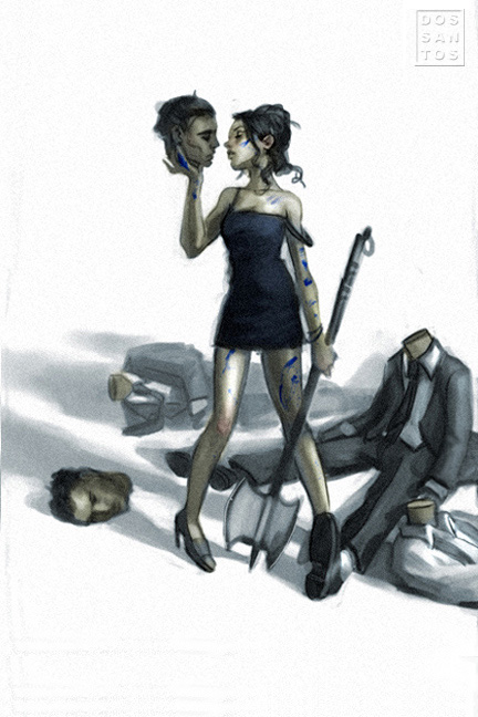
I always tell myself that I will revisit these ideas, but it is very rare that a new assignment comes along where a pre-existing sketch would actually be appropriate for it. So, instead, the sketches sit, as clumps of kilobytes, digital dust-bunnies hiding in some remote corner of my hard drive. For this post, I’d like to dig up some of those sketches, and share with you what some past covers might have been had the AD simply decided to go this way instead of that.


how many thumbnails will you work on before taking them to a concept sketch? do you work back an forth or make a giant pile of thumbs and keep picking ones that might work to work up a little more into concept?
Really, really love the alternate concept, bummer it wasn't chosen!
I'm a big fan of concept art too so thanks for posting a few here Dan!
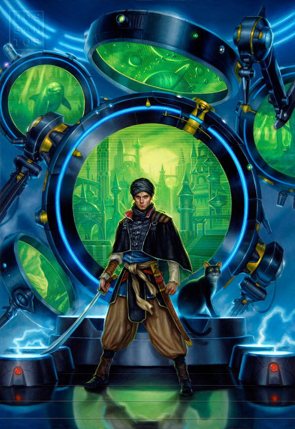
I like that “Implied Spaces” Alt-sketch as well. Nice, edgy mood there.
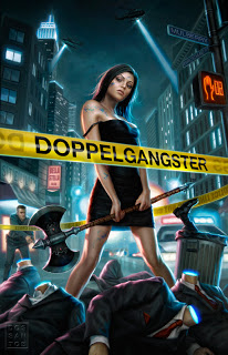
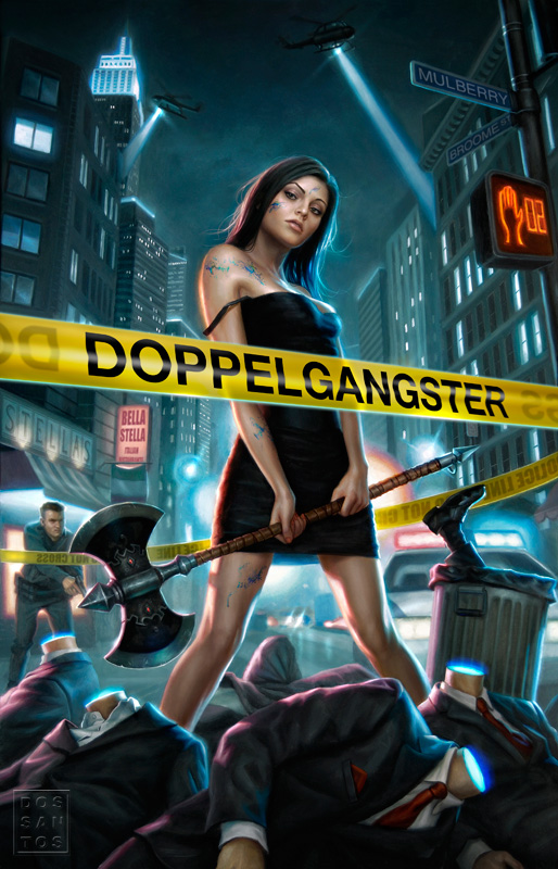
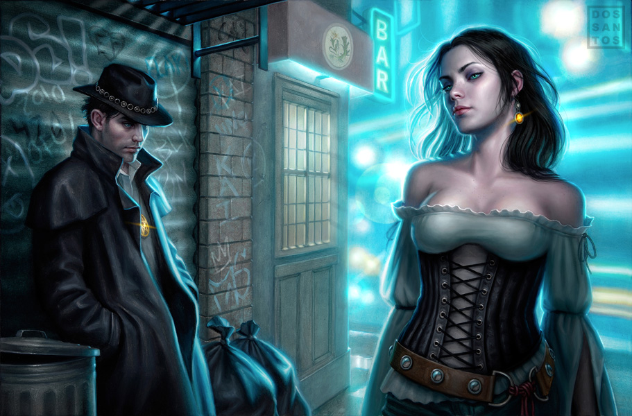
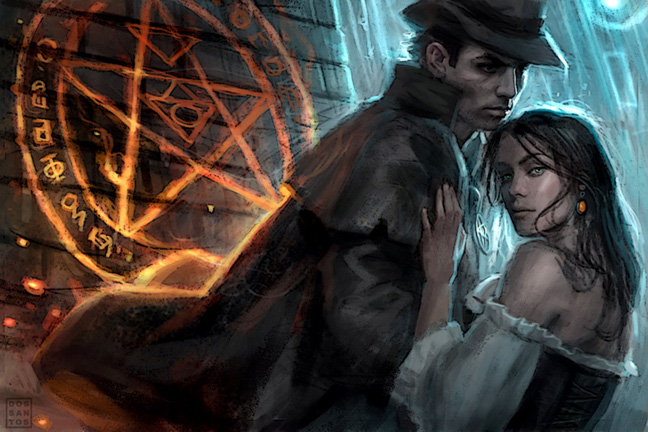
The Jim Butcher cover is intriguing… Is Harry getting a spinoff? I wouldn't be surprised. Butcher is a CRAZY FAST author.
I'm a huge believer in thumbnails. I get really jealous of those artists and illustrators that have those sketch books with beautiful near-completed works throughout because my bound sketch books are dominated with feeble 2×2″ thumbnails.
Also, you always have awesome work.
@Aaron:
I work back and forth.
I basically stare at my computer screen until something magically appears in my mind's eye.
I start to sketch it out VERY roughly (just an over sized thumbnail), and within a minute or two, will know if it needs to be abandoned or not.
If so, I sit and stare again. If I like it, I render it out.
When completed, I start the same process over again; stare, scribble, polish.
This usually goes on for 3 days.
It's really interesting to see the alternate versions! Thank you for sharing. 🙂
Dan,
Hello! The Harry Dresden painting is completely awesome! The lighting behind the female subject is great! Cannot wait to see your work up close again at Illuxcon!
Cheers!
V. Villafranca
Dan you are King of sketches! I want my finishes to have the same energy and smarts as your first attempts.
I like the concept sketch for the anthology much better than the one they chose! The contrasting warm/cold light and the stronger relationship implied by the figures being together, very compelling.
Thanks, was insightful.