-Dan dos Santos
Thanks to everyone who decided to take part in our first ‘Crit-Submit’. We received close to a hundred submissions. I looked through all of them, and they varied greatly. Some of you are just starting out, whereas others of you are obviously at a professional level. I really enjoyed all of them regardless, and appreciate everyone’s interest.

A few of the Muddy Colors guys were a little apprehensive about publicly criticizing someone’s work, so I decided to do this round. It was also my big mouth that spouted out the idea in the first place, so I guess it only fair that I be the first to step up.
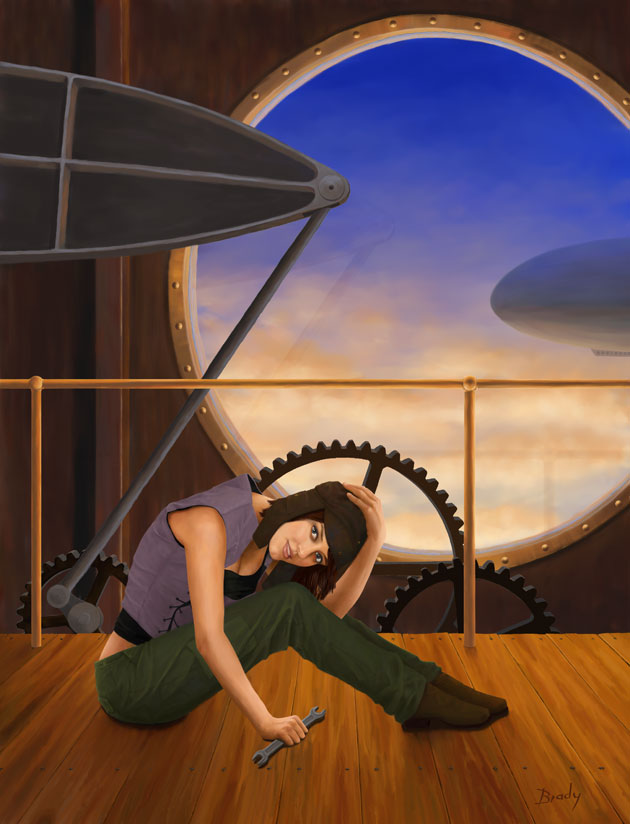
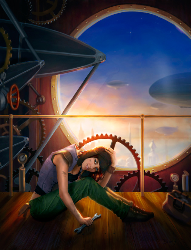
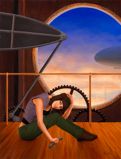
The piece selected belongs to Brady Allen.
A few things struck me as needing improvement right off the bat. Compositionally, the piece is quite empty. The figure does not seem well grounded, and overall, the image is a bit lacking in narrative. On the upside, all the makings of a really good piece are here. The face is beautifully rendered and the anatomy is spot on… so it really only needs a little tweaking.
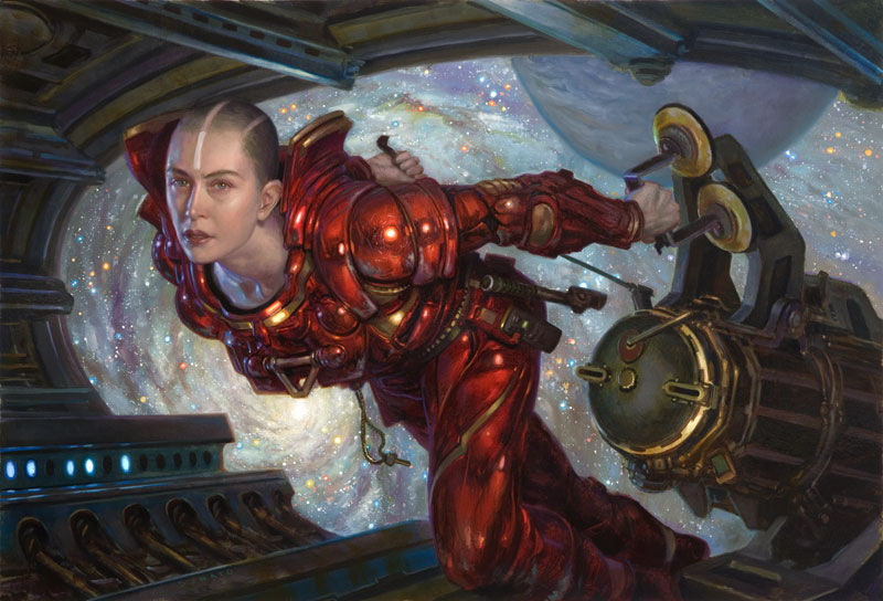 |
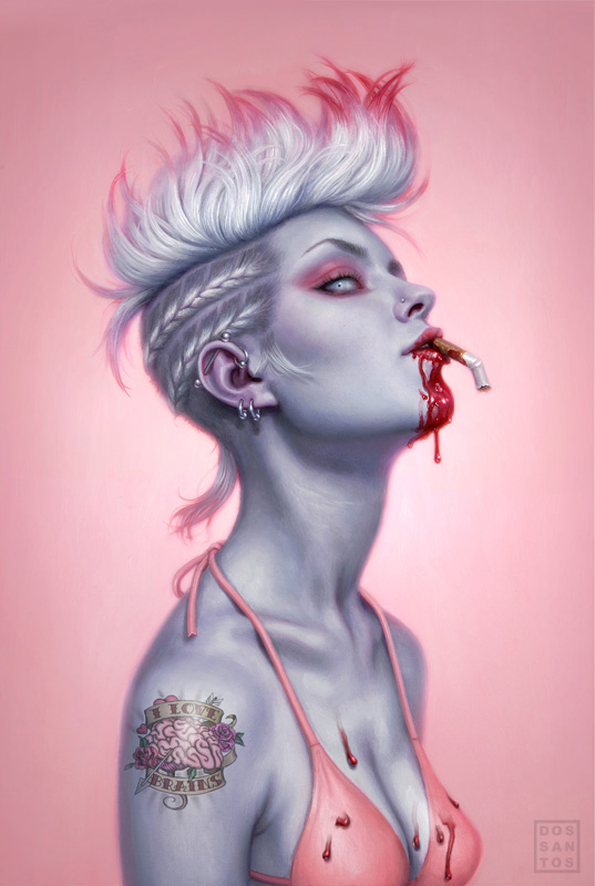
| Everything looks inadequate when it’s next to this painting. |
Firstly, let me clarify ‘narrative’. By definition, the purpose of any illustration is to tell a story. In many cases that story is quite obvious, like a big fight going on or something. Other times, the story is a lot more subtle. Take this painting by Donato for instance. The ‘narrative’ is an internal one. Despite all the super cool stuff in the background, the real story takes place in the woman’s mind. We immediately focus on her, and put ourselves in her position. Temporarily experiencing a slice of her life, we wonder ‘What is going on in her head?’ But in order for a picture to do this effectively, it needs to entice the viewer into her world. We need cues that help us feel like we know what her world is like. That is the purpose of her environment.
In Brady’s painting above, we assume she is a mechanic simply because she is holding a wrench. But that doesn’t really tell us much. I want to know… Is this her daily job? Did her work day just start, or was it a long exhausting day? Is this gear something that requires constant maintenance and perhaps troubles her regularly? Is that blimp in the background part of her fleet? These are the things that help a viewer believe in the fantasy, and they are where your -true- narrative lies.
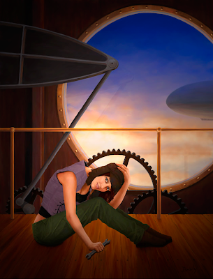
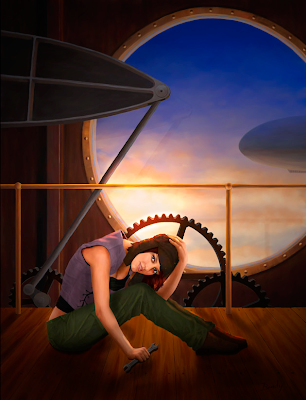
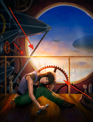
The first thing I did when painting over Brady’s piece was drop a shadow in the corners over everything I felt wasn’t important. The top-left of the painting is attracting a lot of attention, and it doesn’t need to. By darkening up these areas, we keep the focus on the character, and we also add more mood to the piece. I also dodged the sky behind her head for these same reasons.
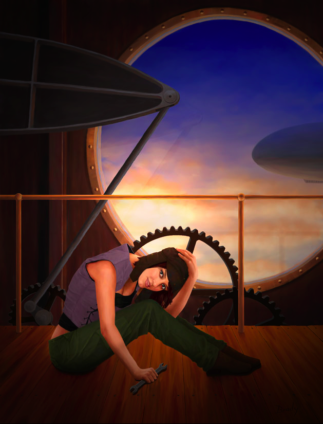
From the start, the gear directly behind the girl’s head was the focus of the piece. It had the highest contrast and sharpest edges. Reestablishing the values in the previous step helped this somewhat, but not entirely. So I decided to blow-out the gear a bit, and add some of that newly established light source on her body as well. I also added a shadow near her hand so that it seemed better grounded.

Once I reached this stage, I could really start to see what the piece needed. Mostly, it just needed ‘stuff’. There is too little to look at, so nothing really holds the viewer’s attention very long. Those big cogs are large, uninterrupted shapes, and so they command a lot of attention. By adding a LOT more overlapping gears we can add some additional interest and break up those big shapes, thereby making her face and the window the only real resting spots for our eyes. It also presents the opportunity to have some of these new gears point to the character’s face, further drawing our attention to her, and helping balance out those other angles.

Everything else was added for the sake of narrative. If she is a mechanic, make her dirty… put some gloves in her back pocket… make her vest look a little more industrial… give her a tool bag. Help us experience her life. Also, if you’re going to have a great big window there, you might as well put something interesting outside of it. By adding a few buildings and a lot more blimps, you now indicate a whole society. The viewer can better fill in the blanks about what her world is really like.
Normally, I would have added some decorative elements to the window, but that large empty space is an Art Director’s wet dream. It is the perfect solution for type placement, so I decided to leave it as is. Aside from that, a little tweaking of the color (which I felt was too warm in the shadows), and that’s about it!
Thanks for being our first guinea pig, Brady! I hope you find it more helpful than discouraging. The same goes for the rest of you. If you enjoyed the post, let us know, and we’ll try to do it again. If there is something in particular that you’d like to know that I didn’t discuss, just ask.

Wow! The changes added were so well explained, and the cover looks complete now. What a great service you are doing for your readers and fans. I'd love to see more of these in the future.
Definitely a helpful post for any aspiring illustrator; can't wait to see more!
This was incredibly informative and beautifully explained! I like the step by step paint-over a lot. It makes everything easier to digest.
Can I use this as an example during my school's Art Club's critique sessions?
Paintovers are always very useful, but you brought something extra this time Dan,
The explanation on why it's wrong in the first place, explaining how one think about ilmages and why we need to add other things.
Thats rare.
Useful to say the least.
Thanks!
Very useful information! I definitely want to see more of those posts!
Thanks Dan!
wow, just amazing, wonder if i can still have the chance to submit a stuff that i did and dont know what else to add ..just asking :p
This was incredibly helpful and informative. Thanks a lot.
One of the best and most constructive critiques I've ever read.
I must say I never thought of making part of a composition busy so that the eye finds a simpler part to rest on, very interesting idea, thank you.
That is one HELL of a paintover!
and this is the reason I sat back and watched the masters play during the Live Crit at IlluxCon. Well done and extremely useful
Awesome! Also a great choice of piece
Thank you for posting it.
There's always something to learn, even when you already work as professional illustrator.
Excellent post. I once sent Dan a jpeg of a piece I thought was finished and he graciously sent me a paint over. It's extremely helpful and I hope to see more of these posts.
I thought that this was very helpful. Thanks Brady! And thanks Dan!
That was an incredibly helpful post. However, you mentioned a certain term, type placement. If you don't mind, could you explain what the term means?
This was one of the best critiques I've witnessed yet, simply because you actually took the time to do a paint over that explained more in seconds than any amount of words ever could. As teachers and mentors go, you guys are top class.
Wow, this is awesome! Is it too late to send one of my pictures in?
Wow, what a great critique! The great thing here is that everybody learns a lot. Not just the creator of the image.
Thanks Muddies!
Very insightful indeed. Well explained from you sir Dan. Hope this is the beginning and more to follow on this kind of post
Encore Encore! It's been a while since I've seen such a thoughtful critique. Your expertise and willingness to help really shines. Please post more of these and often! 🙂
Fantastic post! Really insightful and helpful not only to the artist but to all us readers as well. Looking forward to seeing more of these in the future.
…and this is the reason I am so going to regret not being able to go back to this years IMC. Dan's and the rest of the faculty's critique sessions are invaluable. This post exemplifies what you get tenfold at IMC.
Thanks Dan!!!
Wow! That was amazingly helpful–very clear, to the point, and elucidating. Thanks for the time and effort you clearly put into this. Can't wait to see more!
I don't see any dream crushing going on. If anything, a dream come true! most of us wish this is what painting teachers actually did on a daily basis at school.
amazing post and fantastic paintover!
Wow, an awesome critique. You touched on some stuff i never really thought off. Thanks!
B
As stated, WOW. So awesome that you took the time to look at everyone piece. You really did a gret job Dan, and I'm sure Brady is ecstatic.
Great critique. I hope you guys continue to do this in the future.
Great crit Dan! As an aspiring Concept Artist you are really helping to bridge the gap between student, and professional. Sometimes a teacher will say to add detail, add more narrative…but to be able to see it done on a paint over…it is true learning.
Awesome job! Very insightful, helpful, and revealing. Paint overs always help everyone who reads them (and hopefully the one doing it too), thanks so much! I eagerly look forward to more!
Bibo, I believe Dan is referring to the words on a book cover.
Exceptional! Just exceptional. I am still constantly learning (as we all are) and this crit was wonderful to see. I love the fact that you took Brady's piece and showed him how to improve it without changing the camera angle, instead simply rendering further, adding light & shadow and adding elements & detail. It shows what a pro must think about (and do) to a piece to really make it come alive. I do wonder, though, how changing the camera angle would help, too — especially on the figure so she wasn't so much in profile (like your example of Donato's 3/4 angle view). Of course, that's a reworking which I wouldn't expect from a crit like this, but maybe a thumbnail sketch or two to explore that possibility would be fun to see. Not that I'm bitchin'. This was absolutely wonderful to see. More more more!
thanks a lot for spending your time for something like this!
I'm so glad you came up with this idea – there's nothing like visual learning. Seeing the change happen is different from talking or reading about the concept – especially since many artists tend to be visual learners. Thanks for doing this and thanks to those who submitted and were willing to undergo a critique like this!
Thanks for the crit DDS!
Can we get an art director to weigh in on if that window is truly a wet dream?
Makes me miss the IMC, and being in that “no BS” attitude of honest critique.
Great job, Dan.
Thanks for the critique Dan!
I finished this work last summer and I hadn't thought of it much since, but I wasn't 100 percent comfortable with it.
I'm kind of a minimalist at heart so adding extra stuff for the heck of it goes against my nature, but it definitely improved the story of the artwork.
You can see what else I thought about the critique over at my blog. http://bradyallenart.com/artrounds/?p=80
I love it. The steps and corresponding paint overs are immensely helpful. And the one flashing between the two at the end is great. Good things to think about. Are you going to critique more of the illustrations that got sent in or do another fresh call? Either way, I look forward to more.
Thanks everyone.
We will do another Crit-Submit -very- soon.
You will need to resubmit entries for every call.
If you want to submit the same piece again, that's OK too.
Dan,
Thanks for putting this post together. I found it very helpful towards my own Illustrations. I look forward to seeing more of these, and plan to submit to the next call.
Myeh…bwhahahaha.
Great critique. It was a real improvement to the piece. Your explanations very succinctly explained how to make an image interesting.
This critique is awsome! More, more, more of it! 😀 And thank you 🙂
“…but that large empty space is an Art Director's wet dream. It is the perfect solution for type placement…” hahahahahahaha!