By Jesper Ejsing
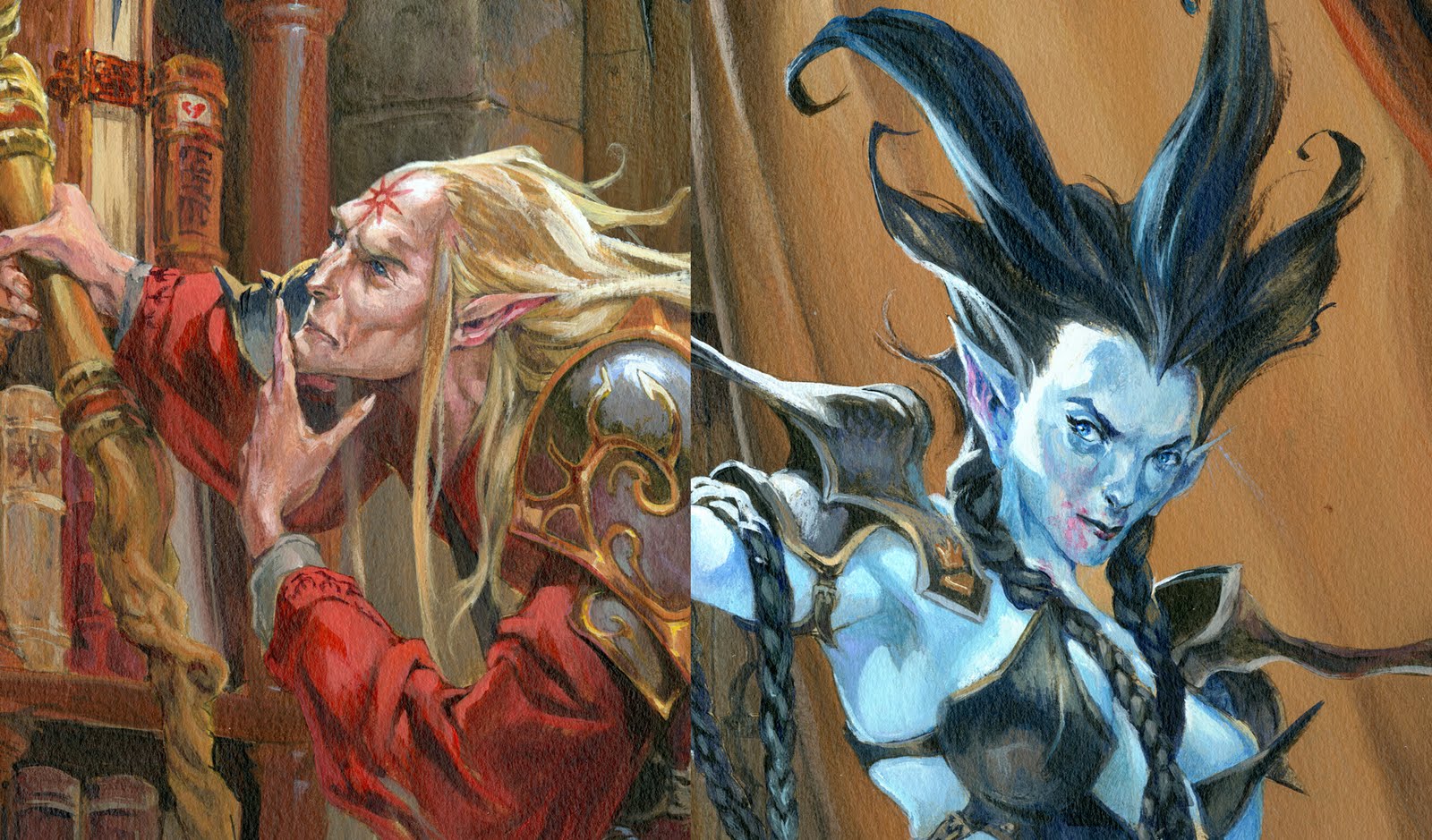
This here is a follow up to the cover I showed 14 days ago with the werewolf and the female fighter. The theme in this one is wizards.
This painting is a little favourite of mine. Because it shows a scene that you would know, if you have played just a little bit of role-playing games. It is the scene where you step into a wizards private champers and gets to loot all the books. The ones you are not supposed to see, the ones with hidden secrets and easy power, the ones that makes you a Bad-Ass. Well; all that of cause is only the background of the painting. The front and focus are 2 cool looking characters posing for the fantasy-camera.
The sketch is a product of those very precious and rare moments where it all sort of falls into place very early and very easy. As always when the thumb/sketch is done I retrospectively impress myself at how much, is already there, at this very rough and unfinished stage. And I only say that so confident, because I remember screwing it up too.
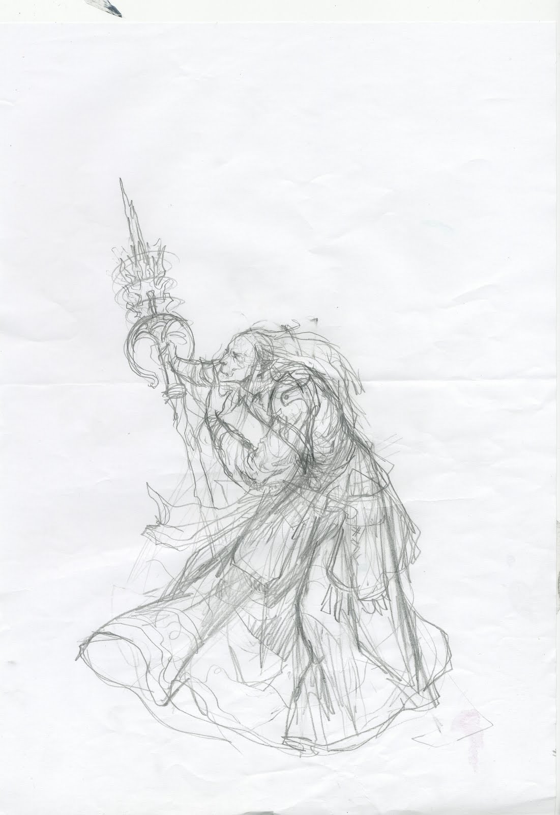
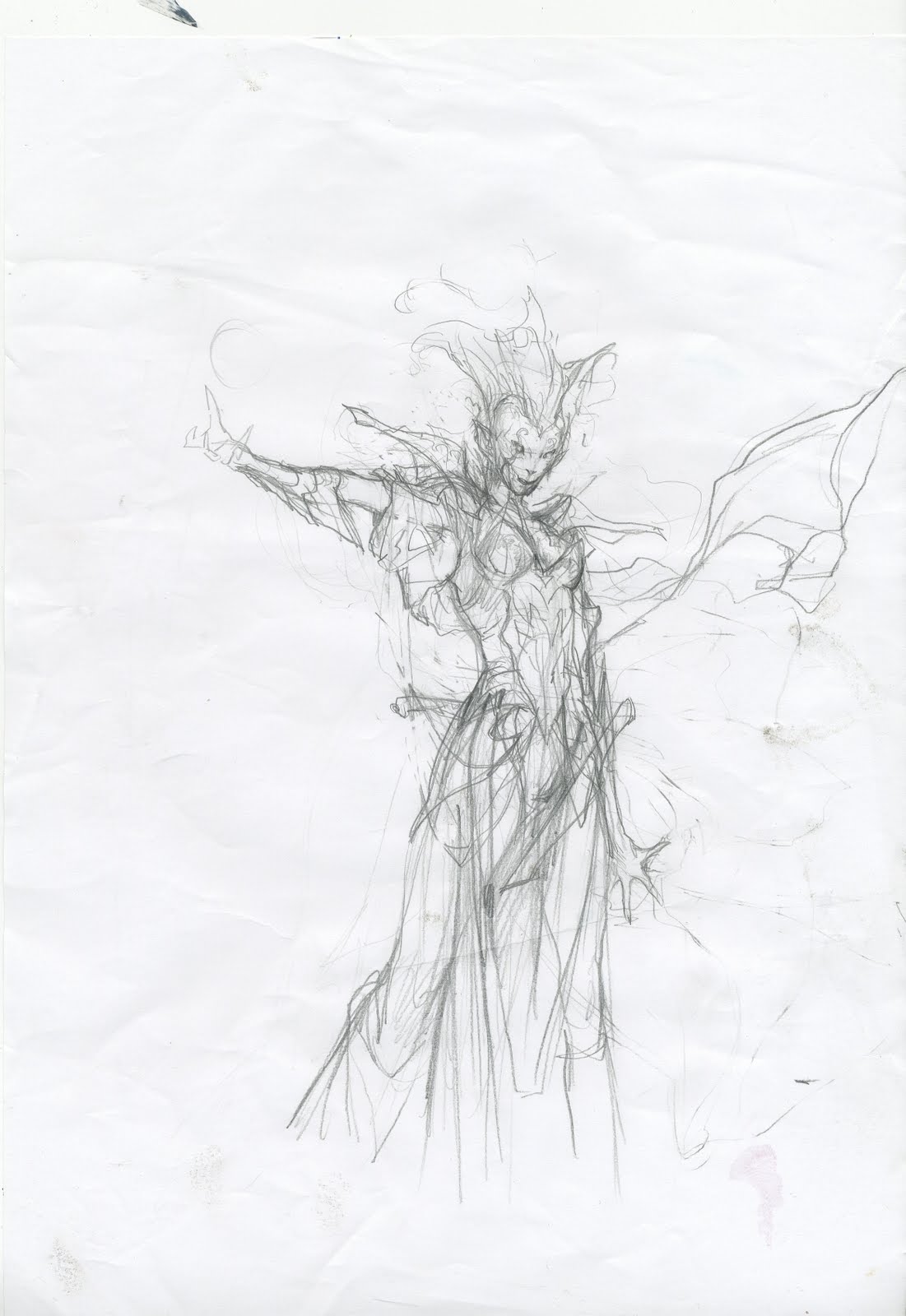
What I do after the thumb is accepted by myself and then the art director, is I start sketching each figure separately. While sketching each figure I try to pull from the pose all I can while still keeping within the boundaries of the silhouette created in the thumb. I use references for hands and facial expressions and clothing catalogues for wrinkles and folds of dresses and costumes. When trying to capture the female – she is a vampire wizard – I went too far from the original pose. I went too far away from my first idea and ended up with a much less simple figure with too much costume messing up the clear pose and striking silhouette. And the face lost all coolness. So I threw it all away. Took my thumb to the copy machine and blew it up to the size it needed on the board and just transferred that. Then I refined the details in hand and shoulders and so on from looking at myself in the mirror that I have right in front of my desk. Well for the cleavage I was forced to get dressed and seek help in my outstanding selection of Playboy Book of Lingerie. Okay I did not undress for looking at myself in the mirror, I just rolled up my sleeves and I didn’t seek help in…well; lets just go on, Shall we?
I was looking in Broms art book trying to find out how he did those beautiful subtle skin tones when I saw how little contrast he had for creating shapes and differences in costumes. And I realised that almost all I needed was already there in my initial thumb. I more or less just divided the dress up into layers of armour/clothing and kept the silhouette of the gloves as they were. Only thing I found silly was the Dracula-like collar piece. So I changed that into long shoulder plates that would emphasise the direction of her arm and shoulders and adding details, and thereby focus, to the top of the figure. The face is myself and a desk lamp from the side. If you compare the thumb to the final I also used the very loose definition of the legs placement under the dress. To make it clear how the knee was turned, I showed some of her right leg and placed some armor.
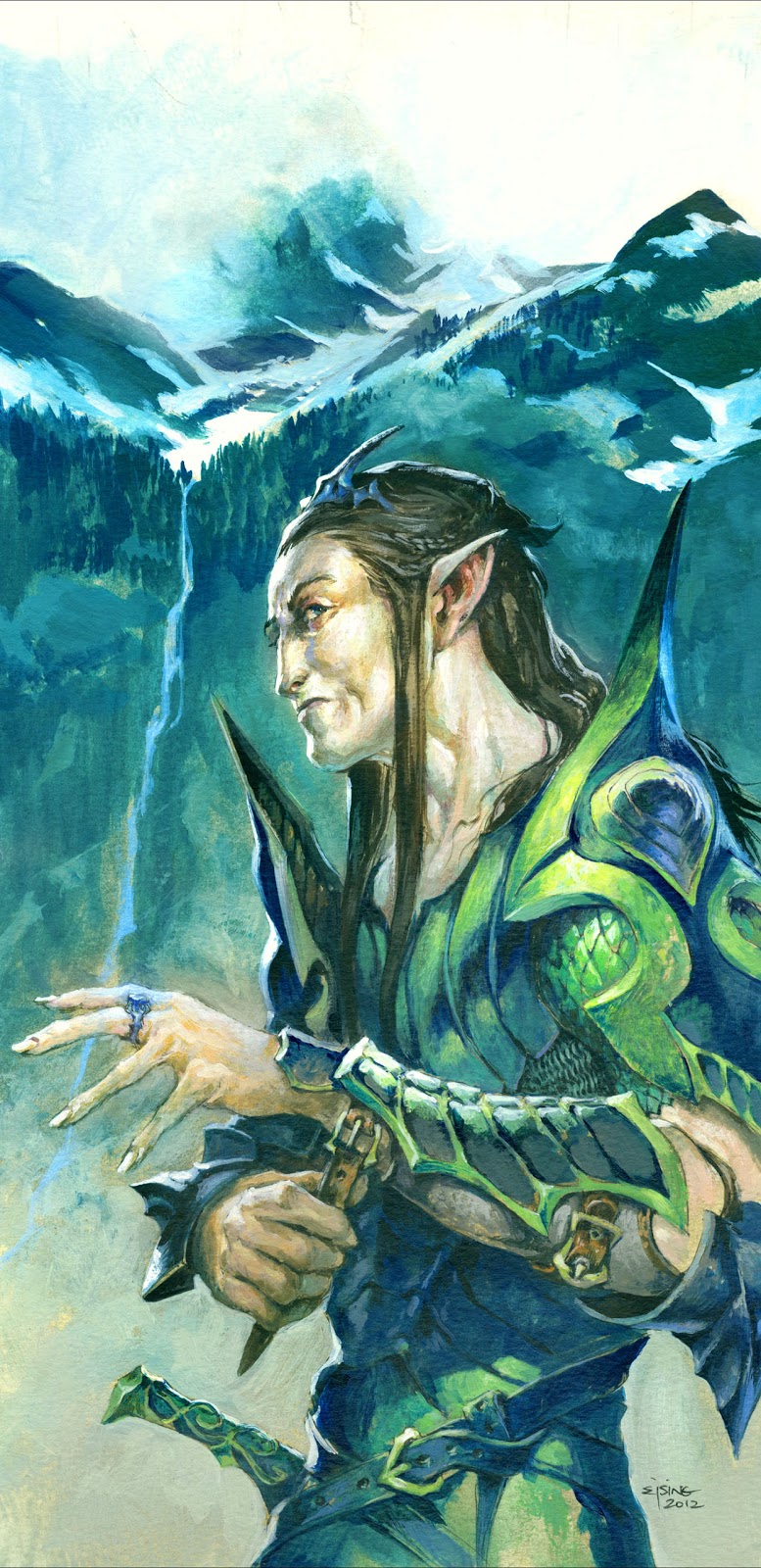
Then on to the elf wizard. I sketched the head and hands but ran into hard trouble when defining his legs underneath the rope. The more I tried the more it looked like he was kneeling for a tough shitting. I couldn’t raise him up. That would take his frame into the arm of the girl. So I used a well known and not desirable solution: I covered it all up in folds and wrinkles and added a large book to cover up the crotch area that else would need to be defining his weight and pose. I am not proud of it. I usually wants to know where figures feet are resting and how they are standing and so on, but that day I let it slide. ( I actually became very happy with the way the book turned out, so it turned out for the better, even if it started as a lazy excuse)
The art description asked for a glowing orb, so I knew the room was going to be dark. But I still wanted to explore the version of a warm background as a contrast to the cool bluish skin of the female vampire. I made 2 colour themes, asked around at the studio knowing I was going to do the warm one. Most of the others agreed.
When I started painting I went farther with the skin tone colour of the girl than my rough was showing. I very cool blue like this would be a stronger contrast than lets say an Ultramarine. I deliberately chose to make the right side of the painting rather empty and not too busy to make a counter balance to the very detailed book shelf on the left site.
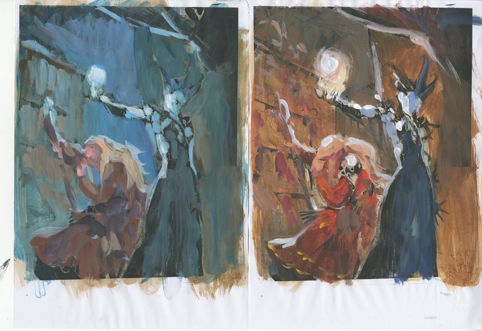
I masked the figures out using frisket-film and painted all of the background first. To make it easier for me to judge the painting I blotched in the blue of the girls skin and the red of the rope on top of the film. It would be peeled off when I removed the film, but until then it served as a counter weight to the background. If I didn’t do that I would fastly cover up the figure with paint on the film and loose track of how important they are, and I would get lost in rendering details in the background.
I resisted the temptation of hiding funny stuff in the bookshelf. I toyed with the idea of placing my own novel in there, but ended up with stuff that would only fit the universe of DnD. There is a Book on Bats and a book about Broken love. A bowl of blood and the tome lying on the reading stand has a dead mans hand print on it. “Told you. There is dangerous knowledge hidden in these books”.


Cool piece-I really like the dynamic angles and color contrast of the figures. Thanks for sharing your process and problem solving -I almost choked on my coffee from grinning. Thanks Jesper!
Thanks for sharing this process! I really like the painting, and I am always a fan of your colors. I am curious though, in every step through the process much of your characters stayed the same, but the staff in the wizards hand is totally different at each step. Just wondering your thought process there.
I'm with band wagon, the vivid reds and blues are such a color adventure.
Man! the color balance in this piece is fantastic, I enjoyed a lot your process description, I hope to see and read more of your artwork in the near future, Great job.
Staff:
The first thumb version I did just to picture a staff. it is the first idea, a kind of traditional leave pattern tip. Boring as hell and too traditional unless the rest of his equipment also had leaves all over and it would be a theme.
So in the sketch I tried to go over the top. I was looking for a gothic shape resempling a fence like shape from around a gothic church or something. But it turned out to look less and less like a staff. And it became too high and would extend above teh arm of teh girl, ruining the composition. So When I transfered it I toned it down. Instead I created a staff that had a fine polished handle and the rest was worn and twisted wood. I like the contrast of fine and rough.
I am glad you all like the colors.