-By Jesper Ejsing
![]()
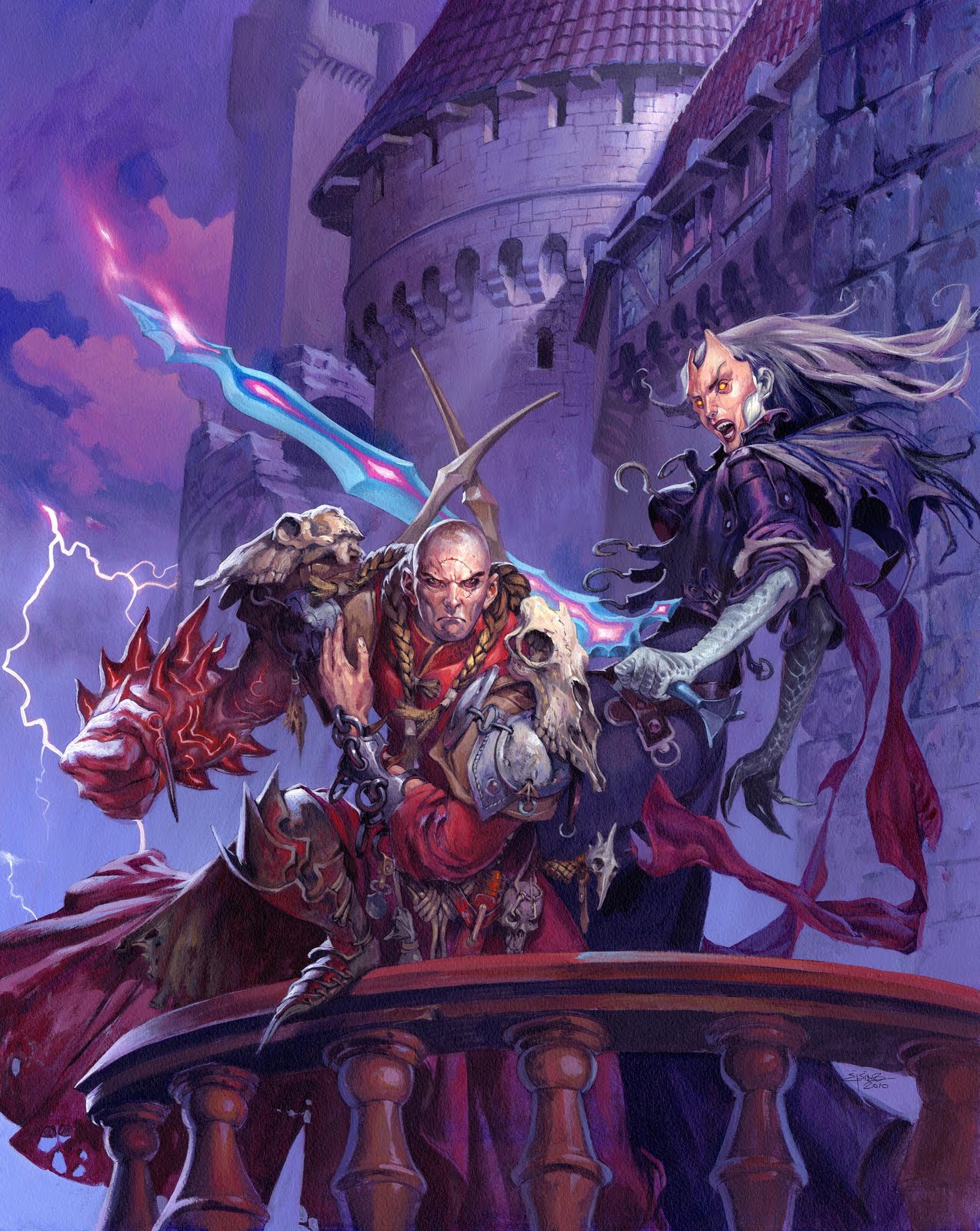
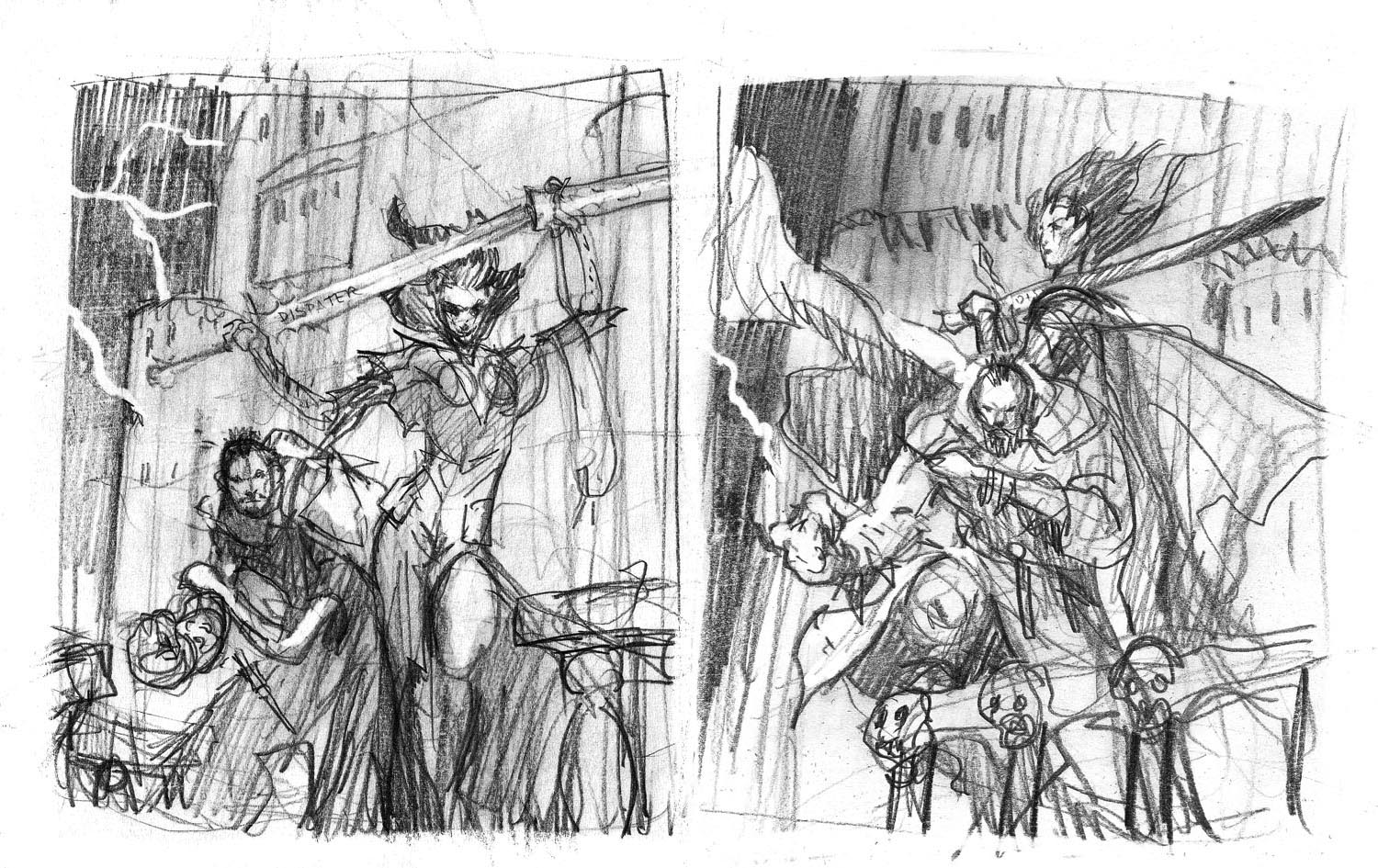
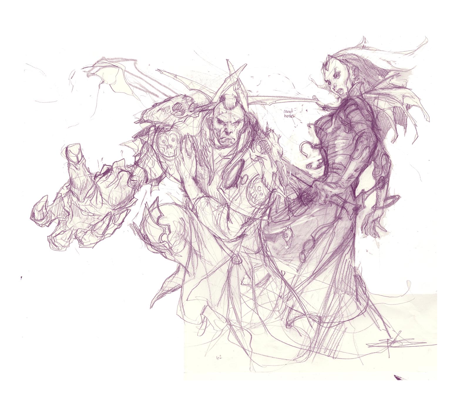
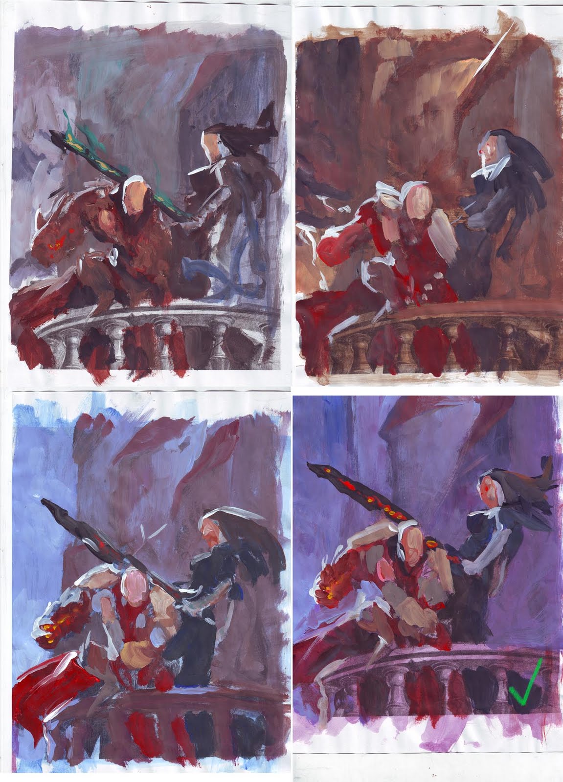
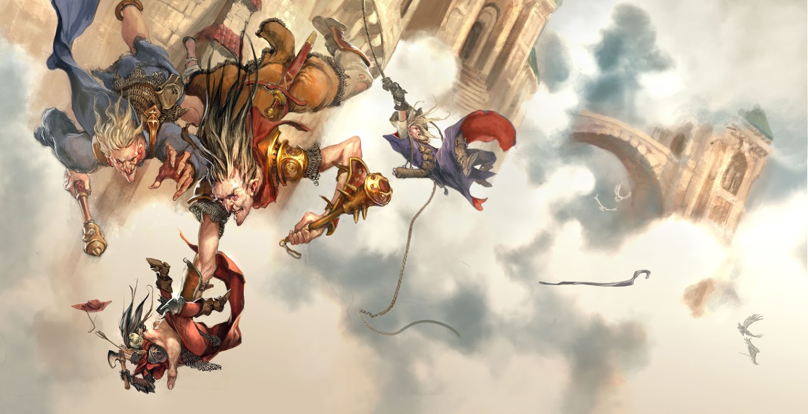
A year ago I made these six covers for Wotc. This is the cover showing 2 Warlocks. My process is as usual to do a bunch of thumbs. Getting the figure in a position that play well together is a matter of rhythm. I sent 2 off to the art director. I liked the first one, but felt it was wromg to have the crouching and hunched figure standing behind. It made the female look too much like a main figure and these had to be equals. Mari Kolkowski from Wotc liked the second one too but asked me to make the female more dynamic and aggressive. I sketched the figures and ended up with a nice couple. I wanted to have the warlock packed with amulets and trinkets. I really like that kind of stuff. When you play role-playing you kind of do not imagine what all that crap in your inventory list looks like before seeing it in a picture. When the figures are solid I transfer them to the board and add the background. I just drew the towers and spire in without ref or pre sketch. It is only something I do when the elements are so simple and do not have real tough perspective. And then I value tone the whole thing in black acrylic. Print out a copy and start color-roughing. I knew I was going for a night scene. I liked the bottom 2 but chose the right one since it had the most cool colors and spelled night the most. (Also, as some of you might have noticed I have a real weakness for purple ). The right bottom one seemed too much like daylight. The final is one of my favourites. Especially the detail of the females face. The whole meat mask idea is just pure evil. The contrast between dead and live flesh is just a sick thing. That is just one of the things I like about getting design ideas to follow. Sometimes I get to go down a path my naïve and innocent mind would never dream up on its own. I whish I had made guys arm with the arm guard shorter. It looked right on my sketch but in the final the draping and surface lines of the guard make it look longer than it is. Have a nice Christmas everyone!

That's a strong, striking piece! The texture on the woman's arms is particularly nice.
How long do WotC give you for something like this (sketches + final)?
Hey Sam
It is usually 2 months. One for sketch and one for final. It is not because you need 2 full months, but more to be sure you can make it fit a scedule and to give time for corrections and changes. I spent 10 days all in all for a cover of this type.
I really really enjoy this piece!
Amazing work! What do you do with the B&W acrylic piece? Is that a value study that you paint over with color or something separate? Again, well done.
Wow, what a great piece! Also love the texture on here arms and the faces are great. How her hand in the background mimics the shapes on his arm is a nice touch. Good choice on the 2 bottom color roughs, the left one indeed looks like day, blue sky but with the characters in shadow.
May I ask how big this is? Would put the timeline into perspective nicely.
A blessed christmas to you, too 🙂
Can't get over how well you use saturated colors.
Nico:
The size is 50 cm tall and 40 cm wide.
Anonymous:
The black and white is how teh painting looks like before I start adding colors. I cover teh black and greyes and white with paint, using it as an underdrawing.
Dom: saturate dcolors are just a matter of having the guts and the daring spirit of going directly from the tube. Also I have a rule of thumb: Black/dark can always be replaced by a color. Pretty simple in theory, but nerve braking painful in real life. i do not know how many times I paint stuff over. I need to see it before I can make a right dessision.
beautiful as always!
really interesting development!for me as a student it opens eyes about how much work and preperation goes into the kind of amazing final work , as this one is . :]
Thanks Ejsing for the response! Really admire all your work!