-Dan dos Santos
When struggling with a pictorial problem, there are a few artists I find myself continuously going back to, hoping to find a solution to my particular problem. Norman Rockwell is definitely at the top of that go-to list.
The past few weeks, I have been working on a painting that has a very strong graphic treatment. The background elements were meant to be more decorative than dimensional, and in order to get them to work well, I really needed to alter the sense of space. Of course, Rockwell was a perfect inspiration for this, and is what inspired me to create this series of posts.
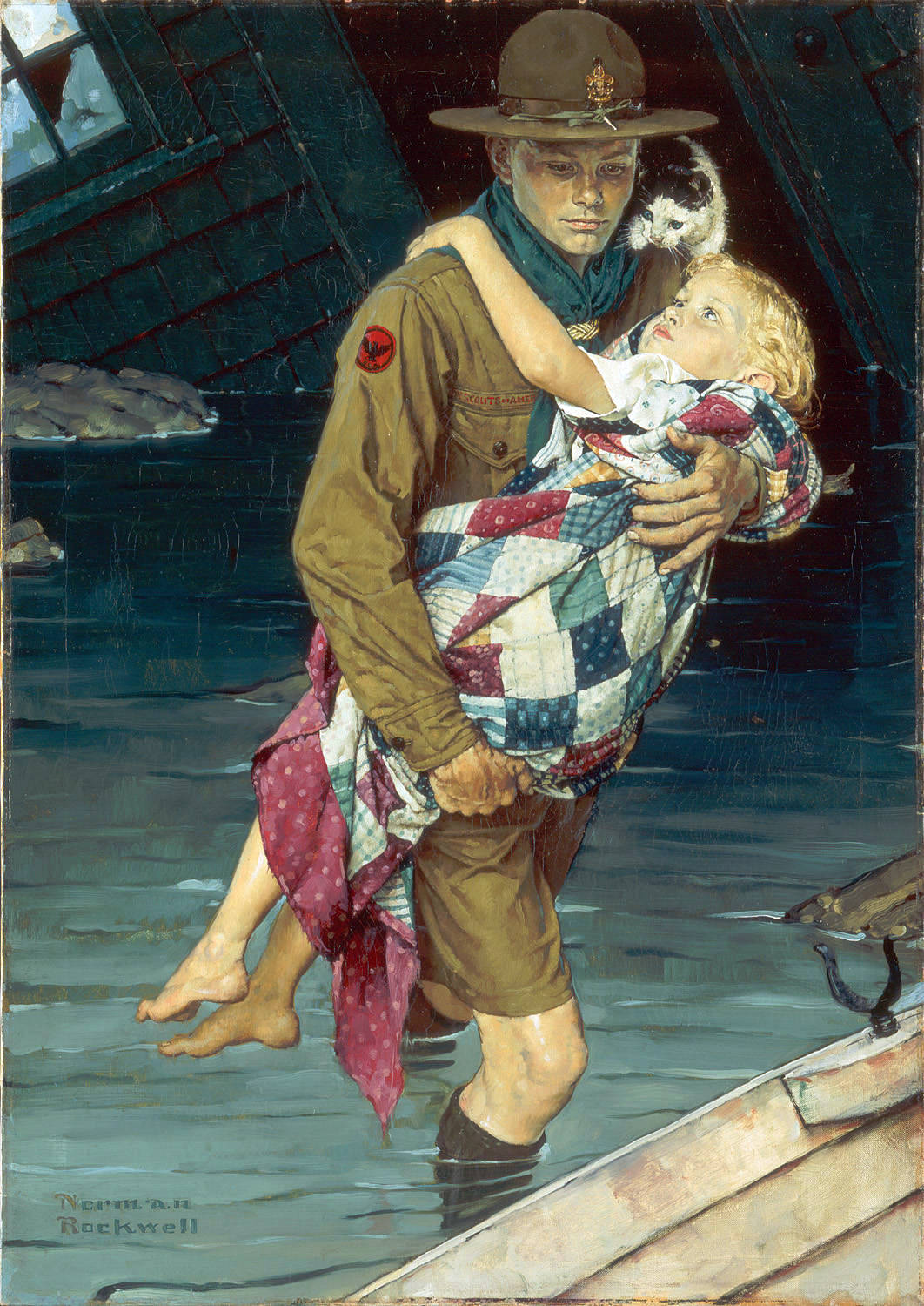
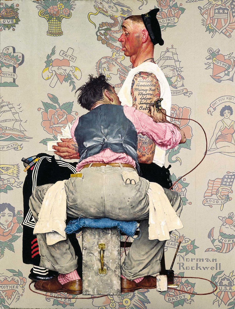
One of the things Rockwell did particularly well, was combine strong realism with a strong graphic composition. Even though the sense of space was shallow, the figures still showed great form. This may seem simple (especially when the background is white), but in my personal experience, it’s much harder than it looks!
There are two means by which Norman seemed to accomplish this feat:
The first, is soft lighting.
Because cast shadows cascade across a form, and onto other forms, is it a simple means by which we can estimate the spacial distance between those forms. By eliminating those shadows, it makes it really hard to determine just how far away those two objects are from one another. Normally, this is a pitfall when trying to achieve a realistic environment, but Norman used it to his advantage. By making the light source extremely soft, he eliminated the strong shadows, allowing him to move, scale, and overlap objects however he saw fit, with little worry about accuracy. This is vital when trying to achieve a graphic affect.
Not only does the lack of cast shadows allow him to move things around, but it also places an emphasis on tonal shapes. If there is no contrast between the light and shadow shapes, the local value and color of a shape will take on MUCH more importance.
So how can you get a soft sense of light on your own model? Ideally, a big studio with large skylights facing north. Yeah… wouldn’t that be nice.
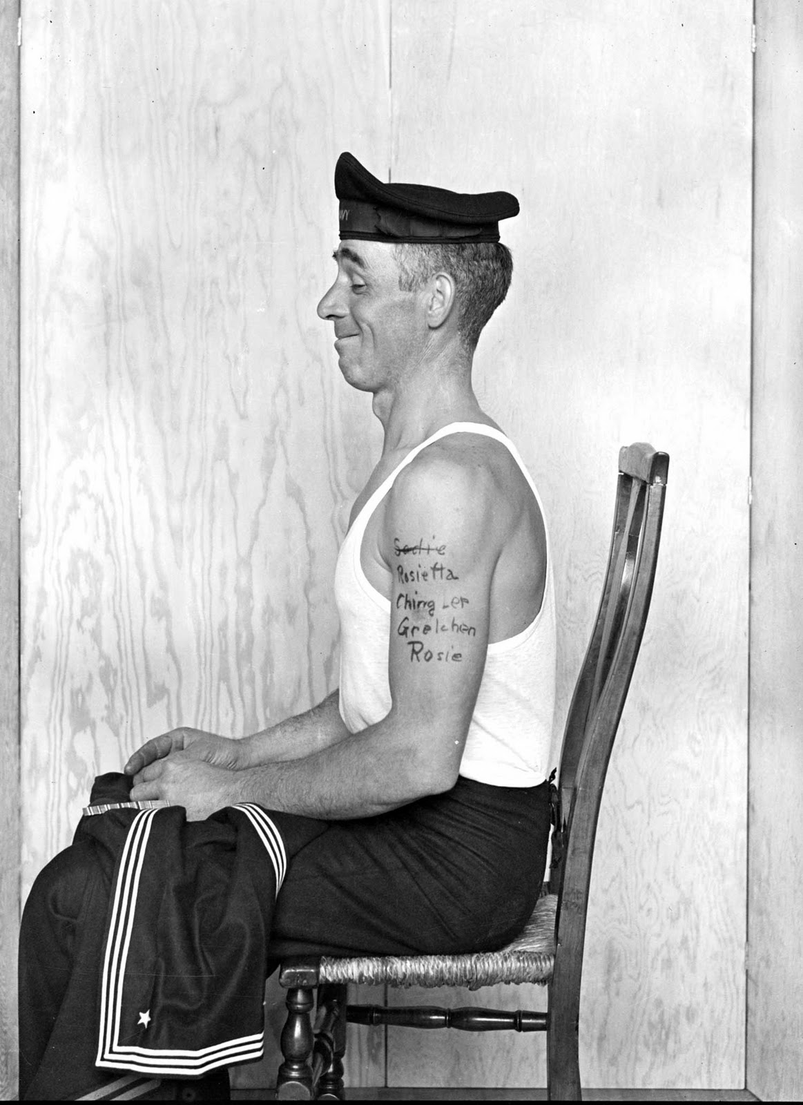
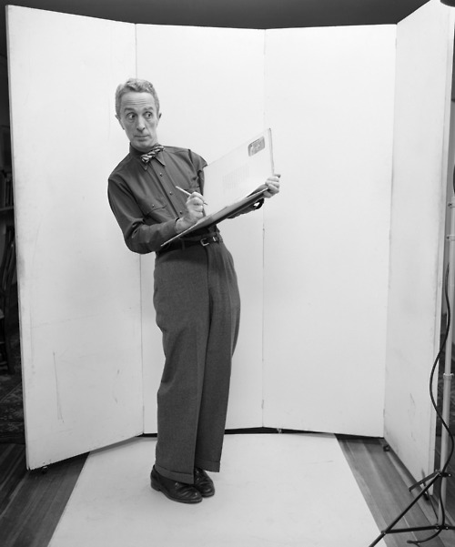
However, if you are like the majority of artists I know, you paint in your basement (or in your bathroom if you live in NYC), and you need to shoot under artificial light. That’s OK. The key to soft light is diffusors and reflectors. A diffusor softens the light coming out of the bulb BEFORE it hits the model. This could be a soft-box, an umbrella, or even a bed sheet or piece of paper. A reflector bounces light BACK onto a model. Again, this could be accomplished with any number of objects, like a blank canvas. Norman went to great lengths to get the right kind of lighting he needed for a particular painting.
The second means by which Rockwell achieved this non-descript sense of space is by creating a neutral eye-level.
He would often take multiple shots of a single figure, focusing separately on the head, waist, and feet. That way, he could combine all those shots into one drawing, achieving a very neutral eye-level. If the viewer can’t determine what eye-level a figure should be at, the artist is free to move that figure anywhere he wants, high or low, front, back… it doesn’t matter!
In his painting ‘Golden Rule”, you can see how Norman Rockwell uses both; soft lighting, and a neutral eye-level, to great affect in order to create a very graphic composition.



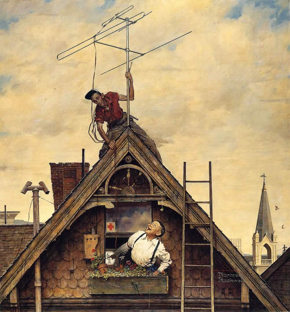
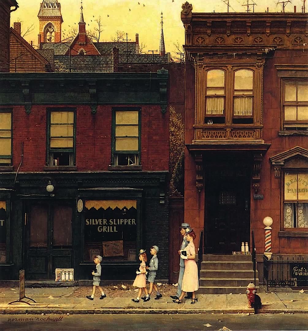




Amazing. The more you look, the more there is to appreciate. What a craftsman!
Really great post.
I was already aware of his soft lighting but never consciously aware of his neutral eye-level.
I can now go back and look at his work with a new eye and appreciate it more.
again thank you….it is appreciated
Thanks for this exquisite analysis of Norman's work! Wonderfull post Dan!
Huh. Great post. Never thought about those two concepts, soft lighting and neutral eye level. You gave me new tools. Makes me re-think my ideas about composition. Thanks!
Great post! I always loved Rockwell but knowing the why and how he did it gives my “inner art geek” the warm fuzzies. Thanks!
Wow that's really fascinating. Great insights Dan!
I'm really enjoying this series on Rockwell, you've really done your homework. Thank You!
A real great Master that' all that I have to said.
Great, great post Dan. In my own bizarre way I do some of the same things. Altering space and a sort of universal lighting. Rockwell sure can teach us a lot. Thanks!
this is great!
I feel like I've learned a lot today!
this is the sort of thing you can't find easily. what a great analysis! Thanks a lot!
A great thanks from DK to you for this post. I've learned a lot from this and the previous posts dealing with analysing Rockwells works. Good job, hoping for more to come and again thank you!
Great insights. It occurs to me that the neutral eye-level you describe plays a big part in giving Rockwell's pictures their humanity and intimacy. We're all on the same level.
For very graphic compositions by Rockwell, I think Jeff Raleigh's Piano Solo is relevant: http://imagecache5d.art.com/watermarker/52-5270-Z00GZPUQ.jpg
Very well written, Dan!
Can someone please explain nuetral eye level further? I'm kind of confused as to what it means.
@Anonymous: 'Eye level' is the implied height that the viewer's eye is seeing something from. If your eye level is high, you will be looking down at something. If your eye level is low, you will be looking up at something. For instance, if you focus a camera at someone face, keeping that camera at the same height as their face, you will view their face straight on (ie. neutral) , but will be looking down at their feet. Rockwell combined multiple shots of his model, each one neutral, in order to create an image where you can not easily detect where the camera's height is.