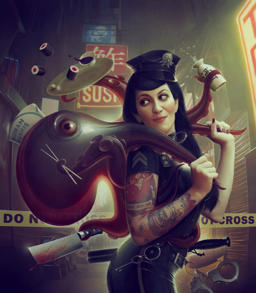
My first artbook is going to be available soon. Here’s a quick walkthrough of the cover …
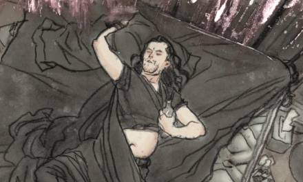
My 3 favourite subjects are pin ups, tentacles and shiny things, so I had to use all of this in this picture.
I had several ideas but, as usual, I decided to try different compositions.
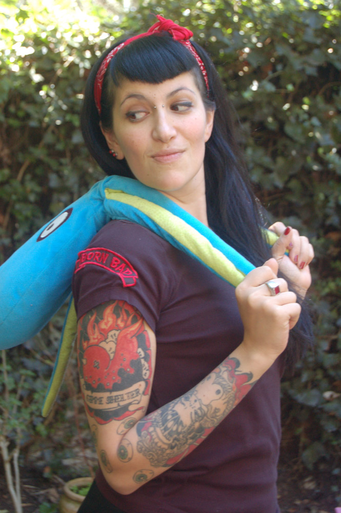
My wife, Chloé was my model. I took a (very bad) photo as reference. You can notice she really holds an octopus … The contrast was very bad and the tones were ugly. The lights were quite interesting. I decided to change her expression a little bit.
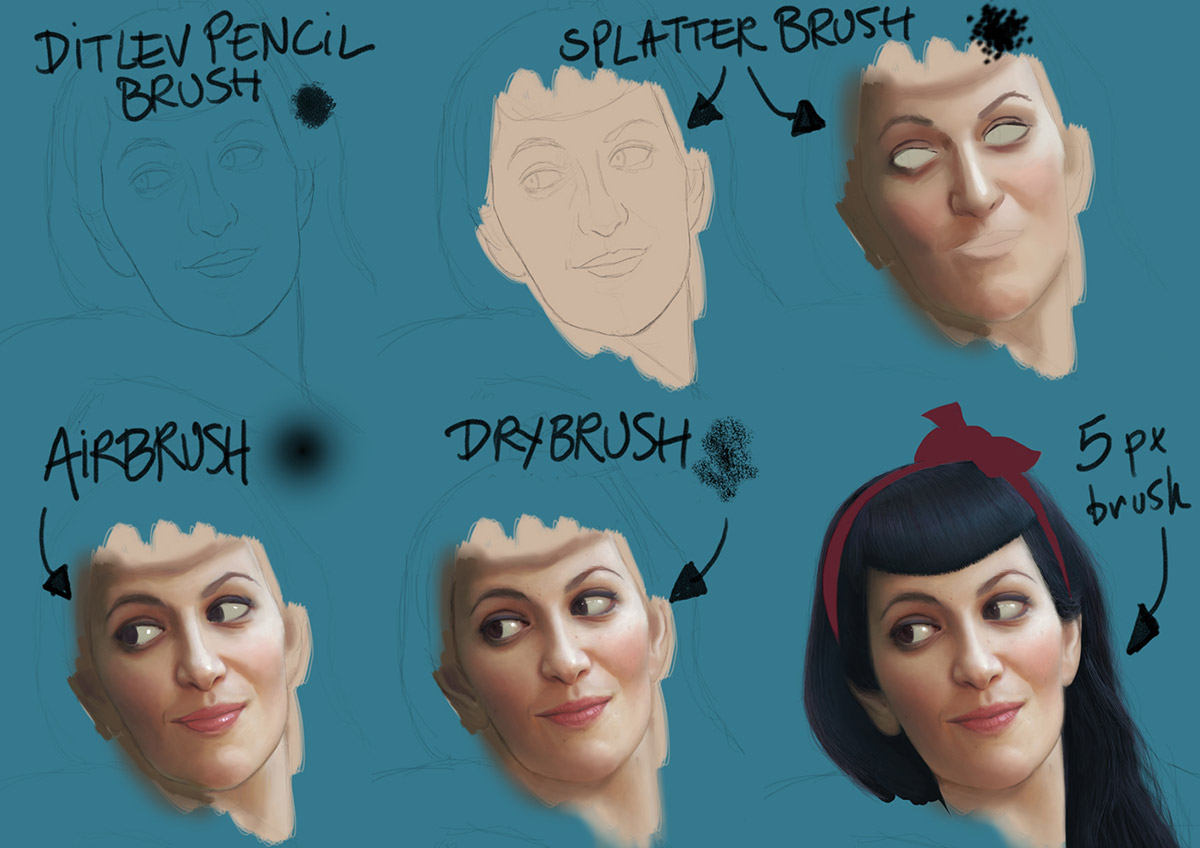
My process is always the same. I started with a basic sketch on an “multiply” type layer. I painted under the sketch.
1. A flat skin color with a “splatter” brush (standard brush). I worked with 100% opacity.
2. On another layer, still with the same brush, I tried to find the good tones and the good contrast. This time, I worked with very low opacity, about 5 %.
3. On another layer, I tried to have more soft gradients by using the soft round brush (standard brush), once again with a very low opacity.
4. On another layer, I did the skin texture with the dry brush (standard brush). For the beauty spots and the freckles, I used the soft round brush. (I wrote something on this blog about digital skin here : http://muddycolors.blogspot.fr/2012/08/digital-skin.html)
5/ On another layer, I did the hair. I started with a black area, I added all the little hair one by one with a very small brush. I did the same for the reflections, using the background color. No, it’s not so long …
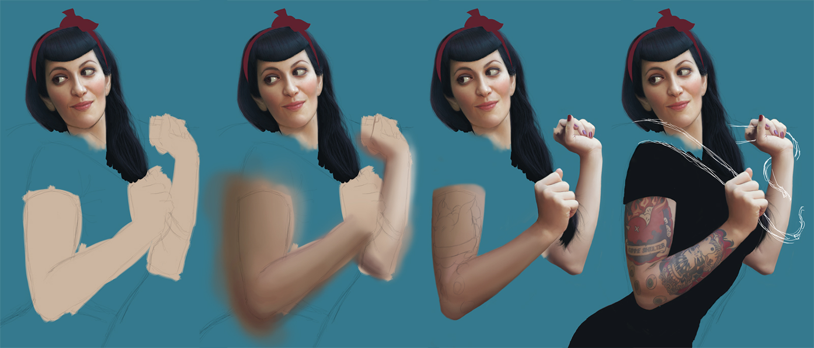
The hands are always a complicated part. I had a good reference this time but I retried several times. The tattoos were a little bit long to do but I found a “quick” technique. I did all the tattoos on a single layer, I duplicated this layer several times on different types of layer (overlay/color/multiply/…) and I decreased the opacity of all the layers. (I did a quick tutorial on my FB page HERE)
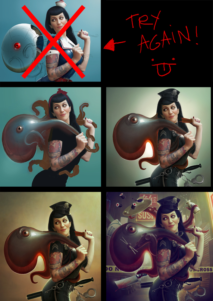
My first idea was to do a gynoïd-like octopus. Hajime Sorayama is my mentor so I thought it could be a sort of tribute to him. I changed my mind for a more “narrative” picture.
The piece took a very long time. I added a lot of details and I had to be very precise. My file was very big (about 1 meter tall, 300 dpi). As we had to do some very big prints, my picture had to be very “clean”. It was about 80 hours of work … Gasp …

Finally, I did a few adjustments (colors/contrast/luminosity/… )
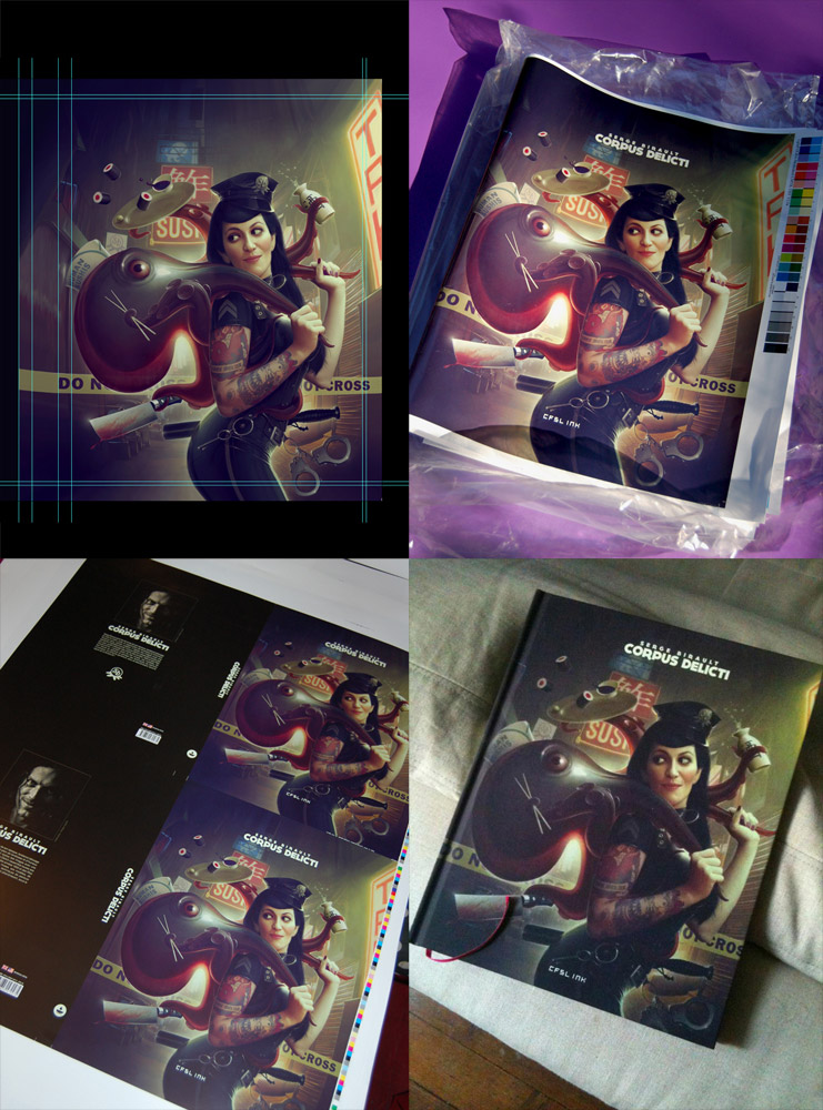
We did a lot of print tests. I worked with a very good team. So I have to thank :
– All the CFSL INK (http://www.cfsl-ink.com/en/) team for the design of the cover.
– Céline Antoine from Ankama (http://www.ankama-editions.com/fr) for her help and her advices during the print tests.
– All the Proost team (http://www.proost.be/)
Wonderful post!!
Awesome ilustration, love it.
Love this, Serge!
I am very, very excited about the book. Please let us know when it's available I will buy at least 10,000 copies. Also, good call on your choice of models. With all respect, she is super-cute. Well done sir.
I want that book! …. But I live to Querétaro 🙁
Awesome tutorial as always! I have one question about the size of the painting. Since I'm a beginner, I was a bit surprised by the fact that the original size of the painting was 1 meter tall. Did you start from 1 meter size in the very beginning? Is that normal? Let me know. Thanks.
Well, I started with this giant canevas. And no, it's not normal. I knew that I had to do very big prints of this picture that's why the file was so tall 🙂
Thanks a million!! You are the best!!
Hi Serge, congratulations for the artbook, I hope to have it in hands as soon as possible.
The Kim guy asked about the canvas size. Ok, you said this work is going to be printed in a big poster size or something like that. But, if it doesn't, which size of canvas do you use on your more regular works? If the work is going to be printed in an A4 for example.
Thanks and keep the good work ^^
Well, I have to deal with my publisher for that print 😉
The file is 1 meter tall ^^'