This will make some of you laugh, because you’ve probably had this conversation with me, but as long as I have been at Orbit, the number one question I get asked by artists is some variation of “Why does Orbit use so much photography for book covers?” Sometimes it’s even the somewhat hostile “Why does Orbit hate Illustration?” (Which I assure you could not be further from the truth.) I was actually nervous to attend my first Illuxcon, an art convention that specializes in traditional illustration, because I thought there was going to be a lynch mob of oil painters after me.
So how do I choose between hiring an Illustrator, setting up a Photo Shoot, or going for a Design approach?
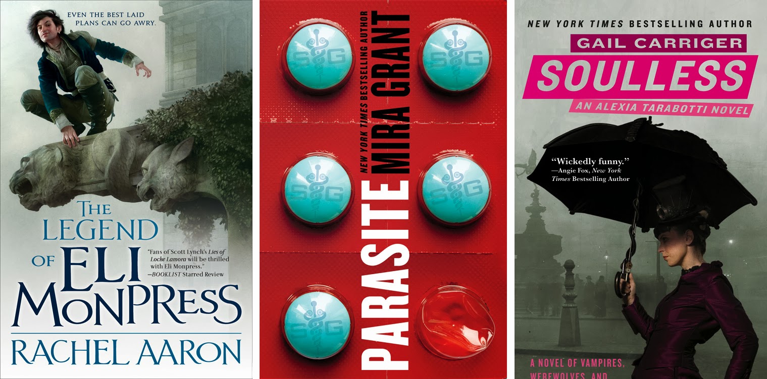
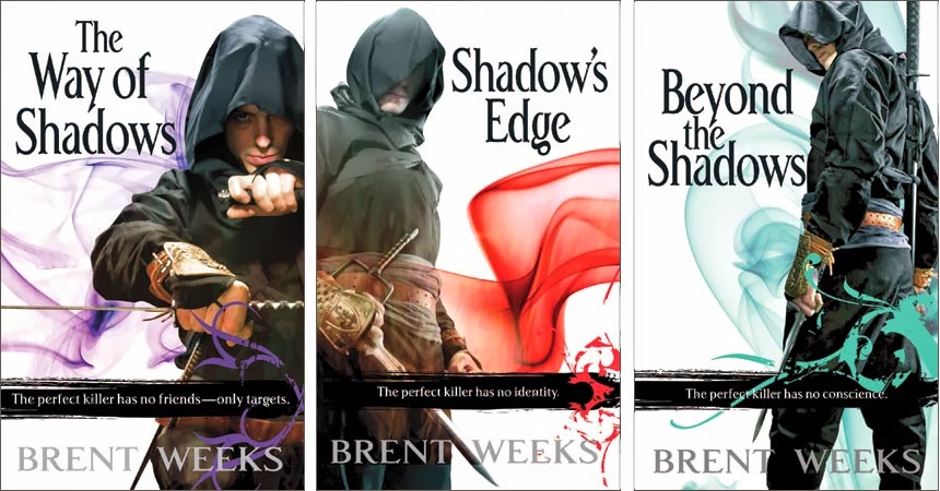
First a little bit of background. The truth is, Orbit uses roughly an equal amount of photo shoots, illustration, and what I call “pure design” covers. Yet people overwhelmingly felt for a while that the Orbit “look” was totally photographic. I realized that although this style range was standard in the non-genre book cover world I had worked in before, the SFF world was traditionally radically skewed to using illustration on covers, and was kind of shocked by all the photographic goings-on. I think a few things contributed to the “Orbit look”: The first year Orbit was in the US, before I became Creative Director, the Little Brown art department handled the Orbit covers. They did a fabulous job, but because no one in that department was a geek or had innate knowledge of the SFF genre history, the covers naturally looked and felt more like mainstream non-genre fiction covers. Then when I started as Creative Director, I brought 7 years of commercial and literary book cover experience with me (along with a lifetime of geekery, a history of working in comic book stores, and an Elvish tattoo) so my covers tended to look more mainstream. I’m also a trained graphic designer, and from the start I designed a lot of Orbit’s covers outright, rather than immediately starting by assigning a freelance artist. And last, Orbit had already started gaining a reputation for bringing a fresh look to fantasy covers with many of the UK originated covers for authors like Trudi Canavan, and the immensely popular Night Angel Trilogy by Brent Weeks, which was co-designed by the Little Brown team and the UK. Let’s just say Orbit launched the army of a thousand hooded shadowy cloaked dudes on covers, for better or worse.
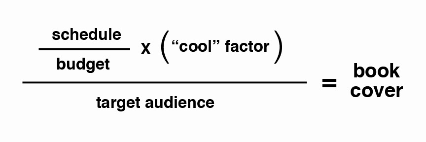
So, given all that history, how do I decide what direction to go for a cover? Well, first of all, it’s not just my decision. (If you want to know exactly what goes into the cover process, check out the super in-depth “Making of A Cover” series of blog posts I’m doing on the Orbit blog.) I present ideas on cover direction to the Publisher and Editors, and we debate/collaborate/fight about the best direction for the book. It’s actually a really complicated formula that looks something like this:
Budget is pretty straight-forward. Not every book has the same selling expectations, due to things like author sales history, whether the book is releasing e-only, a hardcover, or a paperback, and considerations like that. All the money you spend on the book comes out of that book’s budget, so you don’t want to spend $10,000 on a book you only expect to make $5,000 on. Here’s another myth-buster. Photo shoots are way more expensive to produce than most illustrations are. The photographic covers are more work, more people, more time, and more budget as a general rule. Trust me, we only do photo shoots when we have a serious reason for using that style. They are a giant pain in the @$$.
Schedule varies. Sometimes I have all the time in the world to work on a book and I can hire the slowest oil painter with no worries. Sometimes a book drops into the season last second and I can only hire people I know can turn around final art in minimal time. That’s either going to go to an illustrator that works digitally, or it’s going to be all design.
“Cool” factor is where my gut comes in. I spend a lot of time up to my eyeballs in the internet and in all kinds of geek media—not just books, but TV, movies, gaming, etc. I also keep a close eye on what trends are happening in the wider world of publishing and book covers, and art in general. It’s my job to know the trends and try to stay a little ahead of the pack. My target is to create art that feels fresh and new but is still recognizable to the audience.
Which brings us to “target audience”—which is critical, but most fans and artists don’t really consider: The secret is, the target audience will dictate the style of a cover almost every time.
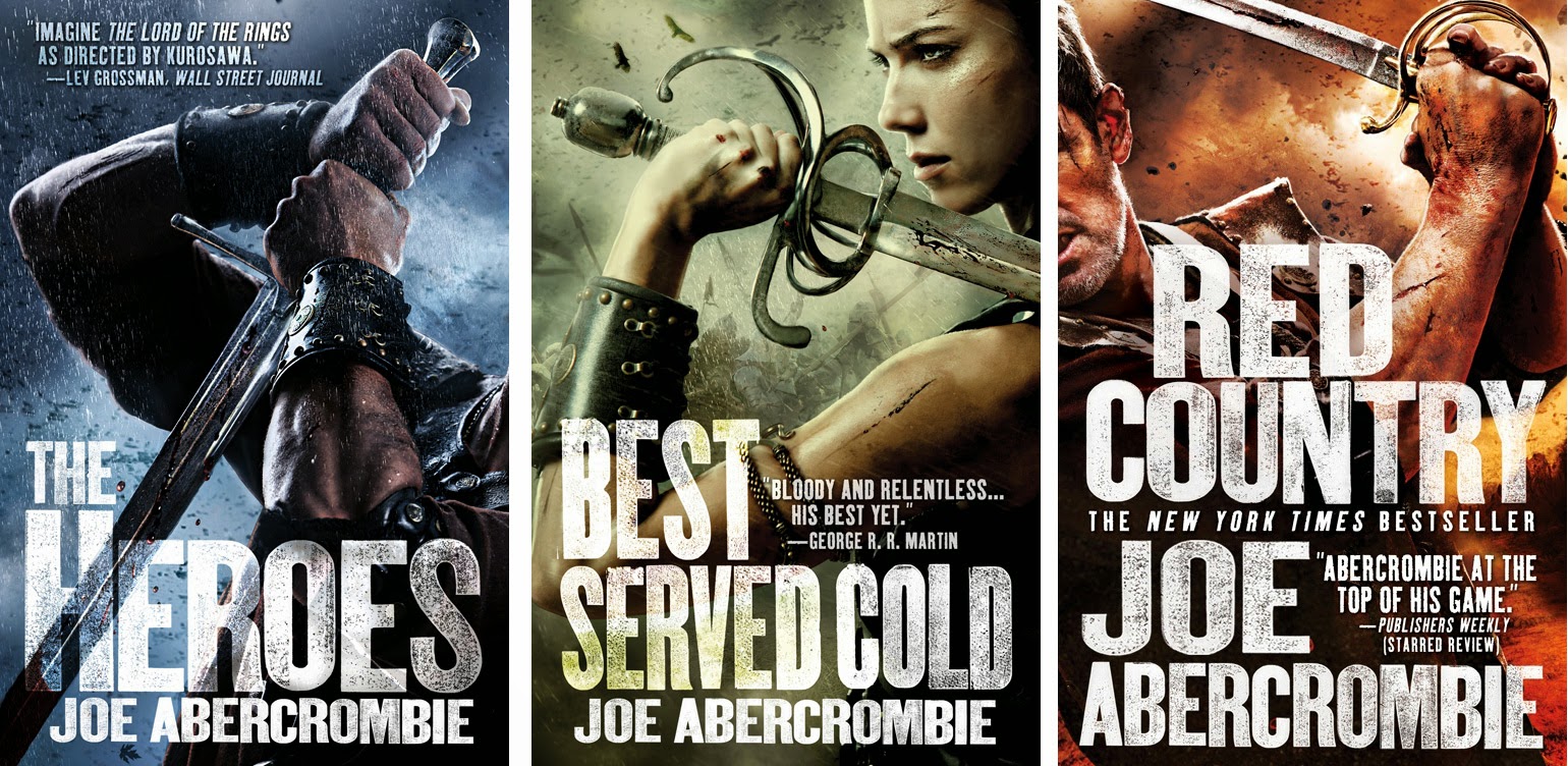
Call it a symptom of having worked in “mainstream” covers for so long, but I don’t only consider Orbit’s audience to be geeks. I love our hardcore geek audience, but I also love gaining mainstream crossover fans for our books. There’s so many potential SFF fans who don’t know they’re geeks yet! We’re converting more every day, and I am seriously evangelical about it. All those people watching Game of Thrones on HBO? I want to put a Joe Abercrombie book in their hands the second they finish reading the last George R. R. Martin book (god knows, they’ll have a long enough wait till the next one). And that’s why I went photographic for the Joe Abercrombie covers. I wanted them to look like a movie poster, like a big-budget television show, and also like hi-def sports photography.
Target audience doesn’t only mean how mainstream vs. how geek an audience is, it’s also about sub-genres and what we call “genre checkpoints”. The best example is urban fantasy. There’s intense debate over what’s cheesy and what’s not in urban fantasy, and we all make fun of awkward poses and bad tattoos, but the truth of the matter is, the urban fantasy audience looks for books that are photographic, or at least very tightly rendered illustrations, and they look for the sexy ladies. If you stray too far from that formula you will miss your target audience. (Which is not to say you can’t do that in a classy way, or in a cool way, which I try to do for all my urban fantasy series.) I’ve overshot my audience before, and no matter how cool the cover looks, if enough people don’t buy it, it’s a failure as a cover no matter how awesome it looks.
Remember, a cover is advertising first, a piece of art second. An ugly cover that sells a ton of books wins over a gorgeous cover that sells ten copies. Every. Time. Trying to balance those opposing forces is often the hardest part of my job.
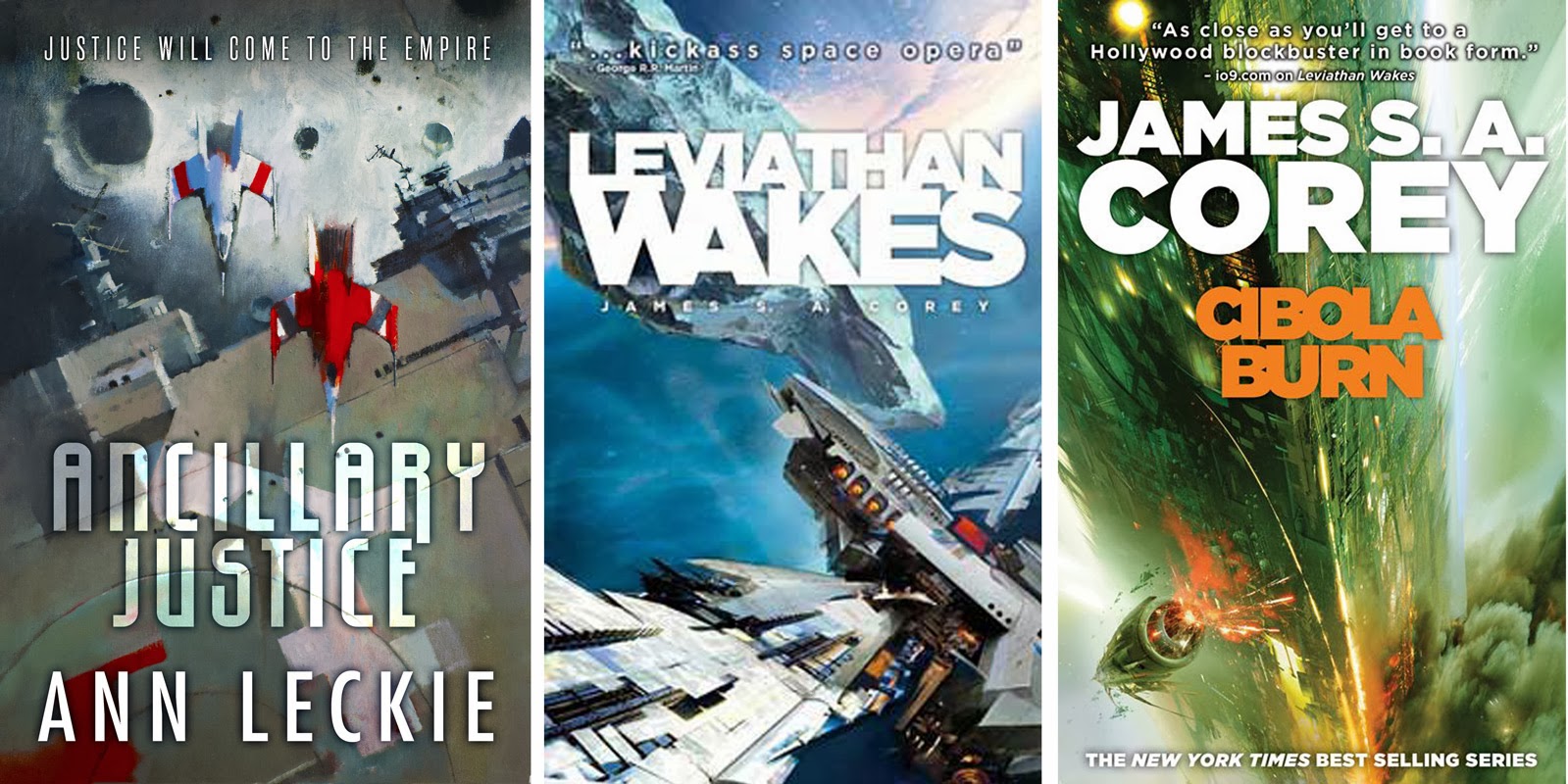
Another example of a sub-genre with a really strong look is the big space adventure books. The audience loves illustration, is out looking for the next big exciting dynamic painting of a space scene, generally the more dynamic the better, and that’s what sells that genre of book. You can play with the rendering style, whether you go more abstract or more rendered, but get an awesome spaceship on there and you’re home free.
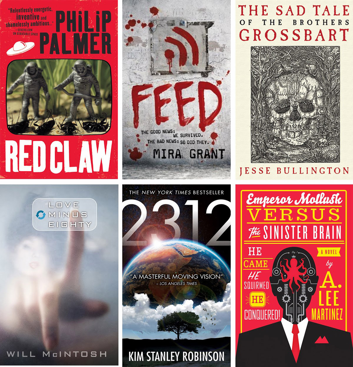
The more modern, pop-culture, thriller, and comedic SFF books do really well with a more graphic/designed treatment. That’s really a broad generalization of that style, it can be really eclectic in subject matter, but a more pure design treatment signifies a more hip or more commercial crossover kind of book.
So that’s a little look inside how I narrow down what style is going to be right for what book. There’s a lot more examples of sub-genres, and like I said, I am massively simplifying here. There are absolutely exceptions, and a lot of times I break my own rules on purpose. But in general, it’s the desired target audience that most dictates the style of the cover. I think it’s an interesting part of the art process that most people don’t really get a chance to think about. I know a lot of artists think I just get to pick what I like, but my personal taste is really just a small part of the equation.
Again, if you’d like to read a really in-depth series on how one cover gets made, from acquisition right to final books, check out the Making of A Cover series.
I apologize for not individually crediting the covers – the credits would be longer than this blog post. I promise credits for everything are on the orbit blog, and on the orbit pinterest.


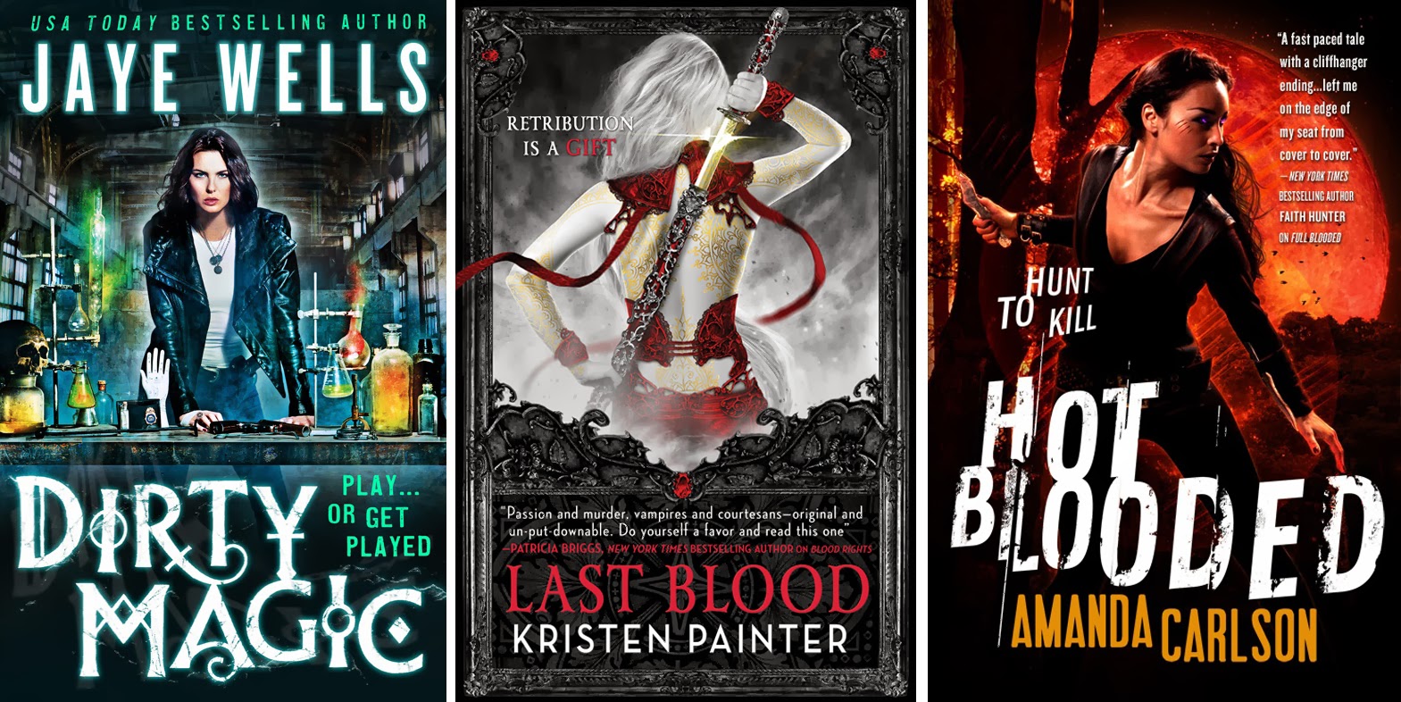

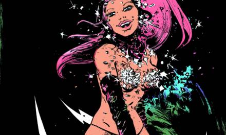
I'm a big reader of urban fantasy and I was a fan of the covers you did for the Jane True series. They were totally different from other books in the UF genre and really stood out to me on the bookstore shelves. I might have overlooked the series had it not been for the unique covers. I think it's important not to underestimate your target audience — be respectful of the genre “formulas” or expectations but not be afraid to push the envelope a little and that's what I've come to love about Orbit covers. Just my two cents as non-artist but a fan. 🙂
It's interesting, as a young artist that hasn't started my career yet, I feel much the same way about my personal style/voice/identity/etc as you do about directing for covers. There's so many things I'd love to try out, and so many inspirations I would like to inform my own art. But at the same time that I'm trying to strike a balance between experimenting and failing, and doing something that I can actually do well, I also have to balance between where my fancy happens to take me at the moment, and working on portfolio pieces that will actually be attractive to potential clients. I think I need some Venn diagrams…
I like that you're using something as un-quantifiable as the “cool factor” in your calculations here. Its a real consideration that takes intuitive thinking to account for.
I drew an album cover for a friend a few years ago that probably would have been better off being a slickly designed graphic or photo. It looked amateurish, and didn't really speak to his intentions with that album which was essentially to make a more hip and up to date version of what he had been doing previously. It was nice to help him realize that goal, but I don't think I was technically up for the challenge then.
I know, I love love love the Nicole Peeler covers, and I love hearing that they were great for the books. However, you are among the very design-saavy of fans, as a lot of geeks are, but urban fantasy is at least half romance and mass market fans, and overwhelmingly the feedback was that they didn't “get” those covers, thought they were Young Adult, didn't realize they were wrapped around exactly the kind of book they were looking for. And that means I unfortunately failed the author, because with a cover with a wider reach, I believe she would have sold a ton more copies.
Another example is the Simon Morden Petrovitch covers with the optical illusions – never have I gotten more design awards and praise for an Orbit series, but people didn't know what the books were, casual fans didn't pick them up, and we were forced to continue the series with a more standard (although still lovely) sf futuristic city concept art look.
I refuse to not push the design of covers forward, but I've learned from these kinds of trials that you CAN move forward, but just in HALF steps at a time.
funny, I hear there's some fab Venns on this very site…
well, there has to be a factor of the AD's personal taste, and instinct, and gut in there somewhere. it's just not as big a portion as people expect…
I was behind those covers 100 % and still love them. I feel totally unfailed. xoxoxo
I loooove you for loving them. But I still feel like there are leagues of people who would have adored Jane True but never read them. I blame small-minded ideas of cover taste, of course, not myself.
I'm totally biased towards illustrated covers, of course, but I love those Joe Abercrombie designs. It sounds like art directors get to deal with the same fun paradoxes as artists – material has to be trendy, but classic! Novel, but familiar! Must stand out, but fit in!
It's cool to see how current designs have evolved from the (sometimes awesome, sometimes cheestastic) SF/F covers of the old days, and I'm curious to see where they're headed from here…
What a great post – I have never heard the design choices behind a book cover broken down in this way.
Hi Lauren, The sub-genre of “big space adventure” is mostly referred to as “Space Opera”. Anyway… Do you know the name of the artist that painted the 'Ancillary Justice' cover?
I'm pretty sure Lauren understands the term and I think I understand why she uses the “big space adventure” words for certain titles that focus intensely on the action and adventure side of a story. To use two examples that I love and have read there is a difference between Surface Detail by Iain M. Banks and the Expanse series by James S. A. Corey. Both are Space Opera but somehow a hyper dynamic space battle scene painting won't suit very well on a Bank's cover. At least that's how I see it as an illustrator and SF fan.
yea I did go back and forth on the “space opera” term. it's been a debate i've been having a lot lately. it feels like every book that occurs in space is now being called “space opera” but that's not automatically the case. so where's the line between “space opera” and “space adventure”? is it the pacing? the world-building? so I played it safe in the post…
Edit: proofreading is a lifeskill 🙂
That makes sense. It seems like the best way to get art people will find exciting is to have someone really who's really excited about art pick out what they like. It's like the mantra artist's repeatedly use “if you're not excited about your own artwork, you can't expect other people to be either”
Genre nomenclature creep. So about that artists name..?
I had suspected as much and it turned out to be the fantastic John Harris (http://www.alisoneldred.com/artistJohnHarris.html)
I saw him do a tutorial at illuxcon a couple years ago and it was amazing. He also has done a lot of covers for the Ender's Game book series that I absolutely love.
Awesome! Thanks.
Excellent, practical, great summation…
sorry! yes it's John Harris – the cover is actually 1/3 of a painting he did, we're using all three parts on the 3 covers, and together they'll make up the full image.
Very interesting post. I think I've known that my personal feelings for covers that don't use illustrations were irrational, but it's hard to separate frustration from logic when you're at the book store and every other cover is some terrible photo-chop. Anyway, thanks for taking the time to put this together.
World Most popular Upcoming Latest cars and vehicles, Latest Mazda Models, Racing Cars, International Sport Cars, Concept Cars, PS-Pod, Strange Vehicles, Nissan, Royce Corniche, Ford Concept Cars, Strange Vehicles, Mercedes and More Sport Cars and Vehicles with Pictures and Info
WorldLatestVehicles.com
Generally, I find photographic covers to look cheap and cheesy – the Romance genre seems to have gone almost entirely photographic, and they generally look awful. So I was surprised to hear you say that photo covers are more expensive.
The Orbit photo covers are a far cut above, however.
But in the end, I think they would be better as tight illustrations, rather than photos. Photos just look too stark, or awkward, or just not quite imaginative enough in terms of costume, props, etc.
i do agree that a “bad” illustration looks way way better than a “bad” photo every time. But unfortunately I can't design covers just for the art-saavy, or the especially geeky among us. trust me, I wish I could. But I also have a great appreciation for a gorgeous photo.
Congratulations! This is the best factor, Thank you so much for trying to talk about this exciting information.
Book cover design – We have a range of affordable services including book cover design, editing, ISBN and CIP lodgment, printing, ebooks, global POD and ebook distribution and more.
thx
Well said! A book cover’s first job is to sell the story, not just decorate it. Understanding what visually excites a genre’s audience is key to striking that balance between art and marketing.
We are truly thankful for your blog entry. You will discover a great deal of methodologies in the wake of going to your post. I was precisely scanning for. A debt of gratitude is in order for such post and please keep it up.
thx