This illustration is for the third story in a series of short stories that started with Dress Your Marines in White, by Emmy Laybourne. Irene Gallo art directed once again for Tor.com.
This story, “What Mario Scietto Says,” is mostly confined to a bomb shelter, so I didn’t have too much variation for images. There’s a point in the story where the main character, Mario, piles all of his survival gear together on a bed to prepare for leaving the shelter.
I thought a nice, cropped still life might actually lend curiosity to the story, and frankly, it was the best I could come up with that I felt would be fun to paint. Irene never seemed quite enticed by the two thumbnail sketches I sent.
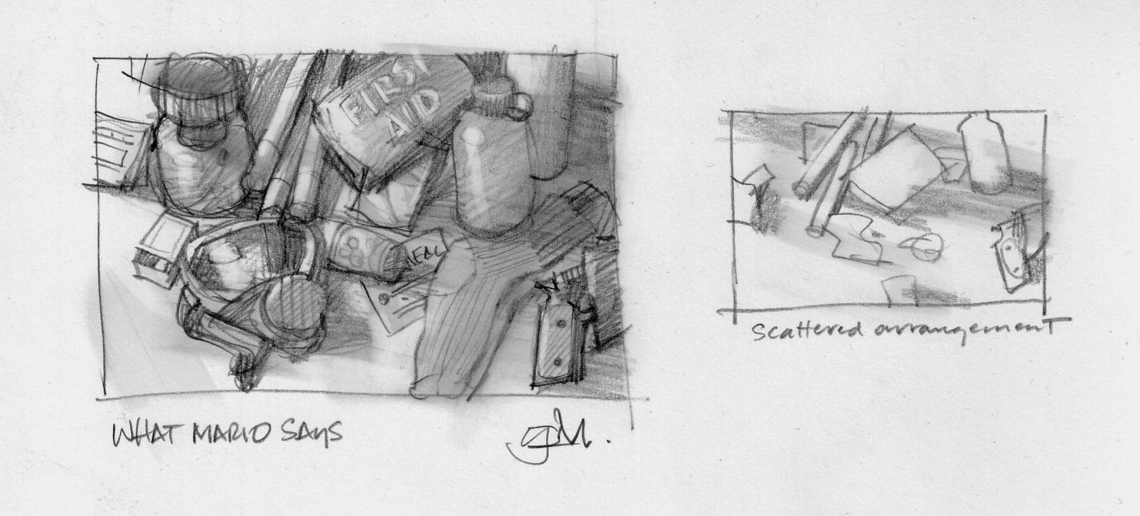
We talked about it, and I explained how I could get the painting to look similar to the first painting of the Marines. The silence on the phone told me she wasn’t buying it. My quick, superior genius realized in less than a nanosecond that I hadn’t explored the subject enough and needed to do more sketching.
I wasn’t sure where to go, but I had an inkling of an idea. Having taught students that ‘an illustrator thinks on paper,’ it was time for me to pony up. I just started scribbling inside a rectangle and a scene started to grow into more of a full-fledged idea. I explored figures coming out of the shelter, and walking into a post-apocalyptic world.
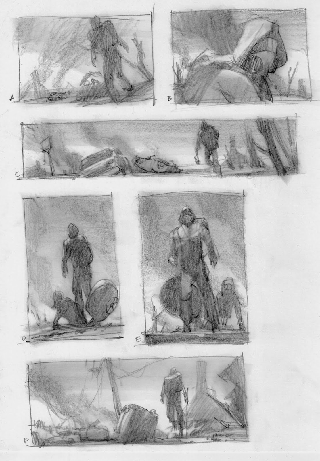
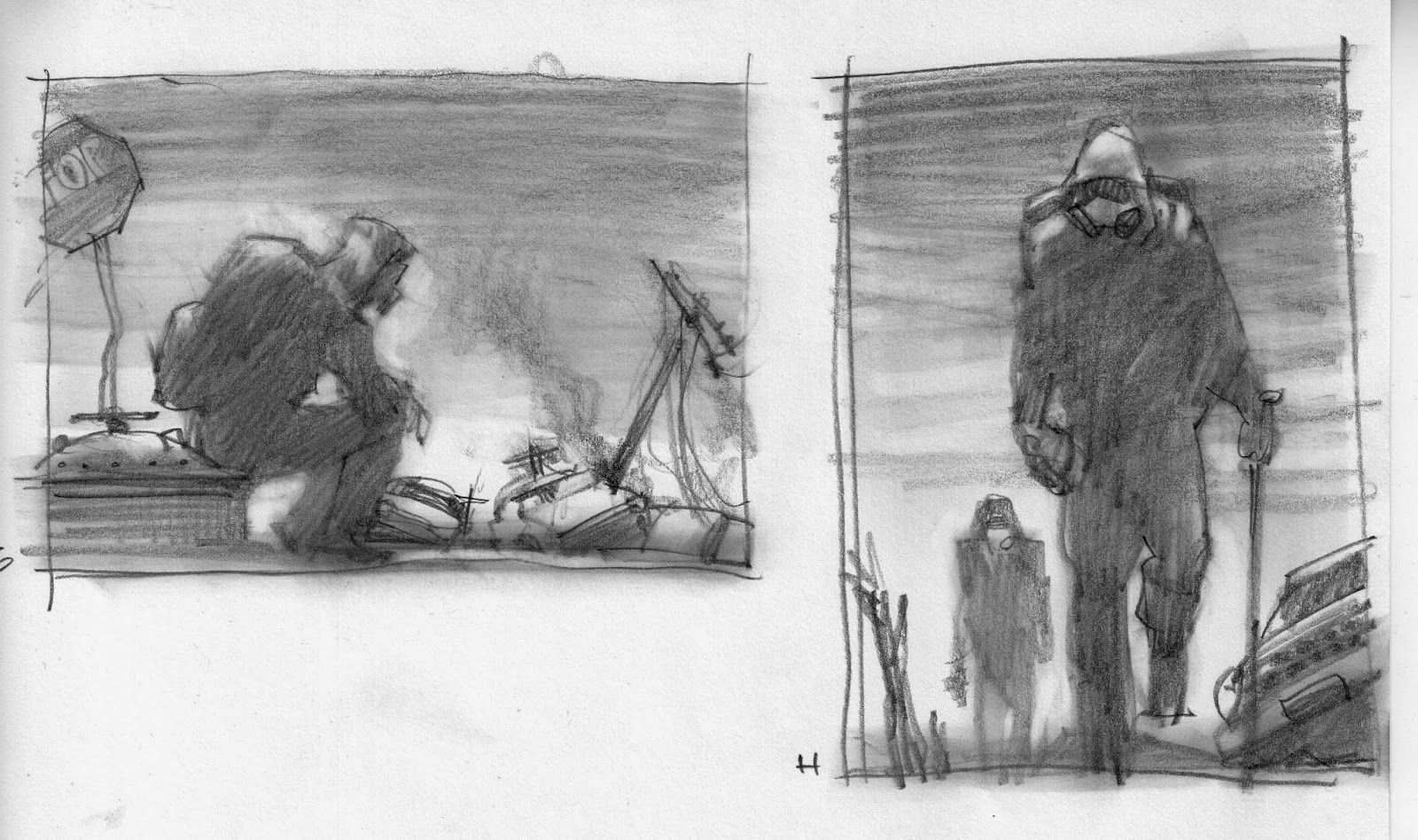
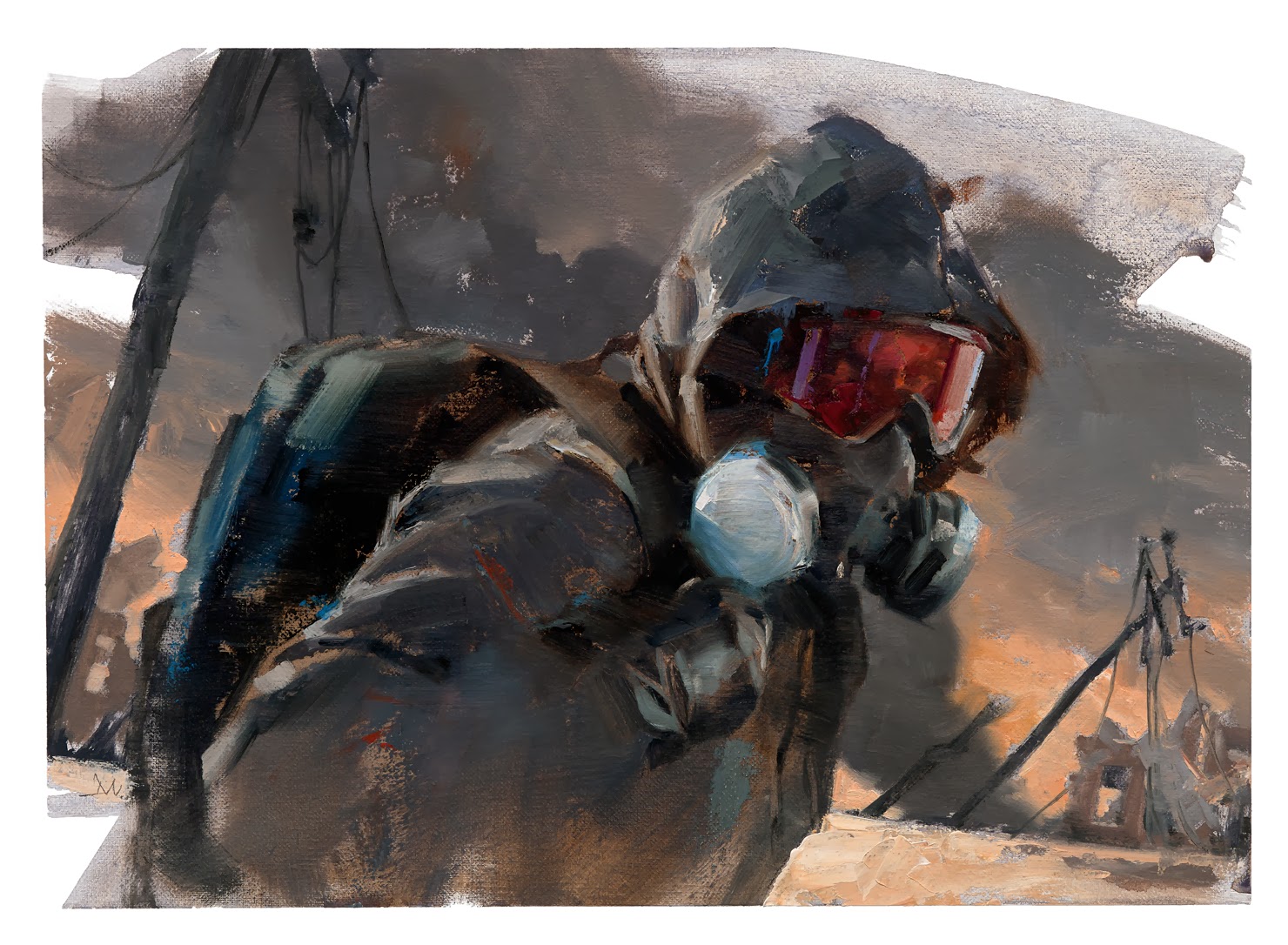
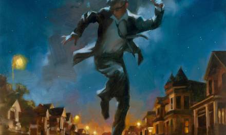
Since I had already done a street scene for the second story, Irene felt that the close-in shot of the character in a respirator, #B, would be a nice alternate direction. This was one of my favorite thumbs so I was happy to develop it into a finished sketch. I shot reference after buying a respirator to get that important detail correct.
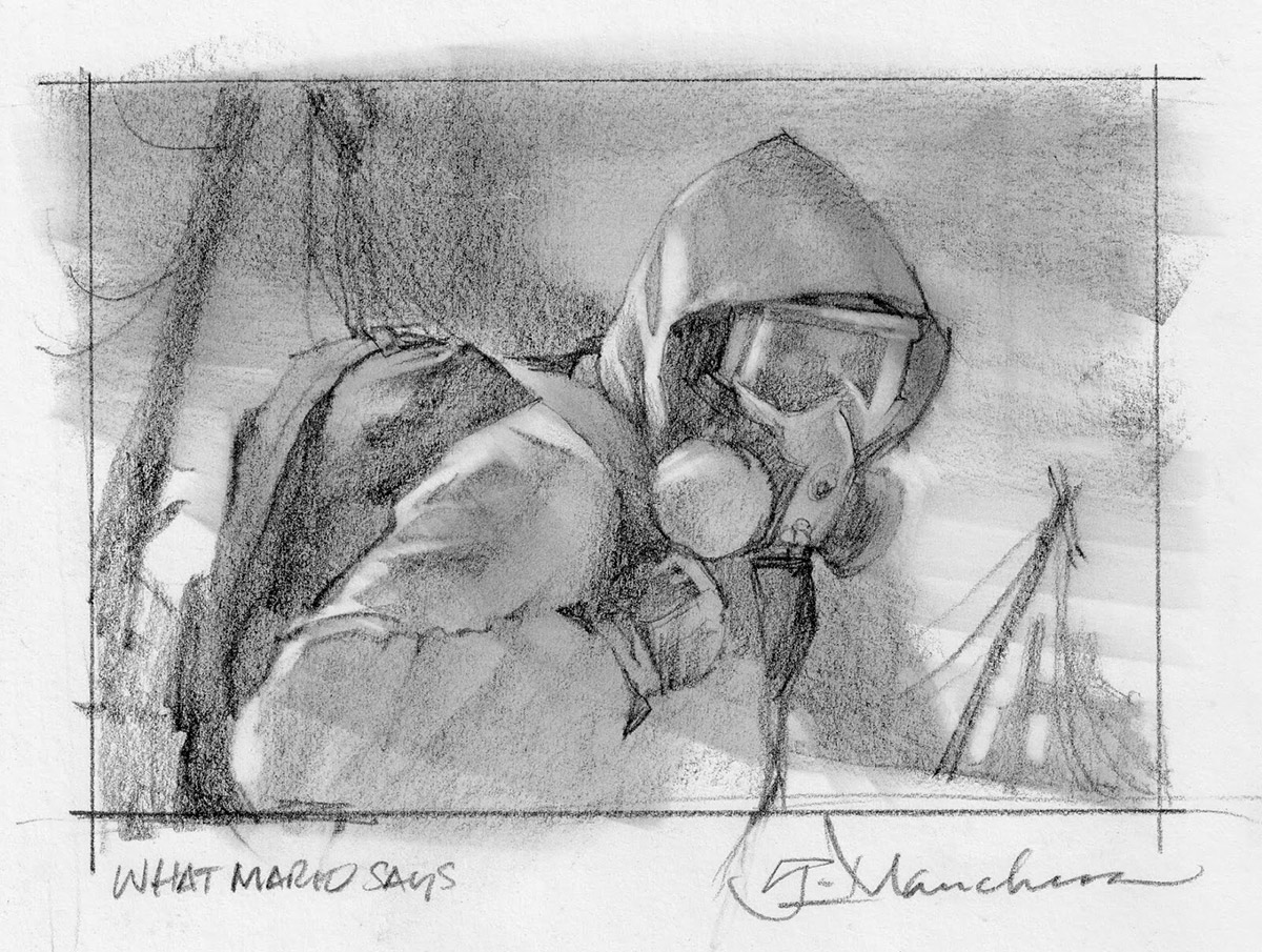
I wanted the finish to reflect the same painting approach I’d used in the first painting. A very loose application of paint achieved by using palette knives and brushes. The trick was to keep from rendering too much, to allow myself the necessary freedom of only capturing what was important to the mood, and important to the visual interest to draw a reader in.
This is not just a simple portrait. It was critical to give the character a sense of motion, to allow the piece to have a slice-of-time element that keeps the motion frozen. To catch the character as he turns slightly to look at us while passing by, caught in stride.
The background has to work with that motion as well. The phone poles are leaning at those angles to keep the feeling of the forward motion. And again, the background elements break the space for balance. Plenty of solid diagonals for interest.
The color scheme is intentional. The browns and greys serve as a nice backdrop for the bright red-violets that commandeer our eyes to the focal point of the picture.
The grit and grime are really what make this image!
I love it!
Thanks for sharing the process. I'm especially interested in how your thumbs have so much tone with a simple sketch.
This is awesome, Greg! Since I'm in your class I saw it last week, but now that I'm seeing it again I'm blown away by the fact that you managed to use all those greys and blacks and still not make a muddy mess. Not all of us could pull that off.
Really nice Greg! Love that little hit of blue and violet on his mask.
I'm impressed that you bought a respirator just for this assignment! You must have an amazing collection of props.
Really awesome job Mister!
Hi Greg, you did a great job on the face and mask, the reflections, and the depth in the mask, and most all a sense of breathing from inside a mask and under a Jacket hood. I instantly felt the confines of being all decked out in that type of outfit. It could be in part because I take daily walks near Bradley Int airport during my day job lunch break….on the cold days I'm wearing a balaclava and jacket hood to keep the cold wind crossing the runway at bay. Anyway your ability to make that confined feeling come back is spot on.
I also like the persons eyes.. There's just enough information to capture the persons look but there's so much you didn't paint. That lack of detail yet so much info is just so elusive for me… Baffling and Amazing at the same time…
Cheers,
Mike
Nice… The eyes through the red goggles look awesome. Great colors too.
HI Greg
Nice Job!
Can someone help me? I was searching the Irene Gallo's email adress to send her my portfolio, but it was impossible.
Give me a hand guys! 😉 Thanks
Álvaro
I love your sketches.
Greg – look at all these delicious (sellable) sketches! Mmmmmmm!
🙂 xxxx
Masterful. Economical, great tonal value, and the colours really hint at something dark that could happen at any second.
I love staring at your work, it's so elegantly simple and fantastic. It never gets old. I'm reminding myself now to sign up for your next class. Oh how I wish I could do that.
numberedart respects the rights of content distributors and replies promptly to any requests for the removal of copyrighted content as required by International Copyright law. In the unlikely case that you find any unauthorized content on NumberedArt.com, and are the rights holder or a representative, please contact us with the URLs of the image.